Virtual concerts have transformed the live entertainment industry. Artists, event organizers, and streaming platforms now rely on digital concerts to reach global audiences, reduce operational costs, and generate new revenue streams. However, managing virtual concert data without a structured reporting system quickly becomes overwhelming.
That is why a Virtual Concerts Dashboard in Excel becomes an essential analytics tool.
In this detailed guide, you will learn what a Virtual Concerts Dashboard in Excel is, why virtual event teams need it, how it works, its page-wise structure, key metrics, advantages, best practices, and frequently asked questions. Moreover, this article uses clear language, smooth transitions, and practical explanations to ensure strong SEO performance and easy understanding.
Click to Purchases Virtual Concerts Dashboard in Excel
What Is a Virtual Concerts Dashboard in Excel?
A Virtual Concerts Dashboard in Excel is a ready-to-use, interactive reporting template that helps event organizers analyze financial performance, audience engagement, and operational efficiency for online concerts.
Instead of working with multiple spreadsheets for ticket sales, platform costs, artist fees, and viewer data, this dashboard consolidates everything into a single Excel file. As a result, users gain instant insights into revenue, profit, costs, ratings, and trends.
Moreover, because the dashboard runs entirely in Excel, it remains flexible, accessible, and easy to update without technical skills.
Why Do Virtual Concert Organizers Need a Dashboard?
Virtual concerts generate data from ticketing platforms, streaming services, marketing campaigns, and payment gateways. Therefore, tracking performance manually often leads to confusion and delayed decisions.
A Virtual Concerts Dashboard in Excel solves these challenges effectively.
Key reasons you need this dashboard:
-
Multiple revenue and cost sources exist
-
Audience engagement metrics vary by platform and region
-
Manual reports consume time
-
Performance trends remain hidden
-
Decision-makers need quick insights
As a result, this dashboard becomes a single source of truth for virtual concert performance.
Click to Purchases Virtual Concerts Dashboard in Excel
How Does a Virtual Concerts Dashboard in Excel Work?
The dashboard follows a simple and structured workflow.
First, you enter concert-related data into a central data sheet. Then, Excel formulas and charts automatically calculate KPIs and update visuals across all pages.
Overall workflow:
-
Enter concert data in the data sheet
-
Navigate using the page navigator
-
Filter data using slicers
-
Review KPIs and charts
-
Analyze trends and performance
Because of this design, users focus on insights instead of manual calculations.
Page Navigator: Easy Navigation Across the Dashboard
The Page Navigator, located on the left side, allows users to move easily between analytical pages.
Benefits of the Page Navigator:
-
One-click navigation
-
Clean dashboard structure
-
Improved user experience
-
Faster analysis
As a result, users can explore insights without searching through sheets.
Click to Purchases Virtual Concerts Dashboard in Excel
Page-Wise Structure of the Virtual Concerts Dashboard in Excel
This dashboard contains 5 well-designed analytical pages, each focused on a specific performance area.
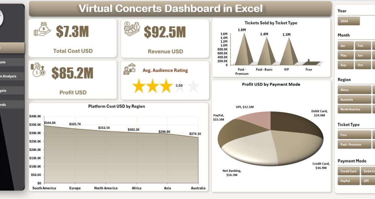
1) Overview Page: How Does the Executive Summary Work?
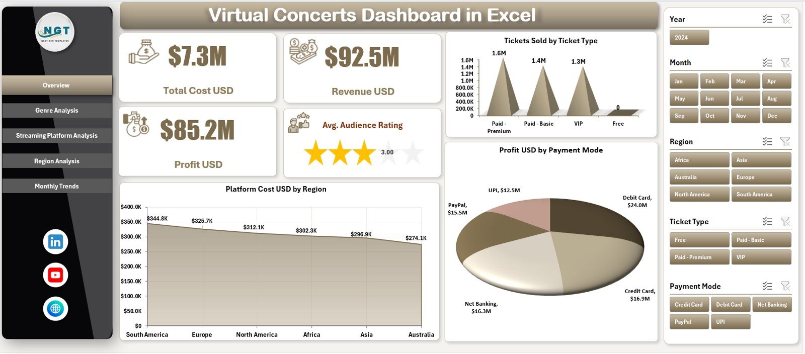
The Overview Page serves as the main dashboard.
Key Filters
On the right side, slicers allow users to filter data based on relevant dimensions such as event, platform, genre, or region.
KPI Cards on the Overview Page
The dashboard displays 5 KPI cards that provide instant performance insights:
-
Total Cost (USD)
-
Revenue (USD)
-
Profit (USD)
-
Average Audience Rating
These KPIs help decision-makers quickly understand overall performance.
Charts on the Overview Page
The page includes three key charts:
-
Tickets Sold by Ticket Type
-
Platform Cost (USD) by Region
-
Profit (USD) by Payment Mode
Together, these visuals show how revenue, costs, and profits distribute across different dimensions.
Click to Purchases Virtual Concerts Dashboard in Excel
2) Genre Analysis Page: How Do Genres Perform?
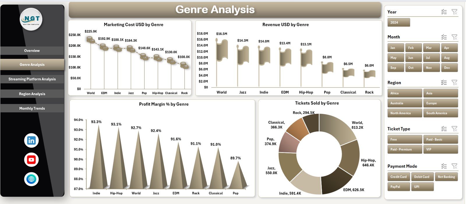
The Genre Analysis Page focuses on performance by music genre.
Filters
Right-side slicers allow users to filter data easily.
Charts on the Genre Analysis Page
This page includes four analytical charts:
-
Marketing Cost (USD) by Genre
-
Revenue (USD) by Genre
-
Profit Margin (%) by Genre
-
Tickets Sold by Genre
As a result, organizers can identify high-performing genres and optimize future events.
3) Streaming Platform Analysis: Which Platforms Perform Best?
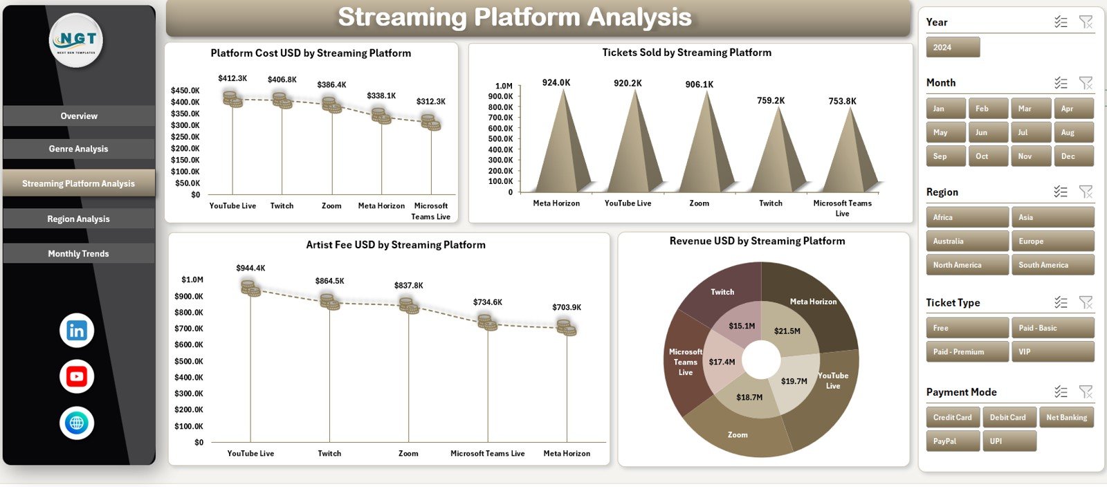
The Streaming Platform Analysis Page evaluates performance across different streaming platforms.
Filters
Right-side slicers allow quick platform-wise analysis.
Charts on the Streaming Platform Analysis Page
This page displays four charts:
-
Platform Cost (USD) by Streaming Platform
-
Tickets Sold by Streaming Platform
-
Artist Fee (USD) by Streaming Platform
-
Revenue (USD) by Streaming Platform
These insights help teams compare platforms and negotiate better terms.
4) Region Analysis: How Does Performance Vary by Location?
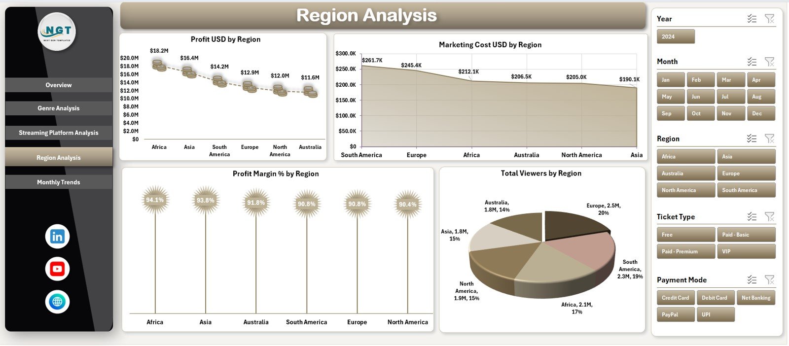
The Region Analysis Page highlights geographic performance.
Filters
Right-side slicers allow region-wise filtering.
Charts on the Region Analysis Page
This page includes four charts:
-
Profit (USD) by Region
-
Marketing Cost (USD) by Region
-
Profit Margin (%) by Region
-
Total Viewers by Region
These insights help target profitable regions and refine marketing strategies.
5) Monthly Trends Page: How Does Performance Change Over Time?
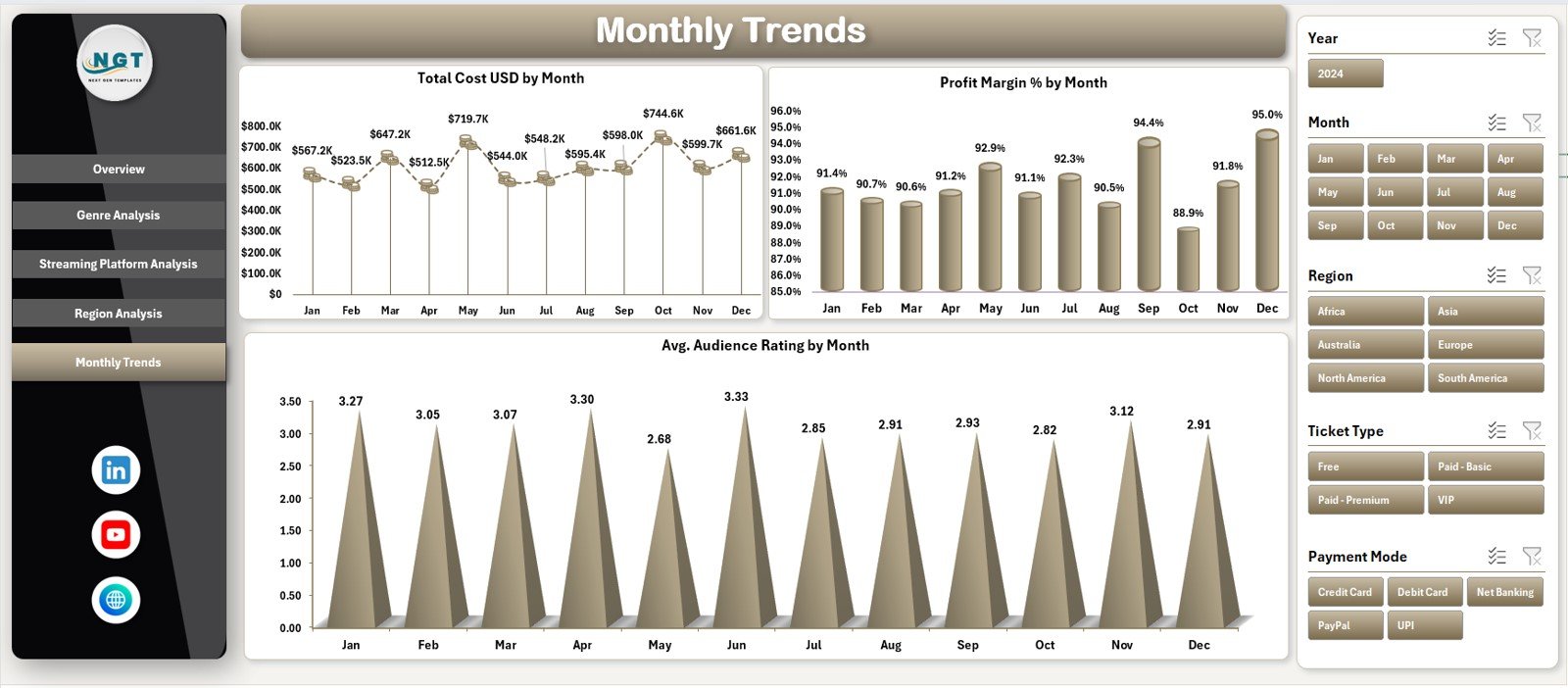
The Monthly Trends Page focuses on time-based analysis.
Filters
Right-side slicers allow users to adjust the time view easily.
Charts on the Monthly Trends Page
This page displays three trend charts:
-
Total Cost by Month
-
Profit Margin (%) by Month
-
Average Audience Rating by Month
As a result, users can track growth, seasonality, and audience sentiment.
Data Sheet and Support Sheet: The Backbone of the Dashboard
Data Sheet
The Data Sheet stores all concert-related data, including:
-
Ticket sales
-
Revenue
-
Costs
-
Ratings
-
Platform details
-
Genre and region
This sheet drives all calculations and visuals.
Support Sheet
The Support Sheet helps manage:
-
Drop-down lists
-
Data validation
-
Helper calculations
Together, these sheets ensure smooth dashboard operation.
Advantages of Virtual Concerts Dashboard in Excel
Using this dashboard delivers strong analytical and business benefits.
Key Advantages
-
🎵 Centralized concert performance tracking
-
🎵 Clear revenue, cost, and profit visibility
-
🎵 Easy Excel-based updates
-
🎵 Interactive charts and slicers
-
🎵 Faster and better decision-making
-
🎵 No advanced tools required
-
🎵 Professional and presentation-ready design
As a result, virtual concert planning becomes data-driven.
Click to Purchases Virtual Concerts Dashboard in Excel
How Does This Dashboard Support Better Decision-Making?
The dashboard transforms raw event data into actionable insights.
Decision-Making Benefits
-
Identify profitable genres and regions
-
Compare streaming platform performance
-
Optimize marketing spend
-
Improve pricing strategies
-
Track audience satisfaction trends
Therefore, teams move from guesswork to confident planning.
Click to Purchases Virtual Concerts Dashboard in Excel
Best Practices for the Virtual Concerts Dashboard in Excel
To get the best results, follow these best practices.
Data Entry Best Practices
-
Update the data sheet regularly
-
Use consistent naming for genres and platforms
-
Avoid blank cells in numeric columns
-
Validate data before analysis
Dashboard Usage Best Practices
-
Review overview KPIs before deep analysis
-
Use slicers to isolate insights
-
Monitor monthly trends consistently
-
Focus on profit margin, not just revenue
Governance Best Practices
-
Protect formula cells
-
Maintain a KPI definition reference
-
Train users on interpretation
-
Keep backup copies of the file
Following these practices ensures long-term dashboard value.
Click to Purchases Virtual Concerts Dashboard in Excel
Who Should Use a Virtual Concerts Dashboard in Excel?
This dashboard fits multiple stakeholders.
Ideal Users
-
Virtual Event Organizers
-
Music Production Companies
-
Artist Management Teams
-
Digital Streaming Platforms
-
Marketing and Finance Teams
Each group benefits from clear insights without technical complexity.
Conclusion: Why Is a Virtual Concerts Dashboard in Excel Essential?
A Virtual Concerts Dashboard in Excel provides a powerful yet simple way to analyze online concert performance.
Instead of juggling multiple spreadsheets, this dashboard delivers a centralized view of revenue, costs, profit, audience ratings, and trends. Moreover, its Excel-based structure ensures flexibility, scalability, and ease of use.
Therefore, if your goal is to improve profitability, audience engagement, and strategic planning, this dashboard becomes an essential tool.
Click to Purchases Virtual Concerts Dashboard in Excel
Frequently Asked Questions (FAQs)
What is a Virtual Concerts Dashboard in Excel used for?
It helps track financial performance, audience engagement, and trends for online concerts.
Do I need advanced Excel skills to use this dashboard?
No. Basic Excel knowledge is enough to update data and review insights.
Can I customize charts and KPIs?
Yes. You can easily modify charts, metrics, and filters based on your needs.
How often should data be updated?
You should update data after each event or monthly for trend analysis.
Is this dashboard suitable for large virtual events?
Yes. The structure supports small, medium, and large-scale virtual concerts.
Click to Purchases Virtual Concerts Dashboard in Excel
Visit our YouTube channel to learn step-by-step video tutorials