Managing electricity purchasing has become more complex than ever. Organizations now deal with multiple utility providers, different energy sources, changing tax structures, transmission charges, and monthly consumption fluctuations. Therefore, relying on scattered spreadsheets or manual reports no longer works. Decision-makers need a clear, visual, and structured way to analyze electricity purchasing data.
That is exactly where the Electricity Purchasing Dashboard in Excel becomes a powerful and practical solution.
In this detailed and SEO-friendly article, you will learn everything about the Electricity Purchasing Dashboard in Excel. Moreover, you will understand its structure, key features, analytical pages, advantages, best practices, and frequently asked questions. By the end, you will clearly see why this dashboard is an essential tool for finance teams, energy managers, procurement professionals, and operations leaders.
Click to Purchases Electricity Purchasing Dashboard in Excel
What Is an Electricity Purchasing Dashboard in Excel?
An Electricity Purchasing Dashboard in Excel is a ready-to-use analytical template designed to track, analyze, and visualize electricity purchasing data in one centralized place. Instead of working with raw data tables, this dashboard converts electricity cost and consumption data into meaningful charts, KPIs, and trends.
Because the dashboard is built in Microsoft Excel, it remains easy to use, flexible, and familiar. At the same time, it delivers powerful insights without requiring expensive BI tools or complex software.
This dashboard helps organizations answer important questions such as:
-
How much electricity are we purchasing?
-
What is our net purchase cost after taxes?
-
Which utility providers cost the most?
-
How do transmission charges affect overall cost?
-
What is the tax impact percentage by month, utility, or location?
-
How much energy comes from renewable sources?
Why Do Organizations Need an Electricity Purchasing Dashboard?
Electricity purchasing directly affects operational costs. Even small inefficiencies can lead to significant financial losses over time. However, when electricity data sits across multiple sheets and reports, visibility drops.
Therefore, organizations need a dashboard that:
-
Centralizes electricity purchasing data
-
Improves cost transparency
-
Highlights tax and transmission impact
-
Tracks energy usage trends
-
Supports informed decision-making
An Electricity Purchasing Dashboard in Excel delivers all of this in a simple and visual format.
Click to Purchases Electricity Purchasing Dashboard in Excel
Key Features of the Electricity Purchasing Dashboard in Excel
The Electricity Purchasing Dashboard in Excel comes with a well-structured layout and powerful analytical capabilities. Let us explore its key features in detail.
Page Navigator for Easy Navigation
The dashboard includes a Page Navigator located on the left side. This navigator allows users to move quickly between different analytical pages.
As a result, users do not waste time scrolling or searching for sheets. Instead, they access insights instantly.
Dashboard Structure – 5 Analytical Pages Explained
The Electricity Purchasing Dashboard in Excel includes 5 dedicated analytical pages, each designed to answer specific business questions.
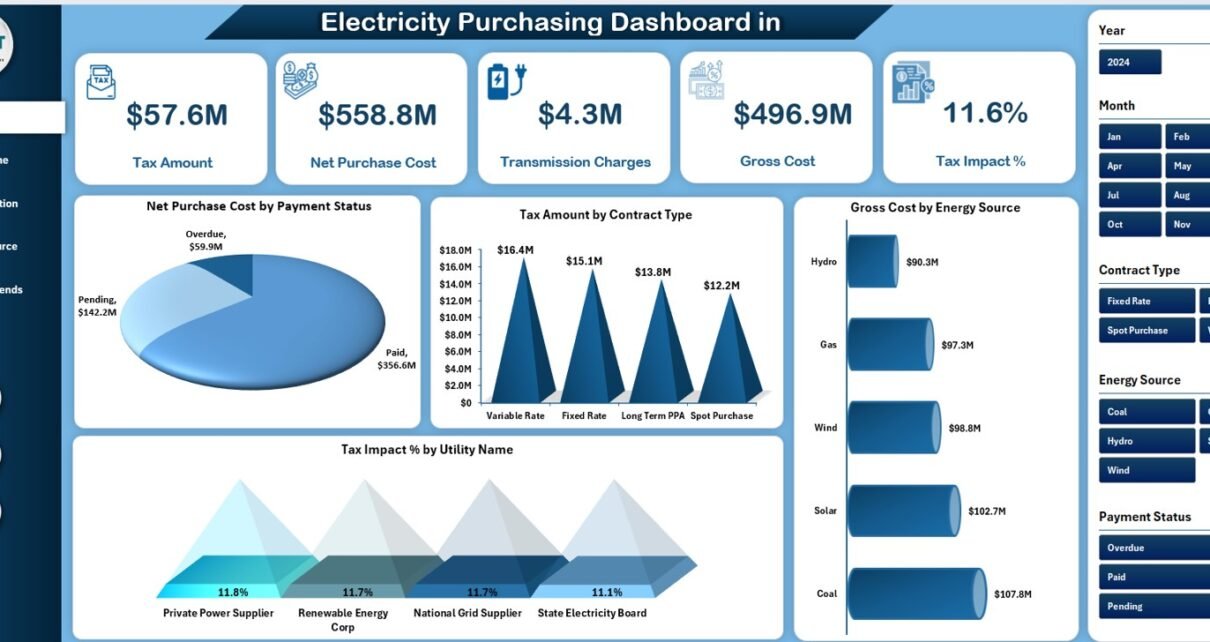
1. Overview Page – What Is Our Overall Electricity Purchasing Performance?
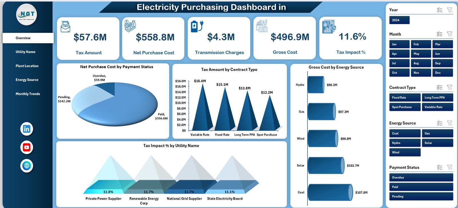
The Overview Page acts as the control center of the dashboard. It provides a high-level summary of electricity purchasing performance.
KPI Cards on the Overview Page
The Overview Page includes 5 KPI cards that instantly highlight critical metrics:
-
Tax Amount – Shows the total tax paid on electricity purchases
-
Net Purchase Cost – Displays electricity cost excluding taxes
-
Transmission Charge – Highlights the cost of transmitting electricity
-
Gross Cost – Shows total electricity cost including all charges
-
Tax Impact % – Indicates how much tax affects total cost
These KPI cards help stakeholders quickly understand cost structure and financial impact.
Charts on the Overview Page
The Overview Page also includes 4 insightful charts:
-
Net Purchase Cost by Payment Status – Identifies paid vs unpaid or pending costs
-
Tax Amount by Contract Type – Shows tax distribution across contract categories
-
Gross Cost by Energy Source – Compares costs across energy types
-
Tax Impact % by Utility Name – Highlights utilities with higher tax impact
Together, these visuals provide instant clarity on electricity purchasing performance.
2. Utility Name Analysis – Which Utility Providers Cost the Most?
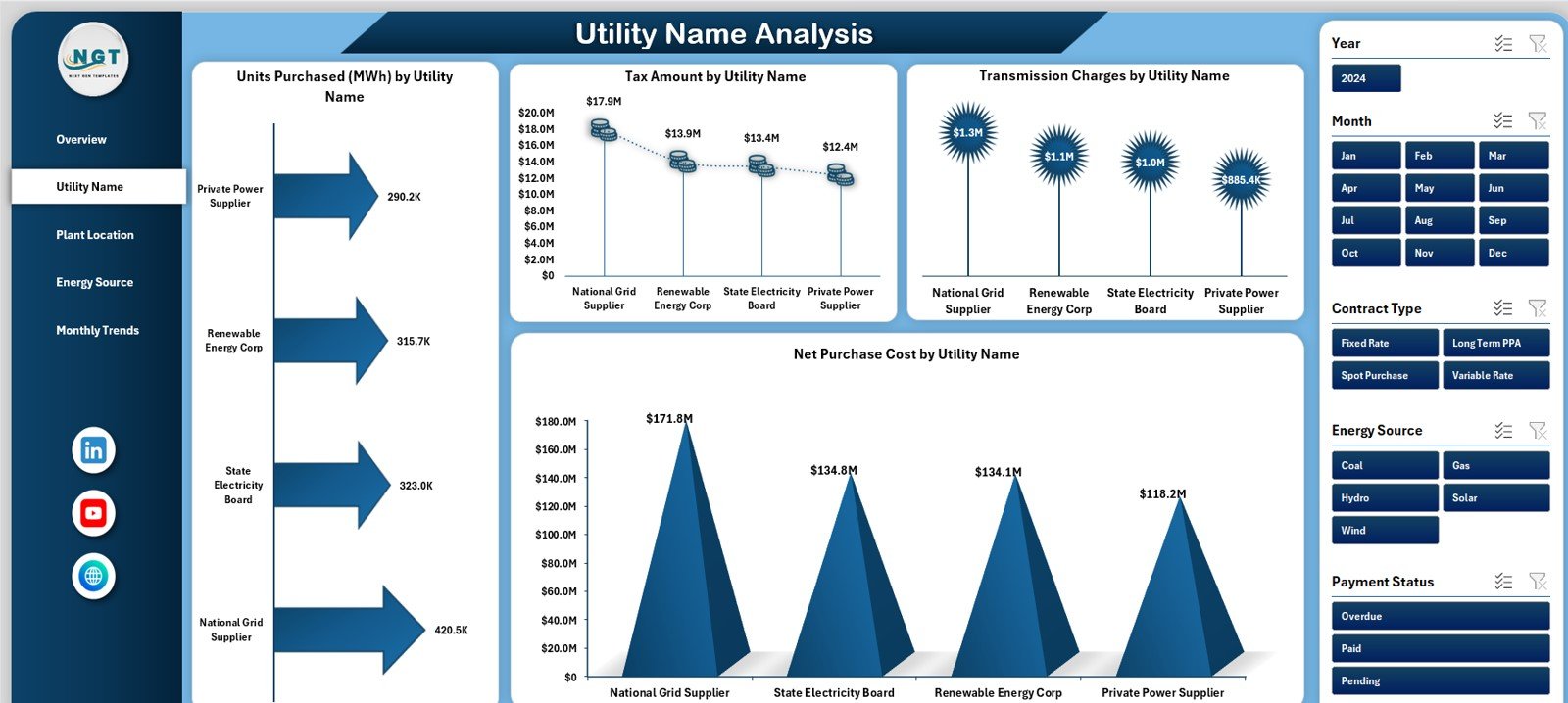
The Utility Name Analysis Page focuses on performance comparison across utility providers.
Key Charts on Utility Name Analysis Page
This page includes 4 powerful charts:
-
Units Purchased (MWh) by Utility Name – Shows electricity volume per provider
-
Tax Amount by Utility Name – Highlights tax contribution by utility
-
Transmission Charges by Utility Name – Identifies high transmission cost providers
-
Net Purchase Cost by Utility Name – Compares net cost across utilities
Because of these insights, organizations can evaluate supplier efficiency and negotiate better contracts.
3. Plant Location Analysis – How Does Electricity Cost Vary by Location?
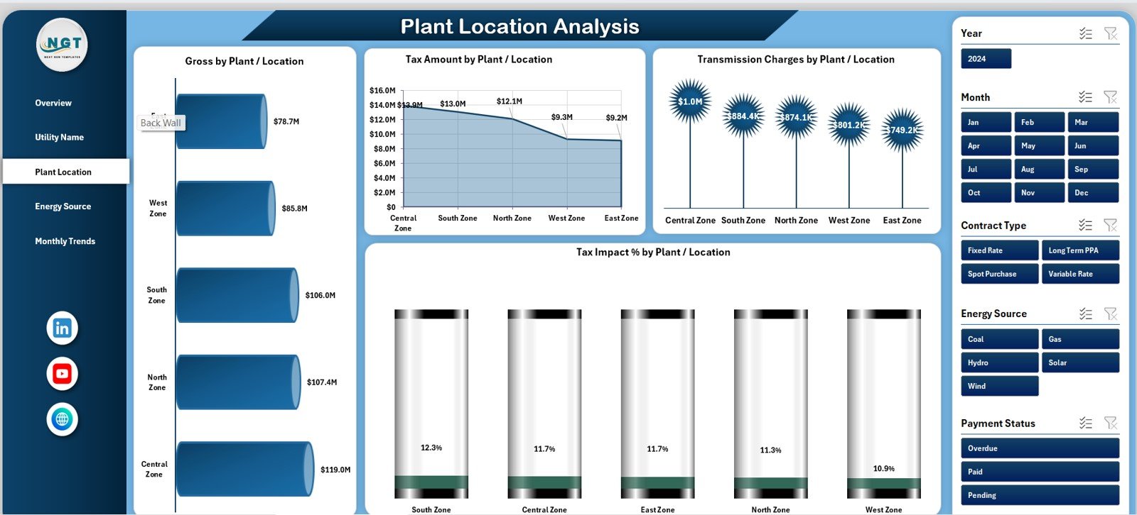
Electricity cost often varies by plant or location due to tariffs, taxes, and energy sources. Therefore, location-based analysis becomes critical.
Key Charts on Plant Location Analysis Page
This page includes 4 detailed charts:
-
Gross Cost by Plant/Location – Shows total electricity cost per site
-
Tax Amount by Plant/Location – Highlights tax impact across locations
-
Transmission Charges by Plant/Location – Identifies sites with high transmission costs
-
Tax Impact % by Plant/Location – Compares tax burden by location
As a result, management can identify high-cost plants and take corrective actions.
4. Energy Source Analysis – How Does Energy Mix Impact Cost?
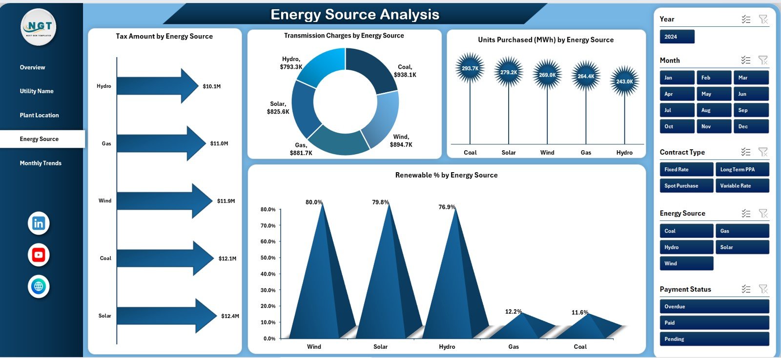
The Energy Source Analysis Page focuses on understanding electricity cost by energy type.
Key Charts on Energy Source Analysis Page
This page includes 4 insightful charts:
-
Tax Amount by Energy Source – Compares tax levels across energy types
-
Transmission Charges by Energy Source – Highlights transmission cost differences
-
Units Purchased (MWh) by Energy Source – Shows consumption by energy type
-
Renewable % by Energy Source – Tracks renewable energy contribution
Because sustainability matters more than ever, this page supports renewable energy planning and reporting.
Click to Purchases Electricity Purchasing Dashboard in Excel
5. Monthly Trends – How Does Electricity Purchasing Change Over Time?
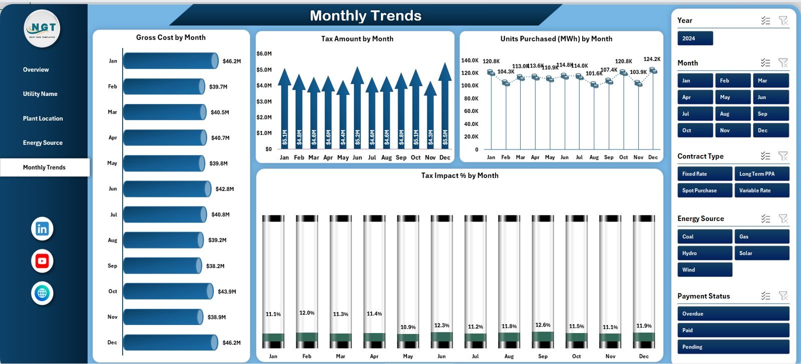
The Monthly Trends Page helps users track electricity purchasing behavior over time.
Key Charts on Monthly Trends Page
This page includes 4 time-based charts:
-
Gross Amount by Month – Shows monthly electricity spending
-
Tax Amount by Month – Tracks monthly tax trends
-
Units Purchased (MWh) by Month – Monitors electricity consumption
-
Tax Impact % by Month – Analyzes monthly tax impact
These trends support forecasting, budgeting, and seasonal analysis.
Support Sheet and Data Sheet – Backbone of the Dashboard
Behind every powerful dashboard lies structured data.
-
Data Sheet stores raw electricity purchasing data such as utility name, energy source, units, tax, transmission charge, and cost.
-
Support Sheet contains helper calculations, mappings, and formulas that drive charts and KPIs.
Because of this structure, the dashboard remains scalable and easy to update.
Advantages of Electricity Purchasing Dashboard in Excel
1. Centralized Electricity Cost Monitoring
The dashboard brings all electricity purchasing data into one centralized file. Therefore, teams avoid managing multiple spreadsheets.
2. Improved Cost Transparency
Users clearly see gross cost, net cost, tax impact, and transmission charges. As a result, cost drivers become visible.
3. Better Supplier and Utility Analysis
Utility-wise analysis helps organizations identify high-cost providers and negotiate better contracts.
4. Location-Based Cost Control
Plant-level analysis allows targeted cost reduction initiatives.
5. Renewable Energy Tracking
Energy source analysis supports sustainability goals and renewable reporting.
6. Time-Saving and User-Friendly
Because the dashboard runs in Excel, users work in a familiar environment without additional tools.
7. Data-Driven Decision Making
Visual insights support faster and more confident decisions.
Click to Purchases Electricity Purchasing Dashboard in Excel
Best Practices for the Electricity Purchasing Dashboard in Excel
1. Maintain Clean and Accurate Data
Always ensure the data sheet remains accurate and updated. Clean data improves dashboard reliability.
2. Update Data Regularly
Update electricity purchasing data monthly or weekly to maintain relevance.
3. Standardize Utility and Energy Source Names
Consistent naming improves analysis accuracy and avoids duplication.
4. Monitor Tax Impact Closely
Track tax impact percentages regularly to identify abnormal increases.
5. Use Insights for Negotiation
Leverage utility-wise and location-wise insights during contract negotiations.
6. Track Renewable Percentage
Use energy source analysis to improve renewable energy adoption.
7. Secure the Dashboard
Protect formulas and structure to avoid accidental changes.
Who Can Benefit from an Electricity Purchasing Dashboard in Excel?
This dashboard benefits multiple stakeholders, including:
-
Energy and utility managers
-
Procurement and purchasing teams
-
Finance and accounting departments
-
Sustainability and ESG teams
-
Plant and operations managers
-
Corporate management
Conclusion – Why the Electricity Purchasing Dashboard in Excel Is Essential
Electricity purchasing affects both operational efficiency and financial performance. Therefore, organizations must move beyond manual reporting and adopt structured analysis.
The Electricity Purchasing Dashboard in Excel provides a complete, visual, and easy-to-use solution. It centralizes data, highlights cost drivers, supports sustainability, and improves decision-making.
If your organization wants better control, visibility, and insights into electricity purchasing, this dashboard becomes an essential tool.
Click to Purchases Electricity Purchasing Dashboard in Excel
Frequently Asked Questions (FAQs)
What is an Electricity Purchasing Dashboard in Excel?
An Electricity Purchasing Dashboard in Excel is a ready-to-use template that analyzes electricity cost, tax, transmission charges, and energy usage using charts and KPIs.
Who should use an Electricity Purchasing Dashboard?
Energy managers, procurement teams, finance professionals, and operations managers benefit the most.
Can I customize the dashboard?
Yes, because it is built in Excel, you can easily customize charts, KPIs, and layouts.
Does the dashboard support renewable energy analysis?
Yes, the Energy Source Analysis page tracks renewable percentage and energy mix.
How often should I update the dashboard?
You should update the dashboard monthly or whenever new electricity purchasing data becomes available.
Do I need advanced Excel skills to use it?
No, basic Excel knowledge is sufficient to use and update the dashboard.
Can this dashboard support budgeting and forecasting?
Yes, monthly trends help with budgeting, forecasting, and cost planning.
Click to Purchases Electricity Purchasing Dashboard in Excel
Visit our YouTube channel to learn step-by-step video tutorials