Are soil testing service providers struggling with scattered data and unclear performance tracking?
Soil testing services play a vital role in agriculture, construction, environmental monitoring, and land development. However, many soil testing organizations still rely on manual reports, disconnected Excel sheets, and delayed performance reviews. As a result, decision-making slows down, targets become unclear, and service quality suffers.
That is exactly where a Soil Testing Services KPI Dashboard in Power BI makes a powerful difference.
This detailed article explains what a Soil Testing Services KPI Dashboard in Power BI is, why it matters, how it works, and how organizations can use it to improve accuracy, efficiency, and profitability. Moreover, you will learn about its advantages, best practices, real-world use cases, and frequently asked questions.
Click to Purchases Soil Testing Services KPI Dashboard in Power BI
What Is a Soil Testing Services KPI Dashboard in Power BI?
A Soil Testing Services KPI Dashboard in Power BI is a ready-to-use analytical solution that tracks, measures, and visualizes key performance indicators related to soil testing operations.
Instead of reviewing raw Excel files or manual reports, this dashboard transforms soil testing data into interactive visuals, KPI cards, trend charts, and performance tables. Consequently, laboratory managers, agronomists, quality teams, and decision-makers gain instant clarity on operational health.
Additionally, the dashboard uses Excel as a structured data source while Power BI handles visualization and analytics. Therefore, teams enjoy flexibility, accuracy, and real-time insights without complex systems.
Why Do Soil Testing Services Need a KPI Dashboard?
Soil testing operations involve multiple KPIs such as test accuracy, turnaround time, sample volume, revenue, compliance rates, and client satisfaction. However, without a centralized dashboard, tracking these metrics becomes difficult.
Here is why a KPI dashboard becomes essential:
-
It centralizes all performance metrics in one place
-
It highlights target achievements and gaps instantly
-
It enables faster corrective actions
-
It improves transparency across teams
-
It supports data-driven decisions
As a result, soil testing organizations operate with confidence and precision instead of assumptions.
How Does a Soil Testing Services KPI Dashboard in Power BI Work?
The dashboard works through a simple yet powerful data flow.
First, users enter actual and target KPI values into structured Excel sheets. Then, Power BI connects to this Excel file and refreshes visuals automatically. Finally, decision-makers analyze KPIs using interactive slicers, trend charts, and performance tables.
Because of this setup, even non-technical users can maintain and use the dashboard easily.
Click to Purchases Soil Testing Services KPI Dashboard in Power BI
What Are the Key Pages in the Soil Testing Services KPI Dashboard?
The dashboard contains three professionally designed pages, each serving a specific purpose.
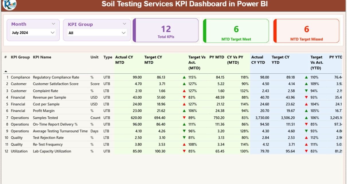
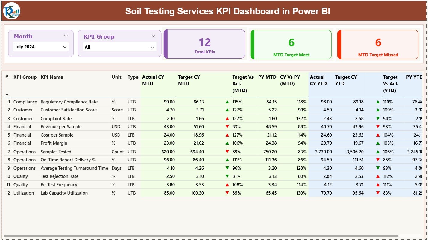
What Is Included in the Summary Page?
The Summary Page acts as the main control center of the dashboard.
At the top, it displays:
-
Month Slicer – Select any reporting month instantly
-
KPI Group Slicer – Filter KPIs by category
Below the slicers, three KPI cards provide an instant snapshot:
-
Total KPIs Count
-
MTD Target Met Count
-
MTD Target Missed Count
What Detailed Information Does the Summary Table Show?
The summary table delivers deep KPI-level insights, including:
-
KPI Number – Unique sequence number
-
KPI Group – Category of the KPI
-
KPI Name – Performance metric name
-
Unit – Measurement unit
-
Type – UTB (Upper the Better) or LTB (Lower the Better)
How Does MTD Performance Get Displayed?
For Month-to-Date analysis, the dashboard shows:
-
Actual CY MTD – Current year actual value
-
Target CY MTD – Current year target value
-
MTD Status Icon – Green ▲ or Red ▼ for quick status
-
Target vs Actual (MTD %) – Actual ÷ Target
-
PY MTD – Previous year same-month value
-
CY vs PY (MTD %) – Current ÷ Previous year comparison
How Does YTD Performance Get Tracked?
For Year-to-Date tracking, the dashboard includes:
-
Actual CY YTD
-
Target CY YTD
-
YTD Status Icon
-
Target vs Actual (YTD %)
-
PY YTD
-
CY vs PY (YTD %)
Because of this structure, users can analyze both short-term and long-term performance in seconds.
Click to Purchases Soil Testing Services KPI Dashboard in Power BI
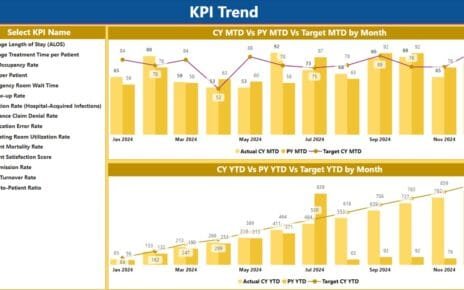
What Is the KPI Trend Page Used For?
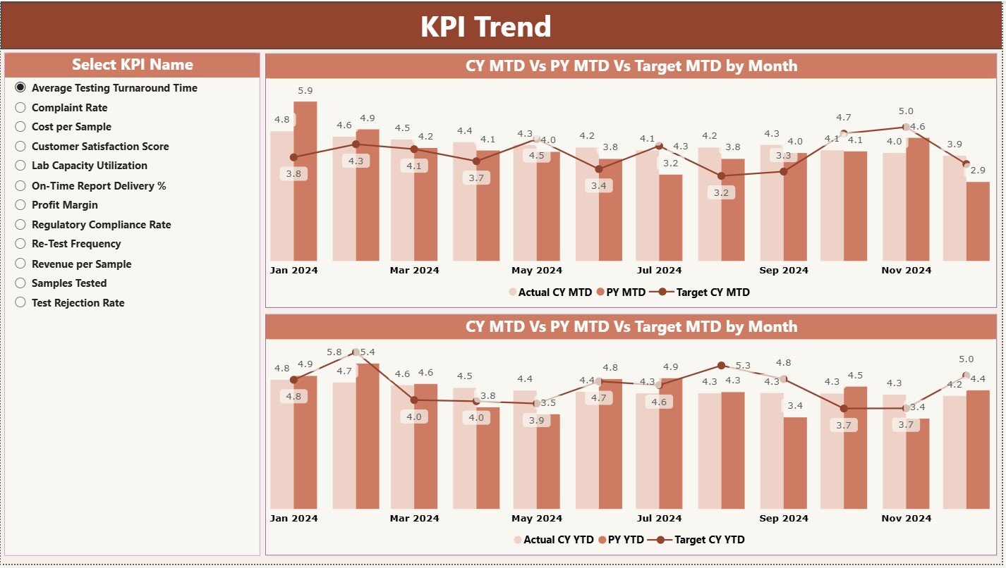
The KPI Trend Page focuses on performance trends over time.
On this page, users see:
-
Two combo charts
-
MTD trend: Actual CY, Target, PY
-
YTD trend: Actual CY, Target, PY
-
A KPI slicer on the left allows users to select any KPI instantly. As a result, trends update dynamically.
This page helps answer critical questions like:
-
Are test turnaround times improving month by month?
-
Are quality KPIs performing better than last year?
-
Are targets realistic or too aggressive?
Why Is the KPI Definition Page Important?
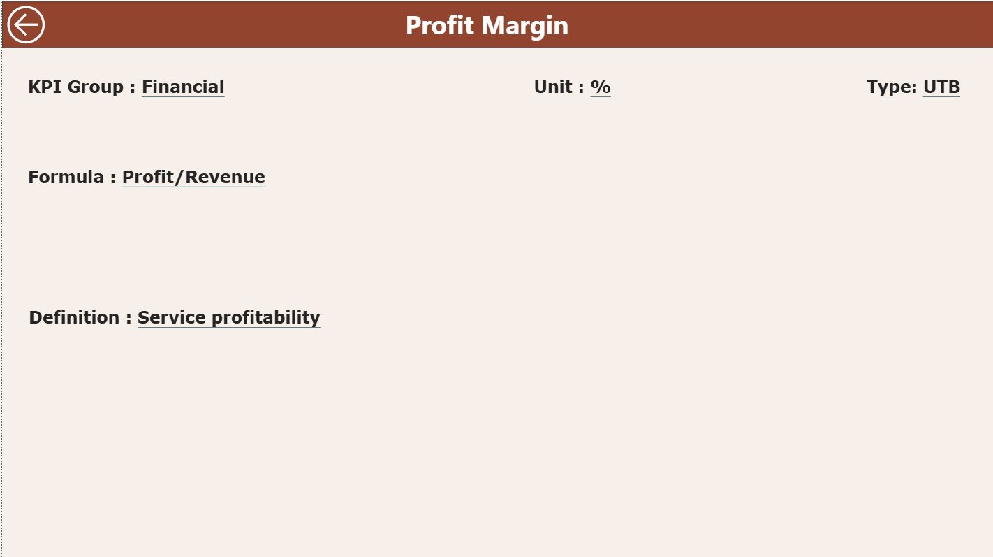
The KPI Definition Page acts as a drill-through reference page.
It remains hidden by default. However, users can drill through from the summary page to view:
-
KPI Formula
-
KPI Definition
-
KPI Unit
-
KPI Type (LTB or UTB)
This design ensures clarity and consistency. Moreover, it prevents misinterpretation of KPIs across teams.
A back button allows instant navigation to the main page.
What Excel Data Structure Powers This Dashboard?
The dashboard uses a clean and structured Excel file as its data source. This design keeps data entry simple and controlled.
What Is the Input_Actual Sheet?
The Input_Actual sheet stores actual performance data.
Users enter:
-
KPI Name
-
Month (first date of the month)
-
MTD Actual Value
-
YTD Actual Value
Because of this structure, Power BI refreshes calculations automatically.
What Is the Input_Target Sheet?
The Input_Target sheet captures target values.
Users fill in:
-
KPI Name
-
Month (first date of the month)
-
MTD Target Value
-
YTD Target Value
As a result, target vs actual comparisons remain accurate and consistent.
What Is the KPI Definition Sheet?
The KPI Definition sheet defines the logic behind every KPI.
It includes:
-
KPI Number
-
KPI Group
-
KPI Name
-
Unit
-
Formula
-
Definition
-
Type (LTB or UTB)
This sheet acts as the backbone of governance and standardization.
Advantages of Soil Testing Services KPI Dashboard in Power BI
Why Should Soil Testing Organizations Use This Dashboard?
This dashboard delivers multiple operational and strategic benefits.
-
Centralized performance tracking across all KPIs
-
Instant visibility into target achievement
-
Reduced manual reporting effort
-
Improved accountability across teams
-
Faster decision-making using real-time insights
-
Better trend analysis for planning and forecasting
Because of these advantages, organizations move from reactive management to proactive control.
Click to Purchases Soil Testing Services KPI Dashboard in Power BI
How Does This Dashboard Improve Decision-Making?
The dashboard eliminates guesswork.
It clearly shows which KPIs perform well and which require action. Moreover, comparison with previous year data highlights long-term trends. Consequently, leaders take informed decisions backed by data.
Who Can Benefit from a Soil Testing Services KPI Dashboard?
This dashboard supports multiple stakeholders, including:
-
Soil testing laboratories
-
Agricultural service providers
-
Environmental testing agencies
-
Construction material testing labs
-
Quality assurance teams
-
Operations managers
-
Business owners and directors
Each role gains tailored insights without complex analysis.
Click to Purchases Soil Testing Services KPI Dashboard in Power BI
Best Practices for the Soil Testing Services KPI Dashboard in Power BI
How Can You Get the Best Results from This Dashboard?
Follow these proven best practices.
-
Define KPIs clearly before implementation
-
Use consistent units and definitions
-
Update Excel data regularly
-
Review MTD and YTD trends together
-
Set realistic and achievable targets
-
Use UTB and LTB logic correctly
-
Train teams to interpret KPIs accurately
When organizations follow these practices, the dashboard delivers maximum value.
How Does This Dashboard Support Continuous Improvement?
Because the dashboard tracks trends over time, teams identify recurring issues quickly. Moreover, early warnings through red indicators trigger corrective actions before problems grow.
As a result, service quality improves continuously.
Conclusion: Why Should You Adopt a Soil Testing Services KPI Dashboard in Power BI?
A Soil Testing Services KPI Dashboard in Power BI transforms raw operational data into meaningful insights. It simplifies reporting, strengthens accountability, and enhances performance tracking.
By combining Excel data input with Power BI analytics, organizations gain a cost-effective yet powerful solution. Moreover, the dashboard supports better planning, improved quality, and faster decisions.
In today’s data-driven environment, relying on manual reports no longer works. Therefore, adopting a KPI dashboard becomes a strategic necessity for soil testing service providers.
Frequently Asked Questions (FAQs)
What KPIs can be tracked in a Soil Testing Services KPI Dashboard?
You can track KPIs such as sample turnaround time, test accuracy rate, revenue per test, client complaints, repeat testing rate, and compliance metrics.
Can non-technical users update this dashboard?
Yes. Users only need to update Excel sheets. Power BI refreshes visuals automatically.
Does this dashboard support both MTD and YTD analysis?
Yes. It tracks Month-to-Date and Year-to-Date performance with targets and year-over-year comparisons.
Can organizations customize KPIs and targets?
Absolutely. Users can modify KPI definitions, targets, and groups directly in Excel.
Is this dashboard suitable for small and large laboratories?
Yes. The design supports scalability for both small labs and large multi-location organizations.
How often should data be updated?
You should update data monthly or more frequently based on reporting needs.
Click to Purchases Soil Testing Services KPI Dashboard in Power BI
Visit our YouTube channel to learn step-by-step video tutorials