Television remains one of the most powerful media channels for advertising, branding, and audience engagement. However, managing multiple TV channels, platforms, regions, and genres creates a massive amount of data. Because of that, decision-makers often struggle to track performance, compare trends, and measure revenue impact effectively.
That is exactly where a TV Channels Dashboard in Excel becomes a game-changing analytical solution.
In this detailed article, you will learn what a TV Channels Dashboard in Excel is, why it matters, how it works, and how each dashboard page helps media professionals make better decisions. Moreover, you will explore its advantages, best practices, and frequently asked questions. By the end, you will clearly understand how this dashboard converts raw television data into actionable insights.
Click to Purchases TV Channels Dashboard in Excel
What Is a TV Channels Dashboard in Excel?
A TV Channels Dashboard in Excel is a ready-to-use analytical dashboard designed to monitor and analyze key television performance metrics such as TRP ratings, ad revenue, impressions, viewers, ad duration, platforms, regions, genres, and monthly trends.
Instead of managing multiple Excel sheets and static reports, this dashboard consolidates everything into one interactive file. As a result, media planners, broadcasters, and advertisers can instantly understand performance patterns and revenue drivers.
Moreover, Excel makes this dashboard flexible, user-friendly, and scalable. Therefore, teams can easily customize metrics, filters, and visuals without technical complexity.
Why Do Media Teams Need a TV Channels Dashboard in Excel?
Television data grows rapidly across platforms like cable, satellite, OTT, and digital TV. Because of this growth, manual reporting becomes time-consuming and error-prone.
A TV Channels Dashboard in Excel solves these challenges by:
-
Centralizing all TV performance data in one place
-
Enabling quick comparison across channels, regions, and genres
-
Improving visibility into ad revenue and audience behavior
-
Supporting faster, data-driven decisions
As a result, stakeholders no longer rely on guesswork. Instead, they act with clarity and confidence.
How Does a TV Channels Dashboard in Excel Work?
The dashboard captures raw data in a dedicated Data Sheet. Then, Excel formulas, pivot tables, and charts process the data automatically. Because of that, visuals update instantly whenever users change slicers or filters.
In addition, a Page Navigator on the left side allows seamless movement between analytical pages. This design improves usability and ensures a smooth analytical flow.
What Are the Key Pages in a TV Channels Dashboard in Excel?
This TV Channels Dashboard in Excel includes five interactive analytical pages, each designed for a specific business purpose. Let us explore them one by one.
Overview Page: How Do You Get a Complete Performance Snapshot?
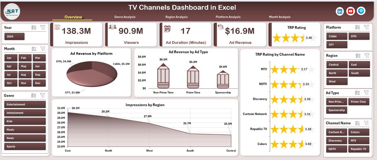
The Overview Page acts as the central command center of the dashboard. It delivers a high-level summary of TV channel performance across multiple dimensions.
Key Elements of the Overview Page
-
Right-side slicer to filter data dynamically
-
Four KPI cards highlighting key metrics
-
Four interactive charts for quick insights
Charts on the Overview Page
📊 Ad Revenue by Platform
This chart compares ad revenue across platforms such as Cable, Satellite, and OTT. As a result, teams quickly identify high-performing platforms.
📊 Ad Revenue by Ad Type
This view shows how different ad formats contribute to revenue. Therefore, advertisers can refine ad strategies.
📊 TRP Rating by Channel Name
This chart highlights channel popularity. Consequently, broadcasters understand which channels attract the highest audience.
📊 Impressions by Region
This chart reveals regional reach and exposure. Hence, regional marketing decisions become more accurate.
Because everything appears on one page, stakeholders immediately understand overall performance.
Genre Analysis Page: Which Genres Drive Viewership and Revenue?
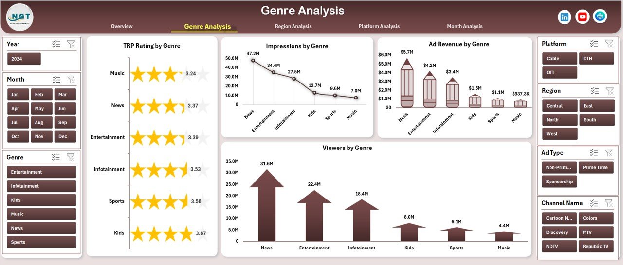
The Genre Analysis Page focuses on content categories such as News, Sports, Movies, Entertainment, and Kids.
Why Is Genre Analysis Important?
Different genres attract different audiences. Therefore, analyzing genre-wise performance helps optimize content strategy and ad placement.
Charts on the Genre Analysis Page
📈 TRP Rating by Genre
This chart shows which genres dominate viewer attention.
📈 Impressions by Genre
This view highlights reach and exposure across genres.
📈 Ad Revenue by Genre
This chart identifies the most profitable genres.
📈 Viewers by Genre
This visual shows audience distribution across genres.
Because of these insights, media planners can align content investment with revenue potential.
Click to Purchases TV Channels Dashboard in Excel
Region Analysis Page: How Does Performance Vary by Geography?
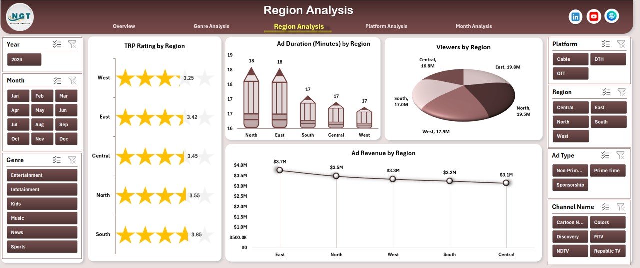
The Region Analysis Page helps teams understand geographical performance trends. Since viewer behavior differs across regions, this analysis becomes essential.
Charts on the Region Analysis Page
🌍 TRP Rating by Region
This chart compares audience engagement across regions.
🌍 Ad Duration by Region
This visual shows how ad airtime varies geographically.
🌍 Viewers by Region
This chart reveals where the largest audiences reside.
🌍 Ad Revenue by Region
This view highlights revenue concentration by region.
As a result, broadcasters and advertisers can plan regional campaigns more effectively.
Platform Analysis Page: Which Platforms Perform the Best?

The Platform Analysis Page evaluates performance across different broadcasting platforms.
Why Platform Analysis Matters
Audiences now consume content across multiple platforms. Therefore, understanding platform-wise performance is crucial for media strategy.
Charts on the Platform Analysis Page
📺 TRP Rating by Platform
This chart compares engagement across platforms.
📺 Ad Duration by Platform
This visual shows how ad time distributes across platforms.
📺 Viewers by Platform
This chart highlights audience preference.
📺 Impressions by Platform
This view reveals reach and exposure.
Because of this analysis, teams can allocate budgets to high-performing platforms.
Month Analysis Page: How Does Performance Change Over Time?

The Month Analysis Page focuses on time-based trends. It helps teams track seasonality, campaign impact, and growth patterns.
Charts on the Month Analysis Page
📅 Viewers by Month
This chart shows monthly audience growth or decline.
📅 Impressions by Month
This view tracks monthly exposure.
📅 Ad Revenue by Month
This chart highlights revenue trends over time.
As a result, forecasting and planning become more accurate.
What Is the Role of the Support Sheet and Data Sheet?
Support Sheet
The Support Sheet stores intermediate calculations, lookup tables, and helper logic. Because of that, the dashboard remains clean and easy to maintain.
Data Sheet
The Data Sheet acts as the single source of truth. Users simply update this sheet, and the entire dashboard refreshes automatically.
This structure ensures accuracy, scalability, and ease of use.
Advantages of a TV Channels Dashboard in Excel
Why Should You Use a TV Channels Dashboard in Excel?
Using a TV Channels Dashboard in Excel offers several powerful advantages:
-
📊 Centralized Reporting – All KPIs appear in one place
-
⚡ Faster Decision-Making – Instant insights reduce delays
-
🎯 Better Campaign Optimization – Identify what works and what does not
-
📈 Improved Revenue Tracking – Monitor ad revenue clearly
-
🧠 Data-Driven Strategy – Replace assumptions with facts
-
🛠 Easy Customization – Modify KPIs without technical skills
-
💰 Cost-Effective Solution – No expensive BI tools required
Because of these benefits, Excel dashboards remain highly popular in the media industry.
Click to Purchases TV Channels Dashboard in Excel
Best Practices for the TV Channels Dashboard in Excel
How Can You Get the Best Results from This Dashboard?
To maximize value, follow these best practices:
-
✅ Keep the data sheet clean and consistent
-
✅ Use clear naming conventions for channels and genres
-
✅ Update data regularly to maintain accuracy
-
✅ Avoid overcrowding charts with too many metrics
-
✅ Use slicers wisely for faster filtering
-
✅ Validate numbers before sharing reports
-
✅ Align KPIs with business goals
By following these practices, you ensure long-term dashboard success.
Who Can Benefit from a TV Channels Dashboard in Excel?
This dashboard benefits a wide range of professionals:
-
📺 TV broadcasters and channel managers
-
📢 Advertising agencies
-
📊 Media planners and analysts
-
🏢 Media networks and production houses
-
📈 Marketing and brand teams
Because it is easy to use, even non-technical users gain value quickly.
How Does This Dashboard Improve Business Outcomes?
When teams use a TV Channels Dashboard in Excel, they:
-
Reduce reporting time significantly
-
Improve visibility across channels and platforms
-
Identify revenue opportunities faster
-
Optimize content and ad strategies
-
Strengthen stakeholder communication
As a result, organizations achieve better ROI and stronger media performance.
Conclusion: Why Is a TV Channels Dashboard in Excel a Must-Have Tool?
A TV Channels Dashboard in Excel transforms complex television data into clear, actionable insights. It simplifies performance tracking across channels, genres, regions, platforms, and time periods. Moreover, it empowers media teams to make confident, data-driven decisions without relying on expensive tools.
If you want clarity, control, and confidence in managing TV channel performance, this dashboard becomes an essential asset.
Frequently Asked Questions (FAQs)
1. What data is required for a TV Channels Dashboard in Excel?
You need channel names, genres, regions, platforms, TRP ratings, ad revenue, impressions, viewers, ad duration, and dates.
2. Can I customize the dashboard KPIs?
Yes. Excel allows full customization of KPIs, charts, and slicers based on your needs.
3. Is this dashboard suitable for OTT platforms?
Yes. You can easily include OTT and digital TV platforms in the data sheet.
4. How often should I update the data?
Ideally, update data monthly or weekly depending on reporting requirements.
5. Do I need advanced Excel skills to use this dashboard?
No. Basic Excel knowledge is enough to use and update the dashboard.
6. Can this dashboard support large datasets?
Yes. With proper structure and optimization, it can handle large datasets efficiently.
Visit our YouTube channel to learn step-by-step video tutorials