In today’s fast-moving digital world, memes and viral content drive engagement, brand visibility, and revenue like never before. Every day, creators, digital marketers, agencies, and brands publish hundreds of memes and short-form viral posts across platforms. However, without a structured system, tracking performance, profitability, and trends becomes difficult.
That is exactly why a Meme and Viral Content Creation Dashboard in Excel plays a critical role.
This article explains everything you need to know about the Meme and Viral Content Creation Dashboard in Excel, how it works, why it matters, its page-wise structure, advantages, best practices, and frequently asked questions. By the end, you will clearly understand how this dashboard helps you create, monitor, and optimize viral content using data instead of guesswork.
Click to Purchases Meme and Viral Content Creation Dashboard in Excel
What Is a Meme and Viral Content Creation Dashboard in Excel?
A Meme and Viral Content Creation Dashboard in Excel is a centralized analytics and performance-tracking tool designed to monitor meme and viral content performance across multiple dimensions.
Instead of using scattered spreadsheets, social media exports, or manual reports, this dashboard brings everything together in one structured Excel file. As a result, you gain instant visibility into trends, revenue, profit margin, ad spend, and content performance.
Moreover, because the dashboard runs in Excel, you do not need advanced tools or expensive software. You can easily update data, refresh charts, and analyze results using familiar Excel features.
Why Do Meme Creators and Marketers Need a Dashboard?
Meme marketing relies heavily on timing, relevance, and audience response. However, creativity alone does not guarantee success. You also need data-driven insights.
Here is why a Meme and Viral Content Creation Dashboard in Excel becomes essential:
-
You track which memes perform best across platforms
-
You measure profit, revenue, and ad spend clearly
-
You identify trending topics and formats faster
-
You compare performance by category, platform, and language
-
You make informed decisions instead of relying on assumptions
Consequently, this dashboard transforms meme creation from an experimental process into a strategic operation.
How Does the Meme and Viral Content Creation Dashboard in Excel Work?
The dashboard works on a simple but powerful concept.
First, you enter or import raw data into the Data Sheet. This data may include meme category, platform, content type, region, revenue, ad spend, profit, profit margin percentage, trending percentage, and date.
Next, Excel processes the data using formulas, pivot tables, and slicers. Then, each analytical page displays insights through interactive charts and KPI cards.
Finally, you use slicers (filters) on the right side to analyze performance by month, platform, category, region, or content type.
As a result, you always see real-time insights without manual recalculation.
Key Features of the Meme and Viral Content Creation Dashboard in Excel
This dashboard comes with several practical and user-friendly features that make analysis easy and efficient.
Page Navigator for Easy Navigation
The dashboard includes a Page Navigator on the left side. This feature allows you to jump quickly between pages without scrolling or searching.
Because of this navigator, even non-technical users can move through the dashboard smoothly.
Right-Side Slicers for Interactive Analysis
Each analytical page includes right-side slicers. These slicers allow you to filter data instantly by relevant dimensions such as month, platform, category, or content type.
As a result, you can explore trends dynamically without changing the underlying data.
Dashboard Structure: 5 Analytical Pages Explained in Detail
The Meme and Viral Content Creation Dashboard in Excel includes five well-structured pages, each serving a specific analytical purpose.
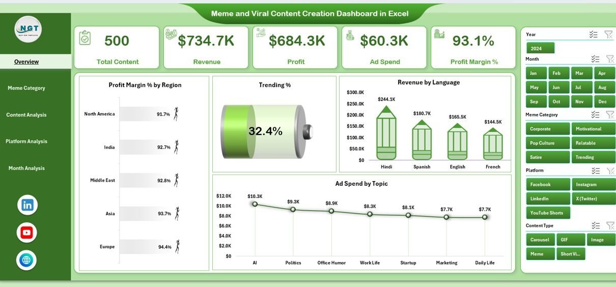
1. Overview Page: What Is Happening Overall?

The Overview Page acts as the control center of the dashboard. It provides a high-level summary of meme and viral content performance.
Key Elements of the Overview Page
KPI Cards
The Overview Page includes four KPI cards that highlight critical metrics at a glance. These cards help you quickly understand overall performance without deep analysis.
Charts on the Overview Page
The Overview Page displays four powerful charts:
-
Profit Margin % by Region
This chart shows how profit margins vary across regions. As a result, you can identify high-performing and low-performing regions easily. -
Trending %
This chart highlights how much content gains traction or virality. Consequently, you can track momentum over time. -
Revenue by Language
This chart helps you understand which languages drive higher revenue. Therefore, you can prioritize content localization strategies. -
Ad Spend by Topic
This chart shows where your advertising budget goes. As a result, you can evaluate spending efficiency by topic.
Together, these charts give you a complete snapshot of overall performance.
2. Meme Category Analysis: Which Meme Categories Perform Best?

The Meme Category Analysis Page focuses on understanding performance by meme category.
Because meme categories evolve rapidly, this page helps you spot winners and eliminate underperformers.
Charts on the Meme Category Analysis Page
This page includes four insightful charts:
-
Ad Spend by Meme Category
This chart shows how much you spend promoting each meme category. -
Profit by Meme Category
This chart reveals which categories generate the highest profit. -
Profit Margin % by Meme Category
This chart compares profitability efficiency across categories. -
Revenue by Meme Category
This chart highlights which categories drive the most revenue.
As a result, you can focus on categories that balance creativity and profitability.
3. Content Analysis: Which Content Types Go Viral?

The Content Analysis Page examines performance by content format or type.
Different formats such as image memes, short videos, GIFs, or text-based posts perform differently across audiences. Therefore, this page becomes extremely valuable.
Charts on the Content Analysis Page
This page includes four analytical charts:
-
Trending by Content Type
This chart shows which content formats trend faster. -
Profit by Content Type
This chart highlights profit contribution by format. -
Profit Margin % by Content Type
This chart compares efficiency across formats. -
Revenue by Content Type
This chart reveals which content types generate the highest revenue.
Using these insights, you can refine your content mix strategically.
Click to Purchases Meme and Viral Content Creation Dashboard in Excel
4. Platform Analysis: Where Should You Publish More?

The Platform Analysis Page focuses on performance across social media platforms.
Since each platform behaves differently, this page helps you allocate effort and budget wisely.
Charts on the Platform Analysis Page
This page includes four platform-focused charts:
-
Trending by Platform
This chart shows which platforms generate viral momentum faster. -
Ad Spend by Platform
This chart displays advertising investment by platform. -
Profit Margin % by Platform
This chart helps you identify the most profitable platforms. -
Revenue by Platform
This chart reveals revenue contribution from each platform.
Consequently, you can double down on platforms that deliver the best returns.
5. Month Analysis: How Does Performance Change Over Time?

The Month Analysis Page focuses on time-based performance.
Trends, seasons, and events influence meme virality significantly. Therefore, monthly analysis becomes essential.
Charts on the Month Analysis Page
This page includes three time-based charts:
-
Revenue by Month
This chart shows revenue growth or decline over time. -
Profit Margin % by Month
This chart highlights changes in efficiency across months. -
Profit by Month
This chart reveals which months generate the highest profit.
Using this page, you can align campaigns with seasonal trends and viral cycles.
Supporting Sheets: Data Sheet and Support Sheet
Data Sheet
The Data Sheet stores all raw data used by the dashboard. You update this sheet regularly to reflect new meme campaigns, platforms, and results.
Because the dashboard connects directly to this sheet, all charts update automatically.
Support Sheet
The Support Sheet contains helper data such as drop-down lists, mapping tables, or reference values. This sheet ensures smooth dashboard functionality and consistent data validation.
Advantages of Meme and Viral Content Creation Dashboard in Excel
Using this dashboard offers several strategic advantages.
Centralized Performance Tracking
You track all meme and viral content metrics in one place. As a result, you avoid confusion and duplication.
Faster Decision-Making
Because charts update instantly, you make quick decisions based on real data.
Improved Content Strategy
You clearly see which categories, platforms, and formats perform best. Therefore, you refine your content strategy continuously.
Budget Optimization
You analyze ad spend versus profit easily. Consequently, you reduce wasted spending.
Easy Customization
Because the dashboard runs in Excel, you can customize charts, metrics, and layouts based on your needs.
Best Practices for the Meme and Viral Content Creation Dashboard in Excel
To get the best results, you should follow these best practices.
Maintain Clean and Consistent Data
Always use consistent naming for categories, platforms, and content types. This practice ensures accurate analysis.
Update Data Regularly
Update the Data Sheet frequently. As a result, your insights remain current and actionable.
Use Slicers Strategically
Apply slicers thoughtfully to compare performance across multiple dimensions.
Focus on Profit, Not Just Virality
Trending content feels exciting. However, always balance virality with profit margin and revenue.
Review Monthly Trends
Analyze monthly charts regularly. This habit helps you anticipate upcoming trends.
Who Can Use This Dashboard?
This dashboard suits a wide range of users:
-
Meme creators and influencers
-
Digital marketing agencies
-
Social media managers
-
Brand marketing teams
-
Content strategists
-
Freelancers managing viral pages
Because Excel remains widely used, anyone with basic Excel knowledge can use this dashboard effectively.
Conclusion: Why This Dashboard Matters More Than Ever
Meme and viral content creation continues to shape modern digital marketing. However, success depends on more than creativity alone.
A Meme and Viral Content Creation Dashboard in Excel empowers you to track performance, optimize strategy, and scale results using data. By combining creativity with analytics, you gain a sustainable competitive edge.
If you want clarity, control, and confidence in your viral content strategy, this dashboard becomes an essential tool.
Frequently Asked Questions (FAQs)
What is a Meme and Viral Content Creation Dashboard in Excel used for?
This dashboard tracks performance, revenue, profit, trends, and ad spend for meme and viral content across platforms, categories, and time periods.
Do I need advanced Excel skills to use this dashboard?
No. Basic Excel knowledge works perfectly. You mainly interact with slicers, charts, and data tables.
Can I customize the dashboard?
Yes. You can add new charts, KPIs, or filters based on your content strategy.
How often should I update the data?
You should update the data weekly or monthly, depending on posting frequency and campaign cycles.
Can agencies use this dashboard for multiple clients?
Yes. Agencies can create separate files or duplicate sheets for each client.
Does this dashboard support long-term trend analysis?
Yes. The Month Analysis page helps you analyze performance trends over time.
Visit our YouTube channel to learn step-by-step video tutorials