Managing a modern power grid without clear performance visibility always creates inefficiencies, delays, and operational risks. Smart grids generate massive volumes of data from meters, substations, transformers, and control systems. However, without a structured analytics framework, this data remains underutilized. Therefore, utilities and energy operators need a simple yet powerful way to track performance, detect issues early, and support data-driven decisions.
That is exactly why a Smart Grid KPI Dashboard in Excel becomes an essential performance management solution.
In this detailed article, you will learn what a Smart Grid KPI Dashboard in Excel is, why it matters, how it works, its complete sheet-wise structure, key KPIs, advantages, best practices, and frequently asked questions. Moreover, this guide explains everything in clear language so you can implement it immediately for real-world smart grid operations.
Click to buy Smart Grid KPI Dashboard in Excel
What Is a Smart Grid KPI Dashboard in Excel?
A Smart Grid KPI Dashboard in Excel is a centralized performance tracking system built using Microsoft Excel. It visualizes key smart grid performance indicators such as reliability, efficiency, losses, outages, demand response, and asset utilization.
Instead of checking raw meter data or scattered reports, grid operators monitor all KPIs from one interactive Excel dashboard. As a result, decision-makers gain instant visibility into both monthly and yearly performance.
Because the dashboard uses Excel, it remains easy to maintain, cost-effective, and accessible to both technical and non-technical users.
Why Do Utilities Need a Smart Grid KPI Dashboard?
Smart grid operations involve continuous monitoring of power flow, outages, demand, and efficiency. However, manual tracking or disconnected systems often create blind spots. Therefore, utilities require a structured KPI dashboard.
Key reasons utilities rely on a Smart Grid KPI Dashboard in Excel:
- You track grid performance in one centralized file
- You identify outages and inefficiencies early
- You compare actual performance against targets
- You monitor trends using MTD and YTD analysis
- You improve regulatory compliance and reporting
- You support faster operational decisions
As a result, utilities improve reliability while controlling costs.
How Does a Smart Grid KPI Dashboard in Excel Work?
The dashboard converts raw operational data into meaningful insights using formulas, conditional formatting, and pivot-ready structures. Moreover, users interact with slicers and drop-downs to view monthly or yearly performance.
You update the input sheets once. Then, the dashboard automatically refreshes all KPIs, comparisons, and trend charts.
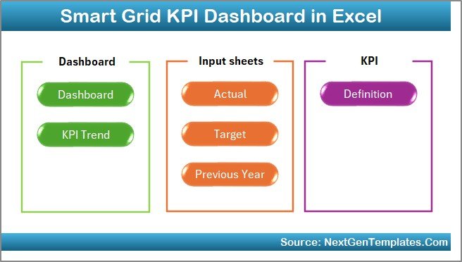
Sheet-Wise Structure of the Smart Grid KPI Dashboard in Excel
This Smart Grid KPI Dashboard in Excel contains 7 well-structured worksheets, each designed for a specific purpose. Together, they create a complete performance monitoring system.
Summary Page – How Does the Dashboard Navigation Work?
The Summary Page acts as an index sheet.
Key features of the Summary Page:
- Six navigation buttons for quick access
- One-click movement to any dashboard section
- Clean and user-friendly layout
As a result, users avoid scrolling through sheets and save valuable time.
Click to buy Smart Grid KPI Dashboard in Excel
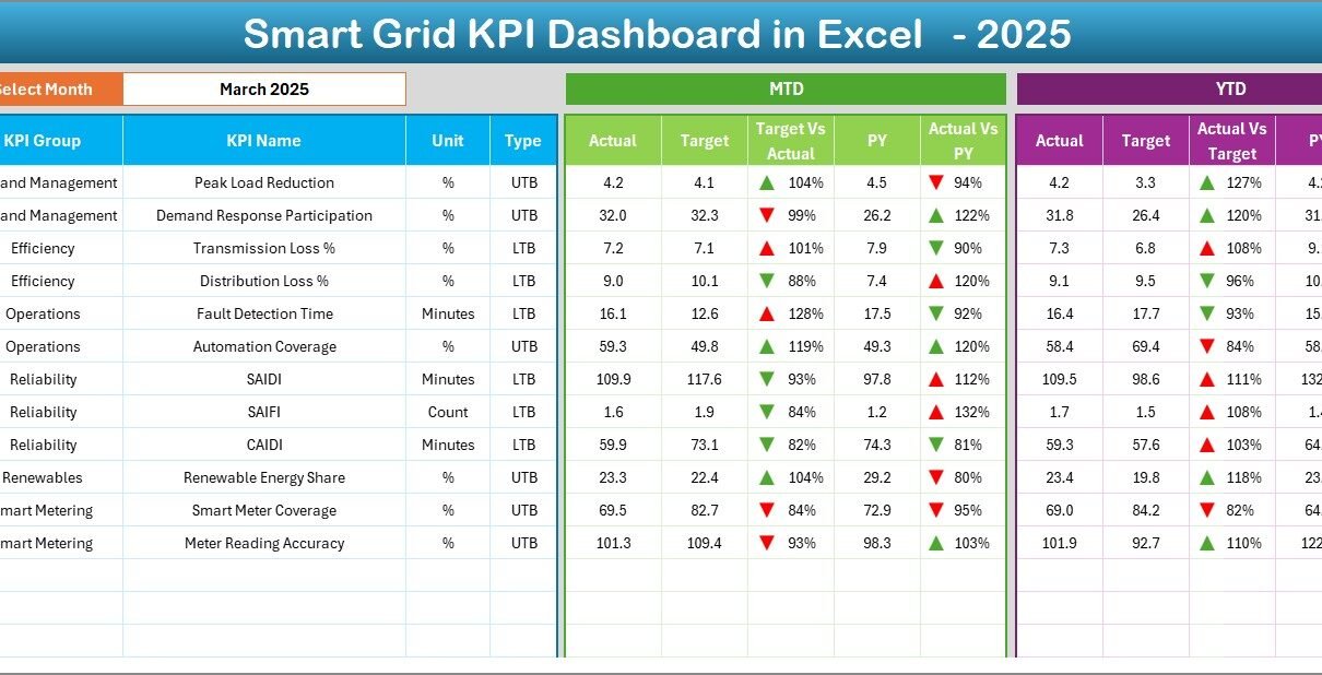
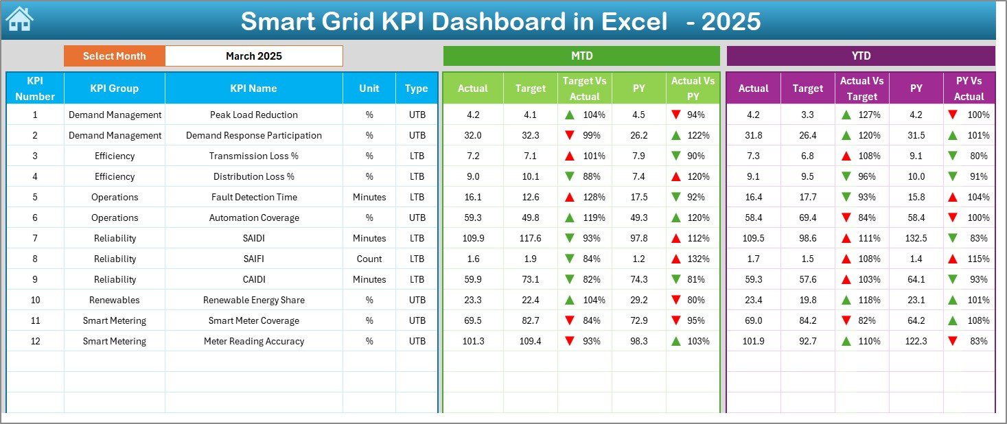
Dashboard Sheet – What KPIs Does the Main Dashboard Show?
The Dashboard Sheet serves as the heart of the Smart Grid KPI Dashboard in Excel.
Interactive Month Selection
- Month selection available in cell D3
- All KPIs update automatically when the month changes
KPI Performance Metrics Displayed
For each KPI, the dashboard shows:
Monthly Performance (MTD)
- Actual
- Target
- Previous Year
- Target vs Actual (with up/down arrows)
- Previous Year vs Actual (with up/down arrows)
Year-to-Date Performance (YTD)
- Actual
- Target
- Previous Year
- Target vs Actual comparison
- Previous Year vs Actual comparison
Visual Enhancements
- Conditional formatting arrows
- Color indicators for performance direction
- Clear comparison logic
Therefore, users instantly understand whether grid performance improves or declines.
Click to buy Smart Grid KPI Dashboard in Excel
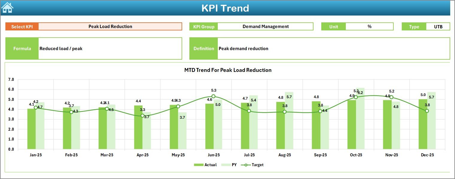
Trend Sheet – How Can You Analyze KPI Trends Over Time?
The Trend Sheet focuses on deep KPI analysis.
KPI Selection
- KPI selection drop-down in cell C3
- Dynamic update based on selected KPI
KPI Metadata Displayed
- KPI Group
- Unit of Measurement
- KPI Type (Lower the Better or Upper the Better)
- KPI Formula
- KPI Definition
Trend Analysis Charts
- MTD trend for Actual, Target, and Previous Year
- YTD trend for Actual, Target, and Previous Year
As a result, users identify long-term patterns and seasonal impacts on grid performance.
Click to buy Smart Grid KPI Dashboard in Excel
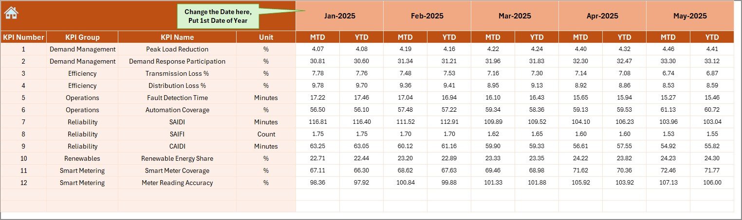
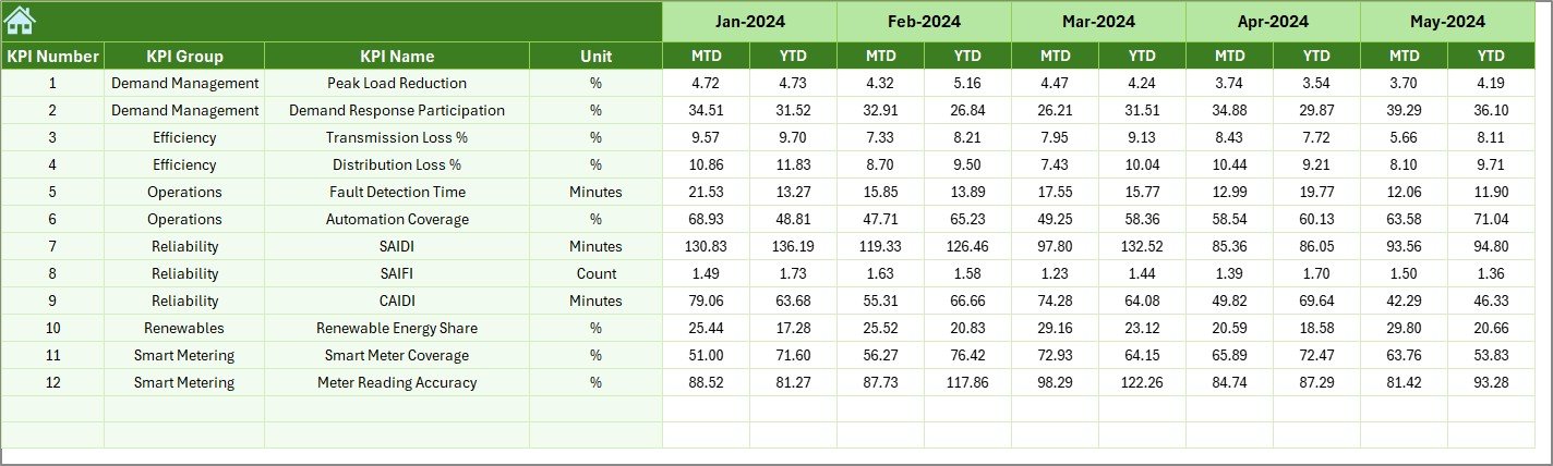
Actual Numbers Input Sheet – Where Do You Enter Real Data?
The Actual Numbers Input Sheet captures operational performance data.
How Data Entry Works
- Enter MTD and YTD actual values
- Change the active month from cell E1
- Input the first month of the year in E1
Because the structure remains consistent, data entry stays simple and error-free.
Click to buy Smart Grid KPI Dashboard in Excel
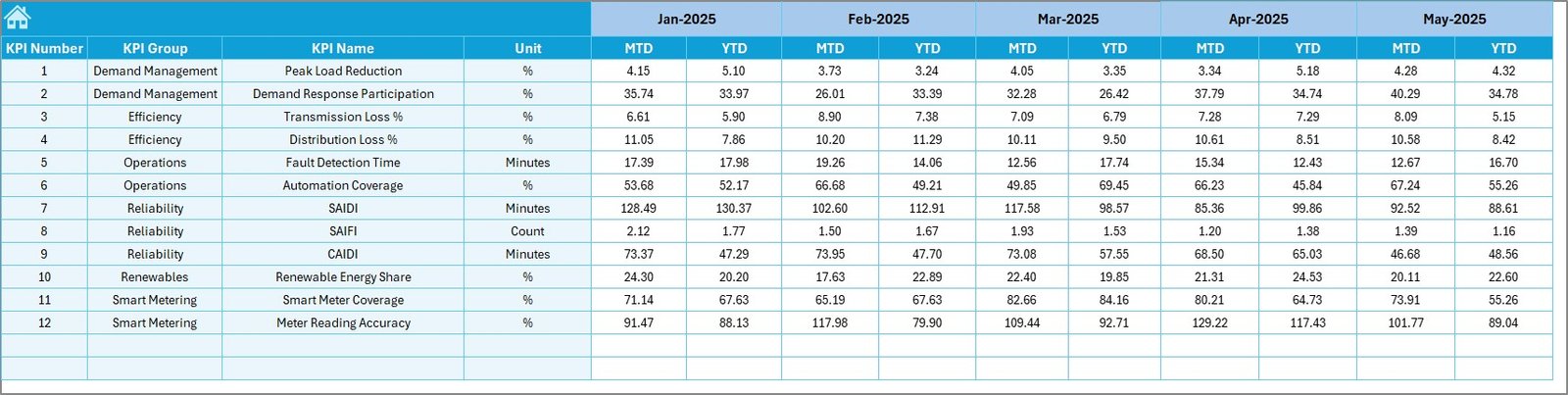
Target Sheet – How Are Performance Targets Managed?
The Target Sheet stores planned or benchmark values.
Key Details
- Enter monthly MTD targets
- Enter cumulative YTD targets
- Maintain targets for each KPI
Therefore, utilities compare actual performance against planned objectives at any time.
Click to buy Smart Grid KPI Dashboard in Excel
Previous Year Number Sheet – Why Is Historical Comparison Important?
The Previous Year Number Sheet stores last year’s performance data.
Benefits of Historical Comparison
- You identify year-over-year improvements
- You detect performance deterioration
- You support regulatory and audit reporting
Moreover, comparing current data with previous year values adds valuable context to every KPI.
Click to buy Smart Grid KPI Dashboard in Excel
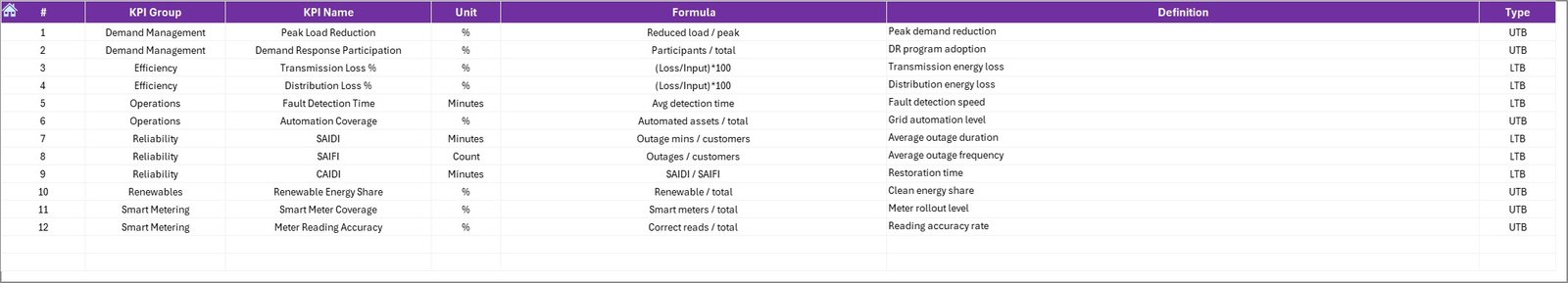
KPI Definition Sheet – How Do You Standardize KPIs?
The KPI Definition Sheet ensures consistency and clarity.
Information Captured
- KPI Name
- KPI Group
- Unit of Measurement
- KPI Formula
- KPI Definition
Because all KPIs remain clearly defined, teams avoid confusion and misinterpretation.
What Are Common Smart Grid KPIs Tracked in Excel Dashboards?
A Smart Grid KPI Dashboard in Excel typically tracks KPIs across multiple operational areas.
Reliability KPIs
- System Average Interruption Duration Index (SAIDI)
- System Average Interruption Frequency Index (SAIFI)
- Customer Average Interruption Duration Index (CAIDI)
Efficiency KPIs
- Transmission losses (%)
- Distribution losses (%)
- Energy delivered vs energy generated
Asset Performance KPIs
- Transformer utilization rate
- Equipment downtime
- Preventive maintenance compliance
Demand Management KPIs
- Peak demand
- Demand response participation
- Load balancing efficiency
Financial and Sustainability KPIs
- Cost per unit delivered
- Renewable energy contribution
- Carbon emission reduction
Advantages of Smart Grid KPI Dashboard in Excel
A Smart Grid KPI Dashboard in Excel delivers multiple operational and strategic benefits.
- Centralized Performance Visibility
You monitor all grid KPIs from one dashboard. As a result, teams stop relying on fragmented reports.
- Faster Decision-Making
Clear visuals and trend charts enable faster response to outages, losses, and inefficiencies.
- Cost-Effective Analytics Solution
Excel eliminates the need for expensive BI tools while still delivering powerful insights.
- Easy Customization
You easily add new KPIs, targets, or charts based on operational needs.
- Improved Regulatory Compliance
Historical tracking supports audits, compliance reporting, and performance reviews.
- User-Friendly Interface
Non-technical users understand the dashboard without additional training.
How Does This Dashboard Support Smart Grid Operations?
This dashboard directly supports day-to-day grid management.
- Operators track outages and reliability metrics
- Engineers analyze asset performance trends
- Managers review monthly and yearly targets
- Executives monitor strategic grid KPIs
As a result, every stakeholder gains role-based visibility.
Best Practices for the Smart Grid KPI Dashboard in Excel
Following best practices ensures long-term dashboard success.
- Define KPIs Clearly
Always document KPI formulas and definitions in the KPI Definition sheet.
- Maintain Data Accuracy
Validate actual, target, and previous year inputs before finalizing reports.
- Update Data Regularly
Update MTD and YTD values monthly to maintain accuracy.
- Use Consistent Units
Ensure all KPIs use standardized units to avoid confusion.
- Review Trends, Not Just Numbers
Analyze trend charts regularly to detect early warning signs.
- Limit KPI Overload
Track only meaningful KPIs that support operational decisions.
Who Can Use a Smart Grid KPI Dashboard in Excel?
This dashboard suits multiple stakeholders:
- Power utilities
- Smart grid operators
- Energy distribution companies
- Renewable energy managers
- Grid reliability teams
- Regulatory and compliance teams
Because Excel remains widely used, adoption stays simple.
Conclusion: Why Should You Use a Smart Grid KPI Dashboard in Excel?
A Smart Grid KPI Dashboard in Excel transforms raw operational data into actionable insights. It helps utilities track reliability, efficiency, and performance using a structured, user-friendly, and cost-effective approach.
By using clear KPI definitions, automated comparisons, and trend analysis, utilities improve grid performance while supporting compliance and sustainability goals. Therefore, this dashboard becomes a critical tool for modern smart grid management.
Frequently Asked Questions (FAQs)
What is a Smart Grid KPI Dashboard in Excel?
A Smart Grid KPI Dashboard in Excel is a performance monitoring tool that tracks grid reliability, efficiency, and operational KPIs using Excel-based visuals and calculations.
Can non-technical users use this dashboard?
Yes, the dashboard uses simple inputs, drop-downs, and visuals, making it easy for non-technical users.
How often should data be updated?
You should update MTD and YTD data monthly to ensure accurate performance tracking.
Can I customize KPIs in this dashboard?
Yes, you can easily add, remove, or modify KPIs based on operational needs.
Does this dashboard support historical analysis?
Yes, it includes previous year comparisons and trend charts for long-term analysis.
Is Excel suitable for smart grid analytics?
Excel works well for KPI monitoring, trend analysis, and reporting, especially when combined with structured data entry.
Visit our YouTube channel to learn step-by-step video tutorials
Watch the step-by-step video tutorial:
Click to buy Smart Grid KPI Dashboard in Excel