Managing a smart grid without real-time performance visibility always creates inefficiencies, hidden risks, and delayed decisions. Moreover, modern power grids generate massive volumes of data from smart meters, substations, transformers, and control systems every single day. However, without a structured analytics framework, this data remains underutilized. Therefore, utilities and energy operators need a simple, reliable, and scalable way to track performance and act faster.
That is exactly why a Smart Grid KPI Dashboard in Power BI becomes a critical performance management solution.
In this detailed article, you will learn what a Smart Grid KPI Dashboard in Power BI is, how it works, why utilities need it, its complete page-wise structure, key metrics, advantages, best practices, and frequently asked questions. Additionally, this guide uses clear language and practical explanations so you can apply it immediately in real-world smart grid operations.
Click to buy Smart Grid KPI Dashboard in Power BI
What Is a Smart Grid KPI Dashboard in Power BI?
A Smart Grid KPI Dashboard in Power BI is an interactive analytics solution that tracks and visualizes key performance indicators related to smart grid operations. Instead of reviewing multiple Excel sheets or static reports, grid operators monitor all critical KPIs from one centralized Power BI dashboard.
Because the dashboard runs on Power BI, it provides:
- Dynamic slicers
- Automated calculations
- Conditional formatting indicators
- Drill-through analysis
- Clear month-to-date (MTD) and year-to-date (YTD) comparisons
As a result, decision-makers gain instant visibility into grid reliability, efficiency, demand performance, and operational stability.
Why Do Utilities Need a Smart Grid KPI Dashboard?
Smart grids involve complex infrastructure and continuous monitoring. Therefore, relying on manual tracking or scattered reports creates blind spots. Moreover, delayed insights often lead to outages, energy losses, and regulatory penalties.
A Smart Grid KPI Dashboard in Power BI helps utilities:
- Track performance in real time
- Compare actual values against targets
- Monitor trends across months and years
- Identify underperforming KPIs early
- Support data-driven operational decisions
Because everything appears in one interactive dashboard, teams save time and improve accuracy.
How Does a Smart Grid KPI Dashboard in Power BI Work?
The dashboard uses Excel as the data source and Power BI Desktop for visualization. You update the Excel file, refresh the Power BI report, and instantly see updated KPIs.
Data Flow Overview
- Enter KPI data in Excel sheets
- Load Excel file into Power BI
- Power BI applies calculations and logic
- Dashboard visuals update automatically
As a result, the dashboard remains easy to maintain while still delivering enterprise-level analytics.
What Is the Overall Structure of the Smart Grid KPI Dashboard in Power BI?
This ready-to-use dashboard contains three structured pages inside the Power BI Desktop file. Each page serves a specific analytical purpose and improves usability.
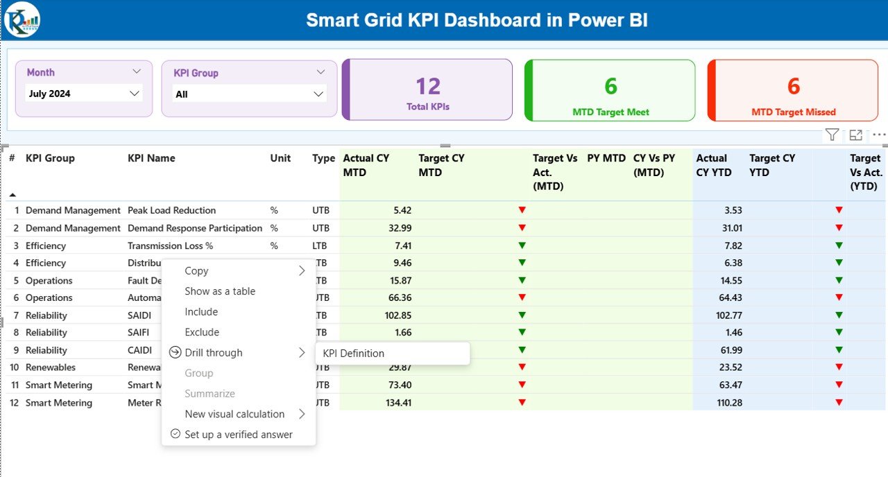
Summary Page Show
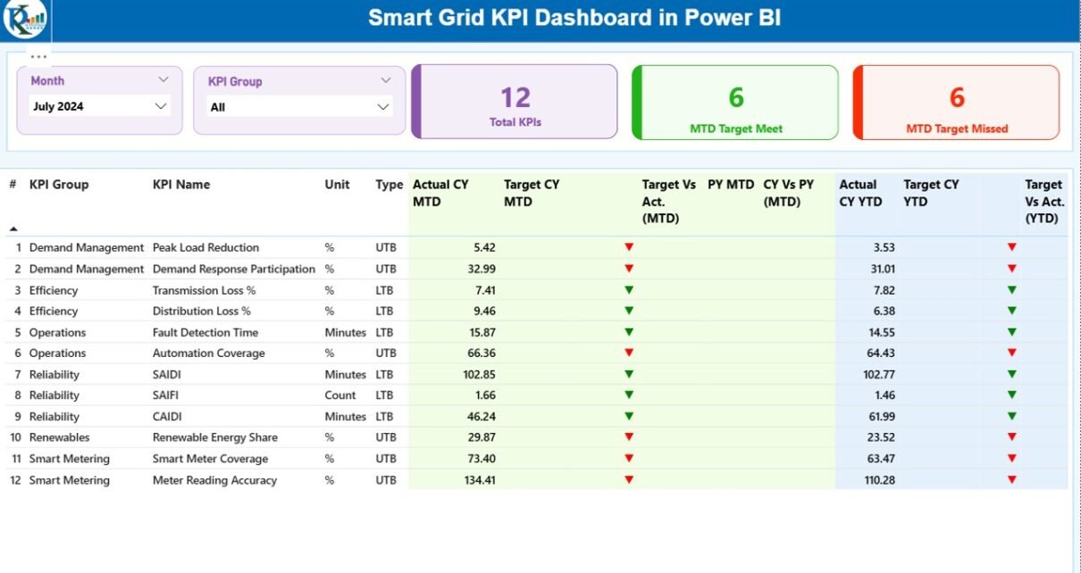
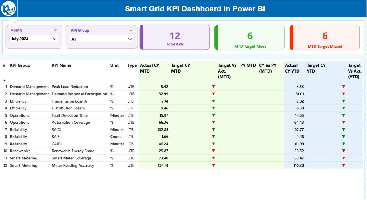
The Summary Page works as the main control center of the dashboard. It provides a complete overview of all smart grid KPIs in one place.
Top-Level Filters
At the top of the page, you will find:
- Month slicer
- KPI Group slicer
These slicers allow users to instantly filter data by reporting period and KPI category.
KPI Cards on the Summary Page
The dashboard displays three high-level cards:
- Total KPIs Count
- MTD Target Met Count
- MTD Target Missed Count
These cards immediately show overall performance status.
Detailed KPI Table
Below the cards, the dashboard shows a comprehensive KPI table with the following columns:
- KPI Number – Sequential identifier of each KPI
- KPI Group – Category of the KPI
- KPI Name – Name of the KPI
- Unit – Measurement unit
- Type – UTB (Upper the Better) or LTB (Lower the Better)
MTD Performance Columns
- Actual CY MTD – Current year actual MTD value
- Target CY MTD – Current year target MTD value
- MTD Icon – Green ▲ or Red ▼ to indicate target achievement
- Target vs Actual (MTD) – Actual ÷ Target percentage
- PY MTD – Previous year MTD value
- CY vs PY (MTD) – Current vs previous year comparison
YTD Performance Columns
- Actual CY YTD – Current year actual YTD value
- Target CY YTD – Current year target YTD value
- YTD Icon – Green ▲ or Red ▼ indicator
- Target vs Actual (YTD) – Actual ÷ Target percentage
- PY YTD – Previous year YTD value
- CY vs PY (YTD) – Year-over-year comparison
Because of this structured layout, users instantly understand both short-term and long-term performance.
Click to buy Smart Grid KPI Dashboard in Power BI
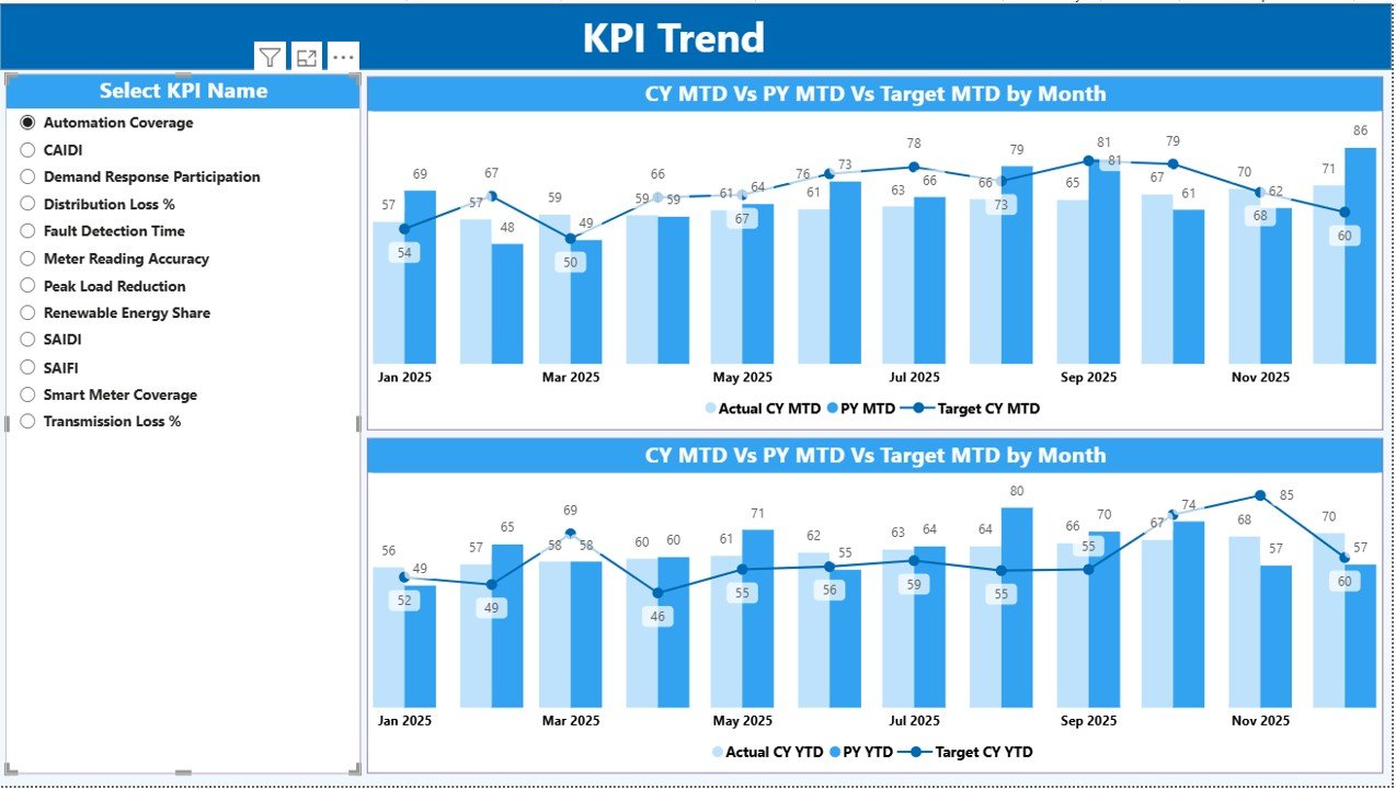
KPI Trend Page
The KPI Trend Page focuses on deep performance analysis for individual KPIs.
Key Elements of the KPI Trend Page
- KPI Name slicer on the left side
- Two combo charts on the main canvas
Charts on This Page
- MTD Trend Chart
Current Year Actual
Previous Year Actual
Target Values
YTD Trend Chart
Current Year Actual
Previous Year Actual
Target Values
Because the charts update dynamically, users can quickly analyze patterns, seasonality, and deviations.
Click to buy Smart Grid KPI Dashboard in Power BI
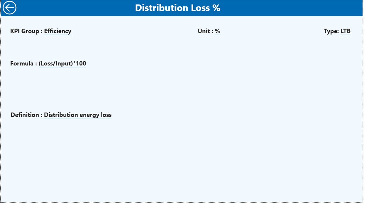
KPI Definition Page
The KPI Definition Page serves as a detailed reference section.
Key Characteristics
- Hidden from normal navigation
- Accessible via drill-through from the Summary Page
- Includes a back button for easy navigation
Information Available
- KPI Number
- KPI Group
- KPI Name
- Unit
- Formula
- Definition
- KPI Type (LTB or UTB)
As a result, business users always understand how each KPI works without searching external documentation.
Click to buy Smart Grid KPI Dashboard in Power BI
What Excel Data Is Required for the Dashboard?
The dashboard uses an Excel file with three worksheets. This design keeps the data structure simple and scalable.
Input_Actual Sheet
In this sheet, users enter:
- KPI Name
- Month (use the first date of the month)
- MTD Actual Value
- YTD Actual Value
Input_Target Sheet
In this sheet, users enter:
- KPI Name
- Month (use the first date of the month)
- MTD Target Value
- YTD Target Value
KPI Definition Sheet
This sheet includes:
- KPI Number
- KPI Group
- KPI Name
- Unit
- Formula
- Definition
- Type (LTB or UTB)
Because of this clear separation, data entry remains error-free and easy to manage.
Click to buy Smart Grid KPI Dashboard in Power BI
Which KPIs Can Be Tracked in a Smart Grid KPI Dashboard?
A Smart Grid KPI Dashboard can track a wide range of metrics, such as:
- Grid Reliability Index
- System Average Interruption Duration Index (SAIDI)
- System Average Interruption Frequency Index (SAIFI)
- Energy Loss Percentage
- Peak Load Utilization
- Renewable Energy Penetration
- Demand Response Participation
- Transformer Utilization Rate
- Voltage Stability Index
- Smart Meter Coverage
Utilities can easily customize KPI lists based on operational priorities.
Advantages of a Smart Grid KPI Dashboard in Power BI
Centralized Performance Visibility
The dashboard consolidates all KPIs into one unified view.
Faster Decision-Making
Real-time insights help teams act quickly.
Clear Target Tracking
Visual indicators immediately show target achievement.
Trend Analysis Made Simple
MTD and YTD trends highlight performance patterns.
Improved Accountability
KPI ownership becomes transparent.
Scalable and Customizable
The dashboard grows with your data.
Opportunities for Improvement in Smart Grid KPI Dashboards
While the dashboard delivers strong insights, organizations can further improve it by:
- Adding real-time data streaming
- Integrating SCADA systems
- Automating data refresh schedules
- Adding predictive analytics
- Including geo-spatial maps for outage tracking
These enhancements further strengthen operational intelligence.
Best Practices for the Smart Grid KPI Dashboard in Power BI
Define KPIs Clearly
Always document formulas and definitions.
Maintain Consistent Units
Avoid confusion by standardizing measurements.
Update Data Regularly
Refresh data monthly or more frequently.
Use Meaningful Targets
Set realistic and achievable targets.
Limit KPI Overload
Focus on high-impact metrics.
Train Business Users
Ensure users understand slicers and drill-throughs.
Who Can Benefit from a Smart Grid KPI Dashboard?
This dashboard benefits:
- Power utilities
- Grid operators
- Energy regulators
- Renewable energy providers
- Transmission and distribution companies
- Smart city planners
- Energy analysts and consultants
Because of its flexibility, both small utilities and large enterprises can use it effectively.
How Does This Dashboard Support Strategic Decision-Making?
The dashboard transforms raw data into actionable insights. As a result, leaders can:
- Identify operational risks early
- Optimize asset utilization
- Reduce outages and losses
- Improve regulatory compliance
- Support sustainability initiatives
Therefore, the dashboard becomes a strategic asset rather than just a reporting tool.
Conclusion
A Smart Grid KPI Dashboard in Power BI provides a powerful, structured, and user-friendly way to monitor modern grid performance. It combines Excel-based data management with Power BI’s interactive analytics to deliver real-time insights, trend analysis, and KPI transparency.
Because the dashboard includes a Summary Page, KPI Trend Page, and KPI Definition Page, it supports both high-level oversight and detailed analysis. Moreover, its clear MTD and YTD tracking ensures continuous performance improvement.
For utilities aiming to modernize operations, reduce risks, and improve decision-making, this dashboard offers a practical and scalable solution.
Frequently Asked Questions (FAQs)
What is a Smart Grid KPI Dashboard in Power BI?
It is an interactive Power BI dashboard that tracks and visualizes smart grid performance metrics using Excel as a data source.
Can I customize the KPIs in the dashboard?
Yes, you can add, remove, or modify KPIs easily through the Excel data file.
Does the dashboard support MTD and YTD analysis?
Yes, it includes both MTD and YTD actuals, targets, and comparisons.
Is Power BI Desktop required to use this dashboard?
Yes, you need Power BI Desktop to open and refresh the dashboard.
Can this dashboard handle large datasets?
Yes, Power BI efficiently manages large datasets with optimized models.
Is this dashboard suitable for renewable energy monitoring?
Absolutely. You can track renewable penetration, capacity utilization, and demand response KPIs.
How often should I update the data?
Monthly updates work well, but you can refresh more frequently if needed.
Visit our YouTube channel to learn step-by-step video tutorials
Watch the step-by-step video tutorial:
Click to buy Smart Grid KPI Dashboard in Power BI