In today’s modern workplace, events play a powerful role in shaping culture, collaboration, and productivity. Companies conduct training programs, town halls, team-building sessions, workshops, onboarding events, and virtual meetings regularly. However, many organizations still track attendance in scattered Excel files.
As a result, HR teams struggle to measure engagement. Managers fail to analyze department participation. Leadership cannot identify trends. Moreover, decision-makers miss valuable insights.
So, how can you track total attendance, present vs absent employees, virtual vs in-person participation, and event duration in one powerful system?You need an Office Event Attendance Dashboard in Power BI.In this complete guide, you will learn:
- What an Office Event Attendance Dashboard in Power BI is
- Why organizations need it
- Detailed explanation of all 5 dashboard pages
- Key attendance KPIs you should track
- Advantages of the Office Event Attendance Dashboard in Power BI
- Best Practices for the Office Event Attendance Dashboard in Power BI
- Frequently Asked Questions with Answers
Click to buy Office Event Attendance Dashboard in Power BI
What Is an Office Event Attendance Dashboard in Power BI?
An Office Event Attendance Dashboard in Power BI is a ready-to-use analytics solution that helps organizations monitor and analyze employee participation in office events.
Instead of checking multiple spreadsheets, you can view:
- Total attendance
- Present attendance
- Absent attendance
- Average event duration
- Virtual vs in-person participation
- Department-level engagement
- Monthly attendance trends
Moreover, Power BI allows you to use slicers (filters) to analyze data by:
- Event type
- Department
- Organizer
- Location
- Month
Therefore, you gain real-time insights into employee engagement and event effectiveness.
Why Do Modern Organizations Need an Office Event Attendance Dashboard?
Today, companies invest heavily in events. However, without tracking participation, you cannot measure impact.
Here’s why you need this dashboard:
Improve Employee Engagement
If employees skip events frequently, engagement levels drop. Therefore, you must track attendance percentage.
Measure Event Effectiveness
Some events attract more participation than others. For example, workshops may have higher attendance than optional webinars. Therefore, you need data.
Optimize Event Duration
Long events may reduce participation. On the other hand, short and focused events often perform better.
Identify Department Participation Gaps
If one department rarely attends events, managers can take corrective action.
Support Data-Driven HR Decisions
Instead of guessing, you can make decisions based on attendance trends.
Clearly, this dashboard turns raw attendance data into actionable insights.
Complete Explanation of All 5 Dashboard Pages
This Office Event Attendance Dashboard in Power BI contains 5 interactive pages. Each page provides unique insights.
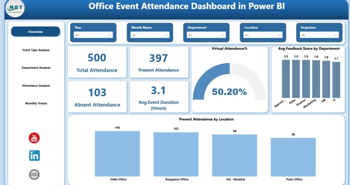
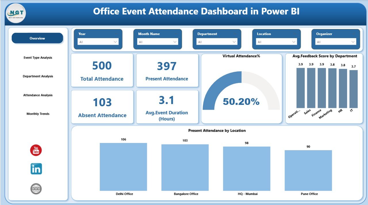
Overview Page – The Main Summary Hub
The Overview Page acts as the central control panel.
KPI Cards Available:
- Total Attendance
- Present Attendance
- Absent Attendance
- Average Event Duration (Hours)
These four cards provide instant visibility into overall event performance.
Why This Page Matters?
- You quickly understand attendance levels.
- You identify absentee trends immediately.
- You evaluate average event duration efficiency.
Moreover, slicers allow you to filter by event type, department, organizer, or month. Therefore, you can drill down into specific insights within seconds.
Click to buy Office Event Attendance Dashboard in Power BI
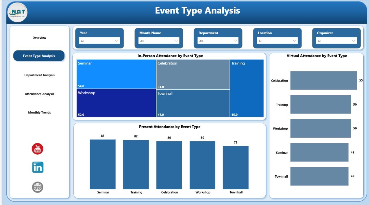
Event Type Analysis – Which Events Perform Best?
Different event types drive different engagement levels.
This page includes 3 key charts:
- In-Person Attendance by Event Type
- Virtual Attendance by Event Type
- Present Attendance by Event Type
What Insights Can You Get?
- Do workshops attract more in-person attendees?
- Do webinars perform better virtually?
- Which event type shows the highest present attendance?
As a result, you can plan future events more effectively.
For example:
- If virtual town halls show higher participation, you can increase virtual sessions.
- If in-person team activities show strong engagement, you can schedule more.
Click to buy Office Event Attendance Dashboard in Power BI
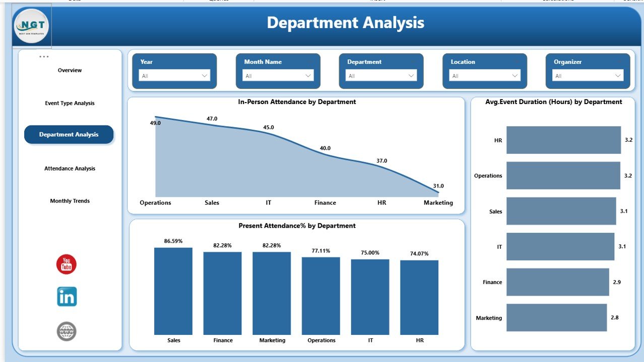
Department Analysis – Who Participates More?
Departments often show different participation behaviors.
This page includes:
- In-Person Attendance by Department
- Average Event Duration (Hours) by Department
- Present Attendance % by Department
Why This Analysis Is Powerful?
- You identify highly engaged departments.
- You detect departments with low attendance.
- You compare participation percentage across teams.
Therefore, HR managers can communicate with specific department heads and improve engagement.
Click to buy Office Event Attendance Dashboard in Power BI
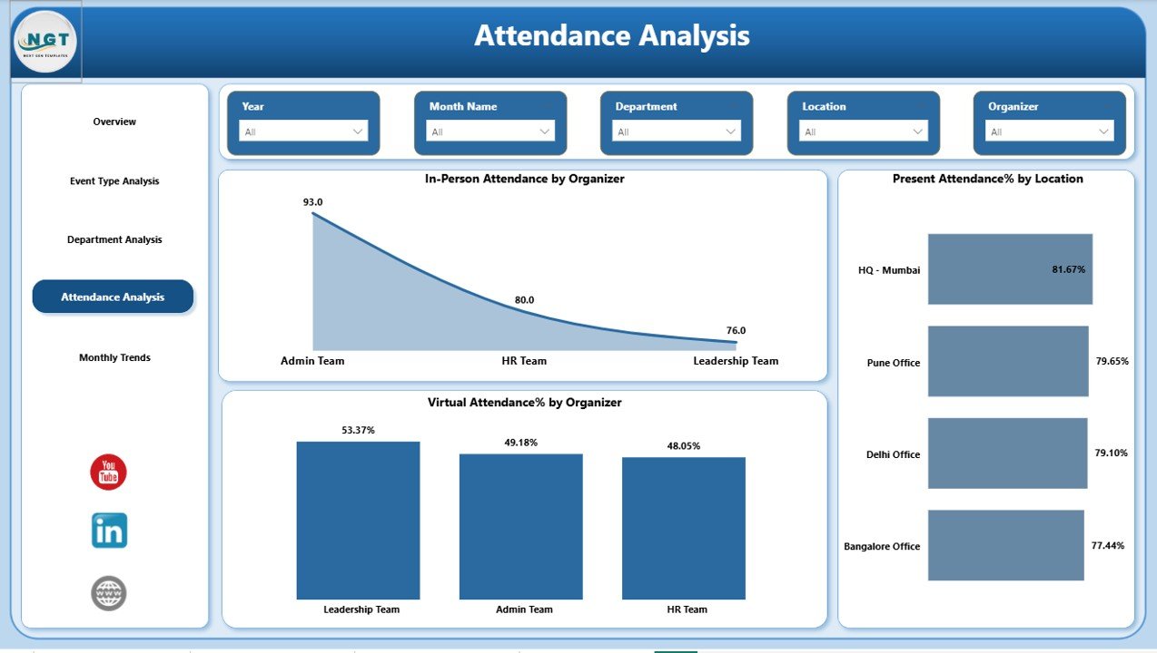
Attendance Analysis – Organizer & Location Insights
This page focuses on organizers and event locations.
Charts include:
- In-Person Attendance by Organizer
- Present Attendance % by Location
- Virtual Attendance % by Organizer
What Can You Discover?
- Which organizer drives higher participation?
- Do certain locations attract more attendees?
- Does virtual format work better under specific organizers?
Consequently, you can optimize event planning strategies.
Click to buy Office Event Attendance Dashboard in Power BI
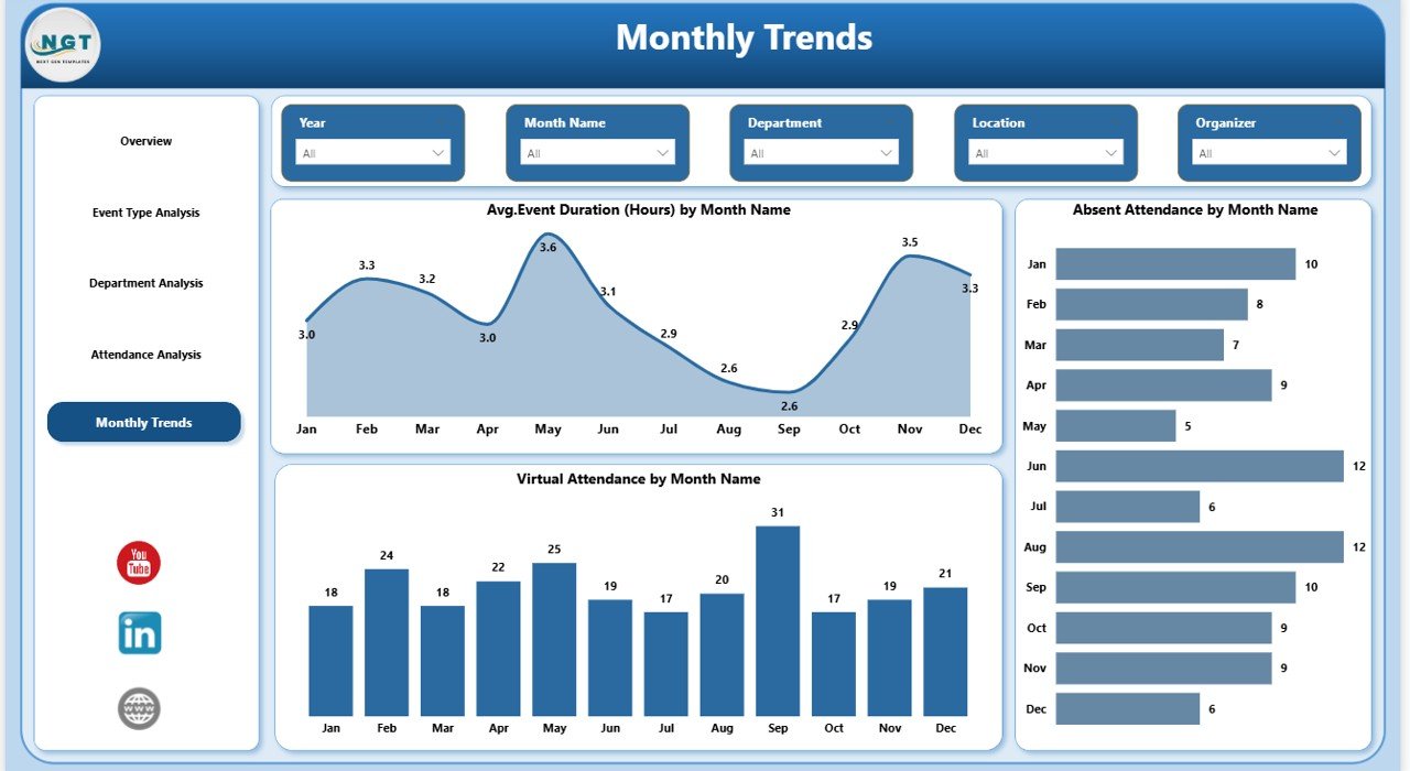
Monthly Trends – How Attendance Changes Over Time?
Trends help you understand patterns.
This page includes:
- Average Event Duration (Hours) by Month
- Absent Attendance by Month
- Virtual Attendance by Month
Why Monthly Trends Matter?
- You track seasonality.
- You identify months with low attendance.
- You monitor improvement over time.
For example:
- Attendance may drop during holiday months.
- Virtual participation may increase during remote work periods.
Thus, you can adjust scheduling accordingly.
Click to buy Office Event Attendance Dashboard in Power BI
Key KPIs You Should Track in an Office Event Attendance Dashboard
To build an effective dashboard, you must track the right KPIs.
Essential KPIs Include:
- Total Registered Attendance
- Total Present Attendance
- Total Absent Attendance
- Present Attendance %
- Virtual Attendance %
- In-Person Attendance %
- Average Event Duration (Hours)
- Attendance by Department
- Attendance by Organizer
- Attendance by Location
- Monthly Attendance Trend
- Event Type Participation Rate
Each KPI helps you answer a specific business question.
Advantages of Office Event Attendance Dashboard in Power BI
Now, let’s explore the major benefits.
Real-Time Visibility
You see updated data instantly. Therefore, you avoid manual calculations.
Interactive Filtering
You use slicers to analyze data quickly. Consequently, you save time.
Better Decision Making
You base decisions on real numbers instead of assumptions.
Improved Employee Engagement
You identify low participation areas and act immediately.
Performance Comparison
You compare:
- Departments
- Event types
- Organizers
- Locations
- Monthly performance
Centralized Reporting
Instead of managing multiple sheets, you control everything in one dashboard.
Best Practices for the Office Event Attendance Dashboard in Power BI
To maximize the value of this dashboard, follow these best practices.
Maintain Clean Data
Ensure you:
- Remove duplicate entries
- Standardize department names
- Validate event duration values
Clean data leads to accurate insights.
Define Clear Event Categories
Clearly define:
- Training
- Workshop
- Town Hall
- Webinar
- Team Building
This structure improves analysis quality.
Track Both Virtual and In-Person Participation
Modern workplaces operate in hybrid mode. Therefore, you must track both formats.
Monitor Attendance Percentage, Not Just Count
A department with 20 attendees may seem strong. However, if 100 employees work there, engagement remains low.
Always analyze percentages.
Review Monthly Trends Regularly
Do not wait until year-end. Instead, review trends monthly and take corrective action early.
Share Dashboard with Leadership
Leadership involvement increases accountability. Therefore, present attendance insights during management meetings.
How This Dashboard Improves Workplace Culture
Attendance tracking goes beyond numbers.
When you measure participation:
- Employees feel accountable
- Managers focus on engagement
- HR improves communication
- Leadership gains transparency
As a result, the organization builds a stronger culture.
How to Use This Dashboard Effectively?
Follow these steps:
- Import attendance data into Power BI.
- Verify department and event type classifications.
- Use slicers to filter by month or event type.
- Analyze attendance percentage.
- Identify low-performing departments.
- Plan corrective engagement strategies.
Simple steps, powerful results.
Who Can Benefit from This Dashboard?
This solution benefits:
- HR Managers
- Training Coordinators
- Event Planners
- Operations Managers
- Corporate Leadership
- Employee Engagement Teams
Moreover, mid-sized and large organizations gain the highest value.
Common Challenges Without an Attendance Dashboard
Without structured reporting:
- You rely on manual tracking.
- You waste time consolidating data.
- You miss attendance trends.
- You fail to measure engagement accurately.
- You struggle to justify event budgets.
Therefore, adopting a Power BI dashboard solves these issues.
Conclusion
Office events drive collaboration, learning, and culture. However, without tracking attendance, organizations lose visibility.
An Office Event Attendance Dashboard in Power BI provides:
- Real-time insights
- Interactive filtering
- Department-level comparison
- Organizer performance analysis
- Monthly trend monitoring
Moreover, it transforms raw attendance data into actionable intelligence.
If you want to improve employee engagement, optimize event planning, and support data-driven HR decisions, this dashboard offers the perfect solution.
Frequently Asked Questions (FAQs)
What is an Office Event Attendance Dashboard in Power BI?
It is an interactive reporting tool that tracks and analyzes employee participation in office events.
Can this dashboard track virtual and in-person attendance separately?
Yes. It tracks both formats and allows comparison by event type, department, or organizer.
Who should use this dashboard?
HR managers, event coordinators, operations leaders, and corporate management teams can use it effectively.
How often should organizations review attendance trends?
Organizations should review trends monthly. Regular analysis improves engagement.
Can this dashboard improve employee engagement?
Yes. When you track participation, you identify gaps and take corrective actions quickly.
Does this dashboard support filtering by department and month?
Yes. It includes slicers for dynamic filtering and detailed analysis.
Visit our YouTube channel to learn step-by-step video tutorials
Watch the step-by-step video tutorial:
Click to buy Office Event Attendance Dashboard in Power BI