In today’s data-driven world, social service organizations must track programs, funding utilization, beneficiary impact, and service performance continuously. However, many nonprofits and social institutions still rely on scattered spreadsheets and manual reports. As a result, decision-makers often struggle to understand program effectiveness quickly.Therefore, organizations increasingly adopt intelligent analytics solutions. One powerful solution is the Social Services Dashboard in Power BI, a centralized reporting system designed to monitor projects, funding, and community outcomes through interactive visuals.In this comprehensive guide, you will learn everything about the Social Services Dashboard in Power BI, including its structure, features, benefits, analysis capabilities, best practices, and frequently asked questions.
Click to buy Social Services Dashboard in Power BI
What Is a Social Services Dashboard in Power BI?
A Social Services Dashboard in Power BI is an interactive business intelligence solution that helps organizations monitor social programs using real-time data visualization.
Instead of reviewing multiple reports separately, managers can analyze performance indicators from one centralized dashboard. Consequently, teams make faster decisions and improve service delivery.
The dashboard combines project information, funding details, beneficiary statistics, and satisfaction scores into meaningful insights. Moreover, Power BI automatically updates visuals when data changes, which ensures accurate reporting.
Typically, the dashboard tracks:
- Total social projects
- Funds allocated and utilized
- Beneficiaries served
- Program performance
- Regional impact
- Satisfaction levels
- Project status trends
Because Power BI supports dynamic filtering, users can explore data by program, region, funding source, or time period instantly.
Why Do Social Service Organizations Need a Dashboard?
Social service operations involve multiple stakeholders, funding sources, and programs. Therefore, monitoring performance manually becomes difficult.
Without a centralized dashboard:
- Reports remain disconnected
- Decision-making slows down
- Funding visibility decreases
- Impact measurement becomes unclear
However, a Power BI dashboard solves these challenges.
Key reasons organizations adopt dashboards:
- Improve transparency in fund usage
- Track program outcomes effectively
- Monitor regional performance
- Enhance accountability
- Support data-driven planning
As a result, leadership teams gain clarity and confidence while making strategic decisions.
Key Features of the Social Services Dashboard in Power BI
This dashboard contains five interactive pages, each designed to answer specific business questions. Let’s explore each page in detail.
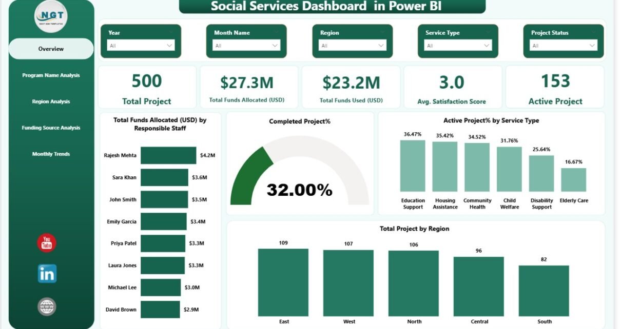
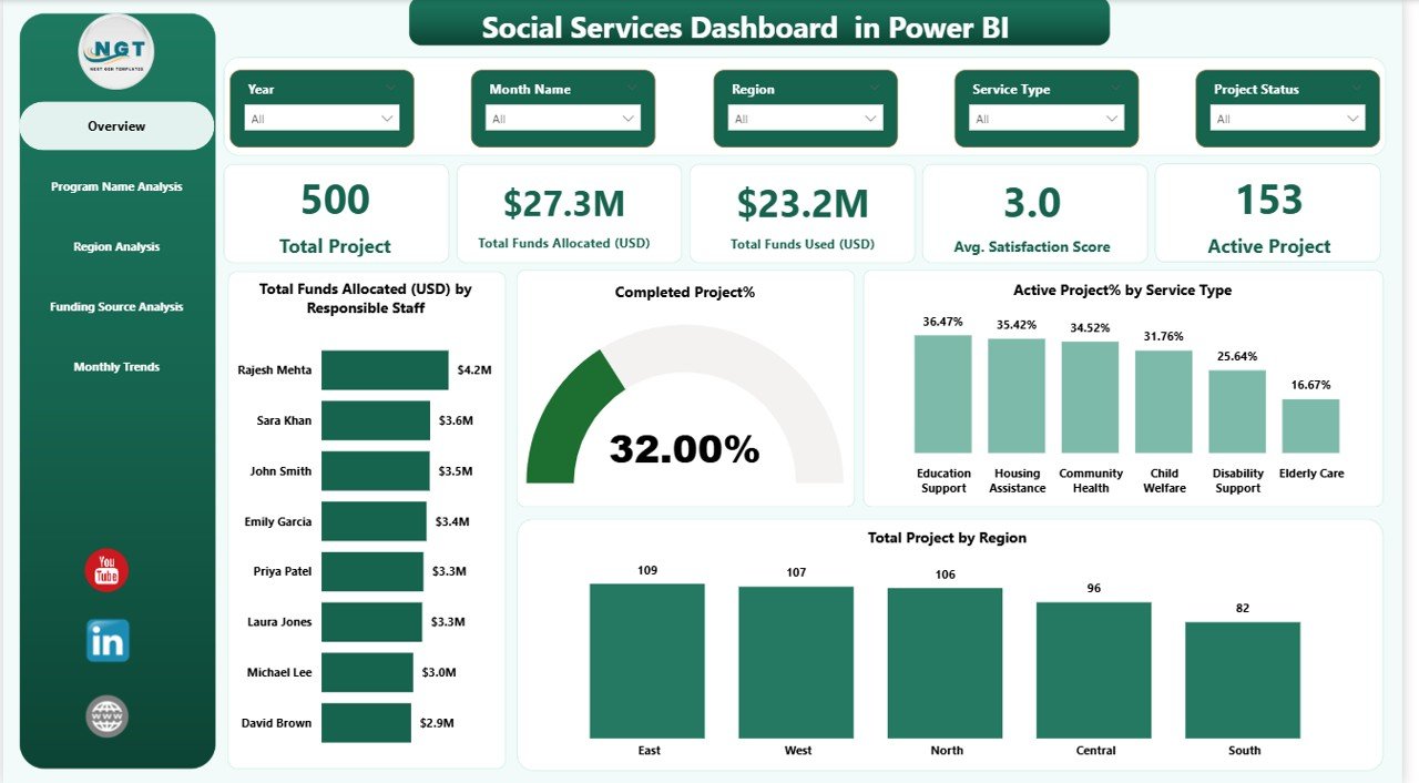
Overview Page – How Does the Organization Perform Overall?
The Overview Page acts as the central monitoring screen. It provides a quick snapshot of organizational performance.
KPI Cards Displayed
The dashboard includes five KPI cards:
- Total Projects
- Total Funds Allocated (USD)
- Total Funds Used (USD)
- Average Satisfaction Score
- Active Projects
These cards immediately highlight operational status.
Charts Available
The page also includes four analytical visuals:
- Total Funds Allocated (USD) by Responsible Staff
- Completed Project % and Active Project % by Service Type
- Total Projects by Region
- Comparative performance indicators
Because slicers appear at the top, users filter insights instantly by selected criteria.
Click to buy Social Services Dashboard in Power BI
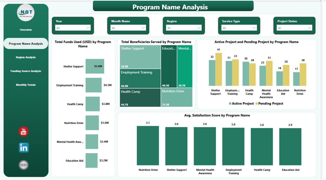
Program Name Analysis – Which Programs Deliver the Best Results?
The Program Name Analysis page focuses on evaluating program effectiveness.
Visual Analysis Included
- Total Funds Used (USD) by Program Name
- Total Beneficiaries Served by Program Name
- Active vs Pending Projects by Program Name
- Average Satisfaction Score by Program Name
Therefore, managers quickly identify high-impact programs.
For example:
- Programs serving more beneficiaries may require additional funding.
- Programs with lower satisfaction scores may need improvement strategies.
As a result, resource allocation becomes smarter and more balanced.
Click to buy Social Services Dashboard in Power BI
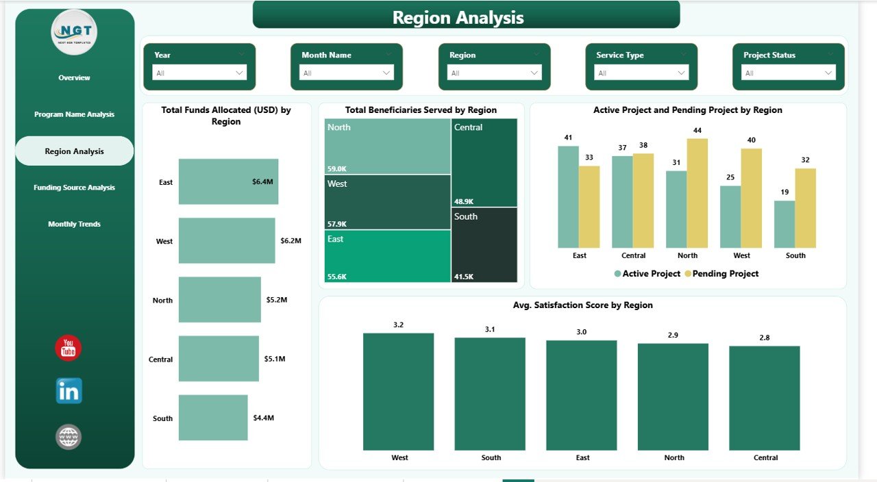
Region Analysis – Which Regions Need More Attention?
Social services often operate across multiple geographic areas. Hence, regional performance tracking becomes essential.
Charts on Region Analysis Page
- Total Funds Allocated by Region
- Total Beneficiaries Served by Region
- Active vs Pending Projects by Region
- Average Satisfaction Score by Region
This page helps leadership answer important questions:
- Which regions receive maximum funding?
- Where do projects remain pending?
- Which areas deliver higher satisfaction?
Consequently, organizations distribute resources more fairly.
Click to buy Social Services Dashboard in Power BI
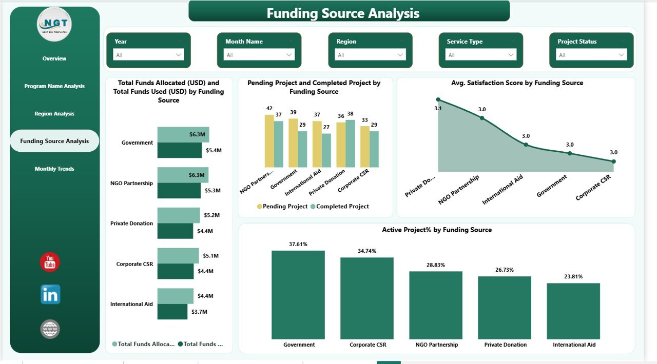
Funding Source Analysis – How Efficiently Are Funds Used?
Funding accountability remains critical for nonprofits and social institutions. Therefore, this page focuses on funding transparency.
Visuals Included
- Total Funds Allocated vs Funds Used by Funding Source
- Pending and Completed Projects by Funding Source
- Average Satisfaction Score by Funding Source
Using this analysis, organizations evaluate:
- Donor contribution performance
- Funding utilization efficiency
- Project completion success rates
Thus, stakeholders gain confidence through transparent reporting.
Click to buy Social Services Dashboard in Power BI
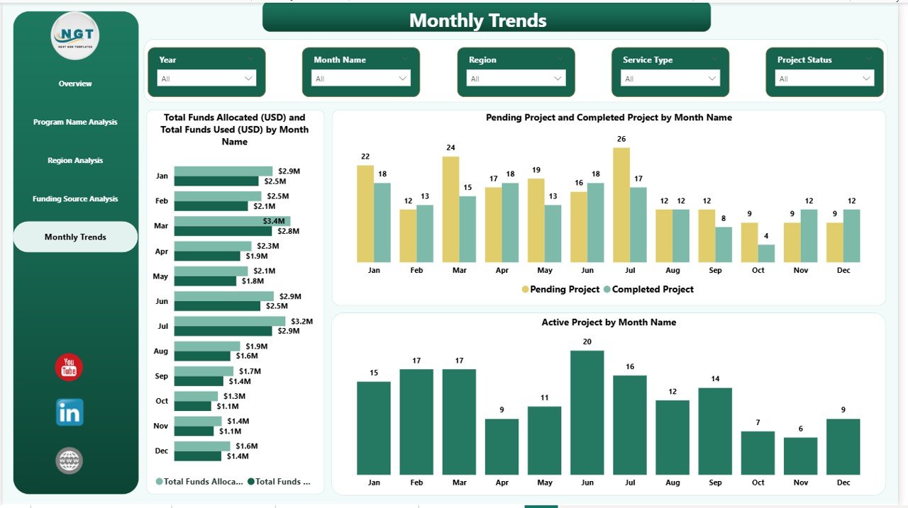
Monthly Trends – How Does Performance Change Over Time?
The Monthly Trends Page analyzes time-based performance.
Charts Available
- Funds Allocated vs Funds Used by Month
- Pending vs Completed Projects by Month
- Active Projects by Month
Trend analysis helps organizations understand patterns.
For instance:
- Funding spikes during certain months
- Project delays during specific periods
- Seasonal service demand variations
Therefore, planners forecast future requirements more accurately.
Click to buy Social Services Dashboard in Power BI
What Insights Can Organizations Gain from This Dashboard?
A well-designed dashboard transforms raw data into actionable insights.
Operational Insights
- Project progress monitoring
- Program efficiency comparison
- Staff performance evaluation
Financial Insights
- Fund allocation tracking
- Budget utilization monitoring
- Donor impact evaluation
Social Impact Insights
- Beneficiary reach analysis
- Satisfaction measurement
- Regional service coverage
Because insights appear visually, decision-makers understand performance instantly.
Advantages of Social Services Dashboard in Power BI
Implementing this dashboard provides several benefits.
Improved Decision-Making
Managers access real-time insights instead of waiting for reports.
Better Financial Transparency
Organizations track every funding source clearly.
Enhanced Beneficiary Impact
Teams measure how services affect communities.
Faster Reporting
Automated visuals eliminate manual calculations.
Regional Performance Visibility
Leadership identifies underserved areas quickly.
Performance Accountability
Staff and program outcomes remain measurable.
How Does Power BI Improve Social Service Management?
Power BI introduces advanced analytics without technical complexity.
Key Capabilities
- Interactive slicers and filters
- Automated data refresh
- Dynamic charts
- Drill-down analysis
- Real-time dashboards
Because users interact visually, even non-technical staff can explore insights easily.
Best Practices for the Social Services Dashboard in Power BI
To achieve maximum value, organizations should follow best practices.
- Maintain Clean Data
Always standardize program names, regions, and funding categories.
- Update Data Regularly
Frequent updates ensure accurate decision-making.
- Define Clear KPIs
Choose measurable indicators aligned with organizational goals.
- Use Meaningful Filters
Add slicers such as region, program, and funding source.
- Monitor Trends Consistently
Review monthly performance instead of yearly summaries.
- Train Team Members
Ensure staff understand how to interpret dashboard visuals.
- Focus on Impact Metrics
Track outcomes, not only financial numbers.
How to Implement a Social Services Dashboard in Power BI?
Organizations can follow a structured implementation process.
Step 1: Collect Data
Gather project, funding, and beneficiary information.
Step 2: Prepare Data in Excel
Clean and structure datasets properly.
Step 3: Import Data into Power BI
Connect Excel files or databases.
Step 4: Create Relationships
Link programs, regions, and funding tables.
Step 5: Design Visuals
Build KPI cards and charts.
Step 6: Add Filters and Slicers
Enable interactive exploration.
Step 7: Publish Dashboard
Share insights securely with stakeholders.
Common Challenges and How to Overcome Them
Although dashboards offer strong benefits, organizations may face challenges.
Challenge: Data Inconsistency
Solution: Use standardized templates.
Challenge: Low Adoption
Solution: Provide user training sessions.
Challenge: Delayed Updates
Solution: Automate data refresh schedules.
Challenge: KPI Confusion
Solution: Define KPI meanings clearly.
Who Can Benefit from This Dashboard?
Many stakeholders gain value from this solution.
- Nonprofit organizations
- Government social departments
- NGOs and charities
- Community development agencies
- Social welfare institutions
- Donor organizations
- Policy planners
Therefore, the dashboard serves both operational teams and leadership executives.
Future Scope of Social Services Analytics
Data analytics continues to evolve rapidly. Consequently, social services increasingly depend on intelligent dashboards.
Future improvements may include:
- Predictive impact analysis
- AI-based beneficiary forecasting
- Automated funding recommendations
- Mobile dashboard access
- Real-time field data integration
As technology advances, organizations deliver more efficient and transparent services.
Conclusion
The Social Services Dashboard in Power BI transforms how organizations monitor programs, funding, and social impact. Instead of relying on manual reports, teams gain real-time visibility into operations.
Because the dashboard combines financial, operational, and beneficiary insights, leaders make faster and smarter decisions. Moreover, interactive visuals improve transparency and accountability across departments.
Ultimately, organizations that adopt data-driven dashboards improve service delivery, optimize funding usage, and maximize community impact.
Frequently Asked Questions (FAQs)
What is a Social Services Dashboard in Power BI used for?
It helps organizations track projects, funding utilization, beneficiaries served, and satisfaction performance through interactive visuals.
Is Power BI suitable for nonprofit organizations?
Yes. Power BI offers cost-effective analytics, easy visualization, and scalable reporting suitable for nonprofits and social agencies.
Can beginners use this dashboard?
Yes. The dashboard uses interactive visuals and filters, so users without technical skills can analyze data easily.
What data is required to build this dashboard?
Organizations need project data, funding details, beneficiary counts, program information, and satisfaction metrics.
How often should organizations update the dashboard?
Ideally, organizations should update data weekly or monthly for accurate insights.
Does the dashboard support multiple funding sources?
Yes. The Funding Source Analysis page compares allocations, usage, and performance across donors.
Can this dashboard improve decision-making?
Absolutely. Real-time analytics helps leaders identify issues quickly and take corrective actions.
Visit our YouTube channel to learn step-by-step video tutorials
Click to buy Social Services Dashboard in Power BI
Watch the step-by-step video tutorial: