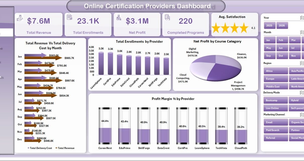
Online Certification Providers Dashboard in Excel is a ready-to-use reporting workbook for online course companies, certification bodies, training academies, exam-prep providers, and education analysts. The workbook includes 7 sheet tabs, 5 headline KPI cards, 5 dashboard pages, 15 analysis charts, an editable Data sheet, and a Support sheet with pivot tables. Instead of rebuilding monthly provider, learner, revenue, renewal, and satisfaction reports manually, you can add records in the same format, click Refresh All from Excel’s Data tab, and review the updated dashboard quickly.
This template is designed for teams that want certification analytics in Microsoft Excel without investing in a full LMS analytics suite. It does not replace course hosting or learner logins; it gives you a clean business reporting layer for revenue, enrollments, cost, net profit, completions, exam pass %, renewals, and satisfaction.
Key Features of Online Certification Providers Dashboard in Excel
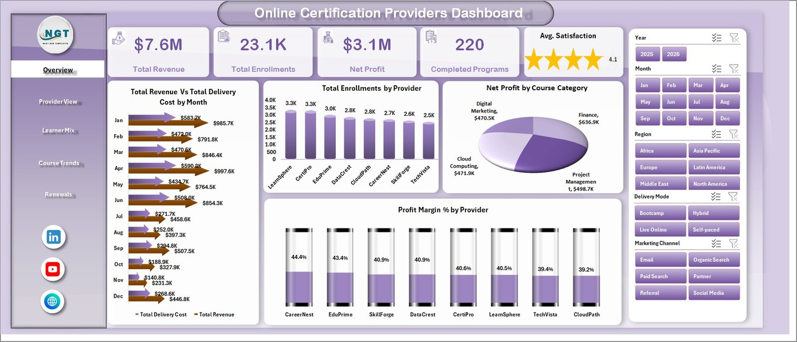
- 5 KPI cards: Total Revenue, Total Enrollments, Net Profit, Completed Programs, and Avg. Satisfaction.
- 5 dashboard pages: Overview, Provider View, Learner Mix, Course Trends, and Renewals.
- 15 chart views: Revenue, delivery cost, enrollments, provider mix, course category profit, profit margin, completion %, exam pass %, records by country, and satisfaction.
- Interactive slicers: Filter the dashboard by selected business dimensions without editing formulas.
- Data sheet: Replace the sample rows with your own certification records in the same format.
- Support sheet: Pivot tables power the dashboard dynamically and can be kept hidden.
Dashboard Pages Explanation
1 – Overview Page
The Overview page gives the high-level certification business summary. The top cards show Total Revenue, Total Enrollments, Net Profit, Completed Programs, and Avg. Satisfaction, so leaders can scan commercial and learner-experience performance together.
Total Revenue and Total Delivery Cost by Month: This chart compares monthly revenue with delivery cost to show whether the business is scaling profitably. It helps identify months where revenue grew but operating cost also increased sharply.
Total Enrollments by Provider: This chart ranks providers by enrollment volume. It helps find the partners or platforms driving the strongest learner demand.
Net Profit by Course Category: This chart highlights which course categories generate the most profit. It helps guide content investment, pricing reviews, and campaign focus.
Profit Margin % by Provider: This chart compares provider profitability, not only provider revenue. It helps identify providers that look strong on sales but weaker on margin.
2 – Provider View
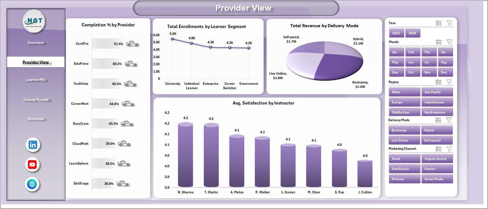
The Provider View page focuses on delivery partners, learner segments, delivery modes, and instructor satisfaction.
Completion % by Provider: This chart compares how well each provider converts enrolled learners into completed programs. It is useful for quality review and partner accountability.
Total Enrollments by Learner Segment: This chart shows the learner groups joining your programs. It helps refine targeting, pricing, and course positioning.
Total Revenue by Delivery Mode: This chart compares revenue across delivery formats such as live, online, blended, or self-paced learning. It supports decisions about where to add delivery capacity.
Avg. Satisfaction by Instructor: This chart shows learner satisfaction by instructor. It helps coaching, instructor assignment, and learner-experience monitoring.
3 – Learner Mix
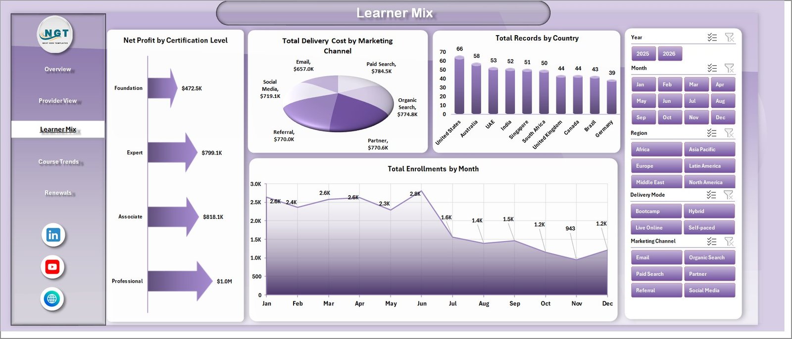
The Learner Mix page explains the learner base and the marketing and geographic dimensions behind certification performance.
Net Profit by Certification Level: This chart compares profit across certification levels. It helps determine whether beginner, intermediate, advanced, or professional programs are producing better financial outcomes.
Total Delivery Cost by Marketing Channel: This chart shows how delivery cost relates to the channel that brought the learner in. It helps investigate channels that may drive costly or hard-to-serve enrollments.
Total Records by Country: This chart shows country-level learner or record volume. It is useful for regional planning, localization, and expansion review.
Total Enrollments by Month: This chart tracks enrollment movement across months. It helps identify seasonality, campaign effects, and slow periods.
4 – Course Trends
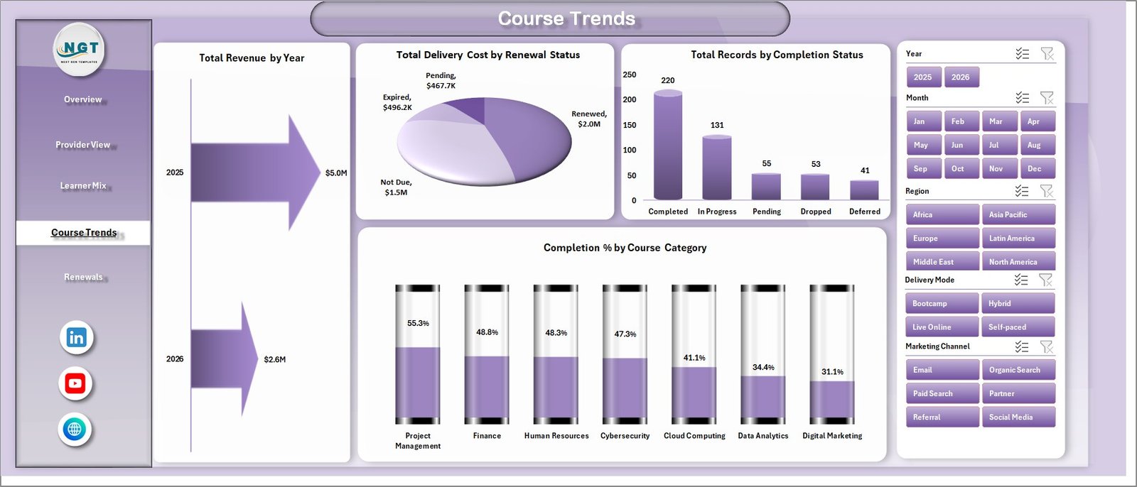
The Course Trends page focuses on long-term revenue, renewal cost, completion status, and category completion performance.
Total Revenue by Year: This chart shows year-wise revenue movement. It gives leadership a clear view of whether certification revenue is growing over time.
Total Delivery Cost by Renewal Status: This chart compares delivery cost across renewal groups. It helps reveal whether renewed learners are cheaper or more expensive to serve.
Total Records by Completion Status: This chart breaks records by completion status. It helps teams monitor completed, in-progress, dropped, or other learner outcomes.
Completion % by Course Category: This chart compares completion rate by category. It helps identify categories where learner support, course design, or difficulty level may need attention.
5 – Renewals
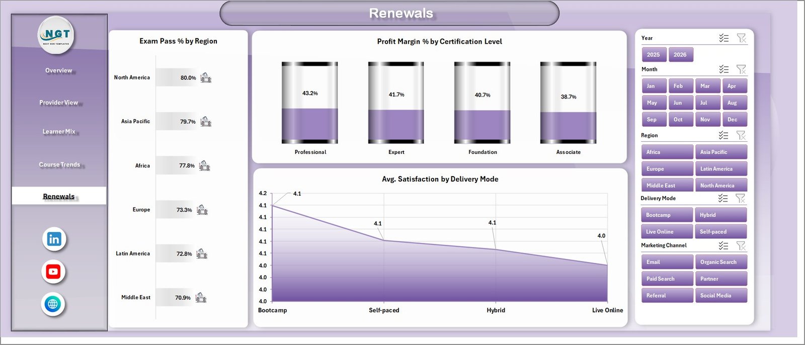
The Renewals page is built for certification retention and learner-success review.
Exam Pass % by Region: This chart compares exam pass performance across regions. It helps identify where preparation quality or support may need improvement.
Profit Margin % by Certification Level: This chart shows which certification levels produce stronger margins. It supports pricing, packaging, and program portfolio decisions.
Avg. Satisfaction by Delivery Mode: This chart compares satisfaction across delivery formats. It helps determine whether online, live, blended, or self-paced models are creating the best learner experience.
6 – Data Sheet Tab
The Data sheet is the source table for the workbook. Add your records in the same format as the sample data, then refresh the workbook to update cards, charts, slicers, and pivots.

7 – Support Sheet
The Support sheet contains the pivot tables used to create the dashboard dynamically. After updating the Data sheet, go to Excel’s Data tab and click Refresh All. The pivots and charts will refresh, and you can keep the Support sheet hidden for normal users.

Online Certification Providers Dashboard in Excel vs. Google Sheets vs. Paid LMS/SaaS – Feature Comparison
| Feature | This Excel template | Google Sheets alternative | Paid LMS/SaaS |
|---|---|---|---|
| Cost | One-time template purchase | One-time template or manual build | Monthly or annual subscription |
| Platform | Microsoft Excel | Browser-based Google Sheets | Vendor cloud platform |
| Setup time | Paste data and refresh pivots | Paste data and configure sharing | Implementation and onboarding |
| Real-time team collaboration | Requires OneDrive or shared file workflow | Native collaboration | Usually included by user license |
| Customizable fields | Editable workbook, charts, pivots, and formulas | Editable sheets and charts | Depends on vendor permissions |
| Certification analytics | Provider, learner, course, renewal, and profit views | Possible with a configured sheet | Often available in reporting modules |
For teams that already export certification data to Excel, this dashboard sits between manual reporting and a full LMS analytics platform. Microsoft also provides helpful guidance on using PivotTables to analyze worksheet data, which is the same Excel reporting foundation used behind this template.
Who Should Use This Template
This template is useful for online certification providers, professional training businesses, course marketplace operators, continuing education teams, exam-prep providers, and education consultants who need repeatable Excel reporting for certification performance.
Real-World Use Cases
Certification operations manager: reviews provider completion %, exam pass %, and satisfaction before the monthly provider meeting.
Online academy founder: checks net profit by course category and profit margin by provider before deciding which programs to promote.
Education analyst: updates the Data sheet, refreshes the Support pivots, and exports dashboard pages for leadership reporting.
Advantages of Online Certification Providers Dashboard in Excel
- Ready-made KPI and chart structure for certification providers.
- No monthly software subscription required.
- Uses familiar Excel sheets, charts, slicers, and pivots.
- Easy to customize for course categories, providers, regions, countries, and learner segments.
- Separates dashboard pages from raw data and support pivots.
Opportunities for Improvement
The workbook does not connect automatically to an LMS, payment gateway, or exam platform. If your business needs live sync, role-based portals, learner accounts, or automated certificates, use a dedicated LMS or build an integration. This Excel dashboard is best when your data is already exported or maintained in a structured table.
Best Practices
- Keep the Data sheet column structure unchanged.
- Refresh all pivots after every data update.
- Use consistent names for providers, course categories, instructors, and delivery modes.
- Hide the Support sheet for everyday dashboard users.
- Save a backup copy before making major layout or formula changes.
Explore Relevant Templates
- Online Certification Providers Dashboard in Excel
- E-learning Content Services Dashboard in Excel
- Education Services Dashboard in Google Sheets
- Professional Training and Coaching Dashboard in Google Sheets
- Browse Excel Dashboard Templates
Frequently Asked Questions
What does this dashboard track?
It tracks revenue, delivery cost, enrollments, net profit, completed programs, satisfaction, completion %, exam pass %, profit margin, records by country, and renewal-related performance.
How do I update the dashboard?
Add your records in the Data sheet, keep the same format, then go to Excel’s Data tab and click Refresh All.
Can I hide the Support sheet?
Yes. The Support sheet contains pivot tables for the dashboard and can be hidden after setup.
Is this a learning management system?
No. It is an Excel analytics dashboard, not a course hosting, learner login, payment, or certificate-issuing platform.
Can I customize the workbook?
Yes. You can edit charts, pivots, formulas, colors, sheet names, and slicers in Excel.
About the Author
Built by PK – Microsoft Certified Professional with 15+ years of Excel, Google Sheets, and Power BI experience. Founder of NextGenTemplates, reaching 300K+ subscribers across YouTube channels. Every template is hand-built and tested before release.
Conclusion
The Online Certification Providers Dashboard in Excel gives certification teams a practical way to review provider performance, learner mix, course profitability, renewal health, and satisfaction in one workbook. If your team already works with Excel exports and wants a repeatable monthly reporting file, this template can save time and bring the key certification metrics into one place. For more Excel tutorials, visit YouTube.com/@PKAnExcelExpert.