Peer to Peer Insurance Dashboard in Power BI is a ready-to-use reporting template for peer-to-peer insurance teams, insurance startups, risk pool administrators, claims managers, finance analysts, and Power BI consultants. IndustryARC forecasts the peer-to-peer insurance market to reach $2.36 billion by 2030 at a 32.4% CAGR during 2024-2030, which shows why clear reserve, claim, payout, premium, and approval reporting matters for this business model.
This Power BI dashboard gives users five report pages with executive cards, claims visuals, policy mix analysis, risk review, regional trends, and interactive slicers. You can open the PBIX file in Power BI Desktop, replace the sample data with your own structured insurance data, refresh the report, and start reviewing results without building every visual from scratch.
Click to Buy Peer to Peer Insurance Dashboard in Power BI
Key Features of Peer to Peer Insurance Dashboard in Power BI
- Five Power BI report pages: Overview, Claims, Policy Mix, Risk Review, and Regional Trend.
- Executive KPI cards: Total Reserve, Total Claims, Total Claim Amount, and Paid Claims.
- Claims performance tracking: Review approval rate, processing days, claims by status, and claim amount by type.
- Premium and reserve monitoring: Compare total premium, total reserve, total payout, and monthly movement.
- Policy mix analysis: Analyze risk pool, customer segment, and policy type performance.
- Risk review metrics: Track annual premium, annual payout, loss ratio by priority, and claim type exposure.
- Regional and channel views: Compare claim amount by channel, approval rate by month, and reserve by month.
- Interactive filtering: Use slicers to narrow the dashboard during claims, finance, underwriting, and management meetings.
- Editable PBIX file: Customize report pages, measures, colors, slicers, source connections, and visuals in Power BI Desktop.
Dashboard Pages Explanation
1 – Overview Page
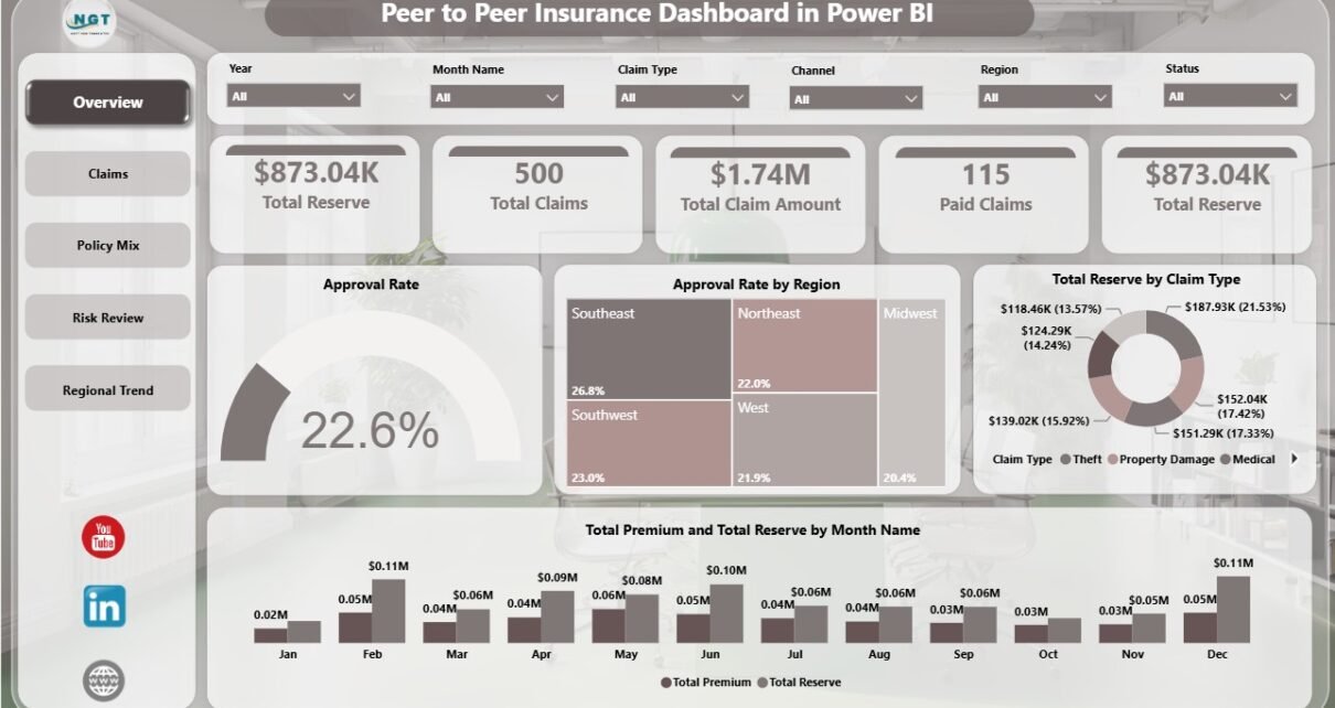
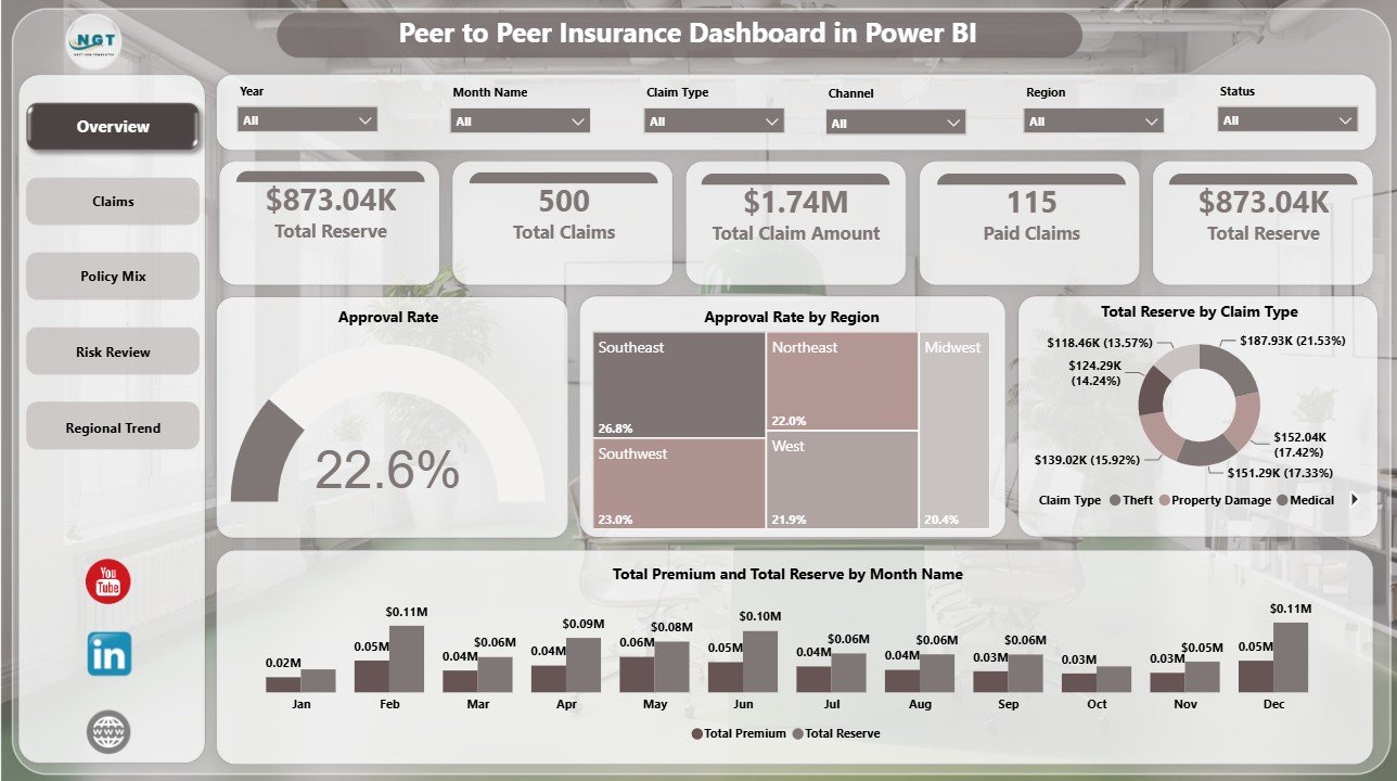
The Overview page is the executive summary of the report. At the top, it shows Total Reserve, Total Claims, Total Claim Amount, and Paid Claims. These cards help leaders quickly understand claims volume, financial exposure, and payment activity before reviewing the detailed report pages.
Approval Rate by Overall Claims: This chart compares approval rate with overall claims activity. It helps claims teams understand whether approval outcomes are changing as claim volume changes.
Approval Rate by Region: This chart compares approval rate across regions. It helps identify locations where claims review, documentation quality, or underwriting rules may need closer attention.
Total Reserve by Claim Type: This visual breaks reserve value by claim category. It helps finance and risk teams see which claim types are holding the largest reserve amounts.
Total Premium and Total Reserve by Month Name: This monthly visual compares premium and reserve side by side. It helps teams monitor whether reserve pressure is moving in line with premium collection.
2 – Claims
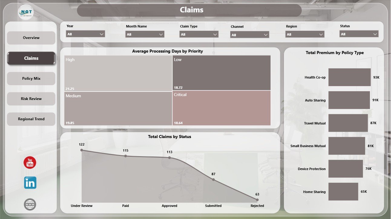
The Claims page focuses on claims operations and processing performance. It is useful for weekly claims review, backlog discussion, and workload planning.
Average Processing Days by Priority: This chart shows average processing time by claim priority. It helps managers identify high-priority groups that may need faster handling or extra resources.
Total Claims by Status: This chart shows claims volume by status. It gives the team a clear view of open, paid, rejected, pending, or other claim workflow stages.
Total Premium by Policy Type: This visual compares premium distribution across policy types. It helps teams understand which policy categories contribute the most premium to the risk pool.
3 – Policy Mix
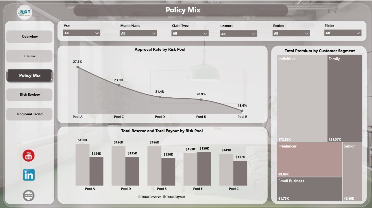
The Policy Mix page explains how risk pools, customer segments, premium, reserve, payout, and approval performance are distributed. It is built for teams that need to review portfolio balance and community risk behavior.
Approval Rate by Risk Pool: This chart compares approval rate across risk pools. It helps identify pools with stronger or weaker approval performance.
Total Reserve and Total Payout by Risk Pool: This visual compares reserve and payout by pool. It helps finance teams understand exposure and payment pressure by risk group.
Total Premium by Customer Segment: This chart shows premium contribution by customer segment. It helps leaders see which member groups or customer categories fund the largest share of premiums.
4 – Risk Review
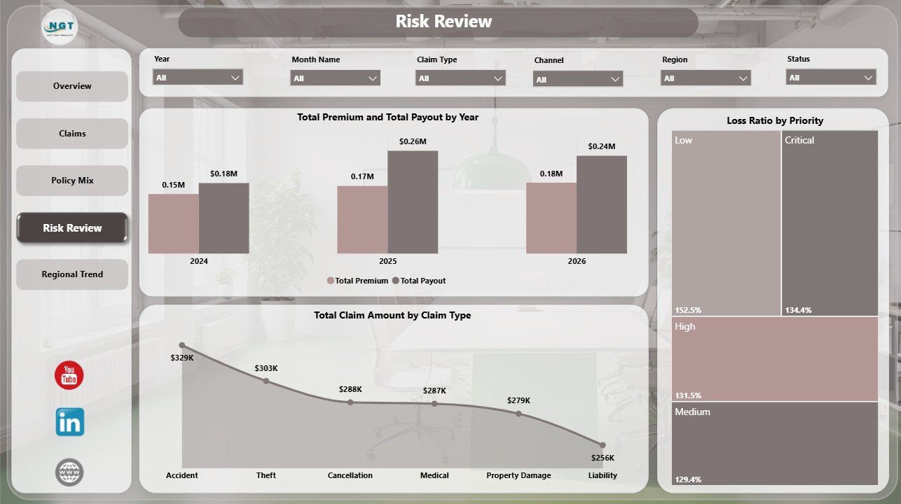
The Risk Review page is designed for finance, claims leadership, underwriting, and portfolio monitoring. It connects premium, payout, claim amount, claim type, loss ratio, priority, and annual trend views in one page.
Total Premium and Total Payout by Year: This chart compares annual premium and payout. It helps teams review whether payout trends are rising faster than premium funding.
Total Claim Amount by Claim Type: This chart breaks claim amount by claim type. It highlights categories that create the largest claim exposure.
Loss Ratio by Priority: This visual compares loss ratio across priority groups. It helps users identify where claims cost may be heavier relative to premium.
5 – Regional Trend
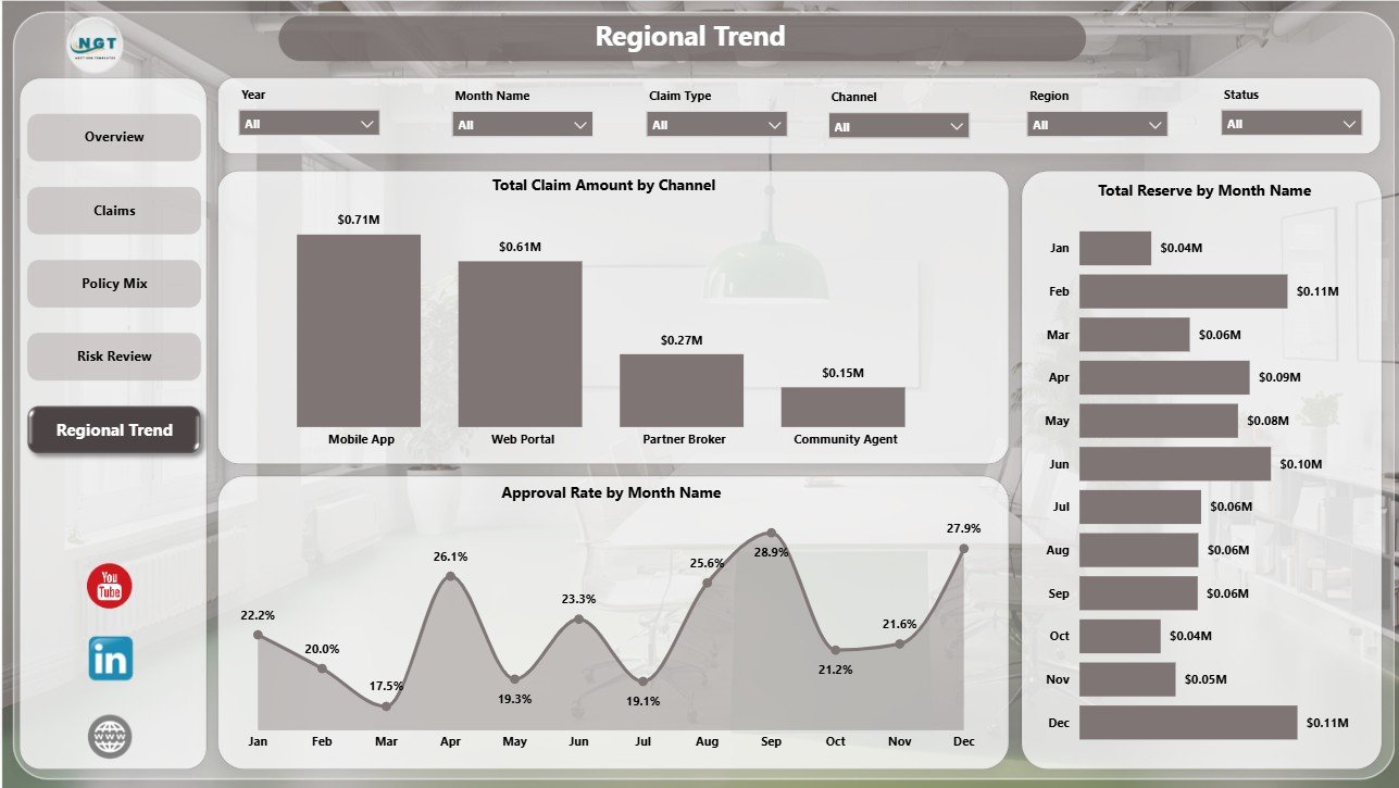
The Regional Trend page helps users review claim amount, channel performance, approval movement, and reserve trend patterns. It is useful for monthly management packs and regional operating reviews.
Total Claim Amount by Channel: This chart compares claim amount across channels. It helps teams understand whether certain sales, service, or claims intake channels are associated with higher claim exposure.
Approval Rate by Month Name: This chart tracks approval rate over months. It helps users identify seasonality, process changes, and monthly approval shifts.
Total Reserve by Month Name: This visual shows monthly reserve movement. It supports finance review and helps teams monitor reserve build-up or release over time.
Peer to Peer Insurance Dashboard in Power BI vs. Tableau vs. Paid Insurance SaaS – Feature Comparison
| Feature | Peer to Peer Insurance Dashboard in Power BI | Tableau Alternative | Paid Insurance SaaS |
|---|---|---|---|
| Cost | One-time template purchase | License cost plus analyst build time | Monthly or annual subscription |
| Platform | Power BI Desktop and optional Power BI Service | Tableau Desktop or Tableau Cloud | Vendor cloud platform |
| Setup time | Open PBIX, connect or replace data, refresh | Build workbook, model, and visuals manually | Implementation and onboarding |
| Real-time team collaboration | Available through Power BI Service licensing | Available through Tableau Cloud licensing | Usually included by plan |
| Mobile access | Available through Power BI mobile apps after publishing | Available through vendor mobile apps | Usually included |
| Customizable fields | Editable PBIX report, measures, slicers, and visuals | Editable, but requires Tableau skills | Limited by vendor configuration |
| Share with link | Possible through Power BI workspace permissions | Possible through Tableau Cloud permissions | Usually login controlled |
| Year-1 cost at 5 users | Template price plus existing Microsoft licensing | License cost plus build time | Often hundreds or thousands per year |
| Insurance reporting focus | Pre-built around reserves, claims, premiums, payouts, approval rate, loss ratio, risk pools, regions, channels, and trends | Requires custom design | Depends on vendor reporting module |
Who Should Use This Template
This template is useful for peer-to-peer insurance startups, insurance operations teams, claims managers, risk pool administrators, underwriting analysts, finance teams, customer segment analysts, regional managers, and Power BI consultants who need a ready reporting structure for prepared insurance data.
It is not a replacement for an insurance core system, policy administration system, claim adjudication workflow, actuarial pricing engine, compliance platform, payment platform, or fraud detection model. It is a management reporting template for Power BI.
Real-World Use Cases
Weekly claims review: A claims operations manager filters the Claims page by priority and status to understand processing time, claim volume, and open workload before assigning follow-up actions.
Monthly finance review: A finance analyst reviews total premium, total payout, total reserve, loss ratio, and claim amount by month, year, risk pool, and priority to prepare commentary for leadership.
Regional performance review: A P2P insurance founder compares approval rate by region and month, then checks claim amount by channel to understand whether certain regions or channels need process review.
Advantages of Peer to Peer Insurance Dashboard in Power BI
- It gives teams a working Power BI report instead of a blank file.
- It combines financial, claims, policy mix, risk, and regional analysis in one PBIX file.
- It helps explain reserve and payout movement across claim types, risk pools, months, years, and priorities.
- It uses familiar Power BI controls, making it easier for analysts to customize.
- It can be shared through Power BI Service when your Microsoft licensing and workspace setup supports it.
Opportunities for Improvement
The dashboard depends on clean source data. Before refreshing, standardize claim type, claim status, priority, policy type, customer segment, risk pool, channel, region, month, year, premium, reserve, payout, and claim amount fields.
Teams with larger operations may eventually connect the PBIX file to a database, SharePoint list, data warehouse, or scheduled export. Microsoft Learn provides helpful Power BI guidance, including how Power BI Desktop and the Power BI service work together.
Best Practices
Keep a backup copy of the original PBIX before editing measures, relationships, or visuals. This gives you a clean version to return to after experimentation.
Validate totals before presenting. Check Total Reserve, Total Claims, Total Claim Amount, Paid Claims, Total Premium, Total Payout, and Loss Ratio against your source records.
Use slicers consistently during meetings. Filtering by region, claim type, risk pool, priority, status, month, policy type, customer segment, and channel can make review conversations more focused.
Separate operational and financial review questions. Claims teams may focus on status and processing days, while finance teams may focus on reserve, payout, premium, and loss ratio.
Explore Relevant Templates
You may also like Patient Care Homes Dashboard in Power BI, Organ Donation Networks Dashboard in Power BI, and Knowledge Hubs Dashboard in Power BI.
Browse more Power BI templates and Power BI Dashboard templates.
Frequently Asked Questions
What does the Peer to Peer Insurance Dashboard in Power BI track?
It tracks reserve, claims, claim amount, paid claims, approval rate, processing days, premium, payout, risk pool, policy type, customer segment, loss ratio, channel, region, month, and year.
Can I use my own peer-to-peer insurance data?
Yes. Replace or connect the sample data source with your structured insurance dataset, then refresh the report in Power BI Desktop.
Do I need Power BI Desktop?
Yes. Power BI Desktop is recommended for opening and editing the PBIX file. Power BI Service is optional for sharing and scheduled refresh.
Can I customize the dashboard visuals?
Yes. You can edit visuals, report pages, slicers, colors, labels, measures, relationships, and source connections.
Is this dashboard connected to live insurance systems?
No. It is a standalone Power BI reporting template. Your team controls the source data and refresh process.
Is this a claims adjudication system?
No. It is an analytics and reporting dashboard, not a claim processing workflow, adjudication engine, or regulatory compliance system.
About the Author
Built by PK – Microsoft Certified Professional with 15+ years of Excel, Google Sheets, and Power BI experience. Founder of NextGenTemplates, reaching 300K+ subscribers across YouTube channels. Every template is hand-built and tested before release.
Conclusion
The Peer to Peer Insurance Dashboard in Power BI gives insurance teams a structured way to review reserves, claims, claim amount, paid claims, premiums, payouts, approval rate, risk pools, policy mix, loss ratio, channels, regions, and monthly trends. With five report pages and interactive slicers, it can support weekly operations meetings, monthly finance review, and management reporting in Power BI.
Click here to purchase Peer to Peer Insurance Dashboard in Power BI
Instant download. One-time payment. No subscription.
Visit our YouTube channel for step-by-step video tutorials: Youtube.com/@PK-AnExcelExpert
Last updated: July 21, 2026