Border Security Tech Dashboard in Power BI is a powerful, professionally designed analytics template built specifically for border security agencies, defense organizations, and government technology teams. This ready-to-use Power BI dashboard provides comprehensive visibility into threat records, operating costs, response times, resolution rates, sector performance, and technology effectiveness. Whether you are a homeland security analyst, a border patrol commander, or a technology operations manager, this dashboard transforms raw border security data into actionable intelligence through stunning interactive visualizations.Border Security Tech Dashboard in Power BI.
If you are looking for the best way to monitor and analyze border protection operations using Microsoft Power BI, this template is your ultimate solution. It features five purpose-built dashboard pages covering Overview, Threat Analysis, Sector Performance, Technology Insights, and Operational Efficiency with dynamic KPI cards, advanced slicers, and rich chart visualizations that make data exploration fast and intuitive. Download it today and start making data-driven decisions that strengthen your border security posture.
👉 Click here to Purchase Border Security Tech Dashboard in Power BI
Key Features of Border Security Tech Dashboard in Power BI
This Power BI dashboard template comes packed with essential features that make border security monitoring and analysis effortless:
- 5 Interactive Dashboard Pages – Navigate through Overview, Threat Analysis, Sector Performance, Technology Insights, and Operational Efficiency pages for a 360-degree view of border operations
- Dynamic KPI Cards – Instantly view key metrics such as Total Records, Total Operating Cost, Avg. Response Time, and Resolved Count on the overview page
- Advanced Slicers & Filters – Slice data by severity level, threat category, border sector, technology type, detection method, shift, month, and more for targeted analysis
- Professional Chart Visualizations – Charts include Total Records by Severity Level, Resolved Count%, Records and Resolved Count by Threat Category, Operating Cost and Maintenance Cost by Month, Detection Accuracy by Method, Response Time by Sector, False Alarm Rate by Technology Type, and many more
- Fully Editable & Customizable – Modify KPIs, chart types, color schemes, filters, and data connections to align perfectly with your organizational requirements
- Sample Data Included – Explore all dashboard functionality immediately with preloaded realistic border security sample data
- Power BI Desktop & Service Compatible – Works seamlessly with Microsoft Power BI Desktop and can be published to Power BI Service for team-wide access
- Clean Professional Design – Modern, intuitive layout designed for government officials, security analysts, and executive stakeholders
Dashboard Pages Explanation
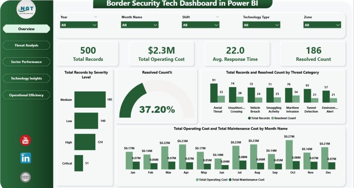
1 – Overview Page
The Overview page serves as your central command center for border security operations. At the top, you will find high-level KPI cards displaying the most critical metrics: Total Records, Total Operating Cost, Avg. Response Time, and Resolved Count. These cards provide an immediate snapshot of your border security posture and operational health.
Below the KPI cards, the page features several interactive charts that provide deeper insights. You will see Total Records by Severity Level which breaks down incidents across severity tiers so you can quickly gauge the threat landscape. The Resolved Count% chart shows the overall resolution rate giving you a clear picture of operational effectiveness. Total Records and Resolved Count by Threat Category helps you compare incident volume against resolution performance across different threat types. Finally, Total Operating Cost and Total Maintenance Cost by Month Name reveals cost trends over time, helping you plan budgets and identify spending anomalies. Multiple slicers allow you to filter the entire page for rapid scenario analysis.
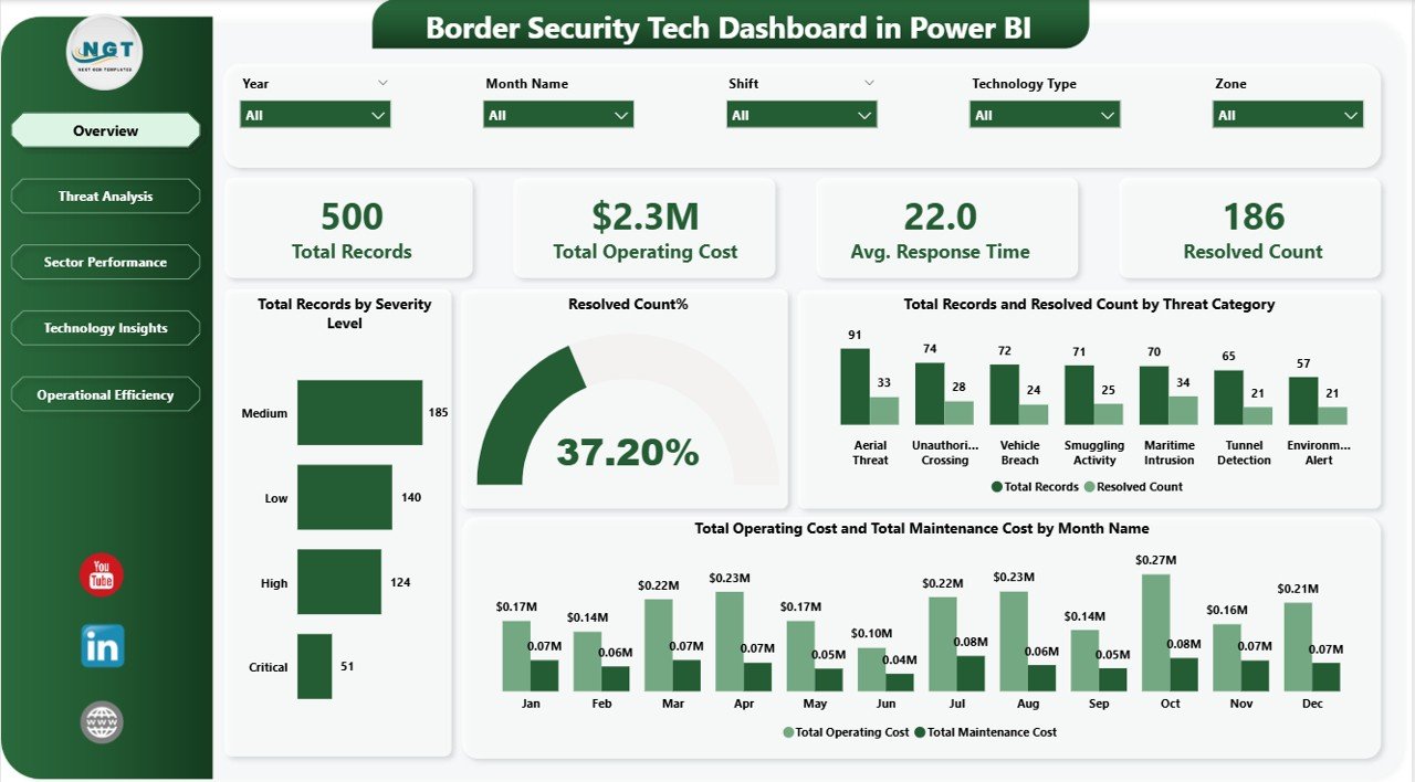
Overview Page – Border Security Tech Dashboard in Power BI
2 – Threat Analysis Page
The Threat Analysis page provides a detailed breakdown of border security threats and how effectively they are being managed. This page is essential for understanding cost distribution across severity levels, evaluating detection methods, and tracking escalation patterns.
Key visualizations on this page include Total Operating Cost by Severity Level which reveals how much each severity tier costs the organization, enabling better resource allocation. Avg. Detection Accuracy by Detection Method compares the effectiveness of different detection technologies and methods, helping you invest in the most reliable systems. Total Records and Resolved Count by Escalation Level shows how incidents flow through escalation tiers and where bottlenecks may exist in the resolution pipeline. Security analysts can use these charts to identify cost drivers, optimize detection strategies, and improve escalation workflows. For a similar approach in Excel format, check out the Border Security Tech Dashboard in Excel.
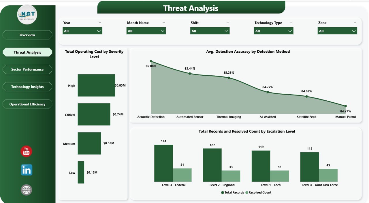
Threat Analysis Page
3 – Sector Performance Page
The Sector Performance page gives you complete visibility into how each border sector is performing relative to others. In border security operations, understanding geographic performance variation is critical for strategic resource deployment.
This page features Total Records by Border Sector which shows incident distribution across all border zones, helping commanders identify the busiest and most vulnerable sectors. Avg. Response Time by Border Sector highlights which sectors are responding quickly and which may need additional resources or process improvements. Avg. Detection Accuracy by Zone evaluates how accurately threats are being detected in each operational zone, enabling targeted technology upgrades where accuracy is lagging. Operations managers can use these insights to rebalance staffing, prioritize equipment deployments, and set sector-specific performance targets. Explore related technology dashboards like the Civic Technology Startups Dashboard in Power BI for additional insights.
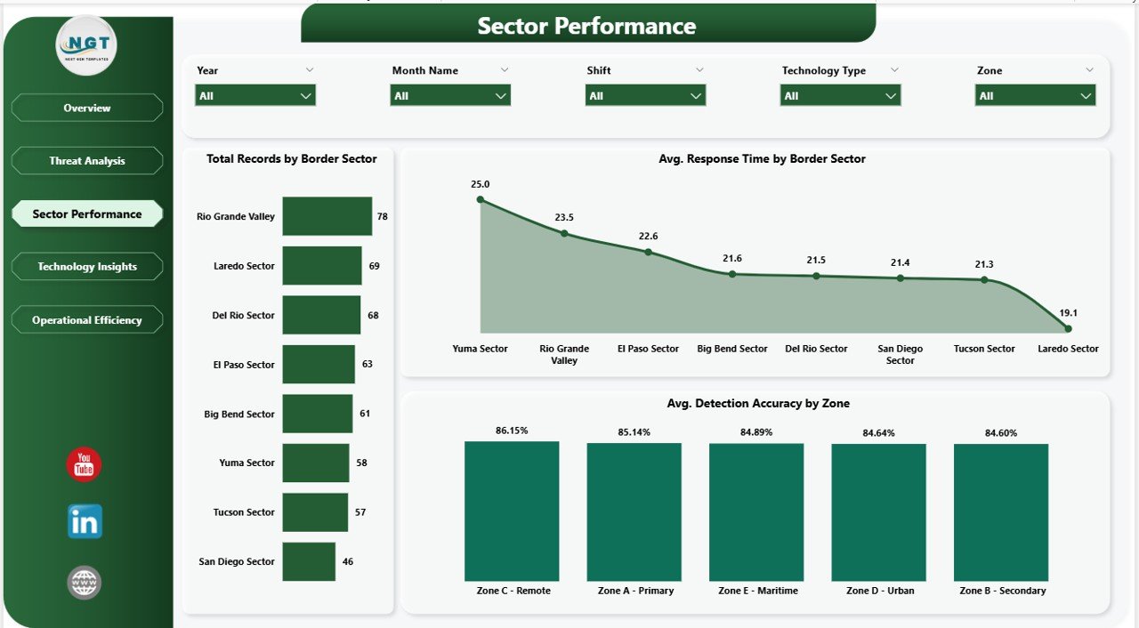
Sector Performance Page
4 – Technology Insights Page
The Technology Insights page focuses on evaluating the performance, reliability, and cost of all security technology assets deployed across border operations. Effective technology management is the backbone of modern border security, and this page provides the analytics needed to optimize it.
Charts on this page include Avg. False Alarm Rate and Avg. Detection Accuracy by Technology Type which provides a side-by-side comparison of how different technology categories perform in terms of accuracy and false alarm generation. Total Maintenance Cost by Technology Type reveals which technologies are the most expensive to maintain, helping you calculate true total cost of ownership. Total Records and Resolved Count by Equipment Model drills down to individual equipment models, showing which devices are handling the most incidents and their resolution effectiveness. You might also find the Cybersecurity Incident KPI Dashboard in Google Sheets useful for related security monitoring needs.
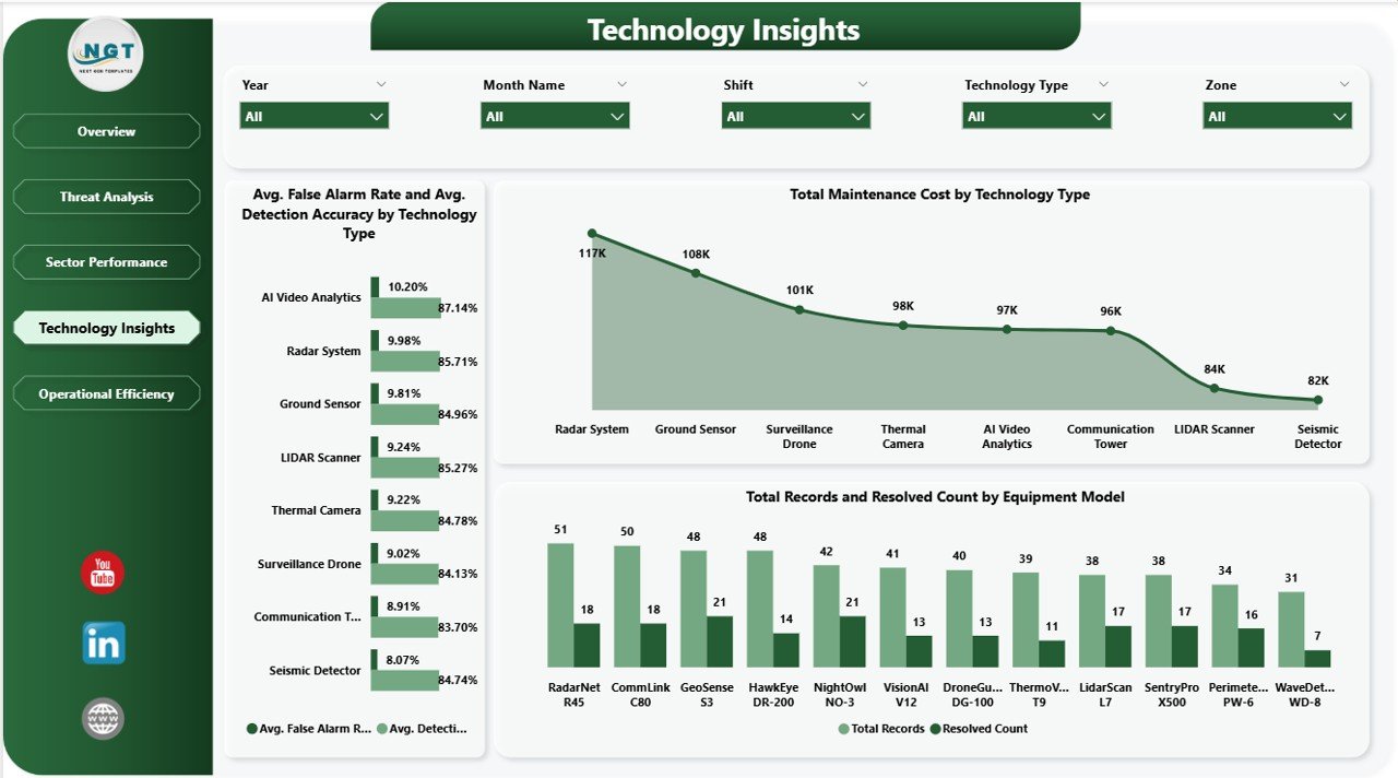
Technology Insights Page
5 – Operational Efficiency Page
The Operational Efficiency page provides comprehensive analytics on shift-based performance and resolution trends over time. Managing operational shifts effectively is just as important as managing technology assets, and this page delivers the data needed to optimize scheduling and workforce productivity.
This page features Avg. Response Time by Shift which compares how quickly different shifts are responding to incidents, revealing staffing gaps or training needs during specific time periods. Resolved Count% by Month Name tracks resolution rate trends over the entire year, helping you identify seasonal patterns and measure the impact of process improvements over time. Resolved Count by Shift shows the absolute number of resolved incidents per shift, enabling fair workload assessment and performance benchmarking. Commanders and HR managers can use these insights to optimize shift rotations, balance workloads, and ensure peak operational readiness around the clock. For an alternative spreadsheet-based approach, explore the Border Security Tech Dashboard in Excel available on our website.
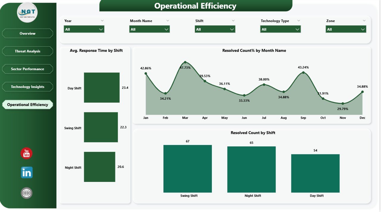
Operational Efficiency Page
Advantages of Border Security Tech Dashboard in Power BI
- Centralized Operations View – Consolidate all border security data including threat records, costs, response times, and technology performance into one unified, interactive dashboard
- Real-Time Decision Making – Dynamic KPI cards and interactive charts enable faster, data-driven decisions during critical border incidents
- Cost Visibility – Track operating costs and maintenance costs by month and by technology type to optimize budget allocation
- Technology ROI Analysis – Compare false alarm rates, detection accuracy, and maintenance costs across technology types and equipment models
- Sector Benchmarking – Compare performance metrics across border sectors to identify underperforming zones and allocate resources strategically
- Shift Optimization – Analyze response times and resolution counts by shift to optimize staffing and scheduling
- Stakeholder Communication – Present professional, visually compelling reports to government officials, legislative bodies, and oversight committees
Opportunities for Improvement
- Real-Time Data Integration – Connect to live border monitoring systems, IoT sensor feeds, and real-time incident reporting platforms for up-to-the-minute intelligence
- Geospatial Mapping – Add interactive map visuals using Power BI’s ArcGIS or Azure Maps integration to display incidents, assets, and zones geographically
- Predictive Analytics – Incorporate machine learning models to predict threat likelihood by severity level, identify high-risk time windows, and forecast maintenance needs
- Custom Alerts – Set up Power BI alerts for KPI thresholds such as response time exceeding targets or detection accuracy dropping below acceptable levels
- Multi-Language Support – Adapt the dashboard for international border agencies by adding multi-language labels and localized data formats
Best Practices for Using Border Security Tech Dashboard in Power BI
- Update Data Regularly – Refresh your data sources daily or in near-real-time to ensure the dashboard reflects the latest border security conditions
- Use Row-Level Security – Implement Power BI’s row-level security to restrict data access based on user roles and clearance levels
- Customize KPI Targets – Set organizational benchmarks for response time, resolution rate, detection accuracy, and false alarm rate to track performance against goals
- Leverage Bookmarks & Drill-Throughs – Create custom views using Power BI bookmarks and drill-through pages for quick access to frequently analyzed scenarios
- Publish to Power BI Service – Share the dashboard securely with your team by publishing it to Power BI Service with appropriate workspace permissions
- Schedule Automatic Refresh – Configure scheduled data refresh in Power BI Service to keep the dashboard current without manual intervention
- Train Your Team – Provide basic Power BI training to end users so they can independently explore data, apply filters, and generate insights
Explore Relevant Templates
If you enjoyed the Border Security Tech Dashboard in Power BI, you might also find these related templates useful for your data visualization needs:
- Border Security Tech Dashboard in Excel – The same border security analytics in an Excel spreadsheet format
- Civic Technology Startups Dashboard in Power BI – Track civic tech startup metrics and performance in Power BI
- Incident Response and Downtime Analysis Dashboard in Google Sheets – Monitor incident response metrics in Google Sheets
- Cybersecurity Incident KPI Dashboard in Google Sheets – Track cybersecurity incidents and KPIs
Visit NextGenTemplates.com to explore our full collection of professionally designed dashboard templates across Excel, Power BI, Google Sheets, and HTML.
Frequently Asked Questions
What software do I need to use this dashboard?
You need Microsoft Power BI Desktop, which is a free application from Microsoft. You can download it from the official Microsoft Power BI download page. You can also publish the dashboard to Power BI Service for online access and team collaboration.
What KPI cards are included in the Overview page?
The Overview page includes four key KPI cards: Total Records, Total Operating Cost, Avg. Response Time, and Resolved Count. These provide an immediate snapshot of your border security operational status.
Can I customize the KPIs and charts in this dashboard?
Absolutely. The Border Security Tech Dashboard in Power BI is fully editable. You can modify KPI cards, change chart types, update color schemes, add new visualizations, and connect your own data sources to tailor the dashboard to your specific requirements.
Does this template come with sample data?
Yes, the dashboard includes preloaded sample data across all five pages so you can explore every feature and visualization immediately after downloading. Simply replace the sample data with your own when you are ready.
Who is this dashboard designed for?
This dashboard is ideal for border security agencies, government defense departments, homeland security analysts, technology operations managers, security consultants, shift supervisors, military organizations, and data analysts working on security-focused visualization projects.
Can I connect this dashboard to live data sources?
Yes, Power BI supports connections to a wide range of data sources including SQL databases, Excel files, SharePoint, Azure, APIs, and many more. You can replace the sample data with live connections to your organization’s data systems for real-time monitoring.
Conclusion
The Border Security Tech Dashboard in Power BI is a comprehensive, professional-grade analytics template that delivers everything you need to monitor, analyze, and optimize border security operations. With five interactive pages covering threat analysis, sector performance, technology insights, and operational efficiency, this dashboard empowers security teams to make faster, smarter, data-driven decisions. Track Total Records, Operating Costs, Response Times, and Resolved Counts while drilling deep into severity levels, detection methods, equipment models, and shift performance.
Whether you are managing a national border protection program or providing security consulting services to government agencies, this Power BI template saves you countless hours of dashboard development while delivering executive-level data visualizations that impress stakeholders and drive results.
👉 Click here to Purchase Border Security Tech Dashboard in Power BI
For step-by-step video tutorials and dashboard walkthroughs, visit our YouTube channel:
👉 Youtube.com/@PK-AnExcelExpert