Railway equipment manufacturing teams manage a high-volume mix of work orders, planned production, actual units, defects, rework, suppliers, components, plants, shifts, supervisors, and manufacturing cost. When those numbers sit in separate reports, small problems can hide until they become late work orders, quality losses, or cost overruns.
The Railway Equipment Manufacturing Dashboard in Power BI gives teams a ready-to-use .pbix reporting template with 5 report pages, 5 executive KPI cards, 17 chart views, and slicers for fast filtering. It is designed for railway equipment manufacturers that want a practical production, quality, cost, and operations dashboard without building a Power BI model from scratch.
Click here to download the Railway Equipment Manufacturing Dashboard in Power BI.
For official platform guidance, Microsoft Learn provides a useful starting point for getting started with Power BI Desktop.
Key Features of Railway Equipment Manufacturing Dashboard in Power BI
- 5 Power BI report pages for Overview Page, Production, Quality, Cost Analysis, and Operations.
- 5 top-level cards for Total Work Orders, Total Units Produced, Total Planned Units, Average Quality Score, and Total Defect Units.
- 17 chart views covering delayed work orders, defect rate, cost, output, rework, attainment, supplier quality, shifts, supervisors, and time trends.
- Multiple slicers so users can filter the dashboard quickly by manufacturing dimensions such as plant, component, category, supplier, line, shift, supervisor, month, and quarter.
- Editable PBIX file for users who want to adjust visuals, measures, page design, color themes, or data connections.
- Railway manufacturing focus for teams that track work orders, planned units, actual units, defects, rework, quality score, and manufacturing cost.
Dashboard Pages Explanation
1 – Overview Page
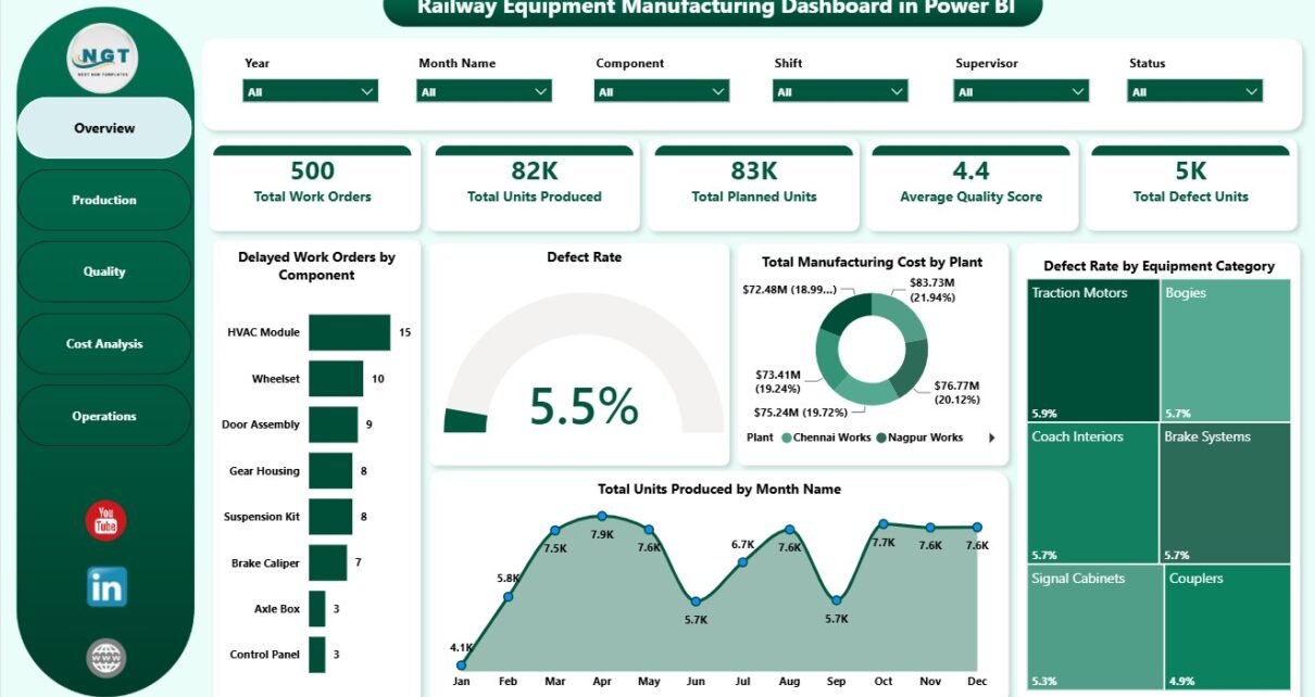
The Overview Page is the executive summary of the Power BI report. The top cards show Total Work Orders, Total Units Produced, Total Planned Units, Average Quality Score, and Total Defect Units, helping managers understand production volume, plan alignment, and quality risk at a glance.
Delayed Work Orders by Component: This chart shows which components are most often connected with delayed work orders. It helps planners locate material or component bottlenecks before they affect delivery schedules.
Defect Rate by Overall Production: This chart compares quality loss against production activity. It helps managers see whether higher output is also creating higher defect pressure.
Total Manufacturing Cost by Plant: This chart compares manufacturing cost across plants. It supports plant-level cost review and helps identify locations that need deeper budget or process analysis.
Defect Rate by Equipment Category: This chart highlights categories with higher defect rates. Quality and engineering teams can use it to focus inspection, root-cause analysis, and supplier follow-up.
Total Units Produced by Month Name: This chart shows output movement month by month. It helps teams spot production seasonality, low-output periods, and months that may require capacity review.
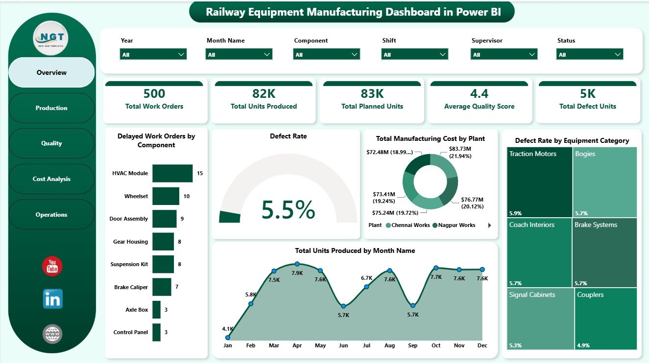
Railway Equipment Manufacturing Dashboard in Power BI
2 – Production
The Production page focuses on output, rework, shift performance, and production line cost. It is useful for plant managers and supervisors who need to compare production performance across operating units.
Total Rework Units by Plant: This chart compares rework volume by plant. It helps teams see where repeated production effort may be reducing efficiency.
Total Units Produced by Shift: This chart compares output by shift. It supports staffing, training, and daily production discussions.
Total Manufacturing Cost by Production Line: This chart shows which production lines carry higher manufacturing cost. It helps users identify lines that may need labor, material, or process review.
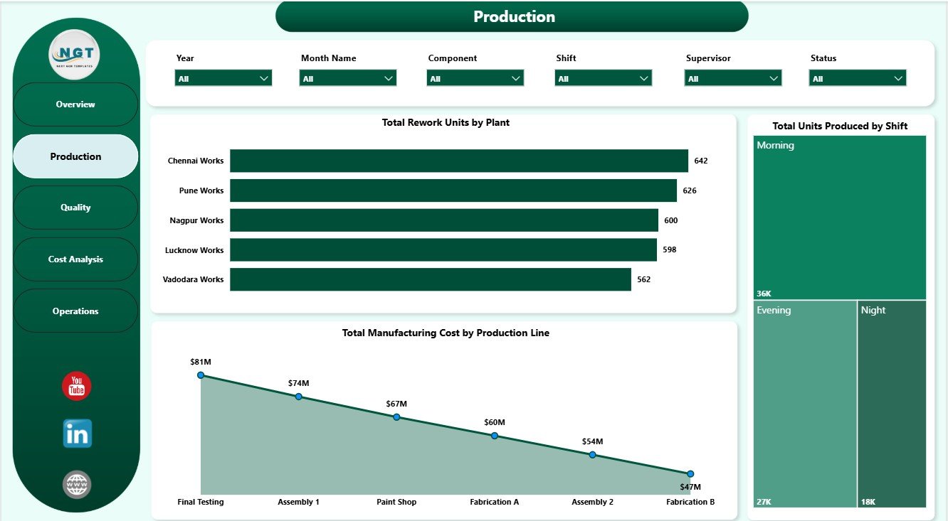
Production
3 – Quality
The Quality page connects cost, monthly quality movement, and supplier performance. It helps quality teams identify where defects are concentrated and whether supplier quality needs attention.
Total Manufacturing Cost by Equipment Category: This chart shows cost by equipment category. It helps teams see whether specific categories carry higher production cost because of complexity, materials, or rework.
Average Quality Score by Month Name: This chart tracks quality score month by month. It helps users identify improvement, decline, or stability in quality performance.
Defect Rate by Supplier: This chart compares supplier-level defect rates. It is useful for supplier scorecards, corrective action meetings, and procurement review.
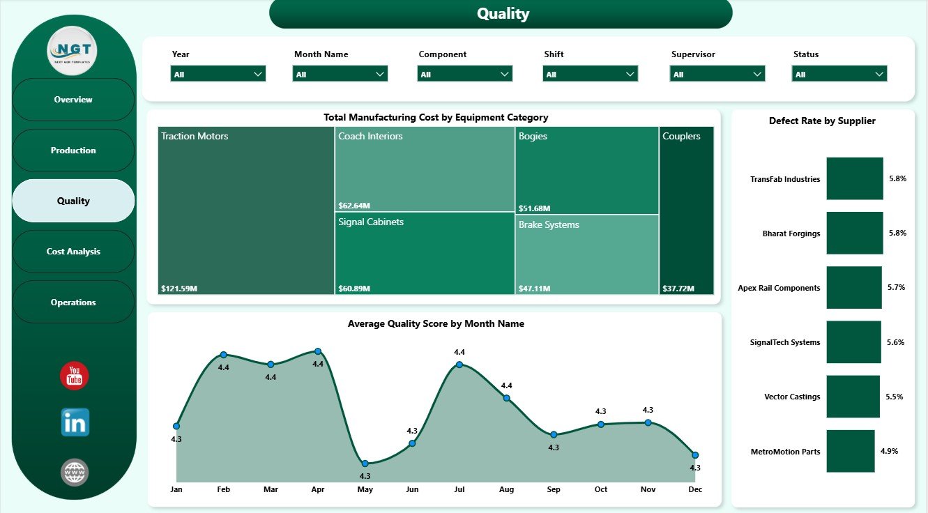
Quality
4 – Cost Analysis
The Cost Analysis page helps finance, operations, and production teams review manufacturing cost and production attainment together. It connects planned-versus-actual output with component-level cost visibility.
Production Attainment by Equipment Category: This chart compares actual production against planned production by category. It helps identify categories where output is meeting or missing plan.
Production Attainment by Production Line: This chart shows attainment at production-line level. It gives supervisors a clear view of which lines may need capacity, staffing, or process attention.
Total Manufacturing Cost by Component: This chart shows component-level cost contribution. It supports sourcing review, cost reduction, and engineering value-analysis discussions.
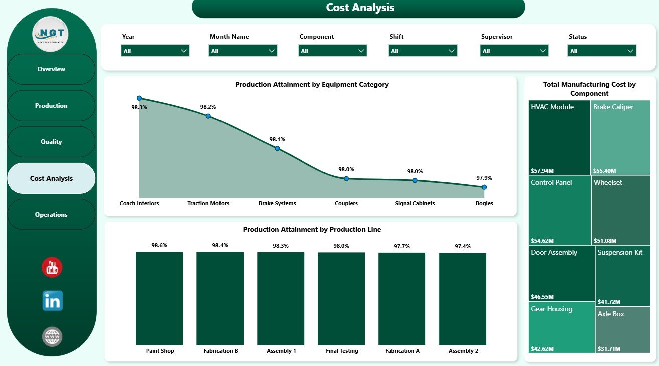
Cost Analysis
5 – Operations
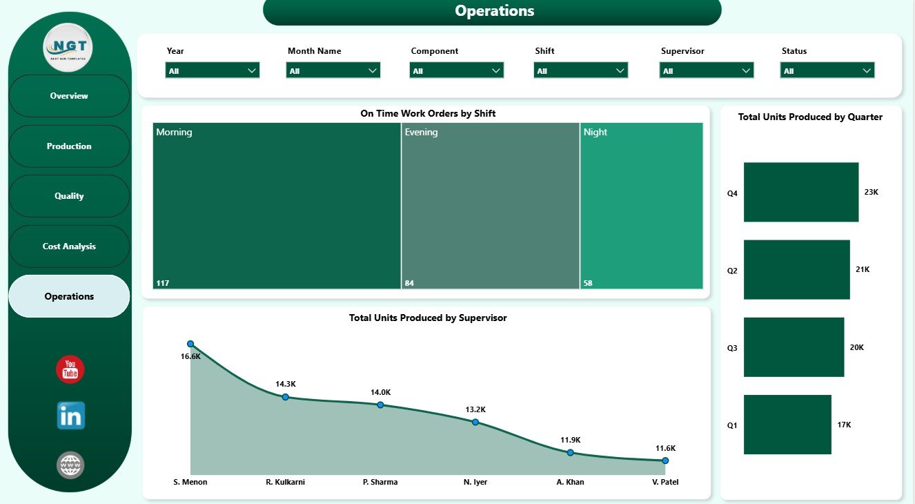
The Operations page reviews shift timeliness, supervisor output, and quarterly production direction. It is useful for leadership reviews where teams need to connect execution performance with people and time.
On Time Work Orders by Shift: This chart compares on-time work order completion by shift. It helps identify strong shifts and shifts that may need support.
Total Units Produced by Supervisor: This chart compares output by supervisor. It gives managers a starting point for workload review, coaching, and team performance discussion.
Total Units Produced by Quarter: This chart shows quarterly output movement. It helps leadership review broader trends beyond monthly production results.
Operations
Railway Equipment Manufacturing Dashboard in Power BI vs. Tableau vs. Paid CRM/SaaS – Feature Comparison
| Feature | This Power BI Dashboard | Tableau or Qlik Alternative | Paid Manufacturing SaaS |
|---|---|---|---|
| Cost | $17.99 one-time sale price | BI license plus analyst build time | Monthly or annual subscription |
| Platform | Power BI Desktop and optional Power BI Service | Desktop or cloud BI platform | Vendor cloud system |
| Setup time | Open PBIX, replace or connect data, refresh | Build visuals and model manually | Implementation and onboarding |
| Real-time team collaboration | Available after publishing to Power BI Service | Available by plan | Usually included |
| Mobile access | Available through Power BI mobile after publishing | Available through vendor app | Usually included |
| Customizable fields | Edit visuals, pages, model, measures, and source connections | Editable with BI skills | Often limited by configuration |
| Share with link | Available through Power BI workspace permissions | Available through platform permissions | Usually login controlled |
| Year-1 cost at 5 users | Template cost plus Microsoft licensing choice | License cost plus build time | Often hundreds or thousands per year |
| Railway manufacturing fit | Built around work orders, units, plans, defects, rework, quality score, suppliers, shifts, and cost | Must be designed manually | Depends on vendor module fit |
Who Should Use This Template
This template is a strong fit for production managers, plant managers, railway equipment manufacturers, quality leaders, cost controllers, procurement teams, manufacturing analysts, supervisors, and Power BI users who need recurring reporting from structured manufacturing data.
It is not intended to replace an ERP, MES, barcode scanning system, machine control system, supplier portal, or workflow approval platform. Use it when the goal is management reporting and decision support, especially when the source data can be exported or connected to Power BI.
Real-World Use Cases
A plant manager uses the Overview and Production pages before weekly meetings to review total work orders, output, rework, shift production, and delayed components.
A quality lead uses the Quality page to compare supplier defect rates, monthly quality score, and defect rate by equipment category before corrective action discussions.
A cost controller uses Cost Analysis to compare production attainment and manufacturing cost by component, equipment category, and production line before monthly variance review.
Advantages of Railway Equipment Manufacturing Dashboard in Power BI
- It gives manufacturing teams a ready report structure instead of a blank Power BI file.
- It combines production, quality, cost, and operations in one interactive report.
- It supports slicer-based filtering for fast management review.
- It can be customized in Power BI Desktop as business needs change.
- It is useful for recurring weekly, monthly, and quarterly reporting.
Opportunities for Improvement
The dashboard depends on clean source data. Inconsistent plant names, supplier labels, component descriptions, shift names, supervisor names, or equipment categories can create messy slicers and split chart values. It also does not automate production transactions or machine-level data capture.
For best results, use this dashboard as the reporting layer after exporting or preparing production data from ERP, MES, quality logs, or spreadsheet-based work order records.
Best Practices
- Open the PBIX file in Power BI Desktop before changing any source settings.
- Keep source columns consistent with the sample data structure.
- Standardize plant, supplier, component, equipment category, shift, line, and supervisor names.
- Refresh the report after replacing or connecting the data source.
- Check slicer selections before presenting final numbers.
- Use the Overview Page first, then review Production, Quality, Cost Analysis, and Operations for deeper explanation.
Explore Relevant Templates
- Railway Equipment Manufacturing Dashboard in Power BI
- Railway Equipment Manufacturing Dashboard in Excel
- Postal Services Dashboard in Power BI
- Chemical Manufacturing KPI Dashboard in Excel
- Browse Power BI Dashboard Templates
Frequently Asked Questions
What does the Railway Equipment Manufacturing Dashboard in Power BI track?
It tracks work orders, units produced, planned units, average quality score, defect units, defect rate, rework units, manufacturing cost, production attainment, suppliers, components, plants, shifts, supervisors, production lines, months, and quarters.
How many Power BI pages are included?
The report includes 5 pages: Overview Page, Production, Quality, Cost Analysis, and Operations.
Do I need Power BI Desktop?
Yes. Power BI Desktop is required to open and edit the PBIX file. Power BI Service is optional for sharing, workspace access, mobile access, and scheduled refresh.
Can I use my own railway manufacturing data?
Yes. Replace or connect the sample data source with your own structured production data and refresh the report.
Can I customize the visuals?
Yes. You can edit charts, cards, slicers, colors, measures, relationships, pages, and source connections in Power BI Desktop.
Does this replace ERP or MES software?
No. It is a reporting dashboard template, not an ERP, MES, barcode, machine control, or workflow automation system.
About the Author
Built by PK – Microsoft Certified Professional with 15+ years of Excel, Google Sheets, and Power BI experience. Founder of NextGenTemplates, reaching 300K+ subscribers across YouTube channels. Every template is hand-built and tested before release.
Conclusion
The Railway Equipment Manufacturing Dashboard in Power BI helps manufacturing teams turn production, quality, cost, supplier, component, shift, supervisor, and time-based data into a clear Power BI report. With 5 pages, executive KPI cards, slicers, and editable visuals, it is built for teams that need faster reporting without creating every page from scratch.
Click here to purchase Railway Equipment Manufacturing Dashboard in Power BI.
For more tutorials, visit YouTube.com/@PKAnExcelExpert.
Last updated: July 31, 2026