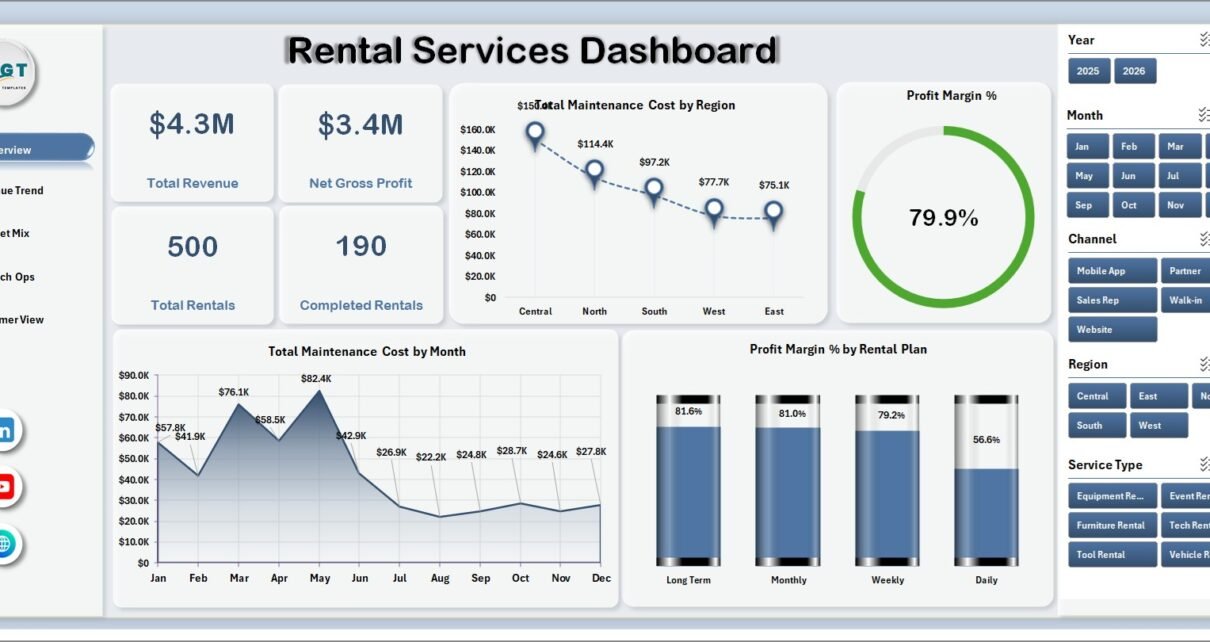
Rental service teams often have plenty of records but not enough reporting clarity. Revenue may sit in one export, maintenance cost in another file, customer ratings in a separate sheet, and branch updates in weekly emails. The Rental Services Dashboard in Excel brings that reporting into one editable workbook with 7 sheet tabs, 4 executive cards, 20 chart views, slicers, a structured Data Sheet, and a Support Sheet powered by pivot tables.
This template is designed for rental companies that want a practical Excel reporting layer before investing in a paid rental SaaS platform. Users can update the source data, click Refresh All, and review performance by region, month, channel, rental plan, service type, customer segment, status, and rating.
Click here to purchase Rental Services Dashboard in Excel
Rental Services Dashboard in Excel
Key Features of Rental Services Dashboard in Excel
- 7 worksheet tabs for Overview, Revenue Trend, Asset Mix, Branch Ops, Customer View, Data Sheet, and Support Sheet.
- 4 KPI cards showing Total Revenue, Net Gross Profit, Total Rentals, and Completed Rentals.
- 20 chart views for revenue, gross profit, maintenance cost, delivery cost, quantity, rental status, customer rating, discount, channel, region, plan, and service type.
- Multiple slicers so managers can filter the dashboard quickly during review meetings.
- Refreshable Excel model built with a Data Sheet and Support Sheet pivot structure.
- Editable workbook so Excel users can change labels, pivots, chart styles, slicers, and source fields.
Dashboard Pages Explanation
1. Overview Page
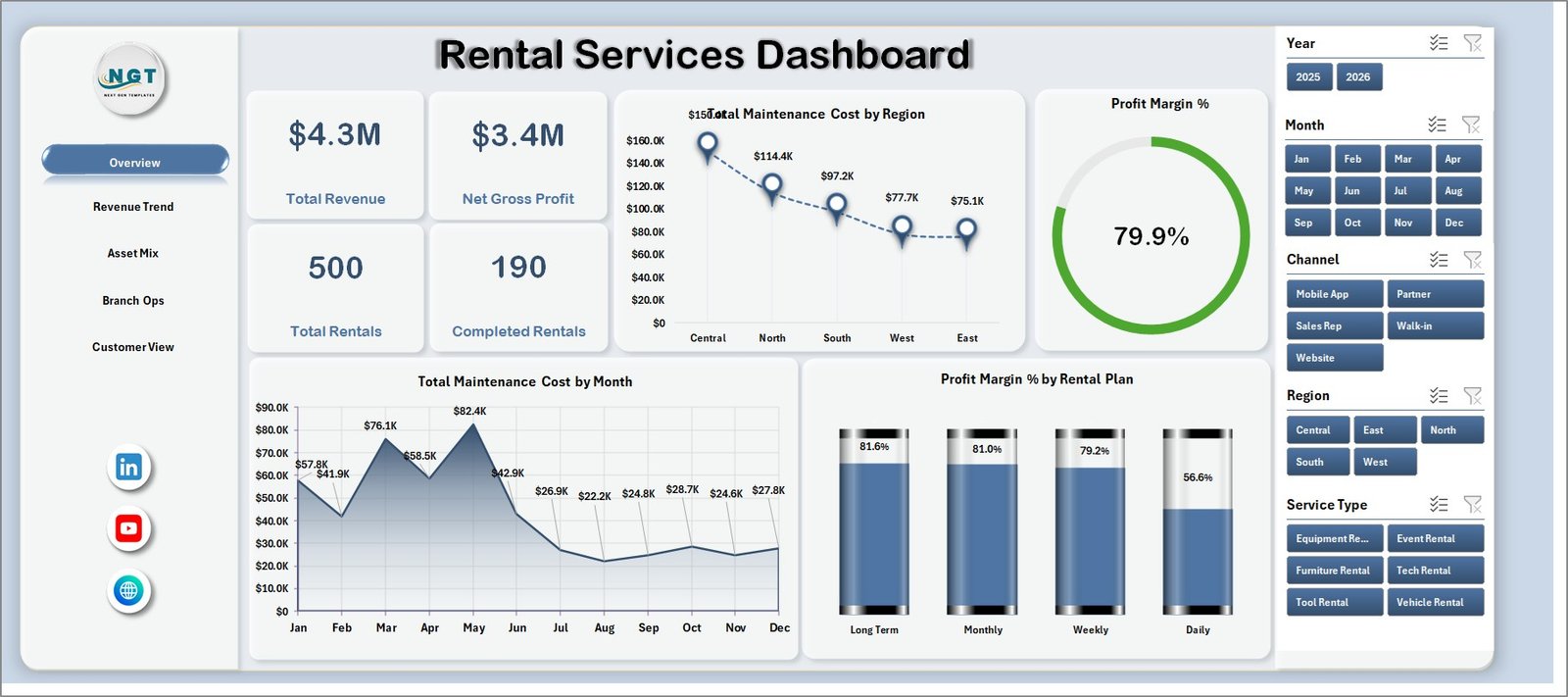
The Overview Page gives a high-level snapshot of rental business performance. The top cards show Total Revenue, Net Gross Profit, Total Rentals, and Completed Rentals, helping owners and managers understand overall business health before looking at the detailed tabs.
Total Maintenance Cost by Region: This chart compares maintenance cost across regions. It helps identify locations where repair, servicing, or asset care costs may be higher than expected.
Profit Margin % by Overall Rentals: This chart connects profit margin with rental volume. It helps managers see whether higher rental activity is creating healthier returns.
Total Maintenance Cost by Month: This chart tracks monthly maintenance spending. It helps finance and operations teams identify seasonal cost spikes and prepare better budgets.
Profit Margin % by Rental Plan: This chart compares margin across rental plans. It helps teams understand which plan types are contributing stronger profitability.
Overview Page
2. Revenue Trend
The Revenue Trend sheet focuses on time-based and channel-based performance. It is useful for monthly reviews, quarterly business analysis, and finance discussions where revenue, cost, quantity, and profit need to be compared together.
Total Revenue by Quarter: This chart shows revenue movement by quarter. It helps users spot growth, slowdown, and seasonality in rental demand.
Total Maintenance Cost by Rental Plan: This chart compares maintenance cost across plan types. It helps managers check whether certain plans create more service pressure.
Net Gross Profit by Channel: This chart compares profit contribution by sales or booking channel. It helps teams decide where marketing and operations attention should go.
Total Quantity by Month: This chart tracks monthly rental quantity. It helps operations teams compare demand volume against revenue and cost movement.
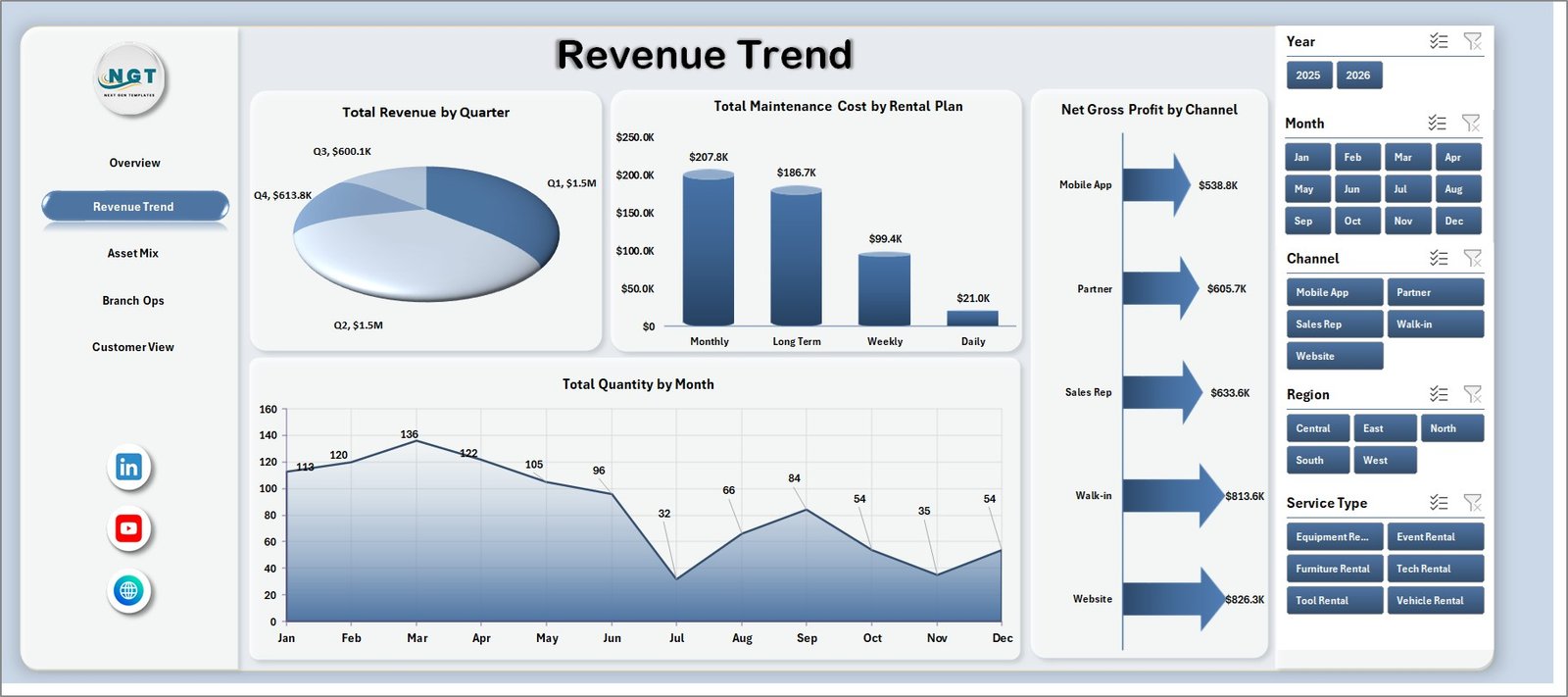
Revenue Trend
3. Asset Mix
The Asset Mix tab helps teams review how different service types, plans, regions, and channels affect profitability and cost. It is useful when a rental company needs to decide which services or plans should be expanded.
Profit Margin % by Service Type: This chart compares profitability across service types. It helps identify which service lines are producing better returns.
Avg. Rental Days by Rental Plan: This chart shows average rental duration by plan. It helps managers understand whether short-term or longer-term plans are keeping assets occupied.
Total Delivery Cost by Region: This chart compares delivery cost across regions. It supports logistics cost control and branch-level planning.
Total Revenue by Channel: This chart shows revenue by channel. It helps teams evaluate whether online, branch, partner, or direct channels are generating stronger revenue.
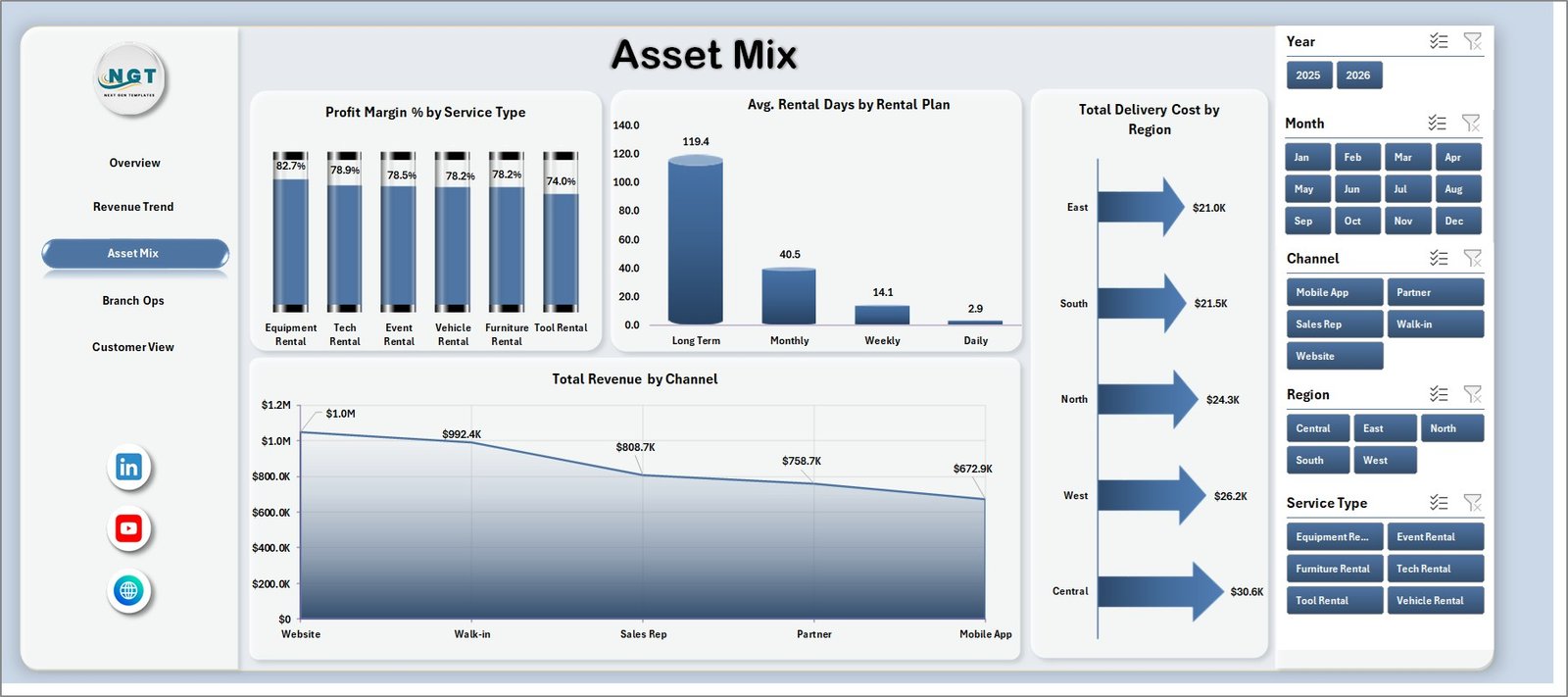
Asset Mix
4. Branch Ops
The Branch Ops sheet gives managers a focused operations view. It combines discount analysis, service-type revenue, customer-segment revenue, and rental status revenue so branch performance can be reviewed quickly.
Total Discount by Channel: This chart shows where discounts are being applied. It helps managers check whether discounts are concentrated in a few channels.
Total Revenue by Service Type: This chart compares revenue by service type. It helps branch teams identify the services that contribute most to business income.
Total Revenue by Customer Segment: This chart breaks revenue by customer segment. It helps teams understand whether corporate, retail, repeat, or other segments are driving demand.
Total Revenue by Status: This chart groups revenue by rental status. It helps users see how much revenue is completed, pending, cancelled, or otherwise categorized.
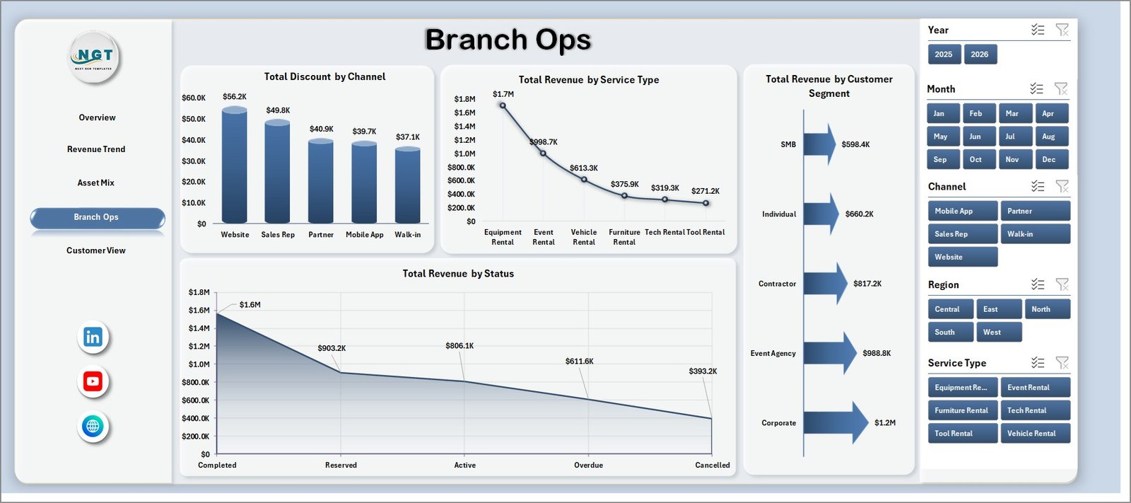
Branch Ops
5. Customer View
The Customer View sheet connects rental count, customer ratings, net gross profit, and regional margin. It helps teams look beyond revenue and understand how customer experience and profitability move together.
Total Rentals by Channel: This chart compares rental volume by channel. It shows where customers are booking most often.
Avg. Rating by Service Type: This chart compares service ratings by service type. It helps managers identify service areas where customer experience is strong or weak.
Net Gross Profit by Month: This chart tracks profit month by month. It helps users see whether the business is improving over time.
Profit Margin % by Region: This chart compares regional margin. It helps identify profitable regions and areas where cost or discounting may need attention.
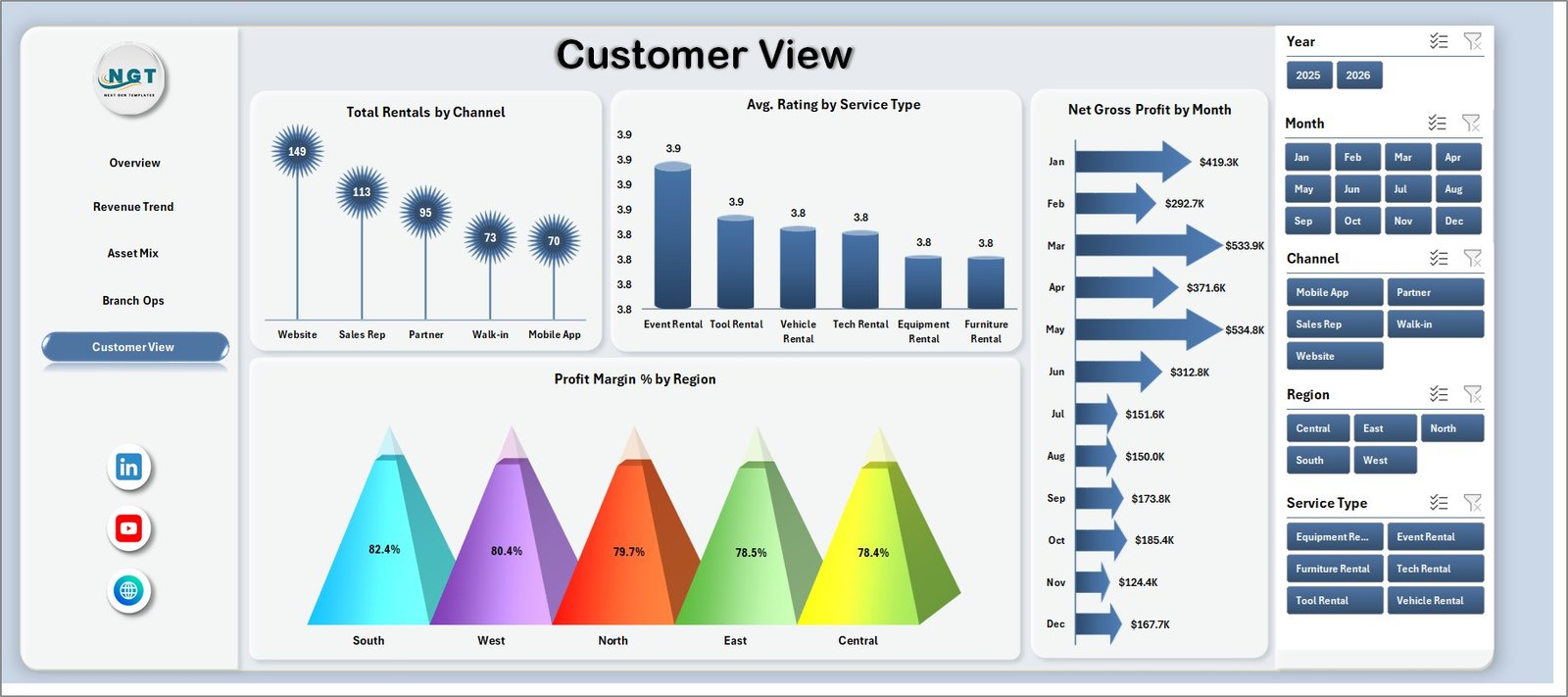
Customer View
6. Data Sheet Tab
The Data Sheet is where users enter or replace rental service records in the same format as the template. Keeping the same column structure helps the pivot tables, slicers, KPI cards, and charts refresh correctly.

Data Sheet tab
7. Support Sheet
The Support Sheet contains the pivot tables used to create the dashboard dynamically. After updating the Data Sheet, go to the Excel Data ribbon and click Refresh All. All pivots and charts refresh together. You can keep this sheet hidden before sharing the workbook with regular users.

Support sheet tab
Rental Services Dashboard in Excel vs. Google Sheets vs. Paid CRM/SaaS – Feature Comparison
| Feature | This Excel dashboard | Google Sheets alternative | Paid rental SaaS |
|---|---|---|---|
| Cost | $17.99 one-time sale price | Low software cost but manual setup required | Recurring subscription |
| Platform | Microsoft Excel | Google Sheets | Vendor cloud platform |
| Setup time | Update data and refresh pivots | Build sheets, formulas, charts, and filters | Onboarding and configuration |
| Real-time team collaboration | Available through Microsoft 365 sharing workflows | Native browser collaboration | Usually included |
| Mobile access | Excel mobile or web for light review | Google Sheets mobile app | Vendor app or browser |
| Customizable fields | Editable workbook, pivots, charts, and slicers | Editable spreadsheet model | Limited by vendor settings |
| Share with link | Possible through OneDrive or SharePoint | Native link sharing | Role-based access |
| Year-1 cost at 5 users | $17.99 template plus Excel access | Workspace cost plus build time | Often hundreds or thousands per year |
| Rental reporting | Revenue, profit, rentals, cost, channel, plan, status, region, and rating analysis | Must be built or adapted | Depends on modules purchased |
Who Should Use This Template
This template is ideal for rental service owners, equipment rental companies, event rental companies, vehicle rental teams, regional managers, finance analysts, customer service leaders, branch managers, and consultants who need repeatable Excel-based reporting.
It is best when source records are already available in Excel, CSV, or export format. It is not a live booking engine, payment system, customer portal, GPS dispatch tool, or maintenance work-order application.
Real-World Use Cases
Branch performance review: A branch manager uses Branch Ops to compare revenue by service type, discount by channel, and status-based revenue before a weekly operations meeting.
Profitability review: A finance analyst uses Revenue Trend and Customer View to review net gross profit by month, maintenance cost by plan, and margin by region.
Customer experience review: A service manager uses Avg. Rating by Service Type and Total Rentals by Channel to understand where customer satisfaction and demand are strongest.
Advantages of Rental Services Dashboard in Excel
- It centralizes rental revenue, profit, cost, channel, region, plan, service type, and customer metrics.
- It gives leaders KPI cards and detailed page-level analysis in one workbook.
- It reduces manual report preparation time for recurring rental reviews.
- It works inside Excel, so teams can edit formulas, pivots, slicers, and visuals.
- It supports quick filtering without rebuilding charts.
Opportunities for Improvement
The dashboard depends on clean source data. Region names, channel names, rental plan labels, service types, customer segments, statuses, and dates should be standardized before refresh. Teams that need live booking, inventory control, or customer communication should use this workbook as a reporting layer connected to exported operational data.
Best Practices
- Keep the Data Sheet column structure unchanged unless you also update the pivots.
- Use consistent names for region, channel, rental plan, service type, status, and customer segment.
- Refresh all pivots after every major data update.
- Check slicer selections before presenting numbers.
- Review profit and cost together instead of revenue alone.
- Keep the Support Sheet hidden if end users only need dashboard pages.
For official Excel guidance, see Microsoft Support: Create a PivotTable to analyze worksheet data.
Explore Relevant Templates
- Rental Services Dashboard in Excel
- Car Rental Services Dashboard in Power BI
- Car Rental Services KPI Dashboard in Excel
- MS Excel templates
Frequently Asked Questions
What is the Rental Services Dashboard in Excel?
It is a ready-to-use Excel dashboard for tracking rental revenue, gross profit, total rentals, completed rentals, maintenance cost, delivery cost, customer ratings, regions, channels, plans, service types, statuses, and customer segments.
How many sheets are included?
The workbook includes 7 tabs: Overview, Revenue Trend, Asset Mix, Branch Ops, Customer View, Data Sheet, and Support Sheet.
Can I use my own rental data?
Yes. Replace the sample data in the Data Sheet with your own records in the same format, then refresh all pivots and charts.
Does this dashboard require macros?
No. The dashboard is built with Excel tables, pivot tables, charts, and slicers.
Can I hide the Support Sheet?
Yes. The Support Sheet contains pivot tables and can be hidden during regular dashboard use.
Does this replace rental management software?
No. It is a reporting dashboard, not a live booking, payment, dispatch, customer portal, or inventory control system.
About the Author
Built by PK – Microsoft Certified Professional with 15+ years of Excel, Google Sheets, and Power BI experience. Founder of NextGenTemplates, reaching 300K+ subscribers across YouTube channels. Every template is hand-built and tested before release.
Conclusion
The Rental Services Dashboard in Excel gives rental businesses a practical way to review revenue, net gross profit, total rentals, completed rentals, maintenance cost, delivery cost, discounts, channels, plans, service types, regions, statuses, and customer ratings. With 7 tabs, 4 KPI cards, 20 chart views, slicers, a Data Sheet, and a Support Sheet, it is built for repeatable rental service reporting without starting from a blank workbook.
Click here to purchase Rental Services Dashboard in Excel
Visit our YouTube channel to learn step-by-step Excel dashboard tutorials.