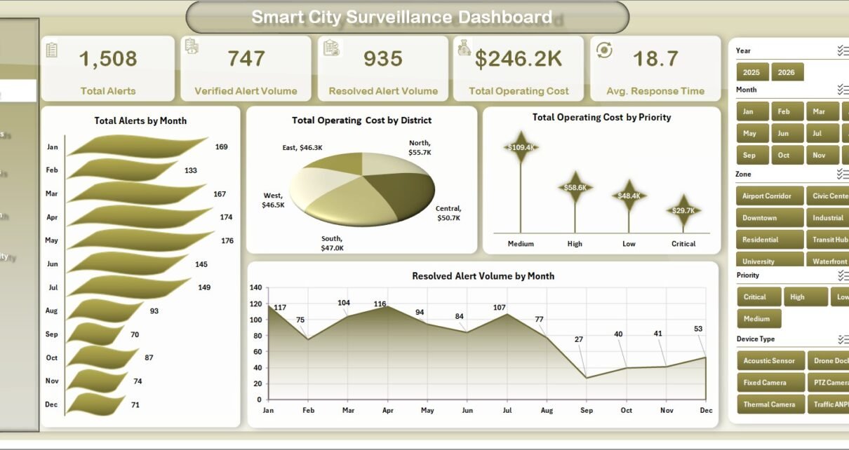
Smart City Surveillance Dashboard in Excel helps city operations, public safety, CCTV monitoring, and command-center teams convert incident records into clear dashboard insights. A surveillance program can generate thousands of alerts across zones, districts, device types, vendors, shifts, and priorities, and even a small delay in reviewing response time or unresolved alerts can affect service quality. This Excel dashboard brings the main numbers together in one workbook: Total Alerts, Verified Alert Volume, Resolved Alert Volume, Total Operating Cost, Avg. Response Time, verified alert percentage, resolved alert percentage, vendor analysis, device health, and support pivot tables.
The template is built for Microsoft Excel users who want a ready-to-use reporting file without building formulas, slicers, pivot tables, and charts from zero. You can replace the sample records in the data sheet, refresh the workbook, and review the dashboard pages using the slicers and charts already included. For Excel refresh guidance, you can also refer to Microsoft Support on refreshing PivotTable data.
Smart City Surveillance Dashboard in Excel
Key Features of Smart City Surveillance Dashboard in Excel
This dashboard is designed around practical surveillance operations metrics. It includes multiple dashboard pages, KPI cards, monthly trends, cost analysis, response analysis, status breakdowns, incident type performance, vendor comparisons, district-level views, and pivot-backed support tables.
The workbook uses slicers to filter the dashboard quickly, so users can review alert performance by time period, zone, district, priority, status, vendor, shift, device type, and incident type where those fields are available in the data. This makes the file useful for recurring review meetings as well as deeper operational checks.
- Overview cards for Total Alerts, Verified Alert Volume, Resolved Alert Volume, Total Operating Cost, and Avg. Response Time.
- Multiple analysis pages for incident trends, zone analysis, device health, and response quality.
- Pivot-table driven charts that update after the data sheet is refreshed.
- Dedicated data sheet for adding surveillance incident records in the same structure.
- Support sheet with pivot tables used to power the dynamic dashboard visuals.
- Excel slicers for fast filtering across surveillance and command-center dimensions.
Dashboard Pages Explanation
1. Overview Page
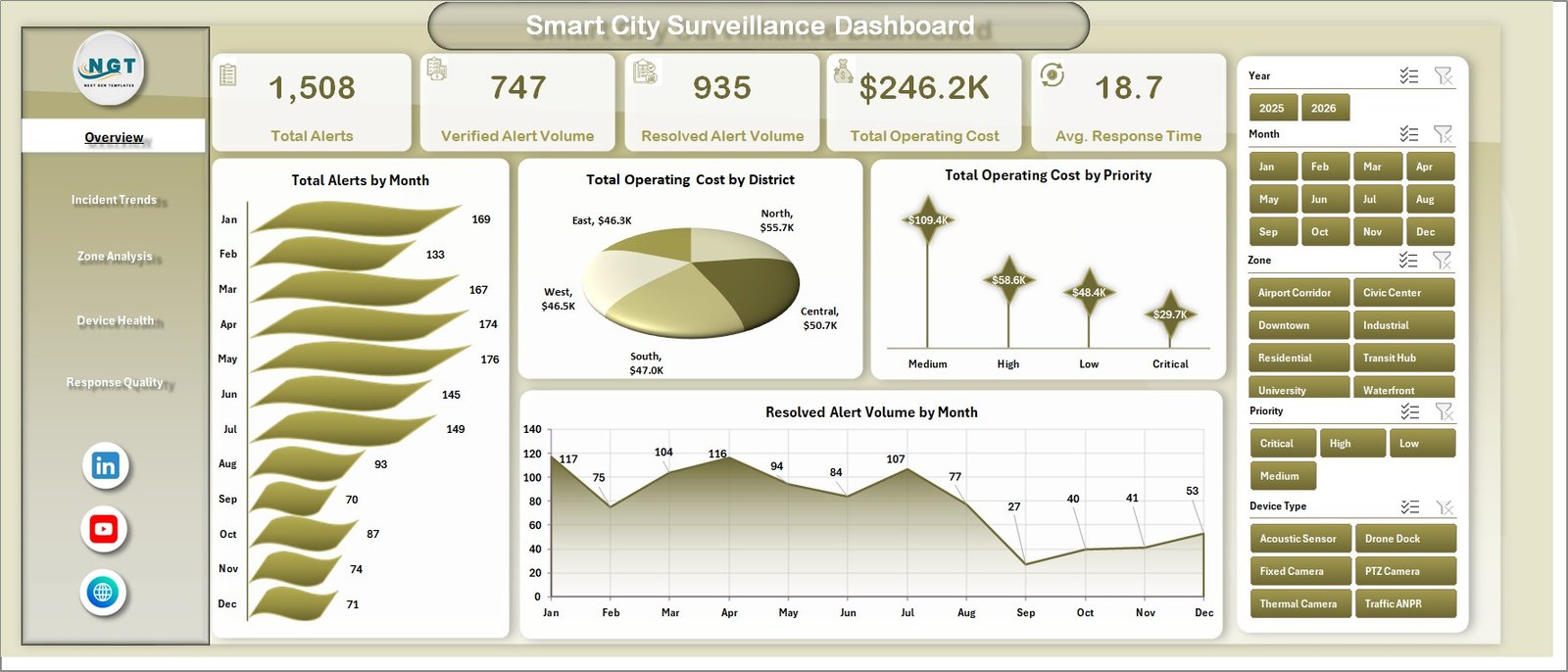
The Overview page gives leadership and operations teams a high-level picture of surveillance activity. The cards at the top show Total Alerts, Verified Alert Volume, Resolved Alert Volume, Total Operating Cost, and Avg. Response Time, helping users see workload, cost, and response quality in one place.
Total Alerts by Month shows how alert volume changes across the year. This chart helps identify seasonal spikes, recurring pressure periods, or months where surveillance operations need closer review.
Total Operating Cost by District compares spending across districts. It helps managers locate areas with higher surveillance costs and review whether those costs align with alert volume and response demand.
Total Operating Cost by Priority shows how cost is distributed across priority levels. This is useful for understanding whether high-priority incidents are consuming the expected share of operational resources.
Resolved Alert Volume by Month tracks monthly resolution output. When compared with total alerts, it helps users see whether the team is keeping pace with incoming surveillance events.
2. Incident Trends
The Incident Trends sheet focuses on alert movement, cost patterns, status distribution, and incident-type resolution performance. It is useful for monthly reviews and for spotting operational pressure across different periods and classifications.
Total Operating Cost by Zone shows which zones are consuming the most operational budget. This can guide staffing, maintenance, and resource allocation decisions.
Total Operating Cost by Year compares yearly spending patterns. It helps teams evaluate whether surveillance operating costs are increasing, decreasing, or staying stable over time.
Total Alerts by Status breaks alerts into operational status groups. This makes it easier to monitor unresolved, pending, verified, or closed work depending on how the data is maintained.
Resolved Alert % by Incident Type compares the resolution rate across incident types. It helps identify categories where processes may be strong and categories where follow-up needs improvement.
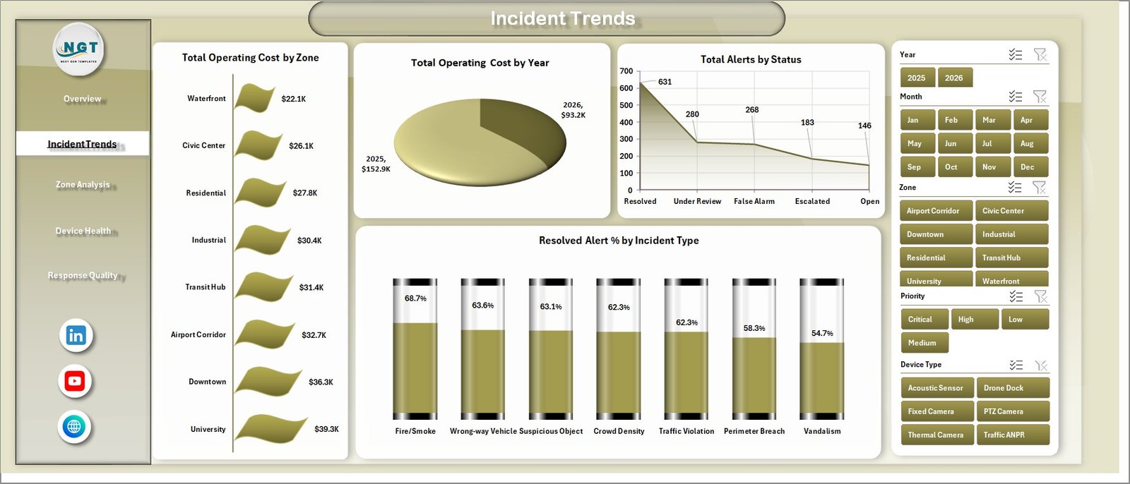
Incident Trends
3. Zone Analysis
The Zone Analysis sheet helps compare surveillance performance by district, vendor, shift, and device type. It is useful when managers need to understand where alert handling is efficient and where operating cost or response time needs attention.
Avg. Response Time by District compares how quickly teams respond across different districts. Long response-time districts can be reviewed for staffing, geography, workload, or escalation issues.
Total Alerts by Vendor shows alert volume linked to each vendor. This chart can support vendor performance reviews and device network quality discussions.
Total Operating Cost by Shift compares cost across day, evening, night, or other shift categories. It helps identify which shifts carry the highest cost load.
Total Operating Cost by Device Type shows cost by camera, sensor, or other surveillance device types. This helps users review whether certain device groups are more expensive to operate.
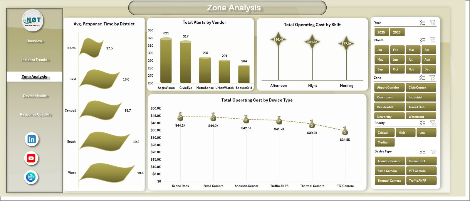
Zone Analysis
4. Device Health
The Device Health sheet focuses on vendor, priority, status, and zone views. It helps teams review whether surveillance infrastructure and alert handling are performing consistently across the network.
Resolved Alert % by Vendor compares resolution percentages by vendor. It can reveal whether some vendor-managed assets or systems need more support.
Resolved Alert % by Priority shows whether high, medium, and low priority alerts are being resolved effectively. This is useful for validating that urgent alerts receive the right attention.
Verified Alert Volume by Status connects verified alert counts with status categories. It helps users understand the current state of verified events after operator review.
Total Alerts by Zone compares alert volume across zones. High-alert zones may need camera tuning, field inspection, preventive action, or more focused review.
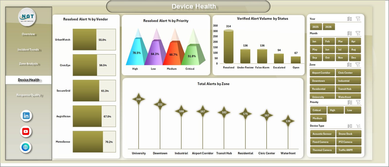
Device Health
5. Response Quality
The Response Quality page helps users evaluate verification quality, operator rating, and monthly verification trends. It is useful for supervision, training, process audits, and performance improvement reviews.
Verified Alert % by Incident Type shows how often alerts are verified across incident categories. Low verification percentages may indicate false alerts, device tuning issues, or classification problems.
Avg. Operator Rating by Shift compares operator quality ratings by shift. This can help supervisors identify coaching needs or strong practices by time period.
Verified Alert % by Month tracks the verified alert percentage over time. It helps teams see whether alert quality and operator verification are improving month by month.
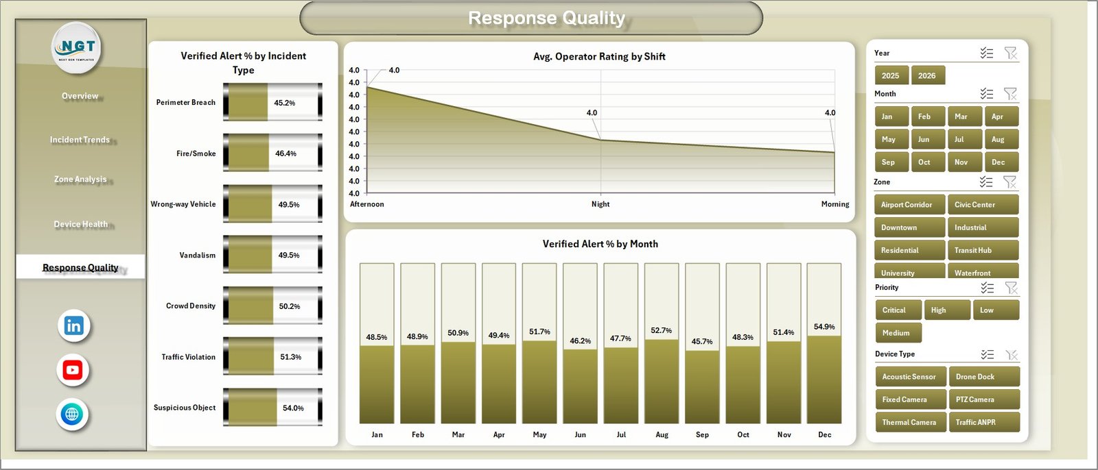
Response Quality
6. Data Sheet Tab
The Data sheet is where you add or update the source records in the same format as the sample data. After updating this sheet, refresh the workbook so the pivot tables and dashboard charts reflect the latest surveillance data.

Data Sheet tab
7. Support Sheet
The Support sheet contains the pivot tables used to create the dynamic dashboard. After changing the data sheet, go to the Data tab in the Excel Ribbon and click Refresh All. The pivots and charts will refresh. You can keep this sheet hidden during normal use.

Support sheet tab
Smart City Surveillance Dashboard in Excel vs. Google Sheets vs. Paid CRM/SaaS – Feature Comparison
| Feature | This Excel Dashboard | Google Sheets Alternative | Paid SaaS Alternative |
|---|---|---|---|
| Cost | One-time template purchase | Usually free with a Google account | Monthly or annual subscription |
| Platform | Microsoft Excel desktop workbook | Browser-based spreadsheet | Cloud software platform |
| Setup time | Fast; replace sample data and refresh | Fast, but dashboard formatting may vary | Longer onboarding and configuration |
| Real-time team collaboration | Limited unless stored in OneDrive or SharePoint | Strong collaboration features | Usually strong, depending on license |
| Mobile access | Available through Excel mobile with layout limits | Good browser/mobile access | Usually available through app or web |
| Customizable fields | High, if your team can edit Excel structure | High, with spreadsheet knowledge | Depends on vendor configuration limits |
| Share with link | Possible through cloud storage | Built in | Built in |
| Year-1 cost at 5 users | Template price plus existing Microsoft 365 cost | Google Workspace cost if using business accounts | Often significantly higher |
| Pivot-based surveillance analysis | Included | Possible, but must be built or adapted | Depends on reporting module |
| Local file control | Strong | Cloud-first | Vendor-controlled environment |
Who Should Use This Template
This template is a good fit for smart city teams, CCTV monitoring units, command centers, municipal operations teams, public safety analysts, security vendors, and consultants who need a structured way to report surveillance alerts in Excel.
It is also useful for teams that receive incident exports from another system and want a presentation-ready dashboard without paying for a full SaaS reporting platform. It is not the right fit if you need live camera feeds, real-time dispatch integration, automated emergency alerts, or multi-user case management workflows.
Real-World Use Cases
Municipal command center manager: reviews Total Alerts, Avg. Response Time, and Resolved Alert Volume before weekly operations meetings.
Public safety analyst: compares incident types, zones, and districts to find areas where alerts are growing or response quality is changing.
Security vendor supervisor: uses vendor, shift, and device type charts to prepare monthly service performance discussions.
Advantages of Smart City Surveillance Dashboard in Excel
The biggest advantage is speed. You get a ready Excel reporting structure with KPI cards, slicers, charts, data input, and support pivots already arranged. The dashboard also keeps the data model visible, so an Excel user can audit, modify, and extend the workbook as reporting needs change.
Another advantage is ownership. Because the file is Excel-based, teams can keep their reporting process inside a familiar tool, share it internally, and adjust calculations without waiting for a SaaS vendor or external developer.
Opportunities for Improvement
This template is designed for reporting and analysis, not live surveillance operations. Teams that need live alert routing, direct camera integration, incident dispatch, or automatic notifications should use a dedicated public safety or security operations platform and use this workbook as a reporting companion.
For larger deployments, you may also connect Excel to Power Query, a database export, or a structured CSV process so the data sheet is updated more consistently.
Best Practices
- Keep the same column structure in the Data sheet when replacing sample data.
- Use consistent names for zones, districts, vendors, priorities, statuses, and incident types.
- Refresh all pivot tables after updating the Data sheet.
- Keep the Support sheet hidden for normal users, but available for admins.
- Review Avg. Response Time together with alert volume so performance is interpreted fairly.
Explore Relevant Templates
You can explore more Excel dashboard templates on NextGenTemplates Excel Dashboard templates. For this specific workbook, use the product listing on NextGenTemplates after the product draft is published: Smart City Surveillance Dashboard in Excel.
Frequently Asked Questions
Can I use this dashboard with my own surveillance data?
Yes. Replace the sample records in the Data sheet using the same format, then refresh the workbook so the pivot tables and charts update.
Does this template require macros?
No macro requirement is mentioned for this dashboard. It is designed around Excel sheets, charts, slicers, and pivot tables.
Can I filter the dashboard?
Yes. The dashboard includes slicers so you can quickly filter the analysis and review specific sections of the surveillance data.
What pages are included?
The workbook includes Overview, Incident Trends, Zone Analysis, Device Health, Response Quality, Data Sheet, and Support Sheet tabs.
Can I hide the Support sheet?
Yes. The Support sheet contains pivot tables used by the dashboard, and it can be kept hidden during normal use.
Is this a live monitoring system?
No. This is an Excel reporting dashboard for analyzing alert and response data, not a live CCTV or dispatch platform.
About the Author
Built by PK – Microsoft Certified Professional with 15+ years of Excel, Google Sheets, and Power BI experience. Founder of NextGenTemplates, reaching 300K+ subscribers across YouTube channels. Every template is hand-built and tested before release.
Conclusion
The Smart City Surveillance Dashboard in Excel is a practical reporting template for teams that need better visibility into alerts, response time, cost, verification, resolution, vendor performance, zone activity, and device-related trends. It gives smart city and surveillance teams a clear Excel-based way to review performance, refresh data, and present insights without starting from a blank workbook.
For more tutorials, visit PK: An Excel Expert on YouTube.