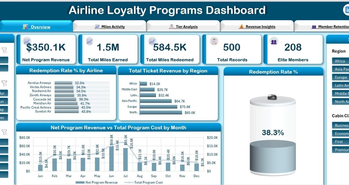
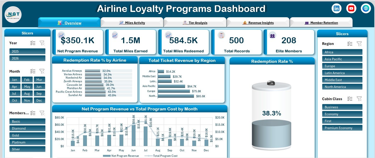
Loyalty programmes are one of the few parts of an airline that generate revenue without flying an aircraft, and they are also one of the hardest parts to report on. Miles are issued in one system, burned in another, and the finance team wants a single number for what the programme actually netted. The Airline Loyalty Programs Dashboard in Excel is a five-page report built to answer exactly that in one workbook. The sample build reads 500 member records and reports $350.1K net programme revenue, 1.5M miles earned, 584.5K miles redeemed, a 38.3% redemption rate and 208 elite members – all of it recalculating when you touch any of the five slicers.
Important: every figure shown in this article and in the screenshots is sample data shipped with the template. It is not real airline, member or revenue data, and the carrier names in the sample set are invented.
Key Features of the Airline Loyalty Programs Dashboard in Excel
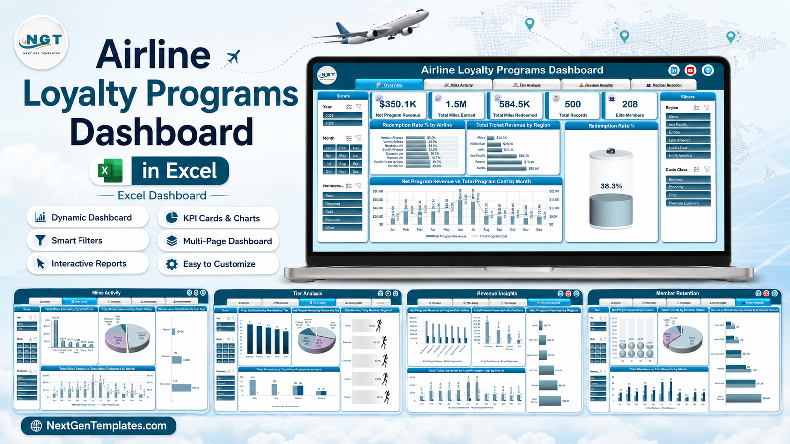
- Five report pages – Overview, Miles Activity, Tier Analysis, Revenue Insights and Member Retention – with a tab strip on every page so you move between them in one click.
- Five KPI cards on the Overview: Net Program Revenue, Total Miles Earned, Total Miles Redeemed, Total Records and Elite Members.
- Five slicers on every page – Year, Month, Membership Tier, Region and Cabin Class – each filtering all the visuals on that page at once.
- Eighteen charts, all native Excel pivot charts, so they extend automatically as rows are added rather than needing their ranges edited.
- An earn-and-burn split: miles accrued by partner type against miles redeemed by cabin class, on the same page.
- Five membership tiers reported three different ways – satisfaction, revenue share and elite-member count.
- No macros, no add-ins, no subscription. It is a plain .xlsx file that opens in Excel 2016 or later and in Microsoft 365.
Everything in the file is built with pivot tables and slicers rather than volatile formulas. If you have not used slicers to drive several pivot charts at once, Microsoft’s own guide to using slicers to filter data is the clearest short explanation of the mechanism this dashboard relies on.
Dashboard Pages Explanation
Page 1 – Overview
The Overview is the page you send upward. It carries the five KPI cards across the top, then four visuals: Redemption Rate % by Airline ranking eight partner carriers from 32.0% to 43.8%, Total Ticket Revenue by Region with North America leading at $85.6K, a Redemption Rate % gauge reading 38.3% overall, and a combination chart of Net Program Revenue vs Total Program Cost by Month.
That last chart is the one that earns the page. Revenue is plotted as columns and cost as a line on a secondary axis, so the months where cost climbs faster than revenue are visible without any arithmetic. In the sample data June and July carry both the highest revenue and the highest cost, which is exactly the pattern a seasonal programme produces.
Page 2 – Miles Activity
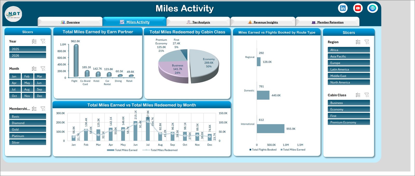
Miles Activity is the accrual and redemption page. Total Miles Earned by Earn Partner splits the six sources – Flight at 962.8K dominates, followed by Co-Brand Card 185.1K, Hotel 142.7K, Car Rental 123.8K, Dining 60.5K and Retail 49.6K. Total Miles Redeemed by Cabin Class shows Economy taking half the redemptions at 289.6K, Business 24%, Premium Economy 21% and First just 5%.
Miles Earned vs Flights Booked by Route Type is the interesting one: Domestic carries the most flights (781) but International generates far more miles (955.9K against 440.6K), which is the sort of divergence that changes how you value a route in the programme. Total Miles Earned vs Total Miles Redeemed by Month then puts both curves on one timeline so the liability gap is a shape rather than a spreadsheet column.
Page 3 – Tier Analysis
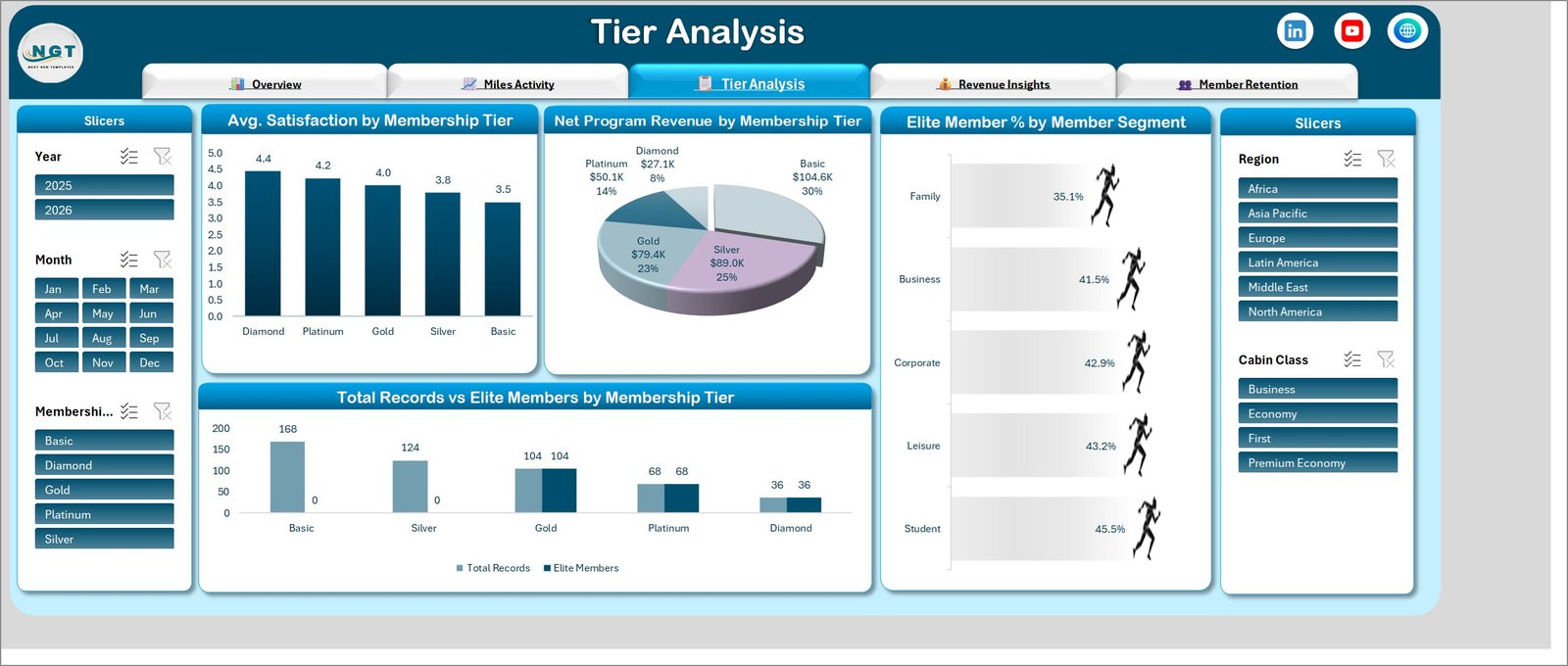
Four charts on how the tier ladder actually behaves. Avg. Satisfaction by Membership Tier runs cleanly downward from Diamond 4.4 to Basic 3.5. Net Program Revenue by Membership Tier runs the other way: Basic contributes the largest share at $104.6K (30%) while Diamond contributes $27.1K (8%). Elite Member % by Member Segment compares Family, Business, Corporate, Leisure and Student, and Total Records vs Elite Members by Membership Tier shows elite status starting at Gold – Basic and Silver record zero elite members.
Read together, those two facts – highest satisfaction at the top, highest revenue at the bottom – are the standing tension in almost every loyalty programme, and having them side by side on one page is more useful than either chart alone.
Page 4 – Revenue Insights
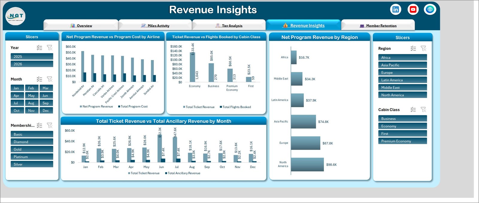
The commercial page. Net Program Revenue vs Program Cost by Airline puts revenue and cost bars side by side for all eight partner carriers, so a carrier that looks strong on volume but thin on margin has nowhere to hide. Ticket Revenue vs Flights Booked by Cabin Class pairs $133.4K of Economy revenue across 1,043 flights against $23.5K of First revenue across 59 – roughly $128 and $398 per flight respectively in the sample set.
Net Program Revenue by Region ranks the six regions from North America at $98.6K down to Africa at $16.7K, and Total Ticket Revenue vs Total Ancillary Revenue by Month keeps the ancillary line visible next to the ticket line rather than buried in a total.
Page 5 – Member Retention
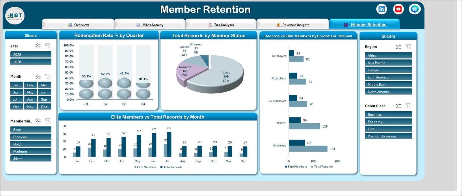
Retention closes the report. Redemption Rate % by Quarter shows the rate rising from 36.1% in Q1 to 41.5% in Q3 before dropping to 31.1% in Q4. Total Records by Member Status splits the base into Active 309 (62%), Dormant 101 (20%), Lapsed 65 (13%) and Churned 25 (5%).
Records vs Elite Members by Enrollment Channel is the page’s most actionable chart: Mobile App produced the most sign-ups (161) and the most elite members (67), but Airport Desk converted 35 of 72 – close to half – which is a materially better ratio than the app’s 42%. Elite Members vs Total Records by Month finishes with the enrolment trend over the year.
Airline Loyalty Programs Dashboard in Excel vs. Google Sheets vs. Paid Loyalty SaaS – Feature Comparison
| This Excel dashboard | Google Sheets loyalty tracker | Paid loyalty platform | |
|---|---|---|---|
| Cost | $17.99 one-off | Free to $30 one-off | $500-$3,000+ per month |
| Platform | Excel 2016+ / Microsoft 365 | Browser | Vendor cloud |
| Setup time | Under 15 minutes | Under 15 minutes | 4-12 weeks |
| Real-time team collaboration | Via OneDrive or SharePoint | Yes, built in | Yes |
| Mobile access | Excel mobile app | Yes | Yes |
| Customisable fields | Fully | Fully | Vendor-defined schema |
| Share with link | Yes, via OneDrive | Yes | Yes |
| Year-1 cost at 5 users | $17.99 | $0-$30 | $6,000-$36,000+ |
| Miles earn vs burn by partner | Built in | Build it yourself | Yes |
| Issues points and runs campaigns | No – reporting only | No | Yes |
The distinction that matters: a loyalty platform operates the programme, this workbook reports on it. They are not competitors. Most teams that buy this already have a platform and simply need the monthly view their platform’s built-in reporting does not give them.
Who Should Use This Template
It suits loyalty and CRM analysts at airlines and travel groups, revenue-management teams that need programme cost sitting next to programme revenue, co-brand card partnership managers reviewing accrual volumes, consultants preparing a loyalty review, and analysts building a portfolio piece with realistic airline structure. It also works well for any points-based programme outside aviation – hotel, retail or fuel – because the underlying model is earn, burn, tier and channel rather than anything aircraft-specific.
It is not the right tool if you need to issue points, run tier promotions, or contact members. It does none of that. It is a reporting layer, not an operating system.
Real-World Use Cases
Monthly programme pack. An analyst pastes the export, hits Refresh All, and screenshots the Overview and Revenue Insights pages straight into the deck. What used to be six loose pivot tables becomes two images that always agree with each other because they read the same model.
Co-brand partner review. Filter Miles Activity to the Co-Brand Card earn partner and one region, then cross-check the elite-member counts on Member Retention. That answers whether card acquisition is producing flying members or dormant accounts – a question the card issuer will ask directly.
Tier threshold redesign. Tier Analysis shows revenue concentrated in Basic while satisfaction concentrates in Diamond. Presenting both in one screenshot reframes a threshold discussion faster than a memo can.
Channel budget allocation. The enrolment-channel chart on Member Retention separates volume from conversion. A channel producing half the sign-ups but twice the elite conversion rate is a different budget decision than a raw sign-up count suggests.
Advantages of the Airline Loyalty Programs Dashboard in Excel
- Nothing to install. No macros to enable, no add-in for IT to approve, no account to create.
- Self-extending. Because every visual is a pivot chart, new tiers, regions, carriers or earn partners appear after a refresh without touching a single chart range.
- Aggregate-first. Every chart in the file runs on counts and sums by tier, region, channel, cabin class and date. You never need to load member names, emails or card numbers to produce any of it.
- Consistent numbers. One model feeds all five pages, so the revenue figure on the Overview cannot drift from the one on Revenue Insights.
- Fast to hand over. A colleague opens the file and reads it. There is no onboarding.
Opportunities for Improvement
Being honest about the boundaries is more useful than pretending there are none.
- It is a snapshot, not a ledger. There is no miles-liability accrual schedule and no breakage estimate. If you need to value outstanding miles for accounting, that calculation sits outside this file.
- No automated refresh. You paste or link your export and click Refresh All. There is no scheduled pull from a loyalty platform API.
- Row limits are real. Tens of thousands of rows are comfortable. Beyond roughly 200,000 the workbook slows noticeably, and at that scale the Power BI build is the better home.
- No member-level drillthrough. Deliberately – the dashboard is designed to stay at aggregate level so it never needs personal data in it.
- Date handling is strict. If your export writes dates as text, the Month and Year slicers will not group until you convert them.
Best Practices
- Strip personal columns before you paste. Names, emails, card numbers and phone numbers are not used by any chart in the file. Leaving them out keeps a widely-shared workbook out of scope for most data-protection headaches.
- Keep dates as dates. Convert text dates with Power Query or Text to Columns before pasting, or the time slicers will not behave.
- Match the column order of the sample Data sheet rather than reordering the model.
- Refresh before you screenshot. Data > Refresh All, every time. A stale pivot cache is the most common reason two charts disagree.
- Keep one file per reporting period if you need history. The workbook reports what is in it; it does not archive.
- Clear slicers before sharing. A filtered slicer travels with the file, and a colleague opening a pre-filtered Overview will read the wrong totals.
Explore Relevant Templates
- Airline Loyalty Programs Dashboard in Excel – the template covered in this article.
- Airline Loyalty Programs Dashboard in Power BI – the same five pages rebuilt as a PBIX report for larger datasets.
- Aircraft Leasing Dashboard in Excel – fleet and lease-portfolio reporting.
- Business Travel Services Dashboard in Excel – corporate travel spend and supplier mix.
- Airports Dashboard in Excel – passenger, movement and terminal metrics.
- Airline Catering Dashboard in Excel – meal cost and service-quality reporting.
- Alumni Associations Dashboard in Excel – another membership-and-engagement model.
- Carpooling Platforms Dashboard in Excel – transport-side usage and retention reporting.
Frequently Asked Questions
Which versions of Excel does it work in?
Excel 2016, 2019, 2021 and Microsoft 365 on Windows. It uses only pivot tables, pivot charts and slicers, so there are no version-specific dynamic-array formulas. Excel for Mac opens and reads the file, though slicer styling can look slightly different.
Does the file contain macros?
No. It is a plain .xlsx workbook, so there is nothing to enable and nothing for IT to whitelist.
Are the numbers in the screenshots real?
No. All 500 records are generated sample data used to demonstrate layout and behaviour. Carrier names such as Nordwind Air, Cascade Jet and Vertex Airlines are invented for the sample set.
Can I add tiers, regions, carriers or earn partners of my own?
Yes. Every visual is pivot-driven, so new values in your data appear automatically after a refresh. You only touch the workbook if you want to change formatting.
How much data can it handle?
Tens of thousands of rows run smoothly. Past roughly 200,000 the file feels slow, and that is where the Power BI version becomes the better choice.
Does it hold member personal data?
Not by design. Every chart runs on aggregates – tier, region, enrolment channel, cabin class, dates and amounts. You do not need to load identifying columns, and we recommend you strip them before pasting.
Can I use it for a non-airline loyalty programme?
Yes. Relabel the earn partners and cabin classes to match your own categories. The underlying earn-burn-tier-channel structure is common to most points programmes.
About the Author
Built by PK – Microsoft Certified Professional with 15+ years of Excel, Google Sheets, and Power BI experience. Founder of NextGenTemplates, reaching 300K+ subscribers across YouTube channels. Every template is hand-built and tested before release.
Conclusion
The reason loyalty reporting is painful is rarely that the metrics are hard – it is that they live in four places and never quite reconcile. The Airline Loyalty Programs Dashboard in Excel solves that narrowly and well: one data sheet, one pivot model, five pages, five slicers, and a monthly pack you can produce in the time it takes to paste and refresh. It will not run your programme, and it does not try to. It will give you and your finance team the same numbers on the same page, which is usually the whole argument.
Get the Airline Loyalty Programs Dashboard in Excel on NextGenTemplates – instant download, lifetime access, free updates.
For step-by-step Excel dashboard tutorials, subscribe to youtube.com/@PKAnExcelExpert.