If your desk already keeps a carbon credit trade log in a spreadsheet, the monthly reporting pass is usually the tedious part – the same pivot tables rebuilt, the same charts recoloured, the same summary pasted into a deck. The Carbon Trading Dashboard in Power BI is a finished report layout that sits on top of that log so you stop rebuilding it.

One thing to be clear about before anything else. This is a reporting template, not a market tool. Every price, cost, margin and position figure it displays is a number you type into the supplied workbook. There is no market data feed, no live pricing, and no connection to Verra, Gold Standard, the American Carbon Registry, the Climate Action Reserve, the CDM or any other registry. It gives no trading, investment or hedging advice and never suggests when to buy or sell. It does not measure or verify emissions, does not assess offset quality or additionality, does not establish compliance with the EU ETS, UK ETS, CORSIA, Article 6, RGGI or any other scheme, and takes no position on how allowances should be accounted for. What it does is chart data you already own.
What you actually get
The download is a single zip containing three files:
- Carbon Trading Dashboard in Power BI.pbix – the complete Power BI Desktop report and its data model.
- Data.xlsx – a 20-column, 500-row source workbook. Every one of those 500 rows is invented demo data – the registry names, project types, trader names, prices and verification scores are all made up so that the layout renders before you load anything real. Deleting them is step one.
- Power BI Dashboard – User Manual.pdf – how to swap in your own data, refresh and edit.
Inside the .pbix there are nine pages: five report pages, a Get More Dashboards catalogue page you can delete, a hidden Details drillthrough, and two hidden tooltip pages. The model carries 43 DAX measures and a proper date table, so the month-on-month arrows and the quarterly grouping work out of the box.
The five report pages
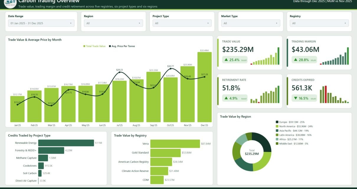
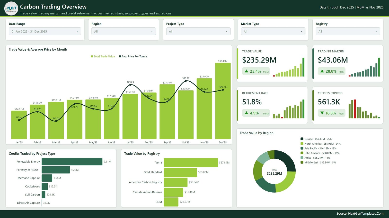
1. Carbon Trading Overview
The landing page: Trade Value, Trading Margin, Retirement Rate and Credits Expired as KPI cards with sparklines and month-on-month deltas, beside a combined Trade Value & Average Price by Month chart. Below that sit Credits Traded by Project Type, Trade Value by Registry and a Trade Value by Region donut. In the demo file it totals $235.29M across five registries, six project types and six regions – again, invented numbers.
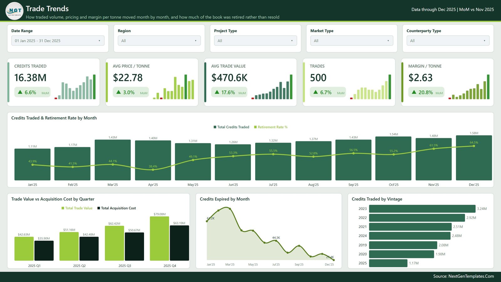
2. Trade Trends
How traded volume, pricing and margin per tonne moved month by month, and how much of the book was retired rather than resold. Five cards across the top (Credits Traded, Avg Price / Tonne, Avg Trade Value, Trades and Margin / Tonne), then Credits Traded & Retirement Rate by Month as a combined column-and-line, and three smaller visuals: Trade Value vs Acquisition Cost by Quarter, Credits Expired by Month and Credits Traded by Vintage.
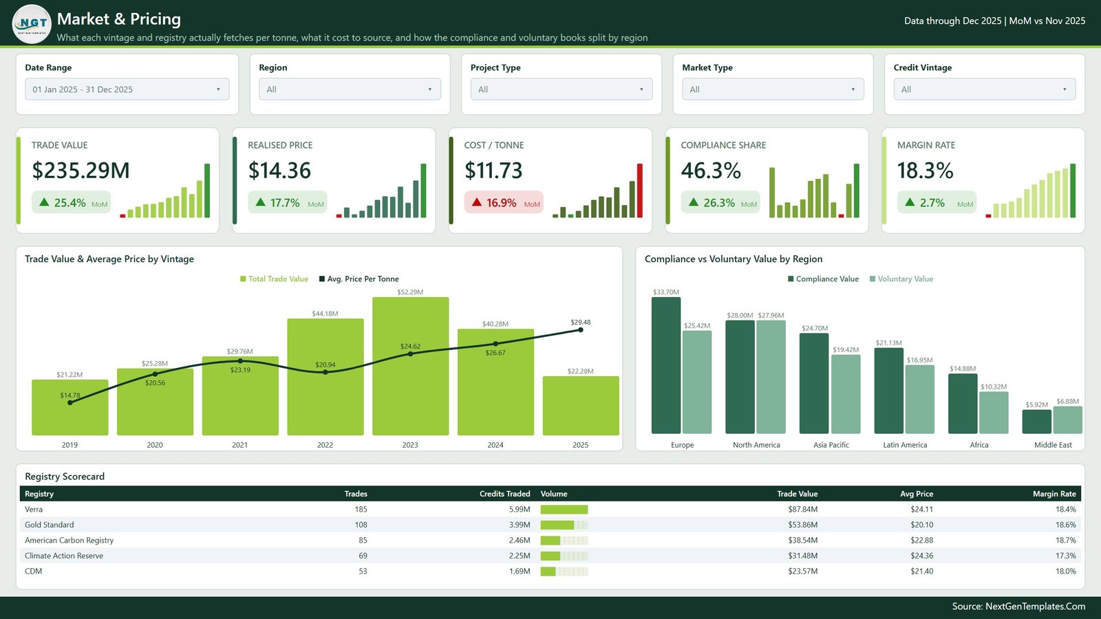
3. Market & Pricing
What each vintage and registry fetched per tonne in your records, what it cost to source, and how your compliance and voluntary books split by region. Cards for Trade Value, Realised Price, Cost / Tonne, Compliance Share and Margin Rate, then Trade Value & Average Price by Vintage, Compliance vs Voluntary Value by Region and a Registry Scorecard table with in-cell volume bars.
The compliance-versus-voluntary split here is a label you assign in the Market Type column. It is a reporting convenience, not a regulatory classification, and the dashboard has no way to check it.
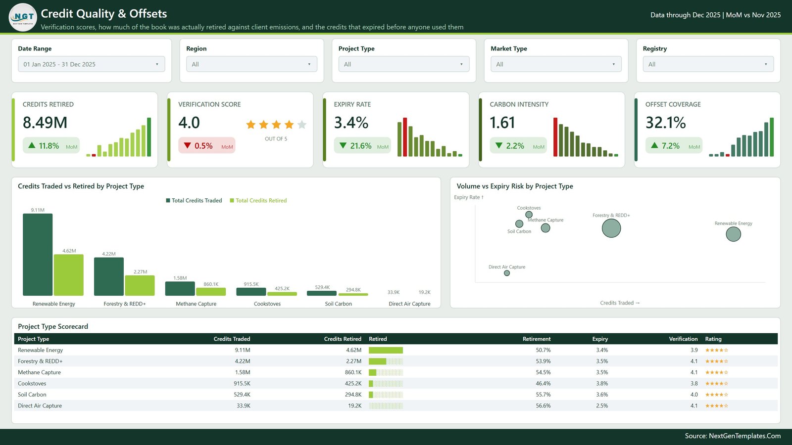
4. Credit Quality & Offsets
Verification scores, how much of the book was retired against the client emissions figure you entered, and the credits that expired before anyone used them. Credits Traded vs Retired by Project Type and a Volume vs Expiry Risk by Project Type scatter sit above a Project Type Scorecard.
Worth spelling out: the Verification Score card – the one showing 4.0 out of 5 stars in the screenshot – is an average of a number you enter yourself on each trade line. It is a slot for whatever internal grading your desk already keeps. It is not issued or endorsed by NextGenTemplates, by any registry or by any standards body, and it is not an assessment of any credit’s quality, additionality or permanence. The same goes for Carbon Intensity and Offset Coverage: both are ratios of columns you filled in, not measurements.
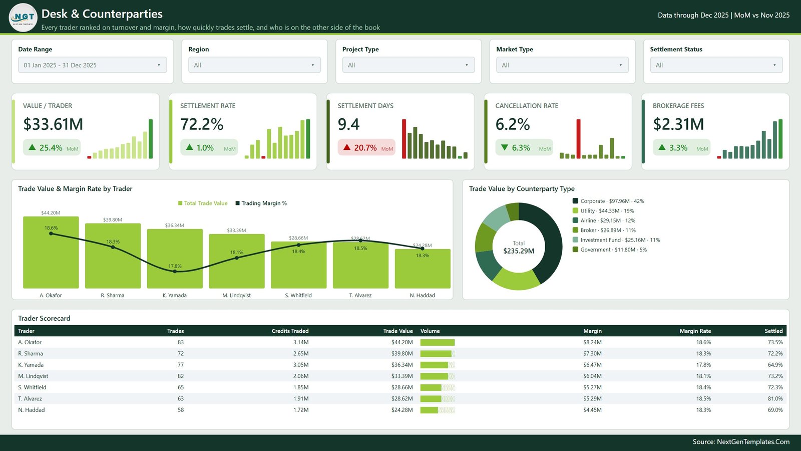
5. Desk & Counterparties
Every trader ranked on turnover and margin, how quickly trades settled, and who was on the other side of the book. Value / Trader, Settlement Rate, Settlement Days, Cancellation Rate and Brokerage Fees as cards, with Trade Value & Margin Rate by Trader, Trade Value by Counterparty Type and a Trader Scorecard. The seven trader names in the demo file are fictional.
The parts you do not see in a screenshot
Three hidden pages do most of the interaction work:
- Details drillthrough. Right-click almost any bar, slice or table row and you can drill through to a hidden page listing the underlying trade lines. It is wired to eight fields: Registry, Project Type, Region, Market Type, Counterparty Type, Credit Vintage, Trader and Settlement Status.
- Two tooltip pages – Category Detail and Trend Detail – are 280×360 mini-reports that pop up on hover, so you get context without leaving the page you are on.
Slicers are synced across all five report pages: Date Range, Region, Project Type and Market Type stay put as you navigate, with a fifth page-specific slicer (Registry, Counterparty Type, Credit Vintage or Settlement Status) depending on what that page is about.
The data sheet
Everything is driven by one flat table. The 20 columns are:
Trade ID, Trade Date, Registry, Project Type, Region, Market Type, Counterparty Type, Credit Vintage, Trader, Credits Traded, Price Per Tonne, Trade Value, Acquisition Cost, Brokerage Fee, Credits Retired, Credits Expired, Client Emissions, Settlement Days, Verification Score, Settlement Status.
Keep the headers exactly as they are and the model will refresh against your rows without a single change. Everything else – Trading Margin, Retirement Rate, Expiry Rate, Realised Price, Carbon Intensity, Offset Coverage – is calculated in DAX from those columns.
How to make it yours
- Open the .pbix in Power BI Desktop. The free version is enough.
- Open Data.xlsx, delete the 500 demo rows, and paste in your own trade records under the same headers.
- In Power BI Desktop go to Transform data > Data source settings, point the query at your copy of the workbook, and hit Refresh.
- Every card, chart and scorecard redraws. Nothing needs rewriting.
- Optional: rename measures to your house terminology, restyle the theme, drop the Get More Dashboards page, add your logo.
Honest limitations
A few things worth knowing before you buy rather than after:
- It is arithmetic over your own entries. If your trade log is wrong, the dashboard is confidently wrong. There is no validation layer.
- No registry integration. Registry, serial and retirement information is text you type. The file cannot confirm any credit is real, unretired or correctly attributed.
- No pricing source. Realised prices, costs and margins come from your columns. There is no benchmark, index or forward curve anywhere in the model.
- It is not an MRV, verification, assurance or compliance tool, and it produces nothing you can submit to a scheme administrator.
- It does no accounting. How allowances or credits should be recognised and disclosed is a question for your accountants, not this file.
- The demo data is a generated sample, so its patterns are plausible rather than meaningful – do not read a market story into the screenshots.
Used as intended – a management report over records you already keep – it saves a real chunk of monthly effort. Used as a source of truth about carbon markets or credit quality, it would be the wrong tool entirely.
Who it suits
- Trading desks and brokers who want their existing log charted rather than pivoted by hand.
- Sustainability and procurement teams reporting internally on credits bought and retired.
- Analysts and consultants who want a presentable starting layout instead of a blank canvas.
- Power BI learners – the DAX, the date table, the drillthrough wiring and the tooltip pages are all open and readable.
Get the template
The Carbon Trading Dashboard in Power BI is available on NextGenTemplates for $17.99 (regular price $29.99), as an instant download containing the .pbix, the source workbook and the user manual.
View the Carbon Trading Dashboard in Power BI →
If you report across a broader environmental area, these are close neighbours:
- ESG Environmental Dashboard in Power BI
- Clean Tech Dashboard in Power BI
- Environmental Services Dashboard in Power BI
- Climate Tech Startups Dashboard in Excel
- Energy & ESG Sustainability Bundle – eight Excel and Power BI templates together
Frequently asked questions
Does this make my carbon trading compliant, or is it trading advice?
No – to both. It charts numbers you have already recorded. No trading, investment, hedging or price advice; no buy or sell signals; and nothing that establishes compliance with the EU ETS, UK ETS, CORSIA, Article 6, RGGI, the California programme or any other scheme. Those decisions stay with you and your advisers.
Is there a live price feed?
No. Price Per Tonne, Acquisition Cost, Brokerage Fee and every derived margin are columns you fill in yourself.
Is the sample data real?
No. All 500 rows are invented demo data, including registry names, project types, trader names and verification scores.
Does it talk to Verra, Gold Standard or any other registry?
No. There is no integration and no serial-number lookup. Registry is a text label you type.
Do I need a paid Power BI licence?
No – Power BI Desktop is free and enough to open and edit the file. A Pro or Premium licence is only needed to publish and share through the Power BI Service.
Can I add my own columns and measures?
Yes. The model is unlocked. Add columns, write DAX, restyle the theme or delete pages as you like.