Most business writing agencies know their revenue and almost nothing else. They can tell you what invoiced last month, but not which document type earns the margin, which writer is quietly carrying the roster, or whether the 18% of work that arrived through the partner network was worth the referral fee. The Business Writing Agencies Dashboard in Power BI answers those questions from a single project log.
The sample model in this template carries 500 writing projects across 14 writers, 8 document types, 6 agency branches, 5 regions, 4 service tiers and 4 client segments – $590.2K of project fees, 1.64M words delivered, a 10.3-day average turnaround and a 4.0 out of 5 client rating. Nine report pages sit inside the file and 36 DAX measures are referenced across the report visuals. It opens in Power BI Desktop, which Microsoft gives away.
Key Features of the Business Writing Agencies Dashboard in Power BI
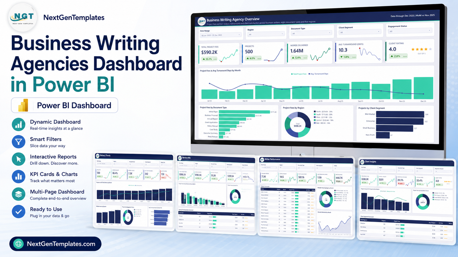
- Five analysis pages – Overview, Delivery Trends, Service Mix, Writer Performance and Client Insights – each with its own five KPI cards and its own question to answer.
- Five slicers per page, synced across the report. Date Range, Region, Document Type and Client Segment appear everywhere; the fifth slot changes per page to Engagement Status, Service Tier, Agency Branch, Writer or Acquisition Channel.
- Twenty-five KPI cards, each carrying a month-on-month delta and a sparkline, so you see the level and the direction in the same tile.
- Three scorecard tables – Writer, Service Tier Economics and Client Segment – with in-cell bars and star ratings.
- Fee against cost. Writer Cost is a first-class column, so gross margin is computed per document type and per tier rather than being a single number at the bottom of a P&L.
- A hidden Details drillthrough page plus two 280×360 tooltip pages, Category Detail and Trend Detail, that appear on hover.
- A 19-column source table you can replace wholesale – keep the headers and every visual follows your rows.
Dashboard Pages Explanation
Page 1 – Business Writing Agency Overview
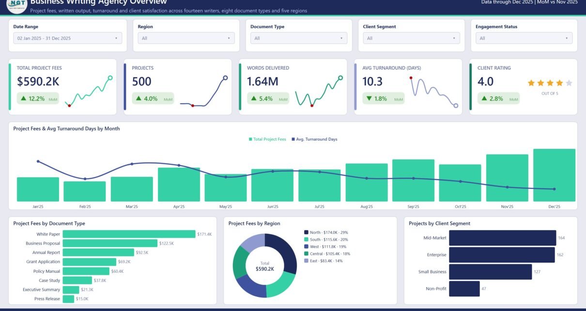
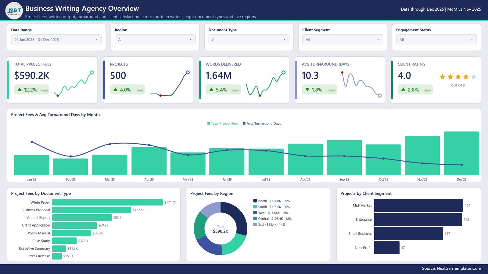
The opening page is the monthly summary: Total Project Fees $590.2K, Projects 500, Words Delivered 1.64M, Avg Turnaround 10.3 days and Client Rating 4.0 out of 5. The large combo chart, Project Fees & Avg Turnaround Days by Month, puts revenue and speed on the same axis – in the sample, fees climb through the year while turnaround falls, which is the shape an agency wants. Underneath, Project Fees by Document Type ranks the eight deliverables (White Paper leads at $171.4K, Press Release trails at $15.0K), Project Fees by Region splits the total five ways, and Projects by Client Segment shows Mid-Market and Enterprise almost level at 164 and 162 projects.
Page 2 – Delivery Trends
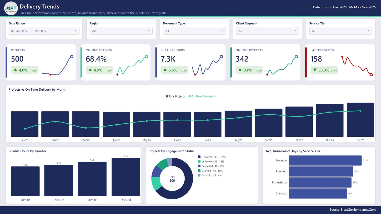
Punctuality gets its own page: Projects 500, On Time Delivery 68.4%, Billable Hours 7.3K, On Time Projects 342 and Late Deliveries 158, the last of which is down 33.3% month on month. Projects vs On Time Delivery by Month shows whether taking on more work is costing you reliability. Billable Hours by Quarter climbs steadily from 1.6K to 2.1K, Projects by Engagement Status breaks the pipeline into Delivered 324, In Review 58, Cancelled 48, Drafting 48 and On Hold 22, and Avg Turnaround Days by Service Tier makes the point that Executive work is the slowest at 11.8 days while Standard turns around in 9.4.
Page 3 – Service Mix
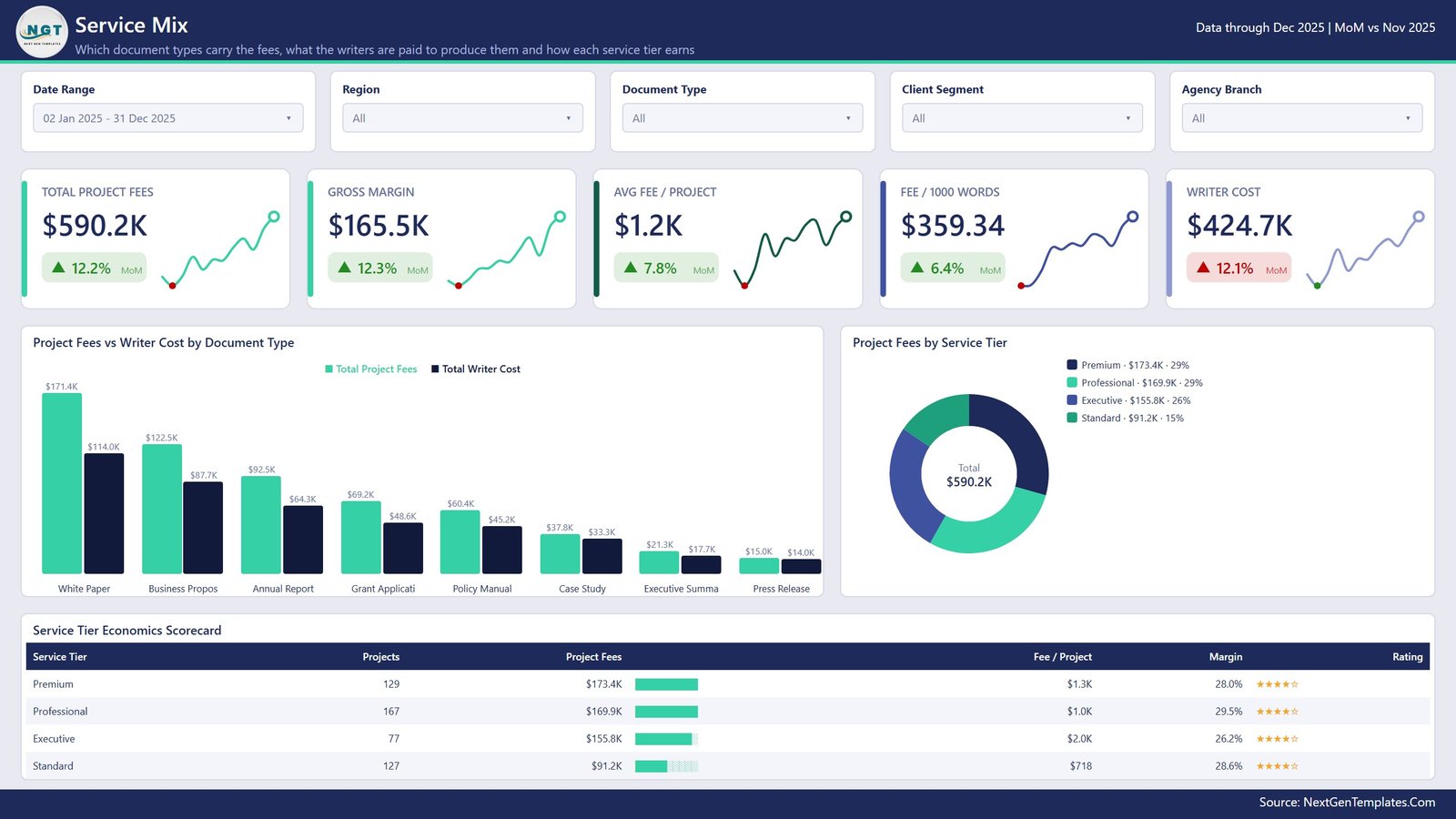
This is the page that pays for the template. Gross Margin $165.5K sits between Total Project Fees $590.2K and Writer Cost $424.7K, with Avg Fee per Project $1.2K and Fee per 1000 Words $359.34 alongside. Project Fees vs Writer Cost by Document Type puts the two bars next to each other for all eight deliverables, so the gap – not the height – is the story. The Service Tier Economics Scorecard then reduces it to a table: Professional carries 167 projects at 29.5% margin, Executive only 77 projects but $2.0K per project at 26.2%, Standard 127 projects at $718 each.
Page 4 – Writer Performance
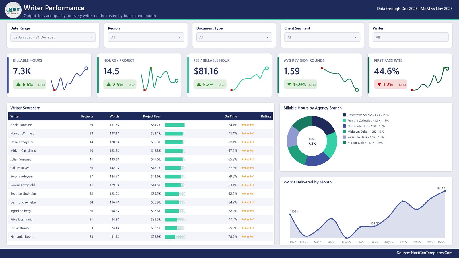
Capacity and quality, writer by writer: Billable Hours 7.3K, Hours per Project 14.5, Fee per Billable Hour $81.16, Avg Revision Rounds 1.59 and First Pass Rate 44.6%. The Writer Scorecard lists all 14 writers with projects, words, fees, on-time share and rating – Adele Fontaine tops the fee column at $54.7K on 39 projects, while Nathaniel Boone has the best on-time share at 78.6% on 28. Billable Hours by Agency Branch spreads capacity across six studios in a tight 15-19% band, and Words Delivered by Month runs from a 140.3K January dip to 168.1K in December.
Page 5 – Client Insights
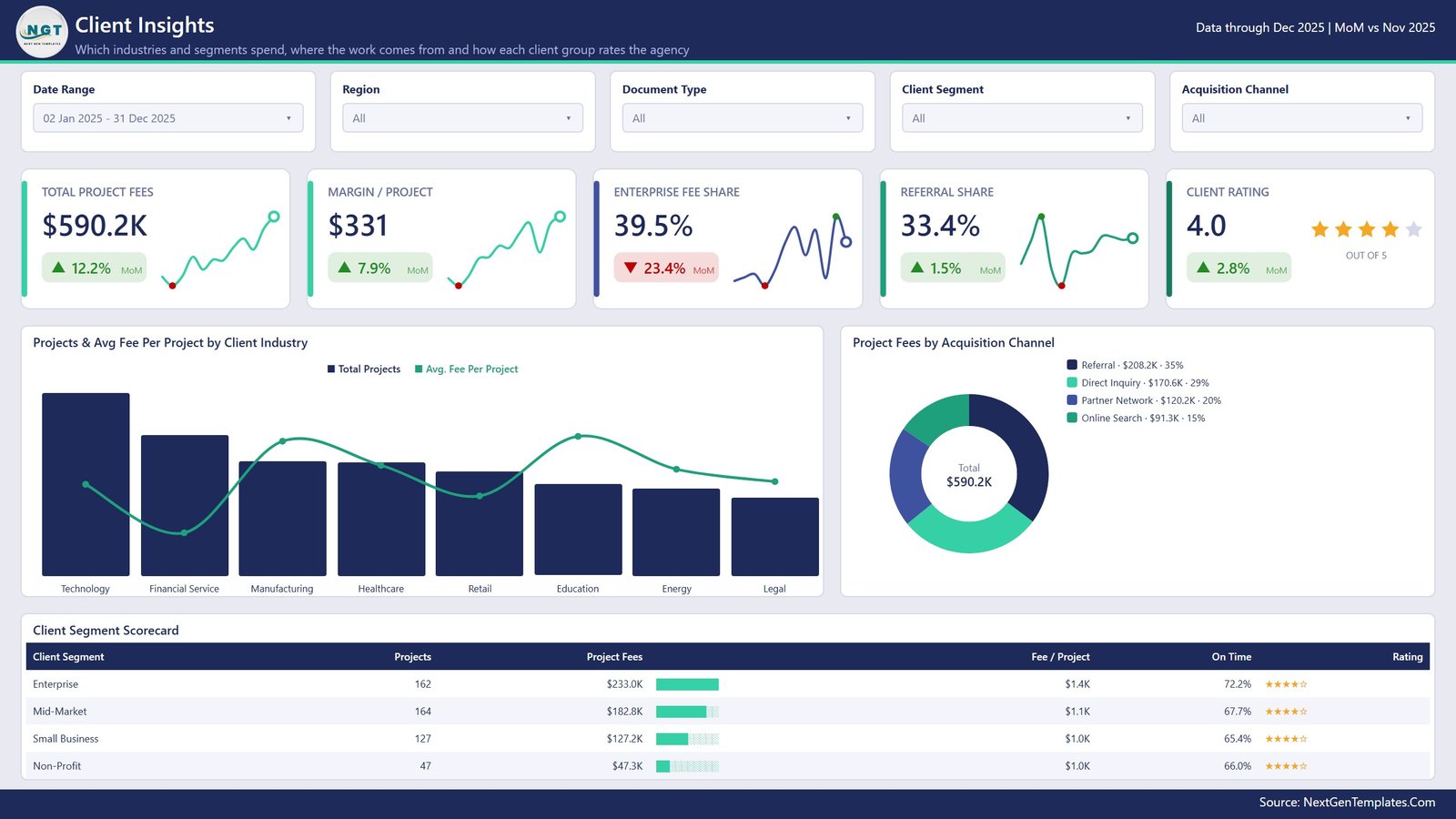
The commercial page. Margin per Project $331, Enterprise Fee Share 39.5%, Referral Share 33.4% and Client Rating 4.0. Projects & Avg Fee Per Project by Client Industry compares eight industries – Technology and Financial Services carry the volume, while Education and Energy command the higher average fee. Project Fees by Acquisition Channel splits the total across Referral $208.2K, Direct Inquiry $170.6K, Partner Network $120.2K and Online Search $91.3K. The Client Segment Scorecard closes the page: Enterprise 162 projects at $1.4K each and 72.2% on time, Non-Profit 47 projects at $1.0K each.
The three pages you will not see in the tab bar
A hidden Details page acts as the drillthrough target – right-click a bar or a table row and you land on the project-level records behind it. Two small tooltip pages, Category Detail and Trend Detail, are built at 280×360 and appear on hover rather than on click. A ninth page links back to the rest of the catalogue.
Business Writing Agencies Dashboard vs. Tableau vs. Agency Ops SaaS – Feature Comparison
| This Power BI template | Tableau or Qlik build | Agency ops SaaS | |
|---|---|---|---|
| Cost | One-time purchase | Per-user subscription plus build time | Recurring per-user subscription |
| Platform | Power BI Desktop (free) | Paid BI platform | Vendor-hosted web app |
| Setup time | Repoint one query | Days of modelling and design | Onboarding plus data migration |
| Real-time collaboration | Through the Power BI Service | Through the vendor’s server | Built in |
| Mobile access | Power BI mobile app once published | Vendor mobile app | Yes |
| Customisable fields | Every measure, column and visual | Yes, with developer effort | Limited to the vendor’s schema |
| Share with link | Yes, after publishing | Yes | Yes |
| Year-1 cost at 5 users | Purchase price only | 5 seats for 12 months | 5 seats for 12 months |
| Writer-level margin | Built in | You build it | Often an add-on module |
| Works offline | Yes | Partly | No |
Who Should Use This Template
It suits an agency that already keeps a project log and has outgrown the pivot table. If you run a business writing, copywriting, technical documentation, proposal or grant-writing practice with somewhere between five and fifty writers, the shape of the model will fit without editing. Freelance collectives and in-house content teams use the same pages with the branch dimension repurposed as a team.
It is not a project management system. There is no task assignment, no invoicing, no time clock and no client portal – it reports on work that has already been logged elsewhere. It is also single-author while it lives on your desktop; if several people need to edit simultaneously, publish it to a Power BI workspace or use a Sheets-based tool instead.
Real-World Use Cases
Repricing a service tier. Open Service Mix, sort the Service Tier Economics Scorecard by margin, and read fee per project beside it. In the sample, Standard delivers 28.6% margin at $718 a project against Executive’s 26.2% at $2.0K – the same margin percentage on very different absolute money, which is the argument for where to put your senior writers.
Fixing a late-delivery problem before the quarter closes. Delivery Trends shows Late Deliveries at 158 and falling. Filter Service Tier to the worst performer, then use Avg Turnaround Days by Service Tier and the writer roster to see whether the delay is a capacity problem or a scoping one.
Deciding where next quarter’s business development budget goes. Client Insights shows Referral as the largest acquisition channel at $208.2K and Online Search the smallest at $91.3K, with Enterprise carrying 39.5% of fees. That is a case for a formal referral programme rather than more paid search.
Advantages of the Business Writing Agencies Dashboard in Power BI
- Margin is designed in, not bolted on. Because Writer Cost is a column in the source table, every fee visual has a cost twin.
- The slicers are synced. Set the date range once and all five pages agree – a surprisingly common failure in hand-built reports.
- Nothing is hard-coded to the sample. Fourteen writers or forty, eight document types or twenty: the visuals expand to the data.
- It runs entirely on your machine. No upload, no vendor, no client names leaving your laptop – which matters when the project log contains named clients under NDA.
- Everything is editable, including the theme file, so a client-facing version in your own colours is a ten-minute job.
Opportunities for Improvement
Two things are worth knowing before you build a report pack on this file, and both are quick to change.
On Time Delivery is measured across every project row, not only delivered ones. The measure compares Turnaround Days with Committed Days for all 500 projects, including the 176 that are still Drafting, In Review, On Hold or Cancelled. That is why the card reads 342 on-time projects while the Engagement Status donut shows only 324 as Delivered. Restricted to delivered work, the sample’s on-time rate is 70.7% rather than 68.4%. Adding an Engagement Status filter to the measure – or simply setting the slicer – resolves it.
Referral Share and the acquisition-channel donut use different bases. The KPI card reads 33.4%, which is a share of project count (167 of 500); the donut beside it shows Referral at 35%, which is a share of fees ($208.2K of $590.2K). Both numbers are right, but sitting side by side they read like a contradiction. Rename the card or switch its basis and the page becomes self-explanatory.
Two cosmetic notes as well: on Service Mix the category axis abbreviates longer document names (“Business Propos”, “Grant Applicati”), and the combo charts on pages 1, 2 and 5 carry no value axis or data labels, so exact figures come from the tooltip. Widening the axis and toggling data labels on are single clicks in Power BI Desktop.
Best Practices
- Keep the 19 column headers. Add columns freely; renaming or dropping one of the originals is what breaks a visual.
- Log Committed Days at scoping time, not after the fact. Every delivery metric in the report depends on it being an honest promise rather than a backfilled value.
- Record Writer Cost even for salaried staff – use an hourly rate times billable hours. Without it the margin pages are blank.
- Refresh monthly, not weekly. The month-on-month deltas on the KPI cards assume complete months; a partial month always looks like a collapse.
- Use the Details drillthrough before you challenge anyone. Right-clicking through to the underlying projects turns “your on-time rate is low” into a specific, arguable list.
- Publish a filtered copy for clients rather than sharing the file – the writer-level cost data is internal.
Explore Relevant Templates
- Creative Agencies Dashboard in Power BI – the studio-side equivalent, built around campaigns and creative utilisation.
- Copywriting & Content Creation Dashboard in Power BI – content performance rather than agency economics.
- Coaching Networks Dashboard in Excel – the same people-delivered services problem, solved in Excel.
- MarTech Dashboard in Power BI – if your agency also owns the marketing stack.
Frequently Asked Questions
Do I need a paid Power BI licence?
No. Power BI Desktop is free and opens the .pbix in full. A licence is only required to publish the report to the Power BI Service for online sharing.
Can I use my own project export?
Yes. Open Transform Data, repoint the Data query at your file, keep the 19 column names, and refresh. The date table rebuilds from your Delivery Date column, so the month and quarter axes follow your period automatically.
How many writers and document types does it support?
The sample uses 14 writers and 8 document types, but no visual is capped at those numbers. The scorecards and bar charts grow with your data.
Why does On Time Projects exceed Delivered projects?
Because the on-time measure runs across all project rows, including work that has not been delivered yet. Filter Engagement Status to Delivered for a completed-work-only view – covered in Opportunities for Improvement above.
Is this the KPI scorecard version?
No. This is the analytical dashboard: monthly trend charts, scorecard tables and drillthrough. The KPI scorecard products are a separate build with a month picker and traffic-light thresholds. Near-identical names exist for both, so check which one you are buying.
Can I rebrand it?
Yes – the report ships with its own theme file, so swapping the palette, header band and logo is a normal Power BI theme edit rather than a per-visual chore.
About the Author
Built by PK – Microsoft Certified Professional with 15+ years of Excel, Google Sheets, and Power BI experience. Founder of NextGenTemplates, reaching 300K+ subscribers across YouTube channels. Every template is hand-built and tested before release.
Conclusion
A business writing agency lives or dies on the gap between what a document earns and what it costs to write. This dashboard makes that gap visible per deliverable, per tier, per writer and per client segment, from a project log you probably already keep. Five pages, 36 measures, a drillthrough and two tooltips – and an honest note about how on-time delivery is counted, so you can adjust it on day one rather than discovering it in a board meeting.
Get the template here: Business Writing Agencies Dashboard in Power BI on NextGenTemplates. For step-by-step Power BI walkthroughs, subscribe at youtube.com/@PKAnExcelExpert.