A capsule hotel operator does not have a room-nights problem. They have a units problem: sixty to two hundred sleeping pods per site, sold by the night, at a price where a two-point swing in occupancy decides whether the month works. Spread that across nine properties in eight cities, add five pod types, five booking channels and five guest segments, and the weekly export stops being readable long before it stops being important.
The Capsule Hotels Dashboard in Power BI is a finished .pbix built for exactly that shape of data. It ships with a 500-row, 19-column sample stay table covering nine capsule properties, eight cities and five pod types, and it renders nine report pages on 33 DAX measures referenced by the report visuals. Five of those pages are the ones you click through; the rest are a Get More Dashboards page, a hidden Details drillthrough bound on eight fields, and two 280×360 tooltip pages that surface on hover.
Before anything else, the honest framing: this report tells you what you load into it. It does not measure your occupancy against an industry benchmark, it does not define average daily rate or revenue per available capsule to any external hospitality standard, and it says nothing about fire safety, building codes, lodging licences or how you handle guest data. Every figure below comes from the sample rows shipped in the file. The measures are ordinary DAX in a file you own – read them, and change them where your house rules differ.
Key Features of the Capsule Hotels Dashboard in Power BI
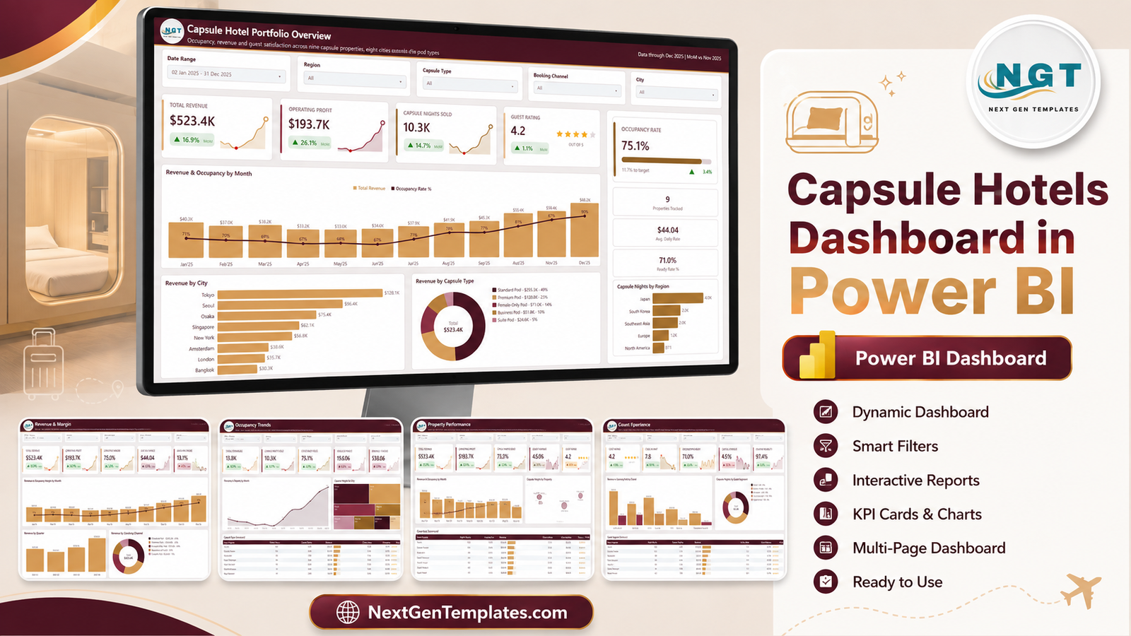
- Nine pages, five of them navigable. Overview, Revenue & Margin, Occupancy Trends, Property Performance and Guest Experience, plus a Get More Dashboards page and three hidden pages.
- 33 DAX measures referenced by the report visuals. Revenue, operating profit, operating margin, occupancy rate, capsule nights, average daily rate, revenue per capsule, ratings, check-in wait, cancellations and booking reliability.
- Five slicers on every page, synced across the report. Date Range, Region, Capsule Type and Booking Channel stay constant; the fifth slot changes with the page – City, Guest Segment, Housekeeping or Guest Origin.
- A Details drillthrough on eight fields. Region, City, Property, Capsule Type, Guest Segment, Booking Channel, Guest Origin and Housekeeping Status all route into one hidden detail page. Microsoft documents the mechanism in the Power BI drillthrough guide.
- Two tooltip report pages. Category Detail and Trend Detail are proper 280×360 pages rather than the default hover box.
- SVG KPI cards with sparklines and MoM deltas. Each card carries its own trend line and a coloured month-on-month arrow.
- A real Date table. Month, quarter and Year-Month sort chronologically instead of alphabetically.
- Nothing locked. No macros, no add-ins, no password, no sign-in.
Dashboard Pages Explanation
Page 1 – Capsule Hotel Portfolio Overview
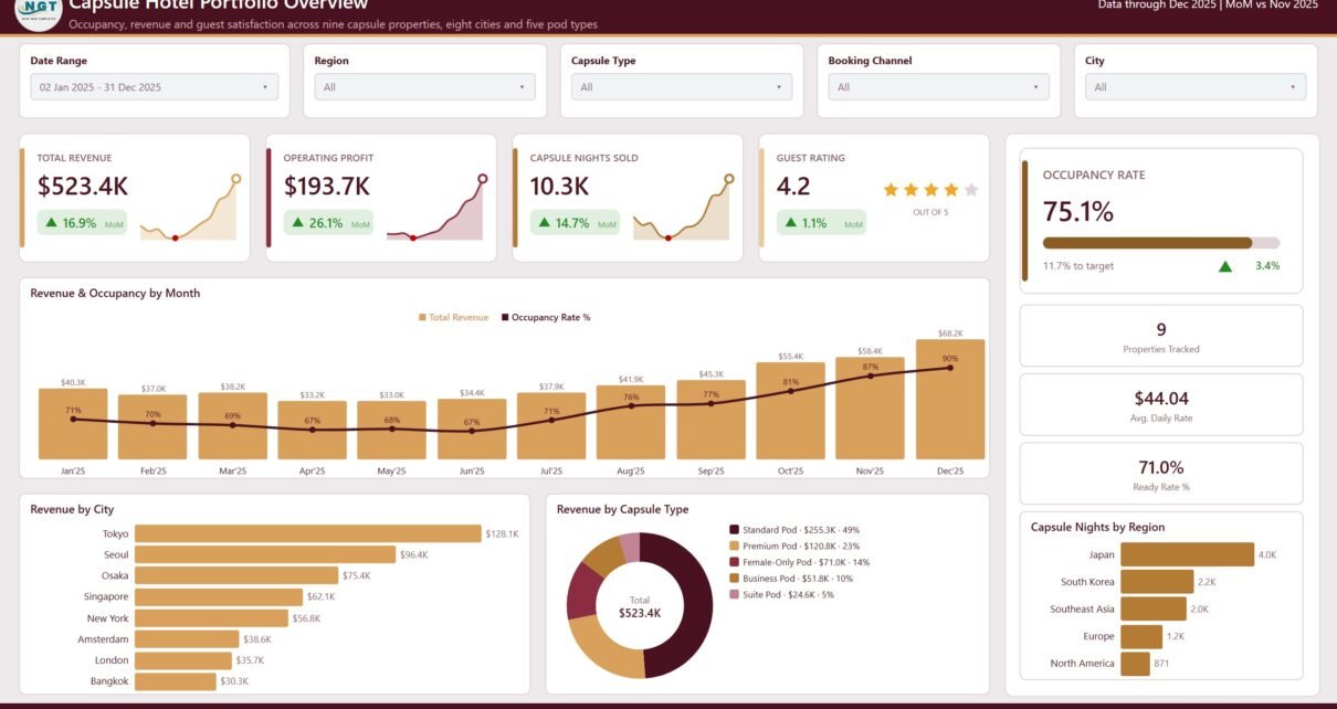
The landing page answers “how did the estate do” in one screen. Four KPI cards carry Total Revenue, Operating Profit, Capsule Nights Sold and Guest Rating, each with a month-on-month delta and its own sparkline. A right-hand rail holds an Occupancy Rate gauge with a distance-to-target readout, then Properties Tracked, Avg. Daily Rate and Ready Rate tiles.
Below that: Revenue & Occupancy by Month as a combo chart with revenue columns and an occupancy line, Revenue by City as a ranked bar running from Tokyo down to Bangkok, Revenue by Capsule Type as a donut that puts value and share in the legend rather than crowding the ring, and Capsule Nights by Region as a bar. In the sample data, Standard Pod carries about half of all revenue – which is the kind of concentration you want to see before you decide whether the Suite Pod experiment is worth the floor space.
Page 2 – Revenue & Margin
This is the page that separates a busy month from a profitable one. Five cards – Total Revenue, Operating Profit, Operating Margin, Avg Daily Rate and Ancillary Share – sit over Revenue vs Operating Margin by Month, Revenue by Quarter, Revenue by Booking Channel and Operating Profit by Capsule Type.
Putting channel revenue next to profit by pod type is the useful part. When the OTA share of revenue climbs, the margin line beside it shows what that share costs, instead of the argument being settled from memory in a Monday meeting.
Page 3 – Occupancy Trends
Capsules Available, Capsule Nights Sold, Occupancy Rate, High Occupancy and Revenue / Capsule head this page. Under them: Occupancy Rate by Month as an area chart, Capsule Nights by City as a treemap where the block size is the volume, and a Capsule Type Scorecard listing night blocks, capsule nights, revenue, occupancy and revenue per capsule for all five pod types.
The scorecard is where pod-mix decisions actually get made: in the sample, the pod type with the highest occupancy is not the one with the highest revenue per capsule, and seeing both columns side by side is the whole point.
Page 4 – Property Performance
Revenue & Occupancy by Property ranks all nine sites, Revenue vs Margin by Property plots turnover against margin as a bubble field so the big site and the profitable site separate visually, and the Property Scorecard carries night blocks, revenue, operating profit, occupancy, margin and rating for each property.
Two cosmetic notes on this page, disclosed rather than retouched: in the exported screenshot the occupancy line passes straight through the third bar’s $65.7K data label, three of the property names on the x-axis are truncated to fit their slot, and several bubble labels collide near the centre of the scatter. None of that affects a single number – it is a rendering artefact of exporting a 1280×720 page at scale. In Power BI Desktop you widen the visual, turn the data labels off, or drop the plot-area padding, and it clears in seconds.
Page 5 – Guest Experience
Guest Rating, Check-In Wait, Housekeeping Ready, Cancellation Rate and Booking Reliability head Revenue vs Operating Profit by Channel as a clustered column, Capsule Nights by Guest Segment as a donut, and a Guest Segment Scorecard covering tourists, business travellers, backpackers, transit passengers and digital nomads with rating, wait and cancellation columns.
Note that on this page a red arrow is not automatically bad news and a green one is not automatically good: cancellation rate rising is coloured as an increase, and you read the direction, not the colour.
The hidden pages
Right-click almost anything and Drill through takes you to Details, a full-width table filtered by whichever of the eight bound fields you came from. Hovering a bar or a treemap block calls one of the two tooltip pages instead of the plain black default. Neither appears in the page tabs, which is why the shipped screenshots show five pages and the file reports nine.
Capsule Hotels Dashboard in Power BI vs. Tableau vs. a Paid Hospitality BI Suite – Feature Comparison
| This template | Tableau / Qlik build | Paid hospitality BI suite | |
|---|---|---|---|
| Cost | One-off template price | Licence plus build time | Monthly, usually per property |
| Platform | Power BI Desktop (free) | Tableau Desktop / Qlik Sense | Vendor cloud |
| Setup time | Open it, repoint one query | Days to model and lay out | Onboarding plus data mapping |
| Real-time team collaboration | Via Power BI Service if you publish | Via Tableau Server | Built in |
| Mobile access | Power BI mobile app once published | Vendor app | Vendor app |
| Customisable fields | Every measure and visual is editable | Fully editable – you build it | Vendor-defined |
| Share with link | Yes, after publishing to the Service | Yes, via server | Yes |
| Year-1 cost at 5 users | The template price, once | Licences plus consultant days | Recurring subscription |
| Connects to a PMS or channel manager | No – you load an export | Only if you build the connector | Usually yes |
| Who defines occupancy and rate | You do – plain DAX you can rewrite | You do | The vendor does |
Who Should Use This Template
It suits operators running roughly two to twenty capsule, pod or hostel-style properties who already pull stay data into Excel or CSV; revenue and operations managers who want occupancy, margin and guest feedback in one file instead of three; and analysts who would rather rebrand a finished Power BI layout than start from an empty canvas.
It is a poor fit for a single site doing a handful of stays a month – a spreadsheet is genuinely enough there. It is not a booking engine, a channel manager or a PMS: it takes no reservations and pushes no rates. And it has no live connector, so something has to hand it a file or a table on a schedule you control.
Real-World Use Cases
A four-site operator in Japan. Four separate stay exports used to be pasted into one sheet every Monday. Appending them into the sample table instead means the Property Scorecard ranks all four on revenue, occupancy and margin in a single view – and the bubble chart makes the point that the busiest site is not the most profitable one.
A revenue manager for a nine-property group. Page 2 is the whole job: channel mix on the left, operating profit by pod type on the right. When the OTA share moves, the margin cost is visible in the same glance.
An operations lead who owns guest satisfaction. Page 5 puts check-in wait, housekeeping ready rate, cancellation rate and rating by segment on one screen. Right-click a weak segment, drill through to Details, and the underlying stays come to the stand-up as evidence rather than as an impression.
Advantages of the Capsule Hotels Dashboard in Power BI
- It is finished, not a frame. Every page is laid out, themed and populated – you are editing, not building.
- The definitions are visible. Occupancy, daily rate and revenue per capsule are readable DAX, not a vendor black box.
- Slicer sync means one filter changes the story everywhere. Pick a region once and all five pages agree.
- Drillthrough on eight fields turns any chart element into a row-level answer.
- Free to open. Power BI Desktop costs nothing; a Pro licence is only needed to publish and share.
- Rebrandable. Swap the theme colours and the logo and it is your report.
Opportunities for Improvement
Being straight about the rough edges is more useful than a feature list. On page 4, the property x-axis truncates long names and the occupancy line crosses one data label – both fixed by widening the visual or switching the labels off. The bubble scatter on the same page crowds its labels once several properties land in a similar revenue-and-margin band; turning labels off and relying on the tooltip reads better. There is no live data connector, so a refresh is only as current as the export behind it. And the sample carries nine properties – a scorecard listing sixty will need scrolling or a top-N filter.
Best Practices
- Click every page with the sample data before you replace anything, so you know what each card is measuring.
- Keep the 19 column headers exactly as shipped when you paste in your own stays; renaming a column breaks the measures that reference it.
- Read the occupancy, daily rate and revenue-per-capsule DAX and rewrite it to match your own definitions before the numbers circulate.
- Set the occupancy target on the Overview gauge to the number your team actually works to, not the shipped placeholder.
- Load a full closed month at a time; part-months make month-on-month deltas misleading.
- If you publish to the Power BI Service, decide who can see property-level margin before you share the link.
- Keep an untouched copy of the original .pbix so you can compare when a measure starts behaving oddly.
Explore Relevant Templates
- Hotel Revenue RevPAR Dashboard in Power BI – the rate-and-revenue view for conventional room stock.
- Airline Loyalty Programs Dashboard in Power BI – the same analytical layout applied to travel loyalty data.
- Eco Lodges Dashboard in Power BI – for lodge and cabin operators.
- Hospitality & Resorts Dashboard in Google Sheets – if the team lives in a browser.
- Business Writing Agencies Dashboard in Power BI – the same nine-page structure for a services business.
Frequently Asked Questions
Does it connect to my PMS, channel manager or OTA account?
No. It reads a file. You export your stay data, drop it into the sample table or point the query at your own source, and refresh. There is no live integration and none is implied.
Are the occupancy, ADR and revenue-per-capsule figures industry-standard?
They are whatever the DAX in the file says, calculated from the rows you load. No claim is made that they match an external hospitality standard or benchmark. Open the measures, read them, and change them to match your own definitions.
Do I need a Power BI Pro licence?
Not to open, edit or use the file. Power BI Desktop is free. Pro or Premium only matters if you want to publish to the Service and share a link.
Will it work for hostels and pod hotels rather than capsules?
Yes. The model is built on a stay row with a unit count, so anything sold as a bed, pod or capsule night fits. Rename Capsule Type to Room Type and it reads as a small hotel report.
How much data can it handle?
The sample is 500 stay rows across nine properties. Power BI’s import engine handles far more, and the layout stays readable well past the sample size – though a scorecard of sixty properties will want a top-N filter.
Is anything locked, protected or macro-driven?
No. No macros, no add-ins, no password and no login. Every measure, colour, visual and page is editable.
What is in the download?
One zip: the .pbix report, the Data.xlsx sample table and a PDF user manual.
About the Author
Built by PK – Microsoft Certified Professional with 15+ years of Excel, Google Sheets, and Power BI experience. Founder of NextGenTemplates, reaching 300K+ subscribers across YouTube channels. Every template is hand-built and tested before release.
Conclusion
Capsule and pod operators live at a scale where the arithmetic is unforgiving and the reporting is usually a pasted spreadsheet. The Capsule Hotels Dashboard in Power BI puts occupancy, margin, property ranking and guest experience into five readable pages backed by 33 measures and an eight-field drillthrough, with the sample data included so you can see it working before you touch your own export. It will not tell you what good looks like in your market – only your own targets do that – but it will stop the numbers from hiding.
Get the Capsule Hotels Dashboard in Power BI on NextGenTemplates – instant download, opens in free Power BI Desktop, nothing locked.
For video walkthroughs of this and every other template, subscribe at youtube.com/@PKAnExcelExpert.