The Credit Union Dashboard in Excel tracks 5 portfolio KPIs across 5 interactive pages, with 19 pivot-driven charts and multiple slicers covering branch, loan type, region, channel, and member type. Setup takes under 10 minutes — replace the sample data, click Refresh All, and every chart updates automatically.
🌍 Join 8,400+ teams in 40+ countries using NextGenTemplates to replace paid SaaS tools with one-time-purchase Excel, Google Sheets, Power BI, and HTML templates.
✅ Instant download · One-time payment · No subscription · No per-user fees · Lifetime access
Credit Union Dashboard in Excel
Introduction
Credit unions sit in a tough spot — too small for million-dollar core-banking platforms like Symitar or Jack Henry, too data-heavy for a stack of disconnected spreadsheets. Managers need branch-by-branch performance, loan-type approval rates, member segmentation, and channel analytics, all without paying $200–$2,000 per user per month for enterprise tools. The Credit Union Dashboard in Excel closes that gap with a pivot-driven workbook you set up in under 10 minutes.
Built on native Excel features — pivot tables, slicers, and standard charts — this dashboard works in Excel 2016, 2019, 2021, and Microsoft 365. No Power BI, no Power Query, no VBA macros. Drop your loan application data into the Data sheet, hit Refresh All from the Data ribbon in Excel, and the 5 KPI cards plus 19 charts recalculate instantly. This blog post walks through every page, the slicer setup, and how the dashboard compares to other credit union dashboards and paid platforms.
Key Features of Credit Union Dashboard in Excel
📌 5 KPI Summary Cards — Total Loan Amount, Total Savings, Total Applications, Total Approved, and Avg. Loan Size sit as summary tiles on the Overview page. Each card recalculates instantly when you adjust slicers or refresh data.
📌 19 Pivot-Driven Charts Across 5 Pages — Total Applications by Loan Type, Total Loan Amount by Month, Total Approved by Region, Approval % by Branch, Avg. Interest Rate by Loan Type, Funding % by Month, and 13 more, all sourced from pivots on a hidden Support sheet.
📌 Slicer-Based Filtering on Every Page — Slicers for loan type, branch, region, month, member type, and channel sit on each analysis page. One click filters every chart on that page.
📌 Branch & Loan Type Drill-Down — Compare branches on approved volume, savings, and approval percentage. Compare loan types on approval rate, average interest rate, and funded amount.
📌 Member & Channel Analytics — Avg. credit score by member type, total applications by channel (Branch, Online, Mobile App, Partner, Call Center), and approval % by channel.
📌 Hidden Support Sheet — All pivot tables live on a single Support sheet that can stay hidden. Refresh All from the Data ribbon updates every visual at once.
Dashboard Pages Explanation
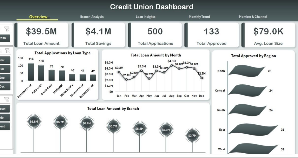
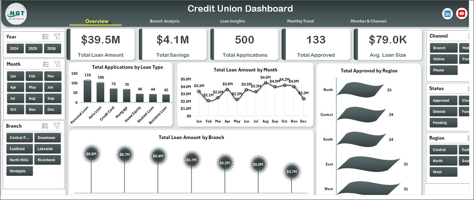
1. Overview Page
The Overview page is the executive summary tile. At the top, 5 KPI cards display Total Loan Amount, Total Savings, Total Applications, Total Approved, and Avg. Loan Size — pulled live from the Data sheet through SUMIFS and pivot references. Below the cards sit 4 charts and a strip of slicers.
Charts on the Overview page:
- Total Applications by Loan Type — shows which products (Auto, Personal, Mortgage, Business, Education) generate the most volume.
- Total Loan Amount by Month — surfaces seasonality and funding velocity month over month.
- Total Approved by Region — geographic split of approved loan dollars.
- Total Loan Amount by Branch — branch contribution to total portfolio value.
Credit Union Dashboard in Excel
2. Branch Analysis Page
The Branch Analysis page zooms into branch-level performance, useful for regional managers who want to compare locations side by side.
Charts on the Branch Analysis page:
- Total Approved by Branch — total approved loan dollars per branch.
- Total Savings by Branch — total deposit / savings balance per branch.
- Approval % by Branch — share of applications approved at each branch.
- Total Loan Amount by Loan Type — loan-type mix at branch level for cross-comparison.
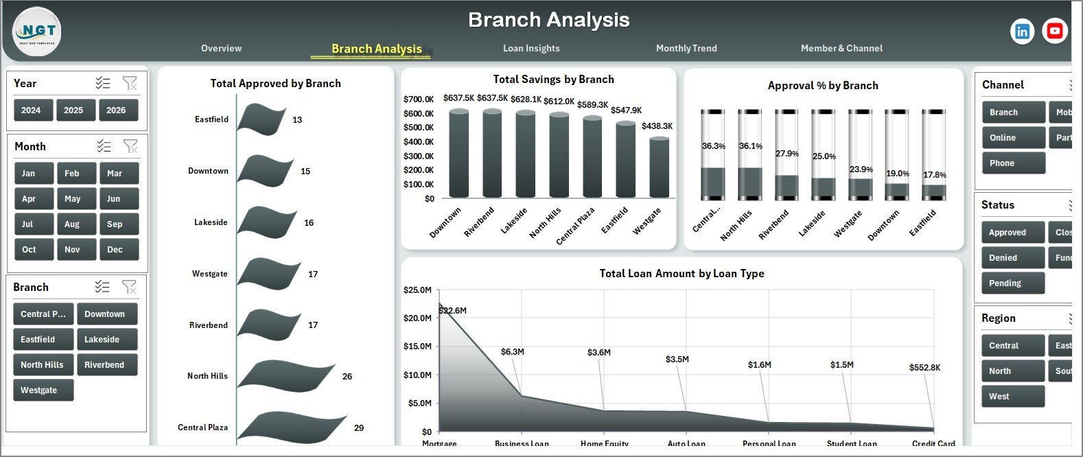
Branch Analysis Page
3. Loan Insights Page
The Loan Insights page is the underwriting and product-mix view — loan officers and product managers use it most.
Charts on the Loan Insights page:
- Approval % by Loan Type — flags underwriting tightening or loosening per product.
- Avg. Interest Rate by Loan Type — pricing comparison across products.
- Total Funded by Loan Type — disbursed dollars per loan type.
- Total Applications by Month — demand pattern across the calendar year.
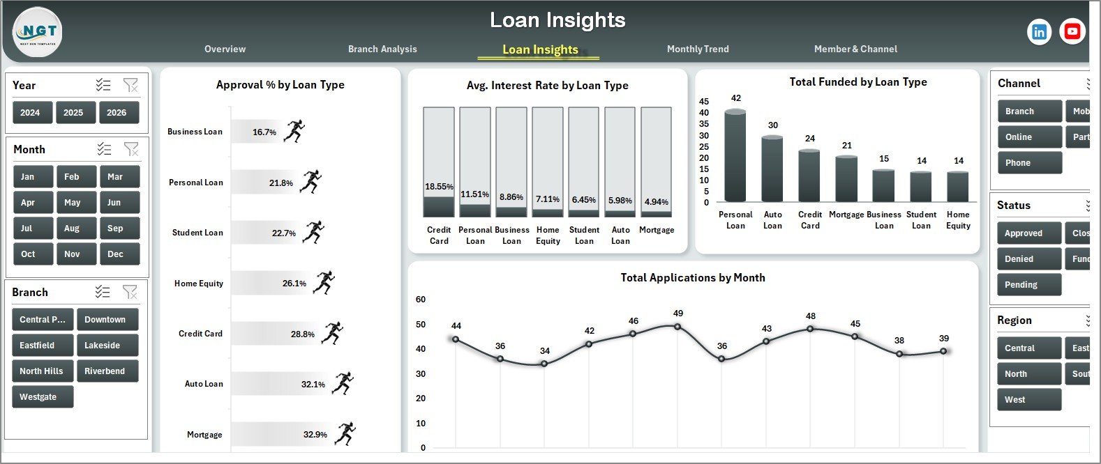
Loan Insights Page
4. Monthly Trend Page
Monthly Trend is the time-series view — useful for forecasting and board reporting.
Charts on the Monthly Trend page:
- Total Funded by Month — funding velocity across all 12 months.
- Total Loan Amount by Member Type — member segment contribution to portfolio.
- Total Loan Amount by Quarter — quarterly roll-up for board packs.
- Funding % by Month — share of applications that converted to funded loans each month.
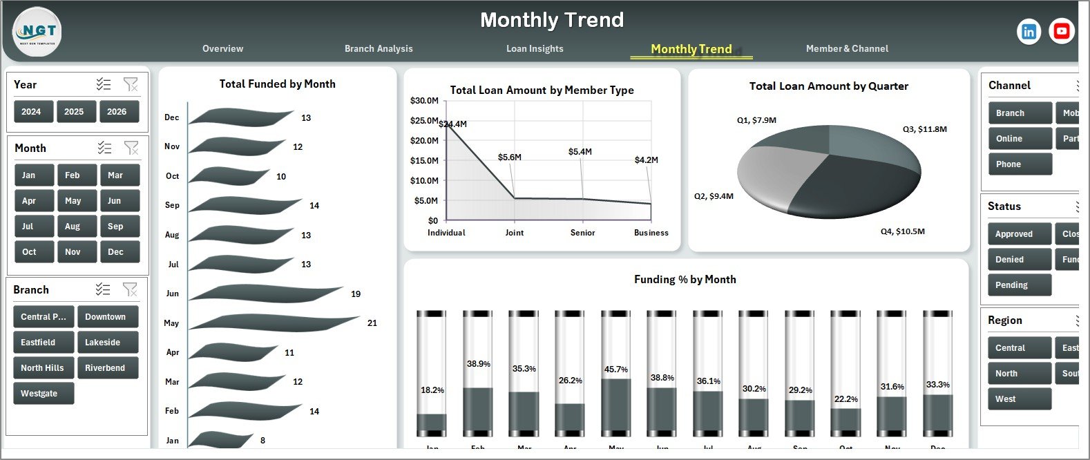
Monthly Trend Page
5. Member & Channel Page
Member & Channel is the marketing and segmentation view — helpful for re-allocating marketing budget and assessing channel ROI.
Charts on the Member & Channel page:
- Avg. Credit Score by Member Type — quality of borrowers by segment (Individual, Joint, Business, Senior, Student, etc.).
- Total Applications by Channel — channel mix across Branch, Online, Mobile App, Partner, Call Center.
- Approval % by Channel — which channel converts best.
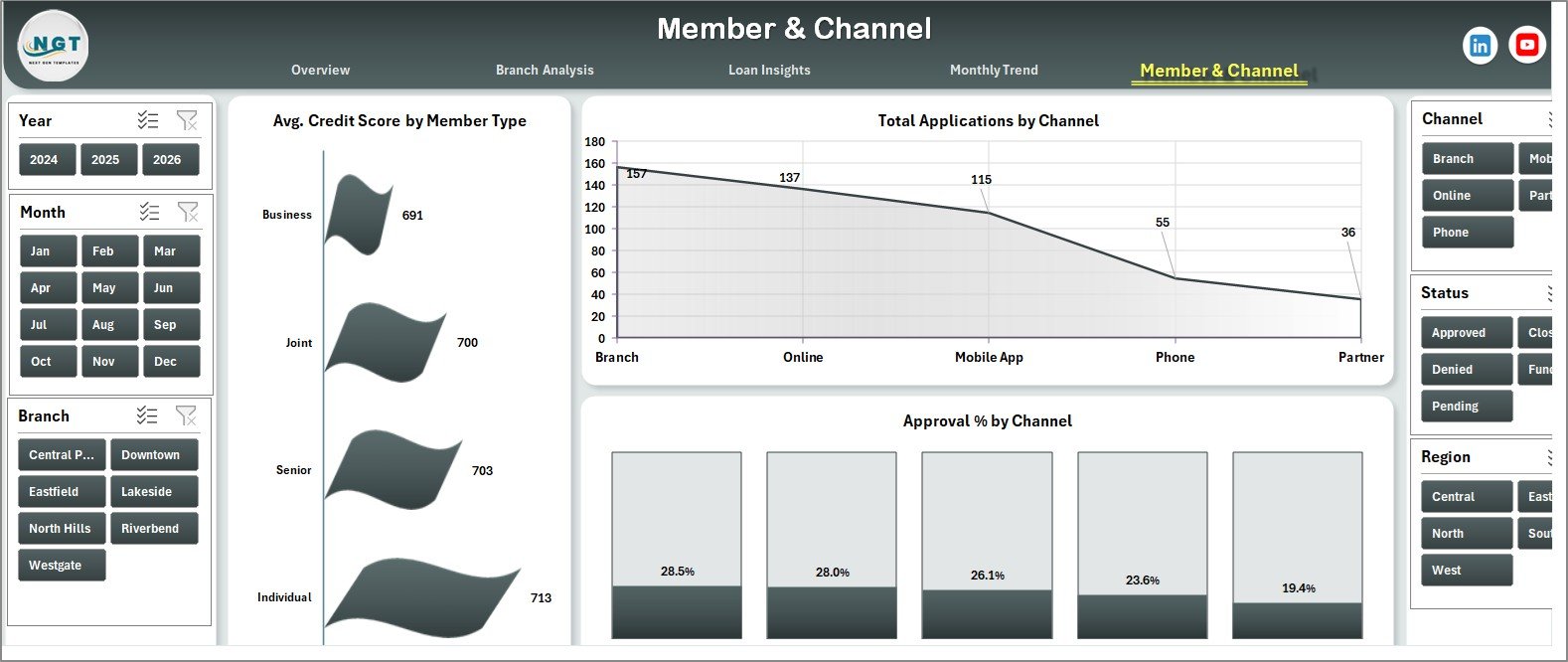
Member & Channel Page
6. Data Sheet
The Data Sheet is the single source of truth. Each row is one loan application with columns for date, member ID, member type, branch, region, loan type, application amount, approved amount, interest rate, channel, status, and credit score. Paste your data here keeping the column order intact, then click Refresh All — that’s the entire update workflow.
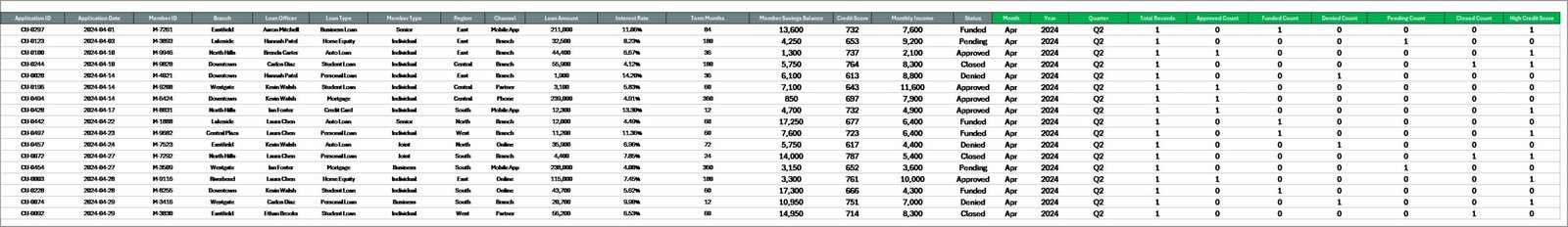
Data Sheet tab
7. Support Sheet
The Support Sheet holds all the pivot tables that feed the dashboard charts. It can stay hidden during normal use — right-click the tab and select Hide. To rebuild it after a data change, go to the Data ribbon and click Refresh All. Every pivot rebuilds and every chart updates instantly.
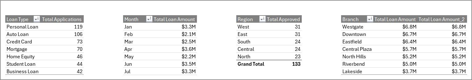
Support sheet tab
Credit Union Dashboard in Excel vs. Google Sheets Equivalent vs. Paid Credit Union Software — Feature Comparison
| Feature | Credit Union Dashboard in Excel | Google Sheets Loan Tracker | CUNA / Symitar / Jack Henry |
|---|---|---|---|
| Cost | $17.99 one-time | $0–$25 one-time | $200–$2,000 / user / month |
| Platform | Excel 2016, 2019, 2021, 365 | Google Sheets (browser) | Proprietary core banking |
| Setup time | Under 10 minutes | 15–30 minutes | 3–9 months implementation |
| Slicer-based filtering | ✅ 5+ slicers | ❌ Manual filter views only | ✅ Built-in reporting |
| Custom KPIs & charts | ✅ Edit any pivot | ✅ Editable | ❌ Locked vendor templates |
| Offline access | ✅ Yes, file-based | ❌ Requires internet | ❌ Server-based |
| Member & channel analytics | ✅ Included | ⚠️ Build it yourself | ✅ Built-in |
| Year-1 cost at 5 users | $17.99 total | $0–$125 | $12,000–$120,000+ |
For small and mid-sized credit unions that want branch, loan, member, and channel reporting without paying core-banking software pricing, the Credit Union Dashboard in Excel sits in the sweet spot.
Who Should Use This Template
Perfect for:
- Credit union managers and CFOs at single-branch and multi-branch institutions
- Loan officers and branch managers who report weekly or monthly numbers to leadership
- Internal audit and compliance teams needing branch and loan-type breakdowns without pulling core-system reports
- Community bank and microfinance analysts who already work in Excel
Not a fit if:
- You need real-time integration with a core banking system (Symitar, Jack Henry, Fiserv)
- You want a browser-only experience (use Google Sheets templates instead)
- You need NCUA Call Report regulatory formats — this is a management dashboard, not a filing tool
Real-World Use Cases
Maria runs operations at a 4-branch community credit union with $180M in assets. Every month she drops the new loan applications into the Data sheet, clicks Refresh All, and emails the file to her branch managers. The Branch Analysis page tells her instantly which branch is approving fastest and which has the highest average loan size. Last quarter she spotted that her Westside branch had a 14% lower approval rate than her Downtown branch and routed an underwriting trainer there.
James is a loan officer at a single-branch credit union serving teachers. He uses the Loan Insights page to track Approval % by Loan Type and Avg. Interest Rate by Loan Type. When his auto-loan approval rate dropped from 78% to 64% in one quarter, the dashboard flagged it before his quarterly board review — giving him time to investigate that the underwriting team had quietly tightened DTI thresholds.
Priya is a finance analyst at a microfinance institution. She uses the Member & Channel page to compare Total Applications by Channel. After seeing that the Mobile App channel had a 22% higher approval rate than the Branch channel, she made a data-backed case to her CMO to redirect 30% of branch marketing spend toward mobile acquisition — without paying $1,800/month for a SaaS reporting tool.
Advantages of Credit Union Dashboard in Excel
📌 Cost-effective — $17.99 one-time vs. $200–$2,000 per user per month for paid credit union software. At 5 users, year-1 savings are $11,982 to $119,982.
📌 No learning curve — if your team uses Excel for anything else, they already know pivot tables and slicers. No new tool to onboard.
📌 Offline-friendly — file-based, works on a plane, in a basement branch, anywhere. No internet dependency.
📌 Fully customizable — every chart is a pivot. Right-click, edit fields, change layout. Add your own KPIs in 5 minutes.
📌 Share by email or shared drive — no per-user licensing. Send the file to as many stakeholders as you want.
📌 Lives in your existing stack — sits alongside your other Excel models, budgets, and trackers. One folder, one source of truth.
Opportunities for Improvement
📌 No real-time core integration — you have to export from Symitar / Jack Henry / Fiserv and paste into the Data sheet. For weekly or monthly reporting cadences this is fine; for real-time dashboards you’ll want a different tool.
📌 No regulatory call-report formats — this is a management dashboard, not an NCUA filing tool. Pair it with a separate regulatory workbook.
📌 Excel row ceiling — pivot tables handle around 1 million rows comfortably; credit unions with 5M+ historical applications will need to archive older years to keep refresh times under 10 seconds.
📌 Single-user editing — Excel isn’t built for simultaneous co-editing the way Google Sheets is. If multiple analysts need to edit at once, host the file on SharePoint or migrate to the Google Sheets equivalent.
Best Practices
📌 Keep the Data sheet column order intact — pivots reference column positions; reordering breaks every chart.
📌 Refresh All after every data update — Data ribbon → Refresh All. Or set the pivot options to refresh on open (Pivot Table Options → Data → Refresh data when opening the file).
📌 Hide the Support sheet before sharing — right-click the Support tab → Hide. End users only need the analysis pages and Data sheet.
📌 Use slicer Report Connections for cross-page filtering — go to Slicer → Report Connections and check all pivots you want a single slicer to control. This lets one branch slicer filter every chart at once.
📌 Archive older years annually — move data older than 3 years into a separate archive workbook to keep refresh times fast.
📌 Back up the master file before any structural change — duplicate the .xlsx before editing pivot structures or adding new charts.
Explore Relevant Templates
💎 Also available as: Credit Unions Dashboard in Power BI — same analytics with DAX measures and Power BI service publishing.
📊 Peer-to-Peer Lending KPI Dashboard in Excel — companion lending KPI dashboard for P2P portfolios.
🏦 Banking Report in Excel — branch-level banking reporting workbook.
💳 Credit Card KPI Dashboard in Google Sheets — credit card portfolio analytics in Google Sheets.
📈 Loan Portfolio KPI Dashboard in Google Sheets — loan portfolio MTD/YTD scorecard in Google Sheets.
📂 Browse the full library of Excel Dashboard Templates on NextGenTemplates.
Frequently Asked Questions
What KPIs does the Credit Union Dashboard in Excel track?
The Credit Union Dashboard in Excel tracks five summary KPIs (Total Loan Amount, Total Savings, Total Applications, Total Approved, Avg. Loan Size) plus 19 breakdown charts across branch, loan type, region, channel, member type, and monthly trend. Every metric refreshes automatically from the Data sheet.
How long does setup take for the Credit Union Dashboard in Excel?
Setup takes under 10 minutes. Download, open in Excel 2016 or later, paste your loan and member data into the Data sheet keeping the column order intact, then click Refresh All under the Data ribbon. Every chart, KPI, and slicer updates automatically.
Does the Credit Union Dashboard in Excel require Power BI or any add-in?
No. The Credit Union Dashboard in Excel runs entirely on native Excel features — pivot tables, slicers, and standard charts. No Power BI, no Power Query, no VBA macros. It works in Excel 2016, 2019, 2021, and Microsoft 365 on both Windows and Mac.
How is the Credit Union Dashboard in Excel different from paid credit union software?
Paid platforms like Symitar or Jack Henry cost $200–$2,000 per user per month and require multi-month implementations. The Credit Union Dashboard in Excel is a $17.99 one-time purchase for management reporting only — it does not replace your core banking system, but it covers branch, loan, and member analytics quickly.
Can I add my own KPIs or charts to the Credit Union Dashboard in Excel?
Yes. Every chart is driven by a pivot table on the Support sheet. Right-click any chart, edit the source pivot, or add a new pivot from the Data sheet. Slicers can be connected to new pivots through Report Connections in the Slicer ribbon.
Will the Credit Union Dashboard in Excel handle 50,000+ loan records?
Yes, comfortably. The Credit Union Dashboard in Excel uses native pivot tables, which Excel handles well up to about 1 million rows. For credit unions with under 50,000 active loans, performance stays smooth on a standard laptop — refresh times typically stay under 5 seconds.
What file format do I receive after purchase?
You receive a ZIP file containing a single .xlsx file. Unzip it, open in Excel, and start using. The file is virus-scanned, contains no macros, and works offline.
About the Author
Built by PK — Microsoft Certified Professional with 15+ years of Excel, Google Sheets, and Power BI experience. Founder of NextGenTemplates, reaching 300K+ subscribers across YouTube channels. Every template is hand-built and tested before release.
Conclusion
The Credit Union Dashboard in Excel packs 5 KPIs, 19 charts, and full slicer-based filtering into a single Excel workbook that sets up in under 10 minutes. For credit unions, community banks, and microfinance institutions that need branch, loan, member, and channel analytics — without paying enterprise core-banking pricing — this is a $17.99 one-time investment that replaces a multi-thousand-dollar SaaS subscription.
📖 Click here to Purchase the Credit Union Dashboard in Excel
✅ Instant download · One-time payment · No subscription
🎥 For step-by-step video walkthroughs, visit Youtube.com/@PK-AnExcelExpert.
📅 Last updated: May 2026