Most coaching networks already have the data. It sits in a booking sheet, an invoice export and a payout spreadsheet, and nobody has time to join them up. The Coaching Networks Dashboard in Excel does that joining once: one flat engagement table feeds five linked report pages and roughly 20 pivot charts.
The sample workbook carries 500 engagements worth $741.7K in coaching revenue, $410.4K in coach payout and therefore $331.3K of net network margin. It records 2,683 sessions delivered against 3,949 booked – a 67.9% session delivery rate – and 3,623 coaching hours spread over 6 coaching types, 4 coach levels, 4 client segments, 5 regions and 12 months. Every one of those figures is filterable by five slicers that are synced across all five pages.
One point of clarification before we go further, because the names get confusing. This is the analytical dashboard – it slices and profiles the whole book of business. It is not the KPI scorecard family, which uses a month picker, target-versus-actual rows and traffic lights. Both exist for coaching topics; they answer different questions.
Key Features of the Coaching Networks Dashboard in Excel
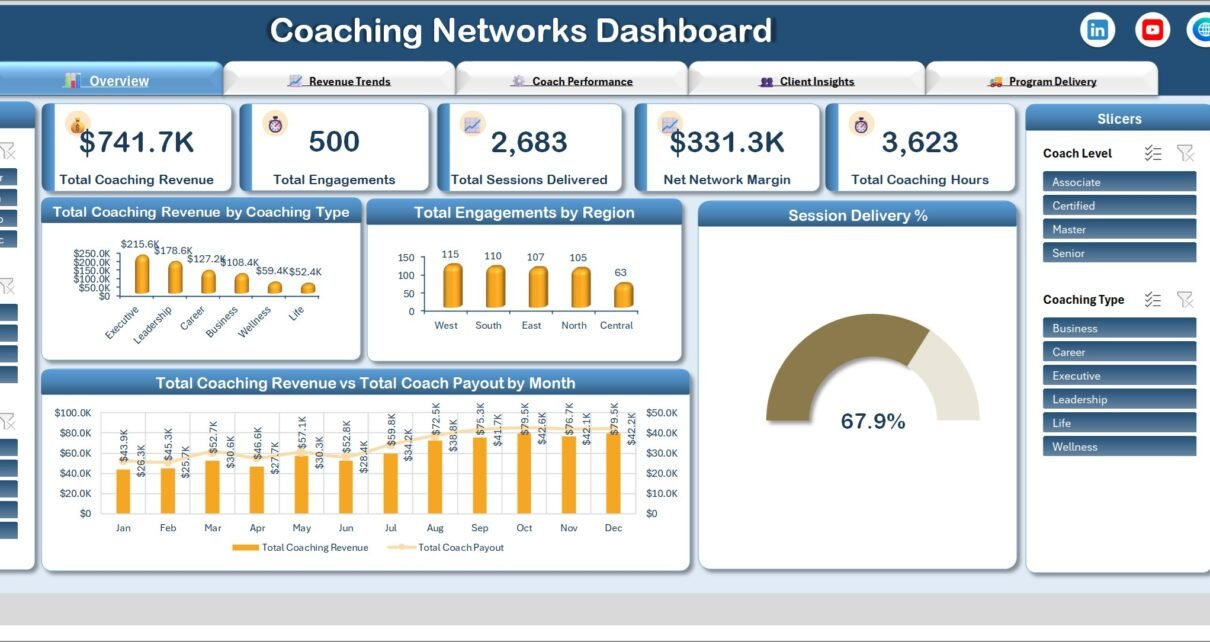
- Five KPI cards on the Overview page: Total Coaching Revenue, Total Engagements, Total Sessions Delivered, Net Network Margin and Total Coaching Hours.
- Five page-synced slicers in two rails – Month, Client Segment and Region on the left, Coach Level and Coaching Type on the right. Filter on one page and the other four follow.
- Revenue paired with payout on three different cuts – by month, by quarter and by region – so margin is visible rather than implied.
- Two coach league tables, one ranking revenue and one ranking engagement volume, which is how you spot the coach who bills well on few clients and the one who carries many for less.
- A delivery gap view: sessions delivered against sessions booked, per program format, plus a gauge that reduces the whole thing to one percentage.
- Renewals against engagements by client segment, instead of a single blended retention number that hides which segment is actually churning.
- Native pivot tables and pivot charts only. No macros, no add-ins, no Power Query refresh chain to break.
Dashboard Pages Explanation
Page 1 – Overview
The five KPI cards sit across the top. Below them, Total Coaching Revenue by Coaching Type ranks Executive $215.6K, Leadership $178.6K, Career $127.2K, Business $108.4K, Wellness $59.4K and Life $52.4K – a distribution worth reading carefully, because the top two types carry more than half the book. Total Engagements by Region shows West 115, South 110, East 107, North 105 and Central 63. A Session Delivery % gauge reads 67.9%, and a full-width Total Coaching Revenue vs Total Coach Payout by Month chart runs along the bottom.
Page 2 – Revenue Trends
Net Network Margin by Month rises from $17.7K in January to $37.3K in December on the sample data, with a visible flat patch in April. Total Engagements by Revenue Band splits the book into Low, Medium and High. Total Coaching Revenue by Client Segment is the page’s blunt answer to “where does the money come from”: Corporate $370.4K, SME $197.6K, Individual $111.3K, Non-Profit $62.4K. The quarterly revenue-versus-payout chart at the bottom shows both lines climbing together, Q1 $141.9K/$82.5K through to Q4 $235.6K/$126.8K.
Page 3 – Coach Performance
Top 10 Total Coaching Revenue by Coach and Top 10 Total Engagements by Coach are stacked so the two rankings can be compared directly. Avg. Client Satisfaction by Coach Level reports Master 4.5, Senior 4.3, Certified 4.1 and Associate 3.8. Total Coaching Hours by Coach Level shows the delivery load: Certified 1,287 hours, Senior 963, Associate 783, Master 591 – which is the interesting tension on this page, since the highest-rated level carries the fewest hours.
Page 4 – Client Insights
Total Engagements by Coaching Type (Executive 122 down to Life 56), Avg. Client Satisfaction by Client Segment, and Renewals vs Engagements by Client Segment. That last chart is the one worth putting in a board pack: Corporate 203 engagements against 131 renewals, SME 135 against 66, Individual 105 against 40, Non-Profit 57 against 28. Underneath, Total Coaching Revenue vs Total Coach Payout by Region compares West $170.0K/$94.3K through to Central $90.4K/$50.3K.
Page 5 – Program Delivery
The operational page. Sessions Delivered vs Sessions Booked by Program Format: One-on-One 1,224 of 1,902, Group 669 of 958, Intensive 580 of 805, Workshop 210 of 284. Total Engagements by Delivery Mode splits Online 234 (47%), In-Person 158 (31%) and Hybrid 108 (22%). Total Coaching Hours by Program Format and Total Engagements by Status – Completed 323, In Progress 70, Cancelled 53, Scheduled 40, On Hold 14 – finish the page.
Coaching Networks Dashboard in Excel vs. Google Sheets vs. Paid Coaching Platforms – Feature Comparison
| This Excel dashboard | Google Sheets build | Paid coaching platform | |
|---|---|---|---|
| Cost | One payment | Free tool, your build time | Roughly $20-$80 per coach per month |
| Platform | Excel 2016+, Microsoft 365, Excel for Mac | Browser | Vendor web app |
| Setup time | Paste rows, refresh once | Days of chart and formula work | Onboarding plus migration |
| Real-time team collaboration | Via OneDrive or SharePoint | Yes, native | Yes, native |
| Mobile access | Excel mobile app, view-oriented | Yes | Yes |
| Customizable fields | Any new column becomes a pivot field | Yes, if you rebuild the pivots | Limited to the vendor schema |
| Share with a link | Yes, via cloud storage | Yes | Yes |
| Year-1 cost at 5 users | The purchase price, once | Your time | Commonly $1,200-$4,800 |
| Revenue vs coach payout view | Built in on three pages | Build it yourself | Often a paid billing module |
| Data stays on your machine | Yes | No, stored in Drive | No, stored by the vendor |
Who Should Use This Template
It suits a coaching network or multi-coach practice that already logs engagements somewhere and now needs to report on them – to partners, to a board, or to the coaches themselves. It suits an operations lead who needs a monthly capacity conversation grounded in a delivered-versus-booked number rather than a feeling. And it suits a practice manager who has to produce the same quarterly pack repeatedly and would rather filter and export than rebuild charts.
It does not suit anyone looking for a system to run coaching – scheduling, contracting, messaging and invoicing are all outside its scope. It does not sync live from a CRM or a booking tool; you paste and refresh. And the Coach Level values are labels you define, not credentials the workbook verifies against any accreditation body.
Real-World Use Cases
A 22-coach leadership network. The partners wanted to know which coaching type genuinely earns after payout. Filtering the Overview to Executive and Leadership, then reading the revenue-versus-payout chart underneath, settles that in a single click – and the answer is often not the type with the biggest gross.
A corporate coaching provider’s operations lead. The Program Delivery page is his monthly meeting. A 678-session gap between One-on-One booked and delivered is a capacity problem, a cancellation problem, or a scheduling problem, and the Status chart on the same page tells him which.
A non-profit practice manager. She filters Client Segment to Non-Profit, exports the Client Insights page, and drops the renewals-versus-engagements chart into the quarterly board pack. Same three clicks every quarter.
Advantages of the Coaching Networks Dashboard in Excel
- Nothing to enable. A plain .xlsx works in locked-down corporate environments where macro-enabled workbooks are blocked outright.
- The arithmetic is checkable. Coaching-type revenue sums to the headline $741.7K; regional engagements sum to 500; delivered sessions divided by booked sessions gives you the gauge percentage. You can audit the dashboard against itself, which matters when someone in the room disputes a number.
- Slicers are page-synced. Filtering to one region on page 3 keeps that region applied on page 5, so a drill-down does not reset every time you navigate.
- Adding a dimension is free. Put a new column on the Data sheet, refresh, and it is available as a pivot field. See Microsoft’s own guide to slicers if you want to wire a new one into the existing rails.
- It reads well as a static export. Each page fits a single landscape print, which is what makes it usable in a partner pack.
Opportunities for Improvement
Reviewing the shipped build page by page, a few things are worth knowing before you buy, and all of them are cosmetic or editorial rather than arithmetic:
- Truncated coach names on page 3. On the Top 10 Total Coaching Revenue by Coach chart, five of the ten category labels are cut short with an ellipsis – “Tobias…”, “Ethan…”, “Sofia…”, “Priya…”, “Amelia…” – while the chart directly beneath it shows the same coaches in full. Widening the plot area or shortening the label field fixes it in about ten seconds.
- Average satisfaction shown as a pie. On page 3 the Avg. Client Satisfaction by Coach Level chart is a pie with percentage shares (27%, 26%, 24%, 23%). The underlying averages – 4.5, 4.3, 4.1, 3.8 – are the useful part; the percentage share of a sum of averages is not a meaningful reading. Page 4’s equivalent donut by client segment has the same shape and shows no numbers at all. Both work better as a bar chart of the raw averages.
- Two charts carry no values. Total Engagements by Revenue Band on page 2 labels Low, Medium and High but prints no counts, so you cannot read a figure off it without clicking through to the pivot.
- Rotated labels on page 5. The Sessions Delivered vs Sessions Booked chart prints its data labels vertically and cramped, and the chart title is letter-squeezed to fit the panel.
- A one-hour rounding difference. Coaching hours by coach level on page 3 sum to 3,624 against the 3,623 on the KPI card and on page 5’s program-format breakdown. It is a display-rounding artefact, not a data error.
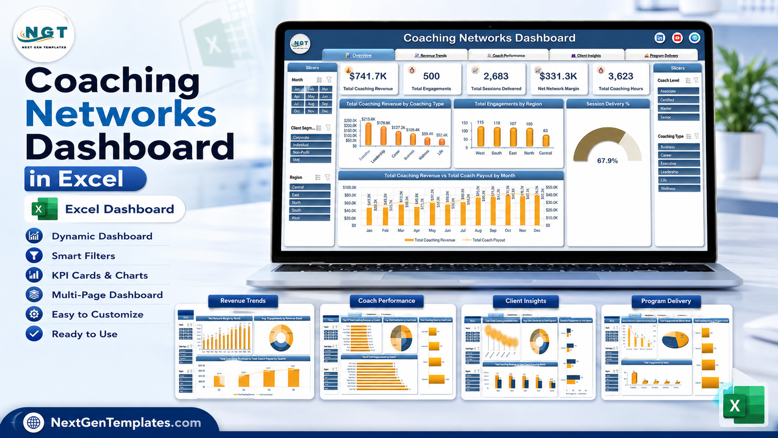
- The square cover image is illustrative. The laptop mockup on the product cover shows slightly different chart values and one or two different category names from the shipped workbook. The wide feature image above matches the real build.
Nothing here changes what the workbook calculates, and the KPI cards are correctly formatted throughout – counts as counts, currency as currency, with standard thousands grouping.
Best Practices
- Keep one row per engagement. The pivots assume a flat, tidy table. Do not add subtotal rows or merged cells inside the data range.
- Fill every dimension column. A blank Coach Level or Region creates an empty slicer tile that silently splits your totals.
- Enter Coach Payout per engagement. The dashboard sums it; it does not apply a commission rule. If your payout is percentage-based, calculate it in a helper column first.
- Refresh once after any paste. Ctrl+Alt+F5 rebuilds every pivot at once. Doing it per chart is unnecessary.
- Clear slicers before you export. A filter left applied on page 2 is still applied on page 5, and an exported PDF gives no hint that it was.
- Anonymise before sharing. Coach and client names appear as chart labels. If the pack leaves your organisation, replace them with codes first.
- Keep a clean master copy of the untouched workbook, so a broken pivot is a re-copy rather than a rebuild.
Explore Relevant Templates
- Coaching Networks Dashboard in Excel – the template described in this article.
- Career Counseling Centers Dashboard in Excel – the closest sibling for guidance and placement programmes.
- Leadership Development Dashboard in Excel – programme-side reporting for leadership work.
- Performance Management Dashboard in Excel – the outcomes coaching is meant to move.
- HR Analytics Dashboard in Excel – when coaching sits inside a wider people report.
- Business Writing Agencies Dashboard in Power BI – the same professional-services shape, built in Power BI.
- Operational Efficiency KPI Dashboard in Google Sheets – if a month-picker scorecard is what you actually wanted.
Frequently Asked Questions
Does it need macros?
No. It is a standard .xlsx built on pivot tables, pivot charts and slicers. There is nothing to enable and nothing a security policy will block.
How do I add my own coaches and coaching types?
Type them into the Data sheet and refresh. New values appear as slicer tiles and chart categories automatically – no formula editing.
Will it slow down with more data?
The sample is 500 rows. Pivot tables handle tens of thousands of rows without difficulty; your machine is the limit, not the template.
Is this the same thing as a Coaching KPI Dashboard?
No. This is the analytical dashboard. A KPI dashboard is a scorecard with a month picker, targets and traffic-light status. They are separate templates that answer different questions.
Can I use it in Excel for Mac or Excel Online?
Excel for Mac and Excel 2016 or later on Windows both work fully. Excel Online will render the workbook, but slicer behaviour in the browser is reduced, so use the desktop app.
Does it calculate coach payouts?
No. Coach Payout is a value you supply per engagement. The dashboard totals it and compares it to revenue; it does not apply a commission rule or trigger any payment.
Can I use it for client work?
Yes, on unlimited projects of your own or your clients’. Reselling or redistributing the template file itself is not permitted.
About the Author
Built by PK – Microsoft Certified Professional with 15+ years of Excel, Google Sheets, and Power BI experience. Founder of NextGenTemplates, reaching 300K+ subscribers across YouTube channels. Every template is hand-built and tested before release.
Conclusion
A coaching network’s hardest reporting question is not “how much did we bill” – it is “what did we keep, who delivered it, and how much of what we booked actually happened”. The Coaching Networks Dashboard in Excel puts all three on facing pages, driven by one flat table and five synced slicers, with no subscription and nothing to install.
Paste your engagement log over the sample, press refresh once, and you have a five-page network report. A handful of chart-formatting quirks are listed honestly above and take minutes to adjust if they bother you; the numbers underneath them are consistent and checkable.
Get the Coaching Networks Dashboard in Excel, and subscribe to youtube.com/@PKAnExcelExpert for step-by-step dashboard tutorials.