Event planning teams usually have the numbers, but the problem is speed. Actuals may sit in one Excel file, targets in another, definitions in a third, and last year’s values in an old report. The Event Planning KPI Dashboard in Power BI brings those moving parts into one refreshable Power BI report with 3 pages, 3 Excel input worksheets, MTD and YTD tracking, target status icons, and drillthrough KPI definitions.
This template is built for teams that review event performance month by month: event planners, venue managers, conference coordinators, event agencies, finance analysts, and operations leaders. Instead of rebuilding the same KPI report every month, you update the Excel source file, refresh Power BI, and review current-year actuals against targets and previous-year performance.
Key Features of Event Planning KPI Dashboard in Power BI
- 3 Power BI pages. The file includes Summary, KPI Trend, and hidden KPI Definition pages.
- MTD and YTD tracking. Review both month-to-date and year-to-date event performance in the same report.
- Target comparison. Compare actual values against targets with Target vs Actual percentage calculations.
- Previous-year comparison. Compare current-year MTD and YTD actuals against previous-year values.
- UTB and LTB KPI logic. The dashboard supports Upper the Better and Lower the Better KPI types.
- Status icons. Red and green up/down indicators show whether each KPI is moving in the right direction.
- Excel data source. Actuals, targets, and KPI definitions are maintained in a simple Excel input file.
- Drillthrough definition page. Users can drill through from the Summary page to see KPI formula and definition details.
Dashboard Pages Explanation
1. Summary Page
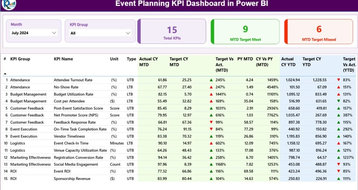
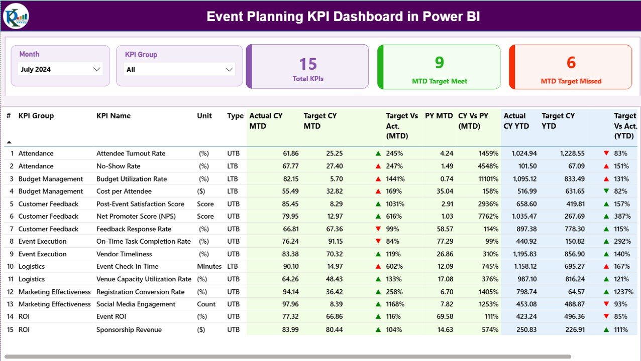
The Summary page is the main review page. At the top, the Month slicer controls the selected reporting period, while the KPI Group slicer helps users focus on a specific category of event KPIs. Below the slicers, three cards summarize the KPI set: Total KPIs count, MTD Target Met count, and MTD Target Missed count.
The detailed table is the real working area. It includes KPI Number, KPI Group, KPI Name, Unit, Type, Actual CY MTD, Target CY MTD, MTD Icon, Target vs Actual (MTD), PY MTD, CY vs PY (MTD), Actual CY YTD, Target CY YTD, YTD Icon, Target vs Actual (YTD), PY YTD, and CY vs PY (YTD). This structure lets a manager scan every KPI without opening multiple sheets or building separate visuals for each metric.
The MTD and YTD icons are especially useful in review meetings. For UTB metrics, higher performance is better. For LTB metrics, lower performance is better. That means a cost-related event KPI can be judged differently from an attendance or revenue KPI without manually reinterpreting the numbers.
2. KPI Trend Page
The KPI Trend page focuses on movement over time. A KPI Name slicer on the left lets the user choose one metric. The page then shows two combo charts: one for MTD and one for YTD. Each chart compares current-year actuals, previous-year actuals, and targets.
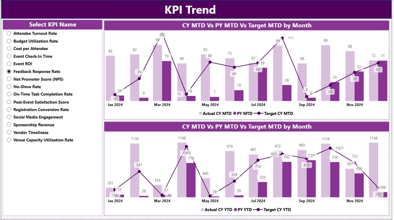
This page is useful when a single KPI needs explanation. For example, if event cost per attendee missed target in the Summary page, the Trend page helps users see whether the miss is a one-month spike or part of a longer pattern. If registrations are ahead of target but YTD attendance is still below plan, the trend view makes that gap visible.
3. KPI Definition Page
The KPI Definition page is a hidden drillthrough page. From the Summary page, users can drill through to see the KPI formula, definition, unit, group, and type. This keeps the Summary page clean while still giving analysts and reviewers access to methodology.
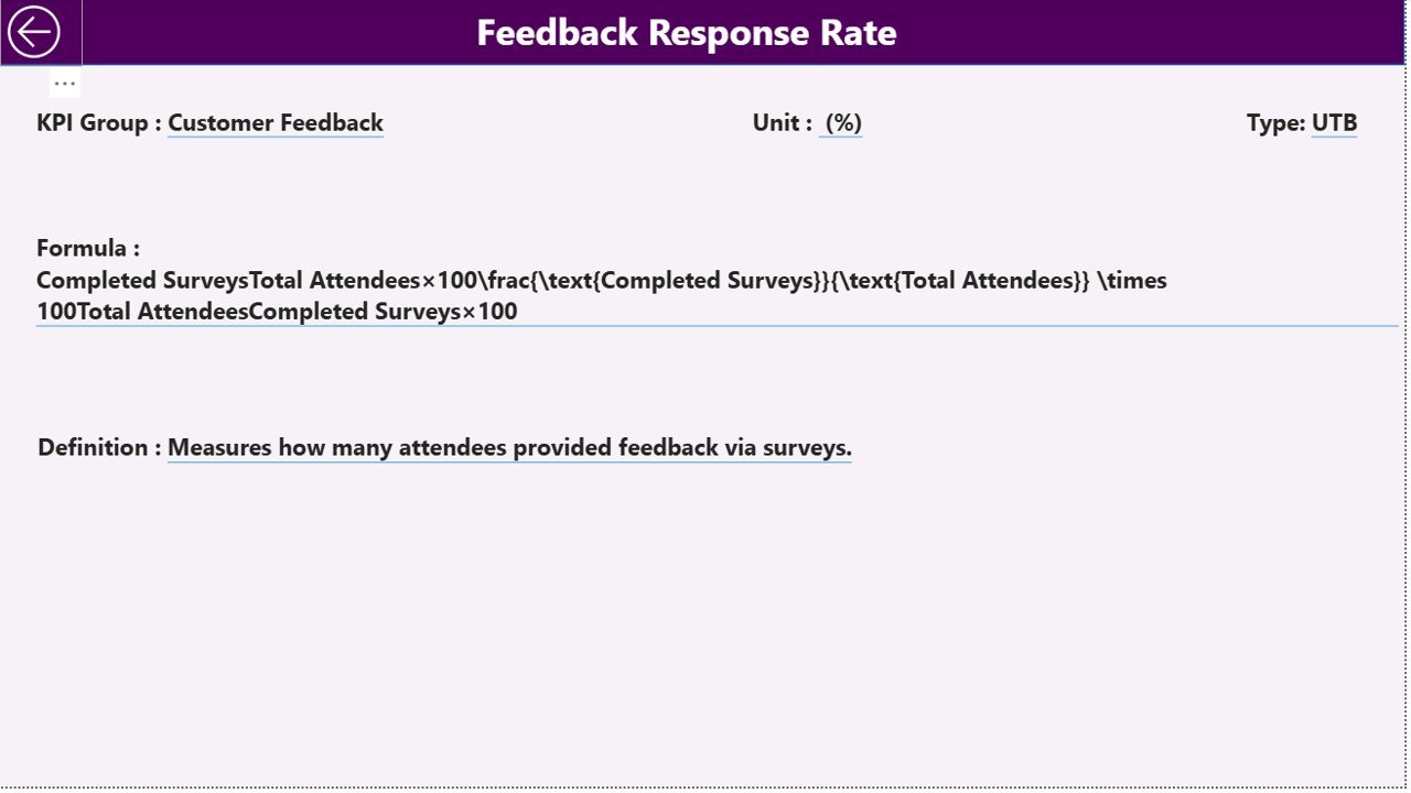
A back button in the top-left corner returns users to the main page. This small navigation detail matters because business users can check a definition during a meeting and return to the KPI table without losing context.
Excel Data Source Structure
The dashboard uses an Excel file as the source. That makes it practical for teams that already collect monthly event metrics in spreadsheet form.
Input_Actual Sheet
Use this worksheet for actual KPI values. Enter KPI Name, Month, MTD number, and YTD number. The Month field should use the first date of the month so Power BI can read the reporting period consistently.
Input_Target Sheet
Use this worksheet for target values. Enter KPI Name, Month, MTD target number, and YTD target number. KPI names should match the actual input sheet exactly.
KPI Definition Sheet
Use this worksheet to maintain the KPI library. Enter KPI Number, KPI Group, KPI Name, Unit, Formula, Definition, and Type. Type should be either LTB (Lower the Better) or UTB (Upper the Better).
Event Planning KPI Dashboard in Power BI vs. Tableau vs. Paid Event Management SaaS – Feature Comparison
| Feature | This Power BI dashboard | Tableau alternative | Paid event management SaaS |
|---|---|---|---|
| Cost | One-time template purchase | Licence and build effort | Recurring subscription |
| Platform | Power BI Desktop and Power BI Service | Tableau Desktop / Cloud | Vendor web platform |
| Setup time | Update Excel input files and refresh | Build model, measures, and visuals | Configure account, events, users, and reports |
| Real-time team collaboration | Available when published to Power BI Service | Available through Tableau Cloud | Usually included |
| Mobile access | Power BI mobile app after publishing | Tableau mobile options | Usually included |
| Customizable fields | Edit Excel source, Power Query, DAX, and visuals | Highly customizable with Tableau skills | Limited to vendor settings |
| Share with link | Yes, through Power BI Service | Yes, through Tableau Cloud | Yes |
| Year-1 cost at 5 users | Template price plus any Power BI sharing licence | Licensing plus development time | Often hundreds or thousands annually |
| MTD/YTD KPI logic | Included | Must be built | Depends on reporting module |
| KPI definition drillthrough | Included | Must be designed | Depends on vendor |
Who Should Use This Template
This template is useful for event planning managers who need a repeatable KPI review, event operations teams that report monthly target performance, corporate event coordinators who compare actuals with planned values, finance analysts supporting event budgets, and consultants building dashboards for client event programs.
It is also useful for Power BI learners because the dashboard shows a practical structure: Excel source tables, slicers, detail tables, trend charts, and drillthrough pages working together.
Real-World Use Cases
Monthly event performance review. An event operations manager updates actual and target data at month-end, refreshes Power BI, and uses the Summary page to see which KPIs met MTD target.
Quarterly leadership reporting. A finance analyst reviews CY vs PY YTD movement before presenting event performance to management.
Client reporting for an event agency. An account manager filters KPI Group to client-facing KPIs, reviews the KPI Trend page, and explains whether the latest event program is improving against target.
KPI governance. A reporting owner uses the hidden KPI Definition page to keep formulas and definitions accessible, so reviewers understand what each KPI means.
Advantages of Event Planning KPI Dashboard in Power BI
- It separates actuals, targets, and KPI definitions into clear Excel inputs.
- It supports both MTD and YTD review without requiring separate reports.
- It gives managers a fast red/green view of target performance.
- It keeps formula definitions available through drillthrough instead of cluttering the main page.
- It works with Power BI Desktop, which is free from Microsoft.
- It can be expanded by users who know Power Query, DAX, and Power BI visual editing.
Opportunities for Improvement
The dashboard depends on clean input data. KPI names must match across Actual, Target, and KPI Definition sheets. Month values should be entered consistently as the first date of the month. Teams that need live registration, ticket scanning, vendor coordination, room booking, attendee communication, or payment collection should use this dashboard as a reporting layer, not as a replacement for event management software.
Best Practices
- Keep KPI names identical across all input sheets.
- Use one row per KPI per month in actual and target sheets.
- Use the first date of each month in the Month column.
- Set KPI Type carefully as LTB or UTB because it affects status interpretation.
- Refresh the Power BI file after every Excel input update.
- Check slicer selections before sharing screenshots or exporting PDF reports.
- Document formula changes in the KPI Definition sheet before changing dashboard measures.
For official guidance on building and maintaining Power BI reports, see Microsoft Learn: Create reports in Power BI.
Explore Relevant Templates
- Event Planning KPI Dashboard in Power BI – the template covered in this article.
- Power BI templates
- Power BI KPI Dashboard templates
- Event Management Dashboard in Power BI
- Project Management KPI Dashboard in Power BI
Frequently Asked Questions
What is the Event Planning KPI Dashboard in Power BI?
It is a ready-to-use Power BI dashboard for tracking event planning KPIs with MTD and YTD actuals, targets, previous-year comparisons, KPI status icons, trend charts, and drillthrough definitions.
How many pages are included?
The Power BI report includes 3 pages: Summary, KPI Trend, and a hidden KPI Definition drillthrough page.
What data source does it use?
It uses an Excel file with Input_Actual, Input_Target, and KPI Definition worksheets.
Can I add my own KPIs?
Yes. Add the KPI to the KPI Definition sheet, then enter matching actual and target values using the same KPI name.
What does LTB mean?
LTB means Lower the Better. It is used for KPIs where a lower value is preferred, such as cost, delay, error rate, or complaint count.
What does UTB mean?
UTB means Upper the Better. It is used for KPIs where a higher value is preferred, such as attendance, revenue, satisfaction, or completion rate.
Does this dashboard replace event management software?
No. It is a reporting dashboard. It does not handle registration, ticketing, payment, vendor booking, or attendee communication.
About the Author
Built by PK – Microsoft Certified Professional with 15+ years of Excel, Google Sheets, and Power BI experience. Founder of NextGenTemplates, reaching 300K+ subscribers across YouTube channels. Every template is hand-built and tested before release.
Conclusion
The Event Planning KPI Dashboard in Power BI gives event teams a repeatable way to review monthly and year-to-date KPI performance. The Summary page shows target status, the KPI Trend page explains movement over time, and the KPI Definition page keeps formulas close at hand. With Excel inputs for actuals, targets, and definitions, the dashboard fits teams that want Power BI reporting without rebuilding the structure from zero each month.
Click here to get the Event Planning KPI Dashboard in Power BI
Visit our YouTube channel for step-by-step Excel and Power BI dashboard tutorials.