Most compliance teams already have the data. What they do not have is a way to show it. Audit results live in one spreadsheet, findings in another, remediation costs in an email thread, and the quarterly board pack gets rebuilt from scratch every three months. The Compliance Monitoring Dashboard in Excel is built for exactly that gap: paste your audit log into one sheet, press refresh, and you get five report pages, 20 charts and four synced slicers.
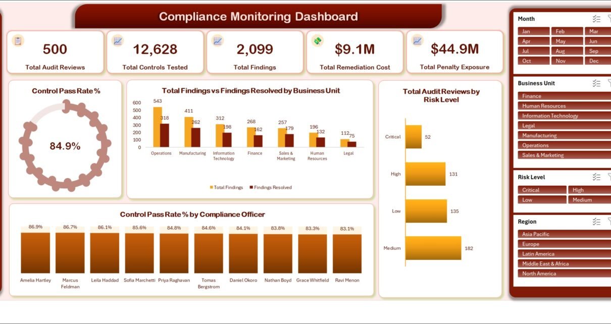
The demo data that ships with it covers 500 audit reviews, 12,628 controls tested, 2,099 findings raised, an 84.9% control pass rate, $9.1M of remediation cost and $44.9M of penalty exposure, spread across seven business units, five regions, seven regulation labels and six control categories. Every visual is populated the moment you open the file, so you can see what the finished report looks like before you type a single row of your own.
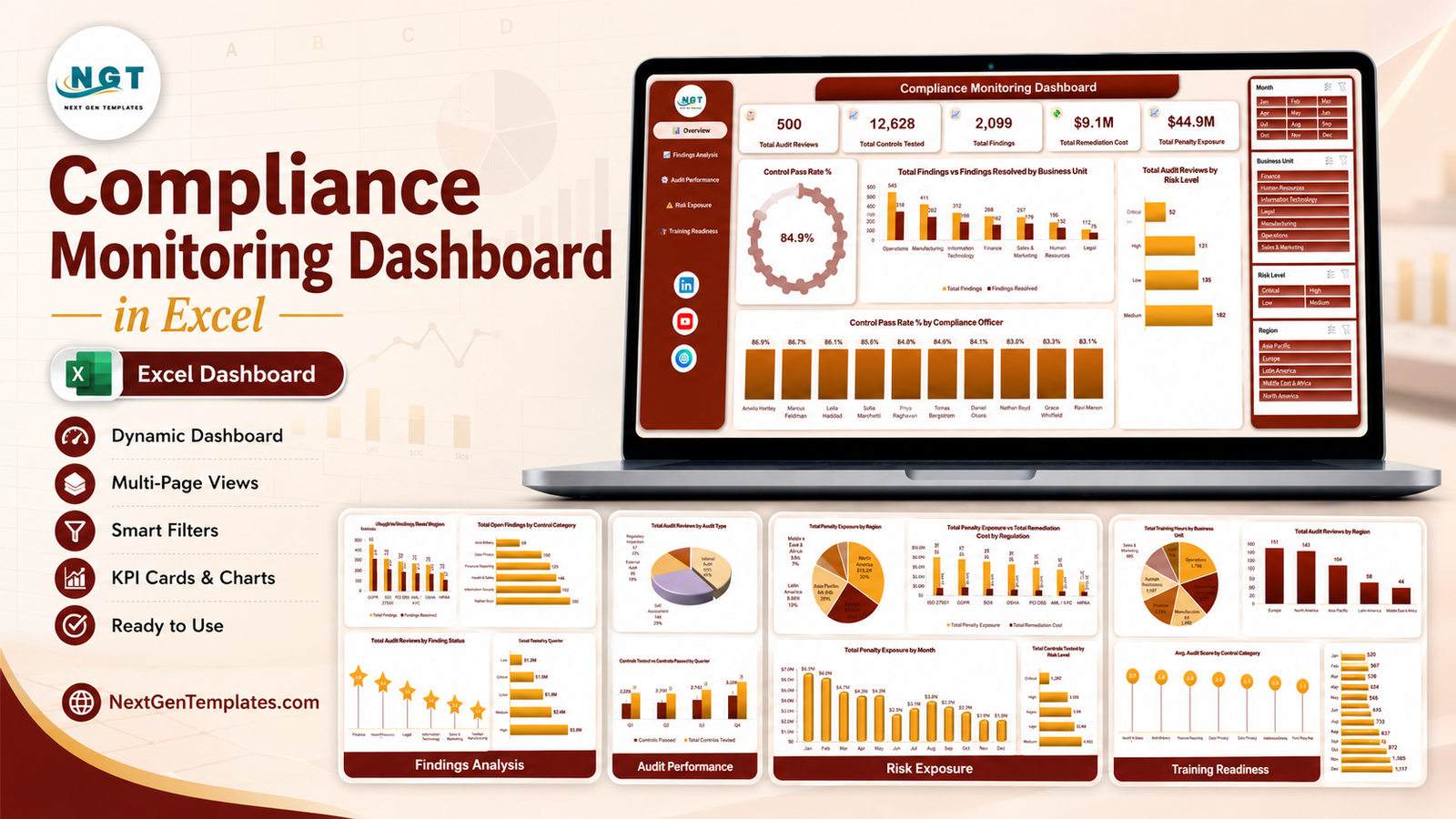
One clarification before we go further. NextGenTemplates publishes two families of compliance templates and their names look alike. This post is about the analytical Excel dashboard – five pivot-driven pages, 20 charts, four slicers and a raw Data sheet you replace. It is not the KPI-scorecard line, which is a separate template built around a month picker, traffic-light targets against thresholds and a dedicated KPI Trend page. If you report breakdowns and trends, you want this one. If you report a fixed set of KPIs against targets each month, you want the scorecard.
And one honest caveat that belongs at the top rather than buried in the small print: this workbook reports compliance activity, it does not create compliance. It performs no control testing, issues no certification or assurance, and is not legal advice. The regulation names in the sample data are text labels, nothing more.
Key Features of the Compliance Monitoring Dashboard in Excel
- Five linked report pages – Overview, Findings Analysis, Audit Performance, Risk Exposure and Training Readiness, reached from a left-hand navigation rail that appears on every page.
- Five KPI cards across the top of the Overview: Total Audit Reviews, Total Controls Tested, Total Findings, Total Remediation Cost and Total Penalty Exposure.
- Twenty charts – exactly four per page. No filler visuals, no crowded pages.
- Four page-synced slicers – Month, Business Unit, Risk Level and Region. Click one and all five pages re-filter together.
- A 28-column Data sheet with 500 demo rows, covering Review Date, Business Unit, Region, Regulation, Control Category, Compliance Officer, Audit Type, Risk Level, Finding Status, Controls Tested, Controls Passed, Findings Raised, Findings Closed, Remediation Days, Remediation Cost, Penalty Exposure, Training Hours and Audit Score.
- Seven sheets in total – the five dashboards, the Data sheet, and a Support sheet holding the pivot tables that feed the charts.
- Plain .xlsx – pivot tables and slicers only. No macros, no Power Query, no add-ins, no security prompt on open. Works in Excel 2016 and later and in Microsoft 365, on Windows and Mac.
- Nothing locked – rename the regulations, add control categories, recolour the theme, add a sixth page if you want one.
Dashboard Pages Explanation
Page 1 – Overview
The five KPI cards sit across the top. Below them a Control Pass Rate % donut reads 84.9% on the demo data. A clustered column chart puts Total Findings next to Findings Resolved for each business unit – Operations leads with 543 raised against 318 resolved, then Manufacturing 411 and 262, Information Technology 312 and 198, Finance 268 and 162, Sales & Marketing 257 and 179, Human Resources 196 and 132, and Legal 112 and 75. A bar chart splits Total Audit Reviews by Risk Level (Medium 182, Low 135, High 131, Critical 52), and a column chart ranks Control Pass Rate % by Compliance Officer from 86.9% down to 83.1%.
That last chart is the one that tends to start conversations. A ten-point spread between officers usually means inconsistent testing depth rather than inconsistent controls.
Page 2 – Findings Analysis
This page answers “what is actually open, and what is it costing us”. Findings raised versus resolved by Regulation runs GDPR 458 and 311, ISO 27001 328 and 179, SOX 316 and 209, PCI DSS 287 and 185, AML / KYC 273 and 171, OSHA 259 and 164, HIPAA 178 and 107. Net Open Findings by Control Category ranks Third Party Risk 174, Information Security 162, Health & Safety 146, Financial Reporting 125, Data Privacy 100 and Anti-Bribery 66. Total Remediation Cost by Risk Level shows High at $3.5M, Medium $2.4M, Critical $1.9M and Low $1.3M. Finally, Total Audit Reviews by Finding Status breaks into Closed 233, In Remediation 101, Open 74, Overdue 50 and Accepted Risk 42.
Note that Medium risk costs more to remediate than Critical in this sample – not a bug, just volume. There are 182 Medium reviews and 52 Critical ones.
Page 3 – Audit Performance
A pie splits Total Audit Reviews by Audit Type: Internal Audit 204 (41%), Self Assessment 144 (29%), External Audit 95 (19%) and Regulatory Inspection 57 (11%). Beside it, Total Findings by Compliance Officer runs from Nathan Boyd at 260 down to Amelia Hartley at 148. Controls Tested versus Controls Passed by Quarter climbs steadily – Q1 2,775 tested and 2,225 passed, Q2 2,844 and 2,361, Q3 3,160 and 2,742, Q4 3,849 and 3,398. Avg. Audit Score by Business Unit runs Finance 3.8, Human Resources 3.7, Legal 3.6, Information Technology 3.5, Sales & Marketing 3.3, Operations 3.3, Manufacturing 3.2.
Page 4 – Risk Exposure
Total Penalty Exposure by Region puts North America at $15.2M (33%), Europe $12.0M (27%), Asia Pacific $8.9M (20%), Latin America $5.8M (13%) and Middle East & Africa $3.0M (7%). Total Penalty Exposure against Total Remediation Cost by Regulation is the page’s most useful chart: ISO 27001 shows $8.1M of exposure against $1.6M of remediation cost, GDPR $7.7M against $1.8M, SOX $7.3M against $1.5M, down to HIPAA at $3.2M against $762.4K. Total Controls Tested by Risk Level and Total Penalty Exposure by Month complete the page.
Treat “penalty exposure” as whatever number your own risk register puts in that column. The template does not calculate it and makes no claim about what any regulator would actually levy.
Page 5 – Training Readiness
Total Training Hours by Business Unit shows Operations at 1,784 hours, Information Technology 1,571, Manufacturing 1,400, Finance 1,378, Human Resources 1,107, Sales & Marketing 985 and Legal 661. Total Audit Reviews by Region ranks Europe 151, North America 143, Asia Pacific 104, Latin America 58 and Middle East & Africa 44. Avg. Audit Score by Control Category runs Health & Safety 3.7, Anti-Bribery 3.6, Financial Reporting 3.6, Data Privacy 3.5, Information Security 3.4 and Third Party Risk 3.1. Total Training Hours by Month rises through the year from 520 in January to 1,117 in December.
Compliance Monitoring Dashboard in Excel vs. Google Sheets vs. Paid GRC SaaS – Feature Comparison
| This template (Excel) | Google Sheets build | Paid GRC platform | |
|---|---|---|---|
| Cost | $17.99 one time | $9.99 to $16.99 one time | $300 to $2,000+ per month |
| Platform | Excel 2016+ / Microsoft 365 | Any browser | Vendor cloud |
| Setup time | Under 15 minutes | Under 15 minutes | Weeks of implementation |
| Real-time team collaboration | Via OneDrive or SharePoint | Yes, native | Yes |
| Mobile access | Excel mobile app | Yes | Yes |
| Customisable fields | All 28 columns are yours | Fully | Limited to the vendor’s model |
| Share with link | Via OneDrive share link | Yes | Yes, seat-based |
| Year-1 cost at 5 users | $17.99 total | $9.99 to $16.99 total | $3,600 to $24,000+ |
| Regulation and control-category views | Built in, two pages | Built in | Built in |
| Data stays on your machine | Yes | In your Google Drive | On the vendor’s servers |
| Automated evidence collection | No – you enter results | No | Yes |
Who Should Use This Template
It fits compliance managers, internal audit leads, risk officers, quality managers and operations directors who already run audits and self assessments across several business units and want a management-ready view without buying a platform. It also works well for independent GRC consultants who deliver a quarterly report to a client board – one workbook per client, relabelled to that client’s framework.
It is the wrong tool if you need automated evidence collection or continuous control monitoring, if you need a tamper-evident audit record for a regulator, or if you want a single-page scorecard with targets and traffic lights. And it is emphatically the wrong tool if you are hoping a spreadsheet will tell you whether you are compliant.
Real-World Use Cases
Quarterly operations review at a mid-size manufacturer. The compliance manager pastes the closed audit log into the Data sheet, filters the Business Unit slicer to Manufacturing, and takes the Findings Analysis page straight into the meeting – open findings by control category on the left, remediation cost by risk level on the right.
Audit committee pack at a regional bank. The internal audit lead uses the Audit Performance page to show how the mix of internal audits, self assessments and regulatory inspections shifted year on year, and uses the quarterly Controls Tested versus Passed chart to make the headcount case.
Consultant deliverable. A GRC consultant keeps one copy per client, swaps the regulation labels for that client’s own framework names, and leads the quarterly report with the Risk Exposure page.
Training budget planning. The Training Readiness page pairs training hours per business unit with average audit score per control category, which is a reasonable starting point for arguing where next year’s training budget should go.
Advantages of the Compliance Monitoring Dashboard in Excel
- No learning curve. Anyone who can paste into a spreadsheet and press refresh can run it.
- Fully offline. The file lives on your machine. Nothing about your audit programme leaves your network unless you send it.
- Cheap to scale. One price, unlimited users, unlimited business units. No per-seat cost.
- Genuinely editable. Because it is pivot tables and slicers rather than macros or a data model, you can pull it apart and rebuild it as you like.
- Slicer sync across pages. Filtering to one region on the Overview filters the other four pages too, so the whole pack stays consistent.
Opportunities for Improvement
Being honest about the limits is the point of this section:
- No automation. Audit results have to be entered or pasted. There is no connector to a ticketing system or a GRC tool.
- No targets or thresholds. There is no red / amber / green logic against a goal – that is what the KPI-scorecard template does instead.
- Refresh is manual. New rows do not appear until you refresh the pivot cache.
- Penalty exposure is an input, not a calculation. The workbook charts whatever you enter in that column and has no view on whether the figure is right.
- No row-level security. Anyone with the file sees every business unit. If different units must not see each other’s findings, split the workbook.
Best Practices
- Keep the column order. Rename headers freely, but do not reorder them – the pivots are built on the header positions.
- Use one row per audit review, not one per finding. The Findings Raised and Findings Closed columns carry the counts.
- Standardise your label columns. “IT” and “Information Technology” become two separate slicer entries. A short validation list on the Data sheet prevents most of it.
- Refresh everything at once with Ctrl + Alt + F5, or Data > Refresh All – see Microsoft’s guide to refreshing PivotTable data if a chart looks stale.
- Archive by year. Keep one workbook per year rather than letting the Data sheet grow forever – the charts stay readable and the file stays fast.
- Say what it is in your report. When you circulate a page, label it as internal monitoring of self-reported audit results. It saves a conversation later.
Explore Relevant Templates
- Audit & Internal Controls Dashboard in Excel – the closest relative, focused on the control environment itself.
- Reg Tech Dashboard in Excel – regulatory technology spend and adoption reporting.
- Risk Assessment Firms Dashboard in Excel – risk-scoring analytics for assessment practices.
- Audit & Internal Controls Dashboard in Power BI – the same subject with drillthrough and tooltip pages.
- Robo-Advisors KPI Dashboard in Excel – an example of the KPI-scorecard format, if targets and traffic lights suit you better.
- Building Material Supplier Management System Web App – for when a spreadsheet is no longer enough and you need a multi-user system.
Frequently Asked Questions
Does this template make my organisation compliant?
No. It is a reporting workbook that charts the audit results, findings, remediation costs and training hours you enter. It performs no control testing, grants no certification or assurance, and is not legal advice. Compliance is determined by your organisation, your auditors and your regulators.
The sample data names GDPR, SOX, ISO 27001, PCI DSS, HIPAA, OSHA and AML / KYC. Is the workbook mapped to those standards?
No. They are text labels in a Regulation column, picked so the charts look realistic. They carry no mapping to any clause, control set or certification scheme. Replace them with your own framework names.
How is this different from the compliance KPI scorecard?
They are two separate products. This is the analytical dashboard – five pages, 20 charts, four slicers, a 28-column Data sheet. The scorecard line uses a month picker, traffic-light targets and a KPI Trend page. Different format, different job.
Do I need macros or any add-in?
No. It is a plain .xlsx built on pivot tables and slicers. Nothing to enable.
Can I use more than 500 rows?
Yes. Paste as many as you have under the headers and refresh. The pivots and charts expand to fit.
Can I add my own business unit or regulation?
Yes. Type the new value into the Data sheet and refresh – it appears in the slicers and charts automatically.
What is in the download?
A zip with the .xlsx workbook and an Excel Dashboard User Manual PDF. One-time payment, lifetime use.
About the Author
Built by PK – Microsoft Certified Professional with 15+ years of Excel, Google Sheets, and Power BI experience. Founder of NextGenTemplates, reaching 300K+ subscribers across YouTube channels. Every template is hand-built and tested before release.
Conclusion
If your compliance reporting currently means rebuilding the same charts every quarter, the Compliance Monitoring Dashboard in Excel removes that work for the price of a lunch. Five pages, 20 charts, four synced slicers and a 28-column Data sheet you own outright – no subscription, no seat licences, no vendor holding your audit history. What it will not do is test a control, gather evidence or tell you that you are compliant; it reports what you already know, clearly enough to put in front of a board.
Get the Compliance Monitoring Dashboard in Excel for $17.99 instead of $29.99 – instant download, lifetime use, User Manual PDF included.
For step-by-step Excel dashboard tutorials, subscribe at youtube.com/@PKAnExcelExpert.
Reporting tool only. This workbook does not certify, assure, audit or establish compliance with any law, regulation, standard or certification scheme, and nothing in this article constitutes legal, regulatory or audit advice. All figures quoted are demonstration data shipped with the template.