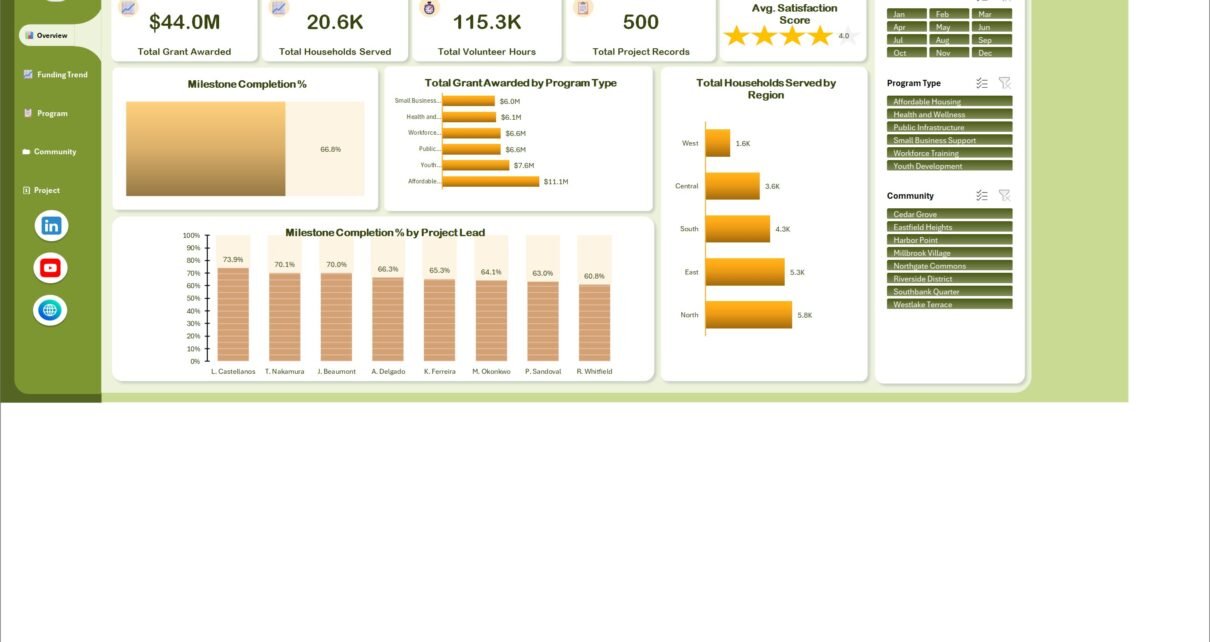
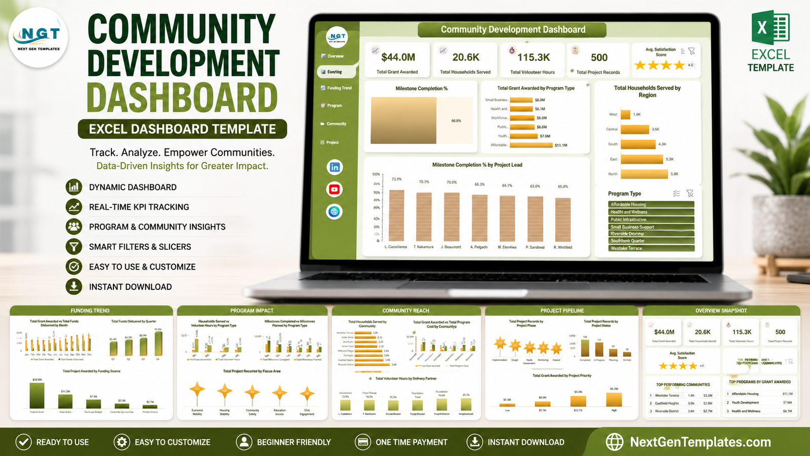
A community-development report can become hard to read when grant values, household reach, volunteer effort, program milestones, and project status live in separate files. The Community Development Dashboard in Excel brings those measures into five linked analysis pages built from 500 sample project records. Its opening view shows $44.0M in grants awarded, 20.6K households served, 115.3K volunteer hours, 500 project records, a 66.8% milestone completion rate, and a 4.0 average satisfaction score. Those are demonstration figures, not benchmarks or promised outcomes. The value of the workbook is the reporting structure: replace the sample records with your own verified data, refresh the workbook, and use the slicers to prepare a consistent review.
This template is designed for nonprofits, foundations, local development bodies, public agencies, and community partnerships that already manage a structured project register in Microsoft Excel. It is a reporting layer, not a grant-compliance system, donor CRM, accounting package, case-management database, or impact-evaluation methodology.
Key Features of the Community Development Dashboard in Excel
- Five focused pages: Overview, Funding Trend, Program Impact, Community Reach, and Project Pipeline.
- 500 populated sample records: test the navigation, filters, and visuals before changing the source data.
- Month, Program Type, and Community slicers: narrow the principal views without building a new report for each meeting.
- Funding analysis: compare grants awarded, funds disbursed, program costs, funding sources, program types, quarters, priorities, and communities.
- Reach and effort analysis: review households served, volunteer hours, delivery partners, focus areas, regions, and communities.
- Delivery analysis: examine milestones planned and completed, project phase, project status, priority, and project-lead results.
- Editable .xlsx workbook: the ZIP contains the Excel file plus a PDF user manual; it does not rely on a macro-enabled file.
- One-time purchase: there is no recurring dashboard subscription or per-seat charge for the template itself.
The workbook uses Excel slicers to make common filters visible and clickable. Microsoft explains that slicers can filter tables or PivotTables and show the current filtering state in its official Excel slicer guide.
Dashboard Pages Explanation
Overview – headline funding, reach, effort, and delivery
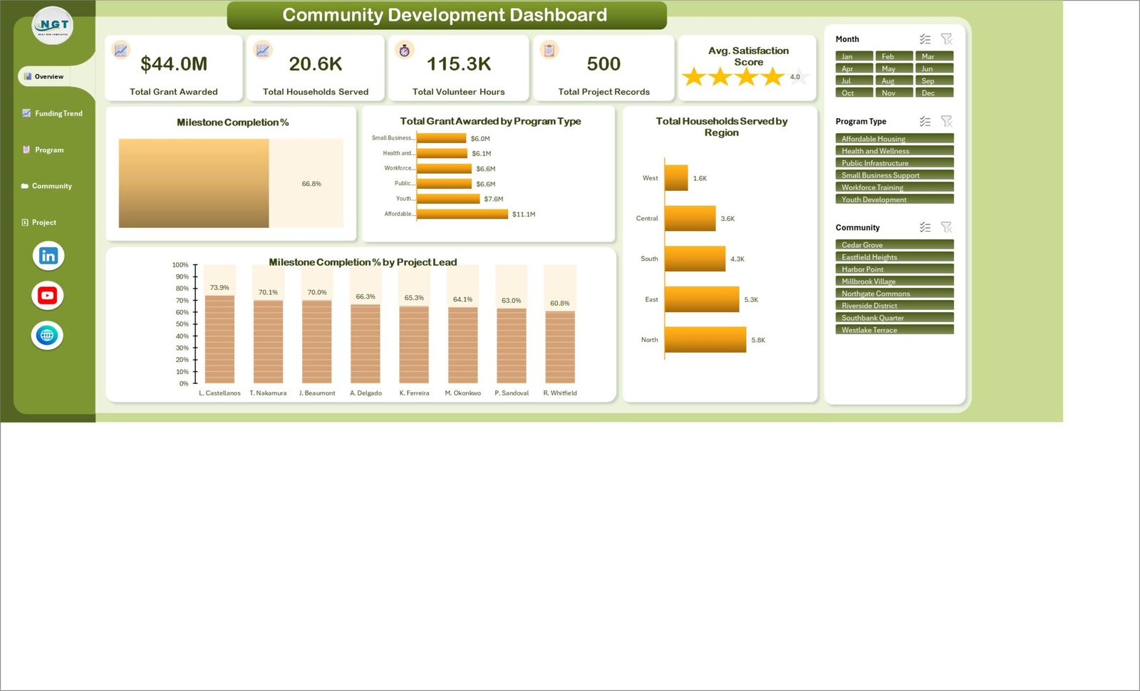
The Overview page is the meeting opener. Five KPI cards show Total Grant Awarded, Total Households Served, Total Volunteer Hours, Total Project Records, and Average Satisfaction Score. A separate visual shows Milestone Completion at 66.8% in the sample file. Below and beside those cards, the page compares Total Grant Awarded by Program Type, Total Households Served by Region, and Milestone Completion % by Project Lead. Affordable Housing leads the sample program view at $11.1M, while the North region leads household reach at 5.8K.
Funding Trend – awards, disbursements, sources, and timing
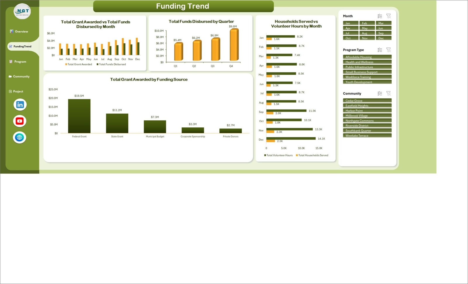
This page compares Total Grant Awarded with Total Funds Disbursed by month. A quarterly view shows sample disbursements rising from $5.4M in Q1 to $9.8M in Q4. Funding-source analysis splits the $44.0M grant total across Federal Grant ($19.5M), State Grant ($11.2M), Municipal Budget ($7.3M), Corporate Sponsorship ($3.3M), and Private Donors ($2.7M). The right-hand visual compares Households Served with Volunteer Hours by month, making it easier to discuss activity and reach together without implying one caused the other.
Program Impact – program activity and focus-area coverage
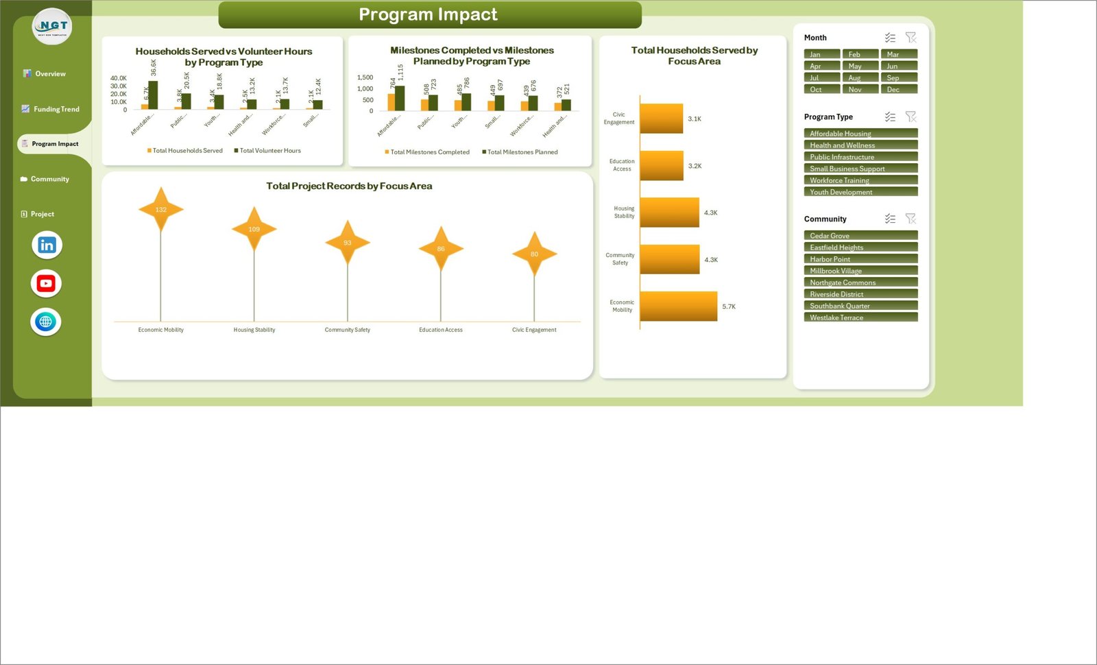
The Program Impact page compares Households Served with Volunteer Hours by Program Type and Milestones Completed with Milestones Planned by Program Type. It also summarizes households served across Economic Mobility, Housing Stability, Community Safety, Education Access, and Civic Engagement. A project-count view uses the same focus areas, with Economic Mobility holding 132 of the 500 sample records. Treat these measures as operational reporting inputs; the dashboard does not establish counterfactual impact, attribution, statistical significance, or long-term outcomes.
Community Reach – geography and delivery partners
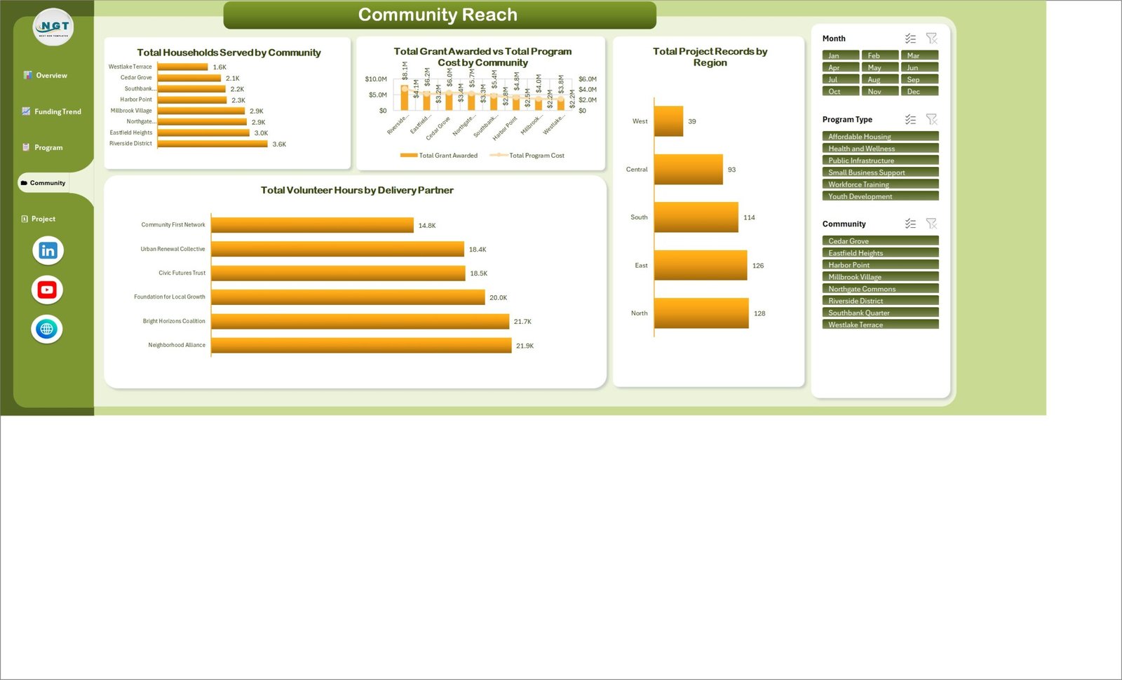
Community Reach compares households served across named communities, grant awarded against program cost by community, project counts by region, and volunteer hours by delivery partner. In the sample view, Riverside District records 3.6K households served, the North region has 128 projects, and Neighborhood Alliance contributes 21.9K volunteer hours. Long community names are shortened on some chart axes, so reviewers should use the source data or slicer labels when an exact name matters.
Project Pipeline – phase, status, priority, and ownership
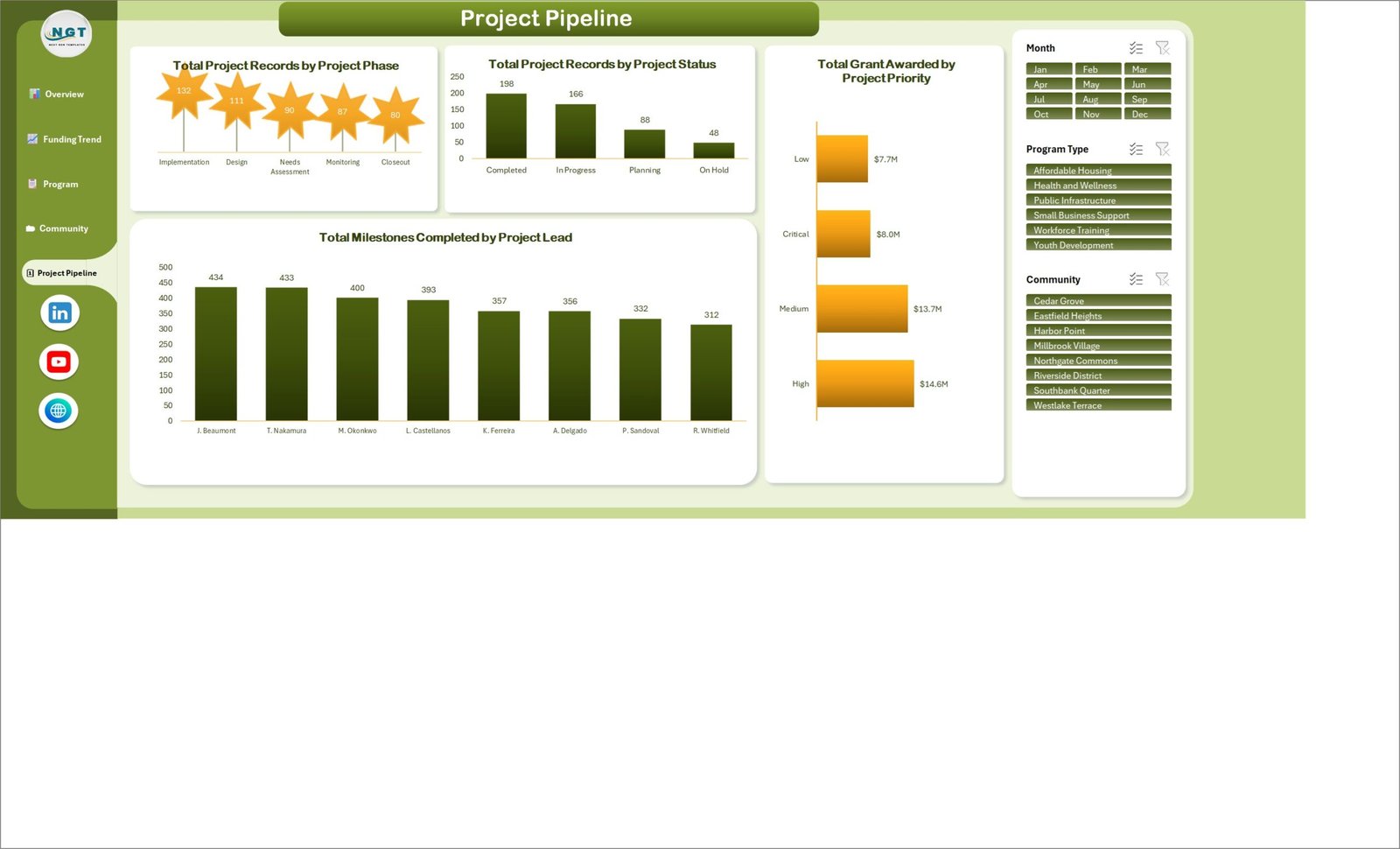
The final page places delivery status in context. Project phase totals are Implementation 132, Design 111, Needs Assessment 90, Monitoring 87, and Closeout 80. Status totals reconcile to the 500 records: 198 Completed, 166 In Progress, 88 Planning, and 48 On Hold. Funding is grouped by priority, while Total Milestones Completed by Project Lead highlights differences in workload and completion volume. These are sample totals; use your own governance definitions for phase, status, and priority.
Community Development Dashboard in Excel vs. Google Sheets vs. Paid Nonprofit SaaS – Feature Comparison
| Capability | This Excel template | Google Sheets dashboard | Paid nonprofit SaaS |
|---|---|---|---|
| Cost model | $17.99 sale price, one time | Usually one-time template cost | Recurring subscription |
| Primary platform | Microsoft Excel desktop | Web browser | Vendor cloud |
| Initial setup | Replace structured sample records and refresh | Copy the sheet and replace data | Configuration, migration, and onboarding |
| Collaboration | Shared file or Microsoft 365 co-authoring | Native browser sharing | Role-based multi-user access |
| Custom calculations | Editable within the workbook | Editable within the sheet | Controlled by vendor features |
| Offline use | Yes, with desktop Excel | Limited/offline mode varies | Usually internet dependent |
| Grant and program reporting | Five pages included | Depends on template | Often configurable |
| Case management, audit trail, permissions | No | No | Often available |
Who Should Use This Template
Nonprofit program directors can use it for monthly operational reviews across several programs. Grant managers can place awarded and disbursed funding beside activity measures before preparing funder updates. Local government or development teams can compare reach across communities and regions. Foundations can summarize a structured grantee-project export, provided the records use consistent definitions.
It is less suitable for organizations that need beneficiary-level case notes, donor communications, receipting, accounting entries, grant-condition workflows, automated survey collection, row-level security, or evidence-grade outcome evaluation. Sensitive personal data should not be added merely because the workbook can hold it; follow your organization’s privacy and retention rules.
Real-World Use Cases
A monthly program review
Maya, a program director, opens Overview to confirm the total record count, then filters Program Impact to one program type. She validates the charts against the source export before including them in the leadership pack.
A grant-utilization discussion
Daniel, a grant manager, uses Funding Trend to compare awards and disbursements by month and quarter. The view flags questions for follow-up, but the finance system remains the source of record.
A community partnership meeting
Aisha, a partnership lead, filters Community Reach to one community and reviews household reach, volunteer contribution, project count, and delivery partners. She uses the dashboard to frame the conversation, not to claim attribution.
Advantages of the Community Development Dashboard in Excel
- It presents funding, reach, volunteer effort, milestones, and pipeline status in one consistent visual system.
- The sample dataset makes the workbook testable immediately.
- Visible slicers reduce the need to duplicate reports for every month, program, or community.
- The workbook is editable and can remain inside an existing Excel-based reporting process.
- A one-time template is easier to budget than another per-user reporting subscription.
Opportunities for Improvement
The template does not connect directly to a CRM, accounting platform, survey tool, or grant-management system. Data replacement and refresh are manual steps. Some long category and community labels are shortened on the charts, especially on the Program Impact and Community Reach pages. The marketing artwork is a designed presentation of the workbook; the five gallery screenshots are the reliable reference for the shipped page layouts. If you need automated imports, protected workflow stages, beneficiary case records, or a formal audit trail, use a database or specialist platform and treat this workbook as a downstream reporting layer.
Best Practices
- Keep an untouched backup of the original download.
- Define each field, status, priority, and outcome measure before importing records.
- Preserve the source headers and value formats used by the workbook.
- Refresh the workbook after replacing data, then test every slicer and page.
- Reconcile grant, project, household, and volunteer totals to the authoritative source.
- Remove or aggregate sensitive personal information before sharing the workbook.
- Add a reporting-period note to exported screenshots so viewers know the time window.
Explore Relevant Templates
- Community Services Dashboard in Excel for a related Excel-based community reporting view.
- Community Services Dashboard in Power BI for interactive Power BI reporting.
- Housing & Urban Development Dashboard in Excel for housing-focused analysis.
- Housing & Urban Development Dashboard in Power BI for cross-platform housing and urban-development reporting.
Browse the full Excel Dashboard collection.
Frequently Asked Questions
Does this dashboard connect automatically to other systems?
No. Import or paste your structured records into Excel and refresh the workbook.
Are the displayed figures real benchmarks?
No. They are sample data used to demonstrate the template and must not be presented as sector benchmarks.
Does the workbook prove social impact?
No. It summarizes the measures provided. Causal attribution and evaluation design require separate methods and evidence.
Can I edit the fields and visuals?
Yes, but keep a backup and preserve the structures used by charts, pivots, and slicers.
Does it require VBA or macros?
No. The package contains an .xlsx workbook and a PDF manual, not a macro-enabled workbook.
Can several people work on it?
Yes, through normal file sharing or supported Microsoft 365 co-authoring. Apply your own access controls.
What is included in the download?
The ZIP contains the Community Development Dashboard in Excel workbook and an Excel Dashboard user manual in PDF format.
About the Author
Built by PK – Microsoft Certified Professional with 15+ years of Excel, Google Sheets, and Power BI experience. Founder of NextGenTemplates, reaching 300K+ subscribers across YouTube channels. Every template is hand-built and tested before release.
Conclusion
The Community Development Dashboard in Excel is a practical option when your team already maintains structured project data and needs a repeatable five-page review of grants, activity, reach, volunteer effort, and delivery progress. It keeps the calculations and presentation inside an editable workbook while being honest about the limits: no automatic source connection, no case management, and no causal impact claims. Get the Community Development Dashboard in Excel for $17.99, replace the sample data with your own verified records, and use it as a reporting layer alongside your source systems.
For more Excel dashboard tutorials, visit the PK-AnExcelExpert YouTube channel.
Last updated: 18 August 2026.