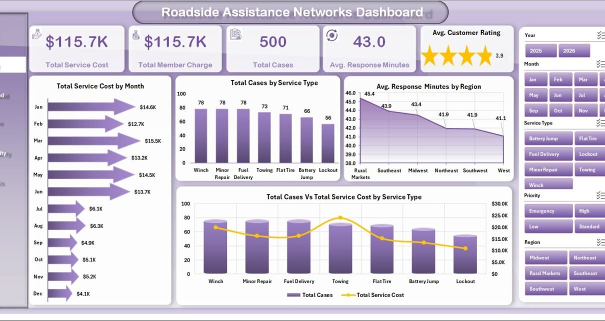
Roadside Assistance Networks Dashboard in Excel is a ready-to-use reporting workbook for teams that need a clearer view of roadside service cost, member charges, case volume, response time, customer rating, provider workload, escalation patterns, and motor club performance. The template includes 7 worksheet tabs, 5 executive KPI cards, 19 chart views, multiple slicers, a Data Sheet, and a pivot-based Support Sheet. Instead of rebuilding the same monthly network report from exported dispatch data, users can replace the sample records, refresh the workbook, and review performance across Overview, Service Demand, Provider Ops, Response Quality, and Cost Analysis pages.
For roadside assistance networks, speed and service consistency matter. A delayed jump start, tow, tire change, lockout, or fuel delivery can quickly affect member satisfaction. This Excel dashboard gives provider managers, motor club teams, dispatch leaders, and analysts a practical way to review what happened, where demand came from, which providers handled the work, and where cost or response quality needs attention.
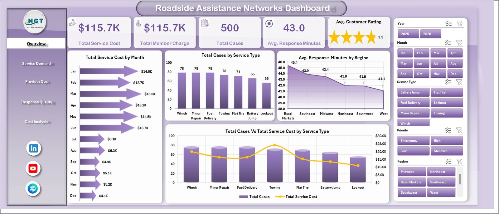
Roadside Assistance Networks Dashboard in Excel
Key Features of Roadside Assistance Networks Dashboard in Excel
- 7 worksheet tabs: Overview, Service Demand, Provider Ops, Response Quality, Cost Analysis, Data Sheet, and Support Sheet.
- 5 KPI cards: Total Service Cost, Total Member Charge, Total Cases, Avg. Response Minutes, and Avg. Customer Rating.
- 19 chart views: Analyze month, service type, region, provider, priority, vehicle type, status, dispatch channel, motor club, and cost behavior.
- Multiple slicers: Filter dashboard pages quickly during weekly operations reviews or monthly partner meetings.
- Refreshable pivot design: Update the Data Sheet, then use Excel Refresh All to update the pivots and charts.
- Editable workbook: Customize labels, fields, slicers, charts, and sample records for your own roadside assistance workflow.
Dashboard Pages Explanation
1. Overview Page
The Overview Page gives the high-level performance summary. At the top, the dashboard shows Total Service Cost, Total Member Charge, Total Cases, Avg. Response Minutes, and Avg. Customer Rating. These cards help managers see cost, volume, response speed, and satisfaction before checking the detailed analysis sheets.
Total Service Cost by Month: This chart tracks monthly service cost movement. It helps teams identify cost spikes, seasonal demand, and months that need deeper provider or region review.
Total Cases by Service Type: This chart compares case volume across roadside services such as towing, jump start, lockout, fuel, tire, or similar assistance categories. It helps explain which service types create the most operational workload.
Avg. Response Minutes by Region: This chart compares average response time across regions. It helps teams see where provider coverage, dispatch routing, or local availability may need improvement.
Total Cases Vs Total Service Cost by Service Type: This chart connects workload and cost by service type. It helps show whether high-volume services also create high spend or whether a lower-volume category is unusually expensive.
2. Service Demand
The Service Demand sheet focuses on how cases are distributed across time, priority, vehicle type, and provider. It supports dispatch planning, network capacity review, and recurring demand analysis.
Total Cases by Month: This chart shows month-wise case volume. It helps managers see seasonality and prepare coverage for busier periods.
Avg. Response Minutes by Priority: This chart compares response time by priority level. It helps confirm whether urgent requests are being handled faster than lower-priority service calls.
Total Distance Miles by Vehicle Type: This chart reviews travel distance by vehicle type. It helps explain whether certain vehicle segments create longer service distance or higher operating effort.
Total Cases by Provider: This chart compares case volume by provider. It helps identify heavily used partners and supports workload balancing discussions.
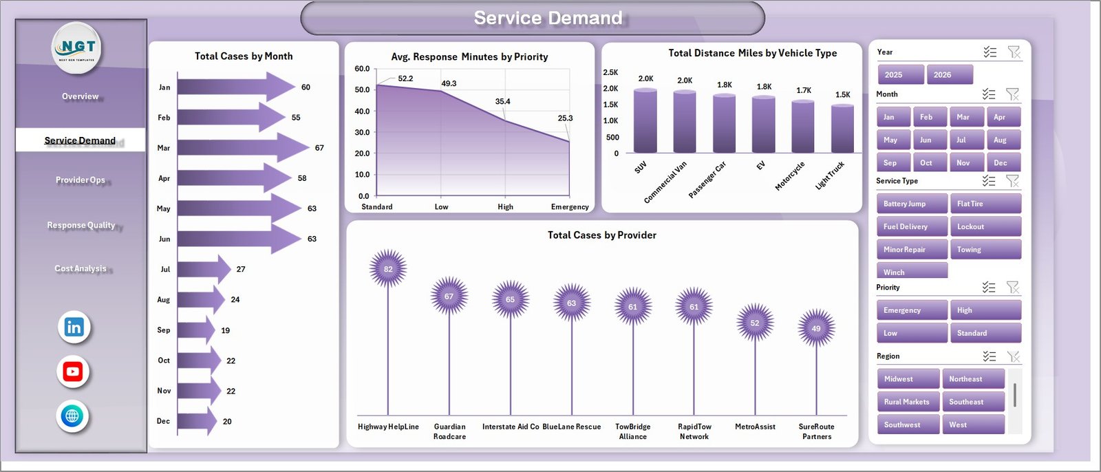
Service Demand
3. Provider Ops
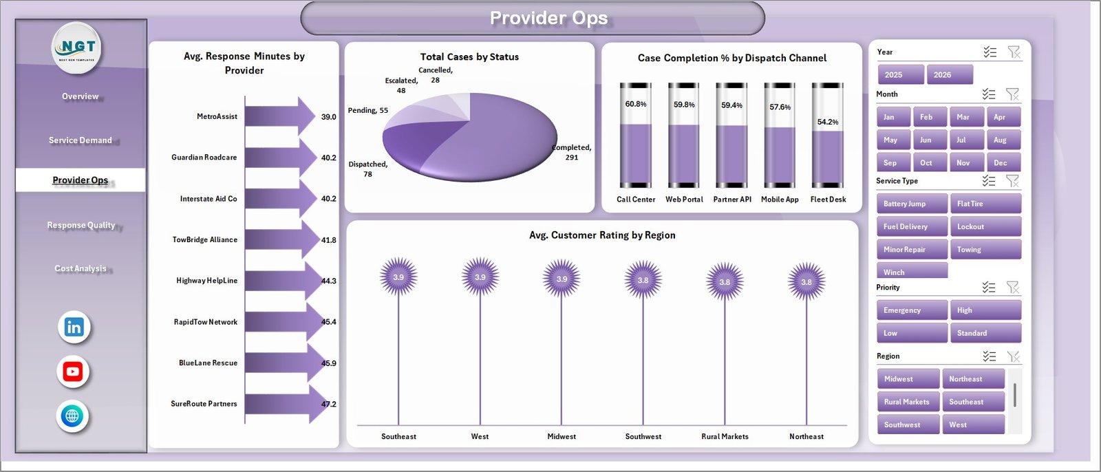
The Provider Ops sheet helps network teams review provider response speed, case status, completion rate by dispatch channel, and regional customer rating. This page is useful before provider scorecard conversations.
Avg. Response Minutes by Provider: This chart compares response time by provider. It helps identify partners that are faster or slower than the network average.
Total Cases by Status: This chart groups cases by status. It gives a clear view of completed, pending, cancelled, open, or other workflow states.
Case Completion % by Dispatch Channel: This chart compares completion percentage across dispatch channels. It helps teams understand whether app, phone, web, partner, or other channels are closing cases efficiently.
Avg. Customer Rating by Region: This chart compares customer satisfaction by region. It helps connect member experience to local network performance.
Provider Ops
4. Response Quality
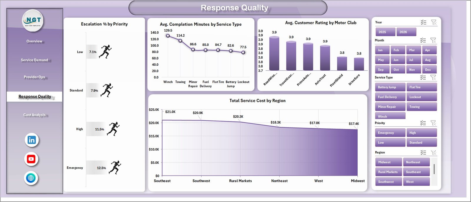
The Response Quality sheet reviews escalation behavior, completion time, customer ratings, motor club performance, and regional cost. It is designed for quality control and service improvement meetings.
Escalation % by Priority: This chart compares escalation percentage by priority. It helps show whether urgent or high-priority cases are also creating more exceptions.
Avg. Completion Minutes by Service Type: This chart compares completion duration by service type. It helps teams understand the total service effort beyond the first response.
Avg. Customer Rating by Motor Club: This chart compares customer rating by motor club. It helps support partner reporting and satisfaction analysis across club relationships.
Total Service Cost by Region: This chart compares regional service cost. It helps identify expensive territories where distance, provider mix, or pricing may need review.
Response Quality
5. Cost Analysis
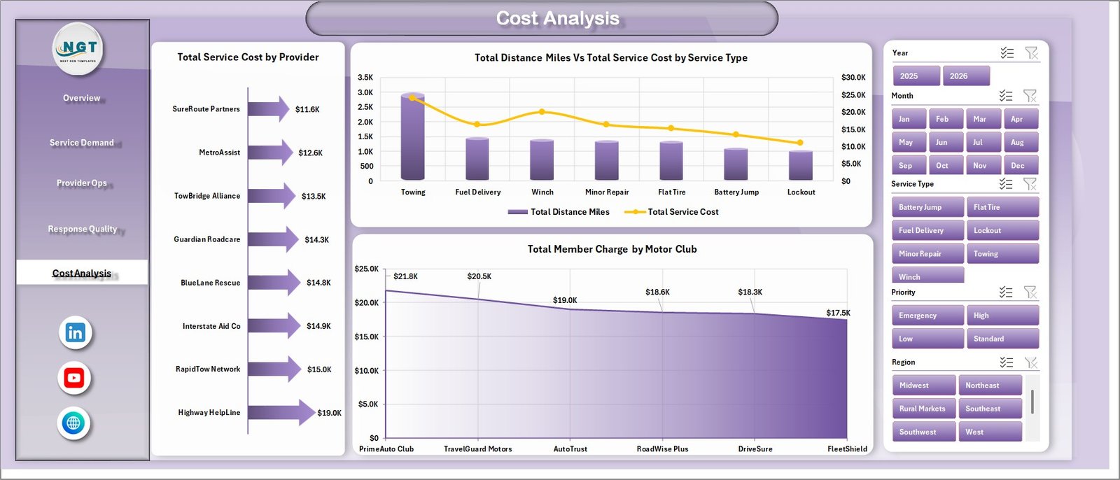
The Cost Analysis sheet helps finance and operations teams review service spend, distance, and member charge concentration. It is useful for monthly cost reviews and provider pricing discussions.
Total Service Cost by Provider: This chart compares total service cost across providers. It helps identify high-cost partners and whether spend appears aligned with workload.
Total Distance Miles Vs Total Service Cost by Service Type: This chart compares distance and cost by service type. It helps explain whether cost pressure is tied to longer travel or specific assistance categories.
Total Member Charge by Motor Club: This chart compares member charge by motor club. It helps teams understand revenue-side contribution across club relationships.
Cost Analysis
6. Data Sheet Tab
The Data Sheet is where users add roadside assistance records in the same format as the sample data. Keeping the column structure consistent is important because the dashboard cards, charts, slicers, and pivot tables depend on this source layout.

Data Sheet tab
7. Support Sheet
The Support Sheet contains multiple pivot tables used to build the dashboard dynamically. After updating the Data Sheet, go to the Data tab in the Excel ribbon and click Refresh All. The pivots and charts will refresh together, and the Support Sheet can be hidden during normal use.

Support sheet tab
Roadside Assistance Networks Dashboard in Excel vs. Google Sheets vs. Paid CRM/SaaS – Feature Comparison
| Feature | This Excel dashboard | Google Sheets alternative | Paid roadside SaaS |
|---|---|---|---|
| Cost | One-time template purchase | Low software cost but manual build | Recurring subscription or contract pricing |
| Platform | Microsoft Excel | Google Sheets | Vendor cloud platform |
| Setup time | Download, replace data, refresh | Build tables, formulas, charts, and filters | Onboarding and configuration required |
| Real-time collaboration | Best with shared Excel/OneDrive workflow | Strong native collaboration | Usually included by plan |
| Mobile access | Depends on Excel and file sharing setup | Available through Google Sheets app | Usually available through app or browser |
| Customizable fields | Editable workbook, pivots, charts, and data table | Editable but must be built carefully | Limited by vendor permissions |
| Year-1 cost at 5 users | Template cost plus Excel access | Workspace cost plus build time | Often much higher with subscriptions |
| Roadside reporting fit | Best for recurring analytical reporting | Best for lightweight shared tracking | Best for live dispatch and workflow execution |
Who Should Use This Template
This dashboard is useful for roadside assistance providers, motor club reporting teams, provider network managers, dispatch operations leaders, automotive service coordinators, insurance assistance teams, fleet support analysts, and consultants who need a structured Excel workbook for service performance reporting.
It is not intended to replace live dispatch software, GPS tracking, customer communication platforms, billing systems, or provider portals. It works best when your data can be exported from another system or entered into the Data Sheet for periodic reporting.
Real-World Use Cases
Maya, provider network manager: reviews response minutes by provider and customer rating by region before monthly provider scorecard calls.
Daniel, dispatch operations lead: checks Service Demand to see which service types and priority levels created the most workload during the month.
Priya, finance analyst: uses Cost Analysis to compare service cost by provider, distance miles by service type, and member charges by motor club.
Advantages of Roadside Assistance Networks Dashboard in Excel
The main advantage is speed. A finished workbook structure lets teams move from raw service records to a management-ready dashboard faster than rebuilding charts every month. The Data Sheet and Support Sheet structure also makes the dashboard easier to refresh as long as the source format is preserved.
Another advantage is transparency. Because it is an Excel file, analysts can inspect the source records, pivot tables, slicers, and chart logic. This makes it easier to customize the workbook for internal terminology, regional structures, service categories, and provider names.
Opportunities for Improvement
This is a reporting dashboard, so it does not automate dispatch, assign providers, collect payments, notify members, or track vehicles live. Teams that need real-time operational execution should use a dedicated roadside assistance system and use this workbook as a reporting layer.
For larger teams, the next improvement would be connecting exported data through Power Query or a controlled data pipeline. Microsoft also continues to improve Excel refresh options, including newer PivotTable auto-refresh features for supported Microsoft 365 environments. You can review related Excel update guidance from Microsoft here: Microsoft 365 Insider – PivotTable Auto Refresh in Excel.
Best Practices
Keep your Data Sheet columns consistent. If you rename or remove columns, the pivot tables and charts may need to be updated. Add new records below the existing sample structure, use clean provider and region names, and avoid mixing spelling variations for the same service type or motor club.
Refresh the workbook after every data update. Review the Support Sheet only when you need to troubleshoot pivot logic, and hide it before sharing the file with users who only need the dashboard pages.
Explore Relevant Templates
- Roadside Assistance Networks Dashboard in Excel
- Rental Services Dashboard in Excel
- Logistics Automation Dashboard in Excel
- Postal Services Dashboard in Power BI
- Browse Excel Dashboard Templates
Frequently Asked Questions
What does this roadside assistance dashboard track?
It tracks service cost, member charge, total cases, average response minutes, customer rating, service type, provider, region, priority, status, vehicle type, motor club, dispatch channel, distance miles, completion minutes, and escalation percentage.
Can I use my own data?
Yes. Replace the sample records in the Data Sheet with your own data in the same format, then refresh the workbook.
Does the dashboard require macros?
No. It is designed around Excel tables, pivot tables, slicers, cards, and charts.
Can I customize the pages?
Yes. You can edit labels, charts, slicers, pivot fields, colors, and source records if you are comfortable with Excel.
Is this a dispatch management system?
No. This is an analytical dashboard for reporting. It does not assign cases, track live vehicle location, or communicate with members.
Which Excel version should I use?
A modern desktop version of Microsoft Excel is recommended for the best pivot refresh and slicer experience.
About the Author
Built by PK – Microsoft Certified Professional with 15+ years of Excel, Google Sheets, and Power BI experience. Founder of NextGenTemplates, reaching 300K+ subscribers across YouTube channels. Every template is hand-built and tested before release.
Conclusion
The Roadside Assistance Networks Dashboard in Excel gives roadside assistance teams a clean way to review cost, cases, response speed, provider workload, quality, distance, motor club results, and regional performance from one workbook. It is especially useful when you already have dispatch or case records and need a faster reporting layer for operations meetings, provider reviews, and monthly performance analysis.
For more Excel dashboard tutorials and template walkthroughs, visit PK An Excel Expert on YouTube.