The Organization Chart in Excel template turns a structured employee master table into a clean, dynamic hierarchy inside Excel. The sample workbook shown here includes 18 employee records, 10 employee data columns, 13 chart formatting controls, and 3 VBA action buttons: Generate Chart, Clear Chart, and Fit to Screen. That structure is useful because org charts change often when people join, managers change, departments move, or dotted-line relationships need to be shown.
This template is built for users who want the employee data and the visual chart in the same workbook. Instead of redrawing boxes manually, you maintain the employee table, choose the chart styling, and generate the hierarchy from the source data. Microsoft also documents the idea of creating organization charts from Excel employee data in Visio, which reinforces the value of keeping the hierarchy in a structured table first. You can read Microsoft Support’s related guidance here: create an org chart based on Excel data.
Get the Organization Chart in Excel template here if you want a ready-made VBA workbook for HR reporting, team planning, and employee hierarchy visualization.
Download the Organization Chart in Excel template from NextGenTemplates
Key Features of Organization Chart in Excel
- Dynamic org chart generation: Use the Generate Chart button to redraw the hierarchy from the employee master data.
- Employee master data table: Maintain employee ID, employee name, designation, department, reporting manager, dotted manager, photo file name, box color, show-in-chart flag, and manager ID validation.
- Solid and dotted reporting lines: Show the main manager with a solid line and optional second or third manager relationships with dashed lines.
- Photo support: Display employee photos using file names from the master data and choose how photos appear in the nodes.
- Department-based colors: Apply box colors from the data table so each department can be visually separated.
- Custom node styling: Control node shape, photo shape, box width, box height, font, font size, and department/designation visibility.
- Connector controls: Adjust connector style, connector color, dotted line color, and dotted line style.
- Fit to Screen button: Quickly resize the generated chart view so the full hierarchy is easier to review.
Workbook Sheets Explanation
The workbook has two visible working areas: an employee master data sheet and a dynamic organization chart sheet. The data sheet is where you update employee records. The chart sheet is where the VBA automation reads those records and draws the reporting structure.
Download the Organization Chart in Excel template from NextGenTemplates
Employee Master Data Sheet
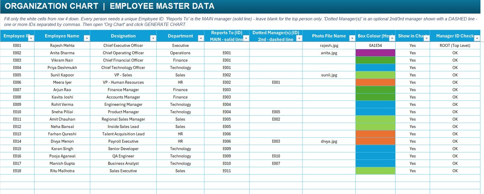
The master data sheet is the control center for the hierarchy. Every employee gets a unique employee ID. The Reports To (ID) column defines the main reporting line, while Dotted Manager(s) (ID) can be used for optional secondary reporting relationships. The Manager ID Check column helps validate whether the reporting setup is ready before the chart is generated.
The screenshot includes sample records for executive, operations, finance, sales, HR, and technology roles. For example, Rajesh Mehta is the top-level CEO record, while department leaders and team members report through their assigned manager IDs. This structure makes the chart easier to maintain than a manually drawn set of shapes.
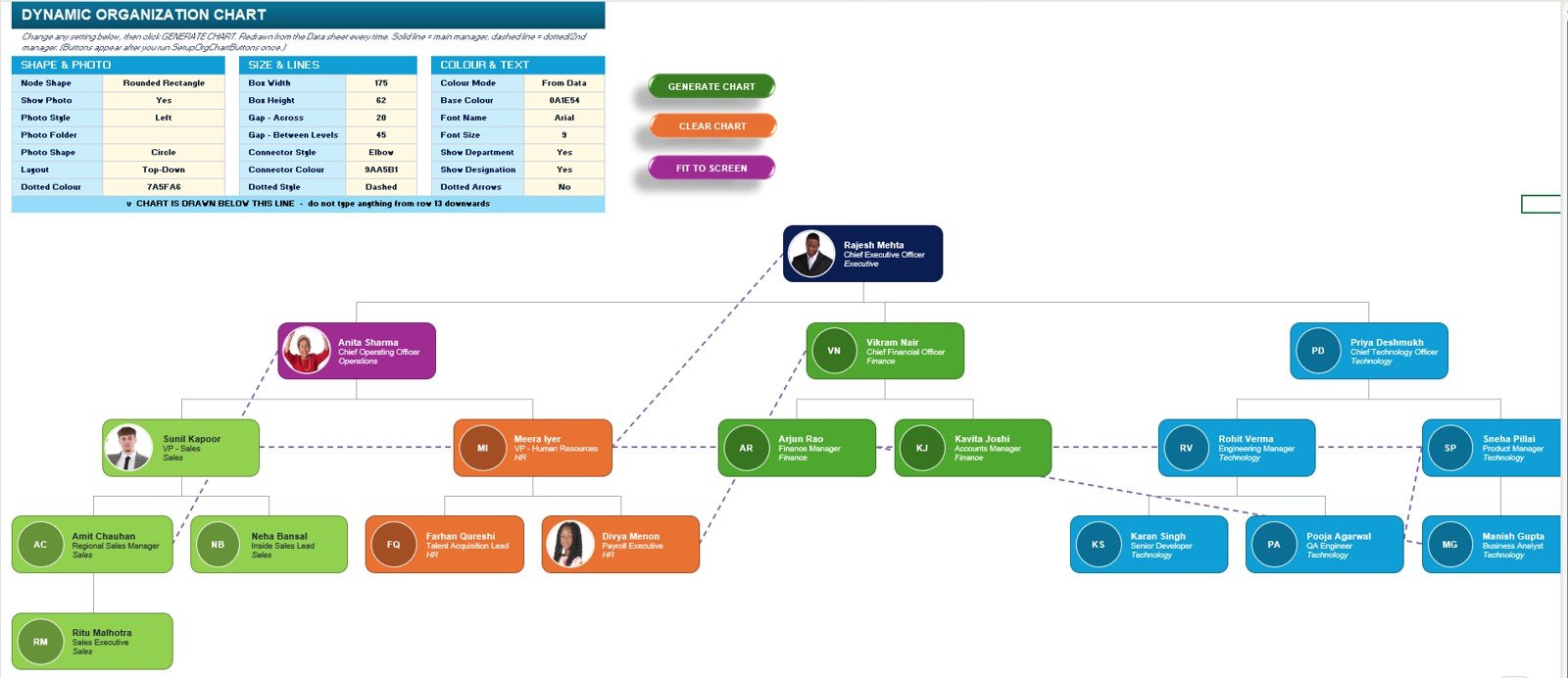
Dynamic Organization Chart Sheet
The chart sheet includes the generated hierarchy plus a settings area for layout and styling. You can choose a top-down layout, rounded rectangle nodes, photo placement, connector type, and whether to show department and designation text. Buttons at the top let you generate, clear, and resize the chart view.
Organization Chart in Excel vs. Google Sheets vs. Paid HR SaaS
| Feature | Excel Template | Google Sheets | Paid HR SaaS |
|---|---|---|---|
| Works from employee table | Yes | Possible with scripts or add-ons | Yes |
| VBA chart generation | Yes | No | No |
| Employee photos | Yes, via file names | Possible with image links | Usually yes |
| Dotted manager lines | Yes | Manual or scripted | Depends on plan |
| One-time cost | Yes | Usually free, but manual work | Usually subscription |
| Works offline | Yes | No | No |
| Best fit | HR teams using Excel | Cloud-first teams | Companies needing full HRIS workflow |
Who Should Use This Template
- HR managers who need a visual employee hierarchy for reporting, onboarding, and leadership reviews.
- Business owners who want a simple way to document roles and reporting lines.
- Operations teams that need a department chart without buying a full HR platform.
- Consultants who prepare organization design, restructuring, or workforce planning files for clients.
- Excel VBA users who want a reusable example of shape creation, connector logic, and data-driven chart automation.
Real-World Use Cases
Download the Organization Chart in Excel template from NextGenTemplates
Monthly HR reporting: Update the employee table each month and regenerate the chart before sending leadership reports.
Department restructuring: Test new reporting lines by changing manager IDs before making official changes.
New employee onboarding: Help new hires understand who reports to whom and where their department sits in the company.
Dotted-line project teams: Use dashed connectors for matrix reporting, project leadership, or temporary secondary managers.
Client consulting files: Build a quick visual hierarchy for process audits, team assessments, or operating model reviews.
Advantages of Organization Chart in Excel
The biggest advantage is control. Many teams already maintain employee lists in Excel, so an Excel-based org chart avoids duplicate tools and duplicate data entry. You can adjust the chart design, add photos, change colors, and rebuild the visual in the same environment where the employee list is maintained.
The template also supports both standard reporting and matrix-style dotted reporting. That is important for finance, technology, operations, and project teams where a person may report to one manager officially while working under another manager for a project or functional review.
Opportunities for Improvement
This template is designed for Excel desktop users and relies on VBA macros. That means it is best used in the desktop version of Microsoft Excel with macros enabled. It is not intended as a replacement for a full HRIS, employee self-service system, or live directory with user permissions.
Future enhancements could include export-to-PDF buttons, more layout options, department filters, multi-page chart printing, and a separate photo folder validator. These would be useful for larger organizations with hundreds of employees or multiple locations.
Best Practices
- Keep every employee ID unique and avoid changing IDs after the chart is already in use.
- Leave the Reports To field blank only for the top-level person in the hierarchy.
- Use department colors consistently so the chart remains easy to scan.
- Store employee photos in one folder and keep file names exactly matched to the master data.
- Use the manager ID check column before generating the chart.
- Save a backup copy before making large restructuring changes.
- Limit node text to the most useful fields: name, designation, department, and optional photo.
Explore Relevant Templates
- Employee Master and Record Data Entry System in Excel
- Payroll Data Entry System in Excel
- Leave Management System
- HR Director Toolkit – 10 Premium Templates
- Excel VBA Tools & Utilities Pack
Frequently Asked Questions
Download the Organization Chart in Excel template from NextGenTemplates
What is Organization Chart in Excel?
Organization Chart in Excel is a VBA-based Excel template that creates an employee hierarchy chart from a structured employee master data table.
Does this template require macros?
Yes. The chart generation buttons use VBA, so macros must be enabled in Excel desktop for the automation to run.
How do dotted managers work?
The main manager is entered in the Reports To ID column and appears as a solid line. Optional dotted managers are entered in the Dotted Manager(s) ID column and appear as dashed lines.
Can I add employee photos?
Yes. The template includes a Photo File Name column and chart settings for showing employee photos inside the chart nodes.
Can I add more employees?
Yes. Add more rows to the employee master data table, assign unique employee IDs, fill in manager IDs, and regenerate the chart.
Can I customize colors and box styles?
Yes. The chart sheet includes settings for node shape, box size, connector style, connector color, dotted line color, base color, font, and department visibility.
Is this suitable for multi-user editing?
It is best for controlled editing by one owner or a small HR/admin team. For simultaneous multi-user editing, use a shared process and avoid multiple people editing the macro workbook at the same time.
About the Author
Built by PK – Microsoft Certified Professional with 15+ years of Excel, Google Sheets, and Power BI experience. Founder of NextGenTemplates, reaching 300K+ subscribers across YouTube channels. Every template is hand-built and tested before release.
Conclusion
The Organization Chart in Excel template is a practical way to turn employee master data into a visual reporting hierarchy. It is especially useful for HR teams, operations managers, and Excel users who want a data-driven chart with photos, department colors, solid reporting lines, and dotted manager relationships.
Download the Organization Chart in Excel template from NextGenTemplates and customize it for your team structure.
For more Excel, VBA, Google Sheets, and dashboard tutorials, visit the PK: An Excel Expert YouTube channel: https://youtube.com/@PKAnExcelExpert.
Last updated: August 2026