Gift Shops Dashboard in Power BI is a ready-to-use Power BI dashboard template for gift shop owners, retail managers, finance teams, and analysts who want to track revenue, cost, net profit, quantity, transactions, product mix, store performance, customer ratings, and monthly trends in one visual report. Gift shops can have sharp sales swings around holidays, tourism seasons, promotions, and local events, so managers need more than a flat sales table to understand what is working.
This Power BI report turns gift shop transaction data into 5 interactive pages with KPI cards, slicers, and focused charts. You can open the .pbix file in Power BI Desktop, replace the sample data with your own source, refresh the model, and review updated visuals. If you are new to Power BI Desktop, Microsoft provides official guidance here: Get started with Power BI Desktop.
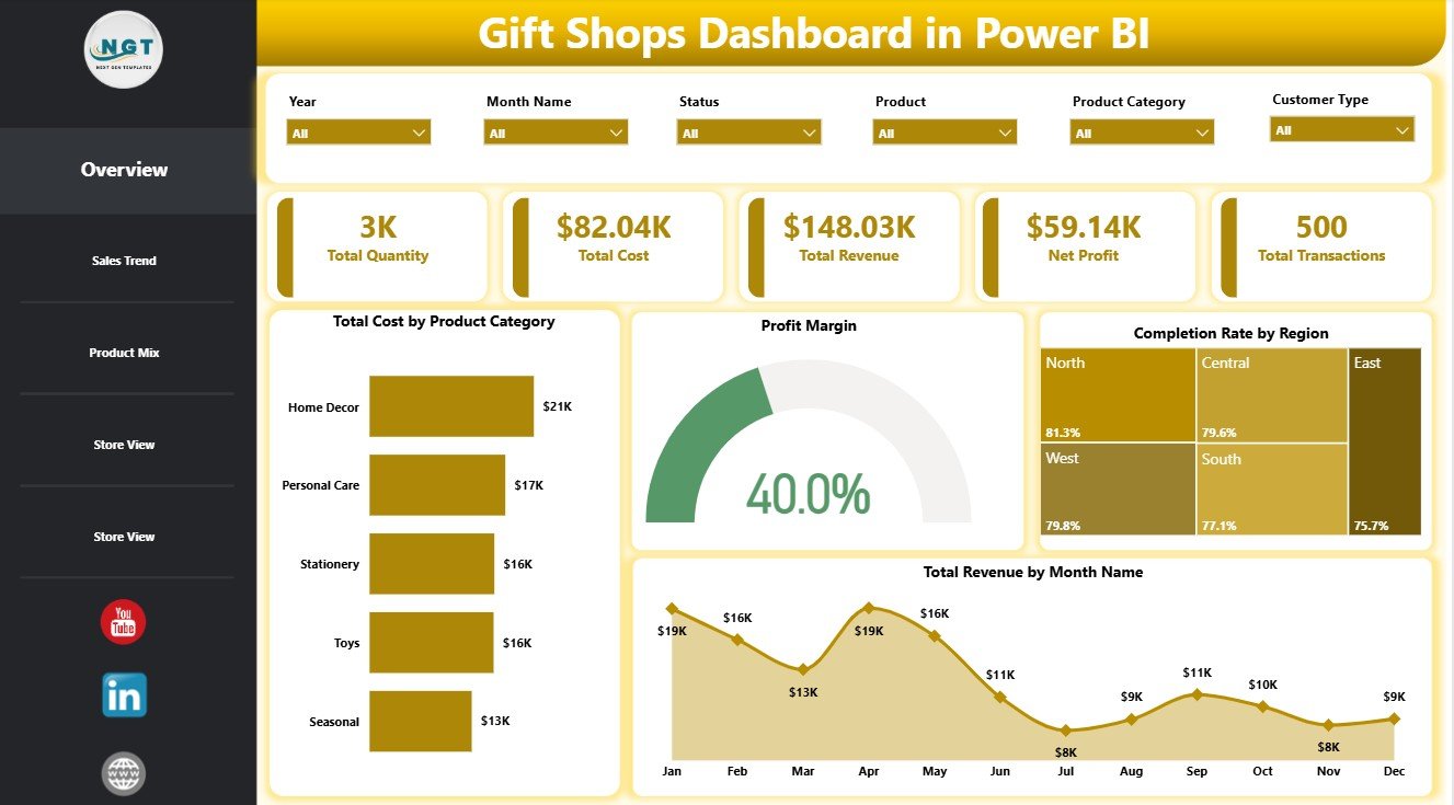
Gift Shops Dashboard in Power BI
Key Features of Gift Shops Dashboard in Power BI
- 5 report pages covering Overview, Sales Trend, Product Mix, Store View, and store performance analysis.
- Executive KPI cards for Total Quantity, Total Cost, Total Revenue, Net Profit, and Total Transactions.
- Interactive slicers for quick filtering across the dashboard.
- Revenue and cost analysis by product category, promotion, sales channel, store, customer type, city, region, product, and month.
- Profitability visuals for net profit, profit margin, and overall performance.
- Customer rating insights by store and customer type.
- Editable Power BI file so you can adjust visuals, filters, fields, and layout as needed.
Dashboard Pages Explanation
1. Overview Page
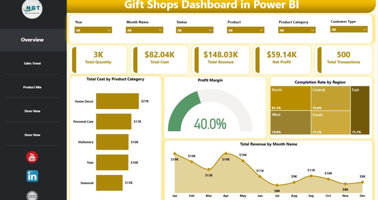
The Overview page gives a high-level snapshot of gift shop business performance. At the top, KPI cards show Total Quantity, Total Cost, Total Revenue, Net Profit, and Total Transactions, so a manager can quickly review sales volume, cost, revenue, profitability, and activity before drilling into detailed pages.
Total Cost by Product Category shows which product groups carry the largest cost load. This helps identify categories that may need pricing review, supplier negotiation, or purchase control.
Profit Margin by Overall Performance helps compare margin health across the dashboard. It shows whether strong sales are also producing healthy profit, which matters in gift retail where discounts and seasonal buying can compress margins.
Completion Rate by Region compares completion performance across regions. This can help managers spot regional fulfillment, cancellation, or service issues that require follow-up.
Total Revenue by Month Name shows monthly sales movement. It is useful for identifying holiday spikes, seasonal slowdowns, and demand patterns that guide inventory and promotion planning.
Overview Page
2. Sales Trend Page
The Sales Trend page focuses on how sales, costs, and profit margins move across categories, promotions, channels, and months. It is useful for weekly or monthly business reviews because it connects revenue performance with cost and profitability.
Net Profit by Product Category shows which categories contribute most to bottom-line results. A product category may generate high revenue but weak profit, so this chart helps separate top sellers from true profit drivers.
Total Cost by Promotion helps evaluate the cost impact of each promotion. If a campaign drives revenue but creates too much cost, managers can adjust discounting, bundles, or promotional timing.
Total Revenue by Sales Channel compares revenue across channels such as in-store, online, marketplace, or other selling routes. This helps identify which channels deserve more marketing attention or operational support.
Profit Margin by Month Name shows monthly margin movement. It helps answer whether revenue growth is also improving profitability, or whether certain months are being supported by low-margin sales.
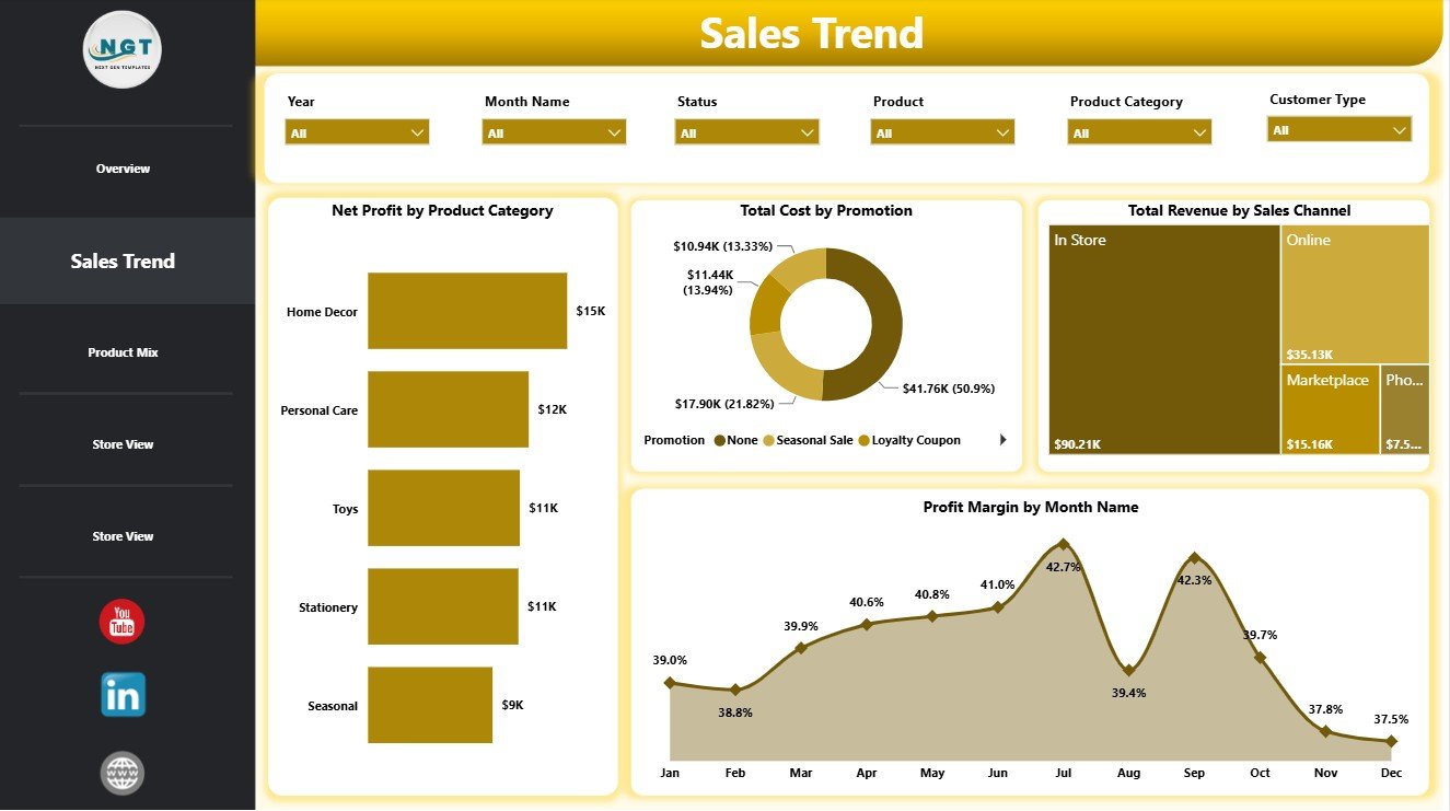
Sales Trend
3. Product Mix Page
The Product Mix page is built for understanding product and store contribution. It helps managers see which stores generate revenue, which products carry strong margins, and which products may need attention because of completion performance.
Total Revenue by Store compares sales contribution by store location. This view helps identify strong branches, underperforming stores, and locations that may need better stock, displays, or promotional support.
Profit Margin by Product shows margin efficiency at the product level. It helps buyers and managers understand which items are worth highlighting, repricing, or renegotiating with suppliers.
Net Profit by Product highlights absolute profit contribution from each product. This is useful because a product with a lower margin can still matter if it sells in high volume.
Completion Rate by Product helps identify products that may have fulfillment, cancellation, availability, or customer-experience issues. Products with low completion rates may need operational review.
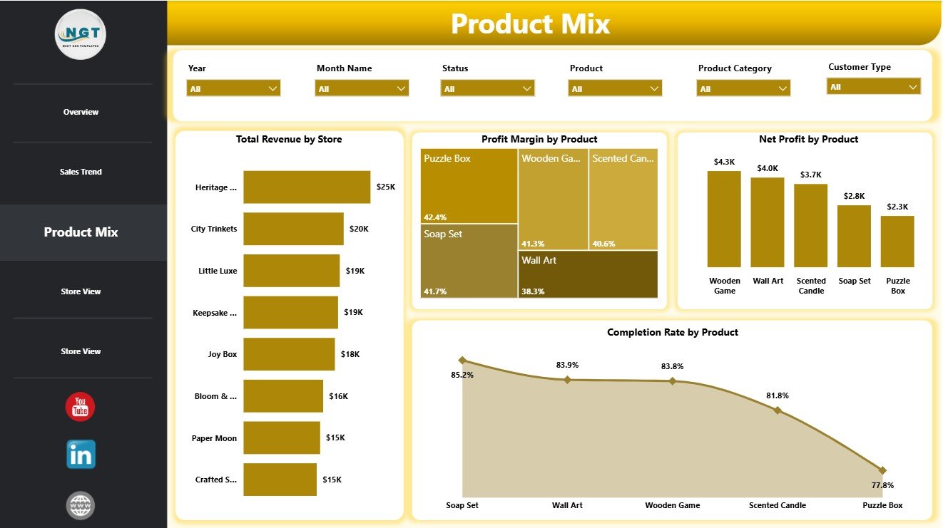
Product Mix
4. Store View Page
The Store View page is designed for location, region, city, and customer-segment analysis. It helps business owners compare how different locations and customer groups contribute to revenue and customer satisfaction.
Total Revenue by Customer Type shows which customer segments generate the most revenue. For gift shops, this can help separate local customers, tourists, members, wholesale buyers, or any customer groups used in the source data.
Profit Margin by Region compares profitability across regions. If one region has strong revenue but weak margin, it may indicate higher costs, heavier discounting, or a different product mix.
Total Revenue by City identifies the strongest city-level sales contributors. This helps with local marketing, store expansion analysis, and regional management reporting.
Average Customer Rating by Store compares the customer experience by location. Managers can use this chart to identify stores that deserve recognition or stores that need service improvement.
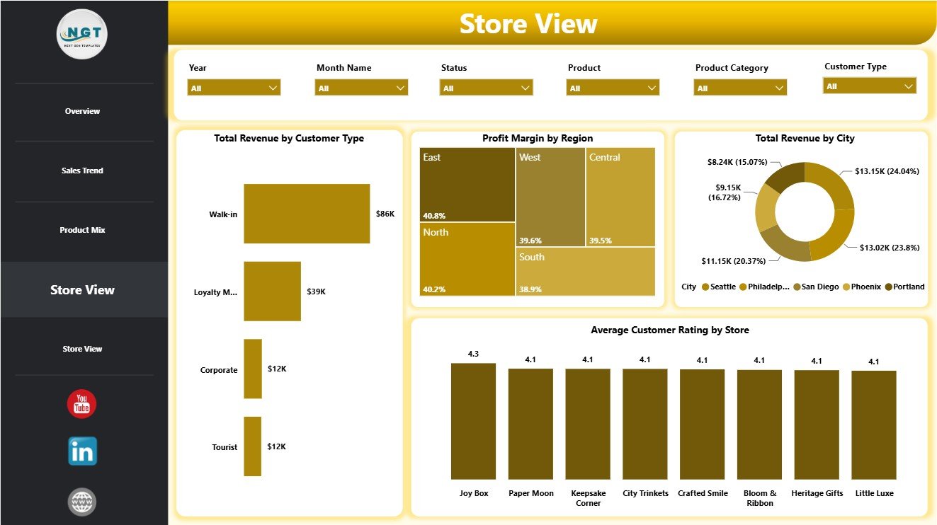
Store View
5. Store Performance Page
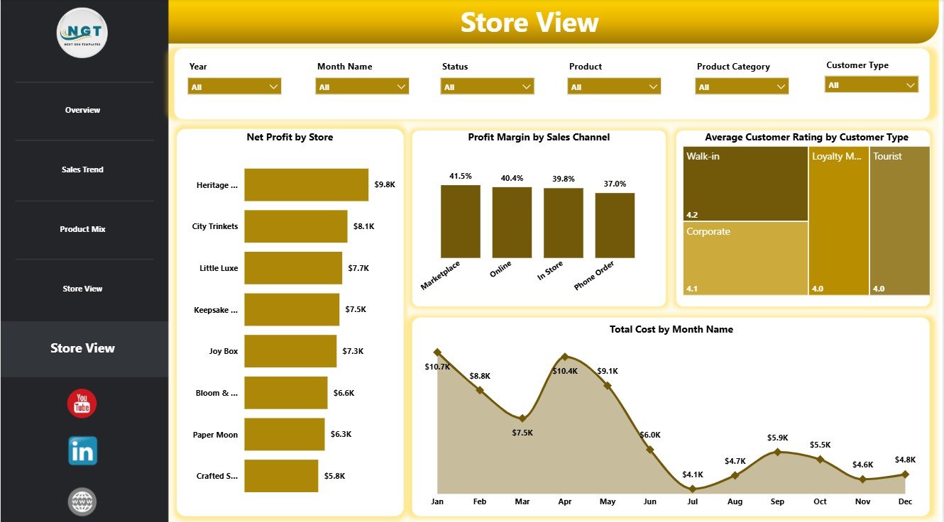
The final page continues the store and customer performance analysis with profit, sales channel margin, customer type rating, and monthly cost views. It is useful when a manager wants to compare operational efficiency, not only sales volume.
Net Profit by Store ranks stores by profit contribution. This chart helps identify locations that are genuinely contributing to the business after cost is considered.
Profit Margin by Sales Channel compares margin efficiency across sales channels. A channel with high revenue may still need review if it has lower profit margin.
Average Customer Rating by Customer Type shows satisfaction differences across customer groups. This helps identify segments that may need better product selection, service, or follow-up.
Total Cost by Month Name shows monthly cost movement. Managers can compare this against revenue and net profit trends to detect cost spikes or inefficient promotional periods.
Store Performance
Gift Shops Dashboard in Power BI vs. Tableau vs. Paid Retail SaaS – Feature Comparison
| Feature | Gift Shops Dashboard in Power BI | Tableau alternative | Paid retail SaaS |
|---|---|---|---|
| Cost | $17.99 one-time template purchase | Requires separate Tableau licensing and report build | Monthly or annual subscription |
| Platform | Power BI Desktop | Tableau Desktop or Tableau Cloud | Vendor cloud platform |
| Setup time | Fast when your data follows the template structure | Often requires dashboard design work | May require onboarding and configuration |
| Real-time team collaboration | Available if published through Power BI Service | Available through Tableau Cloud | Usually included by plan |
| Mobile access | Available if published to Power BI Service | Available after publishing | Usually included |
| Customizable fields | High in Power BI Desktop | High with Tableau skills | Depends on vendor settings |
| Share with link | Possible through Power BI Service | Possible through Tableau Cloud | Usually included |
| Year-1 cost at 5 users | $17.99 plus any Microsoft licensing you choose | Often much higher | Often hundreds or thousands of dollars |
| Gift shop product analysis | Pre-built product, category, store, and margin visuals | Must be built or customized | Depends on retail system |
Who Should Use This Template
This dashboard is a strong fit for independent gift shop owners, souvenir stores, boutique retailers, museum shops, multi-location gift retailers, store managers, finance analysts, and consultants who need a repeatable Power BI reporting template.
It is not the right fit if you need live POS integration, barcode inventory automation, accounting writeback, staff scheduling, or a complete retail operations suite. Those needs usually require a connected retail platform or a custom Power BI project.
Real-World Use Cases
Maya, an independent gift shop owner, uses Total Revenue by Month and Total Cost by Month Name to plan holiday stock purchases and avoid overspending before peak season.
Daniel, a regional retail manager, reviews Net Profit by Store, Profit Margin by Region, and Average Customer Rating by Store before monthly branch meetings.
Sophia, a retail analyst, studies Product Margin, Net Profit by Product, and Completion Rate by Product to recommend better product assortment decisions.
Advantages of Gift Shops Dashboard in Power BI
The main advantage is that the report structure is already built. You do not need to decide which pages, cards, filters, or visuals to create before getting useful insights. The dashboard already organizes the analysis into overview, trend, product, and store views.
Power BI also gives you flexibility. You can adjust visuals, create new measures, change colors, edit field mappings, publish to Power BI Service if needed, or connect the report to your preferred data source once you adapt the model.
Opportunities for Improvement
The template works best when your data is clean and consistently formatted. If store names, product categories, customer types, or date values are inconsistent, clean them before refreshing the dashboard.
Future enhancements could include inventory reorder alerts, POS connector setup, basket analysis, automated refresh in Power BI Service, or additional drill-through pages for product and store managers.
Best Practices
- Keep product, store, city, region, and customer type names consistent.
- Review revenue and profit margin together instead of only tracking sales.
- Check completion rate by both region and product to catch operational issues early.
- Use monthly revenue and monthly cost together for seasonal planning.
- Save a backup copy before changing report fields, relationships, or measures.
- Publish to Power BI Service only after confirming your data privacy and sharing settings.
Explore Relevant Templates
You can download the Gift Shops Dashboard in Power BI from NextGenTemplates. You may also find the Gift Shops Dashboard in Excel useful if you want an Excel version, or browse more Power BI Dashboard Templates.
Frequently Asked Questions
What does the Gift Shops Dashboard in Power BI track?
It tracks total quantity, total cost, total revenue, net profit, total transactions, profit margin, completion rate, products, stores, customer types, regions, cities, sales channels, promotions, months, and customer ratings.
Do I need Power BI Desktop?
Yes. The product is a .pbix file, so you should open it in Power BI Desktop to edit, refresh, and customize the report.
Can I customize the report pages?
Yes. You can change visuals, fields, filters, page names, colors, measures, and layout in Power BI Desktop.
Can I use it for multiple gift shop locations?
Yes. The Store View and Store Performance pages include store, region, city, customer type, revenue, net profit, and rating analysis.
Is this a subscription?
No. It is a one-time template purchase from NextGenTemplates. Microsoft licensing only applies if you choose to use paid Power BI sharing or service features.
Can I connect my own data source?
Yes, if your data fields are mapped correctly. You can replace the sample data source or adapt the model inside Power BI Desktop.
About the Author
Built by PK – Microsoft Certified Professional with 15+ years of Excel, Google Sheets, and Power BI experience. Founder of NextGenTemplates, reaching 300K+ subscribers across YouTube channels. Every template is hand-built and tested before release.
Conclusion
The Gift Shops Dashboard in Power BI gives gift shop teams a practical way to analyze revenue, cost, net profit, transactions, products, stores, sales channels, customer ratings, and monthly trends. With 5 focused pages, KPI cards, slicers, and editable Power BI visuals, it gives you a strong starting point for retail reporting without building a dashboard from a blank file.
Visit YouTube.com/@PKAnExcelExpert for more Excel and Power BI tutorials.