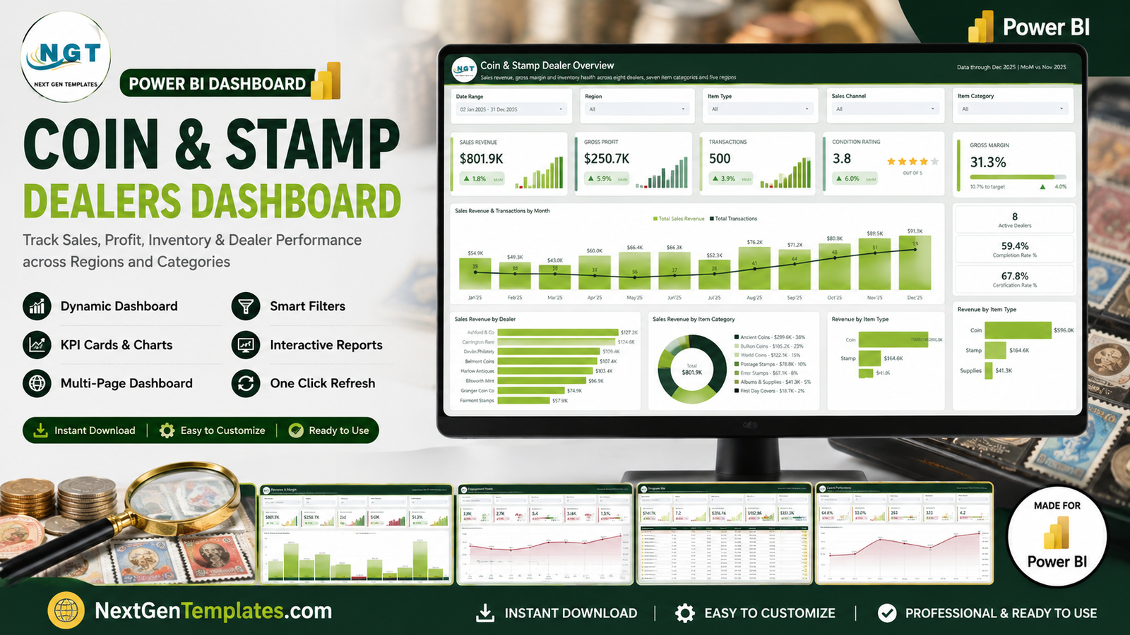
Most coin and stamp dealerships know their turnover to the penny and almost nothing else. The till total is easy; the answer to which of my five selling channels actually pays is not. The Coin & Stamp Dealers Dashboard in Power BI is a finished report file that answers those questions from the transaction book you already keep. The sample ships with 500 transactions covering 941 items, 8 dealers, 7 item categories, 5 regions, 5 sales channels and 5 customer types. Across that book, $801.9K of sales revenue returns $250.7K of gross profit – a 31.3% gross margin – with an average sale price of $1.6K and 41.9 days of stock ageing behind it.
Before anything else, the important boundary: this is a reporting template, not a valuation service. It does not grade, authenticate, certify or appraise a single item. It carries no price guide, no catalogue values and no market feed, and nothing in it is investment advice. Condition grade, certification status and appraised value are columns you fill from your own records or your own third-party paperwork – the dashboard counts, groups and charts what you typed and stops there.
Key Features of the Coin & Stamp Dealers Dashboard in Power BI
- Nine pages, five of them analysis. Overview, Revenue & Margin, Inventory & Grading, Dealer Performance and Channel & Customers, plus a Get More Dashboards page, a hidden Details drillthrough and two 280×360 hover tooltip pages.
- A drillthrough bound on ten fields – Dealer, Region, Item Category, Item Type, Condition Grade, Certification, Sales Channel, Customer Type, Payment Method and Order Status – so a right-click on almost any visual lands you on the underlying rows.
- A consistent slicer bar on every analysis page: Date Range, Region, Item Type and Sales Channel, plus one page-specific filter (Item Category, Customer Type, Condition Grade, Order Status or Certification).
- KPI cards with month-on-month deltas and sparklines, coloured by whether the movement is good for that metric – a return rate falling 3.8% shows green, an average sale price falling 2.0% shows red.
- Three scorecard tables – Condition Grade, Dealer and Customer Type – each with in-cell data bars and a star rating column.
- Inventory ageing as a real chart, not a single number: days in inventory plotted month by month from 45 in January to 38 in December, with a July peak of 49.
- Free Power BI Desktop is enough. No Pro licence, no gateway, no subscription.
Dashboard Pages Explanation
Page 1 – Coin & Stamp Dealer Overview
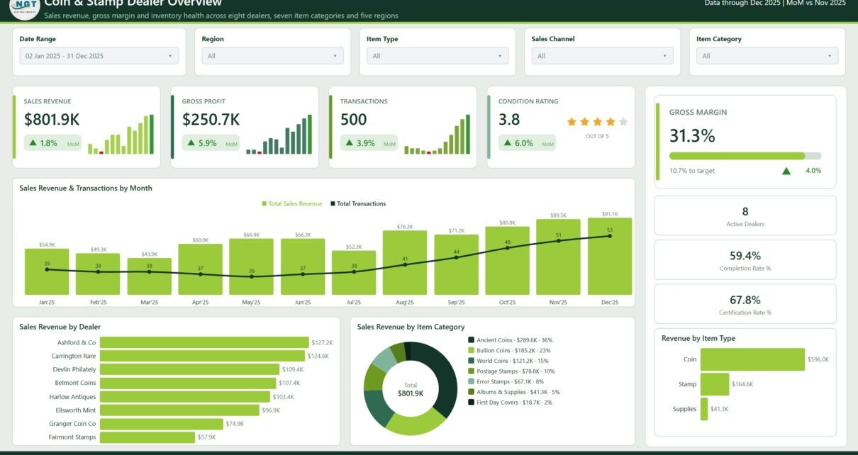
The landing page. Four KPI cards carry Sales Revenue ($801.9K, +1.8% MoM), Gross Profit ($250.7K, +5.9%), Transactions (500, +3.9%) and Condition Rating (3.8 out of 5, shown as stars). A Gross Margin panel reads 31.3% with a progress bar and a note that it is 10.7% to target. Three stat tiles give 8 Active Dealers, a 59.4% Completion Rate and a 67.8% Certification Rate. Below, Sales Revenue & Transactions by Month pairs revenue columns with a transaction line – December peaks at $91.1K on 53 transactions – beside Sales Revenue by Dealer, Sales Revenue by Item Category (Ancient Coins $289.6K / 36% down to First Day Covers $18.7K / 2%) and Revenue by Item Type, which splits the book into Coin $596.0K, Stamp $164.6K and Supplies $41.3K.
Page 2 – Revenue & Margin
Five cards: Sales Revenue, Gross Profit, Gross Margin, Avg Sale Price ($1.6K) and Profit / Sale ($501). Sales Revenue vs Gross Margin by Month shows margin climbing from 27% in January to 34% in December while revenue rises with it. Sales Revenue by Quarter runs $148.2K, $192.6K, $199.7K, $261.4K. Sales Revenue by Region puts North America at $295.5K (37%) ahead of Europe at $191.7K. Gross Profit by Item Category ranks the seven categories by profit rather than turnover, which reorders them – a useful contrast with page 1.
Page 3 – Inventory & Grading
The page a dealer with a slow shelf will use most. Cards: Appraised Value $931.7K, Appraisal Upside 16.2%, Days In Inventory 41.9, Fast Moving 51.6%, Certified Sales 67.8%. The Days In Inventory by Month area chart makes seasonality obvious. An Appraised Value by Item Category treemap sizes Ancient Coins at $338.6K against First Day Covers at $22.4K. The Condition Grade Scorecard lists Mint, Near Mint, Very Fine, Fine and Good with transactions, appraised value, days in inventory, certified share and a star rating – Fine sits 45.2 days on the shelf, Good only 37.5.
Page 4 – Dealer Performance
Revenue / Dealer of $100.2K and a 59.4% Completion Rate headline the page. Sales Revenue & Gross Margin by Dealer puts a margin line over revenue columns, and Volume vs Margin by Dealer plots transactions against margin so a busy-but-thin dealer separates visibly from a quiet-but-fat one. The Dealer Scorecard lists all eight: Ashford & Co at 95 transactions and $127.2K on a 32.7% margin, down to Fairmont Stamps at 45 transactions and $57.9K on 30.3%.
Page 5 – Channel & Customers
Items Sold (941), Avg Sale Price ($1.6K), Return Rate (7.4%) and Certified Revenue (71.2%). Sales Revenue vs Gross Profit by Channel is the sharpest chart in the file: Online turns over $217.2K for $73.6K of profit while Auction turns over $208.0K for $58.3K – almost level on revenue, $15K apart on profit. Sales Revenue by Customer Type and the Customer Type Scorecard show Collectors at $286.6K on a 9.2% return rate against Tourists at $92.4K on 1.4%.
Coin & Stamp Dealers Dashboard in Power BI vs. Tableau vs. Paid Retail Analytics SaaS – Feature Comparison
| This Power BI template | Tableau / Qlik build | Paid retail analytics SaaS | |
|---|---|---|---|
| Cost | $17.99 one-off | Licence from ~$75/user/month plus build time | $60-$300/month |
| Platform | Power BI Desktop (free) | Tableau Desktop or Qlik Sense | Browser |
| Setup time | Swap the sample sheet and refresh – under an hour | Days to weeks to design the same five pages | Hours, plus a POS integration |
| Real-time team collaboration | No – file-based, or publish to a workspace | Via a paid server | Yes |
| Mobile access | Power BI mobile app once published | Via a paid server | Yes |
| Customisable fields | Yes – every visual and measure is editable | Yes | Limited to the vendor’s schema |
| Share with link | After publishing to a workspace | After publishing to a server | Yes |
| Year-1 cost at 5 users | $17.99 | $4,500+ | $720-$3,600 |
| Condition grade and certification as first-class filters | Yes, out of the box | Build them yourself | Rarely – most retail schemas have no grade field |
| Appraised value tracked beside sale price | Yes | Build it yourself | No |
Who Should Use This Template
A coin or stamp dealership running a few hundred to a few thousand transactions a year, with a spreadsheet or a POS export it can tidy up. A multi-counter or multi-branch operation that wants dealer-by-dealer comparison without building it. A collectibles shop selling across auction, online, in-store, trade show and mail order that cannot currently say which of those channels earns its keep. And any analyst or accountant who would rather start from a finished, themed Power BI file than a blank canvas.
It is not for anyone expecting valuations, grading or authentication, and it is not a point-of-sale, inventory-management or customer-database system – it reads a transaction table, it never writes one. It also will not connect to a till, marketplace or grading service on its own; you refresh it from a file or a source you configure.
Real-World Use Cases
The monthly close. Marcus runs a two-counter coin shop and used to close the month with a revenue-by-counter pivot. On Dealer Performance he now sees that his busiest counter (95 transactions) earns 32.7% while a quieter one (49 transactions) earns 29.8% – and the bubble chart shows the gap at a glance instead of a scan.
Costing the fair circuit. Priya sells classic stamps online and at fairs. Channel & Customers tells her Trade Show turns over $137.1K for $44.5K of profit while Mail Order turns over $59.6K for $19.1K, so she starts costing the fair calendar properly rather than treating it as overhead.
Buying decisions, not pricing decisions. Devlin’s shelf moves too slowly. Inventory & Grading shows days-in-inventory peaking at 49 in July, and the Condition Grade Scorecard shows Fine-grade stock sitting 45.2 days against 37.5 for Good. He changes what he buys.
Advantages of the Coin & Stamp Dealers Dashboard in Power BI
- The maths is already written. Margin, profit per sale, revenue per dealer, days in inventory and completion rate are measures, not manual columns, so they hold when you filter.
- Filtering is consistent. The same four slicers sit in the same place on all five pages, so a habit learned on page 1 works everywhere.
- Trade-specific fields are treated as first-class. Condition grade and certification are slicers and scorecard rows, not free-text notes – something no generic retail dashboard gives you.
- It scales past the sample. Power BI’s import engine handles hundreds of thousands of rows on an ordinary laptop, so several years of a busy book is comfortable.
- Nothing is locked. Theme, visuals, measures and page order are all editable, and a page can be duplicated as the start of a new one.
Opportunities for Improvement
Honest notes on this build, all cosmetic or scope-related rather than wrong numbers:
- On page 4, the Volume vs Margin by Dealer bubble chart puts the Carrington Rare and Belmont Coins labels on top of each other where their bubbles nearly touch. Hovering still identifies each one correctly.
- That same bubble chart carries directional axis captions (“Gross Margin” and “Transactions”) rather than a numeric scale, so it reads as a relative-position chart.
- The combo charts show percentage labels on the line but no value axis, which is deliberate for a clean look and worth changing if you present the file to a bank or an accountant.
- The
.pbixinside the download carries a stray double space before its extension. Harmless, and easy to rename after unzipping. - There is no data connector. Refresh is manual, from the included workbook or a source you point at.
- No video walkthrough ships with this release yet.
Best Practices
- Keep the sample workbook’s column headings and data types exactly as they are when you paste your own rows in – that is what keeps every measure working.
- Fill Condition Grade and Certification consistently. A book that mixes “Very Fine”, “VF” and “v.fine” produces three rows in the scorecard instead of one.
- Record appraised value from your own paperwork on the same date basis as the sale price, or the 16.2% upside figure means nothing.
- Set the Date Range slicer first, then work left to right through Region, Item Type and Sales Channel – the page-specific slicer last.
- Use the Details drillthrough before you argue with a number. Ten fields feed it, so almost any visual can take you to the rows behind it.
- Install the free Power BI Desktop from Microsoft rather than an older build – the report uses the current page-definition format.
Explore Relevant Templates
- Coin & Stamp Dealers Dashboard in Excel – the same subject as a native Excel workbook (read the walkthrough)
- Antique Dealers Dashboard in Power BI – the nearest neighbour for a general collectibles shop
- Auction Houses Dashboard in Power BI – for the auction side of the trade (walkthrough)
- NFT Art Marketplaces Dashboard in Power BI – the digital-collectibles equivalent
- Antique Dealers KPI Dashboard in Power BI – the scorecard line, if you want traffic lights and targets instead of exploration
- Compliance Monitoring Dashboard in Power BI and Coaching Networks Dashboard in Power BI – same five-page architecture, different subjects
Frequently Asked Questions
Does this dashboard grade, authenticate or value coins and stamps?
No. There is no price guide, no catalogue value, no market data and no valuation logic anywhere in the file, and nothing in it is investment advice. Condition grade, certification status and appraised value are columns you fill in from your own records or your own third-party paperwork.
Do I need a Power BI Pro licence?
No. Power BI Desktop is free and opens the report completely. Pro or Premium is only needed to publish the report to a workspace and share it with colleagues.
Can it read my POS or marketplace data automatically?
Not out of the box. It refreshes from the included data workbook. If your system exports a transaction list with the same columns, repointing the query at that export takes a few minutes.
How many rows will it handle?
The sample is 500 transactions. Power BI’s in-memory engine handles hundreds of thousands of rows on a normal laptop, so several years of history is fine.
Is this the KPI scorecard version?
No. This is the analytical dashboard – five explore-and-filter pages. The KPI line is a different product: a month-picker scorecard with traffic lights and targets.
Can I add my own logo and colours?
Yes. The theme is a standard Power BI theme file and the logo is an image on the page header – both are replaceable in Power BI Desktop in a couple of minutes.
About the Author
Built by PK – Microsoft Certified Professional with 15+ years of Excel, Google Sheets, and Power BI experience. Founder of NextGenTemplates, reaching 300K+ subscribers across YouTube channels. Every template is hand-built and tested before release.
Conclusion
A coin and stamp business generates exactly the kind of data that rewards a proper report: a grade, a certification status, an appraised value and a channel attached to every single line. The Coin & Stamp Dealers Dashboard in Power BI takes that book and turns it into five pages that answer the questions a dealer actually asks – which channel pays, which dealer converts, which grade sits on the shelf, and where the margin really comes from. It stays firmly on the reporting side of the line: no grading, no authentication, no valuation, no market data, no advice.
Get the Coin & Stamp Dealers Dashboard in Power BI for $17.99 (regular $29.99) – instant download, opens in the free Power BI Desktop, sample data included.
For step-by-step Excel and Power BI tutorials, subscribe to youtube.com/@PKAnExcelExpert.