Selling furniture online is a high-consideration, high-cost-to-serve business. A sofa converts at a fraction of the rate a t-shirt does, takes weeks rather than days to deliver, arrives on a two-person van, and comes back damaged far more often than a small parcel. That combination means a furniture e-commerce team is never watching one number – it is watching conversion, lead time, damage, assembly complaints, repeat rate and acquisition cost at the same time, every month, against target and against last year.
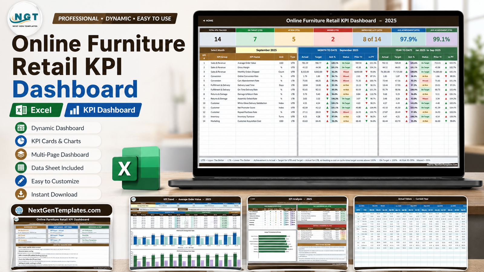
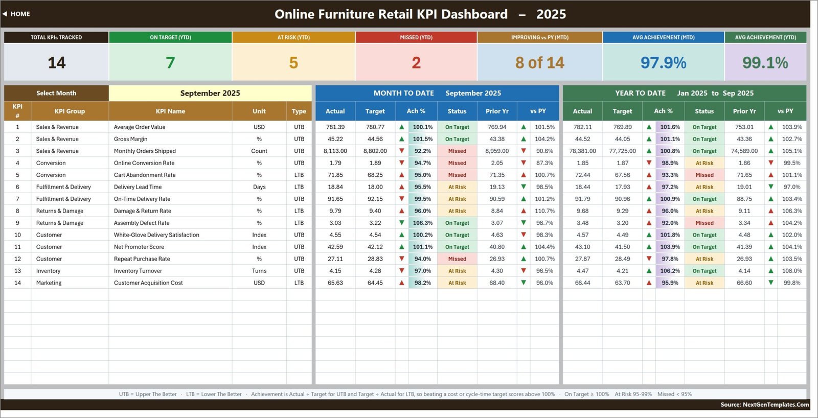
The Online Furniture Retail KPI Dashboard in Excel puts all of that on one screen. It tracks 14 KPIs across 7 KPI groups over 10 workbook pages, and every KPI carries MTD and YTD actual, target, achievement percentage, traffic-light status and a prior-year comparison. The sample year opens on September 2025 with 7 KPIs On Target, 5 At Risk and 2 Missed, an average MTD achievement of 97.9% and an average YTD achievement of 99.1%, so the whole thing is already working before you type a single figure of your own.
One thing to be clear about up front, because NextGenTemplates publishes two similarly named families: this is the KPI scorecard, not the analytical dashboard. It has a month picker, traffic lights, a KPI Trend page and a KPI Analysis page. It does not have pivot charts and slicers over transaction rows – that is the separate Furniture Retail Dashboard in Excel, a different workbook that answers different questions. Plenty of teams use both.
Key Features of the Online Furniture Retail KPI Dashboard in Excel
- One dropdown drives the whole scorecard. Cell D6 on the KPI Dashboard sheet is a twelve-month list. Change it and the seven summary cards, all 14 KPI rows and the entire KPI Analysis page follow together.
- Direction-aware achievement. Every KPI is flagged UTB (upper the better) or LTB (lower the better). Achievement is Actual / Target for UTB and Target / Actual for LTB, so pulling Delivery Lead Time down from 18.4 days or cutting Customer Acquisition Cost below target scores above 100% instead of reading as a miss.
- Traffic lights you can re-band. On Target from 100%, At Risk 95% to 99%, Missed below 95%. The thresholds live in the formulas in columns L and U on KPI Dashboard, so a business that runs tighter or looser governance can change them.
- A KPI Trend page that follows your choice. Pick a KPI in cell B4 and the attribute strip, the formula, the definition, a twelve-month MTD/YTD table and two combo charts all redraw.
- A KPI Analysis page that ranks for you. Achievement rolled up by KPI group, a bar chart of average YTD achievement by group, and Top 5 / Bottom 5 Performing KPIs for the year to date.
- Add or rename KPIs without touching a formula. The sheets are wired for 22 KPIs; 14 are filled in and the rest are live and empty. Type on KPI Definition and it flows everywhere.
- Plain worksheet formulas only. VLOOKUP, MATCH, INDEX and COUNTIF – no Power Query, no data model, no macros, no add-ins. If you want to read up on the lookup functions doing the work, Microsoft’s own VLOOKUP documentation is the reference.
Dashboard Pages Explanation
1. Home
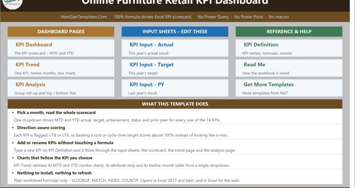
A launchpad that splits the workbook into three columns – Dashboard Pages, Input Sheets (Edit These) and Reference & Help – plus a short “What This Template Does” panel covering the month picker, direction-aware scoring, adding KPIs, the chart behaviour and the fact that there is nothing to install or refresh.
2. KPI Dashboard
The scorecard. Seven summary cards run across the top: Total KPIs Tracked (14), On Target YTD (7), At Risk YTD (5), Missed YTD (2), Improving vs PY MTD (8 of 14), Avg Achievement MTD (97.9%) and Avg Achievement YTD (99.1%). Below them, one row per KPI with a Month to Date block and a Year to Date block, each carrying actual, target, achievement %, status, prior year and a vs PY arrow.
3. KPI Trend
One KPI at a time. The sample opens on Average Order Value – Sales & Revenue, USD, UTB, owned by the Head of Ecommerce, Critical priority, monthly frequency, with the formula (Total Online Revenue / Number of Orders) and definition printed above a twelve-month table. Underneath sit two combo charts: MTD Trend for Average Order Value and YTD Trend for Average Order Value, each plotting actual and prior-year columns against a target line.
4. KPI Analysis
Performance by KPI Group – a count of On Target, At Risk and Missed plus average MTD and YTD achievement for each of the seven groups – alongside Average YTD Achievement by KPI Group as a bar chart. To the right, Top 5 Performing KPIs (led by Inventory Turnover at 106.2%) and Bottom 5 Performing KPIs (Assembly Defect Rate at 92.0% and Cart Abandonment Rate at 93.3% at the bottom), plus a “How To Read This Page” panel.
5-7. KPI Input – Actual, Target and PY
The three sheets you actually type in. Each holds an MTD and a YTD column for all twelve months, with rows driven by KPI Definition so they can never drift out of line. Cell E3 on the Actual sheet is the first month of the reporting year; change it and the Target sheet, the Prior Year sheet, the month dropdown and every sheet title re-base themselves.
8. KPI Definition
The master list: number, group, name, unit, formula, definition, type (UTB/LTB), owner, priority and frequency for all 14 KPIs. Every other sheet reads from here, which is why renaming a KPI is a one-cell job.
9-10. Read Me and Get More Templates
Read Me is a genuinely useful page – the five-minute version, the rules the numbers follow, how to add, rename, remove or go beyond 22 KPIs, and a sheet map. Get More Templates links out to the wider catalogue.
Online Furniture Retail KPI Dashboard in Excel vs. Google Sheets vs. Paid Retail BI – Feature Comparison
| This template (Excel) | Google Sheets equivalent | Paid retail BI SaaS | |
|---|---|---|---|
| Cost | One-off, under $20 | One-off, similar | Typically $50-300 per month |
| Platform | Excel 2013+, Excel for the web | Browser only | Browser plus connectors |
| Setup time | Minutes – paste your monthly numbers | Minutes | Days to weeks of data plumbing |
| Real-time collaboration | Via OneDrive / SharePoint co-authoring | Yes, natively | Yes |
| Mobile access | Excel mobile app | Sheets mobile app | Native apps |
| Customisable KPI list | Yes – type on KPI Definition, no formula edits | Yes | Often limited to the vendor’s metric library |
| Direction-aware scoring (UTB / LTB) | Built in per KPI | Usually hand-built | Varies by vendor |
| Prior-year comparison per month | Built in on a dedicated input sheet | Hand-built | Needs a loaded history |
| Year-1 cost at 5 users | Under $20 total | Similar | $3,000+ |
Who Should Use This Template
This is built for online furniture and homeware retailers whose numbers already exist somewhere – a Shopify or WooCommerce export, a 3PL report, a finance close – and who need one monthly scorecard that a founder, a board or a category meeting can read in a single screen. It fits an e-commerce manager, a head of growth, a logistics or fulfilment director, a customer experience lead or a finance partner.
It is also a good fit for fractional CFOs and consultants running several homeware clients: one copy per client, swap the KPI Definition list, same board-ready format for everyone, no per-client BI licence.
It is not the right tool if you want live data pulled from your store, or if you need to analyse individual orders, SKUs or customers. It holds monthly summary figures, not transaction rows.
Real-World Use Cases
Monthly trading review. An online sofa retailer used to open three separate spreadsheets in its trading meeting. Now the month gets picked once and everyone argues about the same 14 numbers. Cart Abandonment Rate sitting at 93.3% YTD achievement, in red, next to last year, is the business case for the checkout project in one cell.
Fulfilment performance conversation. Delivery Lead Time is LTB and On-Time Delivery Rate is UTB, so the scorecard scores them honestly in opposite directions. A logistics director can open KPI Trend, pick Delivery Lead Time, and show that it improved against prior year even in months where the target was missed – nuance that a single red cell hides.
Quality and returns. Damage & Return Rate and Assembly Defect Rate sit in their own group, so the KPI Analysis page shows Returns & Damage as a whole (94.0% average YTD achievement in the sample) rather than making a quality lead argue KPI by KPI.
Advantages of the Online Furniture Retail KPI Dashboard in Excel
- It opens and works. No install, no add-in, no refresh, no macro warning. It runs in Excel for the web and on the Excel mobile app because there is nothing in it but worksheet formulas.
- Nothing is locked. No password, no hidden sheet, no protected range. You can trace every formula.
- The KPI list is data, not code. This is the single biggest practical advantage – most Excel KPI templates hard-code KPI names into the dashboard formulas, so renaming one means editing dozens of cells. Here it is one cell on KPI Definition.
- MTD and YTD are both stored, not derived. That sounds like extra typing, but it means you keep control of how YTD is defined – cumulative for volumes, running average for rates – instead of inheriting someone else’s assumption.
- Sample data ships with it. A full 2025 actual, target and prior-year set, so you can see the traffic lights, the arrows and the charts behave before you commit your own data.
Opportunities for Improvement
An honest list, because no template is perfect:
- The Read Me carries a leftover example from a sibling template. Its “Cumulative or average YTD” row illustrates the point with “aircraft deliveries, non-conformance reports” – wording inherited from the aerospace build in the same family. The rule it describes is correct and applies exactly as written to furniture volumes and rates; only the example is off-topic. It is on the list for a future rebuild.
- No live connectors. You paste or link your monthly numbers in. That is a deliberate trade for portability, but if you want an automatic feed from Shopify or a warehouse, this is not it.
- KPIs are entered, not calculated. Gross Margin, Inventory Turnover and Customer Acquisition Cost are figures you work out elsewhere and type in. The workbook shows the formula on KPI Definition for documentation, it does not compute it from raw data.
- KPI Trend shows one KPI at a time. Great for depth, less good if you want six sparklines side by side.
- Currency is formatting, not conversion. The sample uses USD. Multi-currency trading needs you to normalise before entry.
Best Practices
- Fix the KPI list before you type any numbers. Rename, re-group and set UTB/LTB on KPI Definition first; the input sheets will then already be labelled correctly.
- Set the reporting year in cell E3 on KPI Input – Actual before anything else. Everything else re-bases off it.
- Be consistent about YTD. Volumes and counts accumulate; rates, ratios, indices and per-unit costs are running averages. A compliance percentage that sums to 1,100% by December is the classic sign of a KPI pack nobody sanity-checked.
- Set targets once, at the start of the year. Editing a target mid-year to make a red cell go green is the fastest way to make a scorecard worthless.
- Assign every KPI an owner on KPI Definition. The Owner column is not decoration – it decides who speaks when the row is red.
- Re-band the thresholds to your governance. If your business calls 98% a miss, change columns L and U rather than mentally discounting the colours.
- Keep last year’s file. The PY sheet is only as good as the history you feed it.
Explore Relevant Templates
- Online Furniture Retail KPI Dashboard in Excel – the template this post is about.
- Order Fulfillment KPI Dashboard in Excel – the same scorecard engine aimed at delivery and returns.
- Fashion E-Commerce KPI Dashboard in Excel – the apparel sibling.
- Furniture Retail Dashboard in Excel – the analytical pivot-and-slicer dashboard for the same industry.
- Last-mile Delivery Dashboard in Excel – the delivery leg behind On-Time Delivery Rate.
- Retail & Store Analytics Bundle – eight retail templates in one purchase.
Frequently Asked Questions
Is this the same as the Furniture Retail Dashboard in Excel?
No. This is the KPI scorecard – month picker, traffic lights, KPI Trend and KPI Analysis pages. The Furniture Retail Dashboard in Excel is the analytical workbook with pivot charts and slicers over transaction-style data. They are different templates for different meetings.
How many KPIs does it track?
Fourteen out of the box: Average Order Value, Gross Margin, Monthly Orders Shipped, Online Conversion Rate, Cart Abandonment Rate, Delivery Lead Time, On-Time Delivery Rate, Damage & Return Rate, Assembly Defect Rate, White-Glove Delivery Satisfaction, Net Promoter Score, Repeat Purchase Rate, Inventory Turnover and Customer Acquisition Cost. The sheets are wired for 22, and the Read Me explains how to go beyond that.
Does it need Power Query, Power Pivot or macros?
None of them. Every number is a plain worksheet formula, so there is no query to refresh and no macro prompt.
Why does a cost KPI show more than 100% achievement?
Because scoring is direction-aware. Customer Acquisition Cost and Delivery Lead Time are flagged LTB, so achievement is Target / Actual. Beating a cost target is a win and the scorecard treats it as one.
Can I change the year, the currency or the status bands?
Yes to all three. The reporting year is cell E3 on KPI Input – Actual. Currency is ordinary Excel number formatting. The On Target / At Risk / Missed bands are formulas in columns L and U on KPI Dashboard.
What is in the download?
A ZIP with the .xlsx workbook and an Excel KPI Dashboard User Manual PDF. Nothing is locked or hidden, and you get lifetime access to the file.
About the Author
Built by PK – Microsoft Certified Professional with 15+ years of Excel, Google Sheets, and Power BI experience. Founder of NextGenTemplates, reaching 300K+ subscribers across YouTube channels. Every template is hand-built and tested before release.
Conclusion
Furniture e-commerce is a business where the interesting numbers are spread across four departments and only make sense together. The Online Furniture Retail KPI Dashboard in Excel is a deliberately small, deliberately transparent way to bring them together once a month: pick a month, read 14 KPIs against target and last year, see which group is dragging, then dig into one KPI’s twelve-month story. No connectors, no refresh, no licence per viewer – just a workbook that opens.
Set the KPI list up the way your business actually talks, type in three sheets of numbers, and your first monthly scorecard is done in an afternoon.
Get the Online Furniture Retail KPI Dashboard in Excel
For more Excel dashboard and KPI tutorials, visit youtube.com/@PKAnExcelExpert.