Fast fashion runs on a handful of numbers that move faster than any monthly report: how quickly a style gets from sign-off to the shop floor, how much of the intake sells before a markdown, and how much stock is still sitting there when the next drop lands. The Fast Fashion Brands KPI Dashboard in Excel puts 13 of those KPIs across 7 groups on one page, with month-to-date and year-to-date actual, target, achievement, traffic-light status and prior-year comparison for every line. The sample workbook opens on September 2025 and reads 8 On Target, 2 At Risk and 3 Missed for the year to date, with average achievement of 97.7% MTD and 99.1% YTD, and 7 of 13 KPIs improving against last year. Every figure is a plain worksheet formula – no Power Query, no Power Pivot, no macros and no add-ins.
Before anything else, one point of clarity, because two very similar-sounding products exist. This is the month-picker KPI scorecard line – a fixed KPI list, monthly actual vs target vs prior year, traffic lights, a trend page and an analysis page. It is not the analytical Excel Dashboard line, which is built on a transaction table with slicers and pivot-driven charts. They answer different questions, and plenty of people own one of each.
Key Features of the Fast Fashion Brands KPI Dashboard in Excel
One dropdown drives the whole scorecard
Cell D6 on the KPI Dashboard sheet is a dropdown of the twelve months in the reporting year. Change it and all 13 KPI rows recalculate – the MTD block (actual, target, achievement, status, prior year, vs PY) and the YTD block alongside it – together with all seven summary cards and the entire KPI Analysis page. There is no refresh step and no query to run.
Direction-aware scoring, so cost KPIs are not punished
Every KPI is flagged UTB (Upper The Better) or LTB (Lower The Better) on the KPI Definition sheet. Achievement is Actual ÷ Target for a UTB KPI and Target ÷ Actual for an LTB one. In the sample month, Design-to-Shelf Lead Time comes in at 23.52 days against a 24.78-day target and correctly scores 105.4%, On Target – beating a lead-time target reads as a win rather than a red cell. The arrow and its colour are separate too: the arrow shows the raw direction, the colour shows whether that direction is good for that particular KPI.
Traffic lights you can move
On Target from 100%, At Risk from 95% to 99%, Missed below 95%. The thresholds are inside the formulas in columns L and U of the scorecard, so a brand that runs tighter or looser governance can change them without rebuilding anything.
Wired for 22 KPIs, 13 filled in
Type a new KPI into the next empty row on KPI Definition – number, group, name, unit, formula, definition, type, owner, priority, frequency – and it appears on the three input sheets, the scorecard, the trend dropdown and the group roll-up immediately. No formula work at all. Clearing a row removes the KPI and the summary cards recount themselves.
Dashboard Pages Explanation
Home
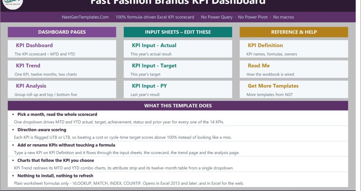
A navigation page grouped into Dashboard Pages, Input Sheets – Edit These, and Reference & Help, plus a short “What This Template Does” panel. Every tile links straight to its sheet.
KPI Dashboard – the scorecard
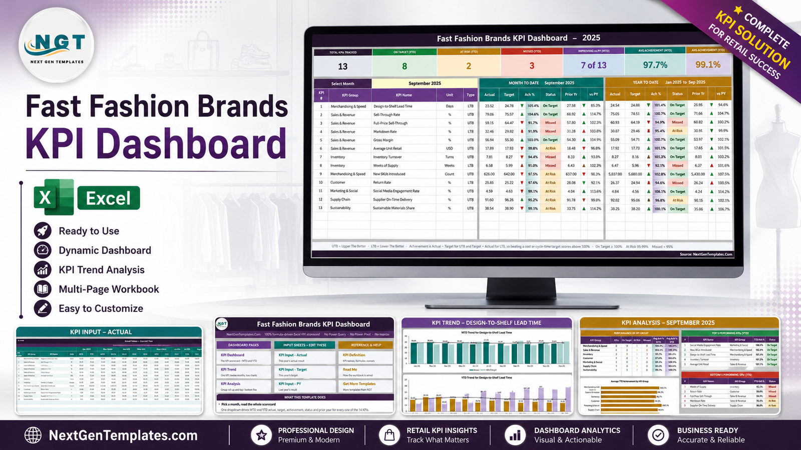
The main page. Seven summary cards run across the top: Total KPIs Tracked (13), On Target YTD (8), At Risk YTD (2), Missed YTD (3), Improving vs PY MTD (7 of 13), Avg Achievement MTD (97.7%) and Avg Achievement YTD (99.1%). Below them, one row per KPI with the KPI group, name, unit and UTB/LTB type, then a full Month To Date block and a full Year To Date block.
The 13 sample KPIs, with their September 2025 MTD readings:
- Design-to-Shelf Lead Time (Merchandising & Speed, Days, LTB) – 23.52 vs 24.78, 105.4%, On Target
- Sell-Through Rate (Sales & Revenue, %, UTB) – 79.06 vs 75.57, 104.6%, On Target
- Full-Price Sell-Through (Sales & Revenue, %, UTB) – 59.15 vs 64.47, 91.7%, Missed
- Markdown Rate (Sales & Revenue, %, LTB) – 32.46 vs 29.82, 91.9%, Missed
- Gross Margin (Sales & Revenue, %, UTB) – 56.94 vs 55.30, 103.0%, On Target
- Average Unit Retail (Sales & Revenue, USD, UTB) – 17.89 vs 17.93, 99.8%, At Risk
- Inventory Turnover (Inventory, Turns, UTB) – 7.81 vs 8.27, 94.4%, Missed
- Weeks of Supply (Inventory, Weeks, LTB) – 6.58 vs 5.99, 91.0%, Missed
- New SKUs Introduced (Merchandising & Speed, Count, UTB) – 626 vs 642, 97.5%, At Risk
- Return Rate (Customer, %, LTB) – 25.85 vs 25.22, 97.6%, At Risk
- Social Media Engagement Rate (Marketing & Social, %, UTB) – 4.59 vs 4.63, 99.1%, At Risk
- Supplier On-Time Delivery (Supply Chain, %, UTB) – 91.60 vs 96.26, 95.2%, At Risk
- Sustainable Materials Share (Sustainability, %, UTB) – 38.54 vs 38.90, 99.1%, At Risk
KPI Trend – one KPI, twelve months
Pick a KPI in cell B4 and the page rebuilds around it: an attribute strip (group, unit, type, owner, priority, frequency), the KPI’s formula and definition in plain language, a twelve-month table with MTD, YTD and vs-prior-year columns, and two combo charts. In the shipped screenshot the selection is Design-to-Shelf Lead Time – owner Head of Merchandising, priority Critical, frequency Monthly – and the charts are MTD Trend for Design-to-Shelf Lead Time and YTD Trend for Design-to-Shelf Lead Time, each showing actual and prior-year columns against a target line. The monthly table makes the one bad month obvious: July 2025 at 94.4% is the only Missed reading in the year.
KPI Analysis – the roll-up
Everything on this page follows the month picked on the scorecard. A Performance by KPI Group table counts On Target / At Risk / Missed per group and averages achievement, and an Average YTD Achievement by KPI Group bar chart plots it: Marketing & Social 106.1%, Merchandising & Speed 102.1%, Sustainability 100.1%, Sales & Revenue 98.6%, Supply Chain 96.8%, Inventory 96.7%, Customer 94.6%.
Beside it sit the two ranking tables. Top 5 (YTD): Social Media Engagement Rate 106.1%, New SKUs Introduced 102.8%, Design-to-Shelf Lead Time 101.4%, Inventory Turnover 101.3%, Average Unit Retail 101.1%. Bottom 5 (YTD): Weeks of Supply 92.1% (Missed), Return Rate 94.6% (Missed), Full-Price Sell-Through 94.9% (Missed), Markdown Rate 95.4% (At Risk), Supplier On-Time Delivery 96.8% (At Risk). Because the ranking uses achievement rather than raw value, a lower-is-better KPI that beats its target ranks near the top, exactly as it should.
KPI Input – Actual, Target and PY
The only three sheets you normally type in. Each holds an MTD and a YTD column for all twelve months, with the KPI rows driven by KPI Definition so the three sheets always line up. Cell E3 on the Actual sheet is the first month of the reporting year – change it and the target sheet, the prior-year sheet, the month dropdown and every sheet title re-base.
KPI Definition, Read Me, Support and Get More Templates
KPI Definition is the master list – number, group, name, unit, formula, definition, UTB/LTB type, owner, priority and frequency, with owners like Head of Merchandising, Pricing Manager, Inventory Manager and Head of Supply Chain already filled in. Read Me explains the wiring. Support holds the helper calculations behind the dropdowns, arrow glyphs and chart series and never needs editing. Get More Templates links back to the catalogue.
Fast Fashion Brands KPI Dashboard in Excel vs. Google Sheets vs. Paid Retail BI – Feature Comparison
| This Excel KPI scorecard | Build it in Google Sheets | Paid retail BI (NetSuite Analytics / Zoho Analytics class) | |
|---|---|---|---|
| Cost | 12.99 on sale (19.99 regular), one payment | Free tool, your build time | Typically 30-100+ per user per month |
| Platform | Excel 2013+ and Excel for the web | Browser | Vendor cloud |
| Setup time | Minutes – paste months in, pick a month | Days to reproduce the logic | Weeks, often with an implementation partner |
| Real-time team collaboration | OneDrive / SharePoint co-authoring | Yes, native | Yes |
| Mobile access | Excel mobile app | Yes | Yes |
| Customizable fields | Every cell – nothing locked or hidden | Yes | Within the vendor’s data model |
| Share with link | Yes, via OneDrive | Yes | Seat-based |
| Year-1 cost at 5 users | 12.99 total | 0 plus build time | 1,800-6,000+ |
| Direction-aware KPI scoring (UTB/LTB) | Built in per KPI | You write it | Usually configurable |
| Live feed from POS / PLM / ERP | No – monthly figures are typed or pasted | No, unless you build it | Yes |
Who Should Use This Template
Merchandising and buying teams at apparel brands and multi-store retailers who already produce the monthly numbers and want a single page a leadership meeting can actually read. Merchandise planners who report sell-through, markdown and weeks of supply every month. Supply-chain leads who need to show a twelve-month shape rather than a single figure. Brand founders and category managers who want a scorecard without commissioning a BI project.
It is a poor fit if you need live data. There is no connector to a POS, PLM or ERP system, and no transaction detail – no SKU list, no order table, no store ledger. You enter monthly KPI values, and that is deliberate: it is what keeps the file portable and every formula readable.
Real-World Use Cases
The Monday buying meeting. A merchandise planning lead at a 40-door high-street brand replaced four spreadsheets with one sheet. Full-Price Sell-Through at 91.7% of target for the month and Markdown Rate at 91.9% say where the margin went before anyone opens a second file – and the YTD block shows both are running below target for the year, not just having a bad month.
The supplier renegotiation. Supplier On-Time Delivery reads 95.2% of target for the month and 96.8% for the year – amber, not red. Read alongside Weeks of Supply, the worst KPI on the board at 92.1% YTD, it turns a vague complaint into a specific conversation about lead times, with the KPI Trend page as the evidence.
The investor update. A founder keeps nine of the thirteen KPIs, clears the rest, adds two of her own on KPI Definition without writing a formula, and screenshots one page.
Advantages of the Fast Fashion Brands KPI Dashboard in Excel
- It opens. No add-in prompt, no macro warning, no “enable content” banner, no data model to refresh. VLOOKUP, MATCH, INDEX and COUNTIF do all of it.
- The scoring is honest about direction. Five of the thirteen sample KPIs are lower-is-better, and none of them is penalised for succeeding.
- MTD and YTD are both stored, not derived. Each input sheet carries both columns, so you decide whether a KPI accumulates through the year or runs as an average – the workbook does not guess for you.
- It scales without editing formulas – nine spare KPI rows are live and empty from day one.
- Nothing is hidden. You can trace every number back to a cell, which matters when somebody in the meeting asks where a figure came from.
Opportunities for Improvement
Two things in this build are worth knowing before you buy, and I would rather say them here than have you find them:
- The KPI count on two reference pages is stale. The Home page says the month dropdown drives “every one of the 14 KPIs”, and the Read Me’s Capacity note says “14 are filled in”. The workbook actually ships 13 – the KPI Definition sheet lists 13 and the scorecard’s Total KPIs Tracked card reads 13. The dashboard is right; the two labels are left over from the template’s build step. It is cosmetic text, and you can retype it in seconds.
- The Read Me has an example from a different industry. Its “Cumulative or average YTD” note illustrates the point with “aircraft deliveries, non-conformance reports” – wording carried over from an aerospace build on the same template family. The rule it describes is correct and applies perfectly well to units, SKU counts and returns; only the example is off-topic.
Neither affects a calculation. Two other faults that have appeared elsewhere on this template line are absent here: there is no Indian-style digit grouping on the numbers (the largest figure in the file, 5,837 YTD New SKUs, is grouped correctly), and no KPI is stuck or stored in the wrong unit – all thirteen move month to month.
Best Practices
- Fix the KPI list before you type any numbers. Renaming on KPI Definition propagates everywhere; renaming after you have filled three input sheets just makes you check three sheets.
- Decide cumulative vs average per KPI. Counts and volumes accumulate through the year; rates, ratios and per-unit values should be running averages. A percentage that reaches 1,100% by December is the tell-tale sign of the wrong choice.
- Set the UTB/LTB flag deliberately. Markdown Rate, Return Rate, Weeks of Supply and Design-to-Shelf Lead Time are all LTB in the sample – get one wrong and its traffic light inverts.
- Tune the thresholds once. If your business treats 98% as fine, move the At Risk band in columns L and U rather than explaining the amber every month.
- Fill the PY sheet. The vs-PY column and the “Improving vs PY” card are the only part of the scorecard that gives a number context beyond its own target.
- Keep one workbook per reporting year and re-base cell E3 on a copy, so last year stays intact as your prior-year source.
If you want to go further on the mechanics behind it, Microsoft’s own reference on the VLOOKUP function covers the lookup pattern the whole workbook is built on.
Explore Relevant Templates
- Fashion E-commerce KPI Dashboard in Excel – the closest neighbour to this one, and a genuinely different scorecard: it tracks an online retail funnel (traffic, conversion, basket, fulfilment, returns), whereas this template scores a fast-fashion brand on speed to market, sell-through, markdown and supply. Brands running both a wholesale/store business and a webstore often want the pair.
- Apparel Manufacturing KPI Scorecard in Excel – the upstream half: production, quality and cost.
- Retail Inventory KPI Scorecard in Excel – deeper on cover, turns and ageing stock.
- Ethical Fashion KPI Scorecard in Excel – a separate scorecard for brands that report sourcing metrics of their own.
- Fashion Boutiques Dashboard in Excel – the analytical line, with slicers and a transaction table.
- Fashion & Apparel KPI Dashboard in Power BI – the same idea for a Power BI team.
Frequently Asked Questions
Does this template measure, verify or certify sustainability, ESG or ethical-sourcing performance?
No. It is a reporting and scorecard template only. It does not measure, verify, audit or certify sustainability, ESG, carbon, water or waste performance. It does not audit supply chains or factories, does not verify labour conditions, wages or modern-slavery/forced-labour compliance, and does not satisfy any due-diligence, supply-chain-transparency or green-claims regulation. The sample includes a KPI named “Sustainable Materials Share” – that is a percentage you type in from your own records, exactly like every other number in the workbook. The file performs no checking of it, and nothing in it substitutes for legal, ESG or assurance advice.
Is this the same as the analytical Excel fashion dashboards?
No. This is the month-picker KPI scorecard: a fixed KPI list scored against target and prior year, with traffic lights, a trend page and an analysis page. The analytical Excel Dashboard products are built on a transaction table with slicers and pivot-driven charts. Similar names, different tools.
How many KPIs can it hold?
Thirteen are filled in and the sheets are wired for 22 rows, so nine more need no formula work. The Read Me explains the two ranges to widen if you go beyond 22.
Do I need macros, Power Query or Power Pivot?
None of them. It is 100% worksheet formulas and opens in Excel 2013 or later, and in Excel for the web.
Can I change the KPI names, owners, units and targets?
Yes – all on KPI Definition, which every other sheet reads from.
Does it connect to my POS, PLM or ERP?
No. Monthly figures are typed or pasted into three input sheets.
What currency is it in?
Average Unit Retail is shown in USD in the sample. Change the cell format to your own currency – no formula depends on it.
What is in the download?
A ZIP containing the .xlsx workbook with a full twelve months of sample data, plus the Excel KPI Dashboard user manual as a PDF.
About the Author
Built by PK – Microsoft Certified Professional with 15+ years of Excel, Google Sheets, and Power BI experience. Founder of NextGenTemplates, reaching 300K+ subscribers across YouTube channels. Every template is hand-built and tested before release.
Conclusion
Fast fashion does not fail on a lack of data – it fails on a lack of one page everybody agrees on. The Fast Fashion Brands KPI Dashboard in Excel gives you that page: 13 KPIs, 7 groups, MTD and YTD, direction-aware scoring, traffic lights you can move, a twelve-month trend view and a group roll-up, all from plain worksheet formulas that you can open, read and change. Type twelve numbers a month and the rest is done.
Get the Fast Fashion Brands KPI Dashboard in Excel for 12.99 (regular 19.99) – instant download, sample data included, lifetime access to the file you buy. Want a different KPI set? Email info@NextGenTemplates.Com and we will build the scorecard around your KPIs.
For Excel walkthroughs and dashboard tutorials, subscribe at youtube.com/@PKAnExcelExpert.


