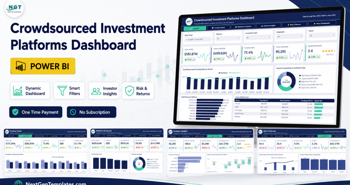
Crowdfunding platforms live and die on one ratio: how much of the target actually gets raised. The Crowdsourced Investment Platforms Dashboard in Power BI puts that ratio on the front page and then gives you four more pages to explain it. The sample report carries 500 campaigns, a $773.24M target against $582.87M raised, a 75.4% funding rate, 90,295 investors and $42.57M returned in distributions – all driven by a proper semantic model with a date table and 70+ DAX measures rather than a pile of static charts.
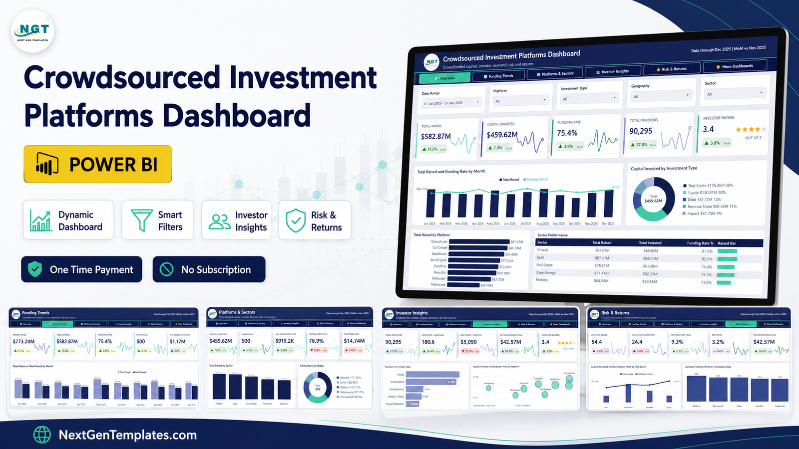
This post walks through what is on each page, what the report will and will not do, and how to swap the sample workbook for your own data. Crowdsourced Investment Platforms Dashboard in Power BI
Key Features of the Crowdsourced Investment Platforms Dashboard
- Five analysis pages plus an upsell page. Overview, Funding Trends, Platforms and Sectors, Investor Insights, Risk and Returns, and a More Dashboards page.
- 25 KPI cards. Five per page, each showing the value, a month-on-month delta with a coloured arrow, and a sparkline of the trend behind it.
- Five slicers on every page. Date Range, Platform, Investment Type and Geography are synced across the whole report. The fifth slot swaps per page: Sector, Campaign Stage, Funding Status, Investor Type, Risk Band.
- 70+ DAX measures. Funding rate, capital deployed, fee ratio, distribution yield, average ticket per investor, investors per campaign and every MoM delta are already written and formatted.
- Drillthrough and two tooltip pages, already connected to the visuals rather than left as an exercise.
- One Excel source. The model reads a single workbook, so repointing it at your own data is a one-path change in Power Query.
- Nothing locked. No image-baked visuals, no protected pages, no external image calls. Recolour it, rename it, put your own logo on the header. Crowdsourced Investment Platforms Dashboard in Power BI
Dashboard Pages Explanation
Page 1 – Overview
The five cards read Total Raised $582.87M (up 11.2% month on month), Capital Invested $459.62M (up 7.0%), Funding Rate 75.4% (up 3.9%), Total Investors 90,295 (up 37.0%) and an Investor Rating of 3.4 out of 5. Crowdsourced Investment Platforms Dashboard in Power BI
Under them, Total Raised and Funding Rate by Month puts twelve monthly raise columns behind the funding-rate line, which is the fastest way to see whether a strong month was strong in absolute terms or only in conversion. Capital Invested by Investment Type is a donut splitting the $459.62M across Real Estate ($175.36M, 38%), Equity ($130.91M, 28%), Debt ($61.17M, 13%), Revenue Share ($50.45M, 11%) and Impact ($41.73M, 9%). Total Raised by Platform ranks eight platforms, with Crowdcube at $87.33M ahead of OurCrowd at $85.18M and SeedInvest at $81.45M. The Sector Performance table closes the page with raised, invested and funding rate per sector, and an in-cell bar for scanning.
Page 2 – Funding Trends
Target Raise $773.24M sits beside Total Raised $582.87M, with Campaigns at 500 and Average Raised per Campaign at $1.17M. Target Raise vs Total Raised by Month is the page that matters: two clustered columns per month, so the gap between ambition and outcome is visible without any arithmetic. In the sample data May is the biggest target month at $78.83M and October the weakest raise at $37.12M. Capital Invested by Month traces deployment as an area chart, and Distributions and Yield by Quarter pairs quarterly distribution volume with the yield line, ending at 9.7% in Q4.
Page 3 – Platforms and Sectors
Capital Invested $459.62M, 500 campaigns, Average Investment Size $919.2K, Capital Deployed 78.9% and Platform Fees $14.74M. Total Raised by Sector ranks eight sectors from Fintech at $89.07M down to Consumer at $60.33M. Campaigns by Stage splits the 500 campaigns into Growth (177), Early (132), Mature (106), Follow-on (57) and Pre-Launch (28). The Platform Scorecard is the league table – raised, invested, funding rate, campaign count and total fees per platform, so you can see that StartEngine converts at 92.0% on 53 campaigns while OurCrowd runs 71 campaigns at 73.1%. Crowdsourced Investment Platforms Dashboard in Power BI
Page 4 – Investor Insights
90,295 investors, 180.6 investors per campaign, $5,090 average ticket per investor and $42.57M in return distributions. Investors by Investor Type ranks Retail (35,419), Accredited (31,351), Institutional (8,892), Family Office (7,986) and Angel Network (6,647). Capital Invested vs Distribution Yield by Platform is a bubble chart that separates the platforms that deploy a lot from the platforms that pay well. Total Raised by Geography splits six regions, led by North America at $184.70M (32%) and Europe at $138.68M (24%). The Investor Type Breakdown table carries total invested, average ticket and a star rating per type. Crowdsourced Investment Platforms Dashboard in Power BI
Page 5 – Risk and Returns
Average Risk Score 54.4, Average Holding 24.4 months, Distribution Yield 9.3%, Fee Ratio 3.2% and $42.57M distributed. Capital Invested and Distribution Yield by Risk Band puts deployment columns behind the yield line across Low, Moderate, Elevated and High. Average Holding Period by Campaign Stage compares five stages, with Mature longest at 26.5 months. Capital Invested by Risk Band and Funding Status is a matrix crossing the four bands with Active, Closed, Funded and Under Review, and it is the view that answers “how much of our exposure is still sitting in review”. Crowdsourced Investment Platforms Dashboard in Power BI
Power BI vs. Tableau vs. Paid Crowdsourced Investment Platforms Dashboard in Power BI Analytics SaaS – Feature Comparison
| What you get | This Power BI template | Tableau or Qlik build | Paid platform analytics SaaS |
|---|---|---|---|
| Cost | One payment of $17.99 | Licence from about $70 per user per month plus build time | Typically $200 to $800 per month |
| Platform | Power BI Desktop, free from Microsoft | Tableau Desktop or Qlik Sense | Vendor web app |
| Setup time | Open, repoint one file path, refresh | Days of modelling and layout | Onboarding call, data mapping, contract |
| Real-time team collaboration | Publish to Power BI Service and share | Server or Cloud licence needed | Built in |
| Mobile access | Power BI mobile app | Vendor mobile app | Built in |
| Customisable fields | Every measure, column and visual is editable | Fully editable, but you build it | Only what the vendor exposes |
| Share with a link | Yes, via Power BI Service | Yes, with a server licence | Yes |
| Year-1 cost at 5 users | $17.99 | $4,200 or more in licences alone | $2,400 to $9,600 |
| Risk-band and stage analysis | Pre-built across four bands and five stages | You define the banding logic | Vendor fixed definitions |
| Your investor data stays local | Yes – the file lives on your machine | Yes | No – it sits in the vendor cloud |
Who Should Use This Template
It suits platform operators who report raise performance to a board every month, syndicate and angel-network leads tracking money spread across several platforms, analysts comparing sector and geography performance, and BI consultants who want a working report skeleton to rebrand for a client rather than a blank canvas. Crowdsourced Investment Platforms Dashboard in Power BI
It does not suit anyone who needs a live API feed from a named platform, cap-table or valuation maths, KYC and AML record-keeping, or regulated filings. It is a reporting layer over data you already have. It gives no investment advice and forecasts nothing.
Real-World Use Cases
The monthly board pack. An investor-relations lead filters Funding Trends to the last quarter, exports the target-versus-raised chart and the funding-rate card, and the pack section is done in ten minutes instead of an afternoon. Crowdsourced Investment Platforms Dashboard in Power BI
The syndicate update. A 40-member angel group wants to know which platform is actually earning its fee. The Platform Scorecard puts raised, invested, funding rate and total fees side by side, and the fee ratio card on Risk and Returns gives the headline number. Crowdsourced Investment Platforms Dashboard in Power BI
The consulting engagement. A fintech client is three weeks from a funding review. The consultant rebrands the report in a morning, repoints Power Query at the client export, and spends the remaining time on the two or three measures that are genuinely client-specific.
Advantages of the Crowdsourced Investment Platforms Dashboard
- It opens populated. Sample data ships inside, so you can evaluate the report before committing your own numbers to it.
- The model is real. Typed columns, a date table and named measures mean you can extend it instead of fighting it.
- Consistent filtering. Synced slicers mean a filter you set on Overview still applies when you land on Risk and Returns.
- Deltas everywhere. Every KPI carries its month-on-month move, so a number never appears without context.
- Rebrandable. No locked visuals and no external image dependencies, which matters if you resell or white-label reports.
- One payment. No seat count, no renewal, no feature tier. Crowdsourced Investment Platforms Dashboard in Power BI
Opportunities for Improvement
Being straight about the limits is more useful than a feature list. The report reads a workbook, so it does not connect to a platform API – if you want a nightly pull you will need to build that step yourself, or schedule the export. There is no valuation or IRR engine; distribution yield is calculated from what you feed it. The risk bands are labels carried in the data, not a scoring model, so the banding logic is yours to define. Power BI Desktop is Windows-only, which means Mac users need a VM or remote desktop for authoring. And because everything is editable, a team without a change owner can drift into five different versions of the same report – worth deciding who owns the master file on day one. Crowdsourced Investment Platforms Dashboard in Power BI
Best Practices
- Keep the sample workbook as a schema reference. Copy it, then paste your data under the same headings rather than renaming columns in the model. Crowdsourced Investment Platforms Dashboard in Power BI
- Change the file path in Power Query, not in the visuals. One parameter change is far safer than editing individual queries.
- Agree your risk-band definitions before loading data. The report will happily band anything; the labels only mean what your team decides they mean.
- Refresh on a fixed cadence and put the refresh date on the header so nobody presents stale numbers.
- Publish to a workspace rather than mailing the .pbix around once more than two people need it.
- Read the Microsoft guidance on data reduction if your campaign table grows past a few hundred thousand rows – see the Power BI data reduction techniques documentation. Crowdsourced Investment Platforms Dashboard in Power BI
Explore Relevant Templates Crowdsourced Investment Platforms Dashboard in Power BI
- Crowdsourced Investment Platforms Dashboard in Power BI – the template covered in this post.
- Crowdsourced Investment Platforms Dashboard in Excel – the same analysis as an Excel workbook if your team has no Power BI.
- Climate Tech Startups Dashboard in Power BI – venture funding analysis for climate-sector portfolios.
- Carbon Trading Dashboard in Power BI – volume, pricing and settlement reporting.
- Angel Investors KPI Dashboard in Excel – a compact scorecard for syndicate leads.
- Browse every Power BI dashboard template. Crowdsourced Investment Platforms Dashboard in Power BI
Frequently Asked Questions
Do I need a paid Power BI licence to use this?
No. Power BI Desktop is free from Microsoft and opens the .pbix file. You only need a Pro or Premium Per User licence if you want to publish the report and share it through the Power BI Service.
How do I put my own data in?
Copy the supplied Data.xlsx, replace the sample rows with your own while keeping the column headings, then change the source file path in Power Query and refresh. Every visual follows automatically.
Are the numbers in the screenshots real?
No. Every figure – the 500 campaigns, the platform names, the investor counts and the yields – is generated demo data included so the report opens populated. None of it is market data and none of it is a performance claim.
Does the dashboard give investment advice?
No. It reports what you load into it. There is no forecasting, no valuation model and no recommendation logic anywhere in the file.
Can I rebrand it and use it with clients?
Yes. Nothing is locked. Swap the logo, change the theme colours, rename pages and measures – it is yours to edit.
Which platforms and sectors are covered?
The sample data uses eight platforms and eight sectors, but both are plain data columns. Add your own names to the workbook and the visuals pick them up on refresh. Crowdsourced Investment Platforms Dashboard in Power BI
What is in the download?
A single ZIP with the .pbix report, the Data.xlsx sample workbook and a Power BI user manual PDF. Crowdsourced Investment Platforms Dashboard in Power BI
About the Author
Built by PK – Microsoft Certified Professional with 15+ years of Excel, Google Sheets, and Power BI experience. Founder of NextGenTemplates, reaching 300K+ subscribers across YouTube channels. Every template is hand-built and tested before release.
Conclusion
Crowdfunding reporting usually fails in one of two ways: a spreadsheet that nobody trusts, or a SaaS subscription that reports exactly what the vendor decided to expose. The Crowdsourced Investment Platforms Dashboard in Power BI sits between them – a real semantic model with 70+ measures and five synced pages, priced as a single file you own and can edit. Repoint one path, refresh, and you have raise-versus-target, a platform league table, an investor mix and a risk-band view in one report. Crowdsourced Investment Platforms Dashboard in Power BI
Get the Crowdsourced Investment Platforms Dashboard in Power BI for a one-time $17.99, and subscribe to youtube.com/@PKAnExcelExpert for Power BI and Excel walkthroughs.