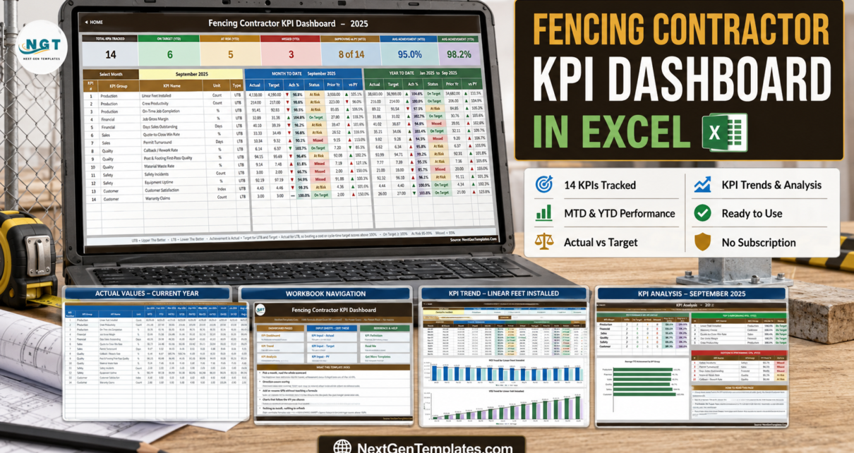
Most fencing contractors already know their numbers. The linear feet went in the ground, the permit either came back this week or it did not, the crew either got the posts plumb the first time or somebody drove back out. What is usually missing is one page that puts all of it side by side, month by month, with a target next to every figure and an honest colour on the result. That is exactly what the Fencing Contractor KPI Dashboard in Excel does – 14 KPIs, one month dropdown, MTD and YTD together, and not a single macro.
First, Which Template Is This?
NextGenTemplates ships three lines whose names look almost identical in a search result, so it is worth thirty seconds to be sure which one you are reading about.
- KPI Dashboard – this one. A month-picker scorecard: 14 KPIs, seven summary cards, traffic lights, plus a dedicated KPI Trend page and a KPI Analysis page.
- KPI Scorecard – a lighter ten-KPI file from a different line. There is a Fencing Contractor KPI Scorecard in Excel and a Google Sheets version of it.
- Dashboard (no “KPI”) – the analytical line, which charts a transaction table through slicers rather than a governed KPI list.
They complement each other. A fair number of firms run the scorecard for a quick weekly look and the dashboard for the monthly management pack.
What You Actually Get
The download is a ZIP with two things in it: the .xlsx workbook and the Excel KPI Dashboard User Manual (PDF). The workbook has ten visible sheets and one hidden helper sheet:
- Home – a nine-tile launcher. Dashboard pages on the left, the three input sheets in the middle, reference and help on the right.
- KPI Dashboard – the scorecard itself.
- KPI Trend – one KPI at a time, twelve months, two charts.
- KPI Analysis – group roll-up, a bar chart, and the top and bottom five.
- KPI Input – Actual, KPI Input – Target, KPI Input – PY – the only three sheets you normally type in.
- KPI Definition – the master KPI list every other sheet reads from.
- Read Me – how the file is wired, on one page.
- Get More Templates – links to the rest of the catalogue.
- Support (hidden) – the selected month, the arrow glyphs, the month dropdown list, the chart series and the ranking helpers. Nothing in here needs editing.
Every number in the file is a worksheet formula. VLOOKUP, MATCH, INDEX, COUNTIF. There is no Power Query, no data model, no add-in and no VBA, which is why it opens without a security prompt and works in Excel for the web as well as on the desktop.
The 14 KPIs, Group by Group
The KPI set is fencing-specific rather than a generic construction list bolted onto a fence company.
- Production (3): Linear Feet Installed, Crew Productivity (linear feet per crew-day), On-Time Job Completion.
- Financial (2): Job Gross Margin, Days Sales Outstanding.
- Sales (2): Quote-to-Close Win Rate, Permit Turnaround.
- Quality (3): Callback / Rework Rate, Post & Footing First-Pass Quality, Material Waste Rate.
- Safety (2): Safety Incidents, Equipment Uptime.
- Customer (2): Customer Satisfaction, Warranty Claims.
Two of those deserve a note. Permit Turnaround is filed under Sales rather than Production on purpose – for most fencing firms the gap between a signed contract and a started job is a city-hall queue, not a crew shortage, and putting it next to Quote-to-Close Win Rate makes that visible. Post & Footing First-Pass Quality is the share of post-hole and footing sets that pass depth and plumb inspection on the first check, which is the leading indicator that shows up as a callback two months later.
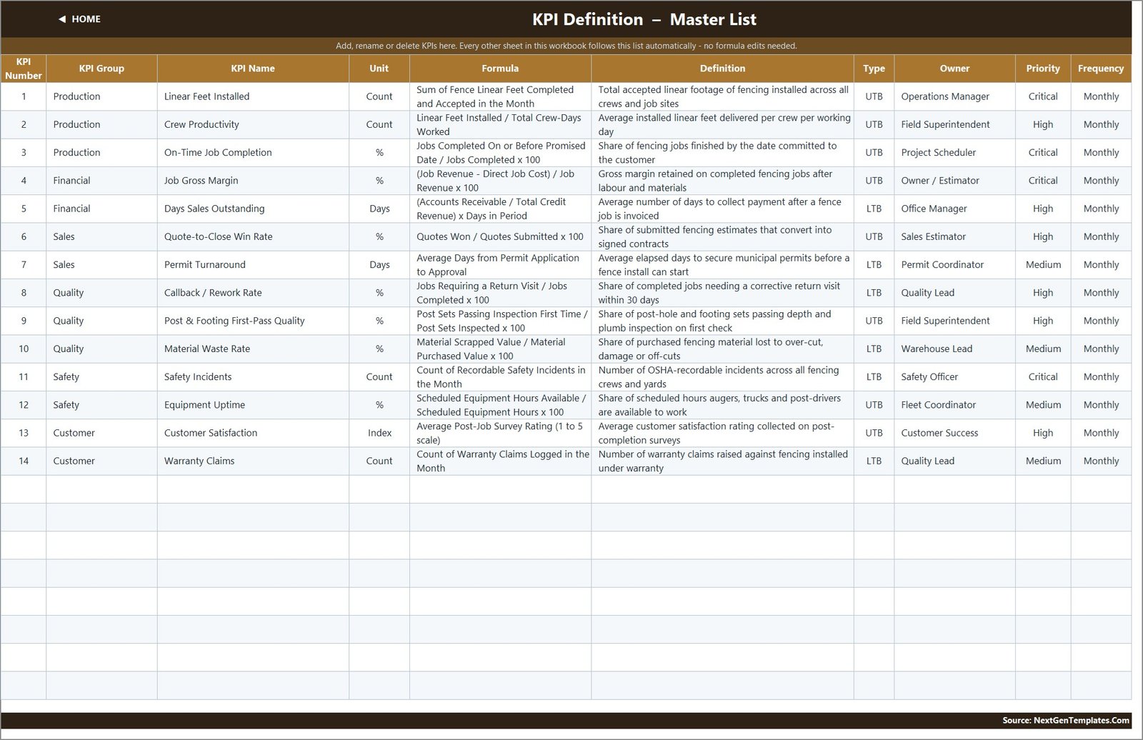
Each row on KPI Definition also carries a formula, a plain-English definition, an owner (Operations Manager, Field Superintendent, Project Scheduler, Owner / Estimator, Office Manager, Sales Estimator, Permit Coordinator, Quality Lead, Warehouse Lead, Safety Officer, Fleet Coordinator, Customer Success) and a Critical / High / Medium priority. Four are Critical, six High, four Medium. That turns the scorecard into a short accountability list as well as a report.
Why the UTB / LTB Flag Is the Most Important Field in the File
Column G on KPI Definition holds either UTB (upper the better) or LTB (lower the better). This build ships 8 UTB and 6 LTB. The lower-is-better six are Days Sales Outstanding, Permit Turnaround, Callback / Rework Rate, Material Waste Rate, Safety Incidents and Warranty Claims.
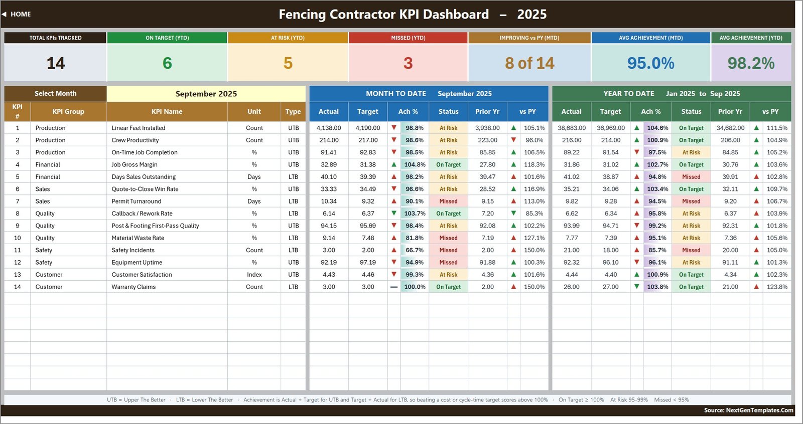
Achievement is Actual / Target for a UTB KPI and Target / Actual for an LTB one. That single switch is what stops the scorecard being nonsense. Cut your permit turnaround from 9.3 days to 8.1 and you score 115%, not 87%. Let your callback rate drift up and it goes red, even though the number went up. It also drives the arrow colour, so a falling waste rate shows a green down-arrow rather than a red one.
If you swap a KPI for one of your own, this is the field to get right before you worry about anything else.
The Seven Summary Cards
Across the top of KPI Dashboard: Total KPIs Tracked, On Target (YTD), At Risk (YTD), Missed (YTD), Improving vs PY (MTD), Avg Achievement (MTD) and Avg Achievement (YTD). In the shipped September 2025 sample they read 14, 6, 5, 3, 8 of 14, 95.0% and 98.2%.
The cards recount themselves from whatever is on the KPI list, so if you delete two KPIs the “14” becomes a “12” without you touching a formula.
The Trend Page
KPI Trend is the drill-down. Pick a KPI in cell B4 and the whole page follows: the attribute strip (group, unit, type, owner, priority, frequency), the formula, the definition, a twelve-month table with MTD and YTD blocks and a vs-prior-year pair of columns, and two combo charts – actual and prior-year columns with a target line running across them. Both chart titles rename themselves, so “MTD Trend for Linear Feet Installed” becomes “MTD Trend for Permit Turnaround” the moment you change the dropdown.
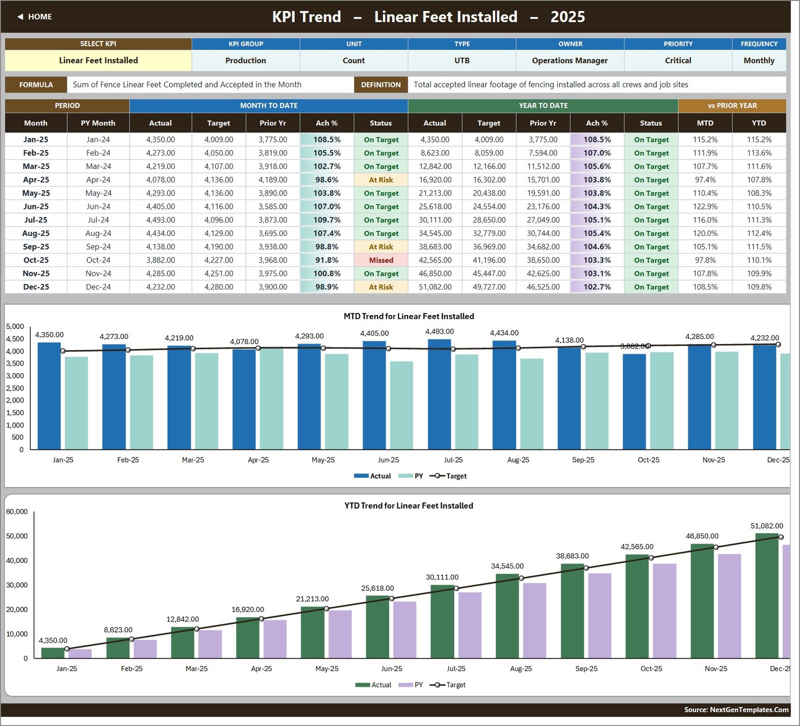
This is the page that answers “was that a good month or a seasonal one”. In the sample data Linear Feet Installed peaks in July at 4,493 and dips in October to 3,882 – a shape most fencing firms will recognise – while the YTD line stays above target all year at 102.7% by December.
The Analysis Page
KPI Analysis follows the same month you picked on the dashboard. It gives you four things: a Performance by KPI Group table (KPIs, On Target, At Risk, Missed, average MTD and YTD achievement per group), an “Average YTD Achievement by KPI Group” bar chart, a Top 5 Performing KPIs table and a Bottom 5 Performing KPIs table, both ranked on YTD achievement.
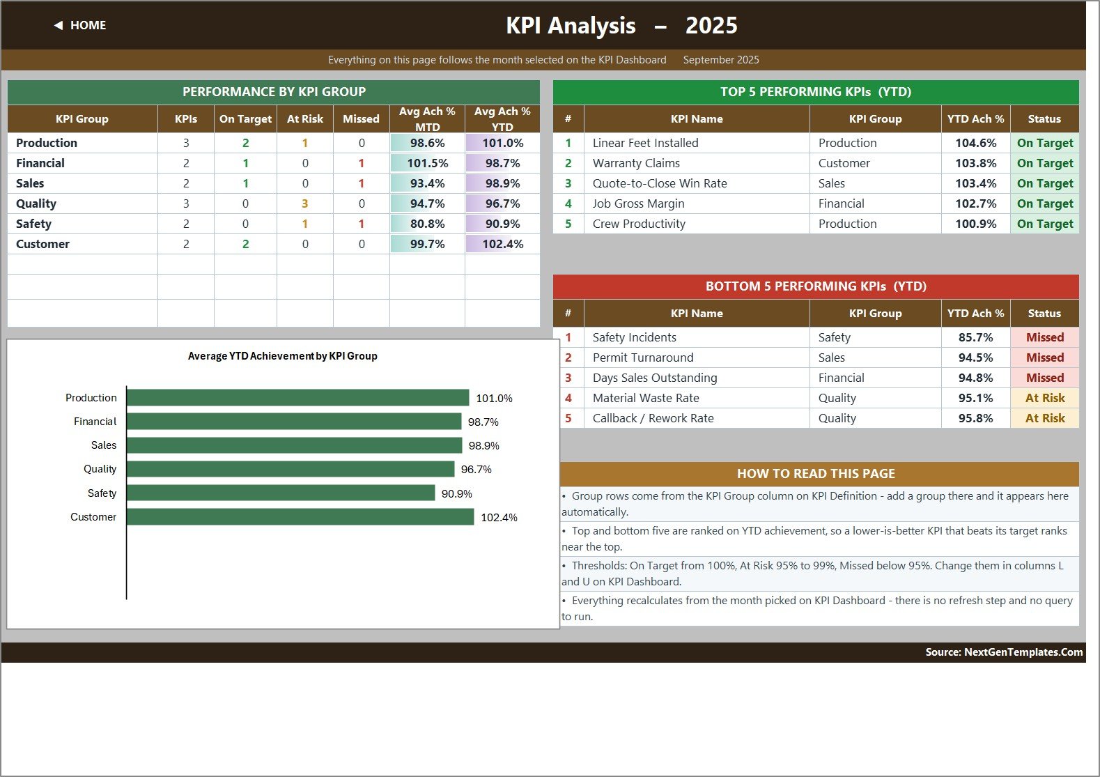
In the September 2025 sample the group averages run Customer 102.4%, Production 101.0%, Sales 98.9%, Financial 98.7%, Quality 96.7% and Safety 90.9% – so the meeting starts at Safety, which is the point. The bottom five are Safety Incidents (85.7%), Permit Turnaround (94.5%), Days Sales Outstanding (94.8%), Material Waste Rate (95.1%) and Callback / Rework Rate (95.8%).
Because the ranking uses achievement rather than the raw number, a lower-is-better KPI that beats its target ranks near the top rather than the bottom. Warranty Claims sits second in the top five for exactly that reason.
Excel or Power BI? They Are Not the Same File
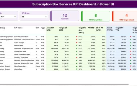
There is a companion Fencing Contractor KPI Dashboard in Power BI, and it is worth being clear that it is a separate build, not this workbook exported to another tool.
- Different KPI set. The Power BI edition tracks 12 KPIs, not 14, and most of them are different ones: Average Job Value, Post-Set Cost per Post, Gate & Latch Callback Count, Bid Win Rate, Utility Locate Turnaround, Estimate-to-Install Lead Time, Jobsite Safety Audit Score and Installed Feet per Crew-Day, alongside Linear Feet Installed, Days Sales Outstanding, Gross Margin and Material Waste. Only about three overlap by name with the Excel build.
- Different grouping. Power BI groups by Materials, Sales, Quality, Financial, Scheduling, Safety, Compliance and Production; Excel uses Production, Financial, Sales, Quality, Safety and Customer.
- Different filtering. Power BI gives you five slicers – Month, KPI Group, Owner, Priority and Direction. Excel gives you two dropdowns: month, and KPI on the trend page.
- Different comparison. The Power BI cards show month-on-month movement with a twelve-month trend bar behind each one, and the scorecard table carries a sparkline per KPI. Excel compares against prior year instead, MTD and YTD.
- Different requirement. Power BI Desktop on Windows, versus Excel 2013+, Excel for Mac or a browser.
Neither is the “better” one. Pick on the tool you already run and the comparison you actually want – month-on-month with slicers, or year-on-year with a printable page.
How It Compares
| What you need | This Excel KPI Dashboard | The Power BI edition | Field-service SaaS |
|---|---|---|---|
| Cost | One-off, lifetime access | One-off, same price | 50-300+ per user per month |
| Needs installing | Nothing – Excel or a browser | Power BI Desktop | Nothing, but a subscription |
| Time to first useful page | Minutes – the sample is already populated | Minutes | Weeks |
| Where your data sits | Your own file | Your own .pbix | The vendor’s cloud |
| Numbers arrive automatically | No – you type them | No – you maintain the data file | Yes |
| Change a KPI or a threshold | Type it, every cell unlocked | Edit the data file | Vendor roadmap |
How to Set It Up in Ten Minutes
- Unzip and open the .xlsx. It lands on Home. Nothing to enable.
- Set the reporting year. Cell E3 on KPI Input – Actual is the first month of your year. Change it and the Target sheet, the PY sheet, the month dropdown and every sheet title re-base themselves.
- Edit the KPI list. On KPI Definition, rename, re-group or delete rows and set UTB or LTB. There are 22 wired rows and 14 in use, so eight more KPIs need no formula work.
- Type your numbers on the three input sheets. Each holds an MTD and a YTD column per month, so you decide whether year-to-date is a running total (linear feet, incidents, warranty claims) or a running average (margin, DSO, satisfaction, all the rates).
- Pick a month in D6 on KPI Dashboard.
- Drill in on KPI Trend with the dropdown in B4.
- Adjust the thresholds if 100 / 95 does not match your governance – they live in the status formulas in columns L and U on KPI Dashboard.
Opportunities for Improvement – the Honest Bit
Two things are worth knowing before you buy, neither of which affects the numbers.
First, the Read Me page’s “Cumulative or average YTD” row still carries example wording borrowed from another industry – it mentions “aircraft deliveries, non-conformance reports” as its illustration of what accumulates through the year. The rule it is describing is correct and applies perfectly well to linear feet and incident counts; the examples are simply not fencing ones. It is a text cell and you can edit it.
Second, the Frequency column on KPI Definition is a documentation label, not a switch. All 14 KPIs here are set to Monthly and the whole workbook runs on a monthly grid; changing that cell to Weekly would document an intention rather than change any behaviour.
And the structural limitation, which is by design rather than a defect: this file stores one number per KPI per month. There is no job list, no crew breakdown, no customer record and no permit register. It reports the summary numbers you produce elsewhere. If you need job-level detail, this is the wrong shape of tool.
More on this blog: Fencing Contractor KPI Scorecard in Excel, HVAC Contractor KPI Dashboard in Excel and Drywall Contractor KPI Dashboard in Excel.
Frequently Asked Questions
Does it use macros? No. Plain .xlsx, worksheet formulas only – VLOOKUP, MATCH, INDEX, COUNTIF. No VBA, no Power Query, no Power Pivot, no add-ins.
Which versions of Excel? Excel 2013 and later, Excel for Mac, Microsoft 365 and Excel for the web.
Can I add more KPIs? Yes – the sheets are wired for 22 and 14 are used, so eight more need no formula work. Beyond 22, select the last data row on each sheet and fill down, then widen the ranges in the summary cards on row 4 of KPI Dashboard.
Does it connect to my accounting or estimating software? No. You type the monthly numbers in – both the MTD and the YTD figure, which is deliberate so that you control how year-to-date is defined per KPI.
Is the sample data real? No. The 2025 and 2024 figures are demonstration data so that every card, chart and traffic light is populated on first open. Delete it and type your own.
Is this an OSHA or safety compliance system? No. Safety Incidents is a count you type each month. There is no incident log, no OSHA 300 form and no corrective-action tracking.
How is this different from the KPI Scorecard version? The scorecard is a lighter ten-KPI file. This dashboard ships 14 KPIs, seven summary cards, a dedicated trend page with two combo charts, and a full analysis page with a group roll-up and top/bottom five.
Are there other trades in this line? Yes – Masonry, Roofing, Carpentry, HVAC, Electrical, Insulation, Drywall and Welding all have their own Excel KPI Dashboard.
Get the Template
The Fencing Contractor KPI Dashboard in Excel is an instant download: the .xlsx workbook plus the Excel KPI Dashboard User Manual PDF, sample 2025 data included, every cell unlocked, lifetime access to the file you buy.
Explore Relevant Templates
- Fencing Contractor KPI Dashboard in Power BI – same trade, a separate 12-KPI slicer-driven build.
- Fencing Contractor KPI Scorecard in Excel and Fencing Contractor KPI Scorecard in Google Sheets – the lighter ten-KPI line.
- Masonry Contractor KPI Dashboard in Excel
- Roofing Contractor KPI Dashboard in Excel
- Carpentry Workshop KPI Dashboard in Excel
- Insulation Contractor KPI Dashboard in Excel and Drywall Contractor KPI Dashboard in Excel
- Or browse the whole KPI Dashboard category.
Last updated: 02 September 2026.