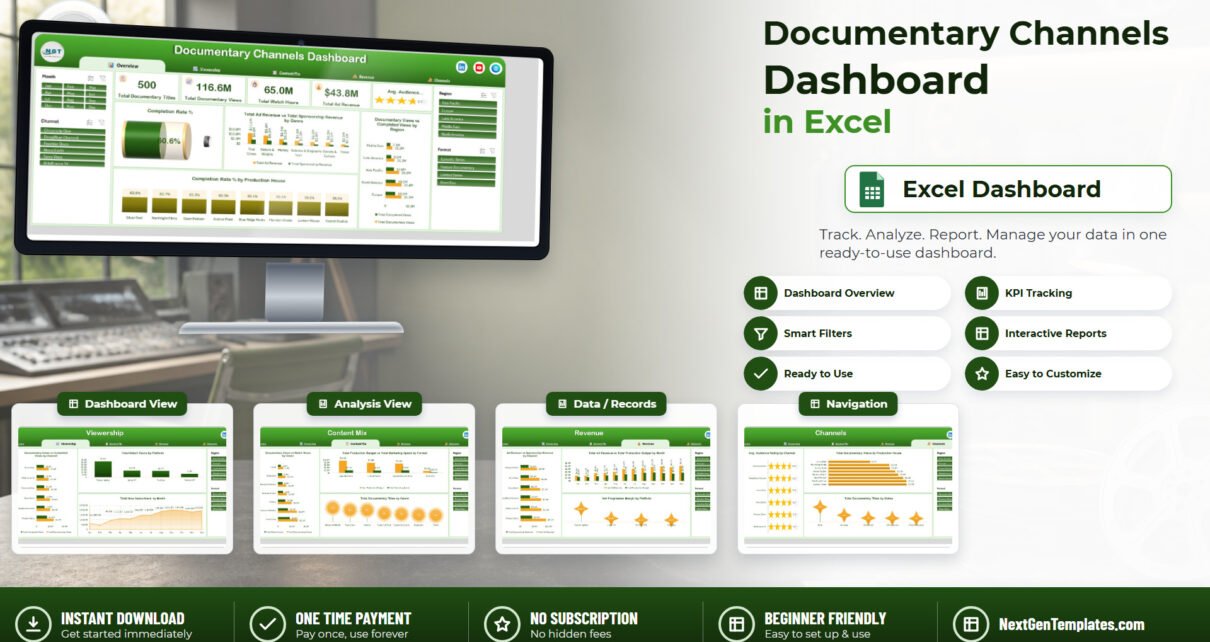
Running a documentary slate means answering three awkward questions at once: how many people started a programme, how many finished it, and whether the money that made it came back. The Documentary Channels Dashboard in Excel puts all three on five linked pages built from 500 sample title records – 116.6M views, 65.0M watch hours, a 60.6% completion rate and $43.8M of ad revenue, sliceable by month, channel, region and format.
This is the analytical Excel dashboard line – pivot tables and slicers you explore, not a one-page traffic-light scorecard. If you have used the Broadcasting Dashboard in Excel or the Content Rights Agencies Dashboard in Excel, this is the same construction applied to factual programming.
Key Features of the Documentary Channels Dashboard in Excel
- Five report pages – Overview, Viewership, Content Mix, Revenue and Channels – reached from a tab strip that sits in the same place on every page.
- Five KPI cards: Total Documentary Titles, Total Documentary Views, Total Watch Hours, Total Ad Revenue and Avg. Audience Rating, the last drawn as a star meter.
- Four synchronised slicers – Month, Channel, Region, Format – repeated on all five pages and sharing one cache, so a filter set on Overview is already applied when you move to Revenue.
- 17 charts, each named for the metric it shows rather than for the chart type.
- 22 pivot tables behind the scenes, all driven from a single Data sheet.
- 500 sample title rows across 24 fields, including air date, channel, region, genre, format, platform, language, production house, episodes, runtime, views, completed views, watch hours, new subscribers, production budget, marketing spend, ad revenue, sponsorship revenue, audience rating and status.
- No VBA – a plain .xlsx for Excel 2016+, Microsoft 365 and Excel for Mac, with a PDF user manual in the ZIP.
Dashboard Pages Explanation
Page 1 – Overview
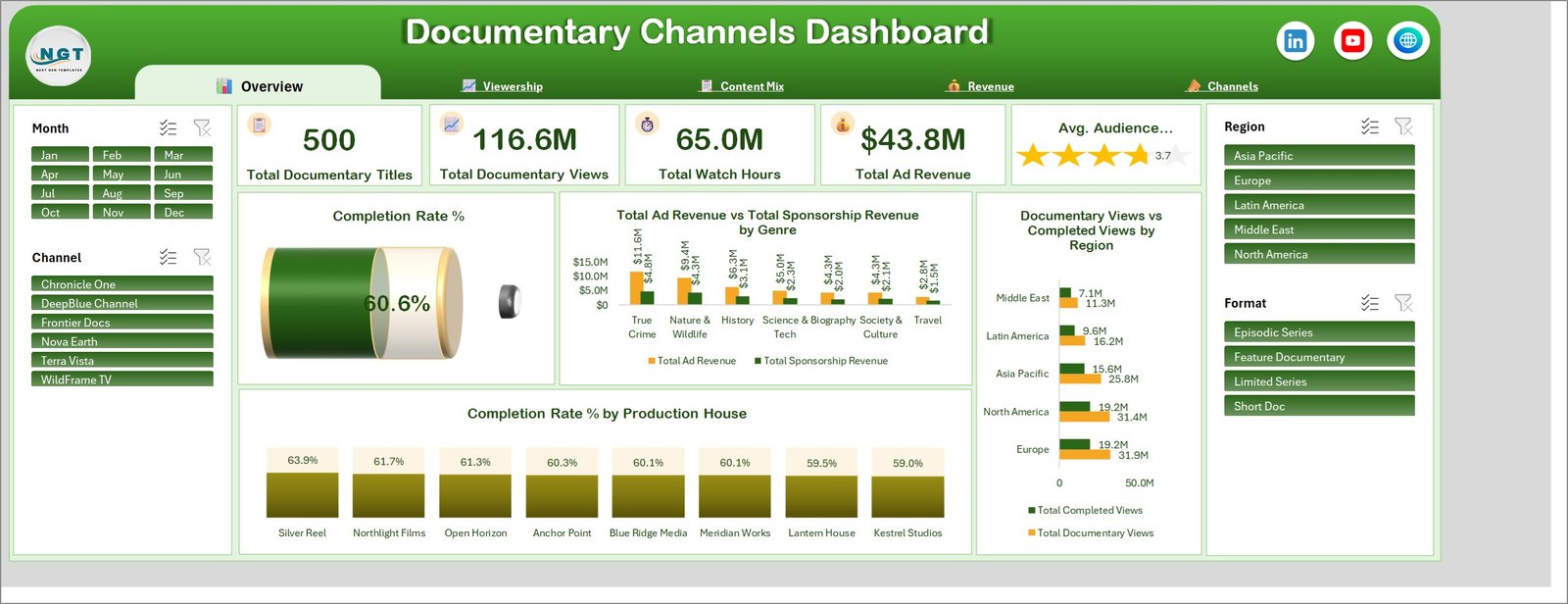
The five KPI cards read 500 titles, 116.6M views, 65.0M watch hours, $43.8M ad revenue and a 3.7 average audience rating. A Completion Rate % cylinder gauge sits at 60.6% – roughly two in five viewers stop before the end, which is the number the rest of the workbook exists to explain.
Total Ad Revenue vs Total Sponsorship Revenue by Genre ranks seven genres, True Crime first at $11.6M of ad revenue and $4.8M of sponsorship, Nature & Wildlife next at $9.4M and $4.3M, Travel last at $2.8M and $1.5M. Documentary Views vs Completed Views by Region puts Europe (31.9M views, 19.2M completed) and North America (31.4M, 19.2M) ahead of Asia Pacific’s 25.8M and the Middle East’s 11.3M. Completion Rate % by Production House spreads eight suppliers across a surprisingly narrow band – Silver Reel at 63.9% down to Kestrel Studios at 59.0%.
Page 2 – Viewership
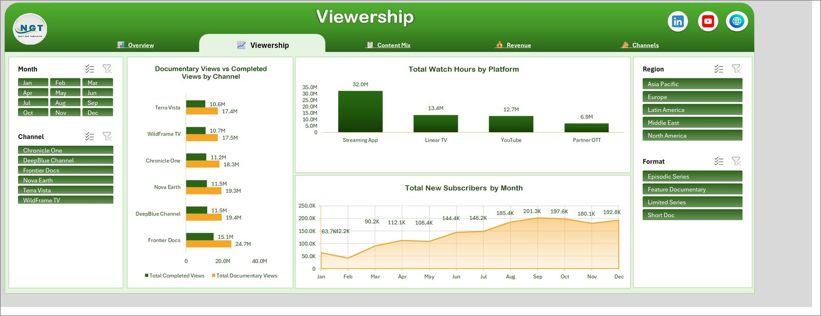
Documentary Views vs Completed Views by Channel gives Frontier Docs 24.7M views against 15.1M completed, then DeepBlue Channel and Nova Earth at 19.4M and 19.3M, Chronicle One at 18.3M, and WildFrame TV and Terra Vista at 17.5M and 17.4M. Total Watch Hours by Platform is the page’s blunt finding: the Streaming App carries 32.0M hours against Linear TV’s 13.4M, YouTube’s 12.7M and Partner OTT’s 6.9M. Total New Subscribers by Month runs from a 42.2K February trough through a 201.3K September peak and holds near 190K to the end of the year.
Page 3 – Content Mix
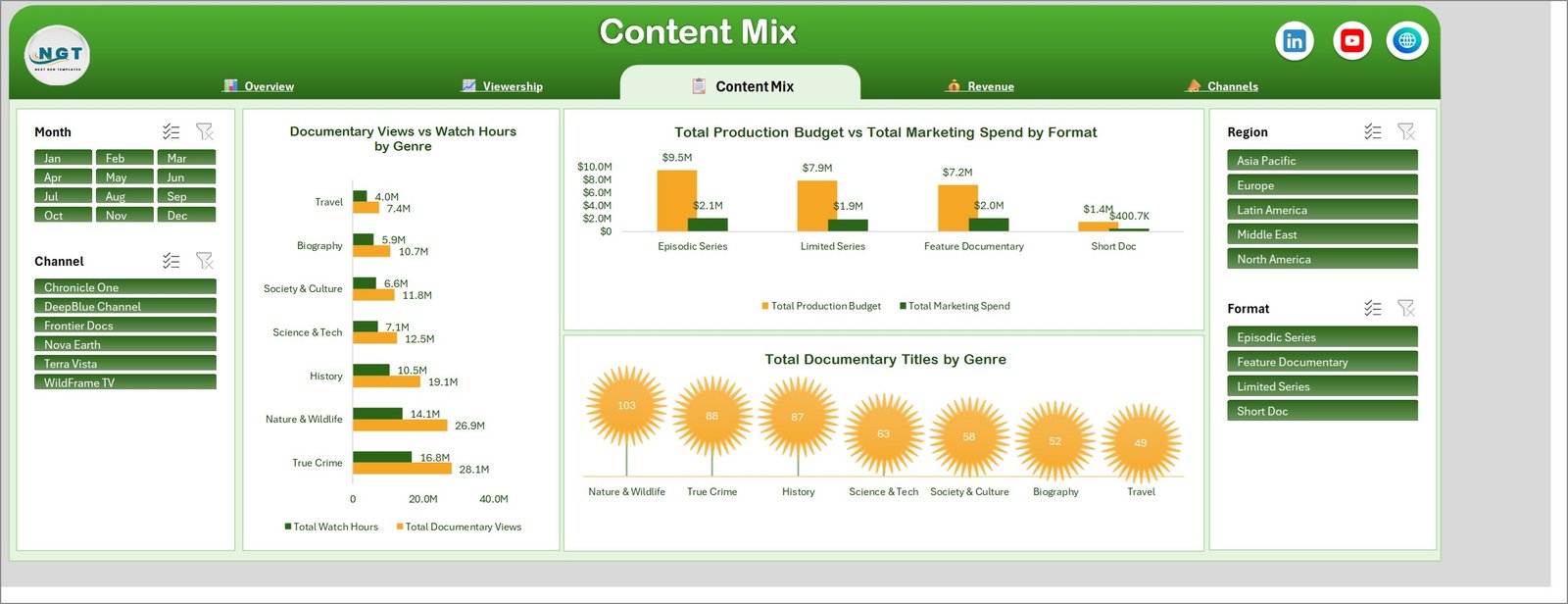
This is the commissioning page. Documentary Views vs Watch Hours by Genre shows True Crime at 28.1M views and 16.8M hours and Nature & Wildlife at 26.9M and 14.1M, with Travel bottom at 7.4M and 4.0M. Total Production Budget vs Total Marketing Spend by Format shows Episodic Series taking $9.5M of budget and $2.1M of marketing, Limited Series $7.9M and $1.9M, Feature Documentary $7.2M and $2.0M, Short Doc $1.4M and $400.7K. Total Documentary Titles by Genre counts 103 Nature & Wildlife, 88 True Crime and 87 History titles down to 49 Travel – set that count against the views chart above and you can see where the slate is over- and under-weighted.
Page 4 – Revenue
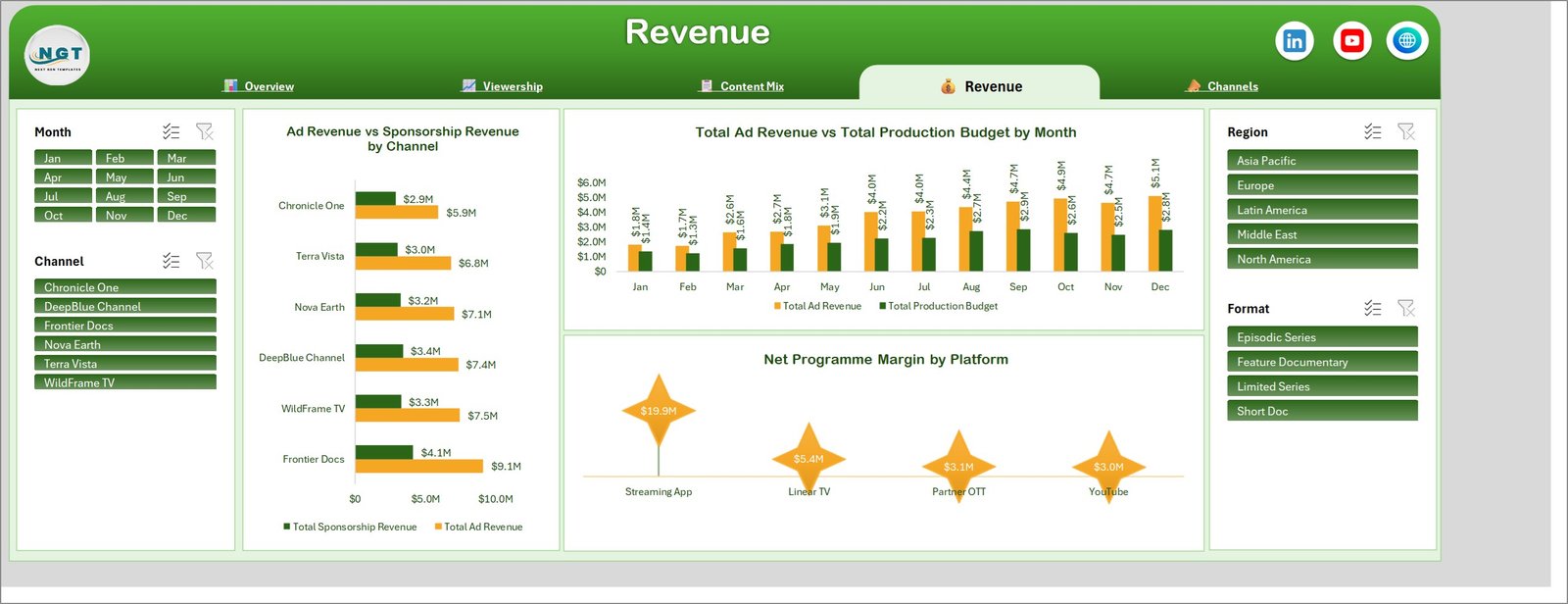
Ad Revenue vs Sponsorship Revenue by Channel gives Frontier Docs $9.1M and $4.1M and Chronicle One $5.9M and $2.9M, with the other four in between. Total Ad Revenue vs Total Production Budget by Month traces both from $1.8M and $1.4M in January to $5.1M and $2.8M in December, so the widening gap is visible month by month rather than only in the annual total. Net Programme Margin by Platform closes the argument the Viewership page opened: $19.9M from the Streaming App against $5.4M from Linear TV, $3.1M from Partner OTT and $3.0M from YouTube.
Page 5 – Channels
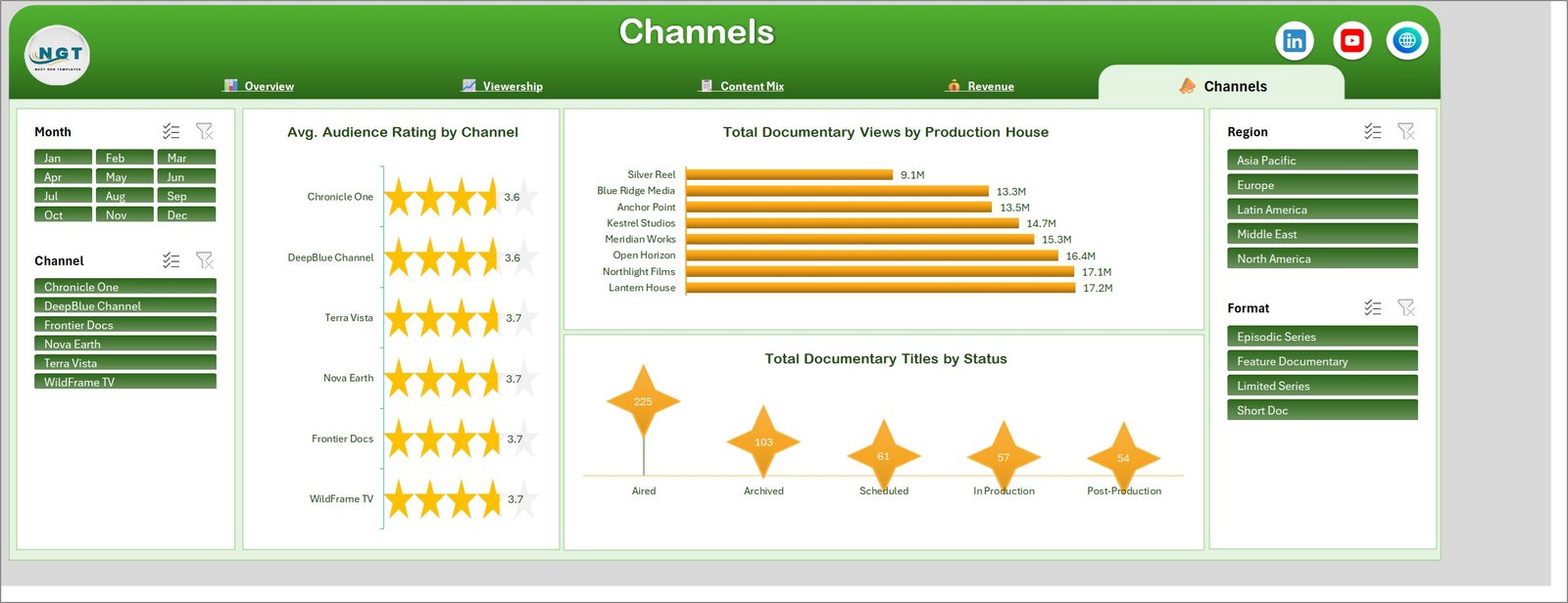
Avg. Audience Rating by Channel draws six star meters clustered between 3.6 and 3.7, which is a useful negative result: rating is not what separates these channels. Total Documentary Views by Production House is where the spread actually lives, from Lantern House at 17.2M and Northlight Films at 17.1M down to Silver Reel at 9.1M. Total Documentary Titles by Status counts 225 aired, 103 archived, 61 scheduled, 57 in production and 54 in post-production – the slate view a commissioning meeting opens with.
Documentary Channels Dashboard in Excel vs. Google Sheets vs. Paid Media Analytics SaaS – Feature Comparison
| What matters | This Excel dashboard | Google Sheets equivalent | Paid SaaS (Nielsen, Parrot Analytics, Conviva) |
|---|---|---|---|
| Cost | $17.99 once | $9.99 once | $20,000-$100,000 per year |
| Platform | Excel 2016+, Microsoft 365, Mac | Browser, any device | Vendor cloud only |
| Setup time | Under 15 minutes | Under 15 minutes | 4-12 weeks |
| Real-time collaboration | OneDrive or SharePoint co-authoring | Native, simultaneous | Native, with approvals |
| Works with your own channel export | Yes, paste and refresh | Yes, paste and refresh | Requires a data feed integration |
| Ad and sponsorship revenue vs production budget | Built in | Built in | Usually a separate finance module |
| Offline use | Yes | Limited | No |
| Year-1 cost at 5 users | $17.99 | $9.99 | $30,000+ |
| Data leaves your organisation | No | Stays in your Google account | Yes, vendor-hosted |
Who Should Use This Template
Documentary channel controllers and heads of factual running a slate across several strands. Streaming and OTT programming teams that need views, watch hours and completion side by side rather than in three separate exports. Independent production houses reporting delivery and audience performance back to a commissioner. Media finance managers who have to set ad and sponsorship revenue against production budget and marketing spend before a renewal decision.
It is not the right tool if you need a live feed from player telemetry or an ad server, per-title permissions for external producers, or minute-by-minute concurrency diagnostics. Those are pipeline and platform problems, not reporting-workbook problems.
Real-World Use Cases
Aisha, channel controller, six factual strands. Her monthly pack used to be three exports stitched together. She now filters Channel to Frontier Docs and shows 24.7M views and $9.1M of ad revenue on one page, then carries the same filter into Content Mix to argue for two more True Crime commissions.
Tom, head of distribution. He only cares about the platform split. Total Watch Hours by Platform and Net Programme Margin by Platform together make the case that the Streaming App carries 32.0M hours and $19.9M of margin while Partner OTT returns $3.1M on a full rights window.
Lena, production finance manager. Filtering Format to Short Doc shows $1.4M of production budget against $400.7K of marketing – the ratio she uses to challenge the marketing allocation on the next Episodic Series slate.
Advantages of the Documentary Channels Dashboard in Excel
- Everything is on one filter set. Four slicers, one cache, five pages – you never re-apply a filter when you change page.
- Views and money sit in the same workbook. Completion rate on Overview and net programme margin on Revenue come from the same 500 rows, so nobody argues about which export is authoritative.
- Charts are named for their metric, so a screenshot pasted into a deck needs no caption.
- No macros and no add-ins – it opens on a locked-down corporate laptop and on Excel for Mac.
- You own the file. One payment, no seats, no renewal, and the data never leaves your machine.
Opportunities for Improvement
Honest limits worth knowing before you buy. Refresh is manual – Data > Refresh All, not automatic on open. Past roughly 100,000 rows the refresh becomes noticeable on an average laptop. There is no year-on-year comparison page; the month slicer covers a single year of sample data, so multi-year trending means adding a Year field and a pivot of your own. And the audience rating is a flat average, not weighted by views – if you want a view-weighted rating, add the helper column before you refresh.
Best Practices
- Keep the 24 column headers exactly as shipped – the pivots are bound to them by name.
- Reuse the existing Channel, Region, Genre, Format, Platform, Production House and Status values, or replace the whole list at once rather than mixing old and new spellings.
- Refresh with Ctrl + Alt + F5 after every paste, then check the Overview KPI cards before you screenshot anything.
- Clear all four slicers before you save, so the next person opens the workbook on the full picture.
- Keep a clean copy of the shipped file and work in a duplicate – it makes a bad paste a two-second fix.
Explore Relevant Templates
- Broadcasting Dashboard in Excel – the general broadcast build this one specialises.
- Content Rights Agencies Dashboard in Excel – the rights and licensing side of the same catalogue.
- Podcast Analytics Dashboard in Excel – episode-level downloads and completion for audio.
- TV Channels Dashboard in Power BI – the Power BI alternative if your data already sits in a model.
- Film & Television Report in Excel – a printable report rather than an interactive dashboard.
- Content Licensing Dashboard in Power BI – licensing windows and royalty tracking.
Frequently Asked Questions
Which Excel versions does the Documentary Channels Dashboard in Excel support?
Excel 2016, 2019, 2021, 2024 and Microsoft 365 on Windows, and Excel for Mac. It is a standard .xlsx with pivot tables and slicers – no macros to enable and no add-ins to install.
How is this different from an Excel KPI dashboard or KPI scorecard?
This is the analytical dashboard line: five exploration pages, 17 charts and free-form slicing across 500 records. A KPI dashboard is a month-picker scorecard with targets and traffic lights; a KPI scorecard is a one-page summary. Near-identical product names exist across all three lines, so check which one you are buying – this is the one you slice.
Can I add my own channels, genres or platforms?
Yes. Type your own values into the Data sheet and refresh – the slicers and charts rebuild around whatever list they find. Nothing is hard-coded to the six sample channels.
Do the charts update automatically?
They update on refresh. Paste your rows, then Data > Refresh All (Ctrl + Alt + F5) redraws all five pages in one step.
How many title records can it handle?
It ships with 500 rows and stays responsive into the tens of thousands. Past roughly 100,000 rows, refresh times become noticeable on an average laptop.
What is in the download?
A ZIP containing the .xlsx workbook and a PDF user manual. Nothing else to install.
Is any of the sample data real?
No. The channel names, production houses and figures are realistic sample data used to demonstrate the charts. Replace them before sharing anything externally.
About the Author
Built by PK – Microsoft Certified Professional with 15+ years of Excel, Google Sheets, and Power BI experience. Founder of NextGenTemplates, reaching 300K+ subscribers across YouTube channels. Every template is hand-built and tested before release.
Conclusion
A documentary slate is judged on two numbers that rarely appear on the same page: how much of a programme people actually watch, and what it earned against what it cost. The Documentary Channels Dashboard in Excel puts a 60.6% completion rate, 65.0M watch hours and $43.8M of ad revenue on five pages driven by one set of slicers, so the answer to “which channel, which genre, which platform” takes a click rather than a rebuild.
Get the Documentary Channels Dashboard in Excel for $17.99 (regular $29.99) – instant download, one-time payment, lifetime access, no subscription.