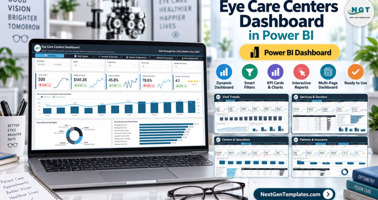
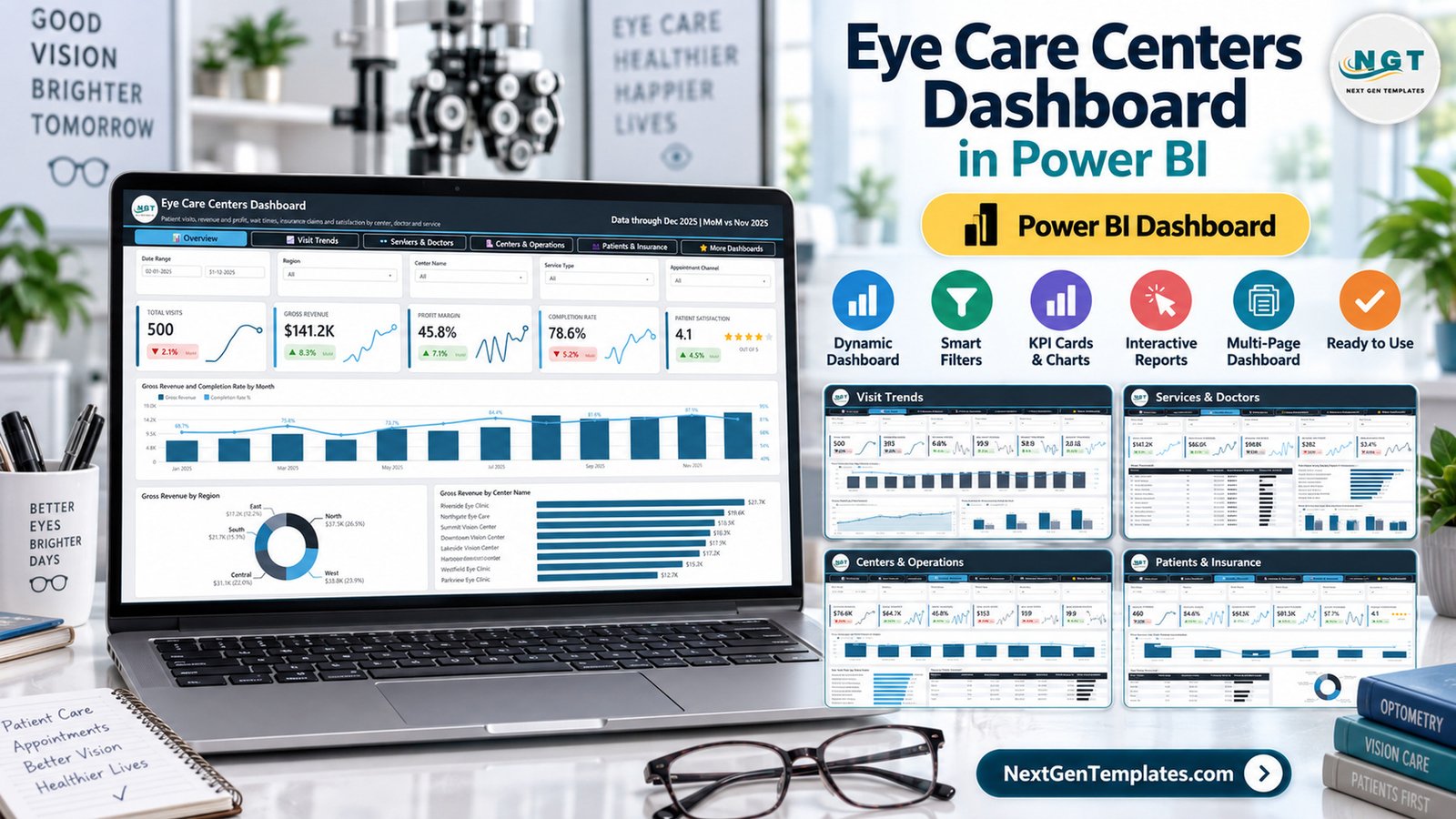
The Eye Care Centers Dashboard in Power BI analyses 500 sample patient visits recorded across 8 eye care centers, 5 regions and 12 doctors during 2025. It packs 25 KPI cards, 11 charts and 3 scorecard tables into five analysis pages, and every card compares December 2025 with November 2025 so you see the latest month-over-month movement at a glance.
Running several eye clinics usually means juggling spreadsheets for visits, revenue, wait times and insurance claims. This Power BI report brings those numbers into one file: which center earns the most, which doctors see the most patients, where patients wait longest and how much of your revenue insurers actually cover. You open it in Power BI Desktop, replace the sample rows with your own export and refresh.
Key Features of the Eye Care Centers Dashboard in Power BI
- Five analysis pages plus a resources page. Overview, Visit Trends, Services & Doctors, Centers & Operations and Patients & Insurance, followed by a More Dashboards page. A button bar at the top of every page handles navigation.
- 25 KPI cards covering 20 measures. Each card shows the current value, a green or red month-over-month badge and a sparkline for the year.
- Five slicers on every analysis page. Date Range, Region, Center Name and Service Type appear everywhere; the fifth slicer changes to Appointment Channel, Visit Status, Age Group, Doctor or Insurance Provider depending on the page.
- Three scorecard tables. A Doctor Scorecard, a Regional Profit Scorecard and an Age Group Scorecard, each with an in-cell data bar for quick ranking.
- Revenue split by source. Gross revenue is broken into procedure charges and eyewear revenue, and shown by 8 service types from Routine Eye Exam to Emergency Eye Care.
- A clean source table. Data.xlsx holds one row per visit with 24 columns, from Visit ID and Visit Date to Satisfaction Score, Follow Up Required and Prescription Issued.
The report runs in Power BI Desktop, which Microsoft provides free for Windows. If you are new to Power BI, the Microsoft guide to connecting data in Power BI Desktop explains the Power Query step used to point the file at your own workbook.
Dashboard Pages Explanation
Page 1: Overview
The Overview page answers the first question every owner asks: how are we doing overall? Its cards show Total Visits (500), Gross Revenue ($141.2K), Profit Margin (45.8%), Completion Rate (78.6%) and Patient Satisfaction (4.1 out of 5 stars). Slicers cover Date Range, Region, Center Name, Service Type and Appointment Channel.
Three charts sit below the cards. Gross Revenue and Completion Rate by Month pairs monthly revenue columns with a completion-rate line. Gross Revenue by Region shows North as the largest region at $37.5K (26.5%), and Gross Revenue by Center Name ranks all 8 centers, led by Riverside Eye Clinic at $21.7K and Northgate Eye Care at $19.6K.
Page 2: Visit Trends
Visit Trends follows patient flow through the year. Its cards are Total Visits, Completed Visits (393), No Show Rate (6.6%), Avg Wait (19.9 minutes) and Consult Time (29.5 minutes), with Visit Status as the page-specific slicer.
The charts are Total Visits and Avg. Wait Time by Month, Gross Profit by Month and Gross Revenue and Operating Cost by Quarter. The quarterly view makes seasonality easy to read: sample gross revenue grows from $24.1K in Q1 to $46.9K in Q4.
Page 3: Services & Doctors
This page looks at what you sell and who delivers it. Cards show Gross Revenue, Procedure Charges ($66.5K), Eyewear Revenue ($49.8K), Revenue per Visit ($282) and Prescription Rate (53.4%), filtered by Age Group as well as the common slicers.
The Doctor Scorecard lists 12 doctors with total visits, gross revenue, average satisfaction stars and a revenue bar. Gross Revenue by Service Type puts Cataract Consultation first at $29.7K, and Procedure Charges and Eyewear Revenue by Age Group shows how the two revenue streams differ between patients under 18 and those over 70.
Page 4: Centers & Operations
Centers & Operations compares locations on cost and efficiency. Cards cover Operating Cost ($76.6K), Gross Profit ($64.7K), Profit Margin, Cost per Visit ($153) and Avg Wait, with a Doctor slicer.
Gross Revenue and Profit Margin by Center Name shows revenue and margin together for all 8 centers. Avg. Wait Time by Center Name ranks waits from Lakeside Vision Center (22.5 minutes) down to Harbour Eye Care (17.2 minutes), and the Regional Profit Scorecard compares visits, gross revenue, gross profit and profit margin for the 5 regions.
Page 5: Patients & Insurance
The last analysis page covers who your patients are and how they pay. Cards show Unique Patients (460), Insured Visits (84.6%), Insurance Claims ($81.5K), Claim Coverage (57.7%) and Patient Satisfaction, with an Insurance Provider slicer.
Gross Revenue and Claim Coverage by Insurance Provider compares 6 payer groups including Self Pay. The Age Group Scorecard adds total insurance claims and follow-up rate for 5 age bands, and Total Visits by Appointment Channel shows Online Booking as the largest channel with 147 visits (29.4%).
Page 6: More Dashboards
A resources page linking to other Power BI templates and to NextGenTemplates custom dashboard services.
This Eye Care Template vs. Tableau / Qlik vs. Paid Healthcare Analytics SaaS — Feature Comparison
| Feature | This Power BI template | Tableau / Qlik build | Athenahealth / Kareo reporting |
|---|---|---|---|
| Cost | ✅ $17.99 one-time | Per-user licence plus build time | Monthly subscription, quoted per provider |
| Platform | Power BI Desktop (free, Windows) | Tableau or Qlik | Vendor web app |
| Setup time | ✅ Opens populated with sample data | Days to weeks from a blank canvas | Onboarding project |
| Real-time team collaboration | Through Power BI Service (Microsoft licence required) | Through Tableau Cloud / Qlik Cloud | ✅ Built in |
| Mobile access | Power BI mobile app after publishing | Vendor mobile app | ✅ Vendor app |
| Customizable fields | ✅ Every visual, measure and colour is editable | ✅ Fully custom | Limited to vendor reports |
| Share with link | After publishing to Power BI Service | After publishing to the cloud | ✅ Inside the vendor portal |
| Year-1 cost at 5 users | ✅ $17.99 plus any Microsoft licences you already hold | Five licences plus build hours | Five subscription seats or more |
| Eye-care pages ready | ✅ Doctors, services, centers, insurance | Built by you | General practice reports |
For eye care groups that want center, doctor and insurance reporting without paying for a new analytics subscription, this Power BI template sits in the sweet spot.
Who Should Use This Template
Perfect for:
- Owners and operations managers of multi-location eye clinics and optometry groups
- Finance and reporting staff who already export visit data from their practice software to Excel
- Power BI consultants and freelancers who want a ready eye care report to adapt for clients
- Students and analysts learning healthcare reporting in Power BI
Not a fit if:
- You need an EHR/EMR, appointment booking, billing or practice-management system
- You need clinical decision support, diagnosis or a HIPAA/GDPR-certified platform
- You work only on a Mac without access to Power BI Desktop on Windows
Important: the template ships with fictional sample data, and every patient, doctor and center name is invented. It is an analytics report, not an EHR/EMR, practice-management, clinical-decision or diagnostic tool, and it makes no HIPAA, GDPR or other compliance claim. If you load real patient data, you are responsible for storing, sharing and protecting it under the rules that apply to you. Consider replacing patient names in your export with a consistent pseudonymous patient code, since the Unique Patients card counts distinct values in that column.
Real-World Use Cases
Maria runs operations for a five-location optometry group. Every Monday she opens Centers & Operations and filters to the last month. When one clinic’s average wait climbs well above the group average, she checks the Doctor slicer to see whether one schedule is overloaded and moves an optometrist for the week.
David is the finance lead at a regional eye clinic chain. He uses Patients & Insurance to compare claim coverage by insurance provider before contract renewals, then switches to Services & Doctors to see how procedure charges and eyewear revenue split across age groups.
Aisha is a Power BI freelancer. A client with three eye care centers asked for a monthly management pack. She mapped the client’s export to the 24 Data.xlsx columns, refreshed the report, recoloured it in their brand and delivered it in an afternoon instead of building from a blank canvas.
Advantages of the Template
- Fast start: the report opens with 500 sample visits, so you can judge every visual before touching your own data.
- One file, many views: 20 measures across revenue, profit, visits, waits, prescriptions and insurance replace several separate spreadsheets.
- Built for comparison: center, region, doctor, service type and age group views make it easy to spot outliers.
- Month-over-month context: every KPI card shows its latest change, so meetings start with what moved.
- Low cost: a one-time purchase that runs on free Power BI Desktop.
Opportunities for Improvement
- Fixed comparison month: the KPI cards compare December 2025 with November 2025 in the sample. With your own data, check the comparison logic follows your latest month.
- Manual refresh: the report reads Data.xlsx, so new visits appear only after you update the workbook and refresh. Scheduled refresh needs Power BI Service and a gateway.
- No appointment or clinical detail: there are no diagnosis codes, prescriptions detail or appointment calendars; the file reports on visit-level operational and financial fields only.
- Windows only for editing: Power BI Desktop is a Windows application.
Best Practices
- Keep the 24 column headers in Data.xlsx exactly as they are before refreshing.
- Pseudonymise patient names in your export with one consistent code per patient, so Unique Patients still counts correctly.
- Review Centers & Operations weekly and the other pages monthly, so wait-time problems surface early.
- Use consistent center, doctor and service names in your source system so slicers do not split one clinic into two.
- Publish to Power BI Service only within your organisation’s data and privacy policies.
Explore Relevant Templates
If you work in eye care or healthcare, these published resources pair well with this report:
- Ophthalmology Services Dashboard in Power BI – an earlier, separate Power BI build focused on ophthalmology services.
- Ophthalmology Services Dashboard in Excel – the same ophthalmology topic for Excel users.
- Optical Store Appointment Calendar in Excel – plan eye tests and lens fittings.
- IVF Centers KPI Dashboard in Power BI – another healthcare center report in Power BI.
- Optical Retail Dashboard in Power BI – sales analysis for optical and eyewear stores.
- Eye Care Center Management System Web App – for recording patients and appointments rather than analysing them.
An Excel edition of this eye care template is in preparation.
Frequently Asked Questions
What does the Eye Care Centers Dashboard in Power BI track?
It tracks 20 measures across 25 KPI cards, including total visits, gross revenue, profit margin, completion rate, no show rate, average wait, revenue per visit, prescription rate, insurance claims and claim coverage, broken down by center, region, doctor, service type, age group and insurance provider.
Do I need a paid Power BI licence to use it?
No. The .pbix file opens in Power BI Desktop, which Microsoft provides free for Windows. A Power BI Pro or Premium licence is only needed if you publish the report to Power BI Service and share it with colleagues.
How long does setup take?
The report opens with sample data straight away. To use your own visits, paste them into Data.xlsx under the same 24 headers, update the file path in Power Query and click Refresh. The time needed depends mainly on how closely your export already matches those columns.
Is this template an EHR or practice-management system?
No. It is a reporting template. It does not book appointments, store medical records, bill insurers or provide clinical advice, and it carries no HIPAA or GDPR certification. It analyses operational and financial visit data you export from your existing systems.
How does it compare to paid healthcare analytics software?
Subscription platforms bundle reporting with scheduling and billing, and charge monthly per provider. This Power BI template costs $17.99 once and focuses purely on analysis, so it suits groups that already have practice software but want flexible, editable eye care reporting.
Can I change the visuals and colours?
Yes. Every page, visual, measure and colour in the .pbix is editable in Power BI Desktop, so you can add your logo, rename centers or build extra pages on the same data model.
About the Author
Built by PK — Microsoft Certified Professional with 15+ years of Excel, Google Sheets and Power BI experience. Founder of NextGenTemplates, reaching 300K+ subscribers across YouTube channels. Every template is hand-built and tested before release.
Conclusion
This eye care report gives multi-location eye care teams one place to review visits, revenue, profit, waits and insurance coverage by center, doctor and service. It is quick to adopt, fully editable and priced as a one-time purchase.
👉 Click here to Purchase the Eye Care Centers Dashboard in Power BI
✅ Instant download · One-time payment · No subscription
🎥 For more tutorials, visit Youtube.com/@PKAnExcelExpert
Last updated: September 2026