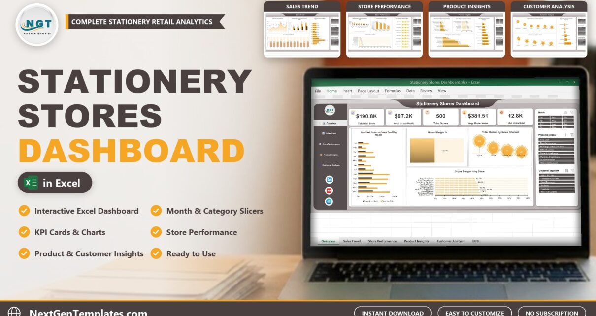
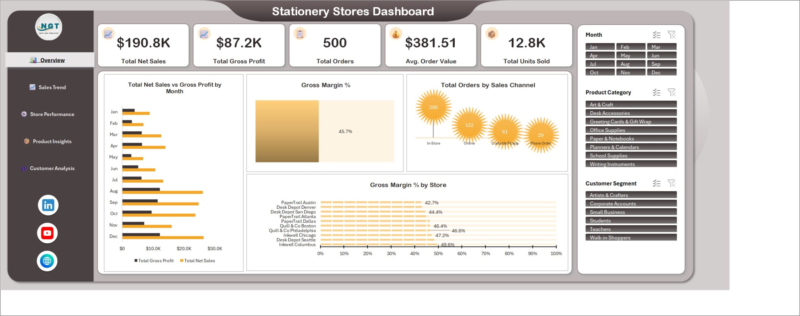
Stationery Stores Dashboard in Excel is a five-page workbook that shows where a stationery business makes its sales and profit across stores, product categories and customer segments. The overview of the sample data reports $190.8K net sales, $87.2K gross profit, 500 orders, a $381.51 average order value and 12.8K units sold at a 45.7% gross margin. These are fictional sample figures. Replace them with your own orders, click Refresh All and the whole dashboard updates.
Watch the Stationery Stores Dashboard in Excel walkthrough
Key Features of the Stationery Stores Dashboard in Excel
The workbook is a plain .xlsx file built with pivot tables, pivot charts and slicers. It needs no macros and no add-ins, so it opens in desktop Excel on any computer. Every page shares the same three slicers on the right, which makes it a practical Excel dashboard with slicers for people who do not want to build pivot tables themselves.
- Five KPI cards: Total Net Sales, Total Gross Profit, Total Orders, Average Order Value and Total Units Sold
- Month, Product Category and Customer Segment slicers connected to all five pages
- Monthly and quarterly sales, cost and margin trends
- Store comparison with region, customer rating and return rate
- Gross profit, margin, units and discounts for eight product categories
- Customer segment and payment method analysis
- 500 sample orders included so every chart works on first open
Dashboard Pages Explained
Overview
The landing page answers the first questions a shop owner asks: how much did we sell, how much did we keep, how many orders came in and how large was the average basket. It adds Total Net Sales vs Gross Profit by Month, a Gross Margin % gauge, Total Orders by Sales Channel (In-Store, Online, Curbside Pickup and Phone Order) and Gross Margin % by Store.
Sales Trend
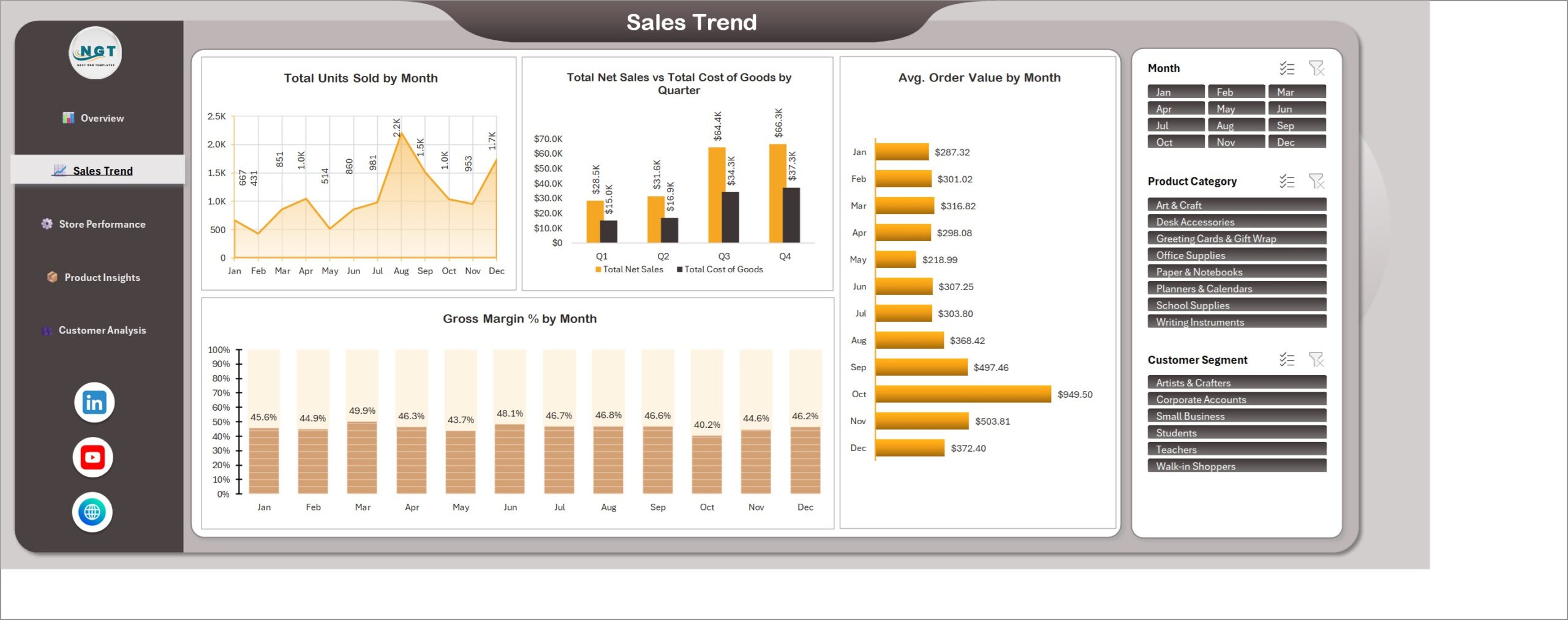
Sales Trend shows Total Units Sold by Month, Total Net Sales vs Total Cost of Goods by Quarter, Gross Margin % by Month and Avg. Order Value by Month. It is the page to open when you want to see when demand rises and whether margin holds up in busy months.
Store Performance
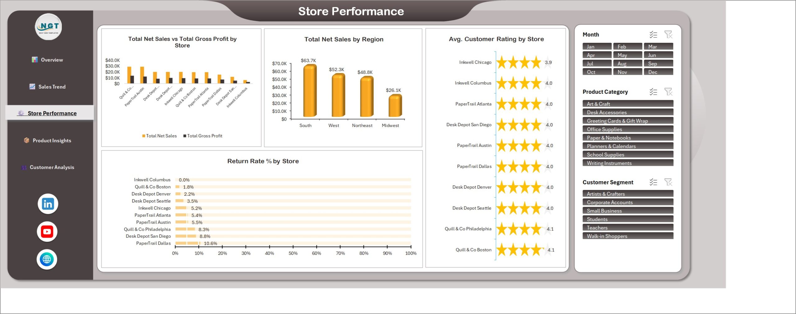
Compare Total Net Sales vs Total Gross Profit by Store, Total Net Sales by Region, Avg. Customer Rating by Store and Return Rate % by Store. As a store performance dashboard Excel managers can read at a glance, it points to the locations with strong sales but weak ratings or high returns.
Product Insights
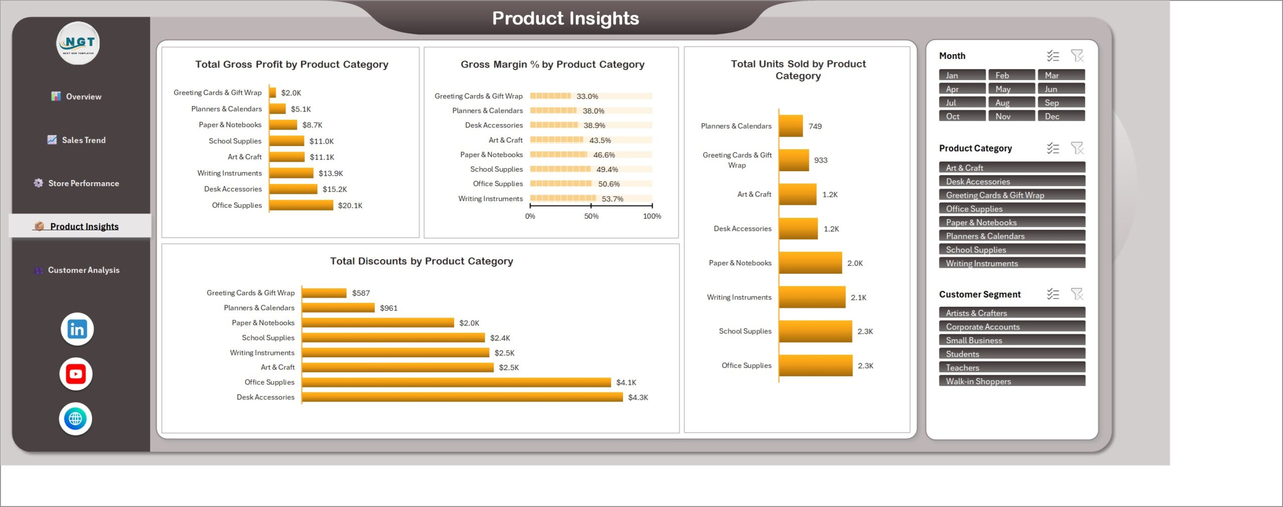
This page ranks eight categories, from Writing Instruments to Greeting Cards & Gift Wrap, by Total Gross Profit, Gross Margin %, Total Units Sold and Total Discounts. It helps buyers decide which lines deserve shelf space and where discounting is eating into profit.
Customer Analysis
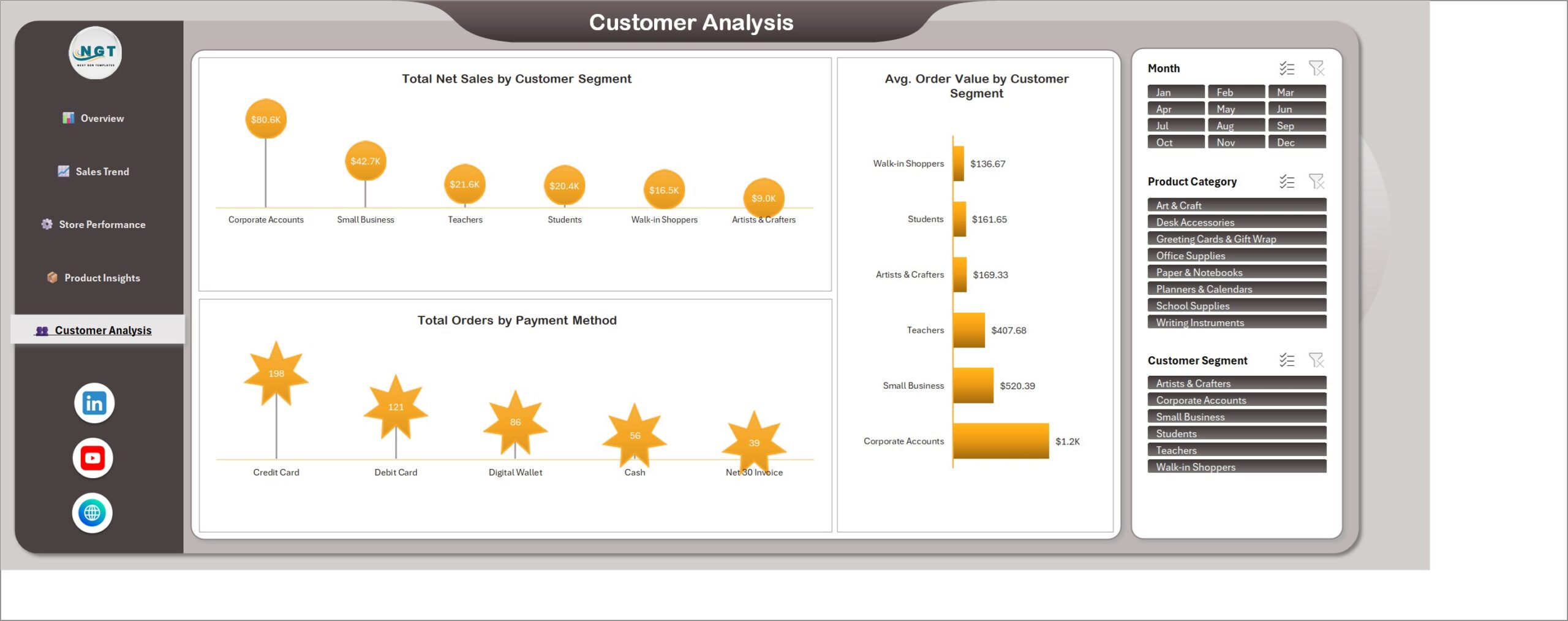
Customer Analysis compares Total Net Sales and Avg. Order Value across six segments, including Corporate Accounts, Small Business, Teachers, Students, Walk-in Shoppers and Artists & Crafters, and counts Total Orders by Payment Method.
How This Compares With Other Options
| Consideration | This Excel dashboard | POS or retail software | Power BI report |
|---|---|---|---|
| Cost model | One-time template | Usually a subscription | Desktop file plus licensing where needed |
| Best for | Reviewing sales and profit from your own data | Billing, stock and daily operations | Larger connected data models |
| Interactive filters | Excel slicers | Vendor-dependent | Report slicers |
| Live POS connection | Not included | Often included | Needs set-up |
| Billing and stock control | Not included | Included | Not included |
Who Should Use It
Stationery shop owners, small chains, office supply retailers, retail analysts and consultants who already export orders from a till, spreadsheet or online store will get the most from it. It is a sales dashboard Excel template for analysis. It is not a POS system, an invoicing tool or a stock-control application, and it does not connect to a POS system.
How to Use the Dashboard
- Download and unzip the package, then open the workbook in desktop Microsoft Excel.
- Keep an untouched copy of the sample file.
- Paste your own orders into the Data sheet using the existing columns.
- Click Data, then Refresh All.
- Use the three slicers to filter all five pages, and check totals against your source records.
As a retail sales dashboard Excel owners can keep next to their order export, it is easiest to review once a month. Start on Overview, then move through Sales Trend, Store Performance, Product Insights and Customer Analysis. Keep store, category and segment names consistent in the Data sheet so that a category does not split into several chart entries.
Explore Relevant Templates
Compare the Retail Dashboard in Excel and the Stationery Shop Stock Data Entry System in Excel for daily stock entry.
Frequently Asked Questions
Does it need macros or add-ins?
No. It is a standard .xlsx workbook with pivot tables, pivot charts and slicers.
Can I use my own sales data?
Yes. Paste your orders into the Data sheet using the existing columns and click Refresh All.
Which slicers are included?
Month, Product Category and Customer Segment.
Does it handle billing or stock?
No. It analyses sales data you add. It does not handle billing or stock control.
Is the sample data real?
No. The orders, stores and figures are fictional examples.
Where can I get the workbook?
See the product page on NextGenTemplates.
About the Author
Built by PK – Microsoft Certified Professional with 15+ years of Excel, Google Sheets, and Power BI experience. Founder of NextGenTemplates, reaching 300K+ subscribers across YouTube channels. Every template is hand-built and tested before release.
Conclusion
This workbook gives a stationery business a clear, repeatable way to review sales, profit, stores, categories and customers in five pages. Treat the sample values as illustrative, add your own orders and reconcile the totals. See the screenshots and download details on NextGenTemplates. For more Excel guidance, follow PK: An Excel Expert on YouTube.