In today’s fast-moving world, managing logistics and transportation efficiently is crucial for businesses that deal with product movement. Whether it’s monitoring shipments, analyzing delivery routes, or evaluating carrier performance, having a centralized system helps make smarter decisions. That’s where the Transportation & Logistics Dashboard in Excel becomes a powerful tool.
This article is your complete guide to understanding, creating, and using a Transportation & Logistics Dashboard built entirely in Microsoft Excel. We will walk you through the layout, key pages, charts, benefits, best practices, and common questions—everything you need to gain visibility into your supply chain.
Click to Purchases Transportation & Logistics Dashboard in Excel
What is a Transportation & Logistics Dashboard in Excel?
A Transportation & Logistics Dashboard in Excel is a visual reporting tool that helps businesses track shipment data, monitor carrier efficiency, measure costs, and analyze delivery performance. Built using Excel and PivotTables, it compiles complex data into easy-to-understand charts and metrics.
With Excel dashboards, you don’t need expensive software or coding skills. You simply use built-in features like slicers, pivot charts, formulas, and data validation tools to manage and visualize large volumes of transportation data.
Pages Included in the Dashboard
This dashboard consists of five key analytical pages, each dedicated to a specific aspect of logistics operations.
Overview Page
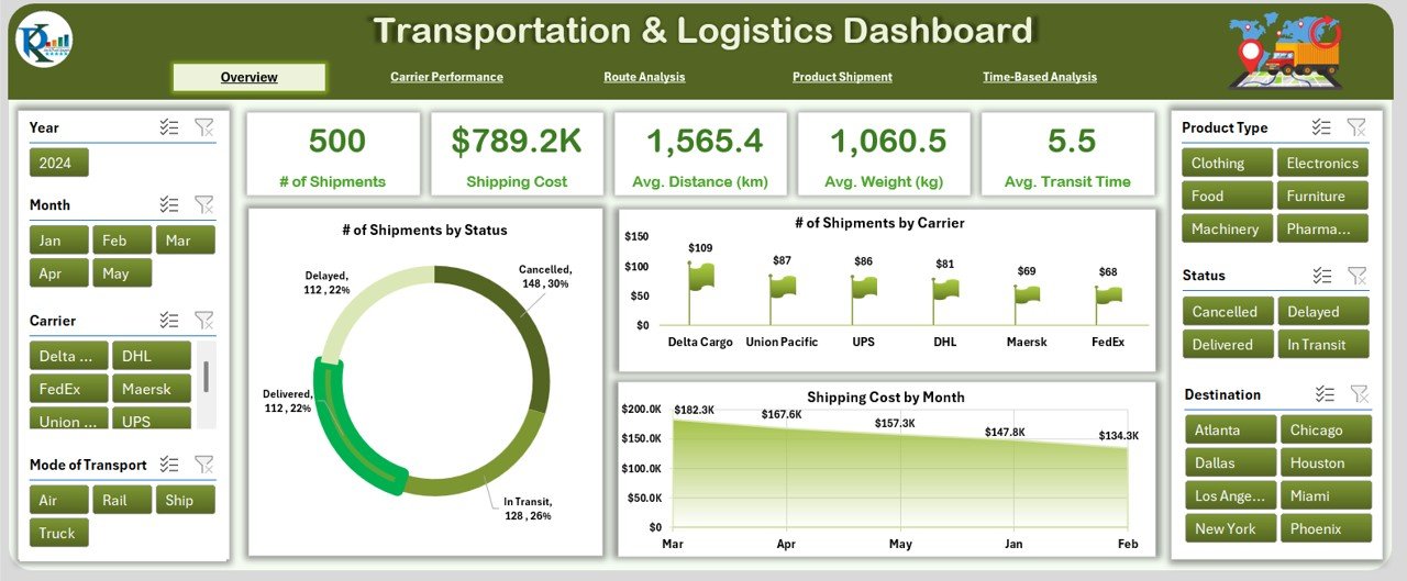
This is the main summary page. It includes:
- Slicers on the left and right sides for quick filtering.
- 5 KPI Cards at the top, such as Total Shipments, Total Cost, On-Time Delivery %, etc.
3 Key Charts:
- Number of Shipments by Status
- Number of Shipments by Carrier
- Shipment Cost by Month
This page provides a high-level snapshot of overall logistics performance.
Carrier Performance Page
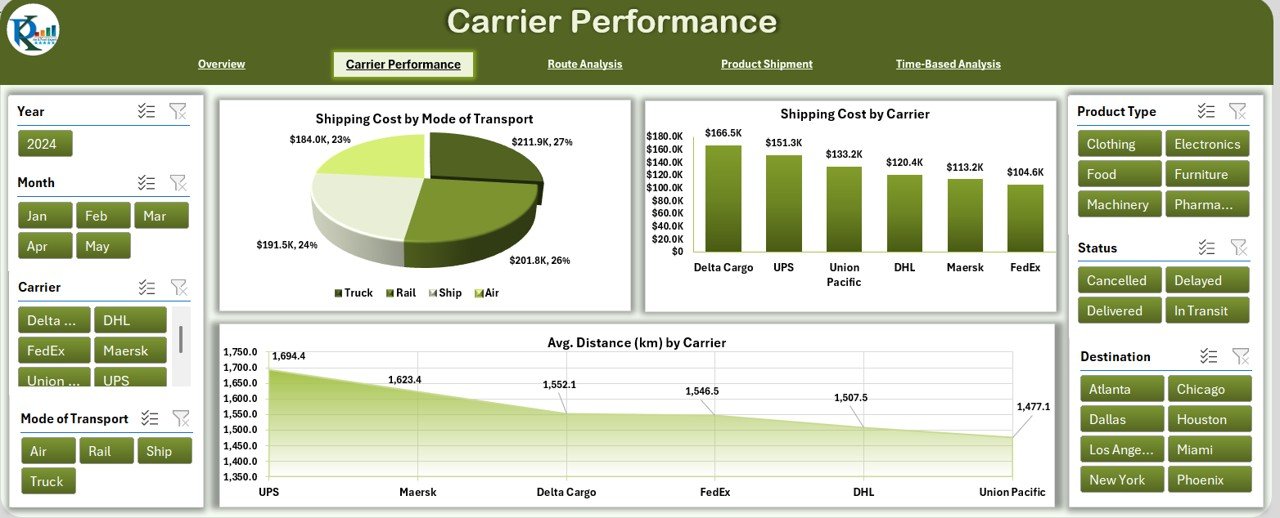
On this page, you can compare how different carriers are performing:
- Slicers on both sides for filtering
5 KPI Cards showing:
- Total Deliveries
- Cost Efficiency
- Avg. Delivery Time
3 Detailed Charts:
- Shipment Cost by Mode of Transport
- Shipment Cost by Carrier
- Avg. Distance (Km) by Carrier
Click to Purchases Transportation & Logistics Dashboard in Excel
Route Analysis Page
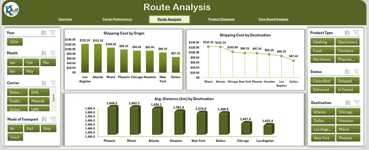
This section helps analyze costs and efficiency by route:
- Slicers to filter by Origin, Destination, Date Range, etc.
- 5 Summary Cards
Charts include:
- Shipment Cost by Origin
- Shipment Cost by Destination
- Avg. Distance (Km) by Destination
Product Shipment Analytics Page
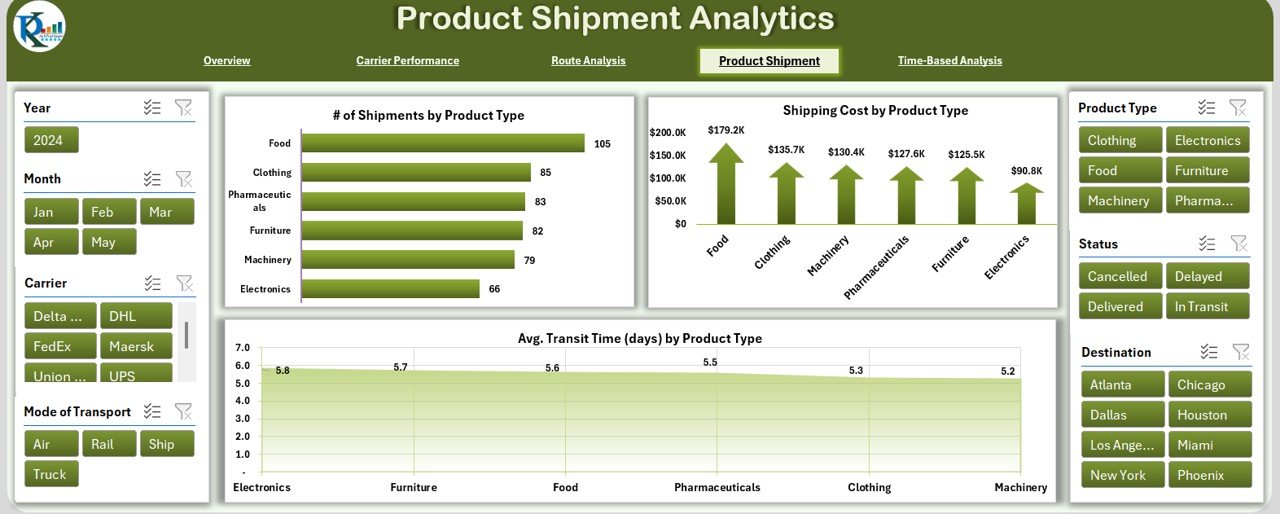
Focuses on products and shipment behavior:
- Slicers to filter by Product Type
- 5 KPIs: Total Shipments, Average Weight, Delivery Time, etc.
Charts include:
- Shipment Cost by Product Type
- Avg. Transit Time (days) by Product Type
Time-Based Analysis Page
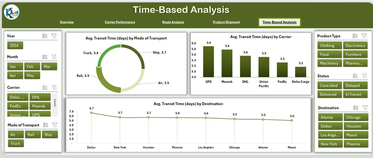
Understand trends over time with this time-focused dashboard:
- Time filters using slicers
- 5 Performance Cards
Key Charts:
- Avg. Transit Time by Mode of Transport
- Avg. Transit Time by Carrier
- Avg. Transit Time by Destination
Click to Purchases Transportation & Logistics Dashboard in Excel
Data Structure Behind the Dashboard
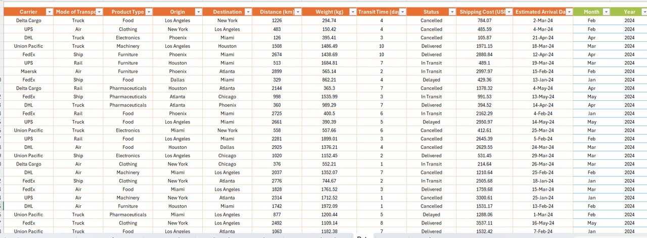
The dashboard runs on a structured dataset with the following columns:
- Shipment ID
- Date
- Carrier
- Mode of Transport
- Product Type
- Origin
- Destination
- Distance (km)
- Weight (kg)
- Transit Time (days)
- Status
- Shipping Cost (USD)
- Estimated Arrival Date
These fields are used in PivotTables to create interactive visuals.
Advantages of Transportation & Logistics Dashboard in Excel
✅ Real-Time Visibility
See how your logistics perform across various carriers, products, and routes.
✅ Cost Management
Track costs by carrier, route, and mode to find savings opportunities.
✅ Carrier Performance Insights
Analyze how carriers perform in terms of distance, cost, and transit time.
✅ Route Optimization
Know which routes are cost-effective and which need adjustments.
✅ Product-level Analysis
Understand how different product categories impact delivery time and cost.
Best Practices for Transportation & Logistics Dashboards
Click to Purchases Transportation & Logistics Dashboard in Excel
To make your dashboard effective and insightful, follow these practices:
⭐ Keep Data Clean
Ensure your data has consistent entries and formats. Dates should be in proper format, and text fields like Carrier and Mode should follow uniform naming.
⭐ Use Dynamic Ranges
When adding new data, use Excel tables or named ranges to auto-update PivotTables.
⭐ Highlight KPIs
Use conditional formatting for KPI cards to draw attention to performance changes.
⭐ Add Slicers and Filters
Always include slicers for Date, Carrier, Product Type, and Status. This helps users slice and dice data quickly.
⭐ Automate Calculations
Use formulas for MTD, YTD, and average calculations. This reduces manual work.
Why Choose Excel for Logistics Dashboards?
While tools like Power BI or Tableau offer advanced visuals, Excel is more accessible. Most logistics professionals are already comfortable using Excel, and it doesn’t require an internet connection or costly licenses.
Moreover, Excel provides the flexibility to customize visuals, add notes, build print-ready views, and integrate with other tools.
How to Create This Dashboard Step-by-Step
Here’s a simplified approach to building your own Transportation & Logistics Dashboard in Excel:
- Prepare Your Data: Use columns such as Shipment ID, Date, Carrier, etc.
- Create Excel Table: Convert your data into a table for easy reference.
- Insert PivotTables: Build PivotTables to calculate Shipment Count, Total Cost, Avg. Time.
- Design Charts: Insert Pivot Charts like bar charts, pie charts, and line graphs.
- Add Slicers: Link slicers to your pivot tables for dynamic filtering.
- Build KPI Cards: Use formulas like COUNTIFS, SUMIFS, AVERAGEIFS for card metrics.
- Style Your Dashboard: Use bold headers, background colors, and borders to make it visually appealing.
Common Mistakes to Avoid
❌ Avoid mixing date formats
❌ Don’t use merged cells in your raw data
❌ Avoid putting charts and data too close together
❌ Don’t forget to refresh your PivotTables when updating data
Conclusion
A Transportation & Logistics Dashboard in Excel gives you a complete picture of your supply chain performance. It’s not just about tracking shipments; it’s about improving delivery efficiency, reducing costs, and making data-driven decisions. With a well-structured Excel dashboard, even small and medium businesses can gain big insights without spending big money.
Start small, build your dataset, and keep improving. Over time, you’ll have a powerful tool that guides your logistics strategy.
Frequently Asked Questions (FAQs)
1. Can I use this dashboard without advanced Excel skills?
Yes, this dashboard uses simple features like PivotTables, slicers, and charts. With basic Excel knowledge, you can manage and update it easily.
2. What kind of businesses can use this dashboard?
Any business that manages shipments or product delivery—from eCommerce to manufacturing—can benefit from this dashboard.
3. How often should I update the data?
Ideally, you should update the data daily or weekly depending on your shipment volume and tracking requirements.
4. Can I add more KPIs to the dashboard?
Absolutely! You can add KPIs like Delivery Delay %, Carbon Emission per km, or any other metric that helps your operations.
5. Is it possible to use this dashboard in Google Sheets?
Yes, with some adjustments. However, Google Sheets might lack some formatting and pivot capabilities found in Excel.
Click to Purchases Transportation & Logistics Dashboard in Excel
Visit our YouTube channel to learn step-by-step video tutorials