In today’s data-driven world, having a clear overview of key metrics is crucial for community managers to gauge performance, set goals, and strategize improvements. Enter the Community Management KPI Dashboard in Power BI – a powerful tool designed to provide real-time insights into your community management performance. Whether you’re managing a small forum or overseeing a global community, this dashboard is an essential asset to monitor progress and ensure success.
In this article, we’ll explore the features, advantages, and best practices of using the Community Management KPI Dashboard in Power BI. Plus, we will answer some frequently asked questions to help you get the most out of this tool.
Click to Purchases Community Management KPI Dashboard in Power BI
What is the Community Management KPI Dashboard in Power BI?
The Community Management KPI Dashboard in Power BI is a dynamic, ready-to-use tool designed to help community managers track and measure their key performance indicators (KPIs) efficiently. The dashboard consolidates data from Excel and Power BI to provide an integrated overview of your community’s performance across various metrics.
By using this dashboard, community managers can quickly assess how their KPIs are performing, compare results across different periods, and identify areas for improvement. Whether you’re looking to track engagement, response times, or satisfaction levels, this tool offers a comprehensive view that helps streamline community management.
Key Features of the Community Management KPI Dashboard
The Community Management KPI Dashboard in Power BI comes with three essential pages that offer detailed insights into your KPIs.
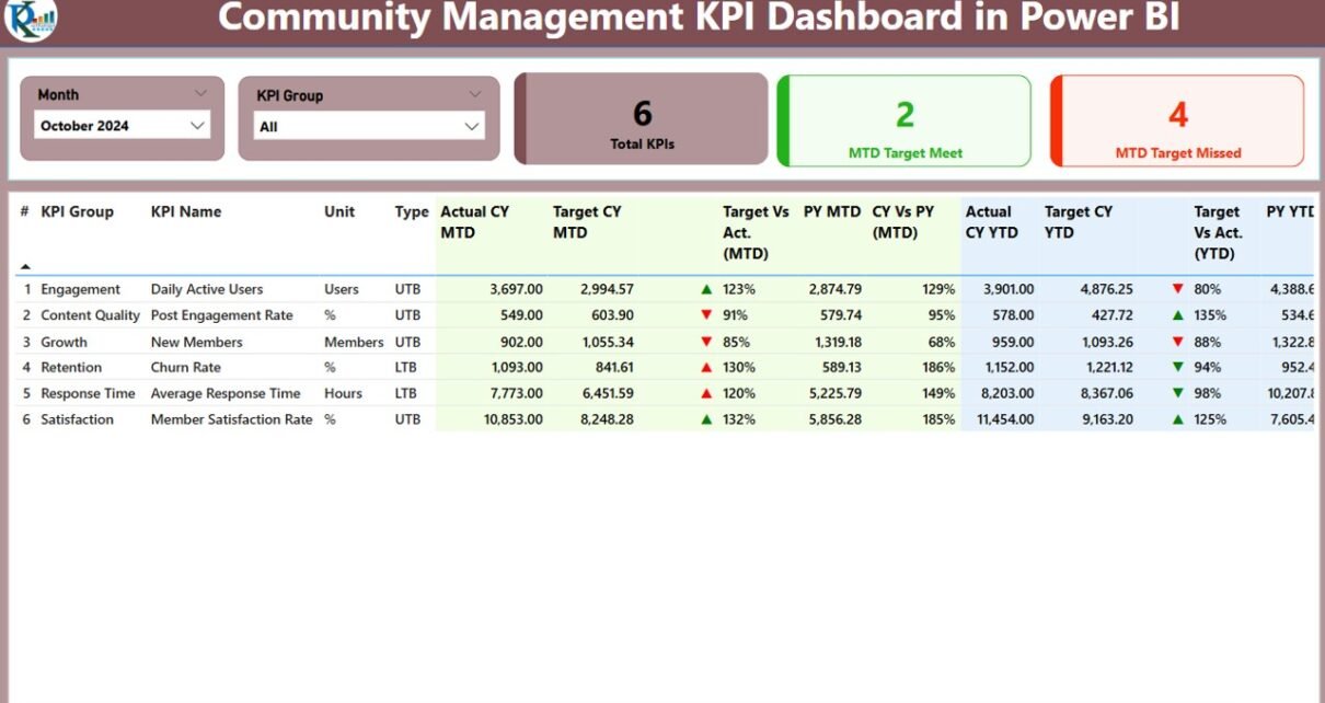
Summary Page

The Summary page is the main dashboard where all crucial KPIs are displayed. It provides a high-level view of your community’s performance. Here’s what you’ll find:
-
Slicers for Month and KPI Group: Filters to adjust the view based on the month and category of KPIs.
KPIs Summary Cards:
- Total KPIs Count: Displays the total number of KPIs tracked.
- MTD Target Met Count: The number of KPIs meeting their Monthly Target.
- MTD Target Missed Count: The number of KPIs missing their Monthly Target.
Detailed KPI Table: This table shows the following data for each KPI:
- KPI Number: The unique identifier for each KPI.
- KPI Group: The category of the KPI (e.g., Engagement, Satisfaction).
- KPI Name: The name of the KPI.
- Unit: The unit of measurement (e.g., Percentage, Count).
- Type (LTB/UTB): Whether the KPI is “Lower the Better” (LTB) or “Upper the Better” (UTB).
- Actual CY MTD: The actual value for the current year, month-to-date.
- Target CY MTD: The target value for the current year, month-to-date.
- MTD Icon: A visual indicator (green or red) showing whether the actual value meets the target.
- Target vs Actual (MTD): The percentage difference between the actual and target values for MTD.
- PY MTD: The previous year’s MTD value for comparison.
- CY vs PY (MTD): The percentage comparison between the current and previous year’s MTD.
- Actual CY YTD: The actual value for the current year, year-to-date.
- Target CY YTD: The target value for the current year, year-to-date.
- YTD Icon: A visual indicator showing whether the YTD target is met.
- Target vs Actual (YTD): The percentage comparison of YTD actual vs target.
- PY YTD: Previous year’s YTD value for comparison.
- CY vs PY (YTD): The percentage comparison between the current and previous year’s YTD.
KPI Trend Page
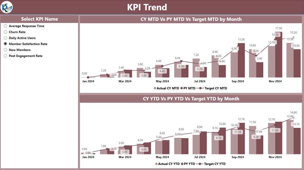
This page provides visual representations of KPI trends over time. Two Combo Charts display:
-
MTD Trend: The trend of the current year’s MTD, previous year’s MTD, and the target.
-
YTD Trend: The trend of the current year’s YTD, previous year’s YTD, and the target.
A slicer is provided for selecting specific KPIs, allowing users to drill into the trends for individual metrics.
KPI Definition Page
This is a hidden drill-through page that gives detailed information about each KPI, including:
-
Formula: The formula used to calculate the KPI.
-
Definition: A brief explanation of what the KPI measures.
-
Type (LTB or UTB): Whether the KPI is “Lower the Better” or “Upper the Better.”
To access this page, simply drill through from the Summary page, and use the back button to return to the main dashboard.
Click to Purchases Community Management KPI Dashboard in Power BI
Data Integration with Excel
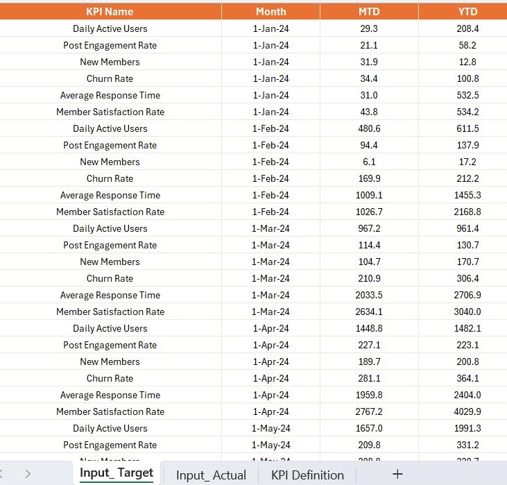
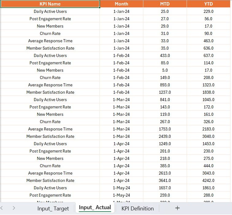
The data for this dashboard is stored in an Excel file and divided into three key sheets:
Input_Actual Sheet:
- This sheet contains actual data for each KPI, with columns for the KPI name, month, MTD, and YTD values.
Input_Target Sheet:
- This sheet holds the target values for each KPI, along with the same columns as the Input_Actual sheet.
KPI Definition Sheet:
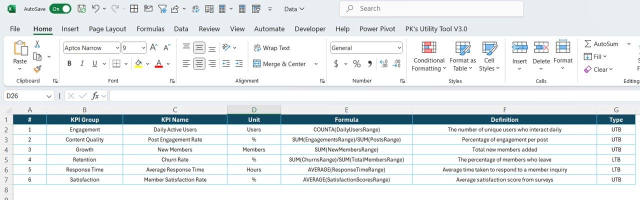
- This sheet defines each KPI, its formula, and its unit of measurement.
Advantages of Using the Community Management KPI Dashboard in Power BI
The Community Management KPI Dashboard in Power BI offers several key benefits to community managers:
1. Comprehensive Performance Overview
With all KPIs presented in one dashboard, you get a holistic view of your community’s performance. This allows you to quickly identify trends, gaps, and opportunities for improvement.
2. Data-Driven Decision Making
The dashboard uses real-time data from Excel, ensuring that the insights you gain are always based on the latest available information. This data-driven approach helps you make informed decisions, set accurate goals, and adjust strategies effectively.
3. Easy Comparison Across Periods
The ability to compare current performance with past periods (monthly and yearly) allows you to gauge growth and identify areas of decline. You can track how each KPI has evolved over time and adjust your approach accordingly.
4. Visual Appeal and Accessibility
Power BI’s interactive and visual nature makes it easier to analyze data and share insights with stakeholders. The slicers, charts, and visual indicators make it simple for both technical and non-technical users to navigate the dashboard.
5. Customizable for Your Needs
You can tailor the dashboard to suit your community’s specific KPIs and goals. Whether you’re measuring engagement, satisfaction, or response time, the dashboard can be adjusted to display the most relevant metrics.
Best Practices for Using the Community Management KPI Dashboard
To get the most out of your Community Management KPI Dashboard, follow these best practices:
-
Update Data Regularly: Ensure your data in the Excel sheets is updated regularly to reflect the most accurate information. This will help you maintain up-to-date insights and avoid decision-making based on outdated data.
-
Use Slicers for Better Filtering: Leverage the slicers available on the Summary Page to filter KPIs by month or group. This helps you focus on specific areas of your community’s performance.
-
Review KPI Definitions Frequently: Regularly review the definitions and formulas for each KPI. This ensures that everyone on the team has a clear understanding of what each metric means and how it’s calculated.
-
Monitor Trends for Early Intervention: Pay close attention to the KPI Trend Page. Trends provide valuable foresight into areas that may require intervention. By catching downward trends early, you can take corrective actions before the situation worsens.
-
Communicate Insights Effectively: Share your findings with team members, stakeholders, and leadership using the dashboard. The visual nature of Power BI makes it easy to present data in a way that’s clear and actionable.
Conclusion
The Community Management KPI Dashboard in Power BI is an invaluable tool for community managers who want to track and analyze their community’s performance effectively. With its comprehensive features, customizable data inputs, and clear visualizations, this dashboard provides actionable insights that can drive improvements and help achieve community management goals.
By following the best practices and regularly updating your data, you can use this dashboard to make informed decisions, improve engagement, and streamline your community management processes.
Frequently Asked Questions (FAQs)
1. What is the Community Management KPI Dashboard in Power BI?
-
It’s a tool that helps community managers track, visualize, and analyze KPIs related to community performance, all in a Power BI environment.
2. How do I use the KPI Trend Page?
-
The KPI Trend Page displays combo charts that show the actual numbers of the current and previous years, as well as targets. You can select specific KPIs using the slicer to visualize trends for those metrics.
3. What data sources does the dashboard use?
-
The dashboard uses data from an Excel file, which includes three sheets: Input_Actual, Input_Target, and KPI Definition.
4. Can I customize the dashboard for my specific KPIs?
-
Yes! The dashboard is customizable, allowing you to input your own KPIs, formulas, and data, making it adaptable to your community’s unique needs.
5. How often should I update the data?
-
It’s recommended to update your data monthly or at regular intervals to ensure your dashboard reflects the most current performance metrics.
Click to Purchases Community Management KPI Dashboard in Power BI
Visit our YouTube channel to learn step-by-step video tutorials