In today’s fast-paced creative environment, graphic design teams work across multiple projects, clients, and platforms simultaneously. From managing budgets and design hours to tracking client feedback, keeping everything organized can be a challenge. This is where a Graphic Design Dashboard in Excel becomes a true game-changer.
A Graphic Design Dashboard is a centralized Excel-based analytical tool that helps designers, agencies, and managers monitor all essential performance metrics in one place. It visually represents design progress, workload distribution, client ratings, and departmental performance — giving a clear snapshot of productivity and efficiency.
Unlike expensive project-management tools or complex analytics platforms, Excel offers flexibility, familiarity, and control. You don’t need coding or advanced software skills to track KPIs — this dashboard template allows you to analyze, visualize, and make decisions with just a few clicks.
Click to Purchases Graphic Design Dashboard in Excel
What Is a Graphic Design Dashboard in Excel?
A Graphic Design Dashboard in Excel is a prebuilt, ready-to-use template designed to help creative professionals analyze their project performance. It consolidates data from different sources such as project details, client reviews, time logs, and cost tracking.
The dashboard provides real-time insights through charts, pivot tables, and KPIs — making it easier to measure how effectively your design projects are performing.
It’s especially useful for:
-
Freelancers managing multiple clients
-
Creative agencies overseeing cross-departmental work
-
Marketing teams tracking design output and cost efficiency
-
Managers who want to improve productivity through data visualization
Structure of the Dashboard
This Excel-based dashboard contains five powerful analytical pages, each designed to give a focused view of different aspects of graphic design operations.
A page navigator panel is located on the left side, allowing easy navigation across all dashboard pages.
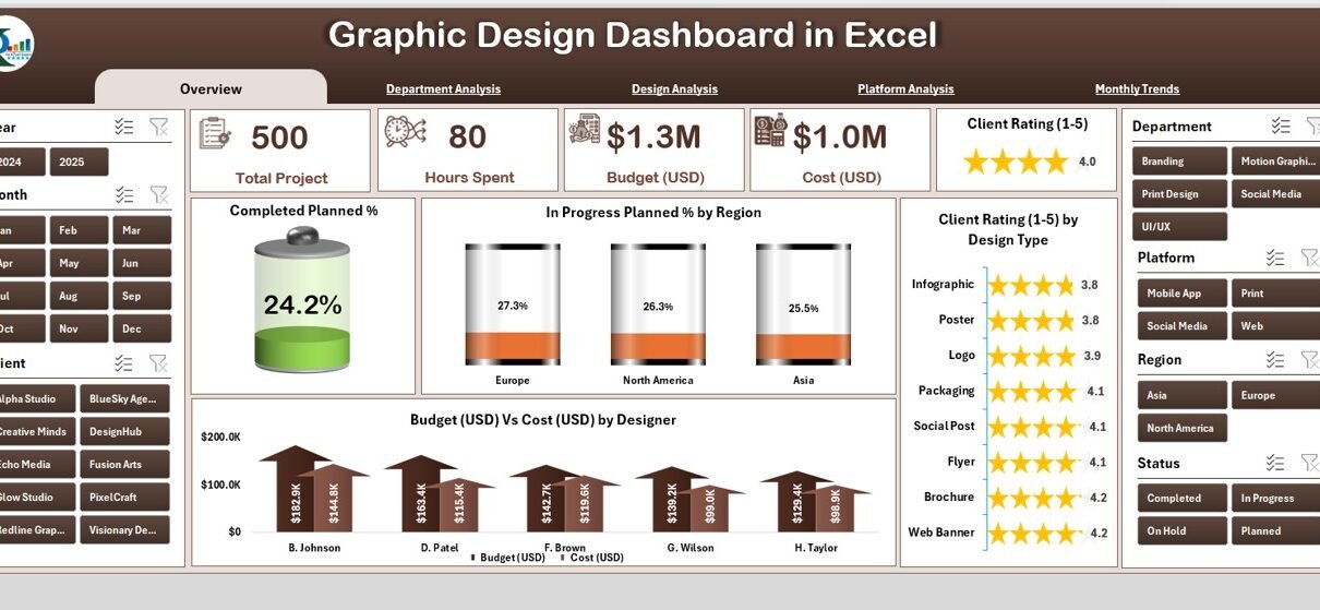
Overview Page
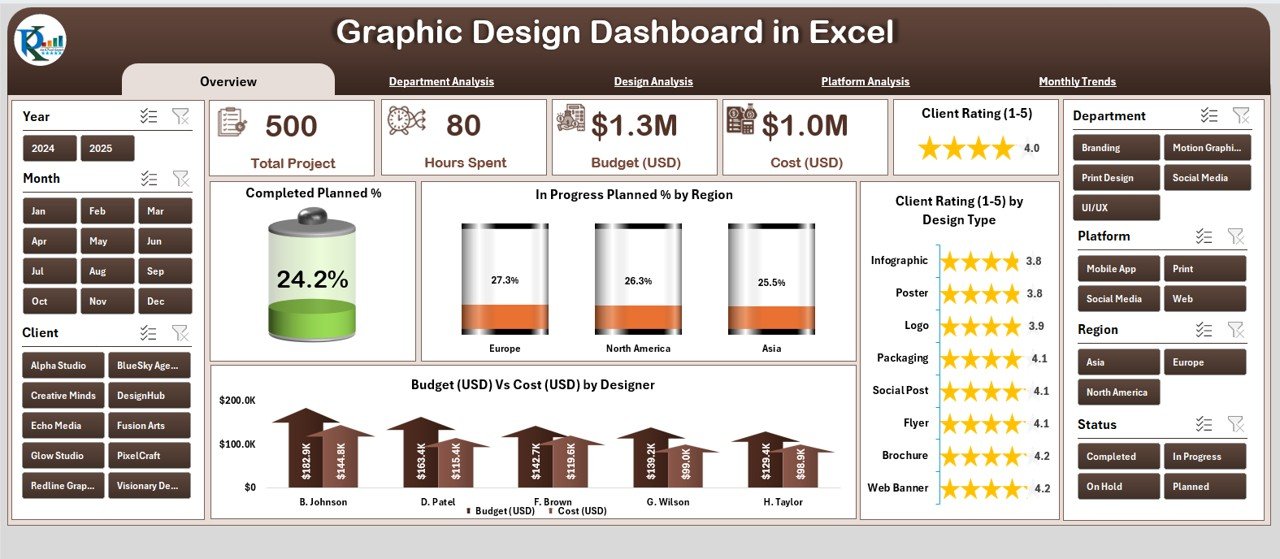
The Overview Page serves as the control center of the dashboard.
Here, you can access:
-
Five Summary Cards: These top-level KPIs show metrics such as total completed projects, planned projects, in-progress tasks, and cost efficiency.
-
Interactive Slicer (Right Side): Lets you filter data by month, client, or designer to view only relevant insights.
Charts Included:
✅ Completed Planned %
🔄 In-Progress Planned % by Region
⭐ Client Rating (1–5) by Design Type
💰 Budget (USD) vs Cost (USD) by Designer
These visuals make it simple to monitor performance at a glance and understand trends across your design team.
Click to Purchases Graphic Design Dashboard in Excel
Department Analysis
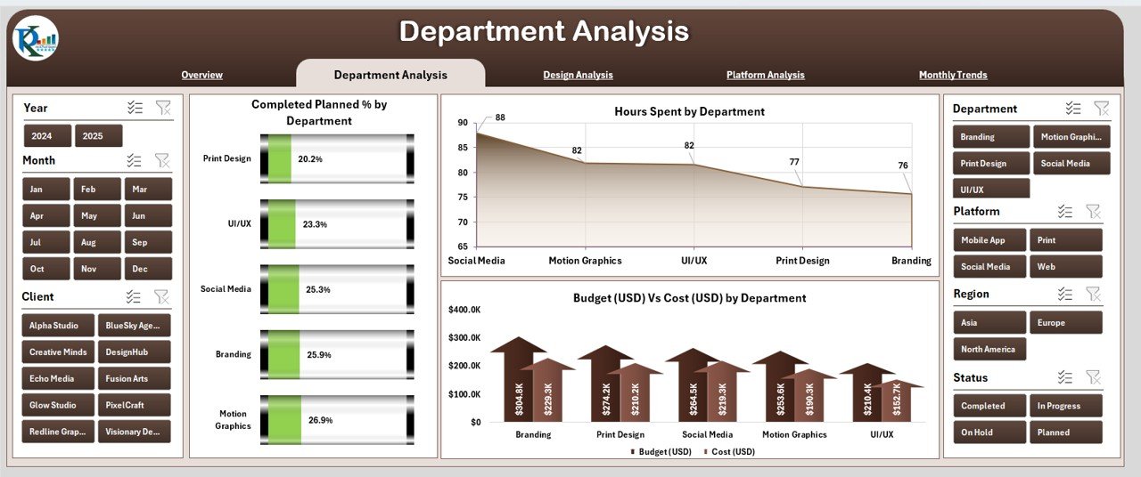
The Department Analysis Page helps you evaluate the performance of each design department — such as Web Design, Branding, UI/UX, Motion Graphics, or Print Design.
Key Features:
-
A right-side slicer for filtering by time period or project type.
Three detailed charts for deeper analysis:
- Completed Planned % by Department
- Hours Spent by Department
- Budget (USD) vs Cost (USD) by Department
This section helps identify departments that perform efficiently and those that may need resource optimization or additional support.
Design Analysis
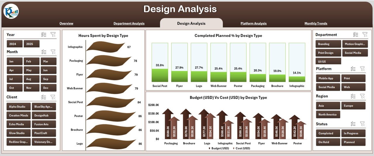
The Design Analysis Page provides insights into how different types of designs perform in terms of time, budget, and client satisfaction.
Key Visuals:
✅ Completed Planned % by Design Type
⏱️ Hours Spent by Design Type
💲 Budget (USD) vs Cost (USD) by Design Type
This view helps you determine which design categories — such as social media creatives, logo design, website layouts, or print materials — yield the best outcomes and client ratings.
Platform Analysis
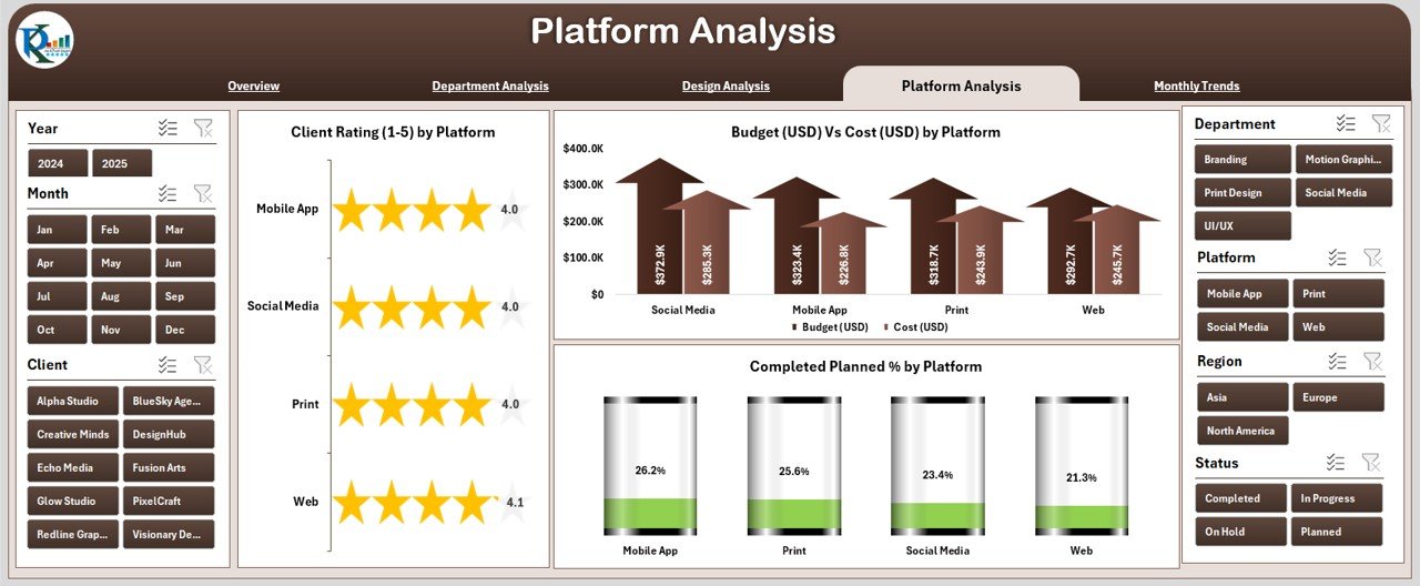
The Platform Analysis Page explores performance across different digital platforms used for delivering or managing design projects.
Charts on this Page:
✅ Completed Planned % by Platform
⭐ Client Rating (1–5) by Platform
💵 Budget (USD) vs Cost (USD) by Platform
This section helps teams analyze which platforms (e.g., Adobe Suite, Canva, Figma, or Sketch) are most efficient, cost-effective, and client-preferred. It assists in resource allocation and tool selection for future projects.
Monthly Trends
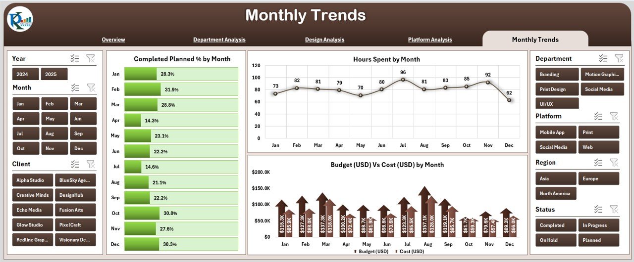
The Monthly Trends Page tracks how the design performance changes over time.
Key Charts:
📅 Completed Planned % by Month
⏳ Hours Spent by Month
💰 Budget (USD) vs Cost (USD) by Month
This section is perfect for monthly review meetings — allowing you to see which months were highly productive, which faced delays, and how costs fluctuated over time.
Support Sheet and Data Sheet
-
Support Sheet: Contains the backend configurations, dropdown lists, and formula references used in slicers and visuals.
-
Data Sheet: Stores all the core information such as project details, designers, platforms, departments, budgets, and client feedback.
Both sheets power the dashboard’s automation and data connectivity, ensuring seamless updates without manual intervention.
Key Features of the Graphic Design Dashboard in Excel
Click to Purchases Graphic Design Dashboard in Excel
Here’s what makes this dashboard an indispensable tool for creative professionals:
📊 Comprehensive Visualization: Get visual insights into performance, cost, and client satisfaction.
⚡ Dynamic Slicers: Filter data instantly by month, region, or designer.
🧠 Department and Design Type Analysis: Identify which departments or design types deliver the best ROI.
💼 Budget vs Cost Comparison: Understand spending patterns and control project costs.
🕒 Time Tracking: Monitor hours spent on different tasks and projects.
⭐ Client Rating Integration: Capture feedback ratings directly and link them to project performance.
🧩 User-Friendly Navigation: Left-side navigator panel for quick access to each page.
🧾 Ready-to-Use Template: Pre-built structure that works out of the box in Excel.
How to Use the Dashboard
-
Enter Your Data:
Fill out the Data Sheet with project details — including project name, designer, department, budget, cost, hours spent, and client rating. -
Refresh Pivot Tables:
Once data is entered, click Refresh All to update all visuals and summaries. -
Explore Pages via Navigator:
Use the left-side navigator to switch between Overview, Department Analysis, Design Analysis, Platform Analysis, and Monthly Trends. -
Apply Slicers:
Filter your results by time, region, or department to get customized reports. -
Review Insights:
Analyze the KPIs and charts to make informed decisions, improve performance, and enhance resource utilization.
Advantages of a Graphic Design Dashboard in Excel
Using this dashboard provides numerous operational and strategic advantages:
✅ 1. Centralized Data Monitoring
All design performance metrics — from cost to client ratings — are visible in one interactive Excel file.
✅ 2. Time-Saving Automation
You don’t need to create charts manually. Pivot tables and slicers automatically visualize data updates.
✅ 3. Cost-Effective Solution
Instead of investing in costly project-tracking software, this Excel-based tool gives you professional-level analytics at no extra cost.
✅ 4. Easy Customization
The dashboard can be customized with your branding, additional KPIs, or new visuals based on your unique needs.
✅ 5. Improved Decision-Making
Real-time data visibility helps managers allocate budgets wisely, identify design bottlenecks, and maintain client satisfaction.
✅ 6. Enhanced Client Communication
Visual charts make it easier to communicate project progress and performance during client meetings or presentations.
Opportunities for Improvement
While this dashboard is comprehensive, users can enhance it further by:
🔧 Adding automation macros to reduce manual updates.
🧩 Integrating Excel with Power BI or Google Sheets for real-time online access.
🖥️ Creating custom KPI cards like Project Profit Margin or Average Design Time.
📤 Linking with task-management tools like Trello or Asana for live project tracking.
🎨 Applying brand-based color themes for personalization.
Best Practices for Using the Graphic Design Dashboard in Excel
Follow these best practices to make the most out of this dashboard:
🗂️ Keep Data Clean: Ensure your data sheet is structured properly with consistent naming.
🔄 Refresh Regularly: Always click Refresh All after data entry to update visuals.
📊 Review KPIs Monthly: Schedule monthly reviews to track performance and discuss results with the team.
🎯 Set Clear Targets: Define monthly goals for each department to measure success effectively.
🧠 Train Team Members: Familiarize your design team with dashboard navigation and slicer usage.
💾 Backup Files: Maintain version backups to track historical performance.
🔍 Analyze Trends: Focus on long-term patterns in cost, client rating, and design output.
Who Can Benefit from This Dashboard?
This Excel-based dashboard benefits a wide range of professionals and organizations:
🎨 Graphic Design Agencies – Track project progress, costs, and client satisfaction.
🧑💻 Freelance Designers – Manage multiple client projects in one place.
🏢 Corporate Marketing Teams – Monitor design efficiency across departments.
🏫 Educational Institutes – Track student design assignments or competition performance.
💼 Creative Managers – Get data-driven insights to optimize workflow and team performance.
Why Choose Excel for Graphic Design Analytics?
Although specialized design-management platforms exist, Excel remains one of the most flexible tools for creative analytics. Here’s why:
-
✅ It’s widely available and easy to use.
-
📊 Supports powerful data visualization through pivot charts.
-
🔗 Integrates seamlessly with tools like Power Query and Power BI.
-
💻 Works offline, making it accessible anytime.
-
🧩 Allows advanced customization with formulas and VBA.
Excel transforms data into visual stories that designers and managers can act upon immediately.
Conclusion
The Graphic Design Dashboard in Excel is a complete performance-tracking solution for modern creative teams. It brings together all key aspects — from project completion and department performance to cost analysis and client satisfaction — in one smart and user-friendly interface.
Whether you’re a freelancer, design manager, or agency head, this dashboard empowers you to make better, data-driven decisions, optimize resources, and improve client relationships. With interactive slicers, charts, and navigators, you can visualize progress and achieve creative excellence effortlessly.
❓ Frequently Asked Questions (FAQs)
Click to Purchases Graphic Design Dashboard in Excel
1. What is a Graphic Design Dashboard in Excel?
It’s an Excel-based tool that tracks and visualizes key performance indicators related to design projects, departments, and client satisfaction.
2. Can I customize this dashboard?
Yes. You can modify KPIs, add new visuals, or apply your company’s color scheme and branding easily.
3. Do I need coding knowledge to use it?
No. The dashboard uses standard Excel formulas, pivot tables, and slicers. Anyone familiar with Excel can use it.
4. How can this help my design agency?
It helps monitor performance, manage costs, and evaluate client satisfaction — all in one dashboard.
5. Is it suitable for freelancers?
Absolutely! Freelancers can track project timelines, budgets, and client feedback for multiple clients simultaneously.
6. How often should I update the data?
Ideally, you should update the data sheet weekly or monthly to maintain accurate insights.
7. Can I use it on Excel Online or Google Sheets?
Yes, with minor adjustments. However, full functionality — especially pivot slicers — works best in the Excel desktop version.
Visit our YouTube channel to learn step-by-step video tutorials
Click to Purchases Graphic Design Dashboard in Excel
Watch the step-by-step video tutorial: