In today’s fast-moving supply chain and logistics environment, businesses must track every stage of their order fulfilment process with precision and clarity. From receiving an order to shipping it out and ensuring timely delivery, visibility into each performance metric is crucial.
That’s where the Order Fulfilment KPI Dashboard in Power BI becomes an essential analytical tool.
This dashboard transforms raw operational data into insightful visuals that help teams monitor efficiency, identify performance gaps, and make data-driven improvements.
Let’s explore how this powerful dashboard works, what it offers, and how it can improve your order fulfilment operations.
Click to Purchases Order Fulfilment KPI Dashboard in Power BI
What Is an Order Fulfilment KPI Dashboard in Power BI?
An Order Fulfilment KPI Dashboard in Power BI is a dynamic visualization system designed to track and analyze key performance indicators (KPIs) related to order processing and delivery efficiency.
It connects data from Excel or other data sources and presents it in an interactive, easy-to-understand format. The dashboard offers real-time insights into critical metrics such as:
-
Order processing time
-
Perfect order rate
-
On-time delivery
-
Order accuracy
-
Return rate
-
Backorder ratio
With this dashboard, business managers can instantly see whether targets are being met and quickly address any issues impacting operational performance.
Core Structure of the Dashboard
The Order Fulfilment KPI Dashboard in Power BI consists of three main pages:
-
Summary Page
-
KPI Trend Page
-
KPI Definition Page
Each page serves a specific analytical purpose and works together to provide a full performance overview.
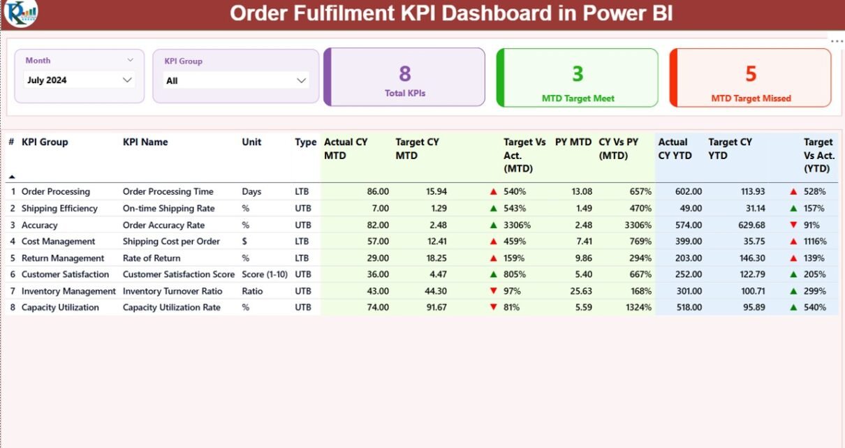
Summary Page – Your Command Center
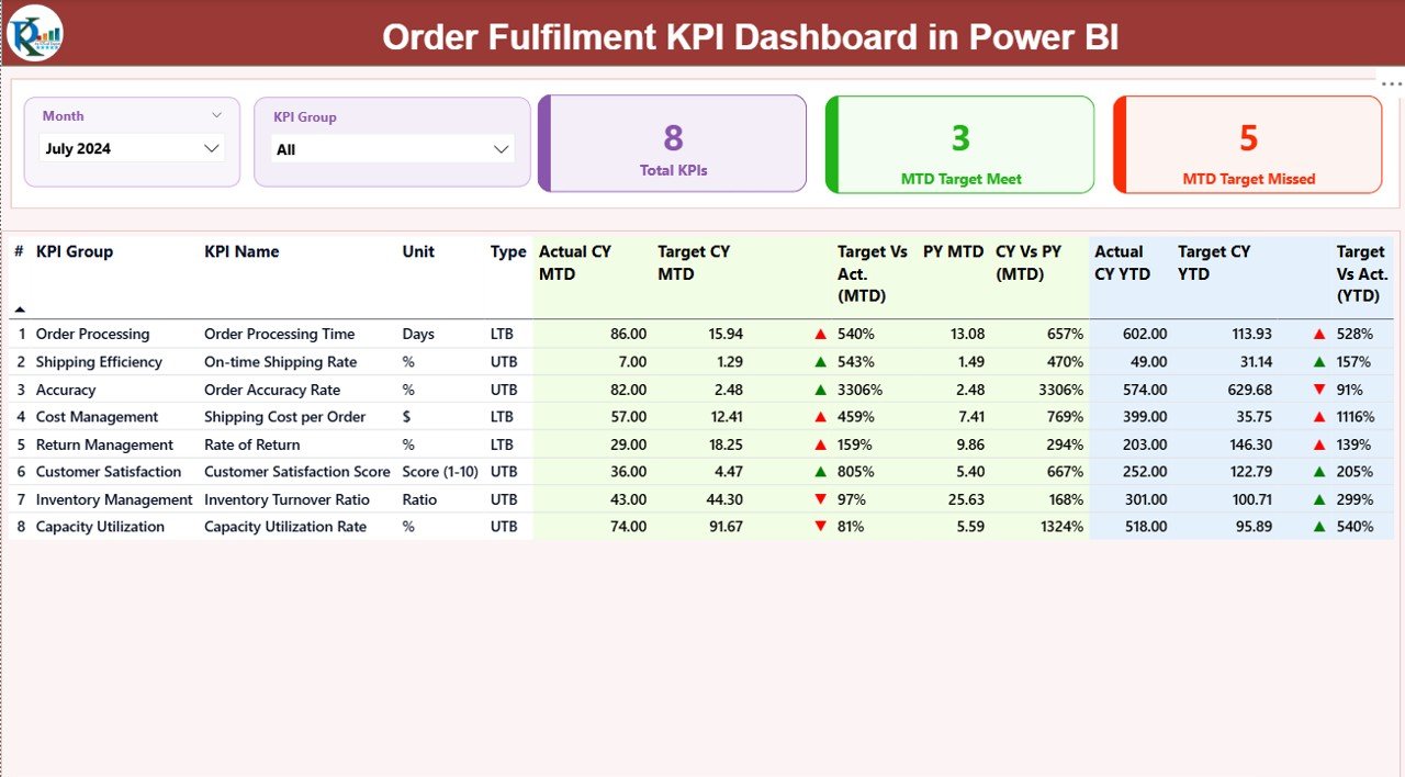
The Summary Page is the main page of the dashboard. It brings together all the essential KPIs in one view for both MTD (Month-to-Date) and YTD (Year-to-Date) performance tracking.
At the top, you’ll find slicers for Month and KPI Group, allowing users to focus on specific time periods or KPI categories.
Key Highlights of the Summary Page:
Performance Cards:
- Total KPI count
- MTD Target Met count
- MTD Target Missed count
Detailed KPI Table:
A comprehensive table showing:
- KPI Number
- KPI Group
- KPI Name
- Unit
- Type (LTB: Lower the Better / UTB: Upper the Better)
- Actual CY MTD
- Target CY MTD
- MTD Performance Icon (▲ or ▼ in green/red)
- Target vs Actual (MTD %)
- Previous Year (PY) MTD
- CY vs PY (MTD %)
- Actual CY YTD
- Target CY YTD
- YTD Performance Icon
- Target vs Actual (YTD %)
- PY YTD
- CY vs PY (YTD %)
Each icon (green ▲ or red ▼) visually indicates performance success or failure against targets. This makes it simple for managers to identify which KPIs need immediate attention.
KPI Trend Page – Deep Dive into Performance
Click to Purchases Order Fulfilment KPI Dashboard in Power BI
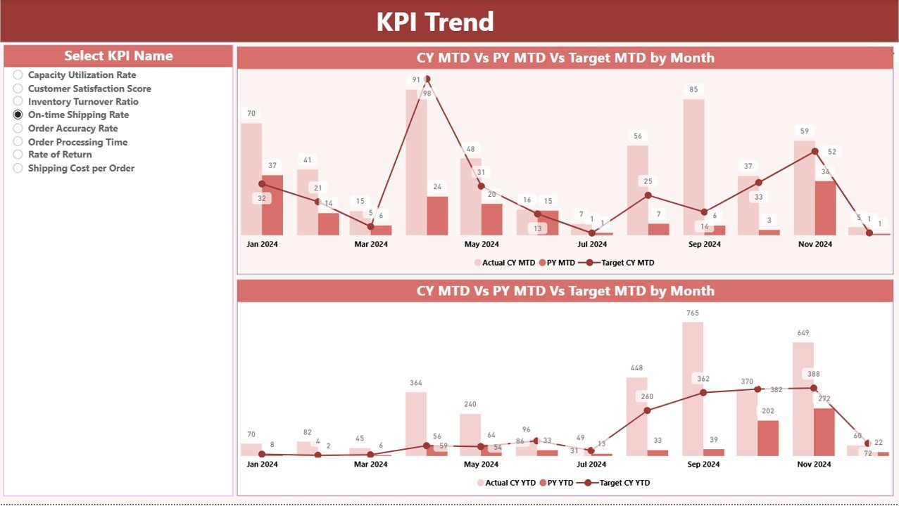
The KPI Trend Page provides a detailed analysis of how each KPI performs over time.
This page includes:
Two combo charts that compare:
- Actual numbers (Current Year)
- Actual numbers (Previous Year)
- Target values (for both MTD and YTD)
-
A slicer on the left side allowing users to choose any KPI name to analyze trends dynamically.
This layout helps track whether performance is improving, stagnating, or declining compared to the previous year — and it helps forecast future outcomes.
KPI Definition Page – Context for Every Metric
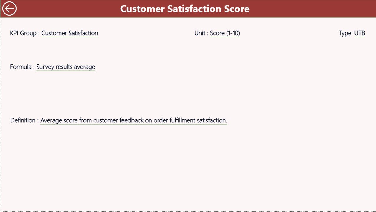
The KPI Definition Page acts as a reference library for your performance metrics.
It is a hidden drill-through page designed for users who want detailed explanations of each KPI. When you drill through from the Summary Page, you can see:
-
KPI Formula
-
KPI Definition
-
KPI Type (UTB or LTB)
A Back Button at the top left corner lets users return to the Summary Page quickly, ensuring a smooth and intuitive navigation experience.
Excel Data Source Structure
The data powering this Power BI dashboard comes from an Excel file.
The Excel workbook contains three key worksheets, which serve as the data foundation:
1. Input_Actual Sheet
This sheet holds the actual performance numbers for each KPI.
It includes:
-
KPI Name
-
Month (use the first day of the month)
-
MTD Value
-
YTD Value
2. Input_Target Sheet
This sheet contains the target values for each KPI.
It mirrors the structure of the actual data sheet and includes:
-
KPI Name
-
Month (first day of the month)
-
MTD Target
-
YTD Target
3. KPI Definition Sheet
This sheet defines each KPI, ensuring everyone understands how metrics are calculated and interpreted.
Columns include:
-
KPI Number
-
KPI Group
-
KPI Name
-
Unit
-
Formula
-
Definition
-
Type (LTB / UTB)
This simple yet powerful structure ensures that Power BI always has clean, consistent, and structured data to visualize.
Why Use Power BI for Order Fulfilment KPIs?
Power BI offers an ideal environment for KPI tracking because it combines visual appeal, automation, and interactivity.
Here’s why businesses prefer Power BI for order fulfilment analytics:
-
Automated Data Refresh: Eliminate manual reporting and get updated insights automatically.
-
Interactive Filtering: Slice and dice data by month, KPI category, or time frame.
-
Cross-departmental Collaboration: Share dashboards with teams, departments, or stakeholders securely.
-
Drill-through Capabilities: Move from summary to granular detail with one click.
-
Custom Visuals: Use charts, icons, and color coding for quick interpretation.
Key KPIs to Track in Order Fulfilment
To achieve operational excellence, businesses should monitor KPIs that reflect both efficiency and customer satisfaction.
Here are some essential Order Fulfilment KPIs to include:
-
Order Accuracy Rate: Measures how often orders are processed correctly.
-
Perfect Order Rate: Combines accuracy, timeliness, and condition of delivered orders.
-
On-Time Delivery Rate: Tracks how consistently deliveries meet promised deadlines.
-
Order Cycle Time: Measures the average time from order placement to delivery.
-
Backorder Rate: Monitors how often inventory shortages delay fulfilment.
-
Return Rate: Evaluates how many orders customers return due to errors or damages.
-
Fill Rate: Calculates the percentage of customer demand met without backorders.
-
Picking Accuracy: Assesses warehouse picking performance and efficiency.
-
Cost per Order: Measures operational cost efficiency per fulfilled order.
Monitoring these KPIs helps identify root causes of delays, inefficiencies, or quality issues.
Advantages of Order Fulfilment KPI Dashboard in Power BI
Implementing a Power BI-based KPI dashboard delivers several operational and strategic advantages.
1. Real-Time Performance Tracking
The dashboard offers live updates, ensuring every stakeholder can see the latest performance data instantly.
2. Enhanced Decision-Making
Visual insights empower managers to make informed decisions quickly, backed by data rather than assumptions.
3. Improved Operational Efficiency
With automated tracking, you can reduce manual reporting time and focus more on process improvement.
4. Target Achievement Monitoring
Easily compare actual performance versus targets for MTD and YTD to identify underperforming areas.
5. Historical Performance Comparison
Compare current performance with previous years to evaluate growth trends and corrective actions.
6. Intuitive Visualization
Color-coded icons, combo charts, and tables make complex data simple to understand and actionable.
7. Data Accuracy and Consistency
Centralized Excel data input ensures that Power BI pulls from verified and standardized datasets.
Best Practices for Using the Order Fulfilment KPI Dashboard
Click to Purchases Order Fulfilment KPI Dashboard in Power BI
To get the maximum benefit from your Power BI dashboard, follow these proven best practices:
1. Maintain Clean and Updated Data
Always keep your Excel data sheets (Actual, Target, and Definition) updated.
Consistent data quality ensures reliable insights.
2. Define Clear KPI Ownership
Assign specific team members to maintain and validate KPIs.
Ownership improves accountability and ensures timely updates.
3. Customize KPI Definitions
Adapt the KPI formulas and definitions to match your business model or industry standards.
This ensures relevance and accuracy.
4. Automate Data Refresh
Use Power BI’s scheduled refresh option to keep the dashboard up-to-date without manual effort.
5. Use Conditional Formatting Effectively
Highlight KPIs using color codes and symbols to make underperformance instantly visible.
6. Leverage Drill-Through Pages
Encourage users to explore the KPI Definition page for deeper context instead of relying on surface metrics.
7. Share Dashboards Securely
Use Power BI Service or Teams integration to share dashboards with appropriate stakeholders.
8. Review Trends Monthly
Analyze trends regularly to forecast future performance and identify process bottlenecks early.
How to Build the Dashboard Step by Step
If you want to create a similar dashboard from scratch, here’s a simple process to follow:
-
Prepare Data in Excel:
Create the three sheets – Actuals, Targets, and KPI Definitions. -
Load Data into Power BI:
Connect the Excel file as a data source. -
Model Relationships:
Build relationships between KPI names and other data fields. -
Create Calculated Measures:
Use DAX formulas for MTD, YTD, Target Achievement %, and CY vs PY %. -
Design the Summary Page:
Add KPI cards, tables, and slicers for Month and KPI Group. -
Add Trend Visuals:
Insert combo charts for MTD and YTD trends. -
Build Drill-Through KPI Definition Page:
Include formula and definition fields. -
Publish and Automate:
Upload the report to Power BI Service and set scheduled refresh intervals.
Following this workflow ensures your dashboard is both functional and visually engaging.
Common Mistakes to Avoid
While building or using the dashboard, avoid these pitfalls to maintain data accuracy and usability:
-
Ignoring data validation in Excel.
-
Forgetting to refresh data sources.
-
Using inconsistent KPI names across sheets.
-
Overloading visuals with too many KPIs at once.
-
Skipping trend analysis or drill-throughs.
-
Neglecting color consistency in icons and visuals.
How This Dashboard Improves Business Efficiency
Implementing the Order Fulfilment KPI Dashboard helps businesses in multiple ways:
-
Reduces order delays through faster issue identification.
-
Improves customer satisfaction by ensuring accurate deliveries.
-
Enhances internal collaboration between procurement, warehouse, and logistics teams.
-
Helps executives monitor performance across regions or departments with a few clicks.
In essence, the dashboard turns operational data into a story of performance improvement and growth.
Example Use Case
Imagine a logistics company managing hundreds of orders daily across multiple warehouses.
With this dashboard:
-
The manager filters Month = September and KPI Group = Delivery.
-
The dashboard instantly shows that On-Time Delivery dropped by 5% compared to the previous month.
-
Drilling through reveals the root cause: a spike in Backorder Rate due to delayed supplier shipments.
-
The team then takes corrective action by improving supplier coordination — reducing delays by 15% in the next month.
This real-life application highlights how data visualization directly drives operational improvements.
Conclusion
The Order Fulfilment KPI Dashboard in Power BI is more than just a reporting tool — it’s a strategic performance management solution.
It empowers organizations to monitor key metrics, improve efficiency, and enhance customer satisfaction with real-time visibility.
By combining Excel data input with Power BI’s robust analytics and visualization capabilities, this dashboard provides an all-in-one solution for businesses seeking operational excellence.
If you aim to streamline your order fulfilment process and make smarter decisions, adopting this Power BI dashboard is the next logical step.
❓ Frequently Asked Questions (FAQs)
1. What is the purpose of the Order Fulfilment KPI Dashboard?
The dashboard helps businesses monitor and improve order processing, delivery, and accuracy by tracking key metrics in real time.
2. Can I customize KPIs in this dashboard?
Yes. You can edit the KPI Definition sheet in Excel to add, remove, or modify KPIs according to your company’s goals.
3. How often should I update the data?
It’s best to update your data monthly or automate the refresh using Power BI Service for real-time updates.
4. What are MTD and YTD in this dashboard?
MTD (Month-to-Date) and YTD (Year-to-Date) show cumulative performance metrics within a specific month and year, respectively.
5. Do I need technical knowledge to use this dashboard?
No. The dashboard is designed to be user-friendly. Anyone familiar with Excel and Power BI basics can operate it easily.
6. How do I drill through to KPI details?
Right-click a KPI on the Summary Page and select “Drill Through” to view its formula and definition on the hidden KPI Definition Page.
7. Can this dashboard be shared across teams?
Yes, Power BI allows you to share the dashboard securely within your organization using Power BI Service or Microsoft Teams.
Final Thoughts
The Order Fulfilment KPI Dashboard in Power BI simplifies performance management by bringing clarity, speed, and intelligence to operational decision-making.
With a few clicks, managers can evaluate progress, identify issues, and ensure every order contributes to higher customer satisfaction and business growth.
Click to Purchases Order Fulfilment KPI Dashboard in Power BI
Visit our YouTube channel to learn step-by-step video tutorials