The healthcare industry has undergone a major transformation in recent years, especially in the home healthcare sector. As more patients prefer receiving medical attention from the comfort of their homes, healthcare providers face growing challenges in managing operations, service quality, patient satisfaction, and financial performance.
That’s where the Home Healthcare Dashboard in Excel steps in — a powerful, ready-to-use template designed to simplify healthcare analytics and reporting without requiring complex software or coding skills.
This dashboard provides a complete view of operational efficiency, financial performance, and patient satisfaction — all in one Excel file. Whether you manage a home nursing agency, a medical equipment service, or a therapy provider, this dashboard helps you track, analyze, and improve performance using real-time insights.
Click to Purchases Home Healthcare Dashboard in Excel
📊 What Is a Home Healthcare Dashboard in Excel?
A Home Healthcare Dashboard in Excel is an interactive reporting system built entirely in Microsoft Excel. It consolidates patient, service, and financial data into one structured workbook, offering visual charts, KPI cards, and summary analytics.
Instead of juggling multiple spreadsheets, managers can rely on this single tool to monitor performance trends, identify improvement areas, and make data-driven decisions.
This dashboard empowers healthcare administrators to:
-
Track patient satisfaction scores across different conditions, roles, or regions.
-
Analyze service fees, invoices, and profits for better cost management.
-
Evaluate monthly performance trends to forecast revenue and workload.
-
Improve care quality and operational efficiency with dynamic insights.
⚙️ Key Features of the Home Healthcare Dashboard
Let’s explore the main components and analytical pages of this powerful Excel template.
🧭 1. Page Navigator
Located on the left side of the Excel file, the page navigator allows users to switch between analytical pages with just one click. This eliminates manual navigation and gives a professional touch similar to BI tools.
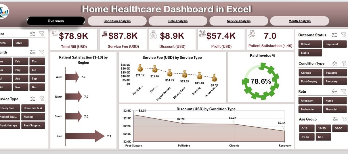
🏠 2. Overview Page
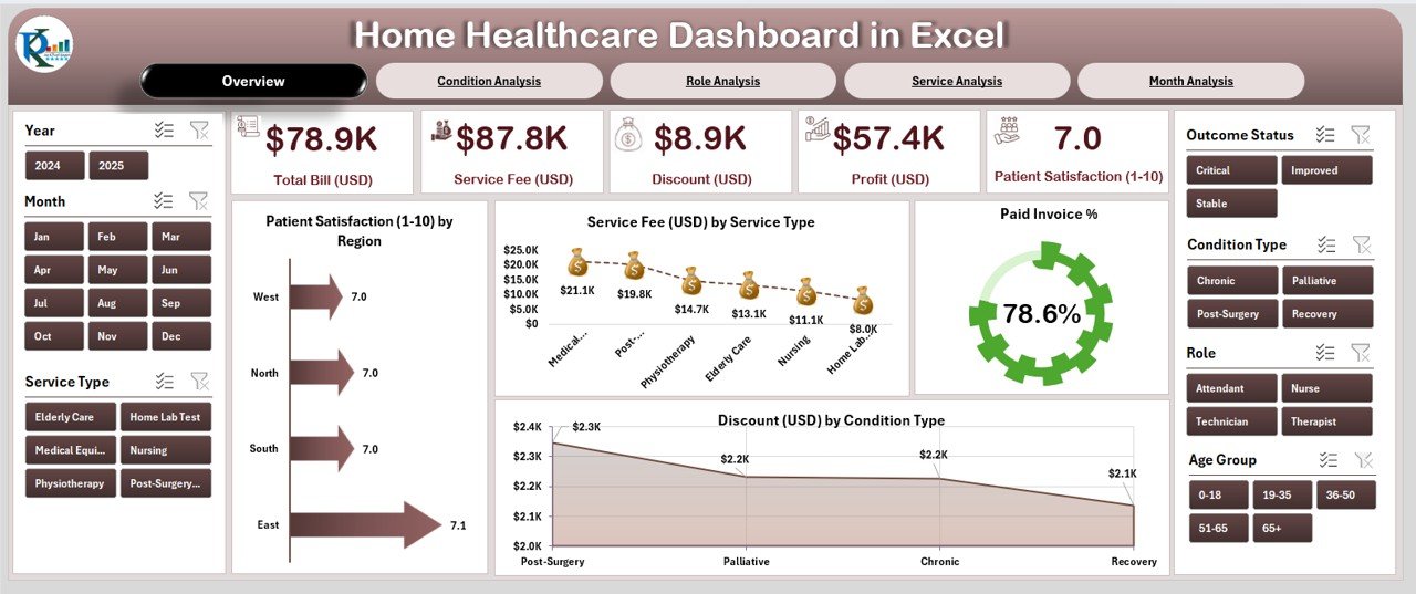
The Overview Page serves as the main dashboard interface — the central hub where you can see the most important business metrics at a glance.
✨ Key Components:
-
5 KPI Cards summarizing the overall business performance.
-
4 Dynamic Charts that update automatically when data changes.
-
Interactive slicers on the right side for filtering by region, service type, or month.
📈 Charts on the Overview Page:
-
Patient Satisfaction (1–10) by Region – Understand how patients rate your care quality in different areas.
-
Service Fee (USD) by Service Type – Analyze which services generate the highest revenue.
-
Paid Invoice (%) – Monitor your payment collection efficiency.
-
Discount (USD) by Condition Type – See where discounts or concessions are being applied most frequently.
This page provides a complete visual summary of your organization’s health performance.
🩺 3. Condition Analysis Page
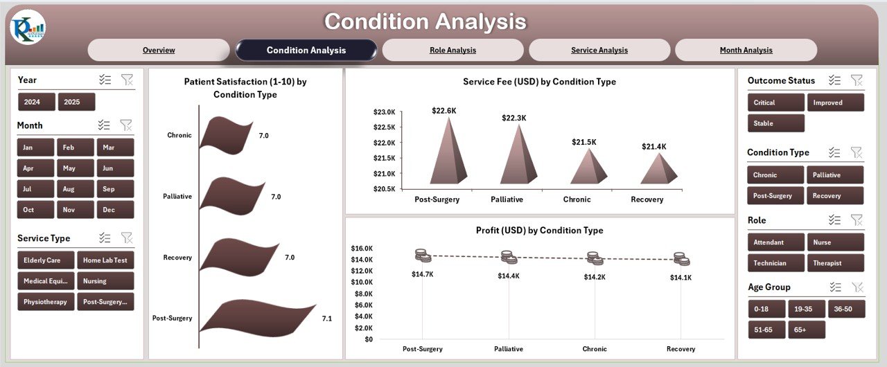
The Condition Analysis Page focuses on patient health conditions and how they influence profitability and satisfaction.
📊 Charts Included:
-
Patient Satisfaction (1–10) by Condition Type – Identify which treatments yield the best patient experience.
-
Service Fee (USD) by Condition Type – Evaluate financial performance by disease or service category.
-
Profit (USD) by Condition Type – Find which conditions bring the best margins for your practice.
This analysis helps administrators understand the relationship between care type, cost, and patient satisfaction, supporting better pricing and service delivery strategies.
👩⚕️ 4. Role Analysis Page
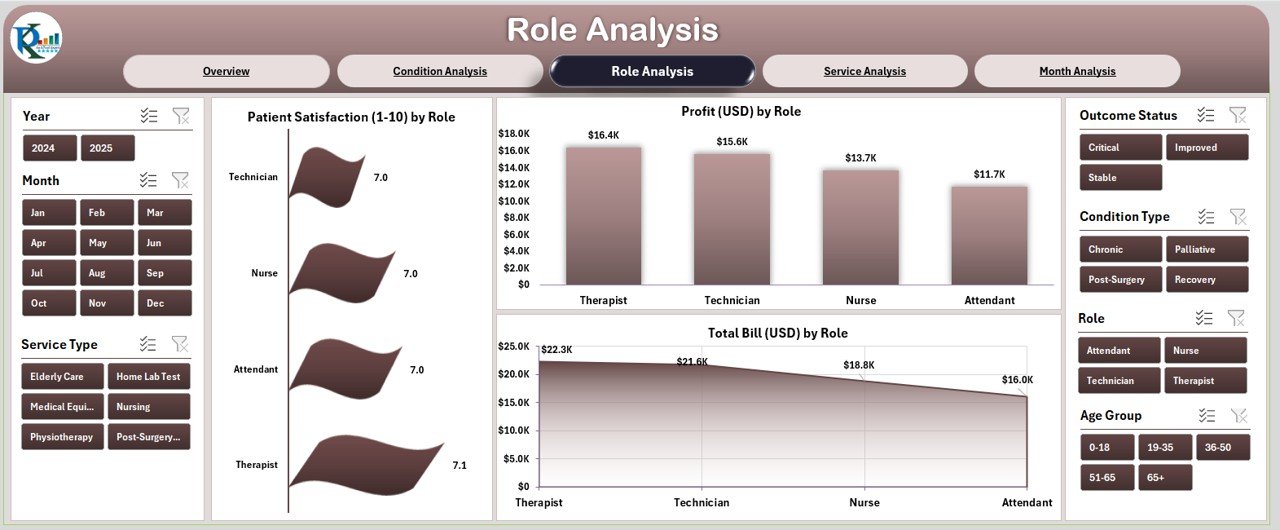
The Role Analysis Page offers insights into the performance of healthcare professionals — from doctors and nurses to physiotherapists and support staff.
Click to Purchases Home Healthcare Dashboard in Excel
📈 Charts on This Page:
-
Patient Satisfaction (1–10) by Role – Measure how well different professionals contribute to patient happiness.
-
Profit (USD) by Role – Identify which roles drive the most revenue.
-
Total Bill (USD) by Role – Understand total billing volume managed by each role.
This page is particularly useful for resource planning, performance evaluation, and incentive design for healthcare staff.
💼 5. Service Analysis Page
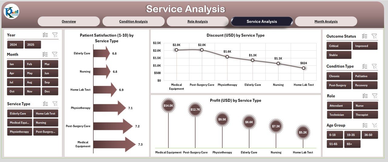
The Service Analysis Page offers a deeper look into the business side of healthcare — where profitability and cost control are crucial.
📉 Charts Displayed:
-
Patient Satisfaction (1–10) by Service Type – Gauge satisfaction across home visits, teleconsultations, lab testing, and more.
-
Profit (USD) by Service Type – Identify which services are most lucrative.
-
Discount (USD) by Service Type – Review pricing strategy and discounts for better margin control.
With this page, you can compare how different services perform financially and operationally, helping you decide where to focus future investments.
📆 6. Month Analysis Page
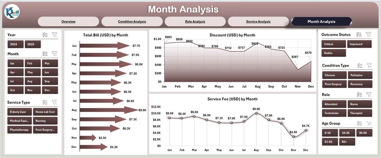
The Month Analysis Page enables time-based performance tracking, which is essential for identifying trends and forecasting future performance.
📊 Charts Featured:
-
Total Bill (USD) by Month – Visualize monthly revenue fluctuations.
-
Discount (USD) by Month – Track monthly discounts and understand their impact on profit.
-
Service Fee (USD) by Month – Compare month-over-month income generation.
This view allows you to detect seasonal trends, plan staffing efficiently, and align financial goals with actual outcomes.
🧾 7. Supporting Sheets
📋 Data Sheet
The Data Sheet stores all raw data inputs used to feed the dashboard. Each row contains records for patient details, services, invoices, satisfaction scores, and more.
This sheet powers the visuals across all five analytical pages and can easily be updated or expanded with new entries.
💡 Advantages of the Home Healthcare Dashboard in Excel
The Home Healthcare Dashboard isn’t just a data visualization tool — it’s a complete performance management solution for healthcare service providers.
✅ 1. Comprehensive View of Operations
You can see financial, operational, and satisfaction metrics together, ensuring balanced decision-making.
✅ 2. Improved Patient Care
Tracking satisfaction and service outcomes helps healthcare teams improve care quality and reduce complaints.
✅ 3. Increased Financial Transparency
With clear insight into invoices, discounts, and profitability, administrators can make smarter budgeting and pricing decisions.
✅ 4. Easy Customization
Because the dashboard is built in Excel, you can easily adapt it to your organization’s specific KPIs or regions.
✅ 5. Cost-Effective Alternative to BI Tools
Instead of investing in expensive software, this Excel dashboard provides similar functionality at a fraction of the cost.
✅ 6. Data-Driven Decision Making
All charts and KPIs update automatically when new data is entered, making insights real-time and actionable.
🧠 How This Dashboard Supports Decision-Making
A data-driven healthcare system relies on timely insights. The Home Healthcare Dashboard supports every key management decision:
-
Operational Efficiency – Track performance by role, service, and condition.
-
Financial Planning – Manage billing, profits, and discounts effectively.
-
Patient Engagement – Measure satisfaction and identify areas for service improvement.
-
Staff Productivity – Analyze how staff roles impact overall revenue and satisfaction.
-
Trend Forecasting – Use month-wise charts to predict future performance.
In short, this dashboard turns complex healthcare data into clear, actionable intelligence.
🎯 Best Practices for Using the Home Healthcare Dashboard in Excel
To make the most of your dashboard, follow these best practices:
🔹 1. Maintain Clean and Updated Data
Ensure that the Data Sheet is regularly updated. Remove duplicates and check for consistency in service names and dates.
🔹 2. Use Standard Units and Formats
Always use consistent currency (e.g., USD) and date formats to prevent chart errors.
🔹 3. Leverage Slicers for Deep Analysis
Use slicers to filter data by month, service type, or role to uncover insights quickly.
🔹 4. Set Monthly Review Routines
Schedule a monthly review meeting where the team discusses dashboard findings and action plans.
🔹 5. Customize KPIs to Fit Your Goals
Add or modify KPIs to reflect your organization’s unique objectives (e.g., readmission rates, response time).
🔹 6. Protect Formulas and Pivot Tables
Lock cells containing formulas or charts to avoid accidental changes.
🔹 7. Automate Data Entry
If possible, link data sources or use simple VBA automation to streamline updates.
📉 Common Mistakes to Avoid
When implementing dashboards, many organizations make errors that reduce their effectiveness. Avoid these pitfalls:
-
❌ Overloading the dashboard with too many KPIs.
-
❌ Ignoring the importance of data validation.
-
❌ Not reviewing trends regularly.
-
❌ Using inconsistent data formats.
-
❌ Forgetting to back up the dashboard.
Following best practices and avoiding these mistakes ensures long-term success.
💬 Real-World Applications
The Home Healthcare Dashboard in Excel is ideal for:
-
Home nursing agencies tracking patient feedback and staff efficiency.
-
Rehabilitation centers managing billing and service performance.
-
Diagnostic and pathology services monitoring discounts and revenues.
-
Therapy providers analyzing satisfaction across multiple roles and conditions.
It’s also highly useful for consultants, analysts, and healthcare administrators who want to showcase performance data in a professional, visual format.
🔍 Charts and Visuals to Include
Visuals play a major role in making data understandable. Recommended chart types for this dashboard include:
-
Clustered Column Charts for region-wise and service-type comparisons.
-
Line Charts for month-wise trends.
-
Pie Charts for percentage distributions like paid invoices or discounts.
-
Bar Charts for condition or role-based satisfaction analysis.
-
KPI Cards for top-line performance indicators (e.g., total profit, satisfaction, total bills).
By combining these visuals, you can transform raw data into compelling insights.
🧩 Why Excel Is Ideal for Healthcare Analytics
While many organizations use Power BI or Tableau, Excel remains a favorite because of its flexibility and accessibility.
Reasons why Excel works perfectly for healthcare dashboards:
-
Widely available and easy to use.
-
Allows dynamic pivot tables and slicers.
-
Can handle thousands of records efficiently.
-
Compatible with other systems (CSV, Google Sheets, etc.).
-
Supports automation through formulas and VBA.
Thus, for small and mid-sized healthcare businesses, Excel provides the best balance of power, simplicity, and cost-effectiveness.
🏁 Conclusion
The Home Healthcare Dashboard in Excel is more than a reporting tool — it’s a complete management system that brings together patient care, service efficiency, and financial control.
By adopting this dashboard, healthcare professionals can:
-
Monitor patient satisfaction effectively.
-
Improve profit margins with data transparency.
-
Identify operational inefficiencies.
-
Make strategic, data-driven decisions faster.
This ready-to-use Excel template simplifies healthcare analytics and empowers organizations to focus more on what truly matters — delivering exceptional patient care.
❓ Frequently Asked Questions (FAQs)
1. What is the purpose of the Home Healthcare Dashboard in Excel?
It helps healthcare providers analyze patient satisfaction, financial performance, and service efficiency all in one place.
2. Who can use this dashboard?
Any healthcare professional or organization providing home care services — including nursing agencies, therapists, and diagnostics teams.
3. Can I customize the dashboard?
Yes! You can add new charts, KPIs, and filters according to your organization’s needs.
4. Does it require advanced Excel skills?
No. The dashboard is user-friendly and prebuilt with formulas and visuals. Basic Excel knowledge is enough.
5. How often should I update the data?
You can update it daily, weekly, or monthly based on your data collection process. The charts will update automatically.
6. Can this dashboard track multiple branches or locations?
Yes. You can filter performance by region or branch using the built-in slicers.
7. How does this dashboard help improve patient satisfaction?
By analyzing feedback trends and identifying areas of improvement across services, roles, and conditions.
8. Is the file compatible with Google Sheets?
Yes, though some advanced features (like slicers or VBA) work best in the Excel desktop version.
Visit our YouTube channel to learn step-by-step video tutorials