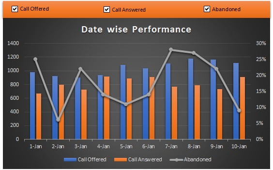
A dynamic combination of Column Chart and Line Chart
Learn Dynamic Variance Arrow Chart step by step
In this dynamic chart you will learn how to hide a series by unchecked a checkbox.
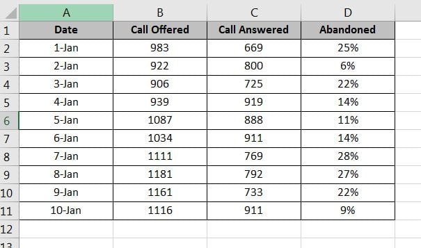
Below is the data point for which we will create this chart.
Below are the steps to create this dynamic chart:
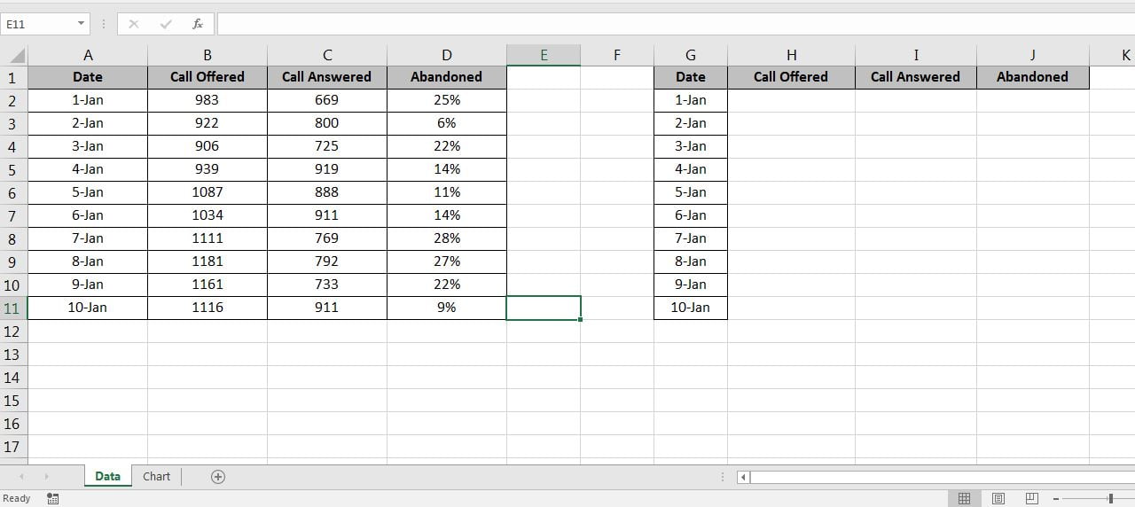
- Copy “A1:A11” and paste on “G1”
- Copy header “B1:D1” and paste on “H1”
- Go to Chart Sheet.
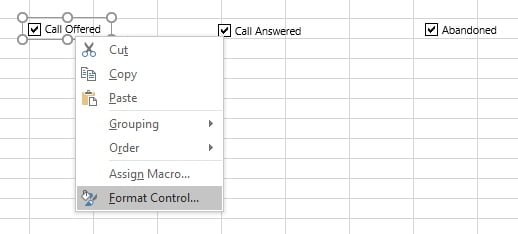
- Go to the Developer tab > Insert >Form Controls >Check Box
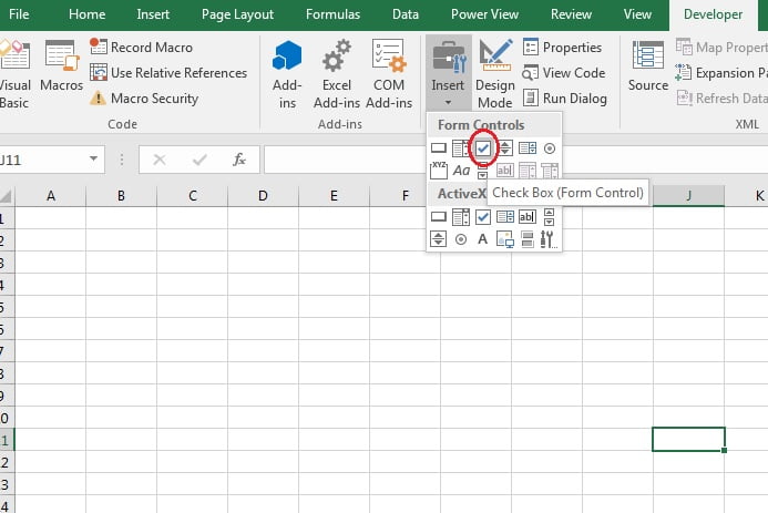
- Insert 3 Check boxes and rename them as Call Offered, Call Answered, Abandoned
- Right click on check boxes and click on “Format Control…”
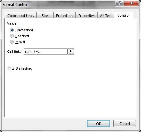
- Put in cell link of Call offered Checkbox “Data!$F$1”
- Put in cell link of Call Answered Checkbox “Data!$F$2”
- Put in cell link of Abandoned Checkbox “Data!$F$3”
- Now go to Data sheet and put formula on
- Range H2 “=IF($F$1,B2,NA())”
- Range I2 “=IF($F$2,C2,NA())”
- Range J2 “=IF($F$3,D2,NA())”
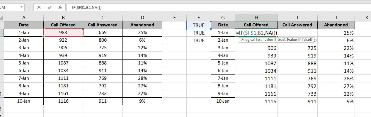
- Fill down the formula on “H2:J11”
- Change the number format of column J as percentage.
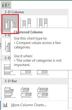
- Select Range “G1:J11”
- Go to Insert>>Charts>>2D Column>>Clustered Column
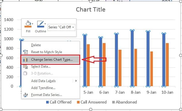
- Now right click on any column and click on “Change Chart Type”
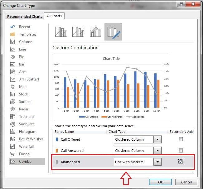
- In Change Chart Type window change the chart type for Abandoned as “Line with Markers”
- Also check the Secondary Axis box
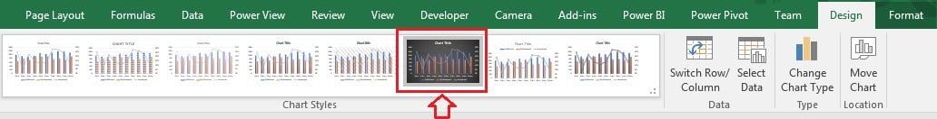
- We will change the Chart Style now
- Select the chart and go to “Design Tab>>Chart Style>>Style6”
- Change the chart title as “Date wise Performance”
- Cut (Ctrl+X) the chart and paste on Chart Sheet.
- Insert a rectangle in Chart Sheet from Insert>>Shapes>>Rectangles>>Rectangle
- Match the Rectangle width with chart width and send to back of check boxes.
Our dynamic Chart is ready. Please download this excel file for practice.
