Most aerospace and defense management packs are assembled by hand. Somebody exports figures from the ERP, somebody else retypes them into a slide, and by the time the review starts nobody is quite sure whether the cycle-time number is the month or the year to date. The Aerospace and Defense KPI Dashboard in Excel replaces that with one workbook: 14 KPIs across 7 groups, 10 worksheets, room for 22 KPIs before you touch a formula, and 36 months of input cells covering this year, target and prior year. Every value is a plain worksheet formula – VLOOKUP, MATCH, INDEX and COUNTIF – so there is no macro, no Power Query, no data model and no refresh step.
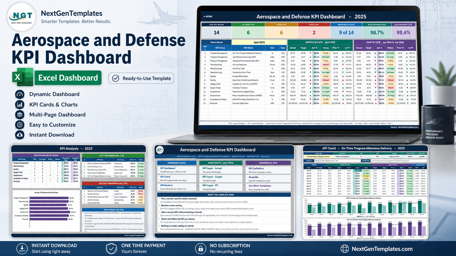
Two things to be clear about before anything else. First, every number shown in the file and in the screenshots below is demo data. It was invented so you can see the scorecard working before you type a thing. No real company, programme, contract or fleet appears anywhere in the workbook. Second, this is a reporting template over numbers you enter yourself. It is not airworthiness, flight-safety or maintenance-record software, it is not a certification, audit or quality-management system, and it is not export-control or trade-compliance software. It shows you what you typed, arranged well.
Key Features of the Aerospace and Defense KPI Dashboard in Excel
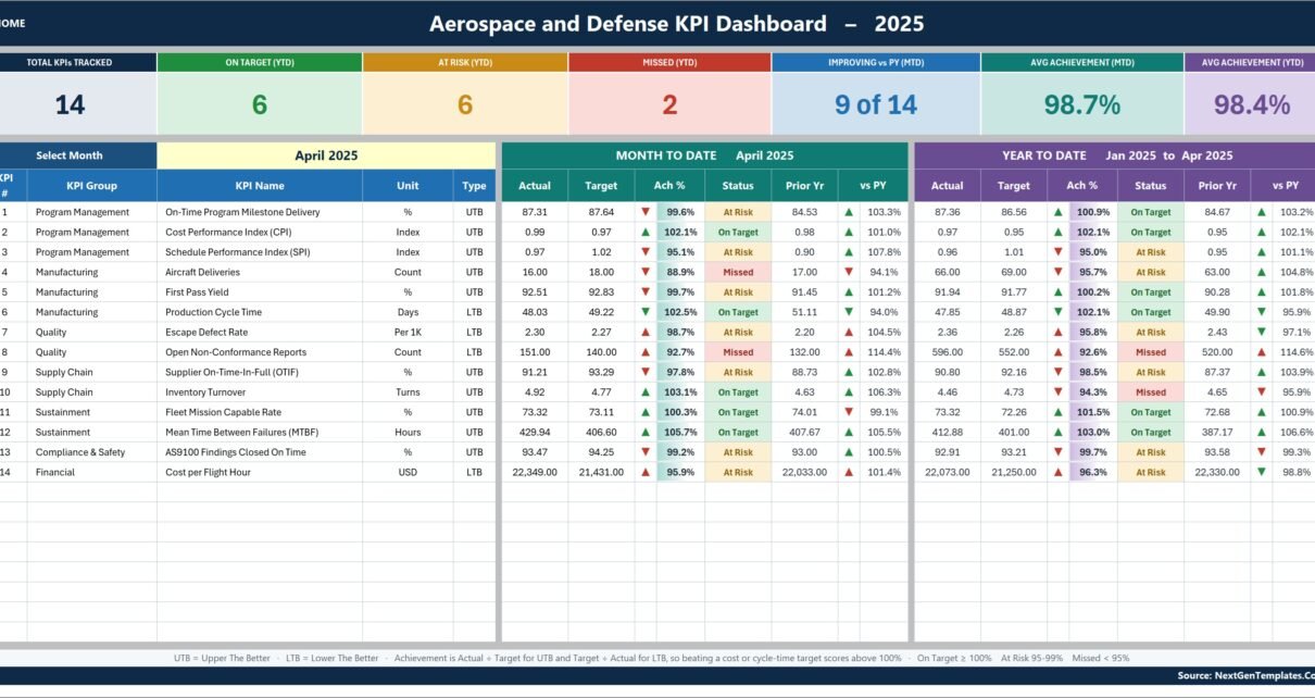
- A single month dropdown. Cell D6 on KPI Dashboard lists the twelve months of the reporting year. Everything downstream – the MTD block, the YTD block, the seven summary cards and the whole KPI Analysis page – follows it.
- MTD and YTD are both stored. Each input sheet holds a month-to-date and a year-to-date column for every month, so you decide how your own YTD behaves. Counts accumulate; rates, ratios, indices and per-unit costs run as averages.
- Direction-aware achievement. Each KPI carries a UTB (upper the better) or LTB (lower the better) flag. Achievement is Actual / Target for UTB and Target / Actual for LTB.
- Editable traffic lights. On Target from 100%, At Risk 95-99%, Missed below 95%. The thresholds live in the status formulas in columns L and U, not in a locked setting.
- Colour-aware arrows. The arrow shows raw direction; its colour says whether that direction is good for that KPI. A falling cost gets a green down-arrow.
- Everything reads from one master list. Rename, add or remove a KPI on KPI Definition and the three input sheets, the scorecard, the trend page and the analysis page all follow. No formula edits.
- Excel 2013 and later, and Excel for the web. Nothing to install, nothing to enable, nothing locked or hidden.
Dashboard Pages Explanation
Home
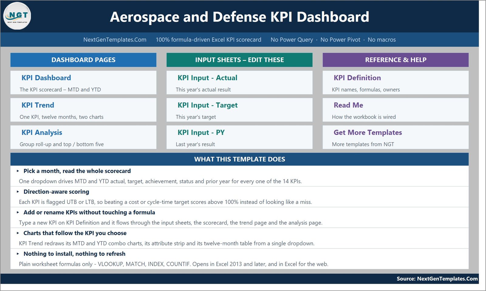
The landing page groups the ten sheets into three columns – Dashboard Pages, Input Sheets (Edit These) and Reference & Help – with a one-line description under each, plus a “What This Template Does” panel. Every tile is a hyperlink, and every other sheet carries a HOME link back.
KPI Dashboard – the scorecard
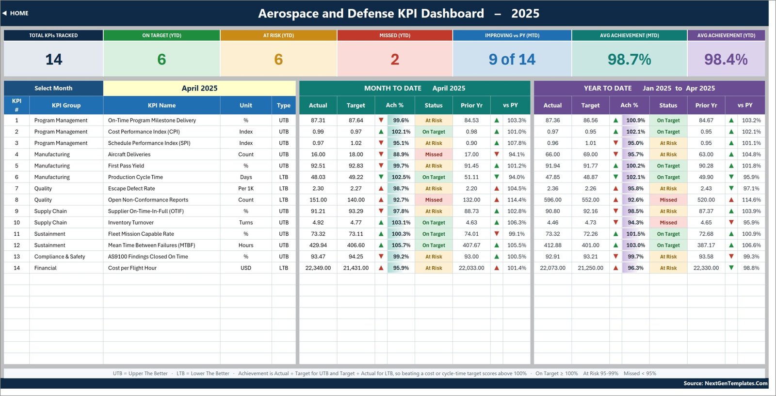
Seven summary cards run across the top: Total KPIs Tracked, On Target (YTD), At Risk (YTD), Missed (YTD), Improving vs PY (MTD), Avg Achievement (MTD) and Avg Achievement (YTD). Below them sit two mirrored blocks – Month to Date and Year to Date – each with actual, target, achievement %, status, prior year and vs PY for every KPI.
The 14 KPIs shipped as samples are: On-Time Program Milestone Delivery, Cost Performance Index (CPI) and Schedule Performance Index (SPI) under Program Management; Aircraft Deliveries, First Pass Yield and Production Cycle Time under Manufacturing; Escape Defect Rate and Open Non-Conformance Reports under Quality; Supplier On-Time-In-Full (OTIF) and Inventory Turnover under Supply Chain; Fleet Mission Capable Rate and Mean Time Between Failures (MTBF) under Sustainment; AS9100 Findings Closed On Time under Compliance & Safety; and Cost per Flight Hour under Financial. Each of those is a label somebody typed and a number somebody types – rename any of them on KPI Definition.
KPI Trend – one KPI, twelve months
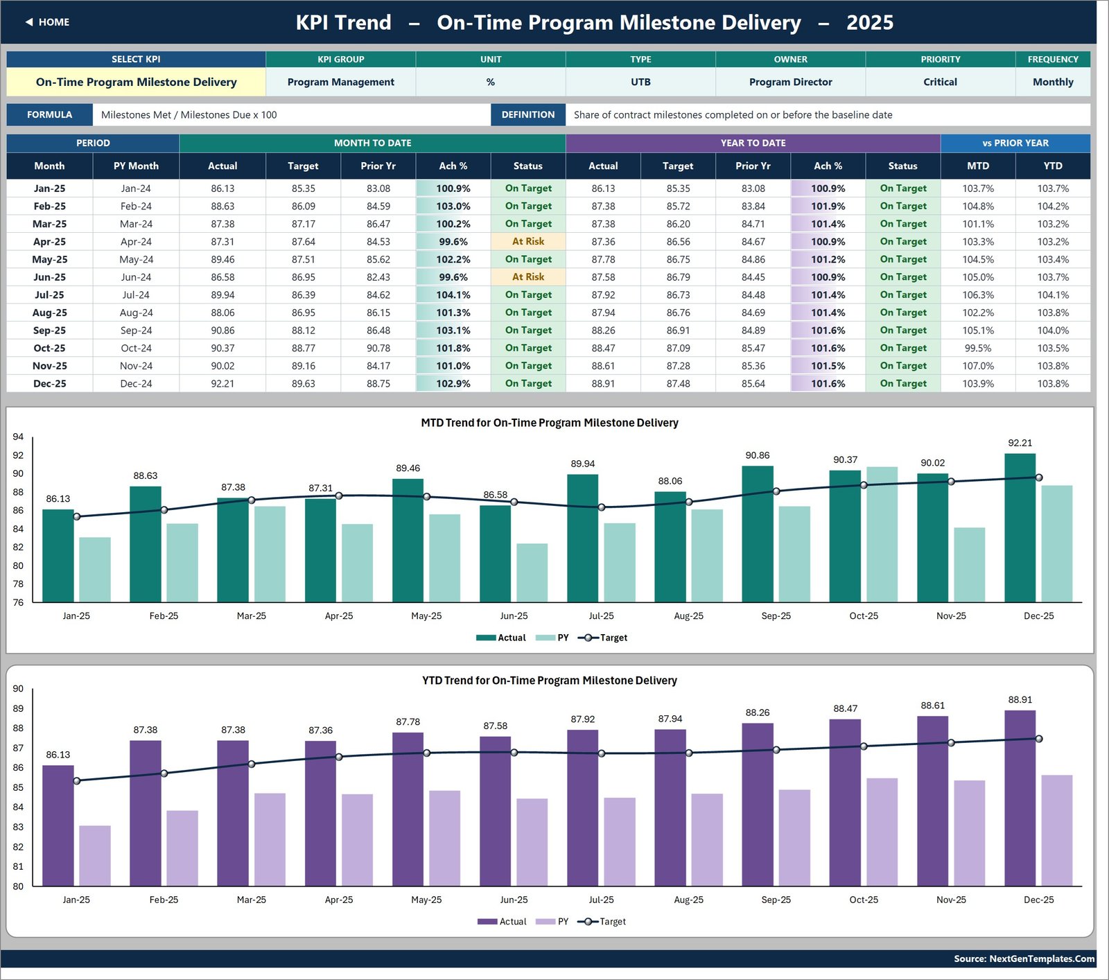
Choose a KPI in cell B4 and the page rebuilds around it: an attribute strip showing group, unit, type, owner, priority and frequency; the KPI’s formula and definition spelled out; a twelve-month table with MTD and YTD actual, target, prior year, achievement and status; and two combo charts. They are titled MTD Trend for [selected KPI] and YTD Trend for [selected KPI], and each plots actual and prior-year columns against a target line.
KPI Analysis – groups and rankings
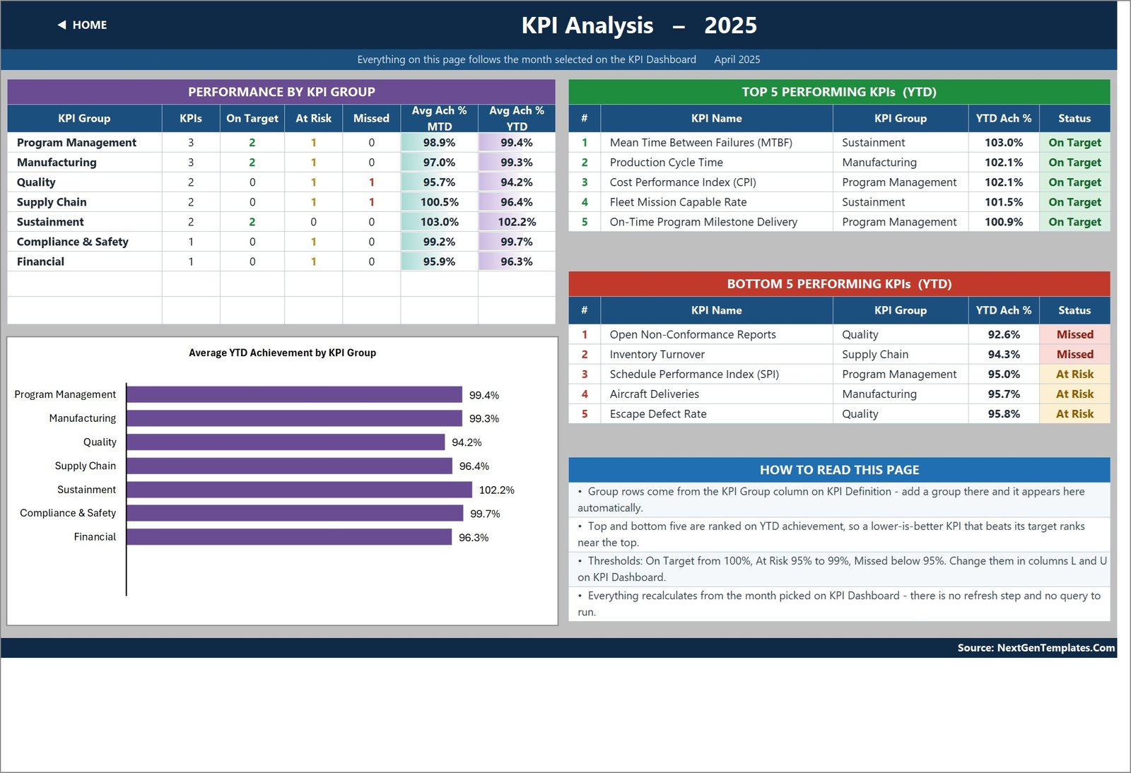
Performance by KPI Group counts On Target, At Risk and Missed KPIs per group and averages their MTD and YTD achievement. A bar chart of Average YTD Achievement by KPI Group sits beneath it. To the right, Top 5 and Bottom 5 Performing KPIs (YTD) rank every KPI on achievement – which means a lower-is-better KPI that is beating its target ranks near the top, exactly as it should. A “How to read this page” panel explains the thresholds and the ranking rule in plain English.
The three input sheets
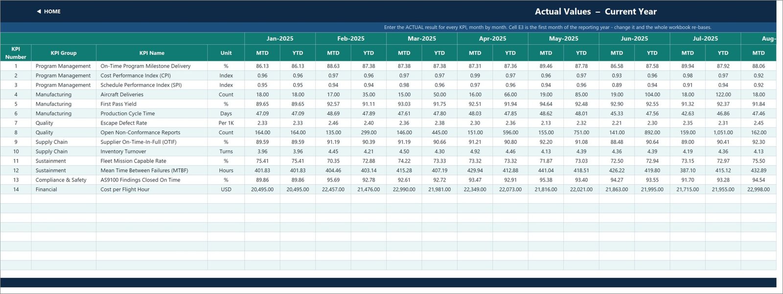
KPI Input – Actual, KPI Input – Target and KPI Input – PY are the only sheets you normally type in. Each has an MTD and a YTD column per month, and the KPI rows on all three are driven by KPI Definition so they can never drift out of line. Cell E3 on the Actual sheet is the first month of the reporting year; change it and the Target sheet, the PY sheet, the month dropdown and every sheet title re-base.
KPI Definition, Read Me, Support and Get More Templates
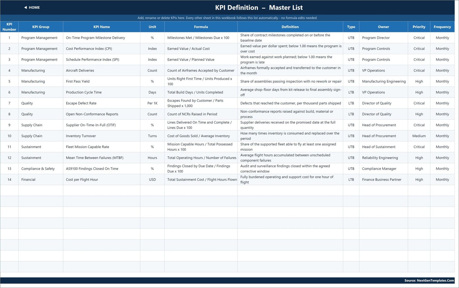
KPI Definition is the master list: number, group, name, unit, formula, definition, UTB/LTB type, owner, priority and frequency. It is where the whole workbook is configured. Read Me is a one-page explanation of the wiring – the five-minute setup, the rules the numbers follow, how to add or remove KPIs, and a sheet map. Support holds the helper calculations behind the dropdowns, arrow glyphs, chart series and ranking, and needs no editing. Get More Templates links back to the catalogue.
Aerospace and Defense KPI Dashboard in Excel vs. Google Sheets vs. Paid Reporting SaaS – Feature Comparison
| This template (Excel) | Google Sheets KPI scorecard | Paid reporting SaaS | |
|---|---|---|---|
| Cost | One-time, under 20 | One-time, similar | Typically 20-75 per user, per month |
| Platform | Excel 2013+, Excel for the web | Browser only | Browser plus connectors |
| Setup time | Under an hour | Under an hour | Days to weeks |
| Real-time team collaboration | OneDrive / SharePoint co-authoring | Native | Native |
| Mobile access | Excel mobile app | Sheets mobile app | Native app |
| Customizable fields | Every cell, nothing locked | Every cell | Within the vendor’s model |
| Share with link | Yes, via OneDrive | Yes | Yes, seat-based |
| Year-1 cost at 5 users | Under 20 total | Similar | 1,200 – 4,500 |
| Direction-aware (UTB / LTB) scoring | Built in, per KPI | Built in | Usually a custom calculation |
| Works offline | Yes | No | No |
Who Should Use This Template
Programme managers and programme-controls leads who report CPI, SPI and milestone delivery monthly. Production and operations managers watching yield, cycle time and delivery counts. Quality managers tracking escapes and open non-conformances. Procurement teams following supplier OTIF and inventory turns. Sustainment and reliability teams reporting mission capable rate, MTBF and cost per flight hour. In short: anyone who already holds the numbers and needs one page that shows this month against target, this year against target, and both against last year.
It is a poor fit if you want transaction-level analysis with slicers over a raw table – that is a different product family – or if you need a live connection to an ERP or MES. It is also the wrong tool, categorically, for airworthiness, safety-of-flight, certification, export-control, classified or controlled-unclassified work, or for anything touching weapons, munitions or ordnance management. None of that is what a spreadsheet of typed-in monthly totals does.
Real-World Use Cases
Monthly programme review. A tier-one supplier’s controls lead keeps four Program Management KPIs, types the earned-value outputs from their own system into the Actual and Target sheets, sets the month dropdown and prints the KPI Dashboard page as the review’s opening slide.
Plant operations meeting. A machined-components manufacturer tracks First Pass Yield, Production Cycle Time, Escape Defect Rate and Open Non-Conformance Reports. Because cycle time and escapes are flagged LTB, a good month reads above 100% and the Manufacturing and Quality rows on KPI Analysis compare fairly against the rate KPIs.
Sustainment reporting. An MRO business reports Fleet Mission Capable Rate, MTBF and Cost per Flight Hour. The prior-year columns on KPI Trend are what separate a genuine improvement from a seasonal one.
Advantages of the Aerospace and Defense KPI Dashboard in Excel
- Nothing to install or refresh. No macros means no security prompt, no macro-enabled file format and no IT conversation. See Microsoft’s own guidance on enabling or disabling macros in Microsoft 365 files for why that matters in a controlled environment.
- The formulas are readable. VLOOKUP, MATCH, INDEX and COUNTIF. You can trace any number back to its input cell, which is the difference between trusting a report and merely receiving one.
- Eight spare KPI rows. The sheets are wired for 22 KPIs and 14 are filled, so adding your own is typing, not engineering.
- Governance is yours. Thresholds, KPI names, owners, priorities and the definition of YTD are all editable in the open.
- It prints. Each page is laid out to fit a landscape sheet, which is what most review packs actually need.
Opportunities for Improvement
Being honest about the edges is more useful than pretending there are none.
- Monthly only. There is no weekly or daily grain. A weekly KPI has to be aggregated before it goes in.
- You type the numbers. There is no connector to an ERP, MES or EVM tool, and that is a deliberate trade for the zero-dependency design. If somebody types the wrong figure, the scorecard shows the wrong figure confidently.
- Twelve months at a time. The workbook covers one reporting year plus its prior year. Multi-year trending means a copy per year or extending the sheets yourself.
- 22 KPIs before manual work. Going beyond that means filling down the last data row on each sheet and widening the summary-card ranges on KPI Dashboard row 4 and in the helper columns on Support. The Read Me sheet spells out how, but it is a manual step.
- One sample KPI is labelled AS9100 Findings Closed On Time. That is a demo row name over a percentage somebody types. It is not a certification record, it evidences nothing to any auditor or standards body, and it can be renamed on KPI Definition in five seconds. Treat it as a placeholder for whatever internal finding-closure metric you actually report.
Best Practices
- Fix the KPI list first, then type numbers. Editing KPI Definition after the input sheets are full still works, but it is far less confusing the other way round.
- Decide what YTD means per KPI, and write it down. Counts accumulate, rates average. A compliance percentage that sums to 1,100% by December is the classic sign that somebody applied the wrong rule.
- Set UTB or LTB deliberately. This is the single field that most often gets left on the default and quietly inverts a KPI’s status all year.
- Match the thresholds to your governance. If your organisation calls 98% green, change the formula rather than explaining the amber every month.
- Name an owner per KPI. The Owner column on KPI Definition costs nothing and turns a status review into an action review.
- Keep one file per reporting year and archive the previous one. It keeps the prior-year columns honest.
- Delete the demo data as you go rather than typing over it selectively – half-replaced sample figures are the most common source of a nonsense first month.
Explore Relevant Templates
- Aerospace and Defense KPI Dashboard in Excel – the template described in this post.
- Aerospace and Defence Dashboard in Excel – the analytical counterpart, built over a transaction table with pivot-driven charts and slicers.
- Aerospace and Defence KPI Dashboard in Excel – an earlier scorecard on the same subject with a different KPI set.
- Defense Equipment Manufacturing Dashboard in Excel – production-side analytics.
- Aerospace and Defense Dashboard in Power BI – the same subject in Power BI.
- Browse every Excel KPI Dashboard.
Frequently Asked Questions
Does this template make my programme compliant, or is it airworthiness or export-control software?
No – to all of it. It is a spreadsheet that displays numbers you type into it. It is not airworthiness or flight-safety software, it does not create or evidence certification or accreditation of any kind, it is not an audit or quality-management system, it is not export-control or trade-compliance software, and nothing it produces is guaranteed to be accepted by any customer, auditor or authority. Use it as a management view alongside your actual systems of record.
Are the figures in the screenshots real?
No. Every number in the workbook and in the images above is invented demo data, included so the scorecard is legible before you enter anything. No real company, programme, contract or fleet is represented.
Do I need Power Query, Power Pivot, macros or an add-in?
None of them. The workbook is 100% worksheet formulas. It opens in Excel 2013 and later and works in Excel for the web.
Can I use my own KPIs instead of the 14 supplied?
Yes – that is the intended workflow. Edit KPI Definition and every other sheet follows automatically. Fourteen of the twenty-two wired rows are filled, so eight are already live and empty.
Why does a lower-is-better KPI score above 100%?
Because achievement is calculated in the direction the KPI runs: Actual / Target for UTB, Target / Actual for LTB. Beating a cost or cycle-time target therefore scores above 100%, the same way beating a revenue target does.
How is this different from the analytical Aerospace and Defence Dashboard?
This is a scorecard – monthly totals, actual against target, a status light and a trend. The analytical dashboard sits over a row-level transaction table and answers slice-and-dice questions with charts and slicers. Different questions, different templates.
What is in the download?
A ZIP containing the .xlsx workbook and a PDF user manual. No installer, no licence key, no account.
About the Author
Built by PK – Microsoft Certified Professional with 15+ years of Excel, Google Sheets, and Power BI experience. Founder of NextGenTemplates, reaching 300K+ subscribers across YouTube channels. Every template is hand-built and tested before release.
Conclusion
The Aerospace and Defense KPI Dashboard in Excel does one job properly: it takes monthly numbers you already own and turns them into a scorecard that reads correctly whether the KPI goes up or down, shows the month and the year together, and puts a twelve-month trend one click away. No macros, no data model, nothing hidden, and every formula open to inspection. It will not make anyone compliant with anything and it does not pretend to – it just makes the monthly review a great deal shorter.
Get it here: Aerospace and Defense KPI Dashboard in Excel. For walkthroughs of this and other Excel dashboards, subscribe to youtube.com/@PKAnExcelExpert.