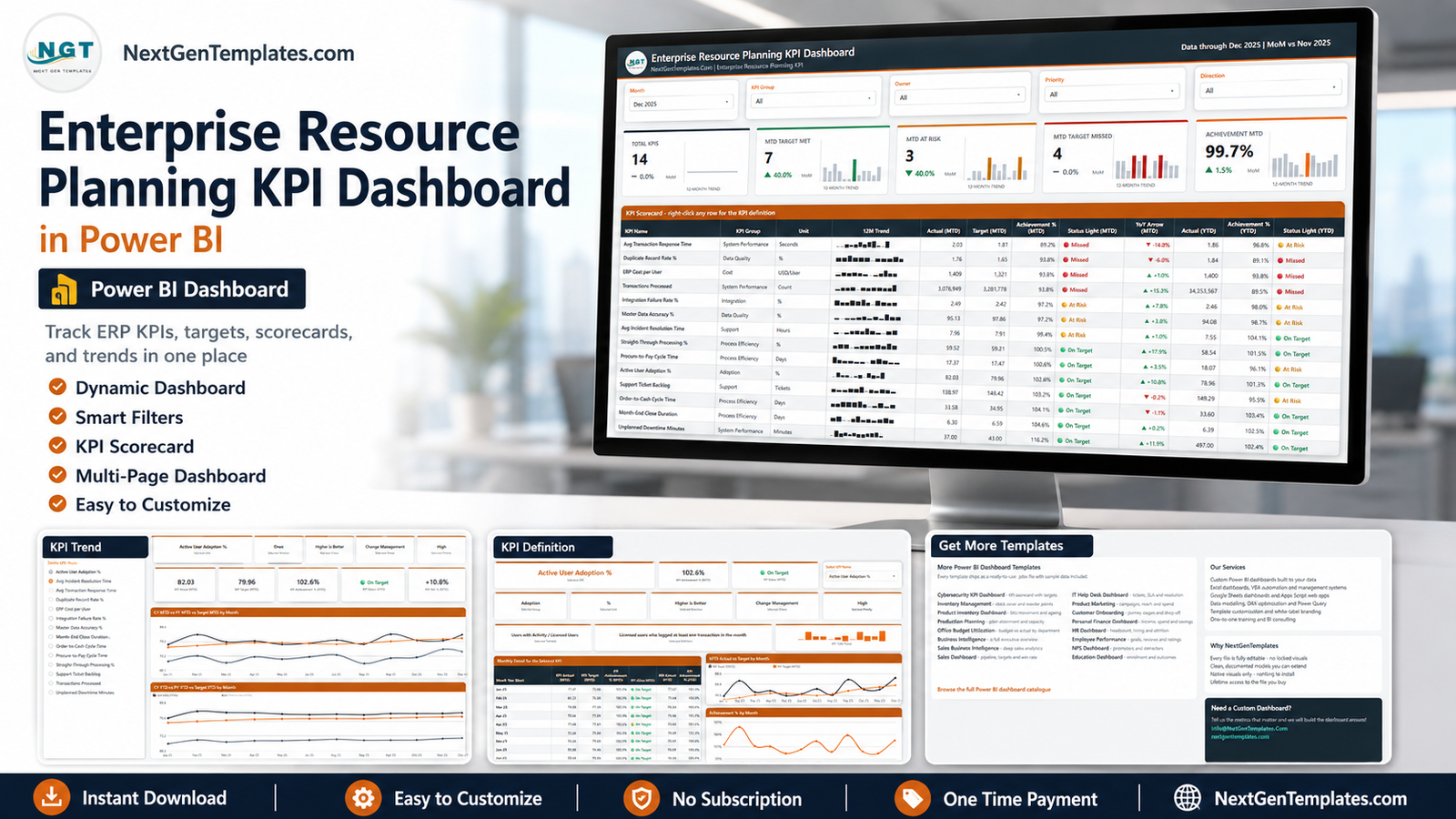
Most ERP programme reporting dies the same death. Someone exports figures from a service desk, a system monitor and a finance ledger, pastes them into a deck, colours a few cells by hand, and by the time the steering meeting happens nobody can say where a number came from. The Enterprise Resource Planning KPI Dashboard in Power BI replaces that ritual with one file: 14 KPIs across 7 groups, a month picker, red/amber/green status lights on both month-to-date and year-to-date, and a drillthrough page that prints the formula behind any metric you right-click.
Two things to be clear about before anything else. First, this is a scorecard, not an analytical dashboard. It answers “which of my ERP metrics missed target last month, and by how much” – one row per KPI, one status light per row. Slicing transaction detail by region and product is a different template on a different page. Second, it has no connection to any ERP product. There is no connector, no import, no sync and no affiliation with any vendor. You type or paste your own monthly figures into an Excel workbook and hit Refresh. Every number in the screenshots below is invented demo data, and every target is a placeholder you replace with your own.
Key Features of the Enterprise Resource Planning KPI Dashboard in Power BI
- 14 ERP KPIs in 7 groups – System Performance (3), Process Efficiency (4), Data Quality (2), Support (2), and one each for Adoption, Cost and Integration.
- Five slicers on the scorecard page: Month, KPI Group, Owner, Priority and Direction.
- Two independent status lights per KPI – MTD and YTD sit side by side, so a metric can be On Target this month while still At Risk for the year.
- Direction-aware achievement – 4 of the demo KPIs are upper-the-better (UTB) and 10 are lower-the-better (LTB). An LTB KPI scores above 100% when it lands under target, so one achievement column is comparable across the whole table.
- A 12-month sparkline in every row, which deliberately keeps showing the full year even when the month picker moves.
- A genuine drillthrough to a per-KPI definition page, bound on 7 fields (KPI Name, Group, Unit, Type, Direction, Owner, Priority).
- Two hidden tooltip pages at 280×360 – KPI Detail and Trend Detail – which appear on hover and stay out of the page navigation.
- 38 DAX measures driving the visuals, all unlocked and readable.
- Nothing hard-coded to 14 KPIs – add, rename or delete rows in the three input sheets and every count, list and chart follows.
- Native visuals only and a single custom theme, so there is nothing to install and recolouring is one edit.
Dashboard Pages Explanation
The .pbix contains 6 pages: 4 you navigate and 2 hidden tooltips. Here is each one.
KPI Scorecard
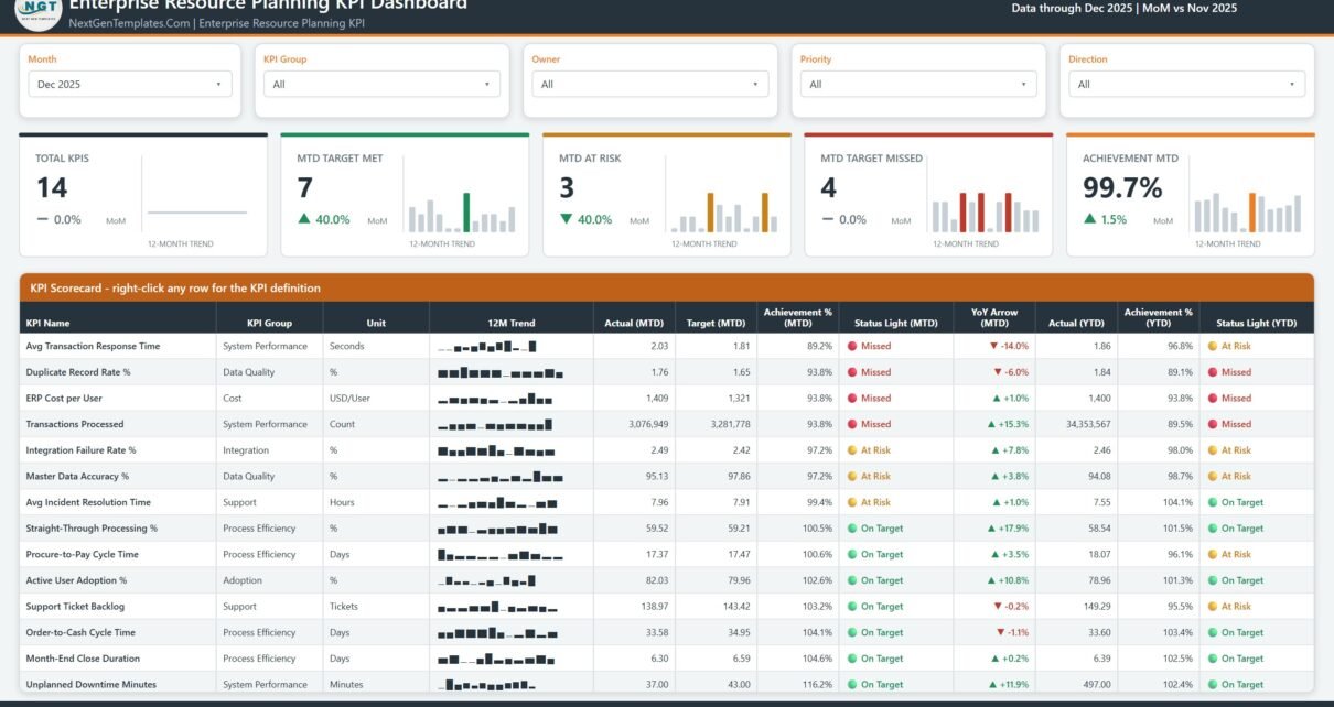
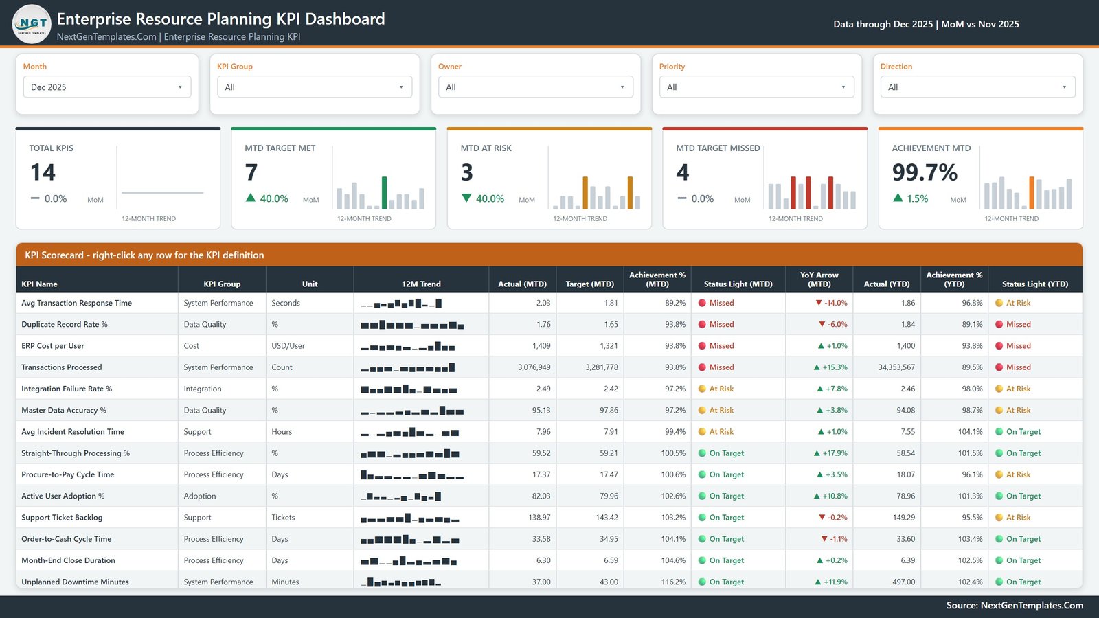
The landing page and the reason the template exists. The five slicers run across the top. Below them sit five KPI cards, each with its own 12-month sparkline: Total KPIs, MTD Target Met, MTD At Risk, MTD Target Missed and Achievement MTD. In the demo month of Dec 2025 those read 14, 7, 3, 4 and 99.7% – sample figures, not a benchmark and not a target we are suggesting.
The scorecard table underneath is the substance. Each of the 14 rows carries the KPI name, its group, its unit, the 12-month sparkline, MTD actual and target, achievement %, a status light, a year-on-year arrow, then actual, achievement % and status light again on a YTD basis. The header says right-click any row for the KPI definition, which is exactly what it does.
KPI Trend
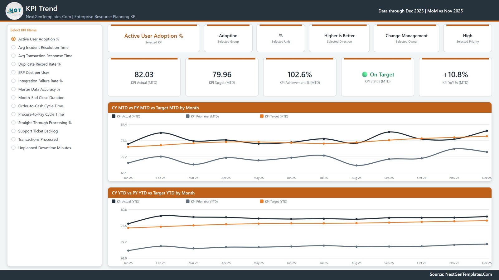
Select one KPI from the radio list on the left and the whole page rebuilds around it. Six context cards restate what you picked – the KPI, its group, unit, direction, owner and priority – then five value cards give MTD actual, MTD target, achievement %, status and year-on-year change. Two line charts follow: CY MTD vs PY MTD vs Target MTD by Month and CY YTD vs PY YTD vs Target YTD by Month, each plotting three series across twelve months.
This is the page you open when someone asks whether a bad number is a trend or a one-off. Seeing the current year, the prior year and the target on the same axis usually settles it in about five seconds.
KPI Definition
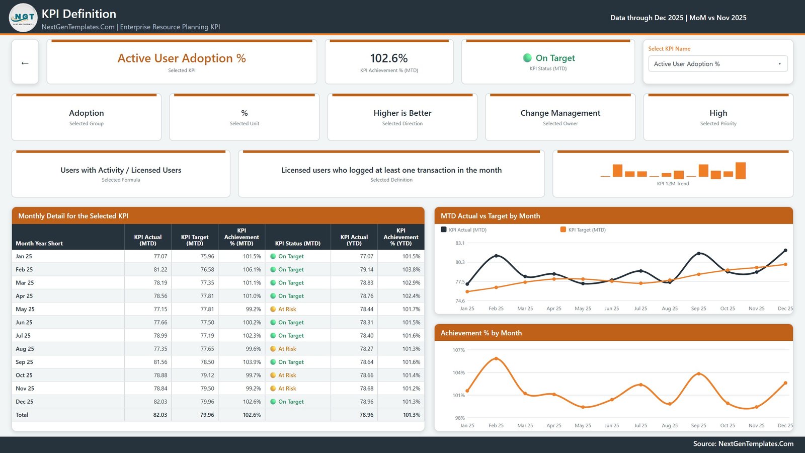
Reached by right-clicking a scorecard row and choosing Drillthrough, or by the dropdown in its top-right corner. It shows the selected KPI’s achievement and status, its group, unit, direction, owner and priority, then two wide cards that are the point of the page: the calculation formula and a plain-English definition. Below sit a 12-row Monthly Detail for the Selected KPI table with a total row, an MTD Actual vs Target by Month chart and an Achievement % by Month chart. The back arrow at top-left returns you to the scorecard.
Shipping the definition inside the report is what stops the “where does this number come from” conversation from repeating every month. It also means a new team member can read the file without a handover call.
Get More Templates
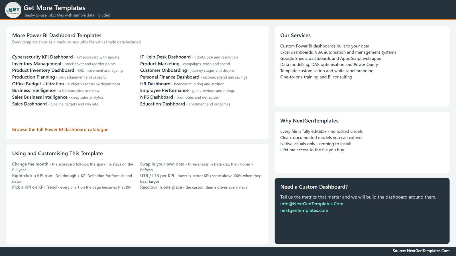
An in-file help and catalogue page rather than a data page. It lists other NextGenTemplates Power BI reports, our services, and a short Using and Customising This Template block covering the month picker, the drillthrough, the UTB/LTB scoring and how to swap in your own data. We include it in the walkthrough because it ships in the file – the customisation notes travel with the report rather than living in a README you lose.
The two hidden pages
KPI Detail and Trend Detail are 280×360 tooltip pages, marked hidden in view mode. They surface on hover over the scorecard and the trend charts and never appear in the page tabs.
Where the data lives
Data.xlsx has four sheets. Read Me explains the model in about a page. KPI Definition is one row per KPI with nine columns – number, group, name, unit, formula, definition, type, owner, priority. Input_ Target and Input_ Actual each hold KPI Name, Month, MTD and YTD; in the demo set that is 168 target rows and 336 actual rows, the actuals covering the current and prior year so the year-on-year comparison has something to compare against.
ERP KPI Scorecard in Power BI vs. a Tableau or Qlik Build vs. Paid KPI Scorecard SaaS – Feature Comparison
| This template (Power BI) | Tableau / Qlik build | Paid KPI scorecard SaaS | |
|---|---|---|---|
| Cost | One payment, file is yours | Licence plus build effort | Per user, per month |
| Platform | Power BI Desktop (free) | Paid desktop authoring | Browser only |
| Setup time | Paste figures into 3 sheets, Refresh | Model and design from scratch | Onboarding and configuration |
| Real-time team collaboration | No – share the file, or publish to your own workspace | Via the vendor’s server | Yes |
| Mobile access | Power BI mobile app once published | Vendor app | Yes |
| Customizable fields | Every KPI, target, owner, formula and colour | Fully, with effort | Only what the vendor exposes |
| Share with link | After publishing to your own tenant | Server-dependent | Yes |
| Year-1 cost at 5 users | The purchase price, once | Four figures plus build time | Several hundred and up |
| KPI definitions inside the report | Yes – a drillthrough page per KPI | Only if you build it | Varies |
| You own the model | Yes – unlocked DAX and visuals | Yes | No |
Who Should Use This Template
It suits an ERP programme manager who reports to a steering committee monthly, an IT operations lead who owns a handful of the metrics and wants to filter to just those, a business systems analyst asked to produce “one page the CFO can read”, and anyone currently rebuilding an ERP scorecard by hand in a spreadsheet every month.
It does not suit anyone who wants live data. There is no integration with any ERP product, so if you need automated extraction this is not it. It is also not an implementation-methodology tool, a go-live readiness assessment, a data-migration accuracy checker or an ROI model, and it makes no claim that any figure it displays is correct – it displays what you type. If you need transaction-level analysis rather than a monthly scorecard, an analytical Power BI dashboard is the right shape instead.
Real-World Use Cases
The monthly steering pack. An ERP programme manager filters the scorecard to Priority = Critical, screenshots one page, and takes it to the meeting. When someone asks how Month-End Close Duration is calculated she right-clicks the row and the formula is on screen before the question finishes.
Owner-level accountability. Ten different owners appear in the demo KPI Definition sheet – IT Operations, Master Data Governance, Application Support and so on. Filtering by Owner gives each team only its own rows, which turns a single report into ten small ones without duplicating anything.
Fewer KPIs than we shipped. An analyst kept the nine metrics her organisation actually tracks, deleted the other five from all three sheets, and refreshed. The KPI count card, the scorecard, the trend list and every chart adjusted, because none of them are hard-coded to fourteen.
Advantages of the Enterprise Resource Planning KPI Dashboard in Power BI
- The definition travels with the number. Most scorecards separate the metric from its formula. This one puts them one right-click apart.
- MTD and YTD side by side. A lot of reporting shows one or the other, which hides the case where a good month sits on top of a bad year.
- Direction handled once, correctly. Getting LTB metrics to score on the same scale as UTB metrics is fiddly DAX. It is done, and it is readable.
- Fully editable. No locked visuals, no custom visual dependency, no obligation to keep our 14 KPIs.
- It renders before you do anything. The demo data means you can judge the layout in Power BI Desktop in two minutes rather than after an afternoon of data prep.
Opportunities for Improvement
An honest list. Data entry is manual – you paste monthly figures into Excel; there is no scheduled pull from anywhere. The grain is monthly, so daily or weekly monitoring needs a rework of the date logic. The scorecard is designed for roughly 10-20 KPIs; push it to 60 and the table will scroll rather than fit a page. There is no commentary field – if your steering pack needs a written explanation per red KPI, that is a column you would add to the definition sheet and a card you would add to the drillthrough page. And the YoY comparison needs prior-year actuals; supply only the current year and those arrows will have nothing to work with.
Best Practices
- Set the Type column before anything else. UTB or LTB per KPI decides whether an achievement above 100% is good news. Get it wrong and the traffic lights invert.
- Keep the KPI name identical across all three sheets. It is the join key. A trailing space is enough to orphan a KPI.
- Set targets deliberately, not aspirationally. The template ships no targets of its own for a reason – a target that nobody agreed to makes the whole scorecard red and the report gets ignored.
- Load prior-year actuals on day one. Two years of history costs one paste and makes the trend page immediately worth opening.
- Recolour in the theme, not per visual. One JSON edit beats forty formatting panes, and it survives your next layout change.
- Cut to the KPIs you will actually review. A 14-row scorecard people read beats a 40-row one they scroll past. See Microsoft’s Power BI report design guidance for more on keeping a page readable.
Explore Relevant Templates
- Enterprise Resource Planning KPI Dashboard in Power BI – the template this article walks through.
- Enterprise Resource Planning KPI Scorecard in Excel – the same subject as a formula-driven workbook, if your team lives in Excel.
- Incident Management KPI Dashboard in Power BI – a deeper look at the support metrics this scorecard summarises in two rows.
- Supplier Performance KPI Dashboard in Power BI – procure-to-pay seen from the supplier side.
- Resource Allocation KPI Dashboard in Power BI – people and capacity alongside system performance.
- Browse every Power BI KPI scorecard.
Frequently Asked Questions
Does this connect to my ERP system?
No. There is no connector, import, sync or integration with any ERP product, and no affiliation with any ERP vendor. You enter your own monthly figures into the included Excel workbook and press Refresh.
Are the 14 KPIs or their targets recommendations?
No. They are a worked example. Every KPI, formula, owner and target in the file is demo content you can change or delete, and we publish no benchmark for what any of these metrics should be.
Can I change how many KPIs there are?
Yes. Add or remove rows in KPI Definition plus the matching rows in the two input sheets, then Refresh. Nothing in the report is bound to a count of fourteen.
How is this different from an ERP analytical dashboard?
A scorecard gives one row per KPI with a target, a status light and a trend, driven by a month picker. An analytical dashboard slices detailed records by dimension. They answer different questions and are sold as different templates.
What do I need to open it?
Power BI Desktop, which is free from Microsoft. A paid licence is only needed if you want to publish and share the report inside your organisation.
Is the data in the screenshots real?
No. Every KPI, owner, target and monthly value shown above is invented demo data, included so the report renders before you type anything of your own.
About the Author
Built by PK – Microsoft Certified Professional with 15+ years of Excel, Google Sheets, and Power BI experience. Founder of NextGenTemplates, reaching 300K+ subscribers across YouTube channels. Every template is hand-built and tested before release.
Conclusion
An ERP scorecard is not a hard report to build. It is a hard report to keep building, month after month, without it drifting into a deck nobody trusts. What this template really buys you is the structure: a fixed place for each KPI’s target, direction, owner and formula, and a report that rebuilds itself from those three sheets rather than from your memory of last month’s layout.
Start by putting your own 10-15 metrics in the definition sheet, set the Type column honestly, load two years of actuals, and refresh. You will have a monthly ERP scorecard you can hand to a steering committee – and, more usefully, one that any colleague can read without asking you what a number means.
Get the template here: Enterprise Resource Planning KPI Dashboard in Power BI. For step-by-step Excel and Power BI walkthroughs, subscribe on youtube.com/@PKAnExcelExpert.