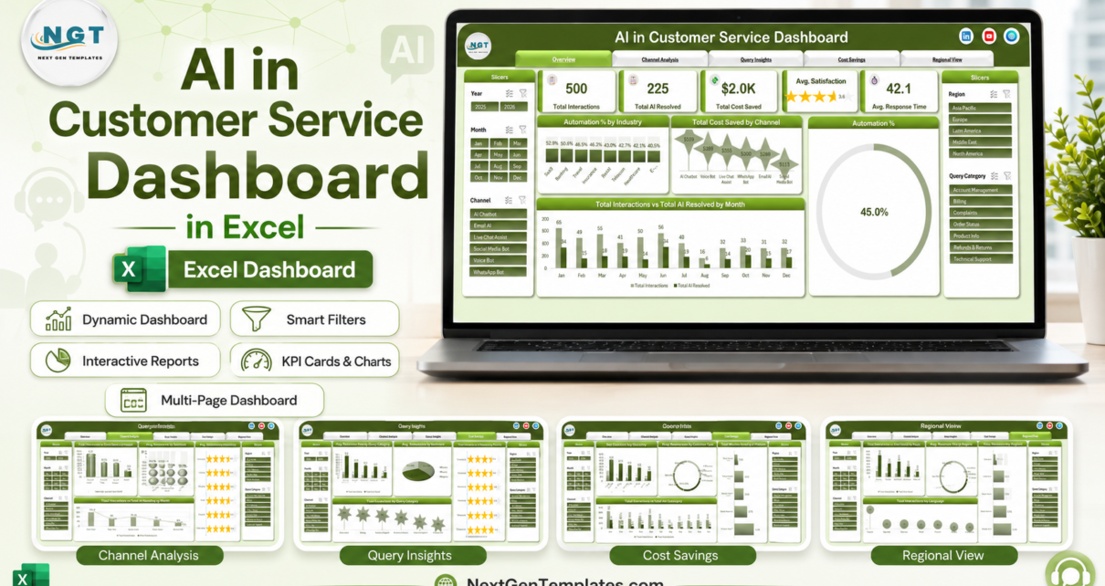
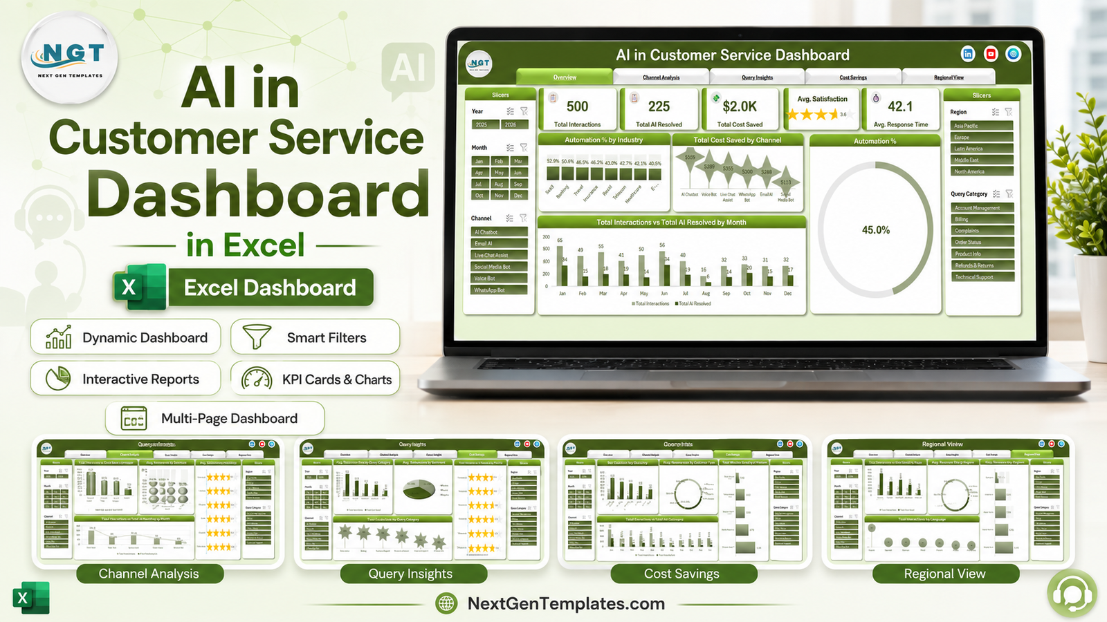
Any support team that has deployed a chatbot eventually faces the same board question, and vendor deflection numbers rarely answer it. They tend to count contacts the bot touched rather than contacts it closed, they treat a handover to a human as a success, and they almost never net the saving against what the AI itself costs to run. The AI in Customer Service Dashboard in Excel is built to answer the question properly: 5 dashboard pages, 20 charts, page-synced slicers on Year, Month, Channel, Region and Query Category, and a sample dataset of 500 interactions spanning 6 AI channels, 5 AI platforms, 8 industries, 7 languages and 5 regions.
This article walks through each page, explains why escalation rate matters more than automation rate on its own, compares the workbook with a Sheets build and a helpdesk analytics add-on, and is direct about what it cannot do. The template is available here.
Key Features of the AI in Customer Service Dashboard
- Automation rate, defined honestly. Total AI Resolved over Total Interactions, with both numbers on their own KPI cards so the rate cannot be inflated by counting touches.
- Escalations tracked separately by channel. Total Interactions vs Total Escalations puts handovers beside volume, which is the only way to spot a bot that closes tickets customers immediately reopen.
- Net cost saving. Total Cost Saved vs Total Handling Cost by Month runs both series across twelve months, so the figure you report survives contact with finance.
- Five AI platforms compared. Generative AI Assistant, Custom NLP Engine, Hybrid Agent Assist, Voice AI Engine and Rule-Based Bot on interactions, cost saved and minutes saved.
- Six channels compared. AI Chatbot, Voice Bot, WhatsApp Bot, Live Chat Assist, Email AI and Social Media Bot, each with automation rate, satisfaction, cost saved and escalations.
- Satisfaction beside automation. Star-rated satisfaction per channel plus Avg Satisfaction by Sentiment across positive, neutral and negative.
- Query category analysis. Resolution time and escalation counts across seven categories, so the query types the bot should never have been given become obvious.
- Priority breakdown. Interactions vs AI resolved across Critical, High, Medium and Low – the check that AI is taking volume rather than urgency.
- Regional and language view. Five regions and seven languages, which is where multilingual models usually show their weak spots.
Dashboard Pages Explanation
Page 1 – Overview
Five KPI cards: Total Interactions, Total AI Resolved, Total Cost Saved, Avg Satisfaction as a star rating, and Avg Response Time. Below them, Automation % by Industry, Total Cost Saved by Channel, an overall Automation % donut, and Total Interactions vs Total AI Resolved by Month. The monthly pairing is worth more than the annual rate: it shows whether automation is improving as the model is trained or drifting as query mix changes.
Page 2 – Channel Analysis
Total Interactions vs Cost Saved by AI Platform, Automation % by Channel, Avg Satisfaction by Channel, and Total Interactions vs Total Escalations by Channel. This is the page that decides where the next investment goes. In the sample data the AI Chatbot channel leads on volume and also leads on escalations by a distance – a pattern most support teams recognise, and one a single deflection number hides completely.
Page 3 – Query Insights
Avg Resolution Time by Query Category, Avg Satisfaction by Sentiment, Total Interactions vs AI Resolved by Priority, and Total Escalations by Query Category. Complaints and Technical Support take the longest to resolve and generate the most handovers, which is usually less about the model and more about the data it cannot reach.
Page 4 – Cost Savings
Net Cost Savings by Industry, Total Revenue Impact by Customer Type across new, returning, premium and enterprise, Total Minutes Saved by AI Platform, and Total Cost Saved vs Total Handling Cost by Month. Minutes saved is the operational measure; net cost is the financial one; the two rarely rank platforms in the same order.
Page 5 – Regional View
Total Interactions vs Cost Saved by Region, Avg Response Time by Region, Automation % by Region, and Total Interactions by Language. A model trained largely on English data usually shows a lower automation rate in the regions with the most non-English volume, and this page is where that becomes measurable rather than anecdotal.
Behind the pages
A data sheet holds one row per interaction and a support sheet carries the pivot tables the charts read. Replace the sample rows with your own export, keep the headers, and use Data then Refresh All – Microsoft’s guide to refreshing PivotTable data covers the mechanics if you have not done it before.
AI in Customer Service Dashboard vs. a Google Sheets Build vs. a Helpdesk Analytics Add-On – Feature Comparison
| This Excel dashboard | A Google Sheets build | Helpdesk / CX analytics add-on | |
|---|---|---|---|
| Cost | Under 20 once | Free, plus your build time | Often 200+ per month on top of the helpdesk |
| Platform | Microsoft Excel, desktop | Google Sheets, any browser | Vendor web app |
| Setup time | Under 30 minutes with your export | 2 to 4 days for five pages | Days, plus connector configuration |
| Real-time collaboration | Via OneDrive co-authoring | Yes, native sharing | Per paid seat |
| Mobile access | Limited | Yes, free Sheets app | Yes |
| Customizable metrics | Yes, every pivot and chart | Yes, if you build them | No, fixed report set |
| Several AI vendors in one view | Yes – reads a data sheet, not an API | Yes | Rarely |
| Nets AI cost against saving | Yes, per month | Build it yourself | Sometimes |
| Works offline | Yes | No | No |
| Year-1 cost for a support team | Under 20 | 0 plus several days | 2,400 and up |
Who Should Use This Template
It fits customer service and CX managers who have deployed AI and now have to report on it; support operations leads comparing chatbot, voice and messaging channels; finance business partners asked to verify a claimed automation saving; BPOs reporting AI performance to a client; and consultants building an AI-in-support business case from real numbers rather than vendor slides.
It is not a live console – this is a weekly or monthly reporting workbook. If your helpdesk already produces analytics you trust, a second view is work rather than insight. And below roughly a hundred interactions a month, no chart will show a reliable pattern.
Real-World Use Cases
A licence renewal decision. Interactions and cost saved by AI platform showed one generative assistant carrying the overwhelming majority of both, while a legacy rule-based bot handled a small volume at a poor rate. The renewal became a consolidation decision rather than a budget line repeated.
Locating an automation failure. A channel leading on volume also led on escalations. Cross-referencing escalations by query category pointed at Order Status and Billing – both requiring live system lookups the bot could not perform. The fix was an integration, not a better model.
A saving finance accepted. Gross cost saved looks impressive until someone asks what the AI costs to run. With handling cost charted beside the saving month by month, the CX lead presented a net figure and kept it.
Advantages of the AI in Customer Service Dashboard
- No macros. A plain .xlsx workbook, so no security prompt and nothing for corporate policy to block.
- Vendor-neutral. It reads an export, so multiple AI vendors can sit in one comparison and the workbook survives a change of platform.
- Escalation and satisfaction alongside automation. Three numbers that only mean something together, on the same pages.
- Net rather than gross saving. The pairing that makes the report defensible in a finance review.
- Works offline. Useful when the analysis has to happen somewhere the helpdesk console does not reach.
Opportunities for Improvement
Stated plainly: there is no live connection, so every refresh means an export and a paste. Containment quality is measured through escalations rather than through reopened-ticket tracking, which would need a ticket-level history the interaction data does not carry. There is no agent-level view, so this compares AI channels rather than AI against individual humans. And the workbook assumes your export can be mapped onto its column headers – a helpdesk with an unusual schema will need a mapping step first.
Best Practices
- Look at the sample data before replacing it. Each chart is easier to read once you have seen what it is meant to say.
- Keep the column headers exactly as they are. The pivots and charts are bound to them; renaming a column silently empties a page.
- Refresh All after every paste. A pivot that has not been refreshed will quietly show last month’s figures.
- Read escalations before automation. A high automation rate with high escalations is not a win, and the order you read the numbers in decides what you conclude.
- Report the net saving, never the gross. It is the difference between a number that survives a finance review and one that does not.
- Rerun monthly and keep the history. Automation drifts with query mix, and the trend matters more than any single month.
Explore Relevant Templates
- AI in Customer Service Dashboard in Excel – the template covered in this article.
- AI Chatbot Providers Dashboard in Excel – vendor-side comparison rather than your own operation.
- AI Chatbot Providers Dashboard in Power BI – the same questions with drillthrough.
- Sentiment Analysis Startups Dashboard in Power BI – a deeper look at sentiment data.
- SaaS Development Dashboard in Excel – the product side of the same business.
Frequently Asked Questions
Which version of Excel do I need?
Excel 2016 or later on Windows, or Microsoft 365. It uses ordinary pivot tables, charts and slicers.
Are there macros?
No. It is a plain .xlsx workbook – no macro warning, no security prompt.
Does it connect to my helpdesk or chatbot platform?
No. You export interactions and paste them onto the data sheet, which is what lets it work with any helpdesk, any AI vendor, and several at once.
How is automation rate calculated?
Total AI Resolved divided by Total Interactions – contacts closed by AI without a human. Escalations are tracked separately, so a handover is never counted as a resolution.
Can I add my own channels, platforms or query categories?
Yes. They are values in your data, not hard-coded lists. Paste your rows, refresh the pivots, and the charts and slicers pick up the new names.
Can I use it in Google Sheets?
Uploading converts the data but the slicer and chart formatting will not survive intact. It is built for Excel.
Can I rebrand the colours?
Yes – standard Excel chart formatting with a single accent colour, so a theme change is minutes rather than a rebuild.
About the Author
Built by PK – Microsoft Certified Professional with 15+ years of Excel, Google Sheets, and Power BI experience. Founder of NextGenTemplates, reaching 300K+ subscribers across YouTube channels. Every template is hand-built and tested before release.
Conclusion
Most AI-in-support reporting is a single deflection percentage supplied by the vendor being evaluated. The useful version needs three numbers together – what AI closed, what it escalated, and what it cost to run – plus enough segmentation to see which query types, regions and languages it handles badly. Five pages of pivots on your own export is a reasonable way to get there. Start with escalations by channel; that is usually where the surprise is.
Get the template here: AI in Customer Service Dashboard in Excel. For walkthroughs of this and other Excel dashboard builds, subscribe to youtube.com/@PKAnExcelExpert.