The Channel Development Teams Dashboard in Power BI is a five-page report built on 42 DAX measures and a 21-column partner engagement table. It ships with 500 demo rows covering January to December 2025, a hidden Details drillthrough page bound to ten fields, and two custom report-page tooltips sized 280×360. Every page carries five slicers and a row of KPI cards with month-on-month deltas and sparklines.
If you run a partner programme, the numbers you need already exist — they are just scattered across a CRM export, an MDF spreadsheet and a training log. This template is the reporting layer that sits on top of them. You paste your own engagement data into one table, repoint the source, and the whole report recalculates. It does not run your programme; it reports on it.
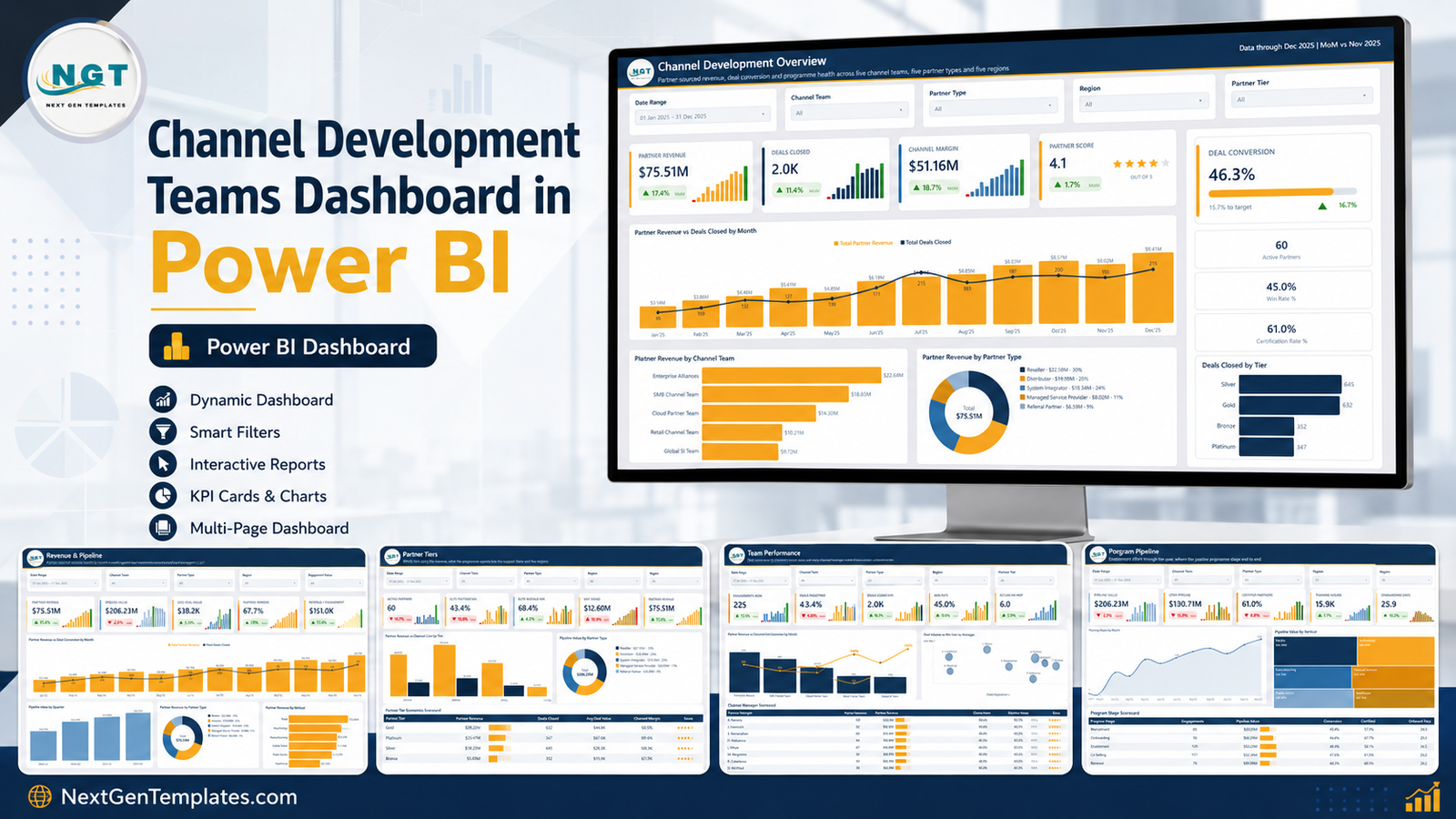
Key Features of the Channel Development Teams Dashboard in Power BI
- Five report pages — Channel Development Overview, Revenue & Pipeline, Partner Tiers, Team Performance and Program Pipeline, plus a sixth page linking to the wider template catalogue.
- 42 DAX measures drive every card, chart and scorecard, so nothing is hard-coded and nothing breaks when the underlying rows change.
- 24 KPI cards across the five pages, each carrying a value, a month-on-month arrow and a 12-month sparkline.
- Five slicers on every page — Date Range, Channel Team, Partner Type and Region everywhere, plus a page-specific fifth filter (Partner Tier, Engagement Status, Certification or Program Stage).
- A hidden Details drillthrough page bound to ten fields: Channel Team, Region, Partner Name, Partner Type, Partner Tier, Channel Manager, Program Stage, Industry Vertical, Engagement Status and Certification Status.
- Two custom tooltip pages — Category Detail and Trend Detail — that appear on hover instead of the default Power BI tooltip.
- Three scorecard tables with data bars and star ratings, ranking tiers, channel managers and programme stages.
- A built-in Date table with month, quarter and year-month keys, so monthly and quarterly visuals sort correctly out of the box.
Dashboard Pages Explanation
The report opens on the Overview page with a left-hand navigation rail. Here is what sits on each of the five pages.
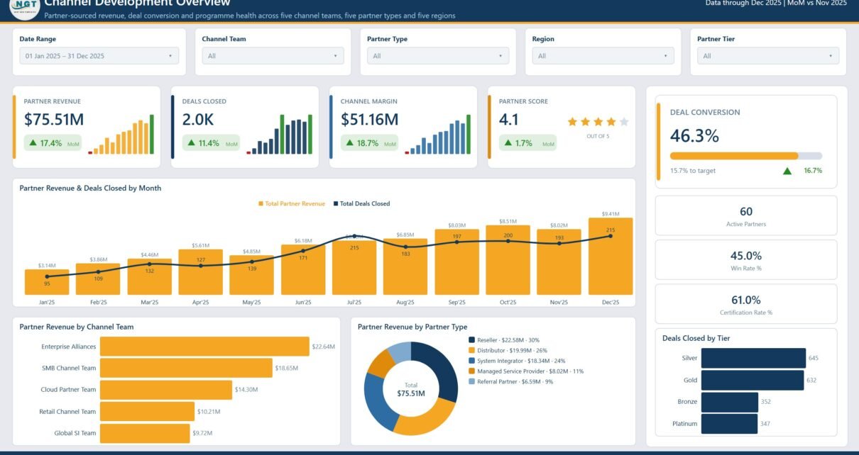
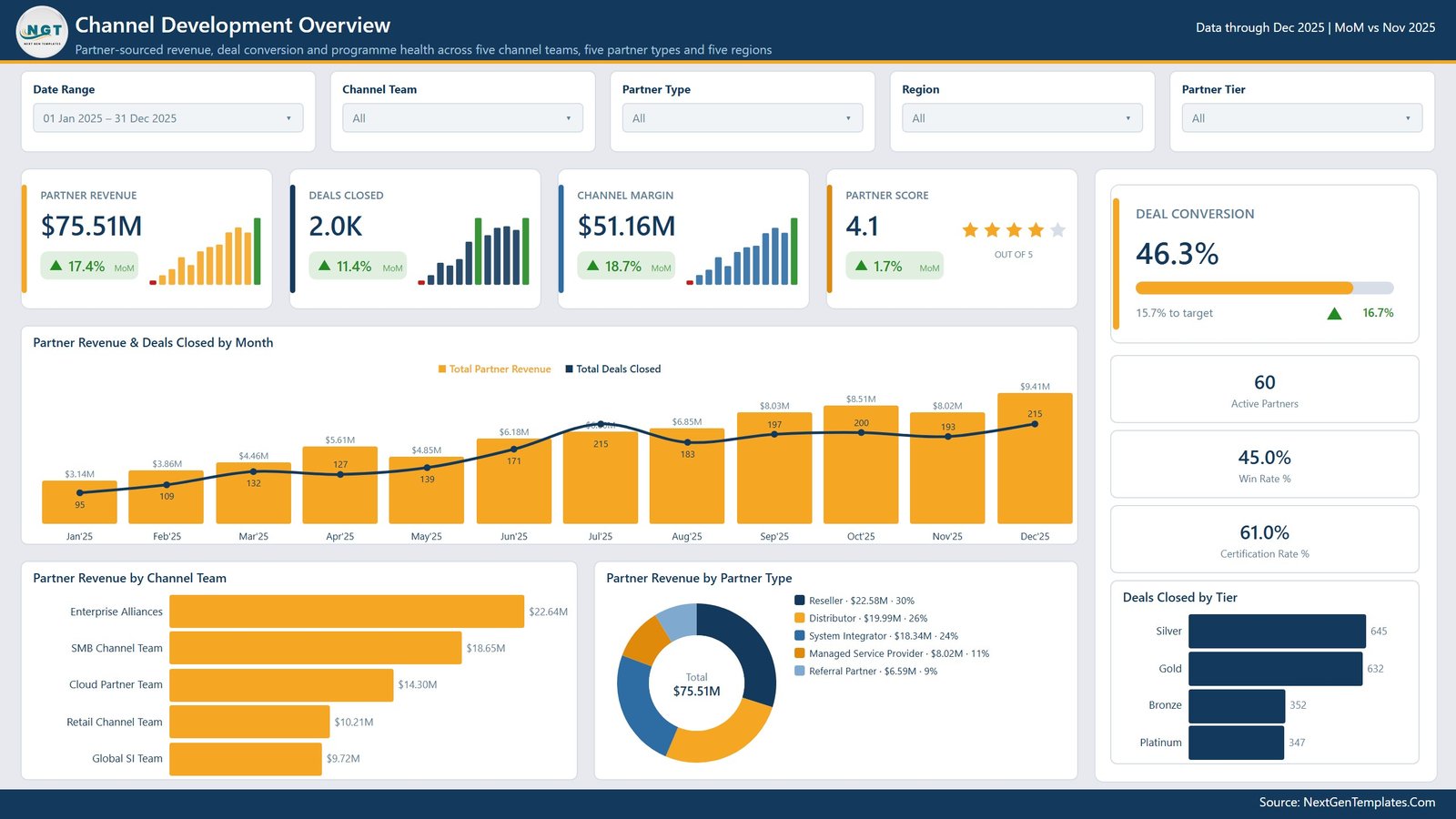
Page 1: Channel Development Overview
The one-screen summary of the programme. Four headline cards show Partner Revenue, Deals Closed, Channel Margin and Partner Score, each with a MoM delta; the right rail carries a Deal Conversion gauge with a distance-to-target reading, plus Active Partners, Win Rate % and Certification Rate %. Charts are Partner Revenue & Deals Closed by Month, Partner Revenue by Channel Team, Partner Revenue by Partner Type and Deals Closed by Tier.
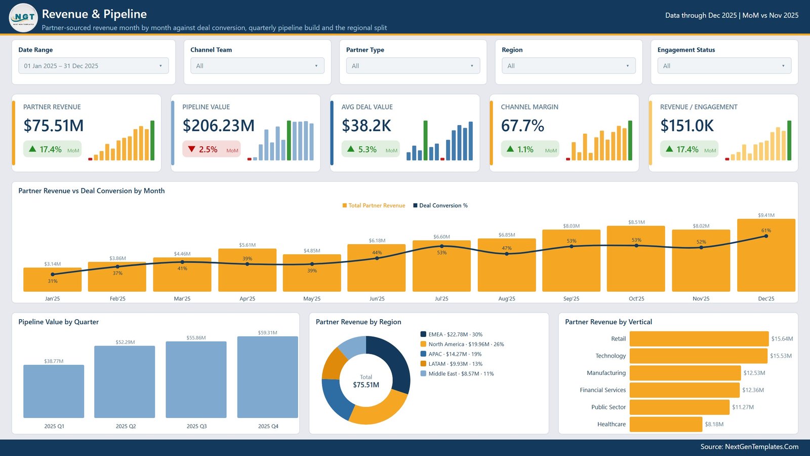
Page 2: Revenue & Pipeline
Booked revenue next to future revenue. Cards cover Partner Revenue, Pipeline Value, Avg Deal Value, Channel Margin and Revenue per Engagement. The visuals are Partner Revenue vs Deal Conversion by Month, Pipeline Value by Quarter, Partner Revenue by Region and Partner Revenue by Vertical — so you can see whether the pipeline is building in the same places the revenue is landing.
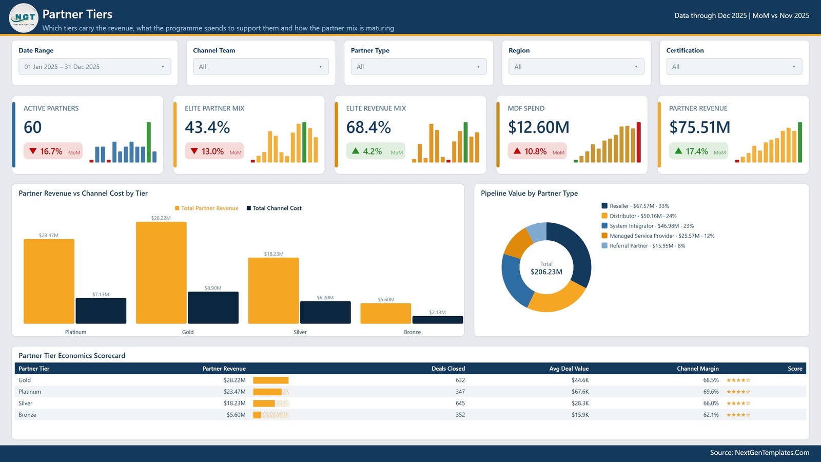
Page 3: Partner Tiers
Tier economics. Cards show Active Partners, Elite Partner Mix, Elite Revenue Mix, MDF Spend and Partner Revenue. Partner Revenue vs Channel Cost by Tier puts revenue and the cost of supporting it side by side for Platinum, Gold, Silver and Bronze, Pipeline Value by Partner Type breaks the pipeline down by reseller, distributor, system integrator, MSP and referral, and the Partner Tier Economics Scorecard lists revenue, deals closed, avg deal value, channel margin and score for every tier.
Page 4: Team Performance
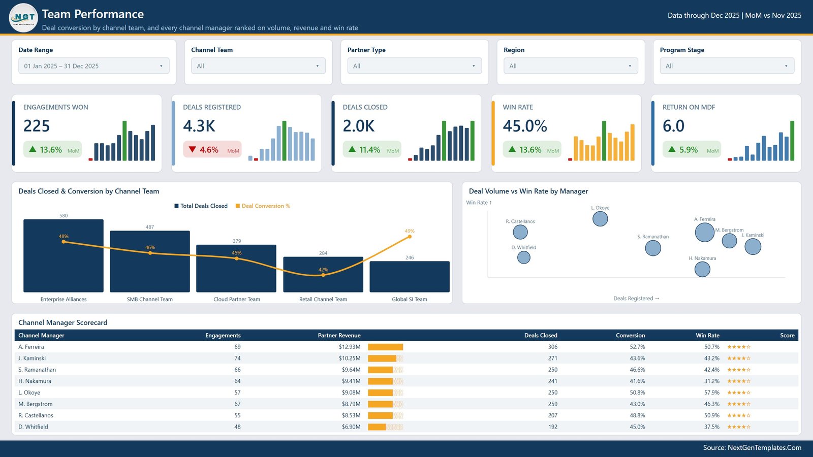
Teams and the people in them. Cards cover Engagements Won, Deals Registered, Deals Closed, Win Rate and Return on MDF. Deals Closed & Conversion by Channel Team pairs volume with conversion rate, Deal Volume vs Win Rate by Manager plots every channel manager on a scatter, and the Channel Manager Scorecard ranks each manager on engagements, partner revenue, deals closed, conversion and win rate with a star score.
Page 5: Program Pipeline
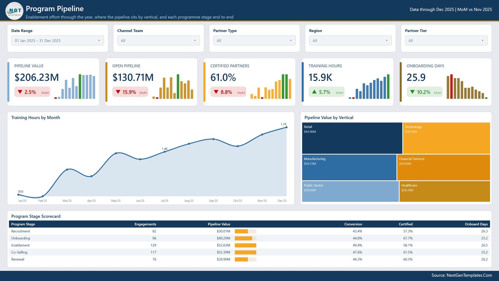
Enablement effort against pipeline. Cards show Pipeline Value, Open Pipeline, Certified Partners, Training Hours and Onboarding Days. Training Hours by Month traces enablement effort through the year, Pipeline Value by Vertical is a treemap across retail, technology, manufacturing, financial services, public sector and healthcare, and the Program Stage Scorecard runs Recruitment, Onboarding, Enablement, Co-Selling and Renewal end to end with engagements, pipeline value, conversion, certification and onboarding days per stage.
Channel Development Teams Dashboard vs. Tableau / Qlik vs. a Paid PRM Platform — Feature Comparison
| Feature | Channel Development Teams Dashboard in Power BI | Tableau / Qlik build | Impartner / ZINFI / Allbound PRM |
|---|---|---|---|
| Cost | $17.99 one-time | $75 / user / month (Tableau Creator) | $1,000-$4,000 / month platform fee |
| Platform | Power BI Desktop (free) | Tableau Desktop or Qlik Sense licence | Vendor-hosted SaaS |
| Setup time | Under 15 minutes — swap the data source | Days of build work | 4-12 week implementation |
| Report pages included | ✅ 5 built pages + drillthrough + 2 tooltips | ❌ You build them | ✅ Fixed vendor templates |
| Editable measures | ✅ All 42 DAX measures are yours to edit | ✅ Yes | ❌ Vendor-controlled |
| Real-time team collaboration | Via Power BI Service if you publish it | Via Tableau Server | ✅ Built in |
| Mobile access | ✅ Power BI mobile app | ✅ Yes | ✅ Yes |
| Your data stays in your own file | ✅ Yes — nothing is uploaded | Depends on server | ❌ Hosted by the vendor |
| Year-1 cost at 5 users | $17.99 total | ~$4,500 | $12,000+ |
For channel teams that want tier, manager and pipeline reporting without signing a PRM contract, the Channel Development Teams Dashboard in Power BI sits in the sweet spot.
Who Should Use This Template
Perfect for:
- Channel and alliances managers running roughly 20-300 partners who already export activity to Excel or CSV
- Partner-marketing and MDF owners who need spend and revenue by tier in one view
- Sales-operations analysts who rebuild a monthly channel pack by hand and would rather not
- Power BI learners who want a finished, readable .pbix with a clean measure structure to study
Not a fit if:
- You need a live PRM — deal registration, a partner portal and MDF approval workflow are not part of this file
- You expect a built-in connector to Salesforce, HubSpot or a PRM API — you point the report at your own exported table
- You require row-level security, SSO or a governed enterprise semantic model as delivered
- You work on a Mac — Power BI Desktop is Windows-only
Real-World Use Cases
Meera leads channel development at a 200-person software vendor. Each month she exports partner engagement data from the CRM, pastes it into the data file and opens the Partner Tiers page. Partner Revenue vs Channel Cost by Tier answers the question her CFO keeps asking — how much of the revenue the elite tiers actually carry against what the programme spends supporting them — on one screen instead of three slides she used to build by hand.
Tom runs partner marketing at a distributor. He filters the Program Pipeline page to a single region and reads Training Hours by Month next to the Program Stage Scorecard, so his budget conversation starts with enablement effort against pipeline rather than a spreadsheet nobody opens.
Priya is a sales-operations analyst. The Channel Manager Scorecard and the Deal Volume vs Win Rate by Manager scatter are her monthly review pack. When someone questions a number, she right-clicks the visual, drills through to the Details page and reads the underlying engagement rows in the meeting.
Advantages of the Channel Development Teams Dashboard in Power BI
The clearest advantage is time. A five-page channel pack rebuilt by hand each month is a day of work; here it is a paste, a refresh and a slicer change. The second is cost — one payment against a PRM platform’s four-figure monthly fee or a per-seat BI licence, with the caveat that this reports rather than operates.
The third is that the model is open. All 42 measures, the Date table, the custom theme and the page layouts are editable in Power BI Desktop. If your programme calls a tier something else, or you track a metric this file does not, you can add it rather than file a feature request. And because everything lives in a local .pbix, your partner and revenue data never leaves your own machine unless you choose to publish it.
Opportunities for Improvement
A few honest limitations worth knowing before you buy:
- No live connector. The report reads a single Excel table. Pointing it at a CRM, a data warehouse or a PRM API is work you do yourself in Power Query.
- One fact table. The model is a flat 21-column engagement table plus a Date table. That keeps it easy to understand but means partner-level attributes repeat on every row; a large programme may want a proper dimension model.
- Targets are not parameterised. The Deal Conversion gauge’s target sits inside a measure rather than in a settings table, so changing it means editing DAX.
- No row-level security. Every reader who opens the file sees every partner and manager. If regional managers should only see their own patch, you will need to add RLS roles.
- Windows only. Power BI Desktop does not run natively on macOS.
- The 500 sample rows are demo data. Partner names, revenue figures, manager names and scores are invented to exercise the visuals. They are not benchmarks and should not be read as typical channel performance.
Best Practices
- Keep the 21 column headers exactly as supplied. Rename one and the measures that reference it break.
- Load a full 12 months on the first refresh so the sparklines and the MoM deltas have something to compare against.
- Set the Date Range slicer to your reporting window before you screenshot anything — the cards read the slicer, not the whole table.
- Use the Details drillthrough before you challenge a number in a meeting. It takes three seconds and usually explains the anomaly.
- Agree what a tier and a programme stage mean across teams before rolling the report out; the visuals are only as consistent as the labels you feed them.
- If you publish to the Power BI Service, set up a scheduled refresh against a file in OneDrive or SharePoint rather than re-uploading the .pbix each month.
Explore Relevant Templates
Staying in Power BI, the Partner Alliances Dashboard in Power BI looks at alliance-level relationships, and the Channel Sales Dashboard in Power BI focuses on sell-through by product and territory. For spreadsheet-first teams, the Partner Alliances Dashboard in Excel, the Channel Sales KPI Dashboard in Google Sheets and the Dealer Network KPI Dashboard in Google Sheets cover similar ground. Marketing-side reporting is handled by the Product Marketing Dashboard in Excel.
Also available as: Channel Development Teams Dashboard in Excel — the same five pages built with pivot tables and slicers for teams that would rather stay in a workbook.
Browse the whole Power BI Dashboard templates catalogue for more.
Frequently Asked Questions
What does the Channel Development Teams Dashboard in Power BI track?
The Channel Development Teams Dashboard in Power BI tracks partner revenue, pipeline value, deals registered and closed, deal conversion, win rate, channel margin, channel cost, MDF spend, return on MDF, training hours, onboarding days, certification rate and partner score across channel teams, partner types, tiers, regions, verticals and programme stages.
Do I need a paid Power BI licence?
No. The Channel Development Teams Dashboard in Power BI opens in Power BI Desktop, which Microsoft provides free for Windows. A Power BI Pro licence is only needed if you want to publish the report to the Power BI Service and share it with colleagues online.
How long does setup take?
Under 15 minutes for most buyers. Replace the 500 demo rows in the supplied data file with your own export, keep the 21 column headers unchanged, repoint the source under Transform data and refresh. All five pages and 24 KPI cards then recalculate from the 42 DAX measures.
How does this compare to a PRM platform like Impartner or ZINFI?
A PRM platform operates your partner portal, deal registration and MDF workflow and costs four figures a month. The Channel Development Teams Dashboard in Power BI is a reporting layer over data you already hold — one payment, no seats, every measure editable. It reports on the programme; it does not run it.
Can I add my own measures, columns or pages?
Yes. Nothing is locked. All 42 DAX measures, the Date table, the theme and the page layouts open normally in Power BI Desktop, so you can add columns to the engagement table, write new measures, or duplicate a page and rebuild it for a metric your programme cares about.
Is the sample data real?
No. The 500 rows are generated demo data — partner names, revenue, manager names and scores are all invented, and exist only so every visual has something to render before you load your own numbers. They are not benchmarks.
Is there an Excel version?
Yes. The Channel Development Teams Dashboard in Excel covers the same five pages using pivot tables and slicers, for teams that prefer to stay inside a workbook.
About the Author
Built by PK — Microsoft Certified Professional with 15+ years of Excel, Google Sheets and Power BI experience. Founder of NextGenTemplates, reaching 300K+ subscribers across YouTube channels. Every template is hand-built and tested before release.
Conclusion
If your channel reporting currently lives in a monthly copy-paste ritual, the Channel Development Teams Dashboard in Power BI replaces it with a file you refresh. Five pages, 42 measures, 24 KPI cards, a drillthrough page and two tooltips — all editable, all running on your own data in your own .pbix.
👉 Click here to Purchase the Channel Development Teams Dashboard in Power BI
Instant download · One-time payment · No subscription
For step-by-step walkthroughs, visit Youtube.com/@PK-AnExcelExpert.
Last updated: August 2026