Managing clinic projects without proper performance tracking often leads to missed deadlines, cost overruns, and weak accountability. However, modern clinics handle multiple projects at the same time, such as infrastructure upgrades, IT implementations, equipment installations, accreditation initiatives, and expansion programs. Therefore, clinics must rely on structured performance tracking instead of manual reports or scattered Excel files.
That is exactly why a Clinic Project KPI Dashboard in Power BI plays a critical role. This dashboard converts raw project data into meaningful KPIs, clear visual indicators, and actionable insights. As a result, clinic leaders gain real-time visibility into project progress and can take timely decisions with confidence.
In this detailed article, you will learn what a Clinic Project KPI Dashboard in Power BI is, how it works, its page structure, KPI logic, Excel data design, advantages, best practices, and frequently asked questions.
Click to buy Clinic Project KPI Dashboard in Power BI
What Is a Clinic Project KPI Dashboard in Power BI?
A Clinic Project KPI Dashboard in Power BI is a ready-to-use analytical reporting solution designed to track, analyze, and evaluate key performance indicators related to clinic projects.
Instead of managing project metrics across multiple spreadsheets, this dashboard centralizes all KPIs into a single interactive Power BI report. Therefore, project managers and clinic administrators can monitor targets, actuals, trends, and year-over-year performance from one place.
Because the dashboard uses Excel as the data source, clinics can implement it quickly without complex system integrations. At the same time, Power BI ensures strong visualization, filtering, and interactive analysis.
Why Do Clinics Need a Project KPI Dashboard?
Clinics manage projects that involve budgets, timelines, vendors, internal teams, and compliance requirements. However, without structured KPI tracking, project risks remain hidden until it becomes too late.
A Clinic Project KPI Dashboard helps because it:
- Provides real-time project performance visibility
- Tracks targets versus actuals clearly
- Identifies delays and risks early
- Improves accountability across teams
- Supports data-driven project decisions
As a result, clinics reduce manual reporting efforts and improve overall project governance.
How Does a Clinic Project KPI Dashboard in Power BI Work?
The dashboard works by combining structured Excel data with Power BI visuals and calculations.
First, users enter actual and target project data into predefined Excel sheets. Next, Power BI automatically calculates KPIs, percentages, indicators, and trends. Therefore, decision-makers always see updated project performance without manual recalculation.
Because the dashboard uses both Month-to-Date (MTD) and Year-to-Date (YTD) logic, it supports short-term tracking and long-term analysis at the same time.
What Are the Main Pages in the Clinic Project KPI Dashboard?
The dashboard consists of three structured pages that work together seamlessly.
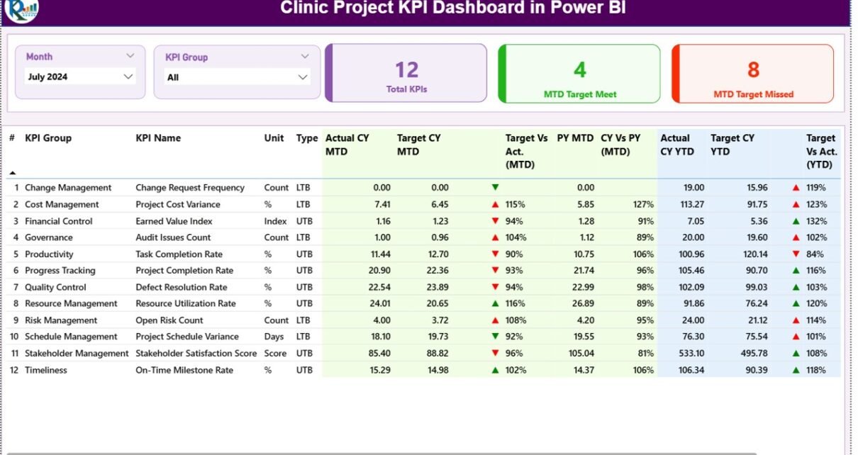
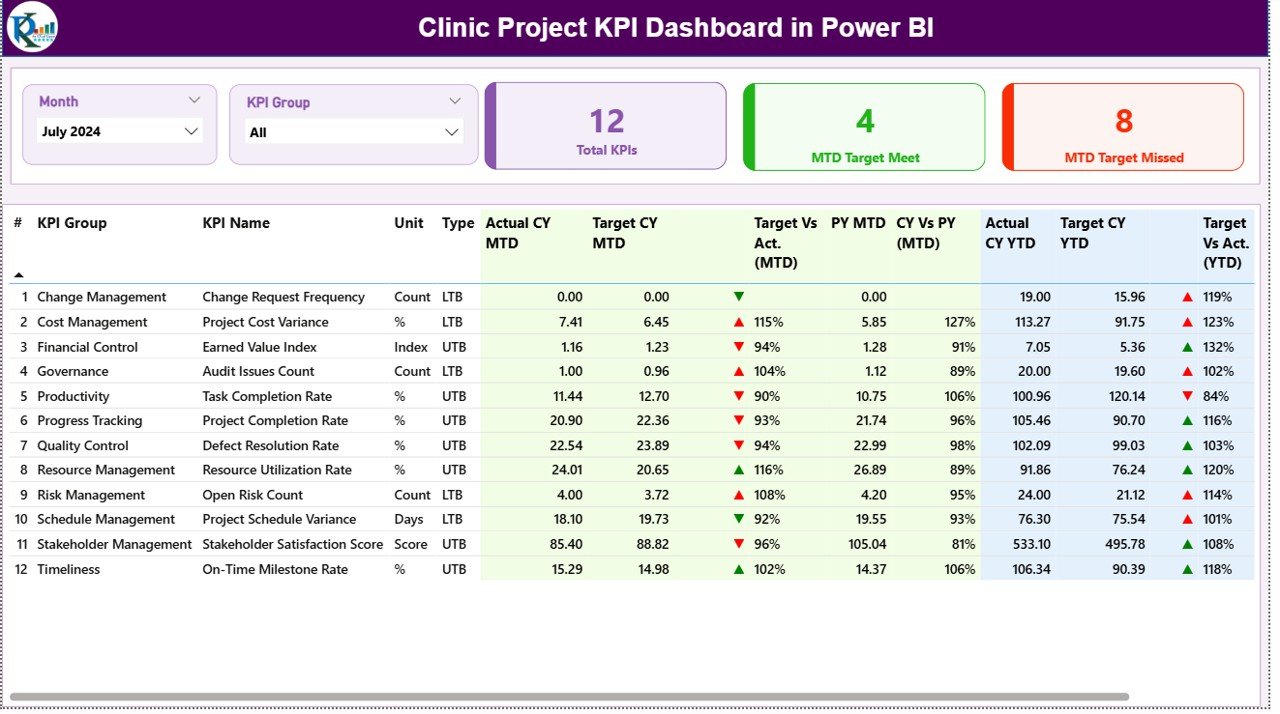
What Is Displayed on the Summary Page?
The Summary Page is the main page of the dashboard. It provides a complete snapshot of all clinic project KPIs.
Key Elements of the Summary Page
Top Slicers
- Month slicer
- KPI Group slicer
Top KPI Cards
- Total KPIs Count
- MTD Target Met Count
- MTD Target Missed Count
These cards provide instant clarity on overall project performance.
Detailed KPI Table
The detailed table includes the following fields:
- KPI Number – Unique sequence number
- KPI Group – Project category
- KPI Name – Name of the KPI
- Unit – Unit of measurement
- Type – LTB (Lower the Better) or UTB (Upper the Better)
MTD Performance Metrics
- Actual CY MTD
- Target CY MTD
- MTD Status Icon (▲ / ▼ with green or red color)
- Target vs Actual (MTD %)
- PY MTD
- CY vs PY (MTD %)
YTD Performance Metrics
- Actual CY YTD
- Target CY YTD
- YTD Status Icon
- Target vs Actual (YTD %)
- PY YTD
- CY vs PY (YTD %)
Because of this layout, users can quickly identify strong and weak project KPIs.
Click to buy Clinic Project KPI Dashboard in Power BI
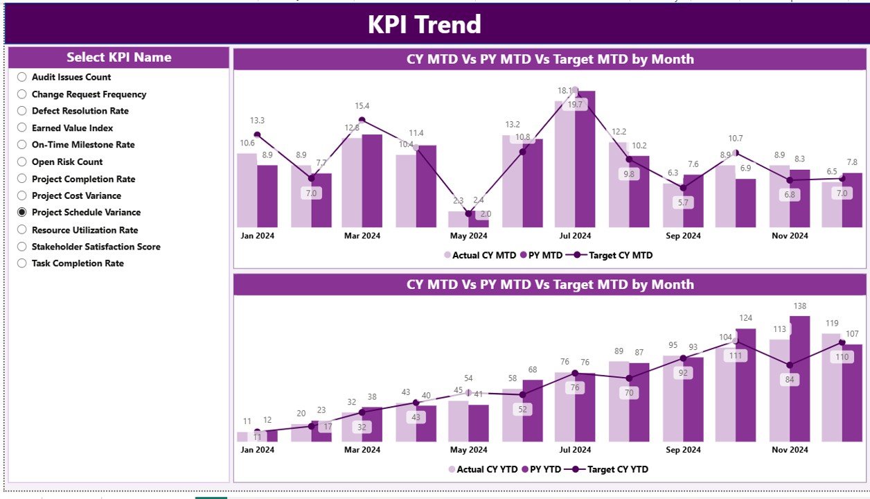
What Does the KPI Trend Page Show?
The KPI Trend Page focuses on historical performance analysis.
Key Features
- Two combo charts for MTD and YTD trends
- Displays:
Current Year Actual
Previous Year Actual
Target values
KPI Name slicer for focused analysis
This page helps users understand how each KPI performs over time and supports root cause analysis.
Click to buy Clinic Project KPI Dashboard in Power BI
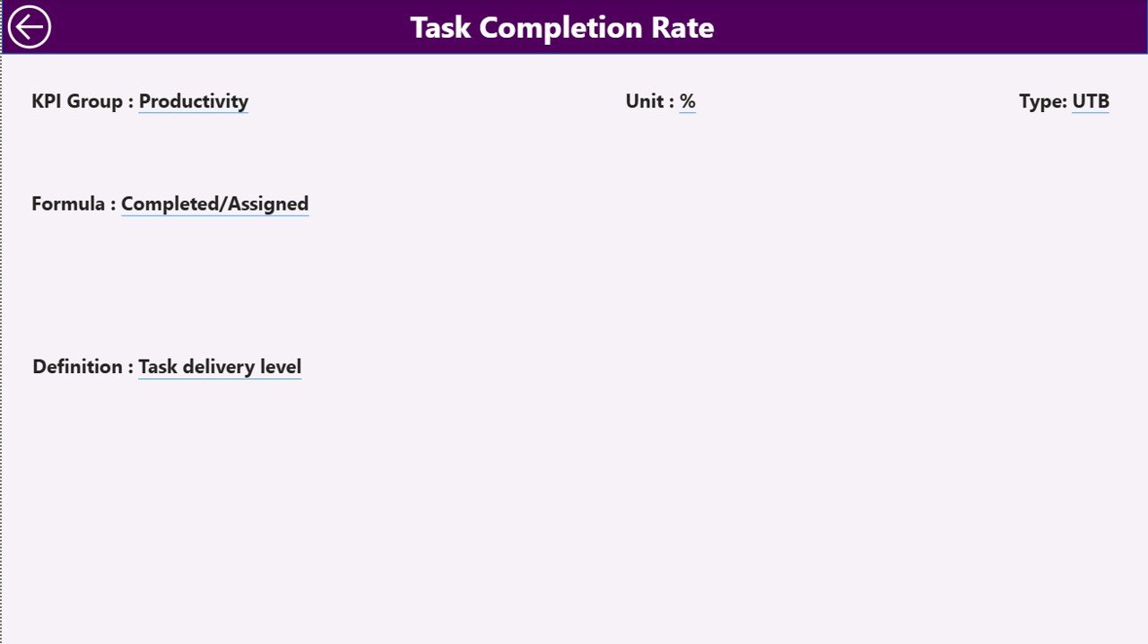
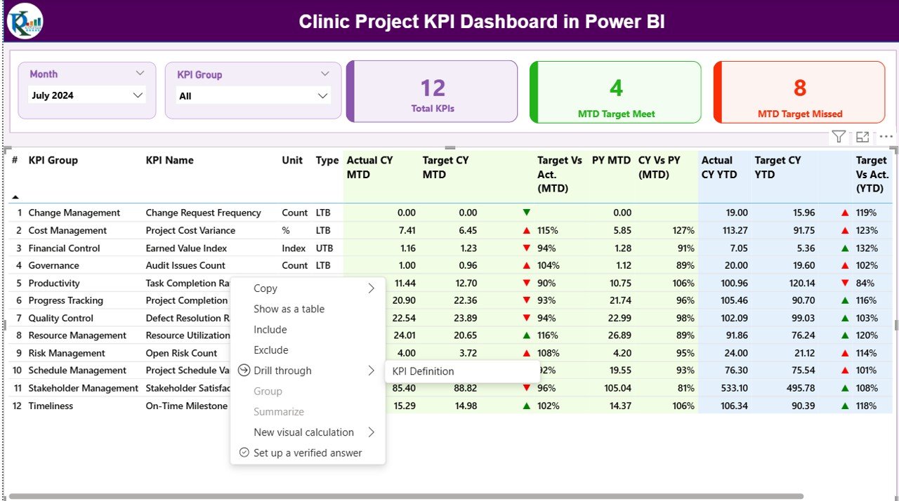
What Is the Purpose of the KPI Definition Page?
The KPI Definition Page acts as a reference and governance page.
Key Characteristics
- Hidden drill-through page
- Accessible from the Summary Page
- Displays KPI Formula, Definition, Unit, and Type
This page ensures consistent KPI understanding across teams and improves transparency during reviews.
Click to buy Clinic Project KPI Dashboard in Power BI
How Is Excel Data Structured for the Dashboard?
The dashboard uses an Excel file with three mandatory worksheets.
What Is Included in the Input_Actual Sheet?
This sheet stores actual project performance values.
Users must enter:
- KPI Name
- Month (first date of the month)
- MTD Actual Value
- YTD Actual Value
What Is Included in the Input_Target Sheet?
This sheet stores target project values.
Users must enter:
- KPI Name
- Month (first date of the month)
- MTD Target Value
- YTD Target Value
Click to buy Clinic Project KPI Dashboard in Power BI
What Is Included in the KPI Definition Sheet?
This sheet defines KPI metadata.
Users must enter:
- KPI Number
- KPI Group
- KPI Name
- Unit
- Formula
- Definition
- Type (LTB or UTB)
This structure ensures clean data modeling and accurate calculations.
How Are KPIs Calculated in the Dashboard?
The dashboard uses simple and effective formulas:
- Target vs Actual (%) = Actual / Target
- CY vs PY (%) = Current Year / Previous Year
These calculations apply to both MTD and YTD values.
Advantages of the Clinic Project KPI Dashboard in Power BI
Using this dashboard offers several advantages:
- Centralized project performance monitoring
- Real-time MTD and YTD insights
- Clear target vs actual comparison
- Year-over-year performance visibility
- Visual status indicators for quick decisions
- Reduced manual reporting effort
- Easy Excel-based data maintenance
- Improved transparency and accountability
Who Should Use a Clinic Project KPI Dashboard?
This dashboard supports:
- Clinic Administrators
- Project Managers
- Operations Teams
- Finance and Planning Teams
- Senior Management
- Quality and Compliance Teams
Best Practices for the Clinic Project KPI Dashboard in Power BI
To achieve maximum value, clinics should follow these best practices:
- Define KPIs clearly before implementation
- Maintain consistent KPI definitions
- Update Excel data regularly
- Validate actual and target values monthly
- Use KPI groups for structured analysis
- Review MTD and YTD trends together
- Train stakeholders on KPI interpretation
- Use the KPI Definition page during reviews
How Does This Dashboard Improve Clinic Project Governance?
The dashboard improves governance by:
- Aligning teams with defined targets
- Highlighting performance deviations early
- Supporting data-driven review meetings
- Standardizing project KPI reporting
As a result, clinics manage projects proactively instead of reactively.
Conclusion
A Clinic Project KPI Dashboard in Power BI serves as a powerful project performance management tool for clinics. It transforms raw project data into actionable insights, strengthens accountability, and supports better decision-making.
By combining Excel-based data entry with Power BI visualization, clinics gain flexibility, clarity, and control over project execution. For clinics managing multiple projects, this dashboard becomes an essential solution for achieving consistent and successful outcomes.
Frequently Asked Questions (FAQs)
What is a Clinic Project KPI Dashboard in Power BI?
It is an interactive Power BI report that tracks clinic project KPIs using Excel-based data.
Can clinics customize KPIs in this dashboard?
Yes, KPIs can be easily customized by updating the Excel sheets.
Does the dashboard support MTD and YTD tracking?
Yes, it supports both Month-to-Date and Year-to-Date analysis.
Is Excel mandatory as a data source?
Yes, the dashboard uses Excel for data input and management.
Who can use this dashboard in a clinic?
Clinic administrators, project managers, operations teams, and leadership can use it.
Does the dashboard support trend analysis?
Yes, the KPI Trend page provides historical performance analysis.
Is the dashboard suitable for non-technical users?
Yes, it is user-friendly and does not require advanced Power BI skills.
Watch the step-by-step video tutorial:
Visit our YouTube channel to learn step-by-step video tutorials
Click to buy Clinic Project KPI Dashboard in Power BI