Colleges and universities handle large volumes of academic, financial, and administrative data every day. Student performance, department-wise trends, faculty ratings, tuition revenue, placements, and monthly academic cycles create constant streams of information. Because of this, educational institutions need a smart and simple way to track everything in real time.
A Colleges & Universities Dashboard in Power BI gives decision-makers a powerful solution. It brings all important metrics into one interactive, easy-to-use reporting system. As a result, administrators, faculty leaders, and management teams make informed decisions with complete confidence.
Click to Purchases Colleges & Universities Dashboard in Power BI
In this detailed guide, you will learn what this dashboard does, how it works, and why every modern educational institution must use it. You will also explore each dashboard page, practical advantages, best practices, and answers to common questions.
What Is a Colleges & Universities Dashboard in Power BI?
A Colleges & Universities Dashboard in Power BI is a visual reporting tool that tracks academic performance, financial data, department operations, student satisfaction, faculty rating, and monthly trends. It converts raw data into interactive charts, KPIs, and insights that users explore with slicers, filters, and drill-downs.
Power BI makes the entire dashboard dynamic. Users switch between academic programs, college types, faculty designations, departments, and monthly timelines without any technical skills. Because of its interactive nature, Power BI becomes the ideal tool for educational analytics.
Why Do Colleges and Universities Need Power BI Dashboards?
Educational institutions deal with multiple challenges:
-
Large student populations
-
Increasing academic programs
-
Varying tuition fees
-
Student feedback
-
Faculty workload
-
Department performance
-
Financial forecasting
-
Placement tracking
Traditional Excel sheets or manual reports cannot handle this complexity efficiently. However, Power BI handles it easily because Power BI pulls data from multiple sources, transforms it quickly, and shows insights in real time.
As a result, leaders save time, improve accuracy, and create strong data-driven strategies for growth.
How Does the Colleges & Universities Dashboard in Power BI Work?
The dashboard contains five structured pages. Each page focuses on a specific requirement of educational analytics. Users also get slicers so they filter the data by various categories such as program, college type, department, student level, or designation.
Below is a breakdown of each page with an explanation.
1. Overview Page – What Insights Does It Provide?
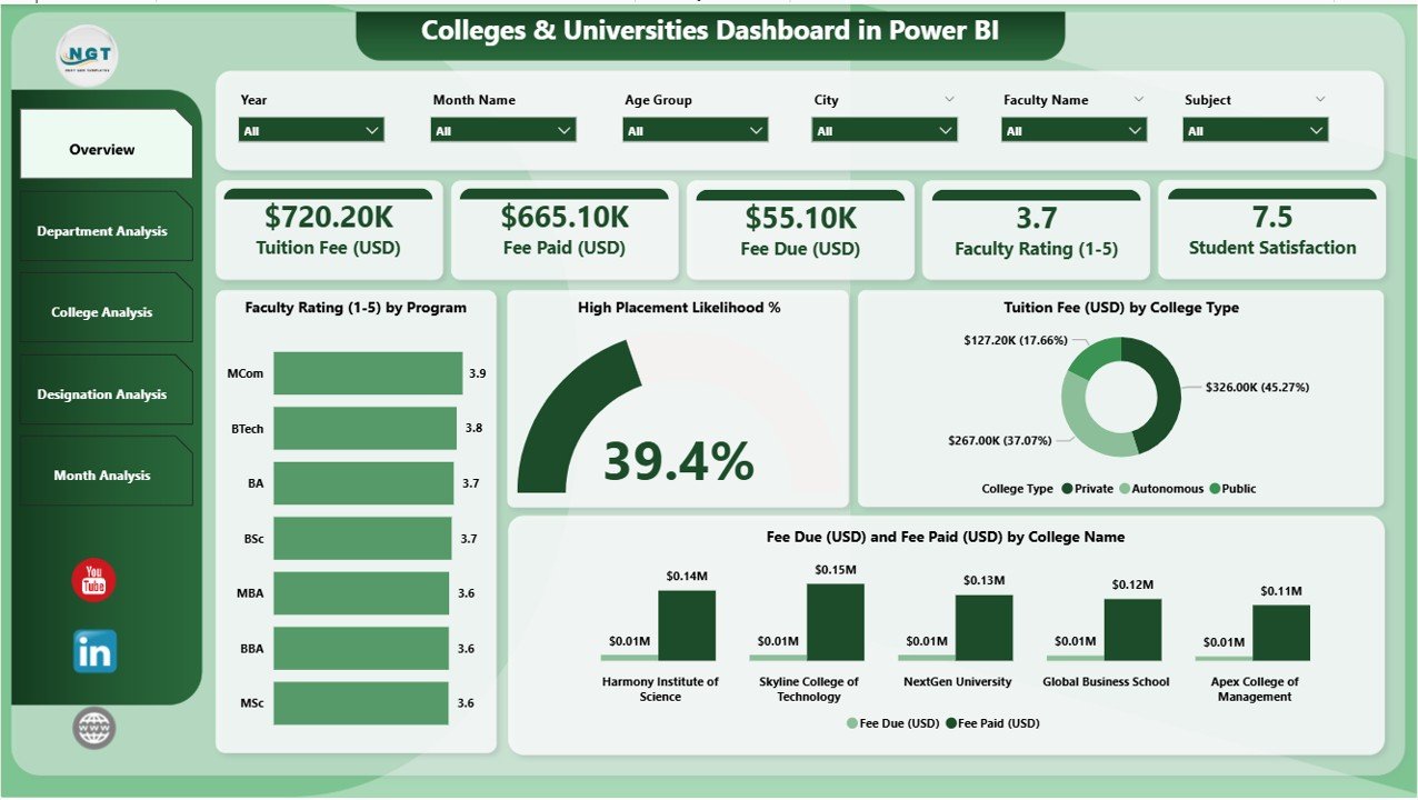
The Overview Page acts as the central dashboard. Users see the most important KPIs and charts in one place. The page includes slicers to filter data based on academic preferences.
Key Components of the Overview Page
✔ Four KPI Cards:
These cards display top-level metrics. Examples include student satisfaction scores, average faculty rating, placement likelihood, or financial collection status.
✔ Faculty Rating by Program:
This chart highlights how different programs or courses perform in terms of faculty effectiveness. Institutions detect areas that need improvement or additional training.
✔ High Placement Likelihood %:
This visual shows which programs deliver strong placement performance. Colleges use this insight to improve training and industry partnerships.
✔ Tuition Fee (USD) by College Type:
The department or college type influences fee structure. This chart compares revenues across government, private, autonomous, or community colleges.
✔ Fee Due and Fee Paid (USD) by College Name:
This helps finance teams track revenue flow and manage outstanding dues.
The overview page works as a quick performance summary for administrators. Because the page offers instant clarity, leaders understand the institution’s overall health in seconds.
2. Department Analysis – What Trends Can You Track?
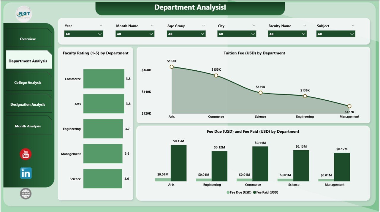
The Department Analysis Page focuses on department-level performance. Every department plays a unique role in academic outcomes, and this page reveals those insights clearly.
Key Visuals on the Department Analysis Page
✔ Faculty Rating by Department:
This chart compares faculty performance across departments like Engineering, Arts, Science, Business, or Medical Studies. It highlights strong teams and departments that need development.
✔ Tuition Fee (USD) by Department:
This visual shows revenue generation by department. Higher enrollment departments create larger fee contributions, and this chart makes it easy to understand the distribution.
✔ Fee Due (USD) and Fee Paid (USD) by Department:
Finance teams use this insight to track outstanding payments department-wise and ensure smooth operations.
Since this page uses interactive slicers, users filter the data by academic year, program, or degree type.
3. College Analysis – How Does Each College Perform?
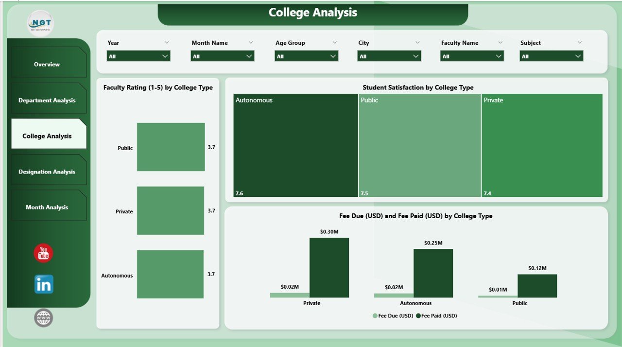
Large institutions often operate multiple colleges or academic branches. The College Analysis Page helps compare their performance side-by-side.
Key Charts in the College Analysis Page
✔ Faculty Rating by College Type:
Different college types maintain different teaching standards. Users see which type produces stronger teaching outcomes.
✔ Student Satisfaction by College Type:
Student satisfaction rating becomes a key indicator of institutional quality. This chart highlights the learning experience across college types.
✔ Fee Due and Fee Paid (USD) by College Type:
This helps identify revenue gaps at the college-type level and connects financial decisions with academic strategy.
Because of these visuals, the administration creates fair comparisons between multiple academic units.
Click to Purchases Colleges & Universities Dashboard in Power BI
4. Designation Analysis – Why Is It Important?
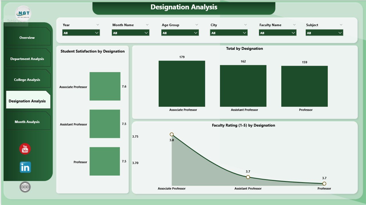
Faculty and administrative designations impact student success and institutional quality. The Designation Analysis Page focuses on this dimension.
Charts Included on the Designation Analysis Page
✔ Student Satisfaction by Designation:
Students often rate professors, associate professors, assistant lecturers, visiting faculty, and academic advisors differently. This insight helps HR and academic committees improve training.
✔ Total Count by Designation:
This visual shows the total number of faculty or staff members under each designation category.
✔ Faculty Rating by Designation:
This helps measure teaching performance based on job role.
With this information, institutions plan promotions, training investments, recruitment, and workload distribution effectively.
5. Monthly Trends – What Patterns Does It Reveal?
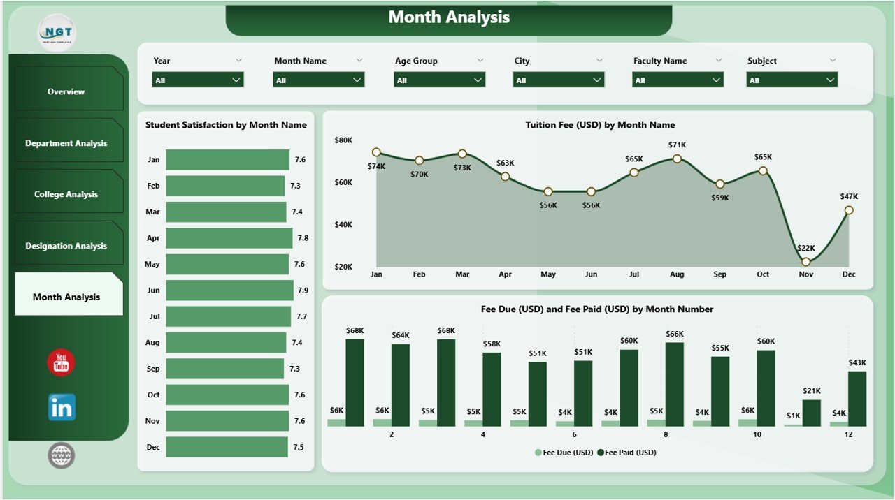
Educational data changes every month. The Monthly Trends Page captures these dynamic patterns so leaders understand performance over time.
Key Monthly Trend Charts
✔ Student Satisfaction by Month:
Administrators identify how feedback changes during semesters, exams, holidays, or admission periods.
✔ Tuition Fee (USD) by Month:
This visual highlights seasonal revenue patterns like admissions, fee cycles, or mid-term payments.
✔ Fee Due and Fee Paid (USD) by Month:
This helps monitor cash flow and financial planning month-to-month.
The Monthly Trends page allows leaders to make proactive decisions, especially during peak academic seasons.
Advantages of a Colleges & Universities Dashboard in Power BI
Institutions get multiple benefits when they implement this dashboard. Below are the most important advantages with explanations.
1. Centralized Academic Insights
All academic, departmental, and financial data stays in one place, so decision-making becomes faster.
2. Real-Time Reporting
Power BI updates insights instantly, which means users always see the latest information.
3. Improved Faculty Management
The dashboard highlights faculty performance clearly, so leaders offer the right training and recognition.
4. Strong Student Satisfaction Tracking
Institutions monitor satisfaction scores and fix issues before they grow.
5. Transparent Financial Monitoring
Fee collection, pending dues, and revenue trends become easy to track.
6. Better Department and College Comparisons
Users compare departments or colleges in one click and identify performance gaps.
7. Enhanced Placement Forecasting
Placement likelihood metrics guide training programs and improve student outcomes.
8. Smooth Monthly Planning
Monthly trend analysis helps institutions plan operations more effectively.
9. Faster Decision-Making
Visual insights reduce analysis time and support confident decisions.
10. Higher Institutional Efficiency
The dashboard helps academic and financial teams operate smoothly without manual reporting.
Best Practices for Using a Colleges & Universities Dashboard in Power BI
To use the dashboard efficiently, institutions follow certain best practices. Below are the recommended guidelines.
1. Keep the Data Updated Daily
Data freshness guarantees accurate decision-making.
2. Use Consistent Data Formats
Date, fee, department names, program codes, and faculty categories must follow uniform formats.
3. Create Clear Naming Conventions
Simple naming helps users understand visuals easily.
4. Train Key Users Regularly
Power BI is easy, but training improves adoption and confidence.
5. Use Slicers to Explore Deeper Insights
Slicers help compare performance across categories.
6. Track Student Satisfaction Closely
This metric influences ranking, quality, and admissions.
7. Review Monthly Trends at the Start of Each Month
This ensures timely corrections and improvements.
8. Use Drill-Downs for Detailed Reporting
Drill-downs help educators move from high-level to detailed academic insights.
9. Connect Multiple Data Sources
Power BI becomes more powerful when it pulls data from admissions, finance, HR, and academic systems.
10. Share Reports with Stakeholders Securely
Power BI allows secure sharing, so teams collaborate better.
Conclusion
A Colleges & Universities Dashboard in Power BI helps educational leaders work smarter and make decisions with clarity. It simplifies academic analysis, improves faculty management, strengthens student satisfaction, and boosts financial transparency. Because the dashboard covers all major areas—departments, colleges, designations, and monthly patterns—institutions get a full view of their performance instantly.
As education becomes more competitive and data-driven, a Power BI dashboard becomes essential. It improves decision-making, reduces manual effort, and supports continuous growth.
Frequently Asked Questions (FAQs)
1. What is a Colleges & Universities Dashboard in Power BI?
It is a visual reporting tool that shows academic, financial, and operational insights in one place through interactive charts and KPIs.
2. Who can use this dashboard?
Administrators, faculty teams, financial officers, academic planners, placement coordinators, and department heads use it regularly.
3. Can we customize the dashboard?
Yes, institutions modify pages, add new KPIs, connect more data sources, or redesign charts based on their needs.
4. Do we need technical skills to use the dashboard?
No, users explore the dashboard with simple slicers, filters, and buttons.
5. What data sources can Power BI connect to?
It connects to Excel, databases, cloud systems, admission portals, HRMS, CRM tools, and department-wise data sheets.
6. How often should we update the dashboard?
Daily updates give the most accurate insights, especially during peak academic seasons.
7. Can this dashboard improve student satisfaction?
Yes, it highlights satisfaction patterns so universities take timely action.
8. Does the dashboard help with financial planning?
Yes, it tracks tuition fee payments, outstanding dues, and monthly revenue cycles.
9. Can users export reports?
Yes, Power BI allows export to PDF, Excel, images, or PowerPoint.
10. Why is Power BI ideal for educational institutions?
Power BI offers quick reporting, simple interface, real-time insights, and full customization, making it perfect for academic analytics.
Visit our YouTube channel to learn step-by-step video tutorials