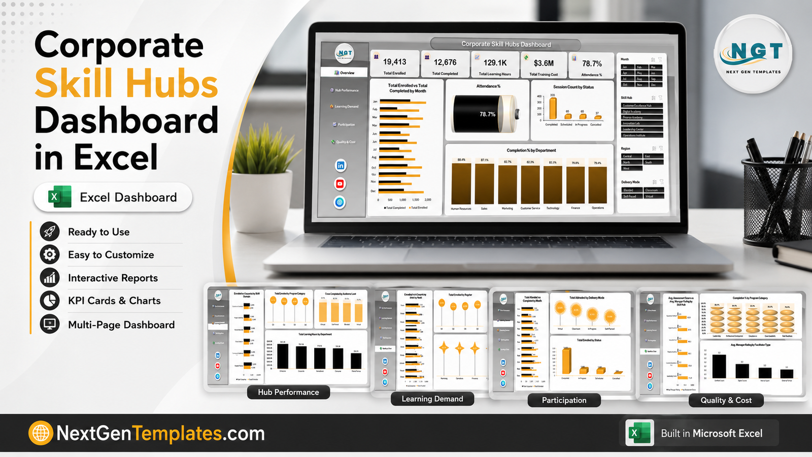
Most corporate learning teams are not short of data. They are short of a view. The LMS exports a session log, someone pivots it in a hurry, and the leadership pack ends up with a completion percentage and no explanation for it. The Corporate Skill Hubs Dashboard in Excel is built to close that last mile: one workbook, five linked pages, 19 pivot-driven charts and four slicers that filter all of them at once.
The sample build ships populated so you can judge it before you touch it. It tracks 19,413 enrollments, 12,676 completions, 129.1K learning hours, $3.6M of training cost and a 78.7% attendance rate across six skill hubs, seven departments, five regions, five business units and four delivery modes – 500 session records across 21 source columns. Replace those rows with your own export and every chart redraws.
One thing to settle up front: this is the analytical dashboard, not a KPI scorecard. There is a separate Corporate Skill Hubs KPI Dashboard in Excel that uses a month picker and traffic lights against targets. Same subject, completely different template. This one is for exploring, that one is for reporting against a target.
Key Features of the Corporate Skill Hubs Dashboard in Excel
- Five dashboard pages – Overview, Hub Performance, Learning Demand, Participation and Quality & Cost – plus a Data sheet and a Support sheet.
- 19 pivot charts sharing a single pivot cache, so nothing drifts out of sync.
- Four slicers – Month, Skill Hub, Region and Delivery Mode – connected to every page. Filtering on the Overview page reshapes Quality & Cost too.
- Five KPI cards across the top of the Overview page, each driven by the same filtered dataset.
- 21 source columns, from Skill Hub and Business Unit down to Assessment Score, Training Cost and Manager Rating.
- A left-hand nav rail on every page, so moving between the five views is a click rather than a tab hunt.
- Plain .xlsx, no macros – it opens on locked-down corporate machines and survives email filters that reject .xlsm.
Dashboard Pages Explanation
Page 1 – Overview
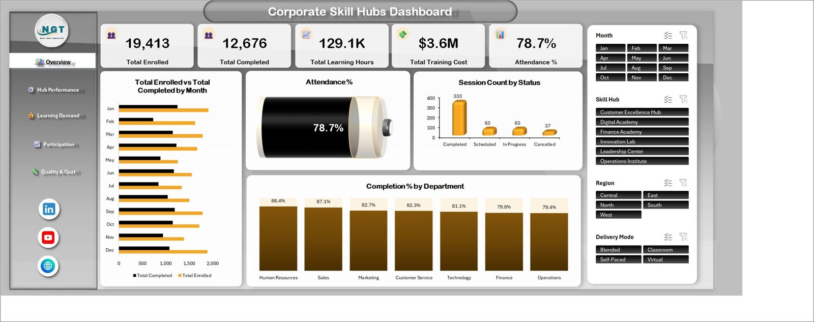
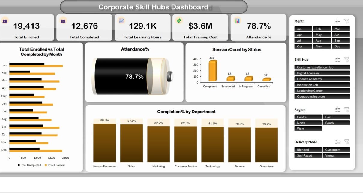
The one-screen summary. Five cards carry Total Enrolled (19,413), Total Completed (12,676), Total Learning Hours (129.1K), Total Training Cost ($3.6M) and Attendance % (78.7%). Below them, Total Enrolled vs Total Completed by Month runs Jan to Dec as paired bars, an Attendance % dial repeats the headline figure as a filled gauge, Session Count by Status breaks the year into 333 Completed, 65 Scheduled, 65 In Progress and 37 Cancelled sessions, and Completion % by Department ranks seven departments from Human Resources at 88.4% down to Operations at 79.4%.
The gap between those two departmental figures is nine points. That is the sort of thing a single completion percentage in a board pack hides completely.
Page 2 – Hub Performance
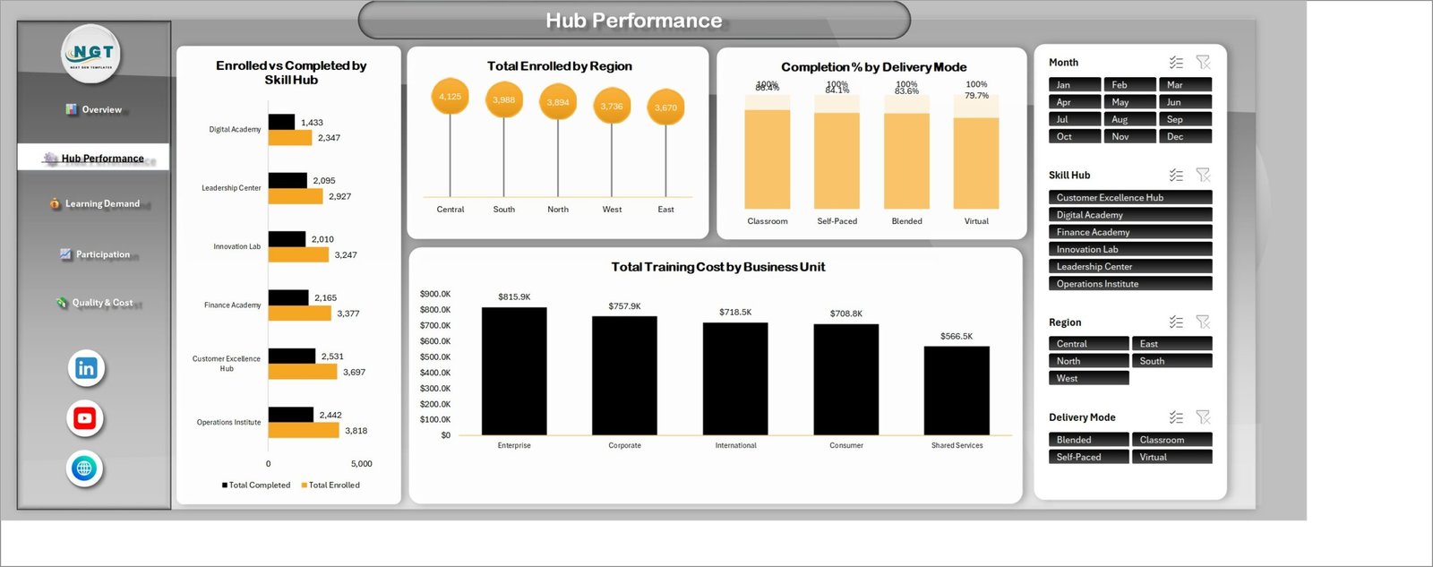
The hub league table. Enrolled vs Completed by Skill Hub lines up all six academies: Operations Institute (3,818 enrolled, 2,442 completed), Customer Excellence Hub (3,697 / 2,531), Finance Academy (3,377 / 2,165), Innovation Lab (3,247 / 2,010), Leadership Center (2,927 / 2,095) and Digital Academy (2,347 / 1,433).
Read those pairs as ratios and the picture flips. The Operations Institute takes the most enrollments but converts the fewest of them. The Customer Excellence Hub takes fewer and converts more. Next to it, Total Enrolled by Region is remarkably flat (Central 4,125 to East 3,670), Completion % by Delivery Mode spreads from Classroom at 86.4% to Virtual at 79.7%, and Total Training Cost by Business Unit puts Enterprise at $815.9K ahead of Corporate ($757.9K), International ($718.5K), Consumer ($708.8K) and Shared Services ($566.5K).
Page 3 – Learning Demand
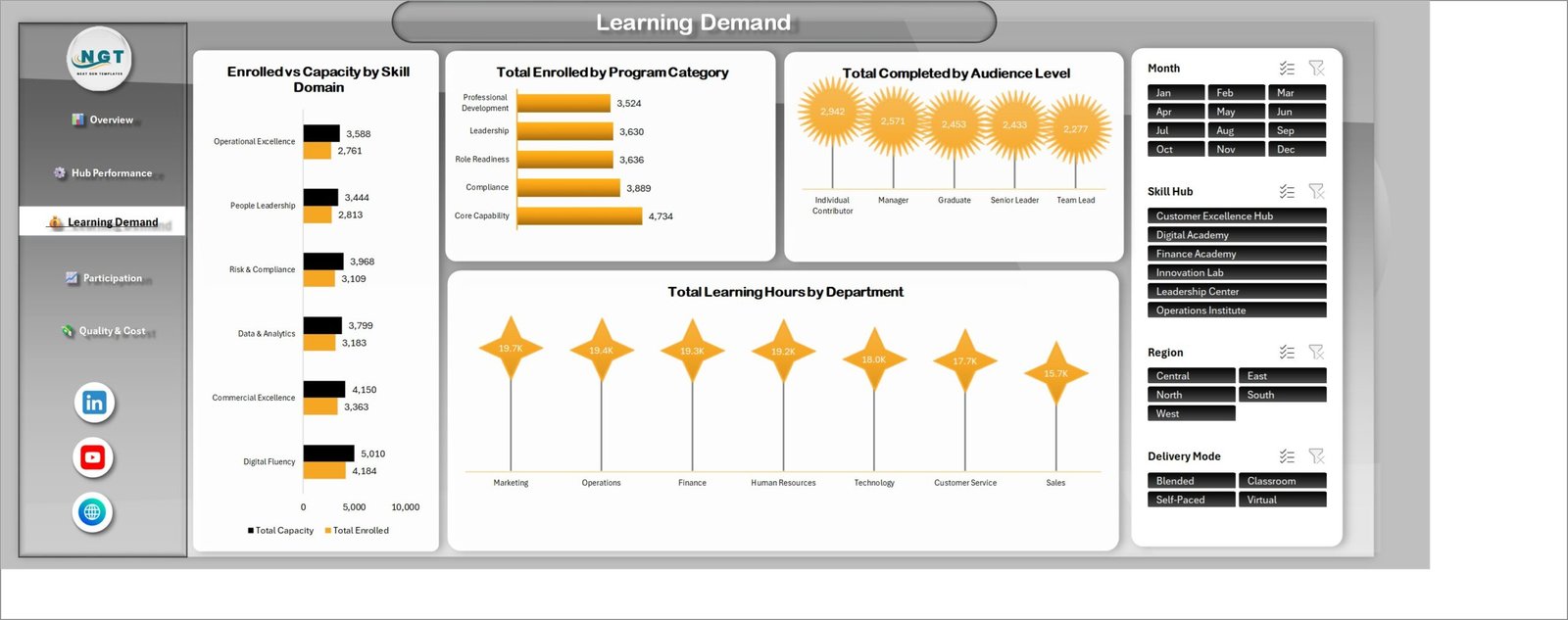
This is the capacity-planning page. Enrolled vs Capacity by Skill Domain puts seats against sign-ups for six domains – Digital Fluency runs 4,184 enrollments into 5,010 seats, Commercial Excellence 3,363 into 4,150, Data & Analytics 3,183 into 3,799, Risk & Compliance 3,109 into 3,968, People Leadership 2,813 into 3,444 and Operational Excellence 2,761 into 3,588.
Total Enrolled by Program Category ranks Core Capability first at 4,734, then Compliance (3,889), Role Readiness (3,636), Leadership (3,630) and Professional Development (3,524). Total Completed by Audience Level shows Individual Contributors completing the most (2,942) and Team Leads the fewest (2,277), and Total Learning Hours by Department closes the page with Marketing on 19.7K hours and Sales on 15.7K.
Page 4 – Participation
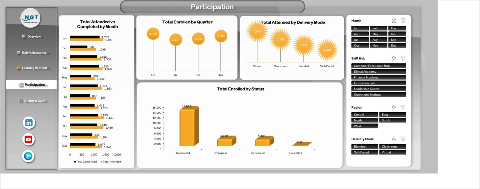
Attendance month by month. Total Attended vs Completed by Month makes February the obvious outlier – 1,099 attended against just 731 completed, the widest gap in the year – while September peaks at 1,430 attended and 1,193 completed. Total Enrolled by Quarter runs Q1 5,318, Q2 4,479, Q3 4,628, Q4 4,988. Total Attended by Delivery Mode puts Virtual well ahead at 5,660, then Classroom (4,198), Blended (3,125) and Self-Paced (2,289). Total Enrolled by Status confirms the overall shape: 14,003 completed, 2,689 in progress, 2,493 scheduled and only 228 cancelled.
Put pages 2 and 4 side by side and a real tension appears. Virtual delivery attracts the most attendance and produces the lowest completion rate.
Page 5 – Quality & Cost
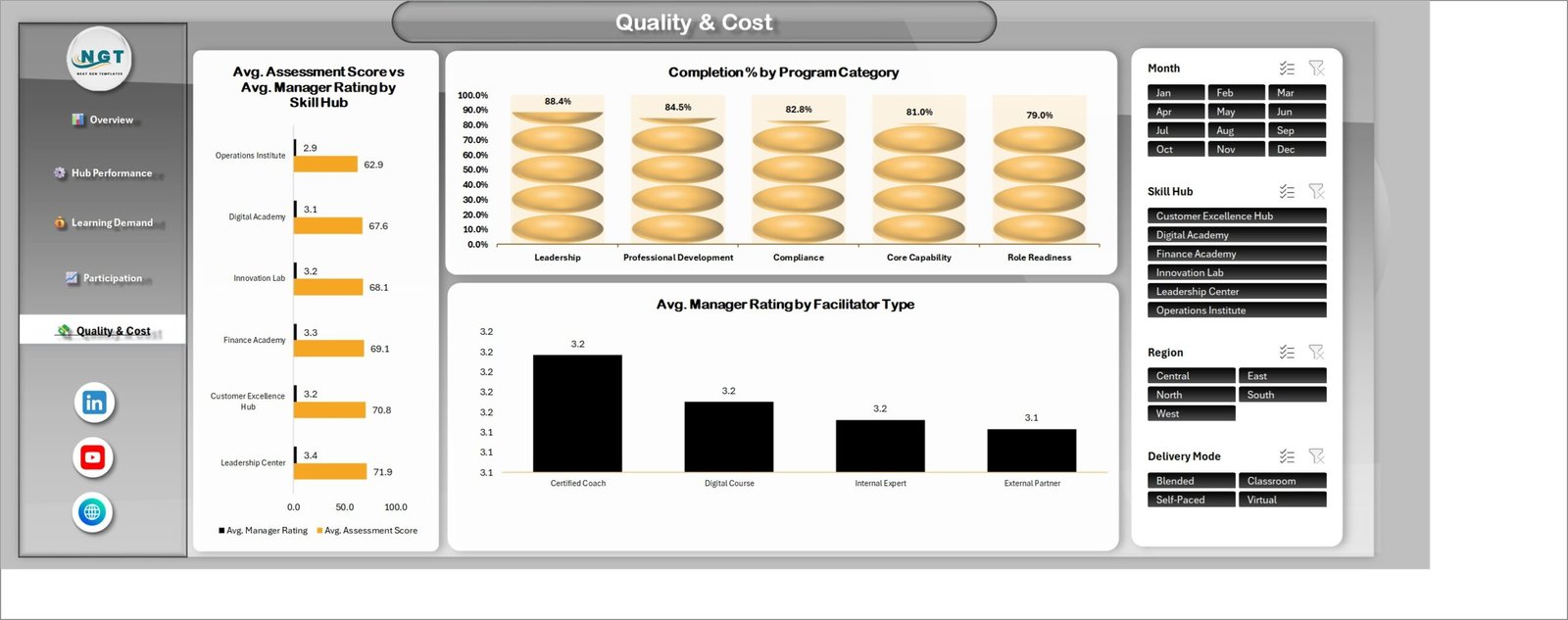
Two quality signals on one axis. Avg. Assessment Score vs Avg. Manager Rating by Skill Hub pairs a test score with a manager’s judgement: Leadership Center leads on both (71.9 and 3.4), then Customer Excellence Hub (70.8 / 3.2), Finance Academy (69.1 / 3.3), Innovation Lab (68.1 / 3.2), Digital Academy (67.6 / 3.1) and Operations Institute (62.9 / 2.9). The two measures agree, which is worth knowing – when they disagree in your own data, that is the signal.
Completion % by Program Category ranks Leadership at 88.4%, Professional Development 84.5%, Compliance 82.8%, Core Capability 81.0% and Role Readiness 79.0%. Avg. Manager Rating by Facilitator Type is almost flat – Certified Coach, Digital Course and Internal Expert all at 3.2, External Partner at 3.1 – which is itself a finding: in this dataset, who delivers the session barely moves the manager’s rating.
Corporate Skill Hubs Dashboard in Excel vs. Google Sheets vs. a Paid LMS Analytics Suite – Feature Comparison
| What matters | This Excel dashboard | Google Sheets build | Paid LMS analytics (Docebo, Cornerstone) |
|---|---|---|---|
| Cost | $17.99 once | Free, but you build it | Per-learner annual licence |
| Platform | Excel 2016+ or Microsoft 365 | Browser | Vendor cloud |
| Setup time | Under 30 minutes | Days of chart wiring | Weeks of implementation |
| Real-time team collaboration | Via OneDrive or SharePoint | Native | Native |
| Mobile access | Excel mobile app | Any browser | Vendor app |
| Customisable fields | All 21 columns are yours | Fully open | Limited to vendor schema |
| Share with a link | OneDrive link | Yes | Seat required |
| Year-1 cost at 5 users | $17.99 | $0 plus your build time | Typically four figures and up |
| Works without your LMS | Yes – any CSV export | Yes | No |
| Training cost next to completion rate | Yes, same page | If you build it | Often a separate module |
Who Should Use This Template
It fits an L&D leader running more than one academy who has to explain six hubs to one leadership team every month. It fits an HR business partner who needs completion by department without waiting on a reporting queue. It fits a finance partner supporting HR who wants training spend and completion in the same frame. And it fits a regional learning manager who only cares about one region and one delivery mode, which is exactly two slicer clicks away.
It does not fit anyone who needs live LMS sync, individual learner transcripts, SCORM or xAPI statement analysis, or a compliance-grade audit trail. This is a reporting layer over an export, not a system of record.
Real-World Use Cases
The monthly leadership pack. Paste the latest export, filter Month to the last three, and screenshot Hub Performance. The Operations Institute’s 3,818 enrollments against 2,442 completions is the whole agenda item.
The budget conversation. Enterprise absorbs $815.9K of the $3.6M. Put that chart beside Completion % by Department and the question stops being how much and starts being what for.
The delivery-mode review. Virtual leads attendance at 5,660 but trails completion at 79.7%. That is a curriculum redesign argument, not a scheduling one – and it takes one page to make.
Advantages of the Corporate Skill Hubs Dashboard in Excel
- It runs on what you already have. No add-in, no macro, no connector, no licence key.
- Nothing is a black box. Every number traces back to a row on the Data sheet, and the Support sheet shows the helper calculations behind the KPI cards.
- The slicers do the work. Four filters, five pages, one pivot cache. Microsoft’s own guide to slicers explains the mechanism if you want to extend it.
- It is populated on arrival. You can evaluate the layout before you have your own data ready.
- Your categories, not ours. Rename the hubs, departments and program categories on the Data sheet and the slicers follow.
Opportunities for Improvement
An honest list, because every template has one.
- No live connection. Refreshing means pasting a new export and pressing Refresh All. If you need scheduled refresh, this is the wrong tool.
- No target line. The analytical pages show what happened, not what should have happened. If you want variance against a target with traffic lights, that is the KPI scorecard version.
- Slicers need desktop Excel. The workbook opens in Excel for the web, but slicer interaction is limited there.
- Column order matters. The pivots read a fixed 21-column layout. Reordering your export before pasting saves a rebuild.
- No learner-level drill-down. The grain is the session, not the individual.
Best Practices
- Keep one row per session, not per learner. Every chart in the workbook assumes that grain.
- Paste values, not formatted cells. Ctrl + Alt + V then V keeps the table clean.
- Refresh with Ctrl + Alt + F5 after every paste, and check a KPI card before you screenshot anything.
- Clear all slicers before you save. A workbook saved with Region filtered to West will confuse the next person who opens it.
- Archive the workbook monthly. Save a dated copy so you have a trail of what each pack was built from.
- Reconcile once. The first time you load your own data, tie Total Enrolled back to your LMS report. After that you can trust it.
Explore Relevant Templates
- Corporate Skill Hubs KPI Dashboard in Excel – the month-picker scorecard twin.
- Coaching Networks Dashboard in Excel – the coaching side of capability building.
- Leadership Development Dashboard in Excel – a focused view of the leadership pipeline.
- Knowledge Hubs Dashboard in Excel – content and knowledge-base analytics.
- Online Certification Providers Dashboard in Excel – external certification spend.
- Corporate Universities Dashboard in Excel – a wider corporate academy view.
- HR Director Toolkit – ten HR templates bundled together.
Frequently Asked Questions
Does the Corporate Skill Hubs Dashboard in Excel connect to my LMS?
No. It reads a table you paste onto the Data sheet. Any LMS, HRIS or spreadsheet that exports a session list to CSV will work – map your columns onto the 21 provided and refresh.
How is this different from the Corporate Skill Hubs KPI Dashboard?
This is the analytical five-page dashboard: slicers, 19 charts, free exploration. The KPI dashboard is a scorecard – a month picker, targets, traffic lights and a KPI trend page. Different structures for different meetings.
Do I need to enable macros?
No. It is a plain .xlsx with pivot tables, pivot charts and slicers.
Which versions of Excel does it work in?
Excel 2016 and later on Windows, and Microsoft 365. Slicers need a desktop version for full interaction.
Can I add my own skill hubs, departments or program categories?
Yes. Type them into the Data sheet and refresh. Nothing is hard-coded into the charts or slicers.
Are the numbers in the screenshots real company data?
No. All 500 rows are realistic sample data generated for demonstration, so the dashboard is fully populated on first open. Replace them with yours.
How many charts and sheets are there exactly?
19 charts across five dashboard pages, plus a Data sheet and a Support sheet – seven worksheets in total.
About the Author
Built by PK – Microsoft Certified Professional with 15+ years of Excel, Google Sheets, and Power BI experience. Founder of NextGenTemplates, reaching 300K+ subscribers across YouTube channels. Every template is hand-built and tested before release.
Conclusion
A training report should answer a question, not just report a number. Five pages, four slicers and 19 charts is enough structure to get from 78.7% attendance to Virtual delivery is where completion leaks in about three clicks – and that is the difference between a slide and a decision.
Grab the Corporate Skill Hubs Dashboard in Excel for a one-off $17.99, paste your export in, and have your own version running before the next review. For more Excel and Power BI walkthroughs, subscribe at youtube.com/@PKAnExcelExpert.