Running a dental clinic involves much more than treating patients — it’s about managing appointments, monitoring costs, ensuring patient satisfaction, and maintaining profitability. In today’s data-driven world, every dental clinic or hospital needs smart tools to analyze their performance efficiently. That’s where the Dental Services Dashboard in Excel becomes an invaluable solution.
This ready-to-use Excel template helps dental professionals track key performance indicators (KPIs) like patient satisfaction, treatment costs, discounts, insurance coverage, and profits — all in one interactive dashboard. With clean visuals, quick filters, and easy navigation, you can make informed decisions that improve both patient experience and clinic profitability.
Click to Purchases Dental Services Dashboard in Excel
What Is a Dental Services Dashboard in Excel?
A Dental Services Dashboard in Excel is an analytical and visual reporting tool designed specifically for dental practices. It consolidates important data from different sources (such as patient records, billing systems, and insurance data) into one structured Excel file.
Instead of manually calculating and analyzing reports every month, this dashboard automatically converts your data into meaningful insights through pivot tables, charts, and slicers.
With this Excel-based dashboard, dental practitioners can:
-
Track financial performance (e.g., profit, treatment cost, discounts).
-
Measure patient satisfaction across branches or treatments.
-
Monitor insurance coverage and claims efficiently.
-
Identify trends and growth opportunities across months or years.
Key Features of the Dental Services Dashboard in Excel
This professionally designed Excel dashboard comes with multiple analytical pages and a simple navigation panel for smooth use. Let’s explore its key components.
🧭 Page Navigator
Located on the left side of the dashboard, the page navigator allows quick access to all major analytical pages — from Overview to Month Analysis. You can switch between pages with a single click, ensuring smooth workflow and faster analysis.
📊 Structure of the Dashboard — 5 Analytical Pages
The Dental Services Dashboard in Excel is divided into five detailed analytical pages, each offering unique insights for decision-making.
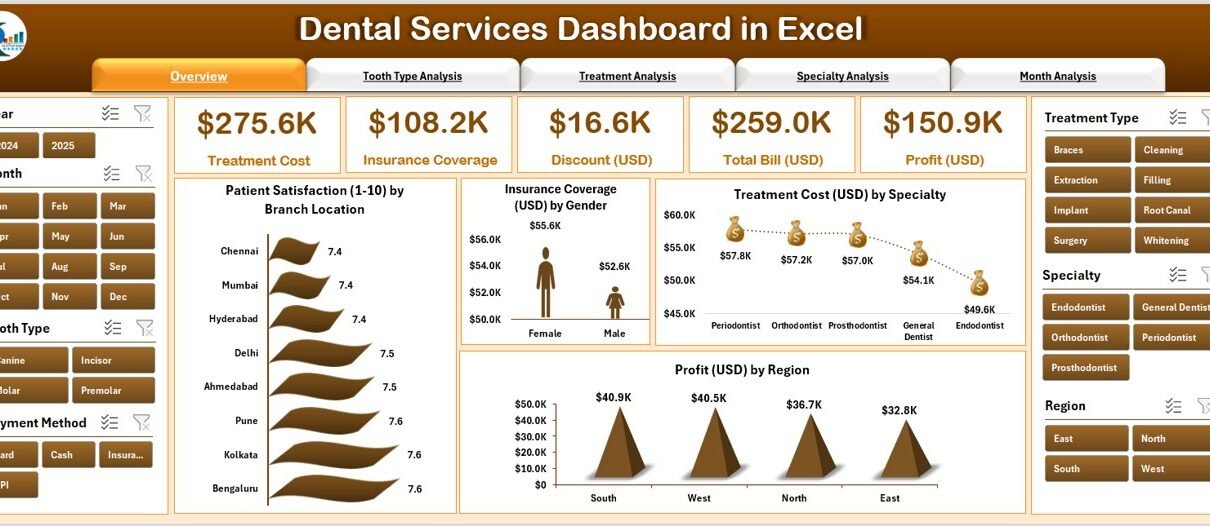
1️⃣ Overview Page — The Heart of the Dashboard
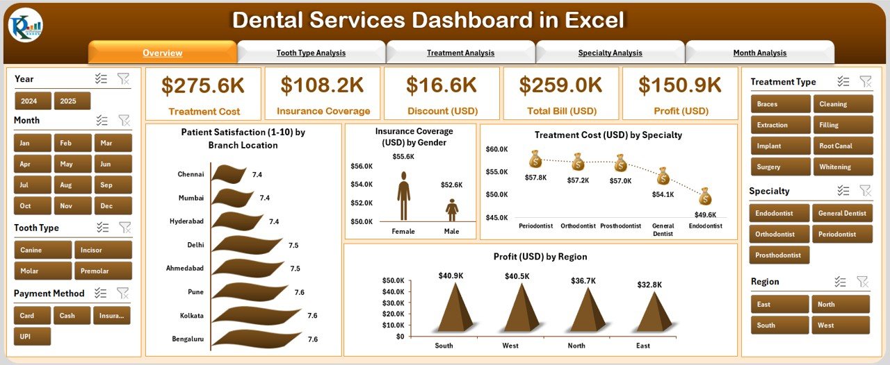
The Overview Page acts as the main control panel.
Key Highlights:
-
Displays five key performance cards for quick insight into clinic performance.
Includes four interactive charts:
- Patient Satisfaction (1–10) by Branch Location
- Insurance Coverage (USD) by Gender
- Treatment Cost (USD) by Specialty
- Profit (USD) by Region
This page gives management a snapshot of overall clinic performance and helps compare branch-wise profitability and patient happiness.
2️⃣ Tooth Type Analysis — Understand Treatment Cost Patterns
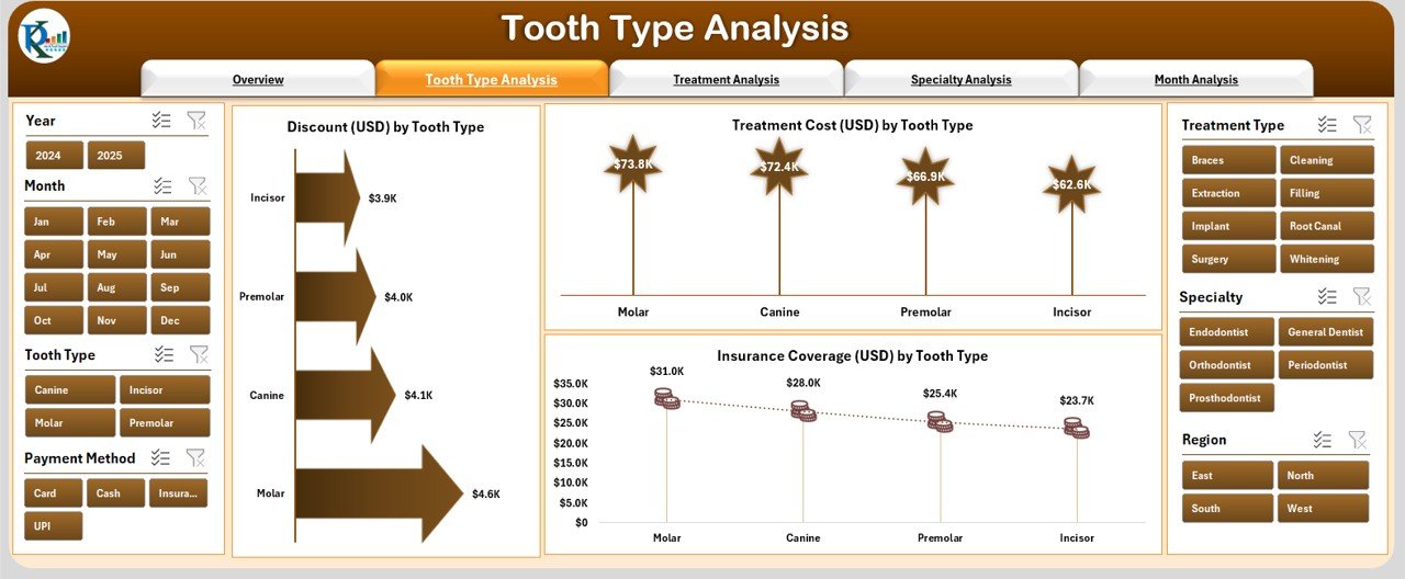
This section focuses on analyzing treatments based on tooth types (such as molar, canine, incisor, etc.).
Click to Purchases Dental Services Dashboard in Excel
Charts Included:
-
Discount (USD) by Tooth Type — Understand which treatments require higher discounts.
-
Treatment Cost (USD) by Tooth Type — Analyze cost differences across tooth types.
-
Insurance Coverage (USD) by Tooth Type — Evaluate how much of each treatment is covered by insurance.
This analysis helps identify the most profitable and cost-effective treatment categories.
3️⃣ Treatment Analysis — Evaluate Service Performance
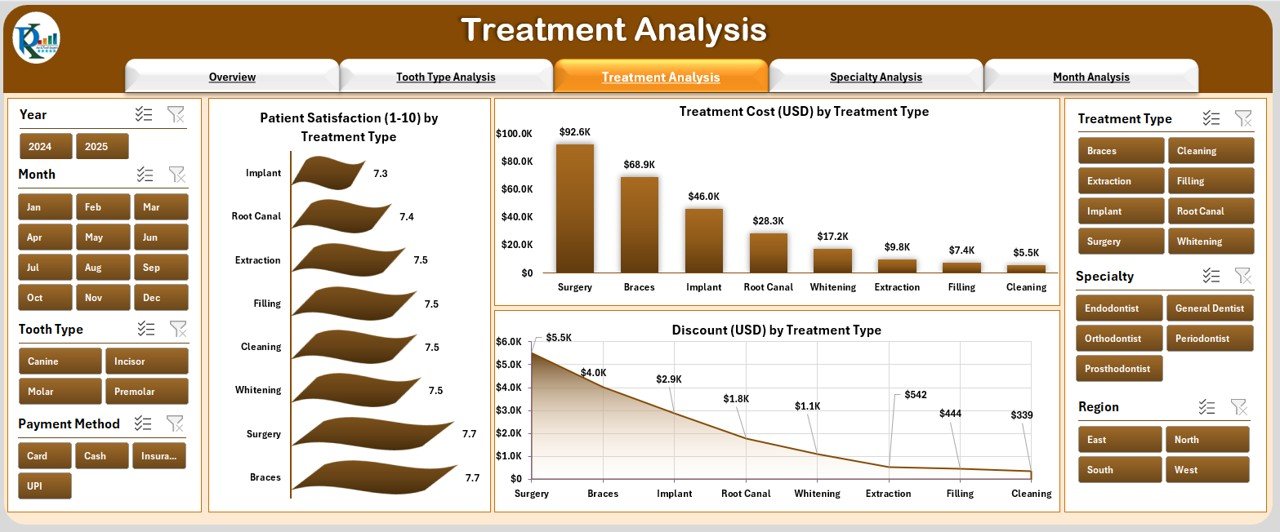
The Treatment Analysis page provides deep insights into different treatment types such as root canal, extraction, whitening, filling, and implants.
Charts Displayed:
-
Patient Satisfaction (1–10) by Treatment Type
-
Treatment Cost (USD) by Treatment Type
-
Discount (USD) by Treatment Type
By comparing satisfaction levels and cost-effectiveness, dental administrators can identify which treatments perform well and which need improvement.
4️⃣ Specialty Analysis — Department-Level Insights
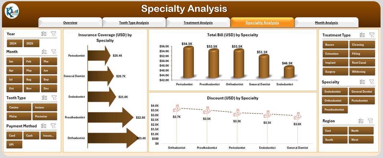
This section focuses on analyzing performance across various dental specialties like orthodontics, prosthodontics, oral surgery, and periodontics.
Charts Included:
-
Insurance Coverage (USD) by Specialty
-
Total Bill (USD) by Specialty
-
Discount (USD) by Specialty
This analysis helps management understand which specialties contribute most to revenue and which may require optimization in pricing or operations.
5️⃣ Month Analysis — Track Progress Over Time
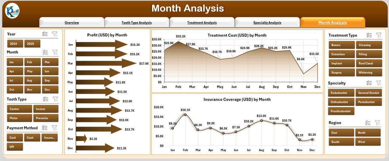
The Month Analysis Page highlights performance trends throughout the year.
Charts Displayed:
-
Profit (USD) by Month
-
Treatment Cost (USD) by Month
-
Insurance Coverage (USD) by Month
By analyzing month-wise patterns, dental clinics can identify peak treatment periods, monitor seasonality, and make better marketing and budgeting decisions.
Support Sheet: Data Sheet
Click to Purchases Dental Services Dashboard in Excel
The Data Sheet acts as the foundation of this dashboard. All source data — including patient details, treatment information, insurance values, costs, and satisfaction scores — are stored here.
This structured dataset ensures that the entire dashboard remains dynamic and automatically updates whenever new data is added.
Why Every Dental Clinic Needs a Dashboard
Running a dental clinic involves juggling multiple tasks — from handling patients to managing accounts and staff. Without structured analytics, it becomes difficult to track overall performance. The Dental Services Dashboard in Excel simplifies this by:
-
Centralizing all critical data in one place.
-
Saving hours of manual reporting time.
-
Providing real-time visual analytics.
-
Helping managers and doctors make quick, data-driven decisions.
🎯 Key Metrics Tracked in the Dental Services Dashboard
The dashboard includes several important KPIs to ensure comprehensive performance tracking.
1. Patient Satisfaction Score (1–10)
Measures how happy patients are with their treatments and services.
2. Treatment Cost (USD)
Tracks the average cost per treatment type, tooth type, or specialty.
3. Profit (USD)
Calculates net profit by region, month, or treatment type.
4. Insurance Coverage (USD)
Shows how much cost is covered by insurance companies versus out-of-pocket payments.
5. Discount (USD)
Monitors discounts provided to patients and their impact on profit margins.
6. Total Bill (USD)
Represents the total billed amount for treatments within a given period.
Advantages of Using a Dental Services Dashboard in Excel
The benefits of using this dashboard go beyond data visualization. It enhances clinic performance and operational efficiency in multiple ways.
📈 1. Real-Time Decision Making
Get instant access to updated data that supports quick and accurate business decisions.
🕒 2. Saves Time
Automates manual reporting tasks and eliminates repetitive calculations.
💵 3. Improves Financial Performance
Monitors treatment costs, discounts, and profits to maintain financial health.
😊 4. Enhances Patient Experience
Tracks satisfaction scores and feedback to improve service quality.
🧾 5. Simplifies Insurance Management
Provides clear visibility of insurance claims, reducing payment delays.
🧩 6. Customizable and Scalable
Add new KPIs, charts, or filters based on your clinic’s needs — all within Excel.
Opportunities for Improvement
Even with a strong foundation, every dental clinic can enhance its performance by focusing on a few improvement areas identified through the dashboard.
-
Monitor Low-Satisfaction Treatments: Identify treatments that receive lower satisfaction scores and take corrective actions.
-
Reduce High Discount Rates: Analyze where discounts are heavily applied and assess if pricing strategies need revision.
-
Improve Insurance Claim Ratios: Work with insurers to increase coverage or simplify claim processes.
-
Enhance Regional Profitability: Use the Profit by Region chart to balance resource allocation and marketing efforts.
Best Practices for Using the Dental Services Dashboard in Excel
To make the most of this analytical tool, follow these best practices:
✅ 1. Keep Data Updated
Ensure that your data sheet is refreshed regularly. Accurate data guarantees accurate insights.
✅ 2. Maintain Data Consistency
Use consistent naming for treatments, tooth types, and branches to avoid duplication and confusion.
✅ 3. Review KPIs Monthly
Set a monthly schedule to review performance trends and take corrective measures.
✅ 4. Use Conditional Formatting Wisely
Highlight low satisfaction or profit areas using color coding for easy identification.
✅ 5. Backup Data Regularly
Since Excel is an offline tool, maintain secure backups to avoid data loss.
✅ 6. Customize Visuals for Your Clinic
Adapt chart types, colors, and filters to match your brand and analysis needs.
🖥️ How to Use the Dental Services Dashboard in Excel
-
Enter your data in the Data Sheet (patient name, gender, treatment type, cost, insurance, satisfaction score, etc.).
-
The dashboard auto-updates based on new entries.
-
Use slicers and dropdowns to filter results by month, specialty, or branch.
-
Analyze each page — Overview, Tooth Type, Treatment, Specialty, and Month — to gain insights.
-
Export visual summaries or screenshots for reports and presentations.
Who Can Use This Dashboard?
The Dental Services Dashboard is perfect for:
-
Dentists who want a quick snapshot of clinic performance.
-
Clinic Managers to monitor operations and profits.
-
Insurance Coordinators to analyze claim coverage.
-
Accountants to track financial KPIs.
-
Healthcare Analysts who prepare monthly performance reports.
How It Supports Strategic Decision-Making
This dashboard is not just a reporting tool — it’s a strategic decision-making assistant.
It helps clinics:
-
Identify the most profitable treatments.
-
Compare performance across locations.
-
Plan budgets and optimize costs.
-
Align staff performance with business goals.
-
Improve patient engagement and loyalty.
Example Use Case
Imagine a dental chain with five branches using this dashboard. Within a few clicks, management can:
-
See that “Orthodontics” has the highest revenue but lower satisfaction.
-
Notice that “Root Canal Treatments” in one region have high discounts, reducing profit.
-
Identify that “Insurance Coverage” peaked in March, improving cash flow.
Such insights help clinics take data-backed actions — adjust pricing, improve services, and enhance overall performance.
Why Choose Excel for Dental Dashboards?
Excel remains one of the most accessible and versatile tools for analytics. Unlike costly software, it allows customization, offline access, and easy sharing.
Benefits of Using Excel:
-
No need for additional software installation.
-
User-friendly interface for non-technical staff.
-
Easy integration with existing clinic records.
-
Portable and shareable reports.
-
Fully customizable visualizations.
🏁 Conclusion
The Dental Services Dashboard in Excel transforms raw clinic data into actionable intelligence. It enables dental professionals to make smarter, faster, and more accurate decisions. By analyzing costs, satisfaction, profits, and insurance data all in one place, it helps streamline operations, increase revenue, and enhance patient care.
Whether you’re a solo practitioner or managing a large dental network, this Excel dashboard is the perfect tool to monitor, evaluate, and improve performance — all with the simplicity of Excel.
❓ Frequently Asked Questions (FAQs)
1️⃣ What is a Dental Services Dashboard in Excel?
It is an Excel-based analytical tool designed to track and visualize dental clinic performance metrics like satisfaction, costs, and profits.
2️⃣ Can I customize the dashboard for my clinic?
Yes, you can easily modify charts, KPIs, and layouts to match your clinic’s structure and requirements.
3️⃣ Is any technical knowledge required to use it?
Not at all. The dashboard works with simple dropdowns and slicers — no coding or formulas required.
4️⃣ How often should I update the data?
Ideally, update the data weekly or monthly to ensure you always have the latest insights.
5️⃣ Can multiple branches use the same dashboard?
Yes, it supports multi-branch data and lets you compare performance across locations.
6️⃣ Does this dashboard support Year-to-Date (YTD) and Month-to-Date (MTD) views?
Absolutely. You can easily track MTD and YTD trends across various KPIs.
Visit our YouTube channel to learn step-by-step video tutorials