Most drywall subcontractors already know their numbers. Board goes on the wall, compound goes on the seams, invoices go out, and somewhere in a spreadsheet there is a figure for waste and a figure for labour hours. What is usually missing is the bit that turns those figures into a decision: a target next to each one, a rule for what counts as good, and a name against whoever owns it.
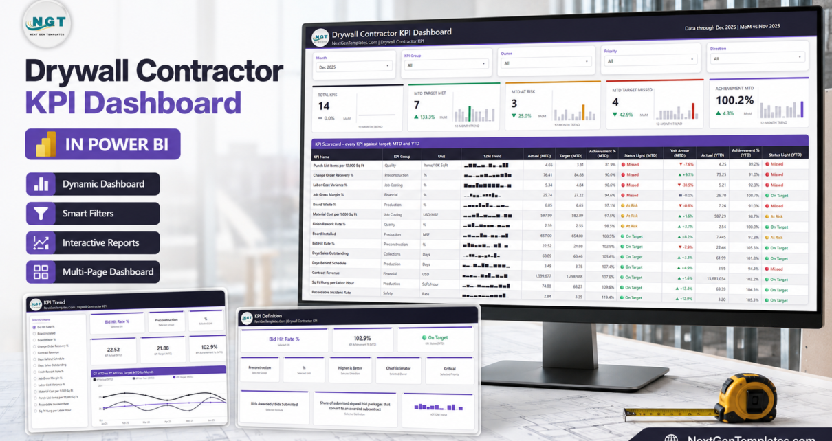
The Drywall Contractor KPI Dashboard in Power BI is that layer. It takes 14 drywall KPIs, scores each one against its own monthly target, and prints a three-state traffic light for the month and for the year to date on the same row. Everything is driven by one Excel workbook you fill in yourself.
This walkthrough goes page by page through the shipped file and explains the sample December 2025 numbers, so you can decide whether the build suits how you already report.
Which of the three drywall templates is this?
NextGenTemplates publishes three families whose names sit uncomfortably close together, so it is worth being explicit before anything else.
- The analytical Dashboard line slices revenue and volume by region, crew, job type and period. It answers “where is the work coming from”.
- The KPI Dashboard line – this one – is a month-picker scorecard. Target versus actual, traffic lights, KPI Trend and KPI Definition pages. It answers “are we hitting the numbers we set”.
- The KPI Scorecard line is a lighter single-file build with its own, shorter KPI list. A Drywall Contractor KPI Scorecard in Excel and a Google Sheets edition are already live and are genuinely different products, not this one repackaged.
If you own more than one they complement each other. They do not overlap.
The 14 KPIs, and who owns them
The shipped KPI list is drywall-specific rather than generic construction. Each row carries a group, a unit, a direction, an owner and a priority.
| KPI | Group | Unit | Direction | Owner |
|---|---|---|---|---|
| Contract Revenue | Financial | USD | Higher is better | Finance Director |
| Job Gross Margin % | Financial | % | Higher is better | Finance Director |
| Labor Cost Variance % | Job Costing | % | Lower is better | Estimating Manager |
| Material Cost per 1,000 Sq Ft | Job Costing | USD/MSF | Lower is better | Purchasing Lead |
| Board Installed | Production | MSF | Higher is better | Production Manager |
| Sq Ft Hung per Labor Hour | Production | SqFt/Hour | Higher is better | Field Operations |
| Board Waste % | Production | % | Lower is better | Purchasing Lead |
| Days Behind Schedule | Production | Days | Lower is better | Project Manager |
| Finish Rework Rate % | Quality | % | Lower is better | Finishing Superintendent |
| Punch List Items per 10,000 Sq Ft | Quality | Items/10K SqFt | Lower is better | Quality Manager |
| Bid Hit Rate % | Preconstruction | % | Higher is better | Chief Estimator |
| Change Order Recovery % | Preconstruction | % | Higher is better | Project Manager |
| Days Sales Outstanding | Collections | Days | Lower is better | Accounts Receivable |
| Recordable Incident Rate | Safety | Rate | Lower is better | Safety Director |
Seven groups, 11 distinct owners, and a priority of Critical, High or Medium on every row – five Critical, six High, three Medium in the sample. Six KPIs are higher-is-better, eight are lower-is-better.
Why direction matters more than it sounds
Eight of these fourteen are numbers you want to go down: waste, rework, punch list items, labour variance, schedule slippage, DSO, material cost, incident rate. A scorecard that divides actual by target everywhere would paint every one of them red the moment they improve.
So the model scores by direction. Higher-is-better KPIs score Actual / Target. Lower-is-better KPIs score Target / Actual. In the shipped December, Recordable Incident Rate came in at 2.84 against a 3.39 target and scores 119.4% – On Target, because a lower rate is the outcome you wanted. Days Sales Outstanding at 60.09 against 63.46 scores 105.6% for the same reason.
The bands are fixed and simple: On Target at 100% or more, At Risk from 95% up to 100%, Missed below 95%.
Page 1 – KPI Scorecard
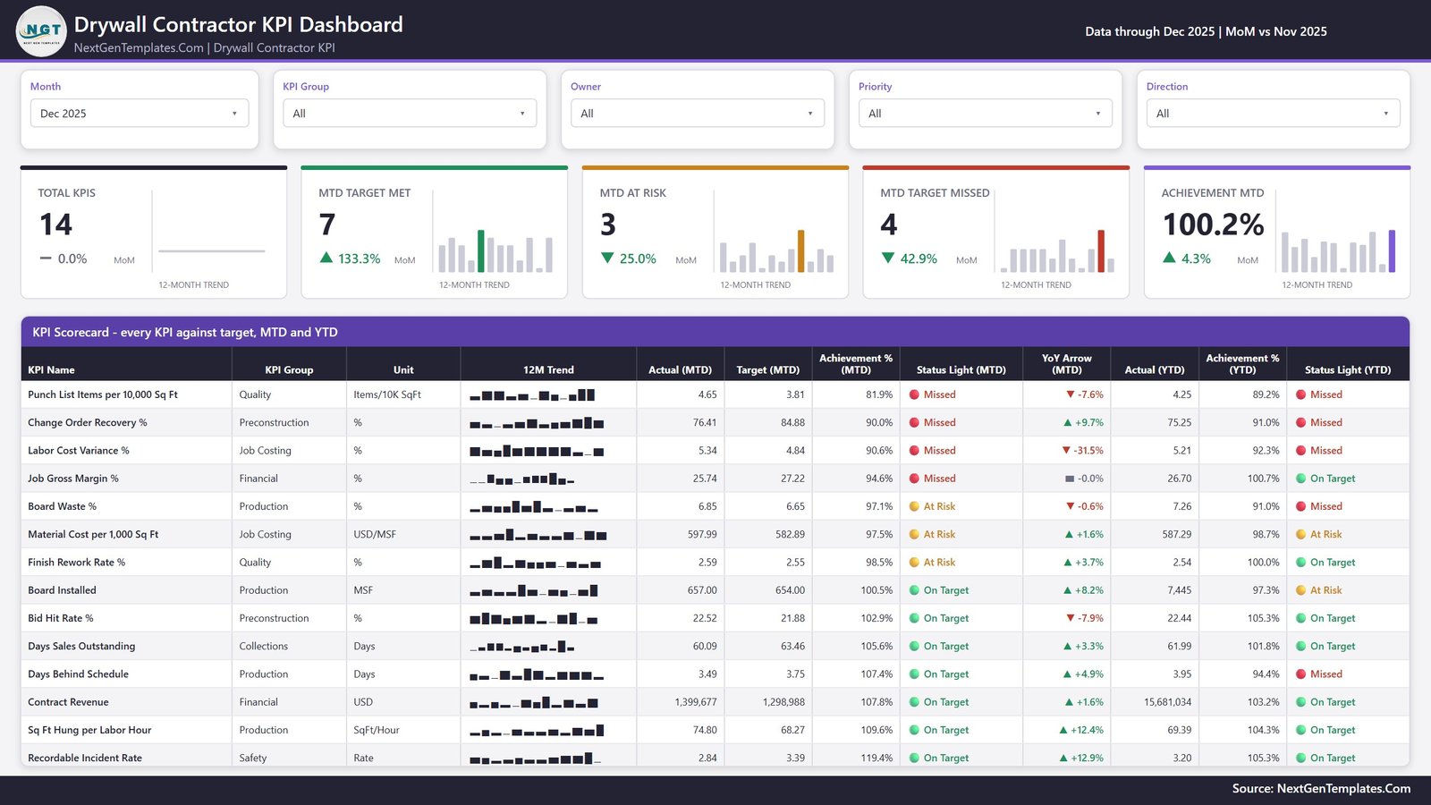
Five slicers run along the top: Month, KPI Group, Owner, Priority and Direction. Under them, five summary cards – Total KPIs, MTD Target Met, MTD At Risk, MTD Target Missed and Achievement MTD – each with its own 12-month trend bar and a month-on-month delta.
With Dec 2025 selected, the sample reads 14 KPIs, 7 met, 3 at risk, 4 missed, 100.2% achievement for the month.
The table below the cards is the substance of the page: KPI Name, KPI Group, Unit, a 12-month sparkline, then Actual (MTD), Target (MTD), Achievement % (MTD), Status Light (MTD), YoY Arrow (MTD), and finally Actual (YTD), Achievement % (YTD) and Status Light (YTD). Rows sort worst-first, so the four misses sit at the top where a meeting will actually look at them.
Two things are worth pointing at in the sample:
- Job Gross Margin % is Missed for the month at 94.6% (25.74 against a 27.22 target) but On Target for the year at 100.7%. One bad month inside a good year – visible because both horizons print side by side rather than one replacing the other.
- Days Behind Schedule is the mirror image: On Target for December at 107.4%, but Missed for the year at 94.4%. A month that recovered does not erase the year.
The sparkline holds the full twelve months regardless of which month is selected, so changing the month picker does not flatten the shape of the year.
Page 2 – KPI Trend
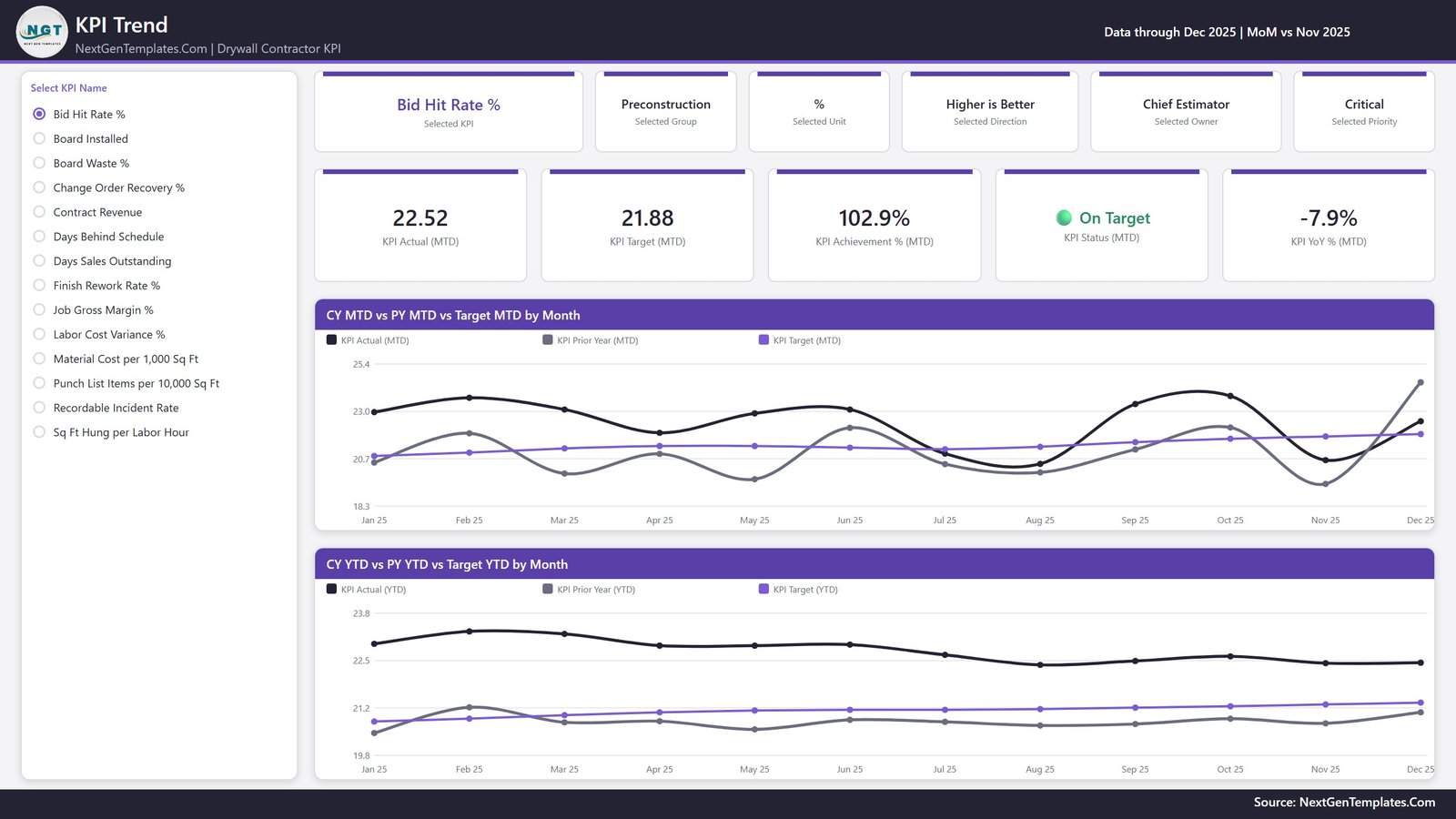
Pick one KPI from the list on the left and the whole page becomes that KPI. Six context cards name the selected KPI, its group, unit, direction, owner and priority. Five value cards show KPI Actual (MTD), KPI Target (MTD), KPI Achievement % (MTD), KPI Status (MTD) and KPI YoY % (MTD).
Then two line charts, each carrying three series – this year, last year, target:
- CY MTD vs PY MTD vs Target MTD by Month
- CY YTD vs PY YTD vs Target YTD by Month
The prior-year line is real history. The data pack holds two full years of actuals, 2024 and 2025, so every PY line and every YoY arrow reads from numbers somebody typed, not from an estimate derived off this year.
Page 3 – KPI Definition
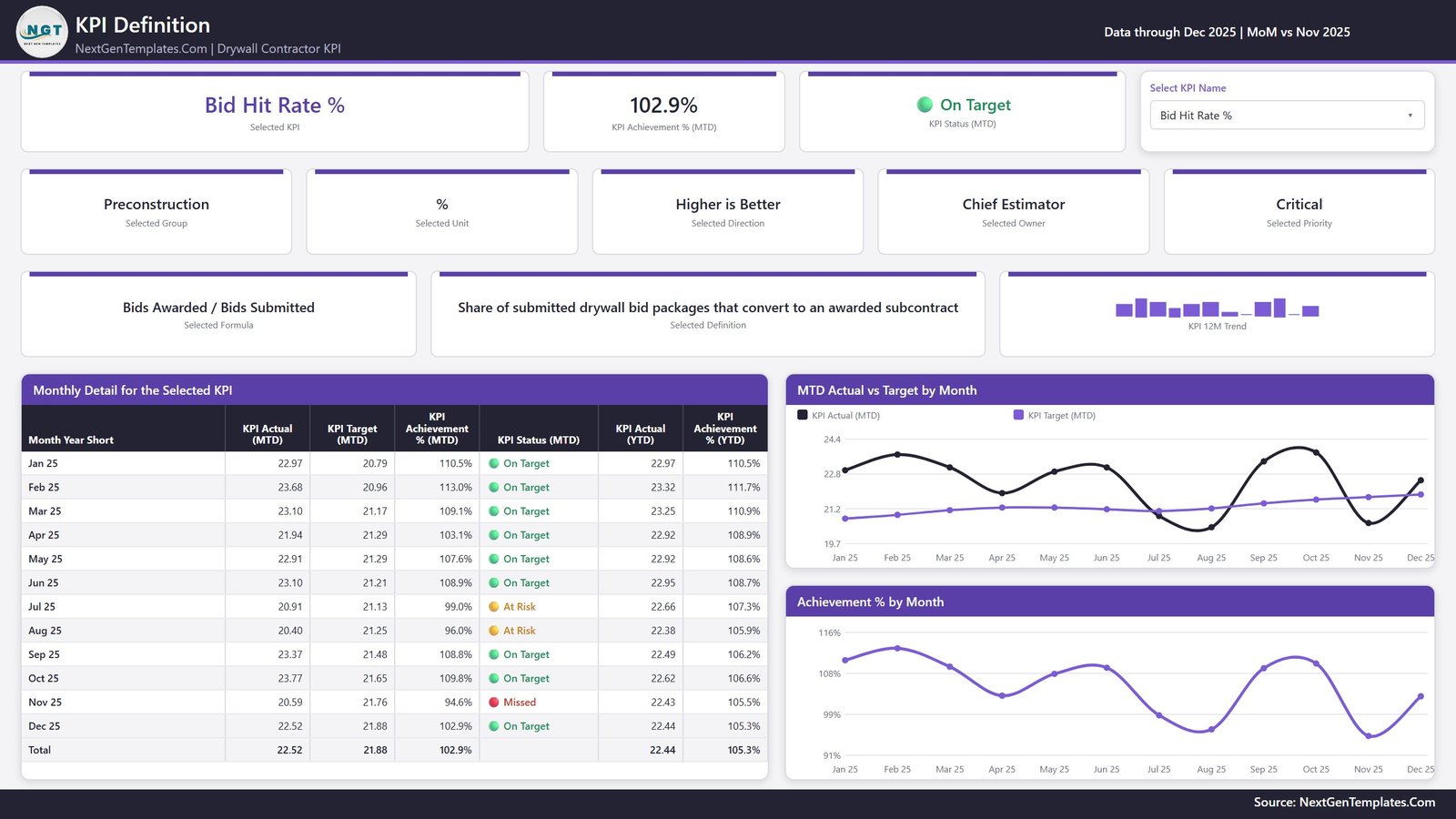
This is the page most KPI packs skip, and the one that stops the monthly meeting turning into an argument about arithmetic. For whichever KPI is selected it prints the formula and a plain-English definition:
- Board Waste % – “(Board Purchased – Board Installed) / Board Purchased”, defined as sheets scrapped, mis-cut or over-ordered against the takeoff quantity.
- Bid Hit Rate % – “Bids Awarded / Bids Submitted”, defined as the share of submitted drywall bid packages that convert to an awarded subcontract.
- Punch List Items per 10,000 Sq Ft – “Punch List Items Raised / (Sq Ft Turned Over / 10,000)”, defined as screw pops, seam cracks and corner-bead defects raised by the GC at turnover.
Below that sits a Monthly Detail table for all twelve months with a total row, an MTD Actual vs Target by Month chart and an Achievement % by Month chart.
Worth knowing before you go looking for it: there is no right-click drill-through in this build. The KPI Definition page is reached from the page tabs, and its KPI selector is synced to the one on KPI Trend – so whichever KPI you clicked is already applied when you switch. Two hidden tooltip pages (KPI Detail and Trend Detail, 280×360) appear on hover, and those are the only hidden pages in the file.
Page 4 – Get More Templates
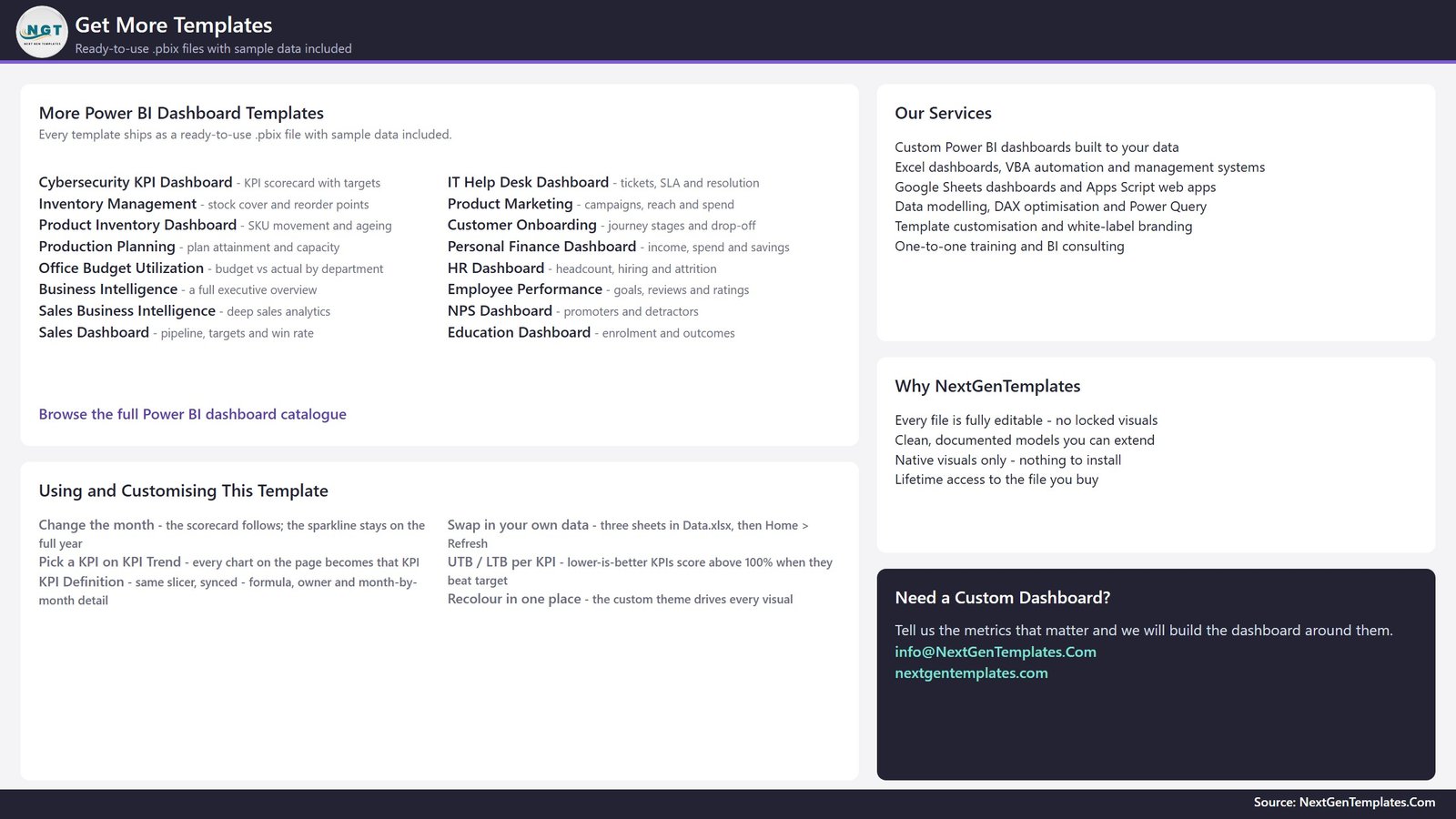
A short in-file catalogue page with customisation notes and contact details. It ships as a visible page, so it is included in the screenshots above rather than hidden from you until after purchase.
The data pack, and what actually drives the report
The download is one ZIP with three files: the .pbix report, Data.xlsx, and a Power BI Dashboard user manual PDF. Keep them in one folder.
Data.xlsx has four sheets:
- Read Me – how the model works, including the rule that trips up most home-made KPI packs: for a rate, ratio or index the YTD figure is the average of the months so far, never a sum. A compliance percentage that adds up to 1,900% by December makes every YTD chart useless.
- KPI Definition – 14 rows, one per KPI: group, unit, formula, definition, Type (UTB or LTB), owner, priority.
- Input_ Target – 168 rows, 14 KPIs by 12 months, MTD and YTD.
- Input_ Actual – 336 rows, because it carries 2024 as well as 2025.
Nothing in the report hard-codes a KPI name. The KPI Name column is the join key across all three sheets, so adding a KPI means adding a row to KPI Definition plus its monthly Target and Actual rows; renaming one means changing it in all three. Press Home > Refresh and the counts, the cards, the scorecard, the selector list and every chart follow.
Under the covers the model is deliberately small: one imported table built from those three sheets, a Date table generated in Power Query, and more than a hundred DAX measures doing the scoring, the status glyphs, the sparklines and the month-on-month deltas. Native Power BI visuals only, with a single custom theme file driving the colours – nothing from AppSource to install, nothing to break when a custom visual is retired.
What it does not do
Worth stating plainly, because it saves a refund.
- It connects to no live system. No API, no gateway, no scheduled refresh against a source. It reads one Excel workbook you maintain by hand. There is no connector to Sage, QuickBooks, Xero, Procore, Buildertrend or ServiceTitan.
- There is no per-job or per-area drill-down. Jobs are not a dimension in the model. This is a company-level monthly scorecard by design.
- It is not takeoff, estimating or accounting software, and it does not do certified or prevailing-wage payroll.
- It is not a safety management system. Recordable Incident Rate is a figure you type in. The file does no OSHA 300 or 300A recordkeeping, checks no silica, scaffold or fall-protection compliance, and tracks no training records.
- It is not a lien, retainage or pay-application system. Days Sales Outstanding is a monitoring ratio you supply, not a receivables ledger.
- None of the shipped numbers are benchmarks. All fourteen targets are sample data. There is no industry average and no Gypsum Association or ASTM level-of-finish rule behind any figure. Replace them before anyone treats a traffic light as meaningful.
Getting it running
- Unzip all three files into one folder.
- Open the
.pbixin Power BI Desktop – free from Microsoft, Windows only. The sample data is already loaded, so look around before changing anything. - Before your first refresh, go to Home > Transform data > Data source settings > Change Source and point the query at your own copy of
Data.xlsx. The path saved inside the file is the folder it was built in. - Edit the KPI Definition sheet first, then Input_ Target, then Input_ Actual – the reporting year and the year before it.
- Home > Refresh.
- Pick your month on the KPI Scorecard, then a KPI on KPI Trend. KPI Definition is on the same selection when you get there.
Frequently asked questions
Do I need a paid Power BI licence?
No. Power BI Desktop is free from Microsoft and opens, edits and refreshes the file on Windows. A Pro or Premium seat is only needed to publish the report to the Power BI Service and share it with colleagues.
Can I change the KPI list?
Yes – add, delete or rename freely. The report has no hard-coded KPI anywhere. Do it in all three sheets and refresh.
Is there an Excel version?
An Excel edition of this same KPI Dashboard – Drywall Contractor KPI Dashboard in Excel – is being prepared alongside this one and will be listed at nextgentemplates.com. It is a separate build with its own KPI list, not a converted copy of this file.
Why is my lower-is-better KPI showing above 100%?
Because that is correct. Lower-is-better KPIs score Target / Actual, so coming in under target is an achievement above 100%. It is the single most useful thing this build does that a hand-made scorecard usually gets wrong.
What is in the download?
One ZIP: the .pbix, Data.xlsx and a Power BI Dashboard user manual PDF. One payment, lifetime access to the file.
Where to get it
The Drywall Contractor KPI Dashboard in Power BI is $12.99 (regular $19.99) – a one-time payment with lifetime access, no subscription and no per-seat licence.
If you want the same build for a neighbouring trade, the Masonry, Painting, Flooring Installation, Electrical and HVAC editions are live, each with its own trade-specific KPI set. Or browse the whole Power BI template catalogue.